Tag: twitter

Improved Twitter Mining in R

Improved Twitter Mining in R

R users have been using the twitter package by Geoff Jentry to mine tweets for several years now. However, a recent blog suggests a novel package provides a better mining tool: rtweet by Michael Kearney (GitHub).

Both packages use a similar setup and require you to do some prep-work by creating a Twitter “app” (see the package instructions). However, rtweet will save you considerable API-time and post-API munging time. This is demonstrated by the examples below, where Twitter is searched for #rstats-tagged tweets, first using twitteR, then using rtweet.

library(twitteR)

# this relies on you setting up an app in apps.twitter.com
setup_twitter_oauth(
  consumer_key = Sys.getenv("TWITTER_CONSUMER_KEY"), 
  consumer_secret = Sys.getenv("TWITTER_CONSUMER_SECRET")
)

r_folks <- searchTwitter("#rstats", n=300)

str(r_folks, 1)
## List of 300
##  $ :Reference class 'status' [package "twitteR"] with 17 fields
##   ..and 53 methods, of which 39 are  possibly relevant
##  $ :Reference class 'status' [package "twitteR"] with 17 fields
##   ..and 53 methods, of which 39 are  possibly relevant
##  $ :Reference class 'status' [package "twitteR"] with 17 fields
##   ..and 53 methods, of which 39 are  possibly relevant

str(r_folks[1])
## List of 1
##  $ :Reference class 'status' [package "twitteR"] with 17 fields
##   ..$ text         : chr "RT @historying: Wow. This is an enormously helpful tutorial by @vivalosburros for anyone interested in mapping "| __truncated__
##   ..$ favorited    : logi FALSE
##   ..$ favoriteCount: num 0
##   ..$ replyToSN    : chr(0) 
##   ..$ created      : POSIXct[1:1], format: "2017-10-22 17:18:31"
##   ..$ truncated    : logi FALSE
##   ..$ replyToSID   : chr(0) 
##   ..$ id           : chr "922150185916157952"
##   ..$ replyToUID   : chr(0) 
##   ..$ statusSource : chr "Twitter for Android"
##   ..$ screenName   : chr "jasonrhody"
##   ..$ retweetCount : num 3
##   ..$ isRetweet    : logi TRUE
##   ..$ retweeted    : logi FALSE
##   ..$ longitude    : chr(0) 
##   ..$ latitude     : chr(0) 
##   ..$ urls         :'data.frame': 0 obs. of  4 variables:
##   .. ..$ url         : chr(0) 
##   .. ..$ expanded_url: chr(0) 
##   .. ..$ dispaly_url : chr(0) 
##   .. ..$ indices     : num(0) 
##   ..and 53 methods, of which 39 are  possibly relevant:
##   ..  getCreated, getFavoriteCount, getFavorited, getId, getIsRetweet, getLatitude, getLongitude, getReplyToSID,
##   ..  getReplyToSN, getReplyToUID, getRetweetCount, getRetweeted, getRetweeters, getRetweets, getScreenName,
##   ..  getStatusSource, getText, getTruncated, getUrls, initialize, setCreated, setFavoriteCount, setFavorited, setId,
##   ..  setIsRetweet, setLatitude, setLongitude, setReplyToSID, setReplyToSN, setReplyToUID, setRetweetCount,
##   ..  setRetweeted, setScreenName, setStatusSource, setText, setTruncated, setUrls, toDataFrame, toDataFrame#twitterObj

The above operations required only several seconds to completely. The returned data is definitely usable, but not in the most handy format: the package models the Twitter API on to custom R objects. It’s elegant, but also likely overkill for most operations. Here’s the rtweet version:

library(rtweet)

# this relies on you setting up an app in apps.twitter.com
create_token(
  app = Sys.getenv("TWITTER_APP"),
  consumer_key = Sys.getenv("TWITTER_CONSUMER_KEY"), 
  consumer_secret = Sys.getenv("TWITTER_CONSUMER_SECRET")
) -> twitter_token

saveRDS(twitter_token, "~/.rtweet-oauth.rds")

# ideally put this in ~/.Renviron
Sys.setenv(TWITTER_PAT=path.expand("~/.rtweet-oauth.rds"))

rtweet_folks <- search_tweets("#rstats", n=300)

dplyr::glimpse(rtweet_folks)
## Observations: 300
## Variables: 35
## $ screen_name                     "AndySugs", "jsbreker", "__rahulgupta__", "AndySugs", "jasonrhody", "sibanjan...
## $ user_id                         "230403822", "703927710", "752359265394909184", "230403822", "14184263", "863...
## $ created_at                      2017-10-22 17:23:13, 2017-10-22 17:19:48, 2017-10-22 17:19:39, 2017-10-22 17...
## $ status_id                       "922151366767906819", "922150507745079297", "922150470382125057", "9221504090...
## $ text                            "RT:  (Rbloggers)Markets Performance after Election: Day 239  https://t.co/D1...
## $ retweet_count                   0, 0, 9, 0, 3, 1, 1, 57, 57, 103, 10, 10, 0, 0, 0, 34, 0, 0, 642, 34, 1, 1, 1...
## $ favorite_count                  0, 0, 0, 0, 0, 0, 0, 0, 0, 0, 0, 0, 0, 0, 2, 0, 0, 1, 0, 0, 0, 0, 0, 0, 0, 0,...
## $ is_quote_status                 FALSE, FALSE, FALSE, FALSE, FALSE, FALSE, FALSE, FALSE, FALSE, FALSE, FALSE, ...
## $ quote_status_id                 NA, NA, NA, NA, NA, NA, NA, NA, NA, NA, NA, NA, NA, NA, NA, NA, NA, NA, NA, N...
## $ is_retweet                      FALSE, FALSE, TRUE, FALSE, TRUE, TRUE, FALSE, TRUE, TRUE, TRUE, TRUE, TRUE, F...
## $ retweet_status_id               NA, NA, "922085241493360642", NA, "921782329936408576", "922149318550843393",...
## $ in_reply_to_status_status_id    NA, NA, NA, NA, NA, NA, NA, NA, NA, NA, NA, NA, NA, NA, NA, NA, NA, NA, NA, N...
## $ in_reply_to_status_user_id      NA, NA, NA, NA, NA, NA, NA, NA, NA, NA, NA, NA, NA, NA, NA, NA, NA, NA, NA, N...
## $ in_reply_to_status_screen_name  NA, NA, NA, NA, NA, NA, NA, NA, NA, NA, NA, NA, NA, NA, NA, NA, NA, NA, NA, N...
## $ lang                            "en", "en", "en", "en", "en", "en", "en", "en", "en", "en", "en", "en", "ro",...
## $ source                          "IFTTT", "Twitter for iPhone", "GaggleAMP", "IFTTT", "Twitter for Android", "...
## $ media_id                        NA, "922150500237062144", NA, NA, NA, NA, NA, NA, NA, NA, NA, NA, NA, NA, "92...
## $ media_url                       NA, "http://pbs.twimg.com/media/DMwi_oQUMAAdx5A.jpg", NA, NA, NA, NA, NA, NA,...
## $ media_url_expanded              NA, "https://twitter.com/jsbreker/status/922150507745079297/photo/1", NA, NA,...
## $ urls                            NA, NA, NA, NA, NA, NA, NA, NA, NA, NA, NA, NA, NA, NA, NA, NA, NA, NA, NA, N...
## $ urls_display                    "ift.tt/2xe1xrR", NA, NA, "ift.tt/2xe1xrR", NA, "bit.ly/2yAAL0M", "bit.ly/2yA...
## $ urls_expanded                   "http://ift.tt/2xe1xrR", NA, NA, "http://ift.tt/2xe1xrR", NA, "http://bit.ly/...
## $ mentions_screen_name            NA, NA, "DataRobot", NA, "historying vivalosburros", "NoorDinTech ikashnitsky...
## $ mentions_user_id                NA, NA, "622519917", NA, "18521423 304837258", "2511247075 739773414316118017...
## $ symbols                         NA, NA, NA, NA, NA, NA, NA, NA, NA, NA, NA, NA, NA, NA, NA, NA, NA, NA, NA, N...
## $ hashtags                        "rstats DataScience", "Rstats ACSmtg", "rstats", "rstats DataScience", "rstat...
## $ coordinates                     NA, NA, NA, NA, NA, NA, NA, NA, NA, NA, NA, NA, NA, NA, NA, NA, NA, NA, NA, N...
## $ place_id                        NA, NA, NA, NA, NA, NA, NA, NA, NA, NA, NA, NA, NA, NA, NA, NA, NA, NA, NA, N...
## $ place_type                      NA, NA, NA, NA, NA, NA, NA, NA, NA, NA, NA, NA, NA, NA, NA, NA, NA, NA, NA, N...
## $ place_name                      NA, NA, NA, NA, NA, NA, NA, NA, NA, NA, NA, NA, NA, NA, NA, NA, NA, NA, NA, N...
## $ place_full_name                 NA, NA, NA, NA, NA, NA, NA, NA, NA, NA, NA, NA, NA, NA, NA, NA, NA, NA, NA, N...
## $ country_code                    NA, NA, NA, NA, NA, NA, NA, NA, NA, NA, NA, NA, NA, NA, NA, NA, NA, NA, NA, N...
## $ country                         NA, NA, NA, NA, NA, NA, NA, NA, NA, NA, NA, NA, NA, NA, NA, NA, NA, NA, NA, N...
## $ bounding_box_coordinates        NA, NA, NA, NA, NA, NA, NA, NA, NA, NA, NA, NA, NA, NA, NA, NA, NA, NA, NA, N...
## $ bounding_box_type               NA, NA, NA, NA, NA, NA, NA, NA, NA, NA, NA, NA, NA, NA, NA, NA, NA, NA, NA, N...

This operation took equal to less time but provides the data in a tidy, immediately usable structure.

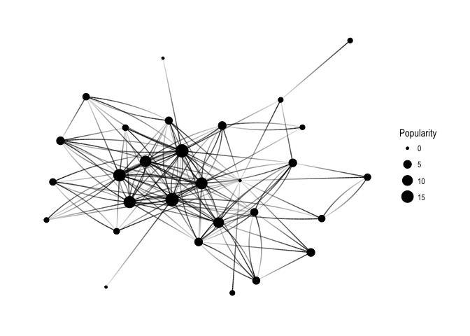
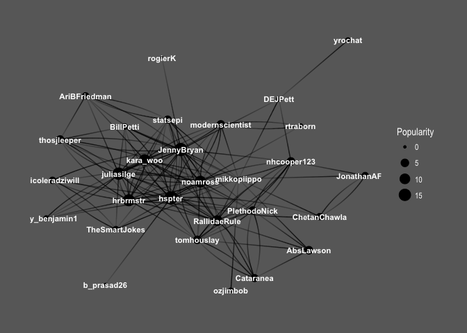
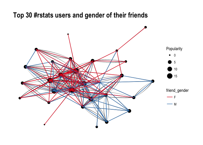
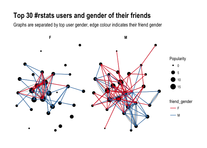
On the rtweet website, you can read about the additional functionalities this new package provides. For instance,ts_plot() provides a quick visual of the frequency of tweets. It’s possible to aggregate by the minute, i.e., by = "mins", or by some value of seconds, e.g.,by = "15 secs".

## Plot time series of all tweets aggregated by second
ts_plot(rt, by = "secs")

stream-ts

ts_filter() creates a time series-like data structure, which consists of “time” (specific interval of time determined via the by argument), “freq” (the number of observations, or tweets, that fall within the corresponding interval of time), and “filter” (a label representing the filtering rule used to subset the data). If no filter is provided, the returned data object includes a “filter” variable, but all of the entries will be blank "", indicating that no filter filter was used. Otherwise, ts_filter() uses the regular expressions supplied to the filter argument as values for the filter variable. To make the filter labels pretty, users may also provide a character vector using the key parameter.

## plot multiple time series by first filtering the data using
## regular expressions on the tweet "text" variable
rt %>%
  dplyr::group_by(screen_name) %>%
  ## The pipe operator allows you to combine this with ts_plot
  ## without things getting too messy.
  ts_plot() + 
  ggplot2::labs(
    title = "Tweets during election day for the 2016 U.S. election",
    subtitle = "Tweets collected, parsed, and plotted using `rtweet`"
  )

The developer cautions that these plots often resemble frowny faces: the first and last points appear significantly lower than the rest. This is caused by the first and last intervals of time to be artificially shrunken by connection and disconnection processes. To remedy this, users may specify trim = TRUE to drop the first and last observation for each time series.

stream-filter

Give rtweet a try and let me know whether you prefer it over twitter.

Datasets to practice and learn Programming, Machine Learning, and Data Science

Datasets to practice and learn Programming, Machine Learning, and Data Science

Many requests have come in regarding “training datasets” – to practice programming. Fortunately, the internet is full of open-source datasets! I compiled a selected list of datasets and repositories below. If you have any additions, please comment or contact me! For information on programming languages or algorithms, visit the overviews for RPython, SQL, or Data Science, Machine Learning, & Statistics resources.

This list is no longer being maintained. There are other, more frequently updated repositories of useful datasets included in bold below:

LAST UPDATED: 2019-12-23
A Million News Headlines: News headlines published over a period of 14 years.
AggData | Datasets
Aligned Hansards of the 36th Parliament of Canada
Amazon Web Services: Public Datasets
American Community Survey
ArcGIS Hub Open Data
arXiv.org help – arXiv Bulk Data Access – Amazon S3
Asset Macro: Financial & Macroeconomic Historical Data
Awesome JSON Datasets
Awesome Public Datasets
Behavioral Risk Factor Surveillance System
British Oceanographic Data Center
Bureau of Justice
Canada
Causality | Data Repository
CDC Wonder Online Database
Census Bureau Home Page
Center for Disease Control
ChEMBLdb
ChemDB
City of Chicago
Click Dataset | Center for Complex Networks and Systems Research
CommonCrawl 2013 Web Crawl
Consumer Finance: Mortgage Database
CRCNS – Collaborative Research in Computational Neuroscience
Data Download
Data is Plural
Data.gov
Data.gov.au
Data.gov.nz
Data.gov.sg
Data.gov.uk
Data.Seattle.Gov | Seattle’s Data Site
Data.world
Data.World datasets
DataHub
Datasets for Data Mining
DataSF
Dataverse
DELVE datasets
DMOZ open directory (mirror)
DRYAD
Enigma Public
Enron Email Dataset
European Environment Agency (EEA) | Data and maps
Eurostat
Eurostat Database
Eurovision YouTube Comments: YouTube comments on entries from the 2003-2008 Eurovision Song Contests
FAA Data
Face Recognition Homepage – Databases
FAOSTAT Data
FBI Crime Data Explorer
FEMA Data Feeds
Figshare
FiveThirthyEight.com
Flickr personal taxonomies
FlowingData
Fraudulent E-mail Corpus: CLAIR collection of “Nigerian” fraud emails
Freebase (last datadump)
Gapminder.org
Gene Expression Omnibus (GEO) Main page
GeoJSON files for real-time Virginia transportation data.
Golem Dataset
Google Books n-gram dataset
Google Public Data Explorer
Google Research: A Web Research Corpus Annotated with Freebase Concepts
Health Intelligence
Healthcare Cost and Utilization Project
HealthData.gov
Human Fertility Database
Human Mortality Database
ICPRS Social Science Studies 
ICWSM Spinnr Challenge 2011 dataset
IIE.org Open Doors Data Portal
ImageNet
IMDB dataset
IMF Data and Statistics
Informatics Lab Open Data
Inside AirBnB
Internet Archive: Digital Library
IPUMS
Ironic Corpus: 1950 sentences labeled for ironic content
Kaggle Datasets
KAPSARC Energy Data Portal
KDNuggets Datasets
Knoema
Lahman’s Baseball Database
Lending Club Loan Data
Linking Open Data
London Datastore
Makeover Monday
Medical Expenditure Panel Survey
Million Song Dataset | scaling MIR research
MLDATA | Machine Learning Dataset Repository
MLvis Scientific Data Repository
MovieLens Data Sets | GroupLens Research
NASA
NASA Earth Data
National Health and Nutrition Examination Survey
National Hospital Ambulatory Medical Care Survey Data
New York State
NYPD Crash Data Band-Aid
ODI Leeds
OECD Data
OECD.Stat
Office for National Statistics
Old Newspapers: A cleaned subset of HC Corpora newspapers
Open Data Inception Portals
Open Data Nederland
Open Data Network
OpenDataSoft Repository
Our World in Data
Pajek datasets
PermID from Thomson Reuters
Pew Research Center
Plenar.io
PolicyMap
Princeton University Library
Project Gutenberg
Quandl
re3data.org
Reddit Datasets
Registry of Research Data Repositories
Retrosheet.org
Satori OpenData
SCOTUS Opinions Corpus: Lots of Big, Important Words
Sharing PyPi/Maven dependency data « RTFB
SMS Spam Collection
Socrata
St. Louis Federal Reserve
Stanford Large Network Dataset Collection
State of the Nation Corpus (1990 – 2017): Full texts of the South African State of the Nation addresses
Statista
Substance Abuse and Mental Health Services Administration 
Swiss Open Government Data
Tableau Public
The Association of Religious Data Archives
The Economist
The General Social Survey
The Huntington’s Early California Population Project
The World Bank | Data
The World Bank Data Catalog
Toronto Open Data
Translation Task Data
Transport for London
Twitter Data 2010
Ubuntu Dialogue Corpus: 26 million turns from natural two-person dialogues
UC Irvine Knowledge Discovery in Databases Archive
UC Irvine Machine Learning Repository –
UC Irvine Network Data Repository
UN Comtrade Database
UN General Debates:Transcriptions of general debates at the UN from 1970 to 2016
UNdata
Uniform Crime Reporting
UniGene
United States Exam Data
University of Michigan ICPSR
University of Rochester LibGuide “Data-Stats”
US Bureau of Labor Statistics
US Census Bureau Data
US Energy Information Administration
US Government Web Services and XML Data Sources
USA Facts
USENET corpus (2005-2011)
Utah Open Data
Varieties of Democracy.
Western Pennsylvania Regional Data Center
WHO Data Repository
Wikipedia List of Datasets for Machine Learning
WordNet
World Values Survey
World Wealth & Income Database
World Wide Web: 3.5 billion web pages and their relations
Yahoo Data for Researchers
YouTube Network 2007-2008
Visualizing #IRMA Tweets

Visualizing #IRMA Tweets

Reddit user LucasCu90 used the R package twitteR to retrieve all tweets that were sent with #Irma and a Geocode of central Miami (25 mile radius) from Saturday September 9, to Sunday September 10, 2017 (the period of Irma’s approach and initial landfall on the Florida Keys and the mainland). From the 29,000 tweets he collected, Lucas then retrieved the 600 most common words and overlaid them on a map of Florida, with their size relative to their frequency in the data. The result is quite nice!

oq41nz62balz

Variance Explained: Text Mining Trump’s Twitter – Part 2

Variance Explained: Text Mining Trump’s Twitter – Part 2

Reposted from Variance Explained with minor modifications.
This post follows an earlier post on the same topic.

A year ago today, I wrote up a blog post Text analysis of Trump’s tweets confirms he writes only the (angrier) Android half.

My analysis, shown below, concludes that the Android and iPhone tweets are clearly from different people, posting during different times of day and using hashtags, links, and retweets in distinct ways. What’s more, we can see that the Android tweets are angrier and more negative, while the iPhone tweets tend to be benign announcements and pictures.

Of course, a lot has changed in the last year. Trump was elected and inaugurated, and his Twitter account has become only more newsworthy. So it’s worth revisiting the analysis, for a few reasons:

  • There is a year of new data, with over 2700 more tweets. And quite notably, Trump stopped using the Android in March 2017. This is why machine learning approaches like didtrumptweetit.com are useful since they can still distinguish Trump’s tweets from his campaign’s by training on the kinds of features I used in my original post.
  • I’ve found a better dataset: in my original analysis, I was working quickly and used the twitteR package to query Trump’s tweets. I since learned there’s a bug in the package that caused it to retrieve only about half the tweets that could have been retrieved, and in any case, I was able to go back only to January 2016. I’ve since found the truly excellent Trump Twitter Archive, which contains all of Trump’s tweets going back to 2009. Below I show some R code for querying it.
  • I’ve heard some interesting questions that I wanted to follow up on: These come from the comments on the original post and other conversations I’ve had since. Two questions included what device Trump tended to use before the campaign, and what types of tweets tended to lead to high engagement.

So here I’m following up with a few more analyses of the \@realDonaldTrump account. As I did last year, I’ll show most of my code, especially those that involve text mining with the tidytext package (now a published O’Reilly book!). You can find the remainder of the code here.

Updating the dataset

The first step was to find a more up-to-date dataset of Trump’s tweets. The Trump Twitter Archive, by Brendan Brown, is a brilliant project for tracking them, and is easily retrievable from R.

library(tidyverse)
library(lubridate)

url <- 'http://www.trumptwitterarchive.com/data/realdonaldtrump/%s.json'
all_tweets <- map(2009:2017, ~sprintf(url, .x)) %>%
  map_df(jsonlite::fromJSON, simplifyDataFrame = TRUE) %>%
  mutate(created_at = parse_date_time(created_at, "a b! d! H!:M!:S! z!* Y!")) %>%
  tbl_df()

As of today, it contains 31548, including the text, device, and the number of retweets and favourites. (Also impressively, it updates hourly, and since September 2016 it includes tweets that were afterwards deleted).

Devices over time

My analysis from last summer was useful for journalists interpreting Trump’s tweets since it was able to distinguish Trump’s tweets from those sent by his staff. But it stopped being true in March 2017, when Trump switched to using an iPhone.

Let’s dive into at the history of all the devices used to tweet from the account, since the first tweets in 2009.

library(forcats)

all_tweets %>%
  mutate(source = fct_lump(source, 5)) %>%
  count(month = round_date(created_at, "month"), source) %>%
  complete(month, source, fill = list(n = 0)) %>%
  mutate(source = reorder(source, -n, sum)) %>%
  group_by(month) %>%
  mutate(percent = n / sum(n),
         maximum = cumsum(percent),
         minimum = lag(maximum, 1, 0)) %>%
  ggplot(aes(month, ymin = minimum, ymax = maximum, fill = source)) +
  geom_ribbon() +
  scale_y_continuous(labels = percent_format()) +
  labs(x = "Time",
       y = "% of Trump's tweets",
       fill = "Source",
       title = "Source of @realDonaldTrump tweets over time",
       subtitle = "Summarized by month")

center

A number of different people have clearly tweeted for the \@realDonaldTrump account over time, forming a sort of geological strata. I’d divide it into basically five acts:

  • Early days: All of Trump’s tweets until late 2011 came from the Web Client.
  • Other platforms: There was then a burst of tweets from TweetDeck and TwitLonger Beta, but these disappeared. Some exploration (shown later) indicate these may have been used by publicists promoting his book, though some (like this one from TweetDeck) clearly either came from him or were dictated.
  • Starting the Android: Trump’s first tweet from the Android was in February 2013, and it quickly became his main device.
  • Campaign: The iPhone was introduced only when Trump announced his campaign by 2015. It was clearly used by one or more of his staff, because by the end of the campaign it made up a majority of the tweets coming from the account. (There was also an iPad used occasionally, which was lumped with several other platforms into the “Other” category). The iPhone reduced its activity after the election and before the inauguration.
  • Trump’s switch to iPhone: Trump’s last Android tweet was on March 25th, 2017, and a few days later Trump’s staff confirmed he’d switched to using an iPhone.

Which devices did Trump use himself, and which did other people use to tweet for him? To answer this, we could consider that Trump almost never uses hashtags, pictures or links in his tweets. Thus, the percentage of tweets containing one of those features is a proxy for how much others are tweeting for him.

library(stringr)

all_tweets %>%
  mutate(source = fct_lump(source, 5)) %>%
  filter(!str_detect(text, "^(\"|RT)")) %>%
  group_by(source, year = year(created_at)) %>%
  summarize(tweets = n(),
            hashtag = sum(str_detect(str_to_lower(text), "#[a-z]|http"))) %>%
  ungroup() %>%
  mutate(source = reorder(source, -tweets, sum)) %>%
  filter(tweets >= 20) %>%
  ggplot(aes(year, hashtag / tweets, color = source)) +
  geom_line() +
  geom_point() +
  scale_x_continuous(breaks = seq(2009, 2017, 2)) +
  scale_y_continuous(labels = percent_format()) +
  facet_wrap(~ source) +
  labs(x = "Time",
       y = "% of Trump's tweets with a hashtag, picture or link",
       title = "Tweets with a hashtag, picture or link by device",
       subtitle = "Not including retweets; only years with at least 20 tweets from a device.")

center

This suggests that each of the devices may have a mix (TwitLonger Beta was certainly entirely staff, as was the mix of “Other” platforms during the campaign), but that only Trump ever tweeted from an Android.

When did Trump start talking about Barack Obama?

Now that we have data going back to 2009, we can take a look at how Trump used to tweet, and when his interest turned political.

In the early days of the account, it was pretty clear that a publicist was writing Trump’s tweets for him. In fact, his first-ever tweet refers to him in the third person:

Be sure to tune in and watch Donald Trump on Late Night with David Letterman as he presents the Top Ten List tonight!

The first hundred or so tweets follow a similar pattern (interspersed with a few cases where he tweets for himself and signs it). But this changed alongside his views of the Obama administration. Trump’s first-ever mention of Obama was entirely benign:

Staff Sgt. Salvatore A. Giunta received the Medal of Honor from Pres. Obama this month. It was a great honor to have him visit me today.

But his next were a different story. This article shows how Trump’s opinion of the administration turned from praise to criticism at the end of 2010 and in early 2011 when he started spreading a conspiracy theory about Obama’s country of origin. His second and third tweets about the president both came in July 2011, followed by many more.

Trump's first seven tweets mentioning Obama

What changed? Well, it was two months after the infamous 2011 White House Correspondents Dinner, where Obama mocked Trump for his conspiracy theories, causing Trump to leave in a rage. Trump has denied that the dinner pushed him towards politics… but there certainly was a reaction at the time.

all_tweets %>%
  filter(!str_detect(text, "^(\"|RT)")) %>%
  group_by(month = round_date(created_at, "month")) %>%
  summarize(tweets = n(),
            hashtag = sum(str_detect(str_to_lower(text), "obama")),
            percent = hashtag / tweets) %>%
  ungroup() %>%
  filter(tweets >= 10) %>%
  ggplot(aes(as.Date(month), percent)) +
  geom_line() +
  geom_point() +
  geom_vline(xintercept = as.integer(as.Date("2011-04-30")), color = "red", lty = 2) +
  geom_vline(xintercept = as.integer(as.Date("2012-11-06")), color = "blue", lty = 2) +
  scale_y_continuous(labels = percent_format()) +
  labs(x = "Time",
       y = "% of Trump's tweets that mention Obama",
       subtitle = paste0("Summarized by month; only months containing at least 10 tweets.\n",
                         "Red line is White House Correspondent's Dinner, blue is 2012 election."),
       title = "Trump's tweets mentioning Obama")

center

between <- all_tweets %>%
  filter(created_at >= "2011-04-30", created_at < "2012-11-07") %>%
  mutate(obama = str_detect(str_to_lower(text), "obama"))

percent_mentioned <- mean(between$obama)

Between July 2011 and November 2012 (Obama’s re-election), a full 32.3%% of Trump’s tweets mentioned Obama by name (and that’s not counting the ones that mentioned him or the election implicitly, like this). Of course, this is old news, but it’s an interesting insight into what Trump’s Twitter was up to when it didn’t draw as much attention as it does now.

Trump’s opinion of Obama is well known enough that this may be the most redundant sentiment analysis I’ve ever done, but it’s worth noting that this was the time period where Trump’s tweets first turned negative. This requires tokenizing the tweets into words. I do so with the tidytext package created by me and Julia Silge.

library(tidytext)

all_tweet_words <- all_tweets %>%
  mutate(text = str_replace_all(text, "https?://t.co/[A-Za-z\\d]+|&amp;", "")) %>%
  filter(!str_detect(text, "^(\"|RT)")) %>%
  unnest_tokens(word, text, token = "regex", pattern = reg) %>%
  filter(!word %in% stop_words$word, str_detect(word, "[a-z]"))
all_tweet_words %>%
  inner_join(get_sentiments("afinn")) %>%
  group_by(month = round_date(created_at, "month")) %>%
  summarize(average_sentiment = mean(score), words = n()) %>%
  filter(words >= 10) %>%
  ggplot(aes(month, average_sentiment)) +
  geom_line() +
  geom_hline(color = "red", lty = 2, yintercept = 0) +
  labs(x = "Time",
       y = "Average AFINN sentiment score",
       title = "@realDonaldTrump sentiment over time",
       subtitle = "Dashed line represents a 'neutral' sentiment average. Only months with at least 10 words present in the AFINN lexicon")

center

(Did I mention you can learn more about using R for sentiment analysis in our new book?)

Changes in words since the election

My original analysis was on tweets in early 2016, and I’ve often been asked how and if Trump’s tweeting habits have changed since the election. The remainder of the analyses will look only at tweets since Trump launched his campaign (June 16, 2015), and disregards retweets.

library(stringr)

campaign_tweets <- all_tweets %>%
  filter(created_at >= "2015-06-16") %>%
  mutate(source = str_replace(source, "Twitter for ", "")) %>%
  filter(!str_detect(text, "^(\"|RT)"))

tweet_words <- all_tweet_words %>%
  filter(created_at >= "2015-06-16")

We can compare words used before the election to ones used after.

ratios <- tweet_words %>%
  mutate(phase = ifelse(created_at >= "2016-11-09", "after", "before")) %>%
  count(word, phase) %>%
  spread(phase, n, fill = 0) %>%
  mutate(total = before + after) %>%
  mutate_at(vars(before, after), funs((. + 1) / sum(. + 1))) %>%
  mutate(ratio = after / before) %>%
  arrange(desc(ratio))

What words were used more before or after the election?

center

Some of the words used mostly before the election included “Hillary” and “Clinton” (along with “Crooked”), though he does still mention her. He no longer talks about his competitors in the primary, including (and the account no longer has need of the #trump2016 hashtag).

Of course, there’s one word with a far greater shift than others: “fake”, as in “fake news”. Trump started using the term only in January, claiming it after some articles had suggested fake news articles were partly to blame for Trump’s election.

center

As of early August Trump is using the phrase more than ever, with about 9% of his tweets mentioning it. As we’ll see in a moment, this was a savvy social media move.

What words lead to retweets?

One of the most common follow-up questions I’ve gotten is what terms tend to lead to Trump’s engagement.

word_summary <- tweet_words %>%
  group_by(word) %>%
  summarize(total = n(),
            median_retweets = median(retweet_count))

What words tended to lead to unusually many retweets, or unusually few?

word_summary %>%
  filter(total >= 25) %>%
  arrange(desc(median_retweets)) %>%
  slice(c(1:20, seq(n() - 19, n()))) %>%
  mutate(type = rep(c("Most retweets", "Fewest retweets"), each = 20)) %>%
  mutate(word = reorder(word, median_retweets)) %>%
  ggplot(aes(word, median_retweets)) +
  geom_col() +
  labs(x = "",
       y = "Median # of retweets for tweets containing this word",
       title = "Words that led to many or few retweets") +
  coord_flip() +
  facet_wrap(~ type, ncol = 1, scales = "free_y")

center

Some of Trump’s most retweeted topics include RussiaNorth Korea, the FBI (often about Clinton), and, most notably, “fake news”.

Of course, Trump’s tweets have gotten more engagement over time as well (which partially confounds this analysis: worth looking into more!) His typical number of retweets skyrocketed when he announced his campaign, grew throughout, and peaked around his inauguration (though it’s stayed pretty high since).

all_tweets %>%
  group_by(month = round_date(created_at, "month")) %>%
  summarize(median_retweets = median(retweet_count), number = n()) %>%
  filter(number >= 10) %>%
  ggplot(aes(month, median_retweets)) +
  geom_line() +
  scale_y_continuous(labels = comma_format()) +
  labs(x = "Time",
       y = "Median # of retweets")

center

Also worth noticing: before the campaign, the only patch where he had a notable increase in retweets was his year of tweeting about Obama. Trump’s foray into politics has had many consequences, but it was certainly an effective social media strategy.

Conclusion: I wish this hadn’t aged well

Until today, last year’s Trump post was the only blog post that analyzed politics, and (not unrelatedly!) the highest amount of attention any of my posts have received. I got to write up an article for the Washington Post, and was interviewed on Sky NewsCTV, and NPR. People have built great tools and analyses on top of my work, with some of my favorites including didtrumptweetit.com and the Atlantic’s analysis. And I got the chance to engage with, well, different points of view.

The post has certainly had some professional value. But it disappoints me that the analysis is as relevant as it is today. At the time I enjoyed my 15 minutes of fame, but I also hoped it would end. (“Hey, remember when that Twitter account seemed important?” “Can you imagine what Trump would tweet about this North Korea thing if we were president?”) But of course, Trump’s Twitter account is more relevant than ever.

I remember when my Android/iPhone analysis came out last year, people asked “Who cares what Trump tweets?”

😬https://twitter.com/mlcalderone/status/890287732559314944 

I don’t love analysing political data; I prefer writing about baseballbiologyR education, and programming languages. But as you might imagine, that’s the least of the reasons I wish this particular chapter of my work had faded into obscurity.

About the author:

David Robinson is a Data Scientist at Stack Overflow. In May 2015, he received his PhD in Quantitative and Computational Biology from Princeton University, where he worked with Professor John Storey. His interests include statistics, data analysis, genomics, education, and programming in R.

Follow this link to the 2016 prequel to this article.

Variance Explained: Text Mining Trump’s Twitter – Part 1: Trump is Angrier on Android

Variance Explained: Text Mining Trump’s Twitter – Part 1: Trump is Angrier on Android

Reposted from Variance Explained with minor modifications.
Note this post was written in 2016, a follow-up was posted in 2017.

This weekend I saw a hypothesis about Donald Trump’s twitter account that simply begged to be investigated with data:

View image on TwitterView image on Twitter

Every non-hyperbolic tweet is from iPhone (his staff).

Every hyperbolic tweet is from Android (from him).

When Trump wishes the Olympic team good luck, he’s tweeting from his iPhone. When he’s insulting a rival, he’s usually tweeting from an Android. Is this an artefact showing which tweets are Trump’s own and which are by some handler?

Others have explored Trump’s timeline and noticed this tends to hold up- and Trump himself does indeed tweet from a Samsung Galaxy. But how could we examine it quantitatively? I’ve been writing about text mining and sentiment analysis recently, particularly during my development of the tidytext R package with Julia Silge, and this is a great opportunity to apply it again.

My analysis, shown below, concludes that the Android and iPhone tweets are clearly from different people, posting during different times of day and using hashtags, links, and retweets in distinct ways. What’s more, we can see that the Android tweets are angrier and more negative, while the iPhone tweets tend to be benign announcements and pictures. Overall I’d agree with @tvaziri’s analysis: this lets us tell the difference between the campaign’s tweets (iPhone) and Trump’s own (Android).

The dataset

First, we’ll retrieve the content of Donald Trump’s timeline using the userTimelinefunction in the twitteR package:1

library(dplyr)
library(purrr)
library(twitteR)
# You'd need to set global options with an authenticated app
setup_twitter_oauth(getOption("twitter_consumer_key"),
                    getOption("twitter_consumer_secret"),
                    getOption("twitter_access_token"),
                    getOption("twitter_access_token_secret"))

# We can request only 3200 tweets at a time; it will return fewer
# depending on the API
trump_tweets <- userTimeline("realDonaldTrump", n = 3200)
trump_tweets_df <- tbl_df(map_df(trump_tweets, as.data.frame))
# if you want to follow along without setting up Twitter authentication,
# just use my dataset:
load(url("http://varianceexplained.org/files/trump_tweets_df.rda"))

We clean this data a bit, extracting the source application. (We’re looking only at the iPhone and Android tweets- a much smaller number are from the web client or iPad).

library(tidyr)

tweets <- trump_tweets_df %>%
  select(id, statusSource, text, created) %>%
  extract(statusSource, "source", "Twitter for (.*?)<") %>%
  filter(source %in% c("iPhone", "Android"))

Overall, this includes 628 tweets from iPhone, and 762 tweets from Android.

One consideration is what time of day the tweets occur, which we’d expect to be a “signature” of their user. Here we can certainly spot a difference:

library(lubridate)
library(scales)

tweets %>%
  count(source, hour = hour(with_tz(created, "EST"))) %>%
  mutate(percent = n / sum(n)) %>%
  ggplot(aes(hour, percent, color = source)) +
  geom_line() +
  scale_y_continuous(labels = percent_format()) +
  labs(x = "Hour of day (EST)",
       y = "% of tweets",
       color = "")

center

Trump on the Android does a lot more tweeting in the morning, while the campaign posts from the iPhone more in the afternoon and early evening.

Another place we can spot a difference is in Trump’s anachronistic behavior of “manually retweeting” people by copy-pasting their tweets, then surrounding them with quotation marks:

@trumplican2016@realDonaldTrump @DavidWohl stay the course mr trump your message is resonating with the PEOPLE”

Almost all of these quoted tweets are posted from the Android:

center

In the remaining by-word analyses in this text, I’ll filter these quoted tweets out (since they contain text from followers that may not be representative of Trump’s own tweets).

Somewhere else we can see a difference involves sharing links or pictures in tweets.

tweet_picture_counts <- tweets %>%
  filter(!str_detect(text, '^"')) %>%
  count(source,
        picture = ifelse(str_detect(text, "t.co"),
                         "Picture/link", "No picture/link"))

ggplot(tweet_picture_counts, aes(source, n, fill = picture)) +
  geom_bar(stat = "identity", position = "dodge") +
  labs(x = "", y = "Number of tweets", fill = "")

center

It turns out tweets from the iPhone were 38 times as likely to contain either a picture or a link. This also makes sense with our narrative: the iPhone (presumably run by the campaign) tends to write “announcement” tweets about events, like this:

While Android (Trump himself) tends to write picture-less tweets like:

The media is going crazy. They totally distort so many things on purpose. Crimea, nuclear, “the baby” and so much more. Very dishonest!

Comparison of words

Now that we’re sure there’s a difference between these two accounts, what can we say about the difference in the content? We’ll use the tidytext package that Julia Silge and I developed.

We start by dividing into individual words using the unnest_tokens function (see this vignette for more), and removing some common “stopwords”2:

library(tidytext)

reg <- "([^A-Za-z\\d#@']|'(?![A-Za-z\\d#@]))"
tweet_words <- tweets %>%
  filter(!str_detect(text, '^"')) %>%
  mutate(text = str_replace_all(text, "https://t.co/[A-Za-z\\d]+|&", "")) %>%
  unnest_tokens(word, text, token = "regex", pattern = reg) %>%
  filter(!word %in% stop_words$word,
         str_detect(word, "[a-z]"))

tweet_words
## # A tibble: 8,753 x 4
##                    id source             created                   word
##                                                   
## 1  676494179216805888 iPhone 2015-12-14 20:09:15                 record
## 2  676494179216805888 iPhone 2015-12-14 20:09:15                 health
## 3  676494179216805888 iPhone 2015-12-14 20:09:15 #makeamericagreatagain
## 4  676494179216805888 iPhone 2015-12-14 20:09:15             #trump2016
## 5  676509769562251264 iPhone 2015-12-14 21:11:12               accolade
## 6  676509769562251264 iPhone 2015-12-14 21:11:12             @trumpgolf
## 7  676509769562251264 iPhone 2015-12-14 21:11:12                 highly
## 8  676509769562251264 iPhone 2015-12-14 21:11:12              respected
## 9  676509769562251264 iPhone 2015-12-14 21:11:12                   golf
## 10 676509769562251264 iPhone 2015-12-14 21:11:12                odyssey
## # ... with 8,743 more rows

What were the most common words in Trump’s tweets overall?

center

These should look familiar for anyone who has seen the feed. Now let’s consider which words are most common from the Android relative to the iPhone, and vice versa. We’ll use the simple measure of log odds ratio, calculated for each word as:3

log2⁡(# in Android+1Total Android+1# in iPhone+1Total iPhone+1)”>log2(# in Android 1 / Total Android + log2⁡(# in Android+1Total Android+1# in iPhone+1Total iPhone+1)

“>1 / # in iPhone + 1 / Total iPhone 1)

android_iphone_ratios <- tweet_words %>%
  count(word, source) %>%
  filter(sum(n) >= 5) %>%
  spread(source, n, fill = 0) %>%
  ungroup() %>%
  mutate_each(funs((. + 1) / sum(. + 1)), -word) %>%
  mutate(logratio = log2(Android / iPhone)) %>%
  arrange(desc(logratio))

Which are the words most likely to be from Android and most likely from iPhone?

center

A few observations:

  • Most hashtags come from the iPhone. Indeed, almost no tweets from Trump’s Android contained hashtags, with some rare exceptions like this one. (This is true only because we filtered out the quoted “retweets”, as Trump does sometimes quote tweets like this that contain hashtags).
  • Words like “join” and “tomorrow”, and times like “7pm”, also came only from the iPhone. The iPhone is clearly responsible for event announcements like this one (“Join me in Houston, Texas tomorrow night at 7pm!”)
  • A lot of “emotionally charged” words, like “badly”, “crazy”, “weak”, and “dumb”, were overwhelmingly more common on Android. This supports the original hypothesis that this is the “angrier” or more hyperbolic account.

Sentiment analysis: Trump’s tweets are much more negative than his campaign’s

Since we’ve observed a difference in sentiment between the Android and iPhone tweets, let’s try quantifying it. We’ll work with the NRC Word-Emotion Association lexicon, available from the tidytext package, which associates words with 10 sentiments: positivenegativeangeranticipationdisgustfearjoysadnesssurprise, and trust.

nrc <- sentiments %>%
  filter(lexicon == "nrc") %>%
  dplyr::select(word, sentiment)

nrc
## # A tibble: 13,901 x 2
##           word sentiment
##               
## 1       abacus     trust
## 2      abandon      fear
## 3      abandon  negative
## 4      abandon   sadness
## 5    abandoned     anger
## 6    abandoned      fear
## 7    abandoned  negative
## 8    abandoned   sadness
## 9  abandonment     anger
## 10 abandonment      fear
## # ... with 13,891 more rows

To measure the sentiment of the Android and iPhone tweets, we can count the number of words in each category:

sources <- tweet_words %>%
  group_by(source) %>%
  mutate(total_words = n()) %>%
  ungroup() %>%
  distinct(id, source, total_words)

by_source_sentiment <- tweet_words %>%
  inner_join(nrc, by = "word") %>%
  count(sentiment, id) %>%
  ungroup() %>%
  complete(sentiment, id, fill = list(n = 0)) %>%
  inner_join(sources) %>%
  group_by(source, sentiment, total_words) %>%
  summarize(words = sum(n)) %>%
  ungroup()

head(by_source_sentiment)
## # A tibble: 6 x 4
##    source    sentiment total_words words
##                     
## 1 Android        anger        4901   321
## 2 Android anticipation        4901   256
## 3 Android      disgust        4901   207
## 4 Android         fear        4901   268
## 5 Android          joy        4901   199
## 6 Android     negative        4901   560

(For example, we see that 321 of the 4901 words in the Android tweets were associated with “anger”). We then want to measure how much more likely the Android account is to use an emotionally-charged term relative to the iPhone account. Since this is count data, we can use a Poisson test to measure the difference:

library(broom)

sentiment_differences <- by_source_sentiment %>%
  group_by(sentiment) %>%
  do(tidy(poisson.test(.$words, .$total_words)))

sentiment_differences
## Source: local data frame [10 x 9]
## Groups: sentiment [10]
## 
##       sentiment estimate statistic      p.value parameter  conf.low
##           (chr)    (dbl)     (dbl)        (dbl)     (dbl)     (dbl)
## 1         anger 1.492863       321 2.193242e-05  274.3619 1.2353162
## 2  anticipation 1.169804       256 1.191668e-01  239.6467 0.9604950
## 3       disgust 1.677259       207 1.777434e-05  170.2164 1.3116238
## 4          fear 1.560280       268 1.886129e-05  225.6487 1.2640494
## 5           joy 1.002605       199 1.000000e+00  198.7724 0.8089357
## 6      negative 1.692841       560 7.094486e-13  459.1363 1.4586926
## 7      positive 1.058760       555 3.820571e-01  541.4449 0.9303732
## 8       sadness 1.620044       303 1.150493e-06  251.9650 1.3260252
## 9      surprise 1.167925       159 2.174483e-01  148.9393 0.9083517
## 10        trust 1.128482       369 1.471929e-01  350.5114 0.9597478
## Variables not shown: conf.high (dbl), method (fctr), alternative (fctr)

And we can visualize it with a 95% confidence interval:

center

Thus, Trump’s Android account uses about 40-80% more words related to disgustsadnessfearanger, and other “negative” sentiments than the iPhone account does. (The positive emotions weren’t different to a statistically significant extent).

We’re especially interested in which words drove this different in sentiment. Let’s consider the words with the largest changes within each category:

center

This confirms that lots of words annotated as negative sentiments (with a few exceptions like “crime” and “terrorist”) are more common in Trump’s Android tweets than the campaign’s iPhone tweets.

Conclusion: the ghost in the political machine

I was fascinated by the recent New Yorker article about Tony Schwartz, Trump’s ghostwriter for The Art of the Deal. Of particular interest was how Schwartz imitated Trump’s voice and philosophy:

In his journal, Schwartz describes the process of trying to make Trump’s voice palatable in the book. It was kind of “a trick,” he writes, to mimic Trump’s blunt, staccato, no-apologies delivery while making him seem almost boyishly appealing…. Looking back at the text now, Schwartz says, “I created a character far more winning than Trump actually is.”

Like any journalism, data journalism is ultimately about human interest, and there’s one human I’m interested in: who is writing these iPhone tweets?

The majority of the tweets from the iPhone are fairly benign declarations. But consider cases like these, both posted from an iPhone:

Like the worthless @NYDailyNews, looks like @politico will be going out of business. Bad reporting- no money, no cred!

Failing @NYTimes will always take a good story about me and make it bad. Every article is unfair and biased. Very sad!

These tweets certainly sound like the Trump we all know. Maybe our above analysis isn’t complete: maybe Trump has sometimes, however rarely, tweeted from an iPhone (perhaps dictating, or just using it when his own battery ran out). But what if our hypothesis is right, and these weren’t authored by the candidate- just someone trying their best to sound like him?

Or what about tweets like this (also iPhone), which defend Trump’s slogan- but doesn’t really sound like something he’d write?

Our country does not feel ‘great already’ to the millions of wonderful people living in poverty, violence and despair.

A lot has been written about Trump’s mental state. But I’d really rather get inside the head of this anonymous staffer, whose job is to imitate Trump’s unique cadence (“Very sad!”), or to put a positive spin on it, to millions of followers. Are they a true believer, or just a cog in a political machine, mixing whatever mainstream appeal they can into the @realDonaldTrump concoction? Like Tony Schwartz, will they one day regret their involvement?

  1. To keep the post concise I don’t show all of the code, especially code that generates figures. But you can find the full code here.
  2. We had to use a custom regular expression for Twitter, since typical tokenizers would split the # off of hashtags and @ off of usernames. We also removed links and ampersands (&) from the text.
  3. The “plus ones,” called Laplace smoothing are to avoid dividing by zero and to put more trust in common words.

About the author:

David Robinson is a Data Scientist at Stack Overflow. In May 2015, he received his PhD in Quantitative and Computational Biology from Princeton University, where he worked with Professor John Storey. His interests include statistics, data analysis, genomics, education, and programming in R.

Follow this link to the 2017 sequel to this article.

Networks Among #rstats Twitterers

Networks Among #rstats Twitterers

Reposted from Kasia Kulma’s github with minor modifications.

Have you ever wondered whether the most active/popular R-twitterers are virtual friends? 🙂 And by friends here I simply mean mutual followers on Twitter. In this post, I score and pick top 30 #rstats twitter users and analyse their Twitter network. You’ll see a lot of applications of rtweet and ggraph packages, as well as a very useful twist using purrr library, so let’s begin!


IMPORTING #RSTATS USERS

After loading my precious packages…

library(rtweet)
library(dplyr)
library(purrr)
library(igraph)
library(ggraph)

… I searched for Twitter users that have rstats termin their profile description. It definitely doesn’t include ALL active and popular R – users, but it’s a pretty reliable way of picking R – fans.

r_users <- search_users("#rstats", n = 1000)

It’s important to say, that in rtweet::search_users() even if you specify 1000 users to be extracted, you end up with quite a few duplicates and the actual number of users I got was much smaller: 564

r_users %>% summarise(n_users = n_distinct(screen_name))
##   n_users
## 1     564

Funnily enough, even though my profile description contains #rstats I was not included in the search results (@KKulma), sic! Were you? 🙂

SCORING AND CHOOSING TOP #RSTATS USERS

Now, let’s extract some useful information about those users:

r_users_info <- lookup_users(r_users$screen_name)

You’ll notice, that created data frame holds information about the number of followers, friends (users they follow), lists they belong to, the number of tweets (statuses) or how many times were they marked favourite.

r_users_info %>% select(dplyr::contains("count")) %>% head()
##   followers_count friends_count listed_count favourites_count
## 1            8311           366          580             9325
## 2           44474            11         1298                3
## 3           11106           524          467            18495
## 4           12481           431          542             7222
## 5           15345          1872          680            27971
## 6            5122           700          549             2796
##   statuses_count
## 1          66117
## 2           1700
## 3           8853
## 4           6388
## 5          22194
## 6          10010

And these variables that I used for building my ‘top score’: I simply calculate a percentile for each of those variables and sum it all together for each user. Given that each variable’s percentile will give me a value between 0 and 1, The final score can have a maximum value of 5.

r_users_ranking <- r_users_info %>%
  filter(protected == FALSE) %>% 
  select(screen_name, dplyr::contains("count")) %>% 
  unique() %>% 
  mutate(followers_percentile = ecdf(followers_count)(followers_count),
         friends_percentile = ecdf(friends_count)(friends_count),
         listed_percentile = ecdf(listed_count)(listed_count),
         favourites_percentile = ecdf(favourites_count)(favourites_count),
         statuses_percentile = ecdf(statuses_count)(statuses_count)
         ) %>% 
  group_by(screen_name) %>% 
  summarise(top_score = followers_percentile + friends_percentile + listed_percentile + favourites_percentile + statuses_percentile) %>% 
  ungroup() %>% 
  mutate(ranking = rank(-top_score))

Finally, I picked top 30 users based on the score I calculated. Tada!

top_30 <- r_users_ranking %>% arrange(desc(top_score)) %>% head(30) %>% arrange(desc(top_score))
top_30 
## # A tibble: 30 x 3
##        screen_name top_score ranking
##              <chr>     <dbl>   <dbl>
##  1          hspter  4.877005       1
##  2    RallidaeRule  4.839572       2
##  3         DEJPett  4.771836       3
##  4 modernscientist  4.752228       4
##  5 nicoleradziwill  4.700535       5
##  6      tomhouslay  4.684492       6
##  7    ChetanChawla  4.639929       7
##  8   TheSmartJokes  4.627451       8
##  9   Physical_Prep  4.625668       9
## 10       Cataranea  4.602496      10
## # ... with 20 more rows

I must say I’m incredibly impressed by these scores: @hpster, THE top R – twitterer managed to obtain a score of nearly 4.9 out of 5! WOW!

Anyway! To add some more depth to my list, I tried to identify top users’ gender, to see how many of them are women. I had to do it manually (ekhem!), as the Twitter API’s data doesn’t provide this, AFAIK. Let me know if you spot any mistakes!

top30_lookup <- r_users_info %>%
  filter(screen_name %in% top_30$screen_name) %>% 
  select(screen_name, user_id)

top30_lookup$gender <- c("M", "F", "F", "F", "F",
                         "M", "M", "M", "F", "F", 
                         "F", "M", "M", "M", "F", 
                         "F", "M", "M", "M", "M", 
                         "M", "M", "M", "F", "M",
                         "M", "M", "M", "M", "M")

table(top30_lookup$gender)
## 
##  F  M 
## 10 20

It looks like a third of all top users are women, but in the top 10 users, there are 6 women. Better than I expected, to be honest. So, well done, ladies!

GETTING FRIENDS NETWORK

Now, this was the trickiest part of this project: extracting top users’ friends list and putting it all in one data frame. As you may be aware, Twitter API allows you to download information only on 15 accounts in 15 minutes. So for my list, I had to break it up into 2 steps, 15 users each and then I named each list according to the top user they refer to:

top_30_usernames <- top30_lookup$screen_name

friends_top30a <-   map(top_30_usernames[1:15 ], get_friends)
names(friends_top30a) <- top_30_usernames[1:15]

# 15 minutes later....
friends_top30b <- map(top_30_usernames[16:30], get_friends)

After this I end up with two lists, each containing all friends’ IDs for top and bottom 15 users respectively. So what I need to do now is i) append the two lists, ii) create a variable stating top users’ name in each of those lists and iii) turn lists into data frames. All this can be done in 3 lines of code. And brace yourself: here comes the purrr trick I’ve been going on about! Simply using purrr:::map2_df I can take a single list of lists, create a name variable in each of those lists based on the list name (twitter_top_user) and convert the result into the data frame. BRILLIANT!!

# turning lists into data frames and putting them together
friends_top30 <- append(friends_top30a, friends_top30b)
names(friends_top30) <- top_30_usernames

# purrr - trick I've been banging on about!
friends_top <- map2_df(friends_top30, names(friends_top30), ~ mutate(.x, twitter_top_user = .y)) %>% 
  rename(friend_id = user_id) %>% select(twitter_top_user, friend_id)

Here’s the last bit that I need to correct before we move on to plotting the friends networks: for some reason, using purrr::map() with rtweet:::get_friends() gives me max only 5000 friends, but in case of @TheSmartJokes the true value is over 8000. As it’s the only top user with more than 5000 friends, I’ll download his friends separately…

# getting a full list of friends
SJ1 <- get_friends("TheSmartJokes")
SJ2 <- get_friends("TheSmartJokes", page = next_cursor(SJ1))

# putting the data frames together 
SJ_friends <-rbind(SJ1, SJ2) %>%  
  rename(friend_id = user_id) %>% 
  mutate(twitter_top_user = "TheSmartJokes") %>% 
  select(twitter_top_user, friend_id)

# the final results - over 8000 friends, rather than 5000
str(SJ_friends) 
## 'data.frame':    8611 obs. of  2 variables:
##  $ twitter_top_user: chr  "TheSmartJokes" "TheSmartJokes" "TheSmartJokes" "TheSmartJokes" ...
##  $ friend_id       : chr  "390877754" "6085962" "88540151" "108186743" ...

… and use it to replace those friends that are already in the final friends list.

friends_top30 <- friends_top %>% 
  filter(twitter_top_user != "TheSmartJokes") %>% 
  rbind(SJ_friends) 

Finally, let me do some last data cleaning: filtering out friends that are not among the top 30 R – users, replacing their IDs with twitter names and adding gender for top users and their friends… Tam, tam, tam: here we are! Here’s the final data frame we’ll use for visualising the friend networks!

# select friends that are top30 users
final_friends_top30 <- friends_top  %>% 
  filter(friend_id %in% top30_lookup$user_id)

# add friends' screen_name
final_friends_top30$friend_name <- top30_lookup$screen_name[match(final_friends_top30$friend_id, top30_lookup$user_id)]

# add users' and friends' gender
final_friends_top30$user_gender <- top30_lookup$gender[match(final_friends_top30$twitter_top_user, top30_lookup$screen_name)]
final_friends_top30$friend_gender <- top30_lookup$gender[match(final_friends_top30$friend_name, top30_lookup$screen_name)]

## final product!!!
final <- final_friends_top30 %>% select(-friend_id)

head(final)
##   twitter_top_user     friend_name user_gender friend_gender
## 1         hrbrmstr nicoleradziwill           M             F
## 2         hrbrmstr        kara_woo           M             F
## 3         hrbrmstr      juliasilge           M             F
## 4         hrbrmstr        noamross           M             M
## 5         hrbrmstr      JennyBryan           M             F
## 6         hrbrmstr     thosjleeper           M             M

VISUALIZING FRIENDS NETWORKS

After turning our data frame into something more usable by igraph and ggraph

f1 <- graph_from_data_frame(final, directed = TRUE, vertices = NULL)
V(f1)$Popularity <- degree(f1, mode = 'in')

… let’s have a quick overview of all the connections:

ggraph(f1, layout='kk') + 
  geom_edge_fan(aes(alpha = ..index..), show.legend = FALSE) +
  geom_node_point(aes(size = Popularity)) +
  theme_graph( fg_text_colour = 'black') 

generic_pure

Keep in mind that Popularity – defined as the number of edges that go into the node – determines node size. It’s all very pretty, but I’d like to see how nodes correspond to Twitter users’ names:

ggraph(f1, layout='kk') + 
  geom_edge_fan(aes(alpha = ..index..), show.legend = FALSE) +
  geom_node_point(aes(size = Popularity)) +
  geom_node_text(aes(label = name, fontface='bold'), 
                 color = 'white', size = 3) +
  theme_graph(background = 'dimgray', text_colour = 'white',title_size = 30) 

generic_names

So interesting! You can see the core of the graph consists mainly of female users: @hpster, @JennyBryan, @juliasilge, @karawoo, but also a couple of male R – users: @hrbrmstr and @noamross. Who do they follow? Men or women?

ggraph(f1, layout='kk') + 
  geom_edge_fan(aes(alpha = ..index..), show.legend = FALSE) +
  geom_node_point(aes(size = Popularity)) +
  theme_graph( fg_text_colour = 'black') +
  geom_edge_link(aes(colour = friend_gender)) +
  scale_edge_color_brewer(palette = 'Set1') + 
  labs(title='Top 30 #rstats users and gender of their friends')

generic_with_gender

It’s difficult to say definitely, but superficially I see A LOT of red, suggesting that our top R – users often follow female top twitterers. Let’s have a closer look and split graphs by user gender and see if there’s any difference in the gender of users they follow:

ggraph(f1, layout='kk') + 
  geom_edge_fan(aes(alpha = ..index..), show.legend = FALSE) +
  geom_node_point(aes(size = Popularity)) +
  theme_graph( fg_text_colour = 'black') +
  facet_edges(~user_gender) +
  geom_edge_link(aes(colour = friend_gender)) +
  scale_edge_color_brewer(palette = 'Set1') +
  labs(title='Top 30 #rstats users and gender of their friends', subtitle='Graphs are separated by top user gender, edge colour indicates their friend gender' )

gender_with_gender

Ha! look at this! Obviously, female users’ graph will be less dense as there are fewer of them in the dataset, however, you can see that they tend to follow male users more often than male top users do. Is that impression supported by raw numbers?

final %>% 
  group_by(user_gender, friend_gender) %>% 
  summarize(n = n()) %>% 
  group_by(user_gender) %>% 
  mutate(sum = sum(n),
         percent = round(n/sum, 2)) 
## # A tibble: 4 x 5
## # Groups:   user_gender [2]
##   user_gender friend_gender     n   sum percent
##         <chr>         <chr> <int> <int>   <dbl>
## 1           F             F    26    57    0.46
## 2           F             M    31    57    0.54
## 3           M             F    55   101    0.54
## 4           M             M    46   101    0.46

It seems so, although to the lesser extent than suggested by the network graphs: Female top users follow other female top users 46% of the time, whereas male top users follow female top user 54% of the time. So what do you have to say about that?

About the author:

Kasia Kulma states she’s an overall, enthusiastic science enthusiast. Formally, a doctor in evolutionary biology, professionally, a data scientist, and, privately, a soppy mum and outdoors lover.