Tag: visualization

Simple Correlation Analysis in R using Tidyverse Principles

Simple Correlation Analysis in R using Tidyverse Principles

R’s standard correlation functionality (base::cor) seems very impractical to the new programmer: it returns a matrix and has some pretty shitty defaults it seems. Simon Jackson thought the same so he wrote a tidyverse-compatible new package: corrr!

Simon wrote some practical R code that has helped me out greatly before (e.g., color palette’s), but this new package is just great. He provides an elaborate walkthrough on his own blog, which I can highly recommend, but I copied some teasers below.
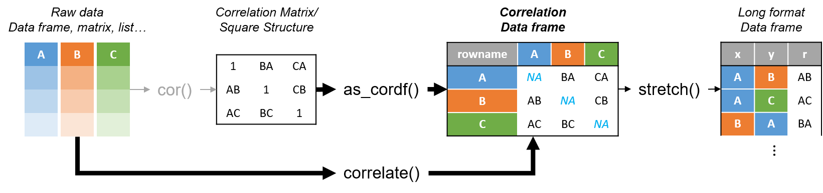
Diagram showing how the new functionality of corrr works.

Apart from corrr::correlate to retrieve a correlation data frame and corrr::stretch to turn that data frame into a long format, the new package includes corrr::focus, which can be used to simulteneously select the columns and filter the rows of the variables focused on. For example:

# install.packages("tidyverse")
library(tidyverse)

# install.packages("corrr")
library(corrr)

# install.packages("here")
library(here)

dir.create(here::here("images")) # create an images directory

mtcars %>%
  corrr::correlate() %>%
  # use mirror = TRUE to not only select columns but also filter rows
  corrr::focus(mpg:hp, mirror = TRUE) %>% 
  corrr::network_plot(colors = c("red", "green")) %>%
  ggplot2::ggsave(
    filename = here::here("images", "mtcars_networkplot.png"),
    width = 5,
    height = 5
    )
mtcars_networkplot.png
With corrr::networkplot you get an immediate sense of the relationships in your data.

Let’s try some different visualizations:

mtcars %>%
  corrr::correlate() %>%
  corrr::focus(mpg) %>% 
  dplyr::mutate(rowname = reorder(rowname, mpg)) %>%
  ggplot2::ggplot(ggplot2::aes(rowname, mpg)) +
  # color each bar based on the direction of the correlation
  ggplot2::geom_col(ggplot2::aes(fill = mpg >= 0)) + 
  ggplot2::coord_flip() + 
  ggplot2::ggsave(
    filename = here::here("images", "mtcars_mpg-barplot.png"),
    width = 5,
    height = 5
  )
mtcars_mpg-barplot.png
The tidy correlation data frames can be easily piped into a ggplot2 function call

corrr also provides some very helpful functionality display correlations. Take, for instance, corrr::fashion and corrr::shave:

mtcars %>%
  corrr::correlate() %>%
  corrr::focus(mpg:hp, mirror = TRUE) %>%
  # converts the upper triangle (default) to missing values
  corrr::shave() %>%
  # converts a correlation df into clean matrix
  corrr::fashion() %>%
  readr::write_excel_csv(here::here("correlation-matrix.csv"))
4.PNG
Exporting a nice looking correlation matrix has never been this easy.

Finally, there is the great function of corrr::rplot to generate an amazing correlation overview visual in a wingle line. However, here it is combined with corr::rearrange to make sure that closely related variables are actually closely located on the axis, and again the upper half is shaved away:

mtcars %>%
  corrr::correlate() %>%
  # Re-arrange a correlation data frame 
  # to group highly correlated variables closer together.
  corrr::rearrange(method = "MDS", absolute = FALSE) %>%
  corrr::shave() %>% 
  corrr::rplot(shape = 19, colors = c("red", "green")) %>%
  ggplot2::ggsave(
    filename = here::here("images", "mtcars_correlationplot.png"),
    width = 5,
    height = 5
  )
mtcars_correlationplot.png
Generate fantastic single-line correlation overviews with <code>corrr::rplot</code>

For some more functionalities, please visit Simon’s blog and/or the associated GitHub page. If you copy the code above and play around with it, be sure to work in an Rproject else the here::here() functions might misbehave.

Google for Colors

Google for Colors

Picular.co calls itself Google, but for colors on its website. And not without good reason. On the site, you type in a color association (e.g., forest green), and it provides you an palette overview of associated colors and their hexadecimal (Hex) codes.

1.PNG

I don’t precisely know how it works, but it seems to work quite well!

2.PNG

12

Analytics in HR case study: Behind the scenes

Analytics in HR case study: Behind the scenes

Past week, Analytics in HR published a guest blog about one of my People Analytics projects which you can read here. In the blog, I explain why and how I examined the turnover of management trainees in light of the international work assignments they go on.

For the analyses, I used a statistical model called a survival analysis – also referred to as event history analysis, reliability analysis, duration analysis, time-to-event analysis, or proporational hazard models. It estimates the likelihood of an event occuring at time t, potentially as a function of certain data.

The sec version of surival analysis is a relatively easy model, requiring very little data. You can come a long way if you only have the time of observation (in this case tenure), and whether or not an event (turnover in this case) occured. For my own project, I had two organizations, so I added a source column as well (see below).

# LOAD REQUIRED PACKAGES ####
library(tidyverse)
library(ggfortify)
library(survival)

# SET PARAMETERS ####
set.seed(2)
sources = c("Organization Red","Organization Blue")
prob_leave = c(0.5, 0.5)
prob_stay = c(0.8, 0.2)
n = 60

# SIMULATE DATASETS ####
bind_rows(
  tibble(
    Tenure = sample(1:80, n*2, T),
    Source = sample(sources, n*2, T, prob_leave),
    Turnover = T
  ),
  tibble(
    Tenure = sample(1:85, n*25, T),
    Source = sample(sources, n*25, T, prob_stay),
    Turnover = F
  )
) ->
  data_surv

# RUN SURVIVAL MODEL ####
sfit <- survfit(Surv(data_surv$Tenure, event = data_surv$Turnover) ~ data_surv$Source)

# PLOT  SURVIVAL ####
autoplot(sfit, censor = F, surv.geom = 'line', surv.size = 1.5, conf.int.alpha = 0.2) +
  scale_x_continuous(breaks = seq(0, max(data_surv$Tenure), 12)) +
  coord_cartesian(xlim = c(0,72), ylim = c(0.4, 1)) +
  scale_color_manual(values = c("blue", "red")) +
  scale_fill_manual(values = c("blue", "red")) +
  theme_light() +
  theme(legend.background = element_rect(fill = "transparent"),
        legend.justification = c(0, 0),
        legend.position = c(0, 0),
        legend.text = element_text(size = 12)
        ) +
  labs(x = "Length of service", 
       y = "Percentage employed",
       title = "Survival model applied to the retention of new trainees",
       fill = "",
       color = "")
survival_plot
The resulting plot saved with ggsave, using width = 8 and height = 6.

Using the code above, you should be able to conduct a survival analysis and visualize the results for your own projects. Please do share your results!

Visualizing model uncertainty

Visualizing model uncertainty

ungeviz is a new R package by Claus Wilke, whom you may know from his amazing work and books on Data Visualization. The package name comes from the German word “Ungewissheit”, which means uncertainty. You can install the developmental version via:

devtools::install_github("clauswilke/ungeviz")

The package includes some bootstrapping functionality that, when combined with ggplot2 and gganimate, can produce some seriousy powerful visualizations. For instance, take the below piece of code:

data(BlueJays, package = "Stat2Data")

# set up bootstrapping object that generates 20 bootstraps
# and groups by variable `KnownSex`
bs <- ungeviz::bootstrapper(20, KnownSex)

ggplot(BlueJays, aes(BillLength, Head, color = KnownSex)) +
  geom_smooth(method = "lm", color = NA) +
  geom_point(alpha = 0.3) +
  # `.row` is a generated column providing a unique row number
  # to all rows in the bootstrapped data frame 
  geom_point(data = bs, aes(group = .row)) +
  geom_smooth(data = bs, method = "lm", fullrange = TRUE, se = FALSE) +
  facet_wrap(~KnownSex, scales = "free_x") +
  scale_color_manual(values = c(F = "#D55E00", M = "#0072B2"), guide = "none") +
  theme_bw() +
  transition_states(.draw, 1, 1) + 
  enter_fade() + 
  exit_fade()

Here’s what’s happening:

  • Claus loads in the BlueJays dataset, which contains some data on birds.
  • He then runs the ungezviz::bootstrapper function to generate a new dataset of bootstrapped samples.
  • Next, Claus uses ggplot2::geom_smooth(method = "lm") to run a linear model on the orginal BlueJays dataset, but does not color in the regression line (color = NA), thus showing only the confidence interval of the model.
  • Moreover, Claus uses ggplot2::geom_point(alpha = 0.3) to visualize the orginal data points, but slightly faded.
  • Subsequent, for each of the bootstrapped samples (group = .row), Claus again draws the data points (unfaded), and runs linear models while drawing only the regression line (se = FALSE).
  • Using ggplot2::facet_wrap, Claus seperates the data for BlueJays$KnownSex.
  • Using gganimate::transition_states(.draw, 1, 1), Claus prints each linear regression line to a row of the bootstrapped dataset only one second, before printing the next.

The result an astonishing GIF of the regression lines that could be fit to bootstrapped subsamples of the BlueJays data, along with their confidence interval:

One example of the practical use of ungeviz, original on its GitHub page

Another valuable use of the new package is the visualization of uncertainty from fitted models, for example as confidence strips. The below code shows the powerful combination of broom::tidy with ungeviz::stat_conf_strip to visualize effect size estimates of a linear model along with their confidence intervals.

library(broom)
#> 
#> Attaching package: 'broom'
#> The following object is masked from 'package:ungeviz':
#> 
#>     bootstrap

df_model <- lm(mpg ~ disp + hp + qsec, data = mtcars) %>%
  tidy() %>%
  filter(term != "(Intercept)")

ggplot(df_model, aes(estimate = estimate, moe = std.error, y = term)) +
  stat_conf_strip(fill = "lightblue", height = 0.8) +
  geom_point(aes(x = estimate), size = 3) +
  geom_errorbarh(aes(xmin = estimate - std.error, xmax = estimate + std.error), height = 0.5) +
  scale_alpha_identity() +
  xlim(-2, 1)
Visualizing effect size estimates with ungeviz, via its GitHub page
Very curious to see where this package develops into. What use cases can you think of?


Add a self-explantory legend to your ggplot2 boxplots

Add a self-explantory legend to your ggplot2 boxplots

Laura DeCicco found that non-R users keep asking her what her box plots exactly mean or demonstrate. In a recent blog post, she therefore breaks down the calculations into easy-to-follow chunks of code. Even better, she included the source code to make boxplots that come with a very elaborate default legend:

Chloride by month, styled.

As you can see, the above contains much more and easier to understand information than the original ggplot2 boxplot below.

ggplot2 defaults for boxplots.

Laura wrote the custom function ggplot_box_legend() (see source code below and in Laura’s blog), which uses the cowplot package to paste the explanation to the box plot. All you need to do is call the legend function just before you run your ggplot2 boxplot call.

ggplot_box_legend <- function(family = "serif"){
  
  # Create data to use in the boxplot legend:
  set.seed(100)

  sample_df <- data.frame(parameter = "test",
                        values = sample(500))

  # Extend the top whisker a bit:
  sample_df$values[1:100] <- 701:800
  # Make sure there's only 1 lower outlier:
  sample_df$values[1] <- -350
  
  # Function to calculate important values:
  ggplot2_boxplot <- function(x){
  
    quartiles <- as.numeric(quantile(x, 
                                     probs = c(0.25, 0.5, 0.75)))
    
    names(quartiles) <- c("25th percentile", 
                          "50th percentile\n(median)",
                          "75th percentile")
    
    IQR <- diff(quartiles[c(1,3)])
  
    upper_whisker <- max(x[x < (quartiles[3] + 1.5 * IQR)])
    lower_whisker <- min(x[x > (quartiles[1] - 1.5 * IQR)])
      
    upper_dots <- x[x > (quartiles[3] + 1.5*IQR)]
    lower_dots <- x[x < (quartiles[1] - 1.5*IQR)]
  
    return(list("quartiles" = quartiles,
                "25th percentile" = as.numeric(quartiles[1]),
                "50th percentile\n(median)" = as.numeric(quartiles[2]),
                "75th percentile" = as.numeric(quartiles[3]),
                "IQR" = IQR,
                "upper_whisker" = upper_whisker,
                "lower_whisker" = lower_whisker,
                "upper_dots" = upper_dots,
                "lower_dots" = lower_dots))
  }
  
  # Get those values:
  ggplot_output <- ggplot2_boxplot(sample_df$values)
  
  # Lots of text in the legend, make it smaller and consistent font:
  update_geom_defaults("text", 
                     list(size = 3, 
                          hjust = 0,
                          family = family))
  # Labels don't inherit text:
  update_geom_defaults("label", 
                     list(size = 3, 
                          hjust = 0,
                          family = family))
  
  # Create the legend:
  # The main elements of the plot (the boxplot, error bars, and count)
  # are the easy part.
  # The text describing each of those takes a lot of fiddling to
  # get the location and style just right:
  explain_plot <- ggplot() +     stat_boxplot(data = sample_df,                  aes(x = parameter, y=values),                  geom ='errorbar', width = 0.3) +     geom_boxplot(data = sample_df,                  aes(x = parameter, y=values),                   width = 0.3, fill = "lightgrey") +     geom_text(aes(x = 1, y = 950, label = "500"), hjust = 0.5) +     geom_text(aes(x = 1.17, y = 950,                   label = "Number of values"),               fontface = "bold", vjust = 0.4) +     theme_minimal(base_size = 5, base_family = family) +     geom_segment(aes(x = 2.3, xend = 2.3,                       y = ggplot_output[["25th percentile"]],                       yend = ggplot_output[["75th percentile"]])) +     geom_segment(aes(x = 1.2, xend = 2.3,                       y = ggplot_output[["25th percentile"]],                       yend = ggplot_output[["25th percentile"]])) +     geom_segment(aes(x = 1.2, xend = 2.3,                       y = ggplot_output[["75th percentile"]],                       yend = ggplot_output[["75th percentile"]])) +     geom_text(aes(x = 2.4, y = ggplot_output[["50th percentile\n(median)"]]),                label = "Interquartile\nrange", fontface = "bold",               vjust = 0.4) +     geom_text(aes(x = c(1.17,1.17),                    y = c(ggplot_output[["upper_whisker"]],                         ggplot_output[["lower_whisker"]]),                    label = c("Largest value within 1.5 times\ninterquartile range above\n75th percentile",                             "Smallest value within 1.5 times\ninterquartile range below\n25th percentile")),                   fontface = "bold", vjust = 0.9) +     geom_text(aes(x = c(1.17),                    y =  ggplot_output[["lower_dots"]],                    label = "Outside value"),                vjust = 0.5, fontface = "bold") +     geom_text(aes(x = c(1.9),                    y =  ggplot_output[["lower_dots"]],                    label = "-Value is >1.5 times and"), 
              vjust = 0.5) +
    geom_text(aes(x = 1.17, 
                  y = ggplot_output[["lower_dots"]], 
                  label = "<3 times the interquartile range\nbeyond either end of the box"), 
              vjust = 1.5) +
    geom_label(aes(x = 1.17, y = ggplot_output[["quartiles"]], 
                  label = names(ggplot_output[["quartiles"]])),
              vjust = c(0.4,0.85,0.4), 
              fill = "white", label.size = 0) +
    ylab("") + xlab("") +
    theme(axis.text = element_blank(),
          axis.ticks = element_blank(),
          panel.grid = element_blank(),
          aspect.ratio = 4/3,
          plot.title = element_text(hjust = 0.5, size = 10)) +
    coord_cartesian(xlim = c(1.4,3.1), ylim = c(-600, 900)) +
    labs(title = "EXPLANATION")

  return(explain_plot) 
  
}

ggplot_box_legend()


What to consider when choosing colors for data visualization, by DataWrapper.de

What to consider when choosing colors for data visualization, by DataWrapper.de

Lisa Charlotte Rost of DataWrapper often writes about data visualization and lately she has focused on the (im)proper use of color in visualization. In this recent blog, she gives a bunch of great tips and best practices, some of which I copied below:

color in data vis advice
Gradient colors can be great to show a pattern but, for categorical data, it is often easier to highlight the most important values with colored bars, positions (like in a dot plot) or even areas. [https://blog.datawrapper.de/colors/]
color in data vis advice
If you need more than seven colors in a chart, consider using another chart type or to group categories together. [https://blog.datawrapper.de/colors/]
color in data vis advice
Consider using the same color for the same variables, but do differentiate between categories, even across graphics. [https://blog.datawrapper.de/colors/]
color in data vis advice
Using grey for less important elements in your chart makes your highlight colors (which should be reserved for your most important data points) stick out even more.  [https://blog.datawrapper.de/colors/]
color in data vis advice
Consider color-blind people. There are many different types of color blindness: Use an online tool or Datawrapper’s automatic colorblind-check. [https://blog.datawrapper.de/colors/]
 You can find additional useful tips in the original DataWrapper blog.