Category: design

Google’s Guidebook for Developing AI Product Development

Google’s Guidebook for Developing AI Product Development

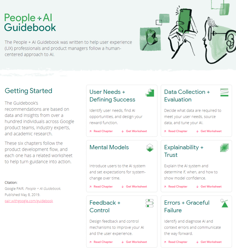
I came across another great set of curated resources by one of the teams at Google:

The People + AI Guidebook.

The People + AI Guidebook was written to help user experience (UX) professionals and product managers follow a human-centered approach to AI.

The Guidebook’s recommendations are based on data and insights from over a hundred individuals across Google product teams, industry experts, and academic research.

These six chapters follow the product development flow, and each one has a related worksheet to help turn guidance into action.

The People & AI guidebook is one of the products of the major PAIR project team (People & AI Research).

Here are the direct links to the six guidebook chapters:

Links to the related worksheets you can find here.

10 Guidelines to Better Table Design

10 Guidelines to Better Table Design

Jon Schwabisch recently proposed ten guidelines for better table design.

Next to the academic paper, Jon shared his recommendations in a Twitter thread.

Let me summarize them for you:

  • Right-align your numbers
  • Left-align your texts
  • Use decimals appropriately (one or two is often enough)
  • Display units (e.g., $, %) sparsely (e.g., only on first row)
  • Highlight outliers
  • Highlight column headers
  • Use subtle highlights and dividers
  • Use white space between rows and columns
  • Use white space (or dividers) to highlight groups
  • Use visualizations for large tables
Afbeelding
Highlights in a table. Via twitter.com/jschwabish/status/1290324966190338049/photo/2
Afbeelding
Visualizations in a table. Via twitter.com/jschwabish/status/1290325409570197509/photo/3
Afbeelding
Example of a well-organized table. Via twitter.com/jschwabish/status/1290325663543627784/photo/2
Learn to style HTML using CSS — Tutorials by Mozilla

Learn to style HTML using CSS — Tutorials by Mozilla

Cascading Stylesheets — or CSS — is the first technology you should start learning after HTML. While HTML is used to define the structure and semantics of your content, CSS is used to style it and lay it out. For example, you can use CSS to alter the font, color, size, and spacing of your content, split it into multiple columns, or add animations and other decorative features.

https://developer.mozilla.org/en-US/docs/Learn/CSS

I was personally encoutered CSS in multiple stages of my Data Science career:

  • When I started using (R) markdown (see here, or here), I could present my data science projects as HTML pages, styled through CSS.
  • When I got more acustomed to building web applications (e.g., Shiny) on top of my data science models, I had to use CSS to build more beautiful dashboard layouts.
  • When I was scraping data from Ebay, Amazon, WordPress, and Goodreads, my prior experiences with CSS & HTML helped greatly to identify and interpret the elements when you look under the hood of a webpage (try pressing CTRL + SHIFT + C).

I know others agree with me when I say that the small investment in learning the basics behind HTML & CSS pay off big time:

I read that Mozilla offers some great tutorials for those interested in learning more about “the web”, so here are some quicklinks to their free tutorials:

Screenshot via developer.mozilla.org/en-US/docs/Learn/CSS/CSS_layout/Introduction
Generative art: Let your computer design you a painting

Generative art: Let your computer design you a painting

I really like generative art, or so-called algorithmic art. Basically, it means you take a pattern or a complex system of rules, and apply it to create something new following those patterns/rules.

When I finished my PhD, I got a beautiful poster of where the k-nearest neighbors algorithms was used to generate a set of connected points.

Marcus Volz’ nearest neighbors graph, via https://marcusvolz.com/#nearest-neighbour-graph

My first piece of generative art.

As we recently moved into our new house, I decided I wanted to have a brother for the knn-poster. So I did some research in algorithms I wanted to use to generate a painting. I found some very cool ones, of which I unforunately can’t recollect the artists anymore:

However, I preferred to make one myself. So we again turned to the work of the author that made the knn-poster: Marcus Volz.

He has written (in R) many other algorithms. And we found that one specifically nicely matched the knn-poster. His metropolis – or generative city:

Marcus’ generative city, via https://marcusvolz.com/#generative-city

However, I wanted to make one myself, so I download Marcus code, and tweaked it a bit. Most importantly, I made it start in the center, made it fill up the whole space, and I made it run more efficient so I could generate a couple dozen large cities quickly, and pick the one I liked most. Here’s the end result:

And in action, in my living room:

You can find my code here on github.

Leonardo: Adaptive Color Palettes using Contrast-Ratio

Leonardo: Adaptive Color Palettes using Contrast-Ratio

Leonardo is an open source tool for creating adaptive color palettes; a custom color generator for creating colors based on target contrast ratio. Leonardo is delivered as a Javascript module (@adobe/leonardo-contrast-colors) with a web interface to aid in creating your color palette configurations, which can easily be shared with both designers and engineers. Simply put, Leonardo is for dynamic accessibility of your products.

Read all about Leonardo in this Medium blog post by its author.

The tool is very easy to use. Even I could create a quick palette! Though it’s probably horrendous (due to my colorblindness : ))

Best Geometric Fonts for Modern UI and Logo’s

Best Geometric Fonts for Modern UI and Logo’s

Typography plays a crucial role in design and finding the right font can take a few minutes or a few days. According to Vijay Verma, every font has specific design intent, communicates certain attributes. Fortunately, there are many (free) online libraries to help you these days, such as Google Fonts, MyFonts, Lineto, TypeAtelier, or TypeMates.

Geometric fonts

Geometric fonts are sans-serif typefaces building on geometric shapes like near-perfect circles and squares.

Image result for geometric font
Via

Today many technology brands currently deploy geometric fonts that represent minimalism, simplicity, and cleanliness, like — Product Sans by Google, Cereal by Airbnb etc.

Vijay Verma (via)

Design experts argue (here, here) that the geometric fonts below will work very well in modern user interfaces. These fonts are used among others by IKEA, Spotify, NASA, AirBnB, Volkswagen, Apple, Marvel, and Snapchat. Can you guess which is which?

You can click the images to visit the source pages.

Futura

https://uxdesign.cc/getting-futura-right-in-ui-design-bda5bc17f2ee

Gilroy

fonts/radomir-tinkov/gilroy/

Brown

https://lineto.com/typefaces/brown/

Circular

https://lineto.com/typefaces/circular/?tab=specimen

Gordita

https://typeatelier.com/font/gordita/

Cera PRO

https://www.typemates.com/fonts/cera-pro

Sailec

https://www.myfonts.com/fonts/typedynamic/sailec/

Avenir Next

https://www.myfonts.com/fonts/linotype/avenir-next-pro/

GT Walsheim

https://www.grillitype.com/typeface/gt-walsheim

TT Commons

https://typetype.org/fonts/commons/

Free Geometric Fonts

Although very aesthetically pleasing, some of these fonts can be pretty expensive if you’re just hobbying. While there are many more fonts out there that may be perfectly free.

Do have a look at Google Fonts, as they provide nearly a 1000 pretty interesting typefaces, all for free!

Moreover, if you’re specifically looking for a geometric font, have a look at these 18 free geometric typefaces!

https://www.cufonfonts.com/zemin/collection/geometric-fonts