Category: entertainment

Two Tinder Experiments: An Unequal Economy

Two Tinder Experiments: An Unequal Economy

I’ve seen a fair share of Tinder experiments come by, for instance, someone A/B-testing attractiveness with and without facial hair, but these new two posts on Medium are the best I’ve come across so far.

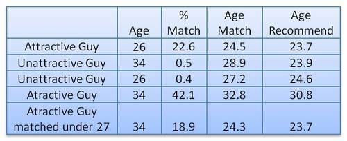
In his first experiment, this self-proclaimed worst online dater went catfishing. He made a Tinder account using stock photos of attractive and less attractive and old and young guys, looking and sampled some like ratio’s.

Basically, his conclusion was that “Tinder actually can work, but pretty much only if you are an attractive guy”

In the second experiment, the author decided to treat Tinder as an economy and study it as an (socio-)economist would:

The wealth of an economy is quantified in terms its currency. […] In Tinder the currency is “likes”. […] Wealth in Tinder is not distributed equally. Attractive guys have more wealth in the Tinder economy (get more “likes”) than unattractive guys do. […] An unequal wealth distribution is to be expected, but there is a more interesting question: What is the degree of this unequal wealth distribution and how does this inequality compare to other economies?

Original Medium Post by Worst Online Dater

The author notes some caveats of this analysis. First and foremost, the data was collected in quite an unethical way, by asking questions to 27 of the matches with the fake accounts the author set up. Moreover, self-report bias is quite likely, as it’s easy to lie on Tinder. Still, the results are quite amusing:

Basically, “the bottom 80% of men are fighting over the bottom 22% of women and the top 78% of women are fighting over the top 20% of men”

Via Medium

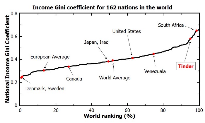
The Lorenz curve shows the proportion of wealth owned by the bottom x% of a population. If wealth was equally distributed the curve would be perfectly diagonal (a 45 degree slope). The steeper the slope, the less inequal an economy. The below shows the curve for a perfectly equal economy, the US economy, and the estimated Tinder economy:

Via Medium

Similarly, the Gini coefficient can be used to represent the wealth equality of an economy. It ranges from 0 to 1, where 0 corresponds with perfect equality (everybody has the same wealth) and 1 corresponds with perfect inequality (one dictator with all the wealth). While most European countries, and even the US, score quite low on this Gini index, the Tinder economy is estimated to be much more towards the lower end.

Via Medium

Finally, based on the collected data, the author was able to reduce Tinder Male Attractiveness to a function of the number of likes received:

Via Medium

According to my last post, the most attractive men will be liked by only approximately 20% of all the females on Tinder. […] Unfortunately, this percentage decreases rapidly as you go down the attractiveness scale. According to this analysis a man of average attractiveness can only expect to be liked by slightly less than 1% of females (0.87%). This equates to 1 “like” for every 115 females.

The good news is that if you are only getting liked by a few girls on Tinder you shouldn’t take it personally. You aren’t necessarily unattractive. You can be of above average attractiveness and still only get liked by a few percent of women on Tinder. The bad news is that if you aren’t in the very upper echelons of Tinder wealth (i.e. attractiveness) you aren’t likely to have much success using Tinder. You would probably be better off just going to a bar or joining some coed recreational sports team.

Original Medium Post by Worst Online Dater

Northstar: The interactive, drag-and-drop data science platform by MIT

Northstar: The interactive, drag-and-drop data science platform by MIT

MIT researchers have spent years developing the new drag-and-drop analytics tools they call Northstar.

Northstar is an interactive data science platform that rethinks how people interact with data. It empowers users without programming experience, background in statistics or machine learning expertise to explore and mine data through an intuitive user interface, and effortlessly build, analyze, and evaluate machine learning (ML) pipelines.

northstar.mit.edu/

Northstar starts as a blank, white interface. Users upload datasets into the system, which appear in a “datasets” box on the left. Any data labels will automatically populate a separate “attributes” box below. There’s also an “operators” box that contains various algorithms, as well as the new AutoML tool. All data are stored and analyzed in the cloud.

news.mit.edu/2019/drag-drop-data-analytics-0627

You can read more about the tool’s functionalities in this MIT news article, which includes several promising GIFs:

Moreover, on the Northstar website you can find this longer video explaining the tool in detail.

https://vimeo.com/342787403

While Northstar looks insanely cool and promising, I do worry about putting such power in the hands of people who may not have much experience with statistics and/or machine learning. We all know how easily errors and bias may slip into data-driven processes, so I am curious to see how these next-gen kind of tools will be deployed and used.

Survival of the Best Fit: A webgame on AI in recruitment

Survival of the Best Fit: A webgame on AI in recruitment

Survival of the Best Fit is a webgame that simulates what happens when companies automate their recruitment and selection processes.

You – playing as the CEO of a starting tech company – are asked to select your favorite candidates from a line-up, based on their resumés.

As your simulated company grows, the time pressure increases, and you are forced to automate the selection process.

Fortunately, some smart techies working for your company propose training a computer to hire just like you just did.

They don’t need anything but the data you just generated and some good old supervised machine learning!

To avoid spoilers, try the game yourself and see what happens!

The game only takes a few minutes, and is best played on mobile.

www.survivalofthebestfit.com/ via Medium

Survival of the Best Fit was built by Gabor CsapoJihyun KimMiha Klasinc, and Alia ElKattan. They are software engineers, designers and technologists, advocating for better software that allows members of the public to question its impact on society.

You don’t need to be an engineer to question how technology is affecting our lives. The goal is not for everyone to be a data scientist or machine learning engineer, though the field can certainly use more diversity, but to have enough awareness to join the conversation and ask important questions.

With Survival of the Best Fit, we want to reach an audience that may not be the makers of the very technology that impact them everyday. We want to help them better understand how AI works and how it may affect them, so that they can better demand transparency and accountability in systems that make more and more decisions for us.

survivalofthebestfit.com

I found that the game provides a great intuitive explanation of how (humas) bias can slip into A.I. or machine learning applications in recruitment, selection, or other human resource management practices and processes.

If you want to read more about people analytics and machine learning in HR, I wrote my dissertation on the topic and have many great books I strongly recommend.

Finally, here’s a nice Medium post about the game.

https://www.survivalofthebestfit.com/game/

Note, as Joachin replied below, that the game apparently does not learn from user-input, but is programmed to always result in bias towards blues.
I kind of hoped that there was actually an algorithm “learning” in the backend, and while the developers could argue that the bias arises from the added external training data (you picked either Google, Apple, or Amazon to learn from), it feels like a bit of a disappointment that there is no real interactivity here.

Zeit’s interactive visualization of the 2019 European election results

Zeit’s interactive visualization of the 2019 European election results

Zeit — the German newspaper — analyzed recent election results in over 80,000 regions of Europe. They discovered many patterns – from the radical left to the extremist right. Moreover, they allow you to find patterns yourself, among others in your own region.

They published the summarized election results in this beautiful interactive map of Europe.

The map is beautifully color-coded for the dominant political view (Conservative, Green, Liberal, Socialist, Far left, or Far right) per region. Moreover, you can select these views and look for regions where they received respectively many votes. Like in the below, where I opted for the Liberal view, which finds strongest support in regions of the Netherlands, France, Czechia, Romania, Denmark, Estonia, and Finland.

For instance, the region of Tilburg in the Netherlands — where I live — voted mostly Liberal, as depicted by the yellow Netherlands. In contrast, in the German border regions conservative and socialist parties received most votes, whereas in the Belgian border regions uncategorizable parties received most votes.

Zeit discovered some cool patterns themselves as well, as discussed in the original article. These include:

  • Right-Wing Populists in Poland
  • North-South divides in Italy and Spain
  • Considerable support for regional parties in Catalonia, Belgium, Scotland and Italy
  • Dominant Green and Liberal views in the Netherlands, France, and Germany

Have a look yourself, it’s a great example of open access data-driven journalism!

Creating plots with custom icons for data points

Creating plots with custom icons for data points

Data visualizations that make smart use of icons have a way of conveying information that sticks. Dataviz professionals like Moritz Stefaner know this and use the practice in their daily work.

A recent #tidytuesday entry by Georgios Karamanis demonstrates how easy it is to integrate visual icons in your data figures when you write code in R. You can simply store the URL location of an icon as a data column, and map it to an aesthetic using the ggplot2::geom_image function.

Do have a closer look at Georgios’ github repository for week 21 of tidytuesday. You will probably have to alter the code a bit to get it to work. though!

For those who haven’t moved away from base R plotting functions yet, here’s a good StackOverflow item showing how to use icons in both base R and tidyverse.

Now that I think of it, the above probably uses the same methods that were used to make this amazing Game of Thrones map in R.

How to find two identical Skittles packs?

How to find two identical Skittles packs?

In a hilarious experiment the anonymous mathematician behind the website Possibly Wrong estimated that s/he only needed to open “about 400-500” packs of Skittles to find an identifical pack.

From January 12th up to April 6th, s/he put it to the test and counted the contents of an astonishing 468 packs, containing over 27.000 individual Skittles! Read all about the experiment here.

Overview of the contents of the Skittles packs, the duplicates encircled.
Via https://possiblywrong.wordpress.com/2019/04/06/follow-up-i-found-two-identical-packs-of-skittles-among-468-packs-with-a-total-of-27740-skittles/
Contents of the two duplicate Skittles packs.
Via https://possiblywrong.wordpress.com/2019/04/06/follow-up-i-found-two-identical-packs-of-skittles-among-468-packs-with-a-total-of-27740-skittles/