Some time back the animations below went sort of viral in the statistical programming community. In them, economics professor Nick Huntington-Klein demonstrates step-by-step how statistical tests estimate effect sizes.
I've been getting used to gganimate and thought it would be useful to put together some illustrations of what various causal inference methods *actually do to data* and how they work. Here, for example, is what it means to control for a (binary) variable pic.twitter.com/lmEvJSPQgY
The BBC data team developed an R package (bbplot) which makes the process of creating publication-ready graphics in their in-house style using R’s ggplot2 library a more reproducible process, as well as making it easier for people new to R to create graphics.
Apart from sharing several best practices related to data visualization, they walk you through the steps and R code to create graphs such as the below:
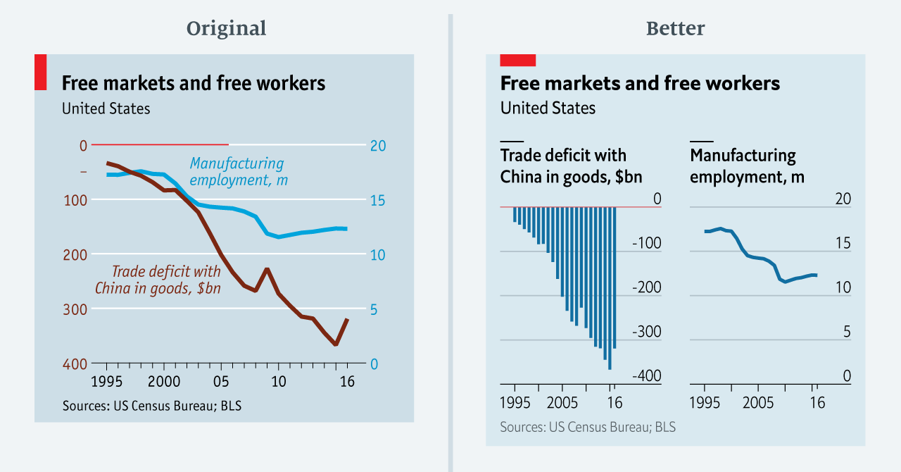
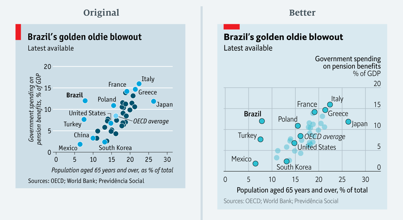
The data team at the Economist also felt a need to share their lessons learned via Medium. They show some of their most misleading, confusing, and failing graphics of the past years, and share the following mistakes and their remedies:
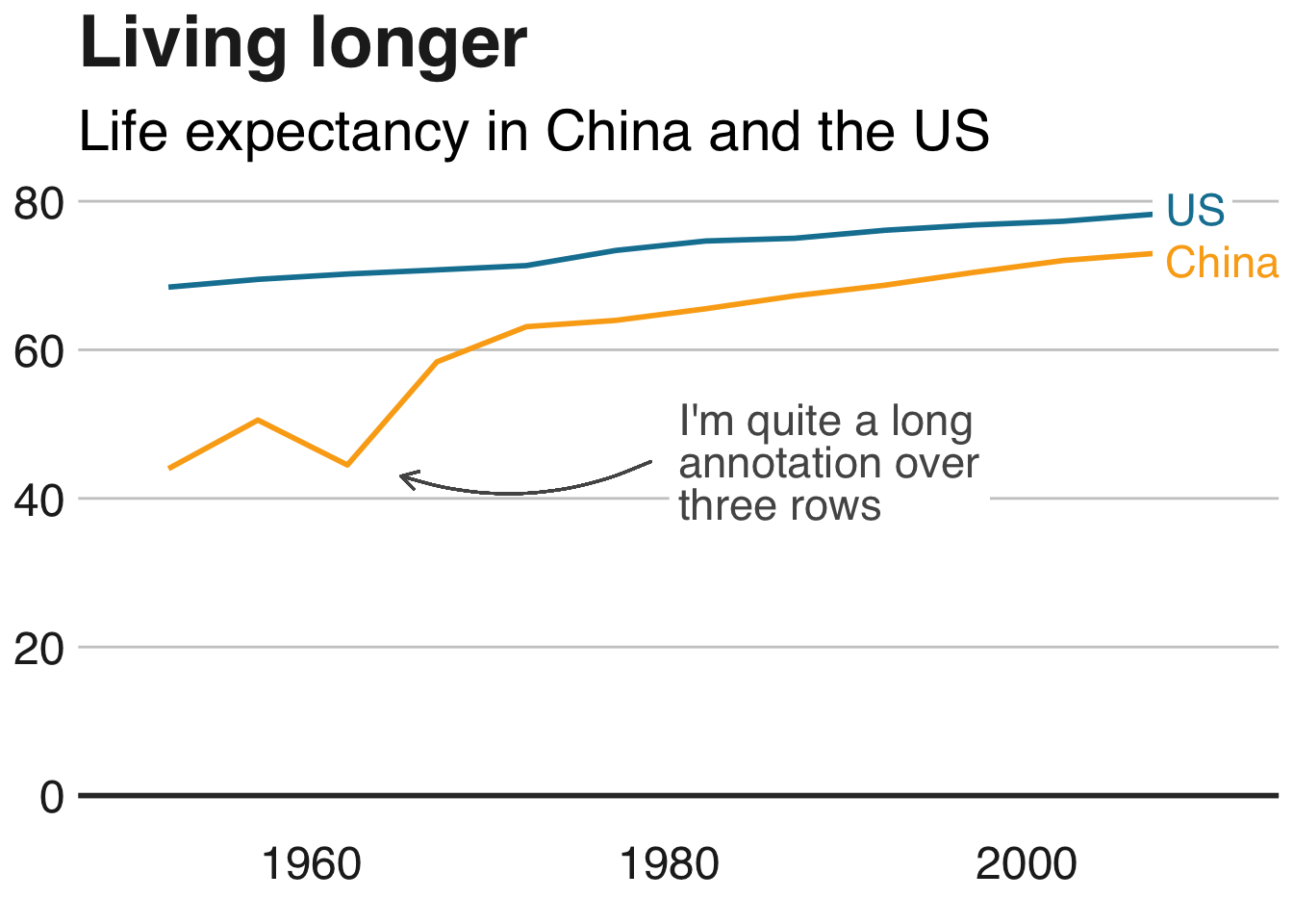
Truncating the scale (image #1 below)
Forcing a relationship by cherry-picking scales
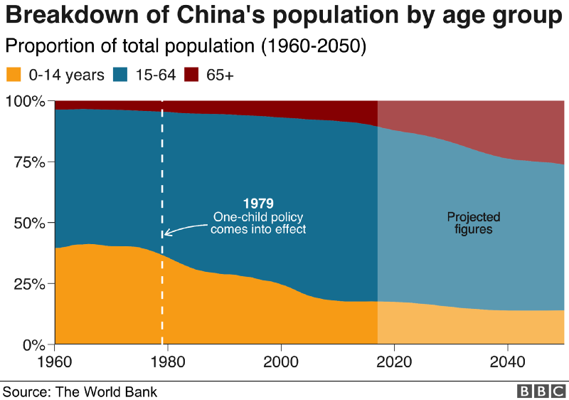
Choosing the wrong visualisation method (image #2 below)
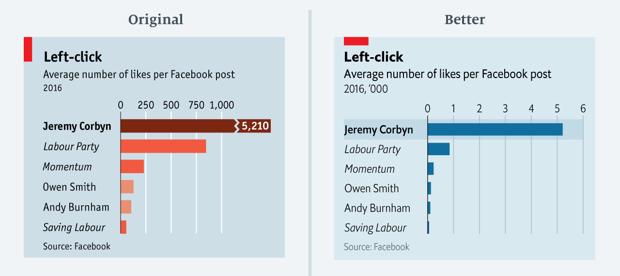
Taking the “mind-stretch” a little too far (image #3 below)
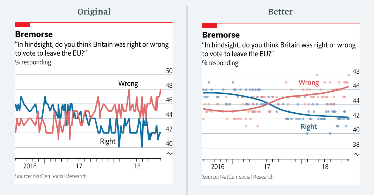
Confusing use of colour (image #4 below)
Including too much detail
Lots of data, not enough space
Moreover, they share the data behind these failing and repaired data visualizations:
All 538’s data visualizations are just stunningly beautiful and often very ingenious, using new chart formats to display complex patterns. Moreover, the range of topics they cover is huge. Anything ranging from their traditional background — politics — to great cover stories on sumo wrestling and pricy wine.
Josh Starmer is assistant professor at the genetics department of the University of North Carolina at Chapel Hill.
But more importantly: Josh is the mastermind behind StatQuest!
StatQuest is a Youtube channel (and website) dedicated to explaining complex statistical concepts — like data distributions, probability, or novel machine learning algorithms — in simple terms.
Once you watch one of Josh’s “Stat-Quests”, you immediately recognize the effort he put into this project. Using great visuals, a just-about-right pace, and relateable examples, Josh makes statistics accessible to everyone. For instance, take this series on logistic regression:
And do you really know what happens under the hood when you run a principal component analysis? After this video you will:
Or are you more interested in learning the fundamental concepts behind machine learning, then Josh has some videos for you, for instance on bias and variance or gradient descent:
With nearly 200 videos and counting, StatQuest is truly an amazing resource for students ‘and teachers on topics related to statistics and data analytics. For some of the concepts, Josh even posted videos running you through the analysis steps and results interpretation in the R language.
StatQuest started out as an attempt to explain statistics to my co-workers – who are all genetics researchers at UNC-Chapel Hill. They did these amazing experiments, but they didn’t always know what to do with the data they generated. That was my job. But I wanted them to understand that what I do isn’t magic – it’s actually quite simple. It only seems hard because it’s all wrapped up in confusing terminology and typically communicated using equations. I found that if I stripped away the terminology and communicated the concepts using pictures, it became easy to understand.
Over time I made more and more StatQuests and now it’s my passion on YouTube.
Just sitting there. Waiting to be opened, read. For months already.
The sender, you ask? Me. Paul van der Laken.
A nuisance that guy, I tell you. He keeps sending me reminders, of stuff to do, books to read. Books he’s sure a more productive me would enjoy.
Now, I could wipe my inbox. Be done with it. But I don’t wan’t to lose this digital to-do list… Perhaps I should put them here instead. So you can help me read them!
Each of the below links represents a formidable book on programming! (I hear) And there are free versions! Have a quick peek. A peek won’t hurt you:
Disclaimer: This page contains one or more links to Amazon. Any purchases made through those links provide us with a small commission that helps to host this blog.
Applied Predictive Modelling – by Max Kuhn & Kjell Johnson
The books listed above have a publicly accessible version linked. Some are legitimate. Other links are somewhat shady. If you feel like you learned something from reading one of the books (which you surely will), please buy a hardcopy version. Or an e-book. At the very least, reach out to the author and share what you appreciated in his/her work. It takes valuable time to write a book, and we should encourage and cherish those who take that time.
Michael Freeman — information researcher at the University of Washington — was asked whether he could manipulate images with only R programming and he thought to give it a try. In his blog, Michael demonstrates how he used ggplot2 and the imager packages, among others, to go from this original photo:
Fortunately, so much of the conference is shared on Twitter and media outlets that I still felt included. Here are some things that I liked and learned from, despite the Austin-Tilburg distance.
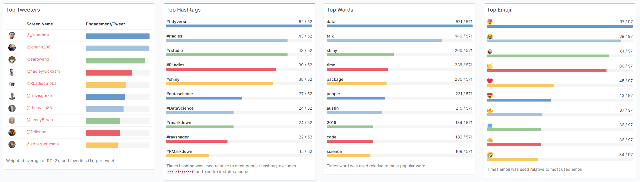
Garrick Aden-Buie made a fabulous Shiny app that allows you to review all #rstudioconf tweets during and since the conference. It even includes some random statistics about the tweets, and a page with all the shared media.
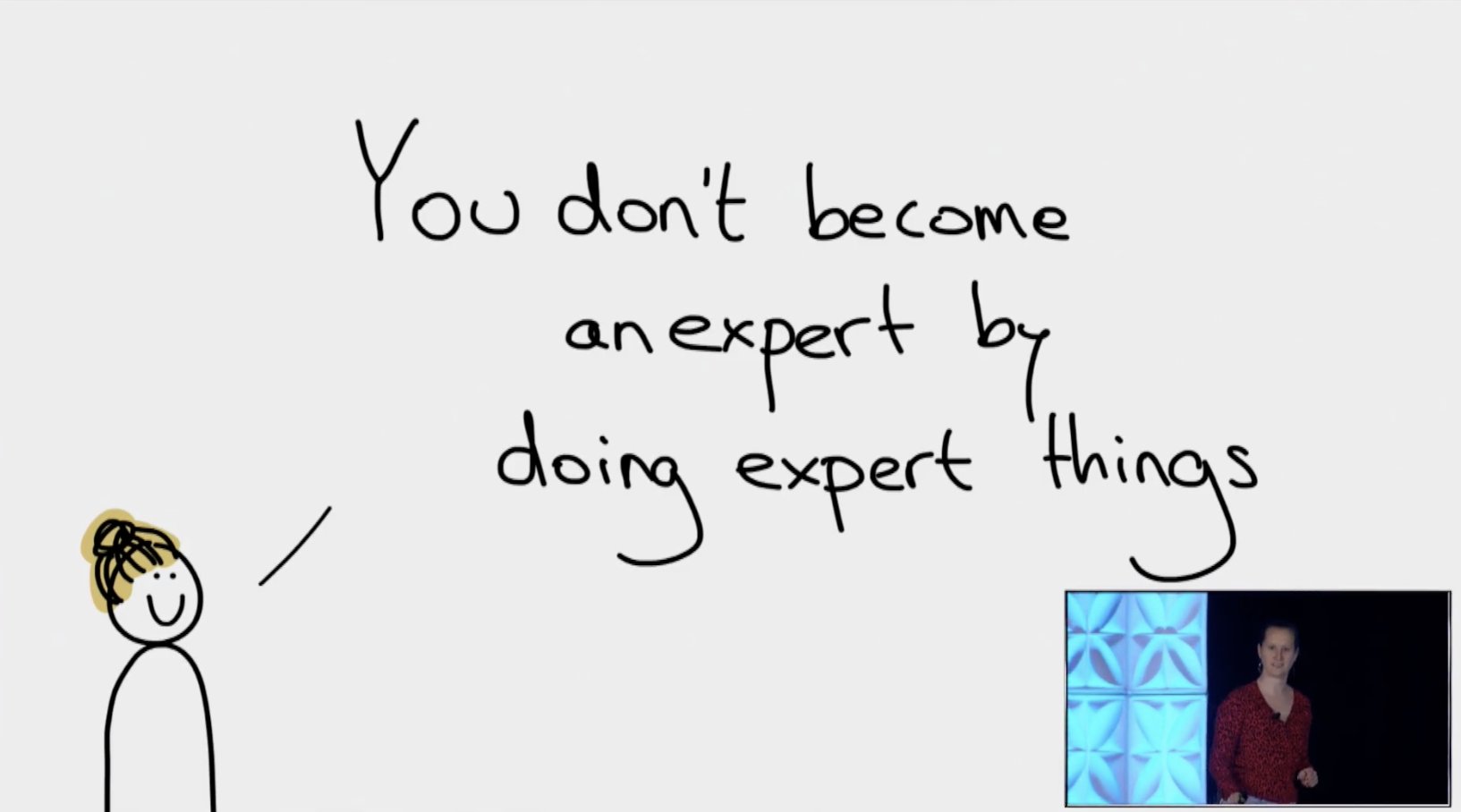
Data scientists can fail by: ❌not saying no enough ❌not providing anything more than a cursory analysis ❌assuming PM knows enough to ask question in the right way and not collaborating with them ❌caring more about using fancy method than solving business problems#rstudioconf
Did you know that RStudio also posts all the webinars they host? There really are some hidden pearls among them. For instance, this presentation by Nathan Stephens on rendering rmarkdown to powerpoint will save me tons of work, and those new to broom will also be astonished by this webinar by Alex Hayes.