I just love psychological experiments around our human biases.
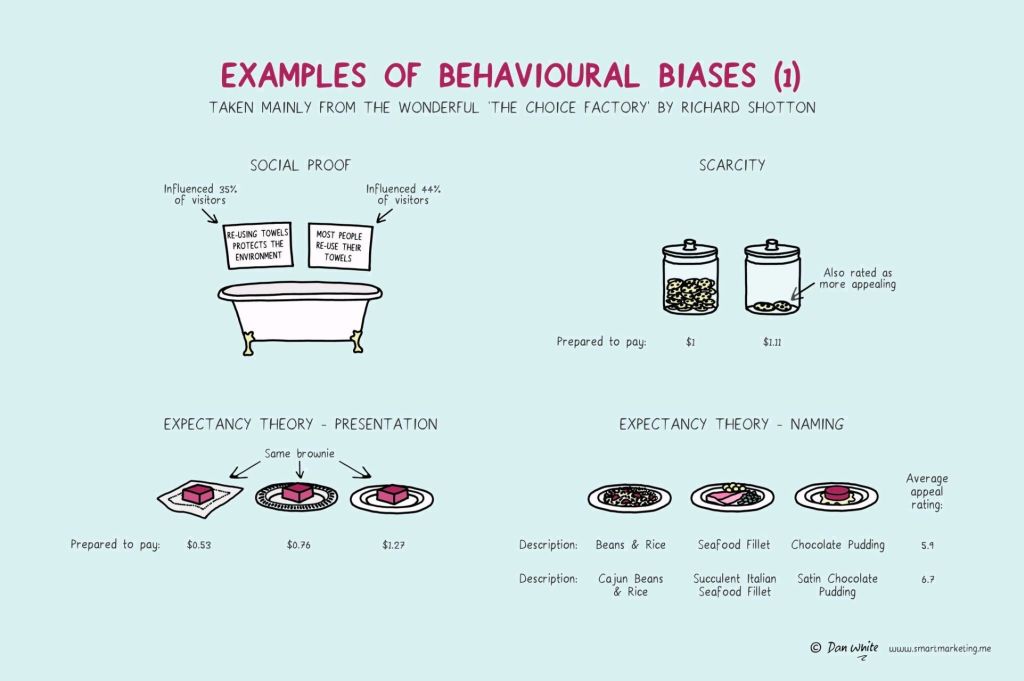
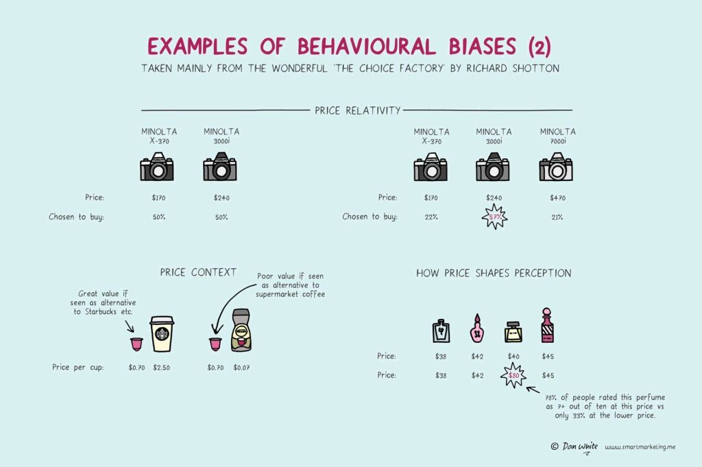
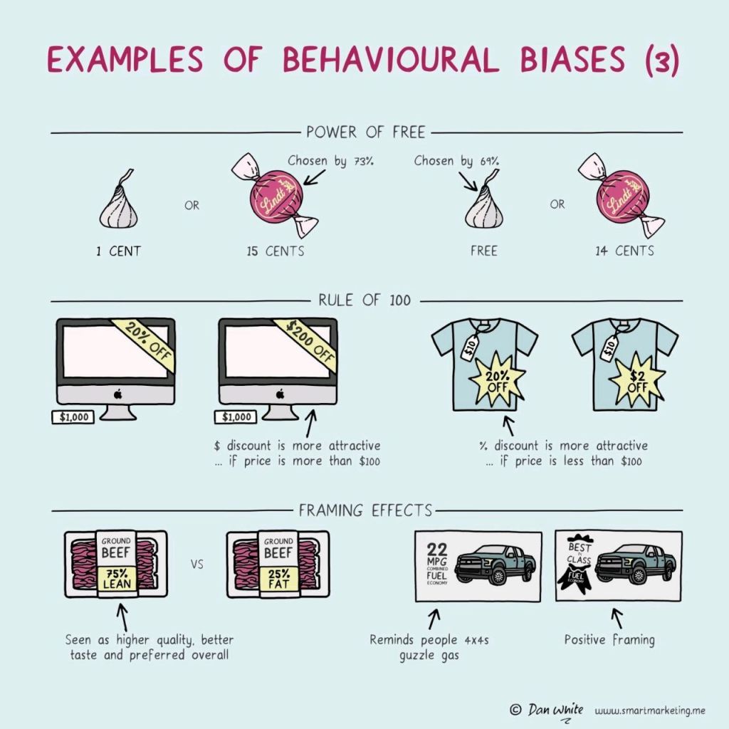
In this case, Dan White visualized some of the psychological biases mentioned in Richard Shotton‘s book “The Choice Factory“.
These biases make for irrational human behavior in the way we make daily decisions.
For example, you will be prepared to pay more for a cookie, when there are less of them in the jar. The generic principle here is that we assign higher valuations to objects under conditions of scarcity.
Once you are aware of such psychological biases, you will start to notice how they are (mis)used nearly everywhere these days. Particularly in sales and marketing. In restaurants, shops, online, and in virtually any case where we act as a consumer, we are subconciously influenced to make certain purchasing decision.
Nudging, is what they call these attempts to manipulate your behavior.
Maybe not so ethical, but still these infographics look amazing and these biases are good to be aware of!
Disclaimer: This page contains one or more links to Amazon. Any purchases made through those links provide us with a small commission that helps to host this blog.
My former colleague at Tilburg University, dr. Brigitte Kroon, summarizes decades of scientific evidence in the field of human resource mangement in her new book – Evidence-based HRM.
She published it open access, so everyone can access it for free.
Brigitte explains what science can (and can not) tell us about the most effective ways to organize and treat people in the workplace. She was able to nicely distill the practical insights from the theoretical frameworks and perspectives.
Human Resource Management is about managing the labor side of organizations. As labor resides in people, managing labor involves managing people. Because people can think and act in response to management, effective management of people involves a good understanding of psychology, sociology, laws, and economics. Any person in a managerial position should therefore have some basic understanding of human resource management. However, since not every organization is the same, and because the challenges that organizations face are different, there is no ‘one best practice suits all’ recipe for doing HRM. Hence, organizations need people who know where to find the best HRM interventions for the issues that they face.
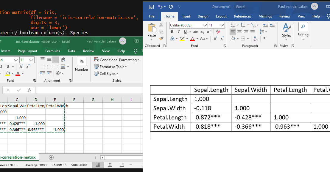
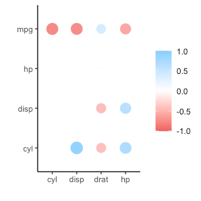
In most (observational) research papers you read, you will probably run into a correlation matrix. Often it looks something like this:
In Social Sciences, like Psychology, researchers like to denote the statistical significance levels of the correlation coefficients, often using asterisks (i.e., *). Then the table will look more like this:
Regardless of my personal preferences and opinions, I had to make many of these tables for the scientific (non-)publications of my Ph.D..
I remember that, when I first started using R, I found it quite difficult to generate these correlation matrices automatically.
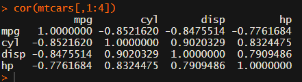
Yes, there is the cor function, but it does not include significance levels.
Then there the (in)famous Hmisc package, with its rcorr function. But this tool provides a whole new range of issues.
What’s this storage.mode, and what are we trying to coerce again?
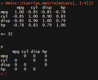
Soon you figure out that Hmisc::rcorr only takes in matrices (thus with only numeric values). Hurray, now you can run a correlation analysis on your dataframe, you think…
Yet, the output is all but publication-ready!
You wanted one correlation matrix, but now you have two… Double the trouble?
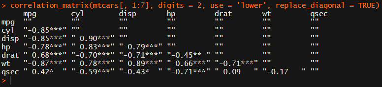
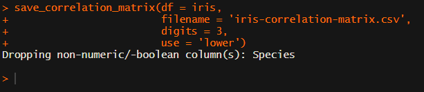
[UPDATED] To spare future scholars the struggle of the early day R programming, Laura Lambert and I created an R package corrtable, which includes the helpful function correlation_matrix.
This correlation_matrix takes in a dataframe, selects only the numeric (and boolean/logical) columns, calculates the correlation coefficients and p-values, and outputs a fully formatted publication-ready correlation matrix!
For instance, you can use only 2 decimals. You can focus on the lower triangle (as the lower and upper triangle values are identical). And you can drop the diagonal values:
Or maybe you are interested in a different type of correlation coefficients, and not so much in significance levels:
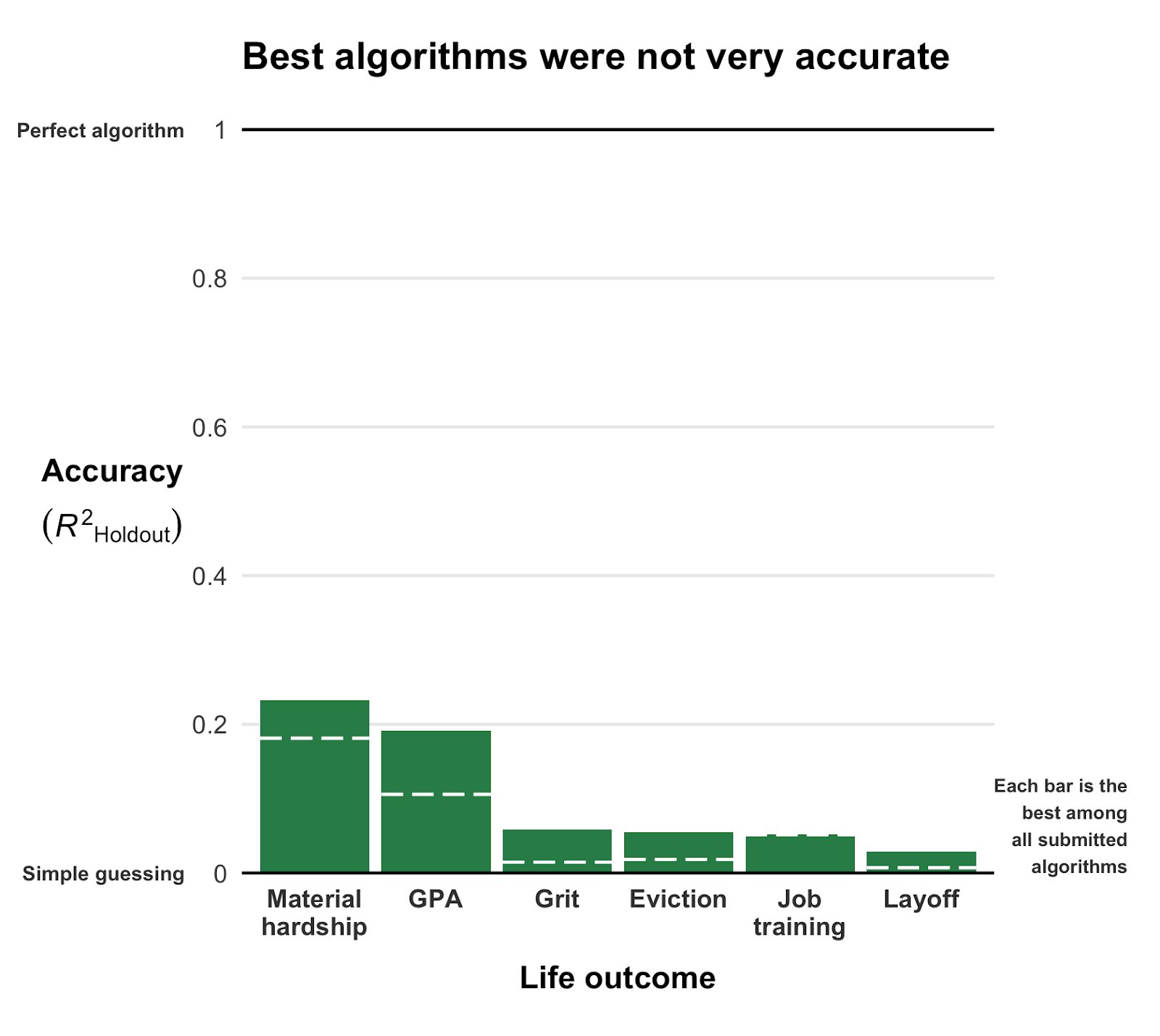
This blog highlights a recent PNAS paper in which 457 data scientists and academic scholars were challenged use machine learning to predict life outcomes using a rich dataset.
Yet, I can not summarize the result better than this tweet by the author of the paper:
If hundreds of scientists created predictive algorithms with high-quality data, how well would the best predict life outcomes? Not very well. Fragile Families Challenge: paper in PNAS w 112 authors https://t.co/WxDJbw0joz & Special Collection of Socius https://t.co/WM9f4oYaABpic.twitter.com/ZPFChD79VR
Over 750 scientific papers have used the Fragile Families dataset.
The dataset is famous for its richness of cohort (survey) data on the included families’ lives and their childrens’ upbringings. It includes a whopping 12.942 variables!!
Some of these variables reflect interesting life outcomes of the included families.
For instance, the childrens’ grade point averages (GPA) and grit, but also whether the family was ever evicted or experienced hardship, or whether their primary caregiver had received job training or was laid off at work.
You can read more about the exact data contents in the paper’s appendix.
Now Matthew and his co-authors shared this enormous dataset with over 160 teams consisting of 457 academics researchers and data scientists alike. Each of them well versed in statistics and predictive modelling.
These data scientists were challenged with this task: by all means possible, make the most predictive model for the six life outcomes (i.e., GPA, conviction, etc).
The scientists could use all the Fragile Families data, and any algorithm they liked, and their final model and its predictions would be compared against the actual life outcomes in a holdout sample.
According to the paper, many of these teams used machine-learning methods that are not typically used in social science research and that explicitly seek to maximize predictive accuracy.
Now, here’s the summary again:
If hundreds of [data] scientists created predictive algorithms with high-quality data, how well would the best predict life outcomes?
Not very well.
@msalganik
Even the best among the 160 teams’ predictions showed disappointing resemblance of the actual life outcomes. None of the trained models/algorithms achieved an R-squared of over 0.25.
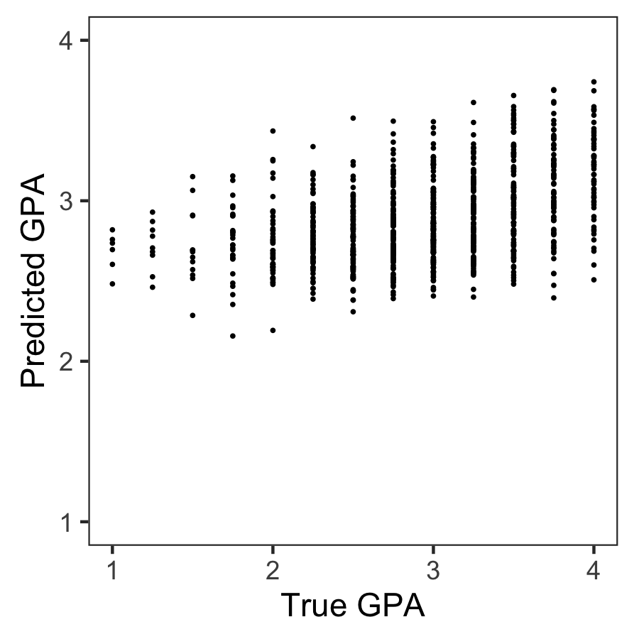
Wondering what these best R-squared of around 0.20 look like? Here’s the disappointg reality of plot C enlarged: the actual TRUE GPA’s on the x-axis, plotted against the best team’s predicted GPA’s on the y-axis.
Sure, there’s some relationship, with higher actual scores getting higher (average) predictions. But it ain’t much.
Moreover, there’s very little variation in the predictions. They all clump together between the range of about 2.1 and 3.8… that’s not really setting apart the geniuses from the less bright!
Matthew sums up the implications quite nicely in one of his tweets:
For policymakers deploying predictive algorithms in high-stakes decisions, our result is a reminder of a basic fact: one should not assume that algorithms predict well. That must be demonstrated with transparent, empirical evidence.
According to Matthew this “collective failure of 160 teams” is hard to ignore. And it failure highlights the understanding vs. predicting paradox: these data have been used to generate knowledge on how the world works in over 750 papers, yet few checked to see whether these same data and the scientific models would be useful to predict the life outcomes we’re trying to understand.
I was super excited to read this paper and I love the approach. It is actually quite closely linked to a series of papers I have been working on with Brian Spisak and Brian Doornenbal on trying to predict which people will emerge as organizational leaders. (hint: we could not really, at least not based on their personality)
Apparently, others were as excited as I am about this paper, as Filiz Garip already published a commentary paper on this research piece. Unfortunately, it’s behind a paywall so I haven’t read it yet.
Moreover, if you want to learn more about the approaches the 160 data science teams took in modelling these life outcomes, here are twelve papers in which some teams share their attempts.
Very curious to hear what you think of the paper and its implications. You can access it here, and I’d love to read your comments below.
Google Brain researchers published this amazing paper, with accompanying GIF where they show the true power of AutoML.
AutoML stands for automated machine learning, and basically refers to an algorithm autonomously building the best machine learning model for a given problem.
This task of selecting the best ML model is difficult as it is. There are many different ML algorithms to choose from, and each of these has many different settings ([hyper]parameters) you can change to optimalize the model’s predictions.
For instance, let’s look at one specific ML algorithm: the neural network. Not only can we try out millions of different neural network architectures (ways in which the nodes and lyers of a network are connected), but each of these we can test with different loss functions, learning rates, dropout rates, et cetera. And this is only one algorithm!
In their new paper, the Google Brain scholars display how they managed to automatically discover complete machine learning algorithms just using basic mathematical operations as building blocks. Using evolutionary principles, they have developed an AutoML framework that tailors its own algorithms and architectures to best fit the data and problem at hand.
This is AI research at its finest, and the results are truly remarkable!