Category: research

Network Visualization with igraph and ggraph

Network Visualization with igraph and ggraph

Eiko Fried, researcher at the University of Amsterdam, recently blogged about personal collaborator networks. I came across his post on twitter, discussing how to conduct such analysis in R, and got inspired.

Unfortunately, my own publication record is quite boring to analyse, containing only a handful of papers. However, my promotors – Prof. dr. Jaap Paauwe and Prof. dr. Marc van Veldhoven – have more extensive publication lists. Although I did not manage to retrieve those using the scholarpackage, I was able to scrape Jaap Paauwe’s publication list from his Google Scholar page. Jaap has 141 publications listed with one or more citation on Google Scholar. More than enough for an analysis!

While Eiko uses his colleague Sacha Epskamp’s R package qgraph, I found an alternative in the packages igraph and ggraph.

### PAUL VAN DER LAKEN
### 2017-10-31
### COAUTHORSHIP NETWORK VISUALIZATION

# LOAD IN PACKAGES
library(readxl)
library(dplyr)
library(ggraph)
library(igraph)

# STANDARDIZE VISUALIZATIONS
w = 14
h = 7
dpi = 900

# LOAD IN DATA
pub_history <- read_excel("paauwe_wos.xlsx")

# RETRIEVE AUTHORS
pub_history %>%
  filter(condition == 1) %>%
  select(name) %>%
  .$name %>%
  gsub("[A-Z]{2,}|[A-Z][ ]", "", .) %>%
  strsplit(",") %>%
  lapply(function(x) gsub("\\..*", "", x)) %>%
  lapply(function(x) gsub("^[ ]+","",x)) %>%
  lapply(function(x) x[x != ""]) %>%
  lapply(function(x) tolower(x))->
  authors

# ADD JAAP PAAUWE WHERE MISSING
authors <- lapply(authors, function(x){
  if(!"paauwe" %in% x){
    return(c(x,"paauwe"))
  } else{
    return(x)
  }
})

# EXTRACT UNIQUE AUTHORS
authors_unique <- authors %>% unlist() %>% unique() %>% sort(F)

# FORMAT AUTHOR NAMES 
# CAPATILIZE
simpleCap <- function(x) {
  s <- strsplit(x, " ")[[1]]
  names(s) <- NULL
  paste(toupper(substring(s, 1,1)), substring(s, 2),
        sep="", collapse=" ")
}
authors_unique_names <- sapply(authors_unique, simpleCap)

The above retrieve the names of every unique author from the excel file I got from Google Scholar. Now we need to examine to what extent the author names co-occur. We do that with the below code, storing all co-occurance data in a matrix, which we then transform to an adjacency matrix igraph can deal with. The output graph data looks like this:

# CREATE COAUTHORSHIP MATRIX
coauthorMatrix <- do.call(
  cbind,
  lapply(authors, function(x){
  1*(authors_unique %in% x)
}))

# TRANSFORM TO ADJECENY MATRIX
adjacencyMatrix <- coauthorMatrix %*% t(coauthorMatrix)

# CREATE NETWORK GRAPH
g <- graph.adjacency(adjacencyMatrix, 
                     mode = "undirected", 
                     diag = FALSE)
V(g)$Degree <- degree(g, mode = 'in') # CALCULATE DEGREE
V(g)$Name <- authors_unique_names # ADD NAMES
g # print network
## IGRAPH f1b50a7 U--- 168 631 -- 
## + attr: Degree (v/n), Name (v/c)
## + edges from f1b50a7:
##  [1]  1-- 21  1--106  2-- 44  2-- 52  2--106  2--110  3-- 73  3--106
##  [9]  4-- 43  4-- 61  4-- 78  4-- 84  4--106  5-- 42  5--106  6-- 42
## [17]  6-- 42  6-- 97  6-- 97  6--106  6--106  6--125  6--125  6--127
## [25]  6--127  6--129  6--129  7--106  7--106  7--150  7--150  8-- 24
## [33]  8-- 38  8-- 79  8-- 98  8-- 99  8--106  9-- 88  9--106  9--133
## [41] 10-- 57 10--106 10--128 11-- 76 11-- 85 11--106 12-- 30 12-- 80
## [49] 12--106 12--142 12--163 13-- 16 13-- 16 13-- 22 13-- 36 13-- 36
## [57] 13--106 13--106 13--106 13--166 14-- 70 14-- 94 14--106 14--114
## + ... omitted several edges

This graph data we can now feed into ggraph:

# SET THEME FOR NETWORK VISUALIZATION
theme_networkMap <- theme(
  plot.background = element_rect(fill = "beige"),
  panel.border = element_blank(),
  panel.grid = element_blank(),
  panel.background = element_blank(),
  legend.background = element_blank(),
  legend.position = "none",
  legend.title = element_text(colour = "black"),
  legend.text = element_text(colour = "black"),
  legend.key = element_blank(),
  axis.text = element_blank(), 
  axis.title = element_blank(),
  axis.ticks = element_blank()
)
# VISUALIZE NETWORK
ggraph(g, layout = "auto") +
  # geom_edge_density() +
  geom_edge_diagonal(alpha = 1, label_colour = "blue") +
  geom_node_label(aes(label = Name, size = sqrt(Degree), fill = sqrt(Degree))) +
  theme_networkMap +
  scale_fill_gradient(high = "blue", low = "lightblue") +
  labs(title = "Coauthorship Network of Jaap Paauwe",
       subtitle = "Publications with more than one Google Scholar citation included",
       caption = "paulvanderlaken.com") +
  ggsave("Paauwe_Coauthorship_Network.png", dpi = dpi, width = w, height = h)

Paauwe_Coauthorship_Network

Feel free to use the code to look at your own coauthorship networks or to share this further.

Talent Works: Data Science to improve Job Application Chances

Talent Works: Data Science to improve Job Application Chances

Searching and applying to jobs can be a costly activity, requiring many hours upon hours of perfecting your motivation letter and CV. Hence, it can be very frustrating to get ghosted (not receiving a reply) for a job. Luckily, Talent Works is able to give us some general tips when it comes to improving the success of your applications. You might remember them from their Interactive Map of the US Job Market.

Using a sample of about 1600 job applications, Talent Works recently conducted all kinds of statistical analyses to look at the hiring process. For instance, they examined the time it takes to get from the application stage to your first day on the job. Split out for various jobs, it seems Mechanical Engineers spend quite a while in the interview stage whereas Software developers are put to work within three weeks.

estimated.mdf.png
The numbers of days spent in each application stage per job (Talent.Works)

In a different analysis, Talent Works examined how to minimize your risk of getting ghosted on a job application. For instance, they found that during the “Golden Hours” (the first 96 hours after a job gets posted), your chances of getting an invitation for an interview are up to 8 times higher than afterwards.

If you submit a job application in the first 96 hours, you’re up to 8x more likely to get an interview. After that, every day you wait reduces your chances by 28% (Talent.Works)

Based on the above they come to the following three timeframes in the application cycle:

  1. “Golden Hours”: Applications submitted between 2-4 days after a job is posted have the highest chance of getting an interview. Not only is there a difference, there’s a big difference: you have up to an 8x higher chance of getting an interview during this period, even if you’re submitting the same application.
  2. Twilight Zone: Chances quickly decrease from OK to really bad: every day you wait after the “Golden Hours” reduces your chances by 28%. The longer you wait, the higher the risk that employers have already checked their inboxes and setup interviews with candidates that met their “good enough”-bar.
  3. Resume Blackhole: According to Talent.Works it’s nearly not worth applying after 10 days. On average, job applications during this phase have a meager ~1.5% of getting an interview. Put another way, if you send out 50 job applications, you might hear back from one (if you’re lucky).

Next, Talent.Works investigated on a more granular level what would then be the best time to apply for a job.This resulted in the following figure

what-best-time-apply-for-job
The best time to apply for a job is between 6am and 10am. During this time, you have an 13% chance of getting an interview — nearly 5x as if you applied to the same job after work. Whatever you do, don’t apply after 4pm (Talent.Works)

Again, they provide a summary of their conclusions:

  • The best time to apply for a job is between 6am and 10am. During this time, you have an 13% chance of getting an interview.
  • After that morning window, your interview odds start falling by 10% every 30 minutes. If you’re late, you’re going to pay dearly.
  • There’s a brief reprieve during lunchtime, where your odds climb back up to 11% at around 12:30pm but then start falling precipitously again.
  • The single-worst time to apply for a job is after work — if you apply at 7:30pm, you have less than a 3% chance of getting an interview.

If you want to see more, please visit Talent.Works. Here, you can let them process your CV and help you improve your hiring chances (see also this blog post).

Video: Human-Computer Interactions in Reinforcement Learning

Video: Human-Computer Interactions in Reinforcement Learning

Reinforcement learning is an area of machine learning inspired by behavioral psychology, concerned with how software agents ought to take actions in an environment so as to maximize some notion of cumulative reward (Wikipedia, 2017). Normally, reinforcement learning occurs autonomously. Here, algorithms will seek to minimize/maximize a score that is estimated via predefined constraints. As such, algorithms can thus learn to perform the most effective actions (those that minimize/maximize the score) by repeatedly experimenting and assessing strategies.

The approach in the video below is radically different. Instead of a pre-defined scoring, human-computer interaction is used to assign each action sequence (each iteration/experiment) a score. This approach is particularly useful for complex behaviors, such as a back-flip, for which it is hard to pre-define the constraints and actions that lead to the “most effective” back-flip. However, for us humans, it is relatively easy to recognize a good back-flip when we see one. The video below shows how the researchers therefore integrated a human-computer interaction in their reinforcement learning algorithm. After observing the algorithm perform a sequence of actions, a human actor indicates to what extent the goal (i.e., a backflip) is achieved or not. This human assessment thus functions as the score which the algorithm will try to minimize/maximize.

This approach can be really valuable for organizations seeking to improve their machine learning application. The paper on the principle (Deep Reinforcement Learning from Human Preferences) can be found here. The scholars conclude that this supervised approach based on human preferences has very good training results whereas the cost are similar the simple bulldozer approach of training a neural net from scratch using GPU servers.

Simpson’s Paradox: Two HR examples with R code.

Simpson’s Paradox: Two HR examples with R code.

Simpson (1951) demonstrated that a statistical relationship observed within a population—i.e., a group of individuals—could be reversed within all subgroups that make up that population. This phenomenon, where X seems to relate to Y in a certain way, but flips direction when the population is split for W, has since been referred to as Simpson’s paradox. Others names, according to Wikipedia, include the Simpson-Yule effect, reversal paradox or amalgamation paradox.

The most famous example has to be the seemingly gender-biased Berkeley admission rates:

“Examination of aggregate data on graduate admissions to the University of California, Berkeley, for fall 1973 shows a clear but misleading pattern of bias against female applicants. Examination of the disaggregated data reveals few decision-making units that show statistically significant departures from expected frequencies of female admissions, and about as many units appear to favor women as to favor men. If the data are properly pooled, taking into account the autonomy of departmental decision making, thus correcting for the tendency of women to apply to graduate departments that are more difficult for applicants of either sex to enter, there is a small but statistically significant bias in favor of women. […] The bias in the aggregated data stems not from any pattern of discrimination on the part of admissions committees, which seem quite fair on the whole, but apparently from prior screening at earlier levels of the educational system.” – part of abstract of Bickel, Hammel, & O’Connel (1975)

In a table, the effect becomes clear. While it seems as if women are rejected more often overall, women are actually less often rejected on a departmental level. Women simply applied to more selective departments more often (E & C below), resulting in the overall lower admission rate for women (35% as opposed to 44% for men).

Afbeeldingsresultaat voor berkeley simpson's paradox
Copied from Bits of Pi

Examples in HR

Simpsons Paradox can easily occur in organizational or human resources settings as well. Let me run you through two illustrated examples, I simulated:

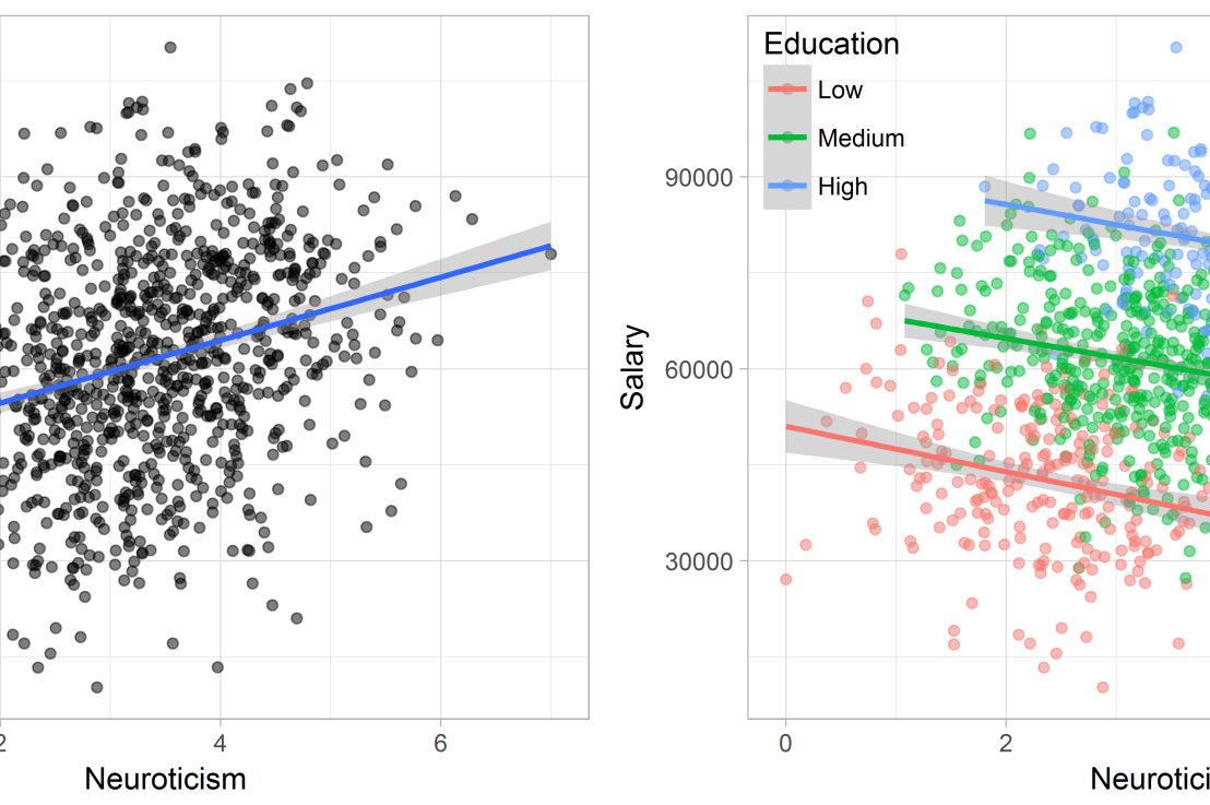
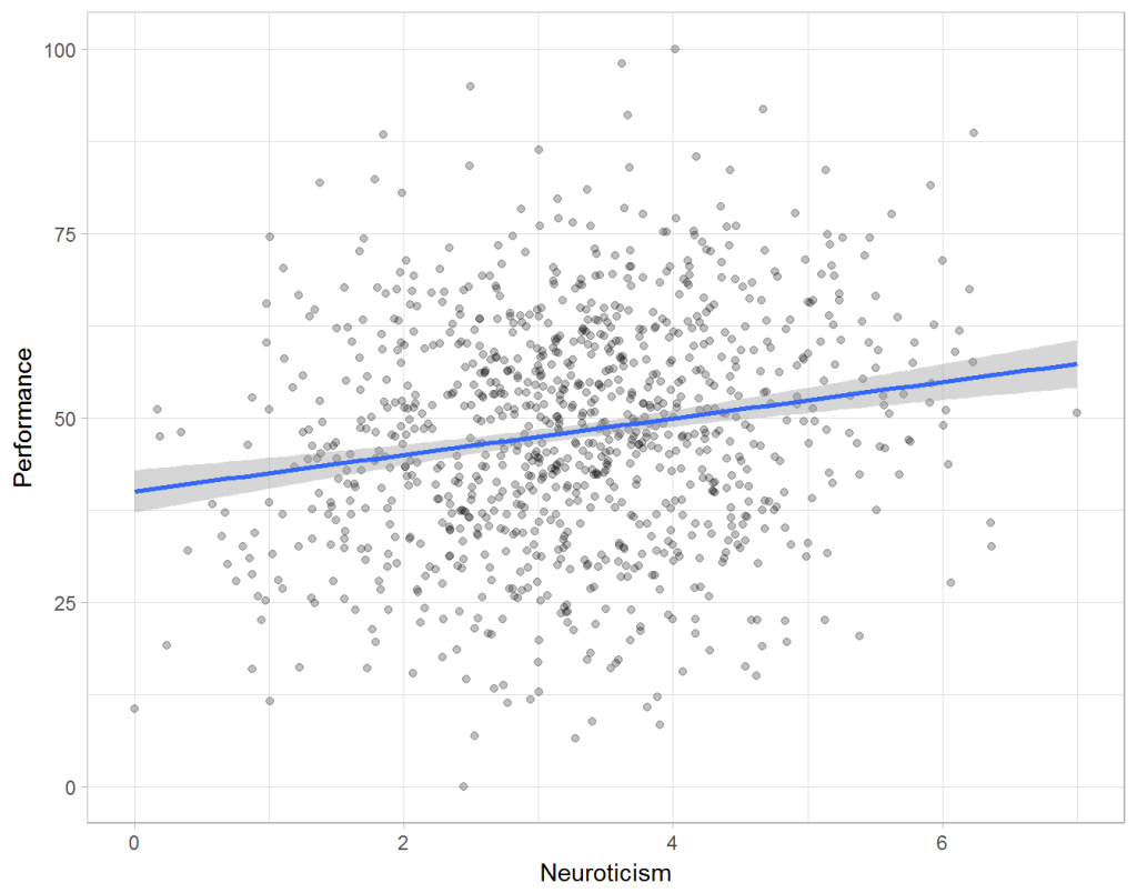
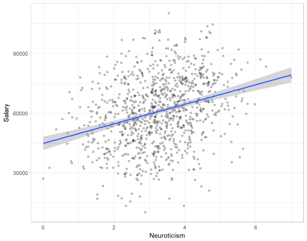
Assume you run a company of 1000 employees and you have asked all of them to fill out a Big Five personality survey. Per individual, you therefore have a score depicting his/her personality characteristic Neuroticism, which can run from 0 (not at all neurotic) to 7 (very neurotic). Now you are interested in the extent to which this Neuroticism of employees relates to their Job Performance (measured 0 – 100) and their Salary (measured in Euro’s per Year). In order to get a sense of the effects, you may decide to visualize both these relations in scatter plots:

downloaddownload (6)

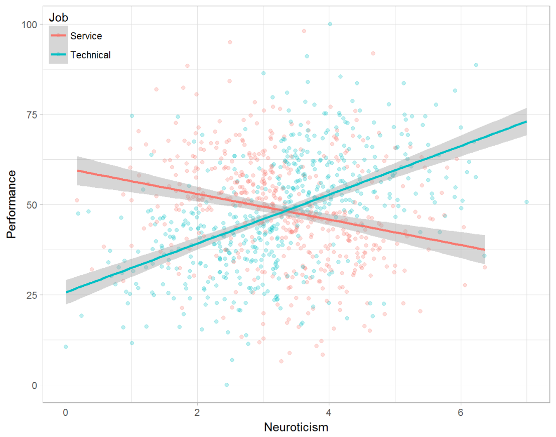
From these visualizations it would look like Neuroticism relates significantly and positively to both employees’ performance and their yearly salary. Should you select more neurotic people to improve your overall company performance? Or are you discriminating emotionally-stable (non-neurotic) employees when it comes to salary?

Taking a closer look at the subgroups in your data, you might however find very different relationships. For instance, the positive relationship between neuroticism and performance may only apply to technical positions, but not to those employees’ in service-oriented jobs.

download (7).png

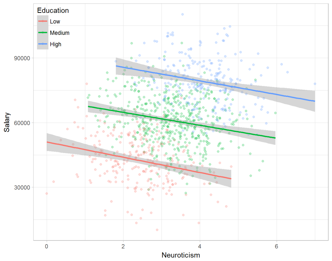
Similarly, splitting the employees by education level, it becomes clear that there is a relationship between neuroticism and education level that may explain the earlier association with salary. More educated employees receive higher salaries and within these groups, neuroticism is actually related to lower yearly income.

download (8).png

If you’d like to see the code used to simulate these data and generate the examples, you can find the R markdown file here on Rpubs.

Solving the paradox

Kievit and colleagues (2013) argue that Simpsons paradox may occur in a wide variety of research designs, methods, and questions, particularly within the social and medical sciences. As such, they propose several means to “control” or minimize the risk of it occurring. The paradox may be prevented from occurring altogether by more rigorous research design: testing mechanisms in longitudinal or intervention studies. However, this is not always feasible. Alternatively, the researchers pose that data visualization may help recognize the patterns and subgroups and thereby diagnose paradoxes. This may be easy if your data looks like this:

An external file that holds a picture, illustration, etc. Object name is fpsyg-04-00513-g0001.jpg

But rather hard, or even impossible, when your data looks more like the below:

An external file that holds a picture, illustration, etc. Object name is fpsyg-04-00513-g0003.jpg

Clustering may nevertheless help to detect Simpson’s paradox when it is not directly observable in the data. To this end, Kievit and Epskamp (2012) have developed a tool to facilitate the detection of hitherto undetected patterns of association in existing datasets. It is written in R, a language specifically tailored for a wide variety of statistical analyses which makes it very suitable for integration into the regular analysis workflow. As an R package, the tool is is freely available and specializes in the detection of cases of Simpson’s paradox for bivariate continuous data with categorical grouping variables (also known as Robinson’s paradox), a very common inference type for psychologists. Finally, its code is open source and can be extended and improved upon depending on the nature of the data being studied.

One example of application is provided in the paper, for a dataset on coffee and neuroticism. A regression analysis would suggest a significant positive association between coffee and neuroticism overall. However, when the detection algorithm of the R package is applied, a different picture appears: the analysis shows that there are three latent clusters present and that the purported positive relationship only holds for one cluster whereas it is negative in the others.

An external file that holds a picture, illustration, etc. Object name is fpsyg-04-00513-g0006.jpg

Update 24-10-2017: minutephysics – one of my favorite YouTube channels – uploaded a video explaining Simpson’s paradox very intuitively in a medical context:

Update 01-11-2017: minutephysics uploaded a follow-up video:

The paradox is that we remain reluctant to fight our bias, even when they are put in plain sight.

Writing your thesis with R Markdown

Writing your thesis with R Markdown

Markdown is a great tool for integrating data analysis and report writing. Rosanna van Hespen wrote a great five-blog guide on how to write your thesis in R Markdown:

  1. Getting started
  2. Text, Citations, & Equations
  3. Figures, Code, & Tables
  4. Putting it all together
  5. Layout
t-SNE, the Ultimate Drum Machine and more

t-SNE, the Ultimate Drum Machine and more

This blog explains t-Distributed Stochastic Neighbor Embedding (t-SNE) by a story of programmers joining forces with musicians to create the ultimate drum machine (if you are here just for the fun, you may start playing right away).

Kyle McDonald, Manny Tan, and Yotam Mann experienced difficulties in pinpointing to what extent sounds are similar (ding, dong) and others are not (ding, beep) and they wanted to examine how we, humans, determine and experience this similarity among sounds. They teamed up with some friends at Google’s Creative Lab and the London Philharmonia to realize what they have named “the Infinite Drum Machine” turning the most random set of sounds into a musical instrument.

Drum Machine.png

The project team wanted to include as many different sounds as they could, but had less appetite to compare, contrast and arrange all sounds into musical accords themselves. Instead, they imagined that a computer could perform such a laborious task. To determine the similarities among their dataset of sounds – which literally includes a thousand different sounds from the ngaaarh of a photocopier to the zing of an anvil – they used a fairly novel unsupervised machine learning technique called t-Distributed Stochastic Neighbor Embedding, or t-SNE in short (t-SNE Wiki; developer: Laurens van der Maaten). t-SNE specializes in dimensionality reduction for visualization purposes as it transforms highly-dimensional data into a two- or three-dimensional space. For a rapid introduction to highly-dimensional data and t-SNE by some smart Googlers, please watch the video below.

As the video explains, t-SNE maps complex data to a two- or three-dimensional space and was therefore really useful to compare and group similar sounds. Sounds are super highly-dimensional as they are essentially a very elaborate sequence of waves, each with a pitch, a duration, a frequency, a bass, an overall length, etcetera (clearly I am no musician). You would need a lot of information to describe a specific sound accurately. The project team compared sound to fingerprints, as there is an immense amount of data in a single padamtss.

t-SNE takes into account all this information of a sound and compares all sounds in the dataset. Next, it creates 2 or 3 new dimensions and assigns each sound values on these new dimensions in such a way that sounds which were previously similar (on the highly-dimensional data) are also similar on the new 2 – 3 dimensions. You could say that t-SNE summarizes (most of) the information that was stored in the previous complex data. This is what dimensionality reduction techniques do: they reduce the number of dimensions you need to describe data (sufficiently). Fortunately, techniques such as t-SNE are unsupervised, meaning that the project team did not have to tag or describe the sounds in their dataset manually but could just let the computer do the heavy lifting.

The result of this project is fantastic and righteously bears the name of Infinite Drum Machine (click to play)!  You can use the two-dimensional map to explore similar sounds and you can even make beats using the sequencing tool. The below video summarizes the creation process.

Amazed by this application, I wanted to know how t-SNE is being used in other projects. I have found a tremendous amount of applications that demonstrate how to implement t-SNE in Python, R, and even JS whereas the method also seems popular in academia.

Luke Metz argues implementation in Python is fairly easy and Analytics Vidhya and a visualized blog by O’Reilly back this claim. Superstar Andrej Karpathy has an interactive t-SNE demo which allows you to compare the similarity among top Twitter users using t-SNE (I think in JavaScript). A Kaggle user and Data Science Heroes have demonstrated how to apply t-SNE in R and have compared the method to other unsupervised methods, for instance to PCA.

indico_features_img_callout_small-1024x973[1].jpg
Clusters of similar cats/dogs in Luke Metz’ application of t-SNE.
Cho et al., 2014 have used t-SNE in their natural language processing projects as it allows for an easy examination of the similarity among words and phrases. Mnih and colleagues (2015) have used t-SNE to examine how neural networks were playing video games.

t-SNE video games
Two-dimensional t-SNE visualization of the hidden layer activity of neural network playing Space Invaders (Mnih et al., 2015)

On a final note, while acknowledging its potential, this blog warns for the inaccuracies in t-SNE due to the aesthetical adjustments it often seems to make. They have some lovely interactive visualizations to back up their claim. They conclude that it’s incredible flexibility allows t-SNE to find structure where other methods cannot. Unfortunately, this makes it tricky to interpret t-SNE results as the algorithm makes all sorts of untransparent adjustments to tidy its visualizations and make the complex information fit on just 2-3 dimensions.