Category: visualization

The Dataviz Project: Find just the right visualization

The Dataviz Project: Find just the right visualization

Do you have a bunch of data but you can’t seem to figure out how to display it? Or looking for that one specific visualization of which you can’t remember the name?

www.datavizproject.com provides a most comprehensive overview of all the different ways to visualize your data. You can sort all options by Family, Input, Function, and Shape to find that one dataviz that best conveys your message.

datavizproject overview

Update: look at some of these other repositories here or here.

Generating 3D Faces from 2D Photographs

Generating 3D Faces from 2D Photographs

Aaron Jackson, Adrian Bulat, Vasileios Argyriou and Georgios Tzimiropoulos
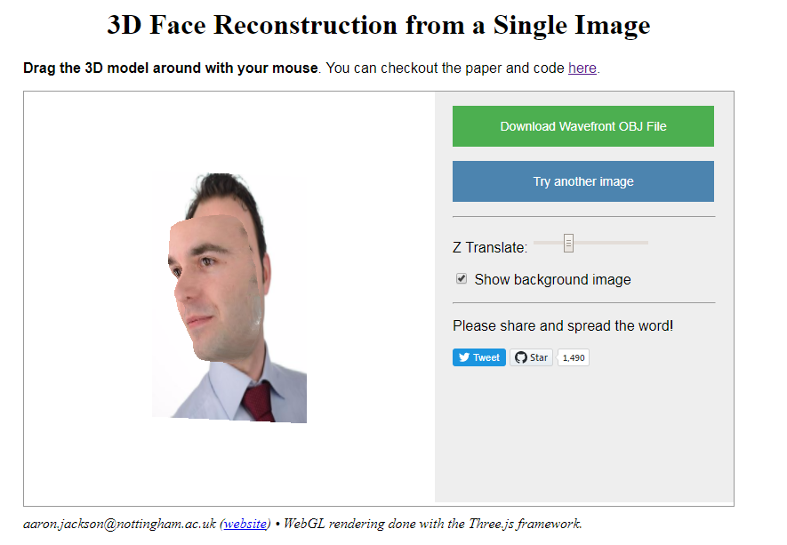
of the Computer Vision Laboratory of the University of Nottingham built a neural network that generates a full 3D image of a single portrait photograph. They turn a photograph like this…

PVDL corporate

… into an accurately creepy 3D image like this.

faceimage

You can try it with your own or other photographs here. I found that images with white background get the best results. On their project website you can read more about the underlying convolutional neural network.

Update 21-10-2017: One of my favorite YouTube channels explains how the models were trained and the data used:

Analysis of Media Coverage on Refugees

Analysis of Media Coverage on Refugees

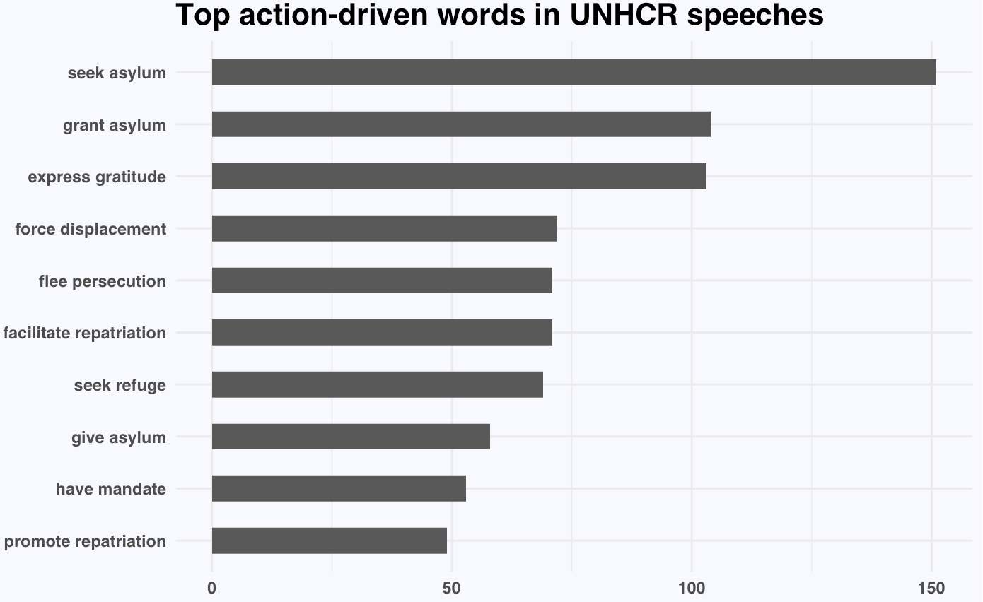
Hannah Yan Han is doing #100dayprojects on data science and visual storytelling and I can only recommend that you take a look yourself. Below you find her R text analysis (#41) of UNHCR speeches and TV coverage on refugees.

Unsurprisingly, nouns like asylum, repatriation, displacement, persecution, plight, and crisis appear significantly more often in UNHCR speeches on refugees than in general English texts. The first visualization below shows the action-oriented verbs most commonly used in combination with these nouns.

This second visualization shows the most occurring verb-noun pairs.

Hannah used newsflash to retrieve the GDELT data on US TV news. Some channels seem to cover refugees more than others. I would have loved to see which topics occurred on each channel, but unfortunately she did not report on this.

Visualizing #IRMA Tweets

Visualizing #IRMA Tweets

Reddit user LucasCu90 used the R package twitteR to retrieve all tweets that were sent with #Irma and a Geocode of central Miami (25 mile radius) from Saturday September 9, to Sunday September 10, 2017 (the period of Irma’s approach and initial landfall on the Florida Keys and the mainland). From the 29,000 tweets he collected, Lucas then retrieved the 600 most common words and overlaid them on a map of Florida, with their size relative to their frequency in the data. The result is quite nice!

oq41nz62balz

Coexisting Languages in Australia: An Interactive map

Coexisting Languages in Australia: An Interactive map

Jack Zhao from Small Multiples – a multidisciplinary team of data specialists, designers and developers – retrieved the Language Spoken at Home (LANP) data from the 2016 Census and turned it into a dot density map that vividly shows how people from different cultures coexist (or not) in ultra high resolution (using Python, englewood library, QGIS, Carto). Each colored dot in the visualizations below represents five people from the same language group in the area. Highly populated areas have a higher density of dots; while language diversity is shown through the number of different colors in the given area.

Good news: the maps are interactive! Here’s Sydney:

Here is the original webpage on Small Multiples and you can browse the interactive map in full screen in your browser. The below language groups are included:

  • Eastern Asian: Chinese, Japanese, Korean, Other Eastern Asian Languages
  • Southeast Asian: Burmese and Related Languages, Hmong-Mien, Mon-Khmer, Tai, Southeast Asian Austronesian Languages, Other Southeast Asian Languages
  • Southern Asian: Dravidian, Indo-Aryan, Other Southern Asian Languages
  • Southwest And Central Asian: Iranic, Middle Eastern Semitic Languages, Turkic, Other Southwest and Central Asian Languages
  • Northern European: Celtic, English, German and Related Languages, Dutch and Related Languages, Scandinavian, Finnish and Related Languages
  • Southern European: French, Greek, Iberian Romance, Italian, Maltese, Other Southern European Languages
  • Eastern European: Baltic, Hungarian, East Slavic, South Slavic, West Slavic, Other Eastern European Languages
  • Australian Indigenous: Arnhem Land and Daly River Region Languages, Yolngu Matha, Cape York Peninsula Languages, Torres Strait Island Languages, Northern Desert Fringe Area Languages, Arandic, Western Desert Languages, Kimberley Area Languages, Other Australian Indigenous Languages


Where to look for your next job? An Interactive Map of the US Job Market

Where to look for your next job? An Interactive Map of the US Job Market

The people at Predictive Talent, Inc. took a sample of 23.4 million job postings from 5,200+ job boards and 1,800+ cities around the US.  They classified these jobs using the BLS Standard Occupational Classification tree and identified their primary work locations, primary job roles, estimated salaries, and 17 other job search-related characteristics. Next, they calculated five metrics for each role and city in order to identify the 123 biggest job shortages in the US:

  • Monthly Demand (#): How many people are companies hiring every month? This is simply the number of unique jobs posted every month.
  • Unmet Demand (%): What percentage of jobs did companies have a hard time filling? Details aside, basically, if a company re-posts the same job every week for 6 weeks, one may assume that they couldn’t find someone for the first 5 weeks.
  • Salary ($): What’s the estimated salary for these jobs near this city? Using 145,000+ data points from the federal government and proprietary sources, along with salary information parsed from jobs themselves, they estimated the median salary for similar jobs within 100 miles of the city.
  • Delight (#): On a scale of 1 (least) to 10 (most delight), how easy should the job search be for the average job-seeker? This is basically the opposite of Agony.

The end result is this amazing map of the job market in the U.S, which you can interactively explore here to see where you could best start your next job hunt.