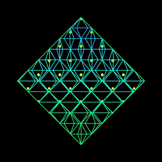
Saskia Freeke (twitter) is a Dutch artist, creative coder, interaction designer, visual designer, and educator working from Amsterdam. She has been creating an awesome digital art piece for every day since January 1st 2015. Her ever-growing collection includes some animated, visual masterpieces.
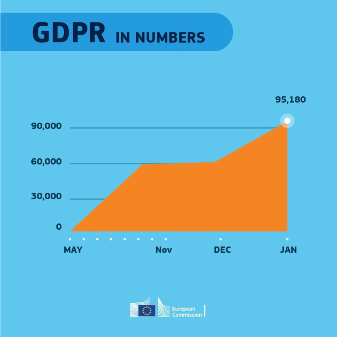
Maarten Lambrechts is a data journalist I closely follow online, with great delight. Recently, he shared on Twitter his slidedeck on the 18 most common data visualization pitfalls. You will probably already be familiar with most, but some (like #14) were new to me:
Save pies for dessert
Don’t cut bars
Don’t cut time axes
Label directly
Use colors deliberately
Avoid chart junk
Scale circles by area
Avoid double axes
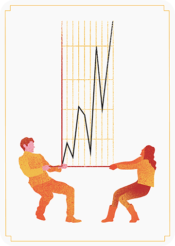
Correlation is no causality
Don’t do 3D
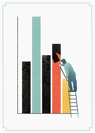
Sort on the data
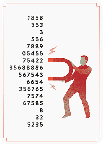
Tell the story
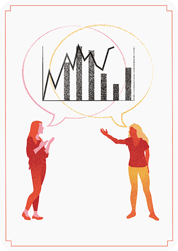
1 chart, 1 message
Common scales on small mult’s
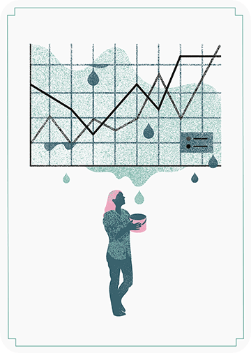
#Endrainbow
Normalise data on maps
Sometimes best map is no map
All maps lie
Even though most of these 18 rules below seem quite obvious, even the European Commissions seems to break them every now and then:
Michael Freeman — information researcher at the University of Washington — was asked whether he could manipulate images with only R programming and he thought to give it a try. In his blog, Michael demonstrates how he used ggplot2 and the imager packages, among others, to go from this original photo:
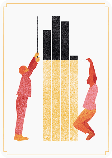
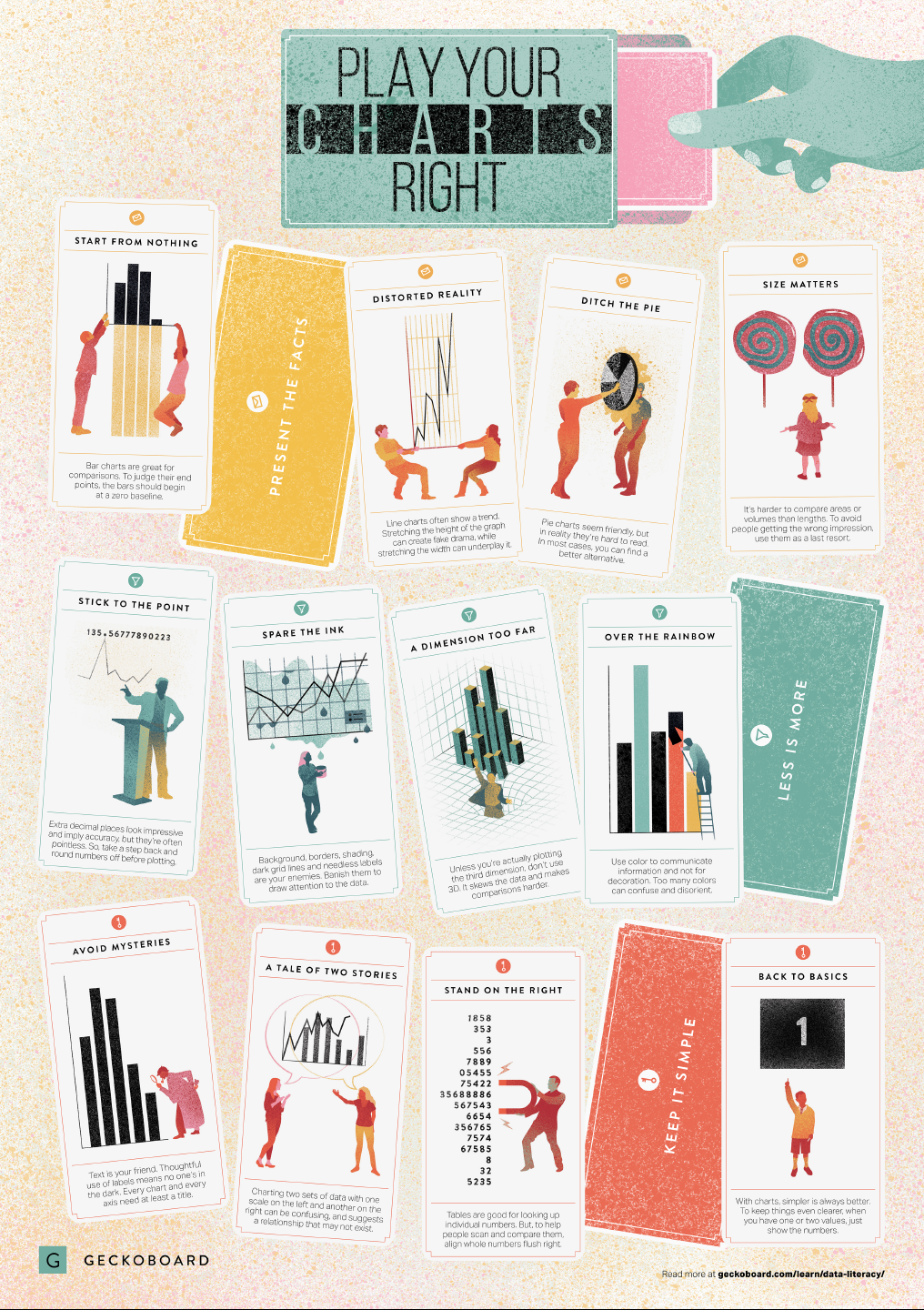
In a world where data really matters, we all want to create effective charts. But data visualization is rarely taught in schools, or covered in on-the-job training. Most of us learn as we go along, and therefore we often make choices or mistakes that confuse and disorient our audience. From overcomplicating or overdressing our charts, to conveying an entirely inaccurate message, there are common design pitfalls that can easily be avoided. We’ve put together these pointers to help you create simpler charts that effectively get across the meaning of your data.
Based on work by experts such as Stephen Few, Dona Wong, Albert Cairo, Cole Nussbaumer Knaflic, and Andy Kirk, the authors at Geckoboard wrote down a list of recommendations which I summarize below:
Present the facts
Start your axis at zero whenever possible, to prevent misinterpretation. Particularly bar charts.
The width and height of line and scatter plots influence its messages.
Area and size are hard to interpret. Hence, there’s often a better alternative to the pie chart. Read also this.
Last year witnessed the creation of many novel types of data visualization. Some lesser known ones, jokingly referred to as xenographics, I already discussed.
Two new visualization formats seem to stick around though. And as always, it was not long before someone created special R packages for them. Get ready to meet waffleplots and swarmplots!
Waffleplot
Waffleplots — also called square pie charts — are very useful in communicating parts of a whole for categorical quantities. Bob Rudis (twitter) — scholar and R developer among many other things — did us all a favor and created the R waffle package.
First, we need to install and load the waffle package.
install.packages("waffle") # install waffle package
library(waffle) # load in package
I will use the famous iris data to demonstrate both plots.
Since waffleplots work with frequencies, I will specifically use the iris$Species data stored as a frequency table.
Here, we see every single flower in the iris dataset represented by a tile. This provides an immediate visual representation of the group sizes in the dataset. Looks pretty huh!
But we can play around with the display settings, for instance, let’s change the number of rows and the placement of the legend. Building on ggplot2, the waffle package works very intuitive:
waffle(spec, rows = 3, legend_pos = "bottom")
Or, in case we want to highlight a specific value, we could play around with the colors a bit.
The plot is a bit crowded though with each flower as a seperate tile. We can simply reduce the number of tiles by dividing the values in our frequency table, like so:
# do not forget to annotate what each square represents!
w1 <- waffle(spec / 10, rows = 5, xlab = "1 square = 10 flowers")
w1
Finally, you might want to combine multiple waffles into a single visual. This you can do with the accompanied well-named waffle::iron function. Like so:
I am definately going to use this package in my daily work. I just love the visual simplicity.
As a final remark, the waffle Github page argues that the argument use_glyph can be used to replace the tiles by pictures from the extrafont package, however, I could not get the code to work.
The visual resulting from the use_glyph waffle example via github.
The ggplot2 waffle extension geom_waffle is being developed as we speak, but is not yet hosted on CRAN yet.
Some examples hosted on the Github page also use the iris dataset, so you can have a look at those. However, I made novel visuals because I prefer theme_light. Hence, I first install the ggbeeswarm package along with ggplot2, and then set the default theme to theme_light.
As this is an “official” ggplot2 extension, most functionality works the same as in any other geom_*. Thus, adding colors or increasing point size is easy:
ggplot(iris, aes(Species, Sepal.Length, col = Species)) + geom_beeswarm(size = 2)
For larger sizes, you might want to adjust the spacing between the points using the cex argument.
Points in a beeswarmplot are automatically plotted side-by-side grouped on the X variable, but you can turn that off with the groupOnX command.
ggplot(iris, aes(Species, Sepal.Length, col = Species)) + geom_beeswarm(groupOnX = FALSE)
Finally, if you have another grouping variable besides those on the axis (e.g., a large Sepal.Length below), you might want to consider using the dodge.width argument to seperate the groups.
The second function in the ggbeeswarm package is geom_quasirandom, an alternative to the original geom_jitter. Basically, it’s a convenient tool to offset points within categories to reduce overplotting.
ggplot(iris, aes(Species, Sepal.Length, col = Species)) + geom_quasirandom()
Instead of the quasirandom offset, the geom allows for many other methods, including a smiley face pattern : )
There is also a earlier package on CRAN, called beeswarm, but it doesn’t seem to be maintained anymore. Moreover, its syntax more or less resembles R’s base::plot, whereas I have a strong preference for ggplot2 personally.
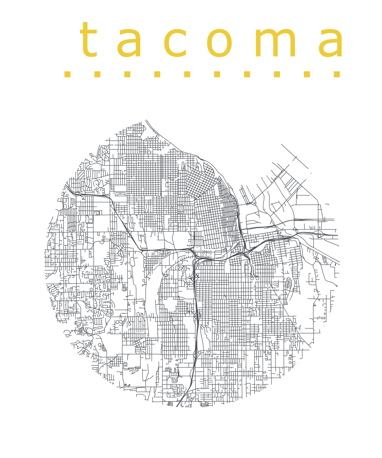
Katie Jolly wanted to surprise a friend with a nice geeky gift: a custom-made map cutout. Using R and some visual finetuning in Inkscape, she was able to made the below.
A detailed write-up of how Katie got to this product is posted here.
Basically, the R’s tigris package included all data on roads, and the ArcGIS Open Data Hub provided the neighborhood boundaries. Fortunately, the sf package is great for transforming and manipulating geospatial data, and includes some functions to retrieve a subset of roads based on their distance to a centroid. With this subset, Katie could then build these wonderful plots in no time with ggplot2.