Talent.Works is back, elaborating on the applicant characteristics that relate to landing an interview. While the majority of applicants has a meager ~2% chance of getting invited to an interview, some applicants do way better! What accounts for their success?
Timo Grossenbacher works as reporter/coder for SRF Data, the data journalism unit of Swiss Radio and TV. He analyzes and visualizes data and investigates data-driven stories. On his website, he hosts a growing list of cool projects. One of his recent blogs covers categorical spatial interpolation in R. The end result of that blog looks amazing:
This map was built with data Timo crowdsourced for one of his projects. With this data, Timo took the following steps, which are covered in his tutorial:
Read in the data, first the geometries (Germany political boundaries), then the point data upon which the interpolation will be based on.
Preprocess the data (simplify geometries, convert CSV point data into an sf object, reproject the geodata into the ETRS CRS, clip the point data to Germany, so data outside of Germany is discarded).
Then, a regular grid (a raster without “data”) is created. Each grid point in this raster will later be interpolated from the point data.
Run the spatial interpolation with the kknn package. Since this is quite computationally and memory intensive, the resulting raster is split up into 20 batches, and each batch is computed by a single CPU core in parallel.
Visualize the resulting raster with ggplot2.
All code for the above process can be accessed on Timo’s Github. The georeferenced points underlying the interpolation look like the below, where each point represents the location of a person who selected a certain pronunciation in an online survey. More details on the crowdsourced pronunciation project van be found here, .
Another of Timo’s R map, before he applied k-nearest neighbors on these crowdsourced data. [original]If you want to know more, please read the original blog or follow Timo’s new DataCamp course called Communicating with Data in the Tidyverse.
In optimizing their transportation services, Uber uses evolutionary strategies and genetic algorithms to train deep neural networks through reinforcement learning. A lot of difficult words in one sentence; you can imagine the complexity of the process.
Because it is particularly difficult to observe the underlying dynamics of this learning process in neural network optimization, Uber built VINE – a Visual Inspector for NeuroEvolution. VINE helps to discover how evolutionary strategies and genetic optimizing are performing under the hood. In a recent article, they demonstrate how VINE works on the MujocoHumanoid Locomotion task.
[…] In the Humanoid Locomotion Task, each pseudo-offspring neural network controls the movement of a robot, and earns a score, called its fitness, based on how well it walks. [Evolutionary principles] construct the next parent by aggregating the parameters of pseudo-offspring based on these fitness scores […]. The cycle then repeats.
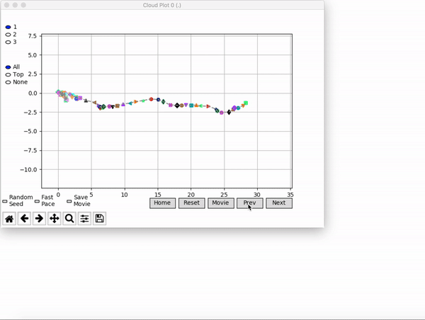
VINE plots parent neural networks and their pseudo-offspring according to their performance. Users can then interact with these plots to:
visualize parents, top performance, and/or the entire pseudo-offspring cloud of any generation,
compare between and within generation performance,
and zoom in on any pseudo-offspring (points) in the plot to display performance information.
The GIFs below demonstrate what VINE is capable of displaying:
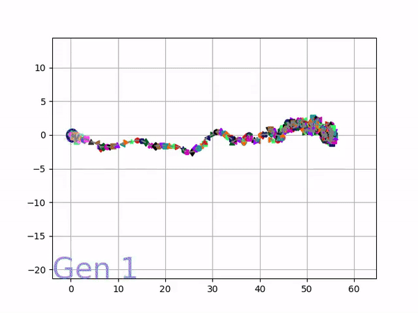
The evolution of performance over generations. The color changes in each generation. Within a generation, the color intensity of each pseudo-offspring is based on the percentile of its fitness score in that generation (aggregated into five bins). [original]Vine allows user to deep dive into each single generation, comparing generations and each pseudo-offspring within them [original]VINE can be found at this link. It is lightweight, portable, and implemented in Python.
Past week, I came across two programming initiatives to uncover Twitter bots and one attempt to identify fake Instagram accounts.
Mike Kearney developed the R package botornot which applies machine learning to estimate the probability that a Twitter user is a bot. His default model is a gradient boosted model trained using both users-level (bio, location, number of followers and friends, etc.) and tweets-level information (number of hashtags, mentions, capital letters, etc.). This model is 93.53% accurate when classifying bots and 95.32% accurate when classifying non-bots. His faster model uses only the user-level data and is 91.78% accurate when classifying bots and 92.61% accurate when classifying non-bots. Unfortunately, the models did not classify my account correctly (see below), but you should definitely test yourself and your friends via this Shiny application.
Fun fact: botornot can be integrated with Mike’s rtweet package
Scraping Dirty Bots
At around the same time, I read this very interesting blog by Andy Patel. Annoyed by the fake Twitter accounts that kept liking and sharing his tweets, Andy wrote a Python script called pronbot_search. It’s an iterative search algorithm which Andy seeded with the dozen fake Twitter accounts that he identified originally. Subsequently, the program iterated over the friends and followers of each of these fake users, looking for other accounts displaying similar traits (e.g., similar description, including an URL to a sex-website called “Dirty Tinder”).
Whenever a new account was discovered, it was added to the query list, and the process continued. Because of the Twitter API restrictions, the whole crawling process took literal days before Andy manually terminated it. The results are just amazing:
After a day, the results looked like so. Notice the weird clusters of relationships in this network. [original]The full bot network uncovered by Andy included 22.000 fake Twitter accounts:
At the end of the weekend of March 10th, Andy had to stop the scraper after running for several days even though he had only processed 18% of the networks of the 22.000 included Twitter bots [original]The bot network on Twitter is probably enormous! Zooming in on the network, Andy notes that:
Pretty much the same pattern I’d seen after one day of crawling still existed after one week. Just a few of the clusters weren’t “flower” shaped.
Zoomed in to a specific part of the network you can see the separate clusters of bots doing little more than liking each others messages. [original]In his blog, Andy continues to look at all kind of data on these fake accounts. I found most striking that many of these account are years and years old already. Potentially, Twitter can use Mike Kearney’s botornot application to spot and remove them!
Most of the bots in the Dirty Tinder network found by Andy Patel were 3 to 8 years old already. [original]Andy was nice enough to share the data on these bot accounts here, for you to play with. His Python code is stored in the same github repo and more details around this project you can read in his original blog.
Fake Instagram Accounts
Finally, SRFdata (Timo Grossenbacher) attempted to uncover fake Instagram followers among the 7 million followers in the network of 115 important Swiss Instagram influencers in R. Magi Metrics was used to retrieve information for public Instagram accounts and rvest for private accounts. Next, clear fake accounts (e.g., little followers, following many, no posts, no profile picture, numbers in name) were labelled manually, and approximately 10% of the inspected 1000 accounts appeared fake. Finally, they trained a random forest model to classify fake accounts with a sensitivity (true negative) rate of 77.4% and an overall accuracy of around 94%.
Tilburg University has set up a masterclass Predictive HR Analytics. In 3 days, the Professional Learning program will teach you all you need to know to implement predictive analytics and take HR to the next level. More information can be found here.
What makes this program unique?
The masterclass Predictive HR Analytics goes beyond HR analytics and focuses on transformational people predictions. You learn how to embed predictive HR analytics into your HR Strategy and how to use your findings to convince others.
The masterclass is developed at the prestigious Human Resources department at Tilburg University, which has obtained international recognition with its high-quality academic research in the HRM field.
The mix of professors in conjunction with leading HR professionals leads to a strong academic program with a practical approach.
Your peer participants will make sure that the class opens up a high-quality network of HR specialists. The diversity of leading companies from different sectors in the classroom creates new insights for all the participants.
The program is like a 3-day pressure cooker. By combining online and offline components, we can create more in-depth discussions in the classroom.
You will experience a high impact on your daily practice, since the program is focused on direct implementation.
Your profile
This course is ideal for anyone in HR seeking to become more adept in using quantitative data for decision making. Typical participants are (future) HR analysts, HR managers, HR business partners, HR consultants and (financial) business analysts with a strong link on people resources. Participants are from various sectors, such as financial services, healthcare institutions, government agencies and business services.
In the video below, one of my favorite YouTube channels (Two Minute Papers) discusses a new super resolution project where academic scholars taught a neural network to improve low quality photo’s. The researchers took the same picture with multiple camera’s of varying quality and allowed a neural network to learn how the lowest quality pictures can be adjusted to more closely resemble their high quality counterparts. A very interesting approach and the results are just mind-boggling: