Category: design

Turning the Traveling Salesman problem into Art

Turning the Traveling Salesman problem into Art

Robert Bosch is a professor of Natural Science at the department of Mathematics of Oberlin College and has found a creative way to elevate the travelling salesman problem to an art form.

For those who aren’t familiar with the travelling salesman problem (wiki), it is a classic algorithmic problem in the field of computer science and operations research. Basically, we want are looking for a mathematical solution that is cheapest, shortest, or fastest for a given problem. Most commonly, it is seen as a graph (network) describing the locations of a set of nodes (elements in that network). Wikipedia has a description I can’t improve on:

The Travelling Salesman Problem describes a salesman who must travel between N cities. The order in which he does so is something he does not care about, as long as he visits each once during his trip, and finishes where he was at first. Each city is connected to other close by cities, or nodes, by airplanes, or by road or railway. Each of those links between the cities has one or more weights (or the cost) attached. The cost describes how “difficult” it is to traverse this edge on the graph, and may be given, for example, by the cost of an airplane ticket or train ticket, or perhaps by the length of the edge, or time required to complete the traversal. The salesman wants to keep both the travel costs, as well as the distance he travels as low as possible.

Wikipedia

Here’s a visual representation of the problem and some algorithmic approaches to solving it:

Now, Robert Bosch has applied the traveling salesman problem to well-know art pieces, trying to redraw them by connecting a series of points with one continuous line. Robert even turned it into a challenge so people can test out how well their travelling salesman algorithms perform on, for instance, the Mona Lisa, or Vincent van Gogh.

Just look at the detail on these awesome Dutch classics:

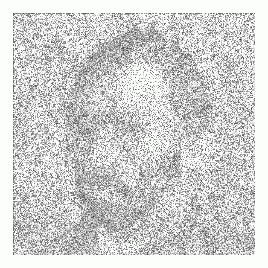
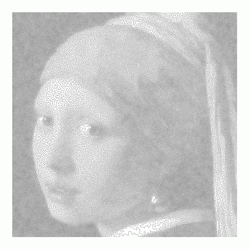
Read more about this awesome project here: http://www.math.uwaterloo.ca/tsp/data/art/

P.S. Why do Brits and Americans have this spelling feud?! As a non-native, I never know what to pick. Should I write modelling or modeling, travelling or traveling, tomato or tomato? I got taught the U.K. style, but the U.S. style pops up whenever I google stuff, so I am constantly confused! Now I subconciously intertwine both styles in a single text…

OriginLab’s Graph Gallery: A blast from the past

OriginLab’s Graph Gallery: A blast from the past

Continuing my recent line of posts on data visualization resources, I found another repository in my inbox: OriginLab’s GraphGallery!

If I’m being honest, I would personally advice you to look at the dataviz project instead, if you haven’t heard of that one yet.

However, OriginLab might win in terms of sentiment. It has this nostalgic look of the ’90s, and apparently people really used it during that time. Nevertheless, despite looking old, the repo seems to be quite extensive, with nearly 400 different types of data visualizations:

Quantity isn’t everything though, as some of the 400 entries are disgustingly horrible:

There’s so much wrong with this graph…

What I do like about this OriginLab repo is that it has an option to sort its contents using a random order. This really facilitates discovery of new pearls:

Thanks to Maarten Lambrechts for sharing this resource on twitter a while back!

treevis.net – A Visual Bibliography of Tree Visualizations

treevis.net – A Visual Bibliography of Tree Visualizations

Last week I cohosted a professional learning course on data visualization at JADS. My fellow host was prof. Jack van Wijk, and together we organized an amazing workshop and poster event. Jack gave two lectures on data visualization theory and resources, and mentioned among others treevis.net, a resource I was unfamiliar with up until then.

treevis.net is a lot like the dataviz project in the sense that it is an extensive overview of different types of data visualizations. treevis is unique, however, in the sense that it is focused on specifically visualizations of hierarchical data: multi-level or nested data structures.

Hans-Jörg Schulz — professor of Computer Science at Aarhus University in Denmark — maintains the treevis repo. At the moment of writing, he has compiled over 300 different types of hierachical data visualizations and displays them on this website.

As an added bonus, the repo is interactive as there are several ways to filter and look for the visualization type that best fits your data and needs.

Most resources come with added links to the original authors and the original papers they were first published in, so this is truly a great resources for those interested in doing a deep dive into data visualization. Do have a look yourself!

The Mental Game of Python, by Raymond Hettinger

The Mental Game of Python, by Raymond Hettinger

YouTube recommended I’d watch this recorded presentation by Raymond Hettinger at PyBay2019 last October. Quite a long presentation for what I’d normally watch, but what an eye-openers it contains!

Raymond Hettinger is a Python core developer and in this video he presents 10 programming strategies in these 60 minutes, all using live examples. Some are quite obvious, but the presentation and examples make them very clear. Raymond presents some serious programming truths, and I think they’ll stick.

First, Raymond discusses chunking and aliasing. He brings up the theory that the human mind can only handle/remember 7 pieces of information at a time, give or take 2. Anything above proves to much cognitive load, and causes discomfort as well as errors. Hence, in a programming context, we need to make sure programmers can use all 7 to improve the code, rather than having to decypher what’s in front of them. In a programming context, we do so by modularizing and standardizing through functions, modules, and packages. Raymond uses the Python random module to hightlight the importance of chunking and modular code. This part was quite long, but still interesting.

For the next two strategies, Raymond quotes the Feinmann method of solving problems: “(1) write down a clear problem specification; (2) think very, very hard; (3) write down a solution”. Using the example of a tree walker, Raymond shows how the strategies of incremental development and solving simpler programs can help you build programs that solve complex problems. This part only lasts a couple of minutes but really underlines the immense value of these strategies.

Next, Raymond touches on the DRY principle: Don’t Repeat Yourself. But in a context I haven’t seen it in yet, object oriented programming [OOP], classes, and inherintance.

Raymond continues to build his arsenal of programming strategies in the next 10 minutes, where he argues that programmers should repeat tasks manually until patterns emerge, before they starting moving code into functions. Even though I might not fully agree with him here, he does have some fun examples of file conversion that speak in his case.

Lastly, Raymond uses the graph below to make the case that OOP is a graph traversal problem. According to Raymond, the Python ecosystem is so rich that there’s often no need to make new classes. You can simply look at the graph below. Look for the island you are currently on, check which island you need to get to, and just use the methods that are available, or write some new ones.

While there were several more strategies that Raymond wanted to discuss, he doesn’t make it to the end of his list of strategies as he spend to much time on the first, chunking bit. Super curious as to the rest? Contact Raymond on Twitter.

Neural Synesthesia: GAN AI dreaming of music

Neural Synesthesia: GAN AI dreaming of music

Xander Steenbrugge shared his latest work on LinkedIn yesterday, and I was completely stunned!

Xander had been working on, what he called, a “fun side-project”, but which was in my eyes, absolutely awesome. He had used two generative adversarial networks (GANs) to teach one another how to respond visually to changing audio cues.

This resulted in the generation of stunning audio-visual fanatasy worlds that are complete brain porn. You just can’t stop staring. So much is happening in these video’s; everything looks familiar, whereas nothing really represent anything realistic. There’s always a sliver of reality before the visual shapes morph to their next form.

Have a look yourself at the video’s on Xander’s new Youtube channel “Neural Synesthesia dedicated to this project. The videos are also hosted here on Vimeo, where they are rendered in higher resolution even.

This is my favorite video, but there are more below.

Amazing how the image responds to changes in the music, right? I suspect Xander let’s the algorithm traverse some latent space with spaces that are determined by the bass, trebble, and other audio-cues.

The audio behind the above video is also just enticing. The track is called Raindrops, by Kupla X j’san.

Here’s another one of Xander’s videos, with the same audio track as background:

But Xander didn’t limit his GANs to generating landscapes and still paintings, but he also dared to do some human faces. These also turned out amazing.

Both the left and right face seem to start out in about the same position/seed in the latent space, but traverse in different, though still similar directions, morphing into all kinds of reaslistic and more alien forms. The result is simply out of this world!

The music behind this video is by Phantom Studies, by Dettmann | Klock.

Curious to see where this project and others head as we continue to see development in this GAN field. This must turn the world of design and art up side down in the coming decade…

A beautiful machine-generated still from the Neural Synthesia videos (link)
A tiny guide to Variable Fonts & Color Fonts

A tiny guide to Variable Fonts & Color Fonts

So, you’ve probably never heard of variable fonts.

Well, I sure had not when I first came across the concept a week or so ago. And I was shocked. This looked so cool. As I adjusted the size of my browser, the text and images adjusted itself along. As I made my Chrome window bigger, the text enlarged to keep filling the space it was allowed. Insane!

Here’s a little write-up on variable fonts called A tiny guide to Variable Color Fonts by Typearture.com.

Variable color fonts: How do they work?

The variability works for letters, but also illustrations. And any part can be colored and sized as pleased:

Variable fonts and illustrations

I find the visual art particularly stunning, which you can find via this link:

Here’s the explanation for the GIF in the header:

Combining variable and color fonts

The original article (which I highly recommend you read) links to many useful links:

Typearture is Arthur Reinders Folmer’s adventure in type, creating type designs with a focus on conceptual, illustrative and ornamental typefaces.

The typefaces in the Typearture library are not just collections of glyphs, but typefaces that use the conventions of type design and written language to tell their stories. These stories are woven throughout the typefaces, connecting A to Z and the Lemniscate to Question mark. Each character has it’s place and meaning, making each keystroke a small tale in itself.

typearture.com