Category: python

Kaggle Data Science Survey 2017: Worldwide Preferences for Python & R

Kaggle Data Science Survey 2017: Worldwide Preferences for Python & R

Kaggle conducts industry-wide surveys to assess the state of data science and machine learning. Over 17,000 individuals worldwide participated in the survey, myself included, and 171 countries and territories are represented in the data.

There is an ongoing debate regarding whether R or Python is better suited for Data Science (probably the latter, but I nevertheless prefer the former). The thousands of responses to the Kaggle survey may provide some insights into how the preferences for each of these languages are dispersed over the globe. At least, that was what I thought when I wrote the code below.

View the Kaggle Kernel here.

### PAUL VAN DER LAKEN
### 2017-10-31
### KAGGLE DATA SCIENCE SURVEY
### VISUALIZING WORLD WIDE RESPONSES
### AND PYTHON/R PREFERENCES

# LOAD IN LIBRARIES
library(ggplot2)
library(dplyr)
library(tidyr)
library(tibble)

# OPTIONS & STANDARDIZATION
options(stringsAsFactors = F)
theme_set(theme_light())
dpi = 600
w = 12
h = 8
wm_cor = 0.8
hm_cor = 0.8
capt = "Kaggle Data Science Survey 2017 by paulvanderlaken.com"

# READ IN KAGGLE DATA
mc <- read.csv("multipleChoiceResponses.csv") %>%
  as.tibble()

# READ IN WORLDMAP DATA
worldMap <- map_data(map = "world") %>% as.tibble()

# ALIGN KAGGLE AND WORLDMAP COUNTRY NAMES
mc$Country[!mc$Country %in% worldMap$region] %>% unique()
worldMap$region %>% unique() %>% sort(F)
mc$Country[mc$Country == "United States"] <- "USA"
mc$Country[mc$Country == "United Kingdom"] <- "UK"
mc$Country[grepl("China|Hong Kong", mc$Country)] <- "China"


# CLEAN UP KAGGLE DATA
lvls = c("","Rarely", "Sometimes", "Often", "Most of the time")
labels = c("NA", lvls[-1])
ind_data <- mc %>% 
  select(Country, WorkToolsFrequencyR, WorkToolsFrequencyPython) %>%
  mutate(WorkToolsFrequencyR = factor(WorkToolsFrequencyR, 
                                      levels = lvls, labels = labels)) %>% 
  mutate(WorkToolsFrequencyPython = factor(WorkToolsFrequencyPython, 
                                           levels = lvls, labels = labels)) %>% 
  filter(!(Country == "" | is.na(WorkToolsFrequencyR) | is.na(WorkToolsFrequencyPython)))

# AGGREGATE TO COUNTRY LEVEL
country_data <- ind_data %>%
  group_by(Country) %>%
  summarize(N = n(),
            R = sum(WorkToolsFrequencyR %>% as.numeric()),
            Python = sum(WorkToolsFrequencyPython %>% as.numeric()))

# CREATE THEME FOR WORLDMAP PLOT
theme_worldMap <- theme(
    plot.background = element_rect(fill = "white"),
    panel.border = element_blank(),
    panel.grid = element_blank(),
    panel.background = element_blank(),
    legend.background = element_blank(),
    legend.position = c(0, 0.2),
    legend.justification = c(0, 0),
    legend.title = element_text(colour = "black"),
    legend.text = element_text(colour = "black"),
    legend.key = element_blank(),
    legend.key.size = unit(0.04, "npc"),
    axis.text = element_blank(), 
    axis.title = element_blank(),
    axis.ticks = element_blank()
  )

After aligning some country names (above), I was able to start visualizing the results. A first step was to look at the responses across the globe. The greener the more responses and the grey countries were not represented in the dataset. A nice addition would have been to look at the response rate relative to country population.. any volunteers?

# PLOT WORLDMAP OF RESPONSE RATE
ggplot(country_data) + 
  geom_map(data = worldMap, 
           aes(map_id = region, x = long, y = lat),
           map = worldMap, fill = "grey") +
  geom_map(aes(map_id = Country, fill = N),
           map = worldMap, size = 0.3) +
  scale_fill_gradient(low = "green", high = "darkgreen", name = "Response") +
  theme_worldMap +
  labs(title = "Worldwide Response Kaggle DS Survey 2017",
       caption = capt) +
  coord_equal()

Worldmap_response.png

Now, let’s look at how frequently respondents use Python and R in their daily work. I created two heatmaps: one excluding the majority of respondents who indicated not using either Python or R, probably because they didn’t complete the survey.

# AGGREGATE DATA TO WORKTOOL RESPONSES
worktool_data <- ind_data %>%
  group_by(WorkToolsFrequencyR, WorkToolsFrequencyPython) %>%
  count()

# HEATMAP OF PREFERRED WORKTOOLS
ggplot(worktool_data, aes(x = WorkToolsFrequencyR, y = WorkToolsFrequencyPython)) +
  geom_tile(aes(fill = log(n))) +
  geom_text(aes(label = n), col = "black") +
  scale_fill_gradient(low = "red", high = "yellow") +
  labs(title = "Heatmap of Python and R usage",
       subtitle = "Most respondents indicate not using Python or R (or did not complete the survey)",
       caption = capt, 
       fill = "Log(N)") 

heatmap_worktools.png

# HEATMAP OF PREFERRED WORKTOOLS
# EXCLUSING DOUBLE NA'S
worktool_data %>%
  filter(!(WorkToolsFrequencyPython == "NA" & WorkToolsFrequencyR == "NA")) %>%
  ungroup() %>%
  mutate(perc = n / sum(n)) %>%
  ggplot(aes(x = WorkToolsFrequencyR, y = WorkToolsFrequencyPython)) +
  geom_tile(aes(fill = n)) +
  geom_text(aes(label = paste0(round(perc,3)*100,"%")), col = "black") +
  scale_fill_gradient(low = "red", high = "yellow") +
  labs(title = "Heatmap of Python and R usage (non-users excluded)",
       subtitle = "There is a strong reliance on Python and less users focus solely on R",
       caption = capt, 
       fill = "N") 

heatmap_worktools_usersonly.png

Okay, now let’s map these frequency data on a worldmap. Because I’m interested in the country level differences in usage, I look at the relative usage of Python compared to R. So the redder the country, the more Python is used by Data Scientists in their workflow whereas R is the preferred tool in the bluer countries. Interesting to see, there is no country where respondents really use R much more than Python.

# WORLDMAP OF RELATIVE WORKTOOL PREFERENCE
ggplot(country_data) + 
  geom_map(data = worldMap, 
           aes(map_id = region, x = long, y = lat),
           map = worldMap, fill = "grey") +
  geom_map(aes(map_id = Country, fill = Python/R),
           map = worldMap, size = 0.3) +
  scale_fill_gradient(low = "blue", high = "red", name = "Python/R") +
  theme_worldMap +
  labs(title = "Relative usage of Python to R per country",
       subtitle = "Focus on Python in Russia, Israel, Japan, Ukraine, China, Norway & Belarus",
       caption = capt) +
  coord_equal() 
Worldmap_relative_usage.png
Countries are color-coded for their relative preference for Python (red/purple) or R (blue) as a Data Science tool. 167 out of 171 countries (98%) demonstrate a value of > 1, indicating a preference for Python over R.

Thank you for reading my visualization report. Please do try and extract some other interesting insights from the data yourself.

If you liked my analysis, please upvote my Kaggle Kernel here!

Text Mining: Pythonic Heavy Metal

Text Mining: Pythonic Heavy Metal

This blog summarized work that has been posted here, here, and here.

Iain of degeneratestate.org wrote a three-piece series where he applied text mining to the lyrics of 222,623 songs from 7,364 heavy metal bands spread over 22,314 albums that he scraped from darklyrics.com. He applied a broad range of different analyses in Python, the code of which you can find here on Github.

For example, he starts part 1 by calculated the difficulty/complexity of the lyrics of each band using the Simple Measure of Gobbledygook or SMOG and contrasted this to the number of swearwords used, finding a nice correlation.

Ratio of swear words vs readability
Lyric complexity relates positive to swearwords used.

Furthermore, he ran some word importance analysis, looking at word frequencies, log-likelihood ratios, and TF-IDF scores. This allowed him to contrast the word usage of the different bands, finding, for instance, one heavy metal band that was characterized by the words “oh yeah baby got love“: fans might recognize either Motorhead, Machinehead, or Diamondhead.

Examplehead WordImportance 3

Using cosine distance measures, Iain could compare the word vectors of the different bands, ultimately recognizing band similarity, and song representativeness for a band. This allowed interesting analysis, such as a clustering of the various bands:

Metal Cluster Dendrogram

However, all his analysis worked out nicely. While he also applied t-SNE to visualize band similarity in a two-dimensional space, the solution was uninformative due to low variance in the data.

He could predict the band behind a song by training a one-vs-rest logistic regression classifier based on the reduced lyric space of 150 dimensions after latent semantic analysis. Despite classifying a song to one of 120 different bands, the classifier had a precision and recall both around 0.3, with negligible hyper parameter tuning. He used the classification errors to examine which bands get confused with each other, and visualized this using two network graphs.

Metal Graph 1

In part 2, Iain tried to create a heavy metal lyric generator (which you can now try out).

His first approach was to use probabilistic distributions known as language models. Basically he develops a Markov Chain, in his opinion more of a “unsmoothed maximum-likelihood language model“, which determines the next most probable word based on the previous word(s). This model is based on observed word chains, for instance, those in the first two lines to Iron Maiden’s Number of the Beast:

Another approach would be to train a neural network. Iain used Keras, which ran on an amazon GPU instance. He recognizes the power of neural nets, but says they also come at a cost:

“The maximum likelihood models we saw before took twenty minutes to code from scratch. Even using powerful libraries, it took me a while to understand NNs well enough to use. On top of this, training the models here took days of computer time, plus more of my human time tweeking hyper parameters to get the models to converge. I lack the temporal, financial and computational resources to fully explore the hyperparameter space of these models, so the results presented here should be considered suboptimal.” – Iain

He started out with feed forward networks on a character level. His best try consisted of two feed forward layers of 512 units, followed by a softmax output, with layer normalisation, dropout and tanh activations, which he trained for 20 epochs to minimise the mean cross-entropy. Although it quickly beat the maximum likelihood Markov model, its longer outputs did not look like genuine heavy metal songs.

So he turned to recurrent neural network (RNN). The RNN Iain used contains two LSTM layers of 512 units each, followed by a fully connected softmax layer. He unrolled the sequence for 32 characters and trained the model by predicting the next 32 characters, given their immediately preceding characters, while minimizing the mean cross-entropy:

“To generate text from the RNN model, we step character-by-character through a sequence. At each step, we feed the current symbol into the model, and the model returns a probability distribution over the next character. We then sample from this distribution to get the next character in the sequence and this character goes on to become the next input to the model. The first character fed into the model at the beginning of generation is always a special start-of-sequence character.” – Iain

This approach worked quite well, and you can compare and contrast it with the earlier models here. If you’d just like to generate some lyrics, the models are hosted online at deepmetal.io.

In part 3, Iain looks into emotional arcs, examining the happiness and metalness of words and lyrics. Exploring words in the Happy/Metal Plane

When applied to the combined lyrics of albums, you could examine how bands developed their signature sound over time. For example, the lyrics of Metallica’s first few albums seem to be quite heavy metal and unhappy, before moving to a happier place. The Black album is almost sentiment-neutral, but after that they became ever more darker and more metal, moving back to the style to their first few albums. He applied the same analysis on the text of the Harry Potter books, of which especially the first and last appear especially metal.

The Evolution of Metallica's style in the Happy/Metal Plane


Coexisting Languages in Australia: An Interactive map

Coexisting Languages in Australia: An Interactive map

Jack Zhao from Small Multiples – a multidisciplinary team of data specialists, designers and developers – retrieved the Language Spoken at Home (LANP) data from the 2016 Census and turned it into a dot density map that vividly shows how people from different cultures coexist (or not) in ultra high resolution (using Python, englewood library, QGIS, Carto). Each colored dot in the visualizations below represents five people from the same language group in the area. Highly populated areas have a higher density of dots; while language diversity is shown through the number of different colors in the given area.

Good news: the maps are interactive! Here’s Sydney:

Here is the original webpage on Small Multiples and you can browse the interactive map in full screen in your browser. The below language groups are included:

  • Eastern Asian: Chinese, Japanese, Korean, Other Eastern Asian Languages
  • Southeast Asian: Burmese and Related Languages, Hmong-Mien, Mon-Khmer, Tai, Southeast Asian Austronesian Languages, Other Southeast Asian Languages
  • Southern Asian: Dravidian, Indo-Aryan, Other Southern Asian Languages
  • Southwest And Central Asian: Iranic, Middle Eastern Semitic Languages, Turkic, Other Southwest and Central Asian Languages
  • Northern European: Celtic, English, German and Related Languages, Dutch and Related Languages, Scandinavian, Finnish and Related Languages
  • Southern European: French, Greek, Iberian Romance, Italian, Maltese, Other Southern European Languages
  • Eastern European: Baltic, Hungarian, East Slavic, South Slavic, West Slavic, Other Eastern European Languages
  • Australian Indigenous: Arnhem Land and Daly River Region Languages, Yolngu Matha, Cape York Peninsula Languages, Torres Strait Island Languages, Northern Desert Fringe Area Languages, Arandic, Western Desert Languages, Kimberley Area Languages, Other Australian Indigenous Languages


Python resources (free courses, books, & cheat sheets)

Python resources (free courses, books, & cheat sheets)

Find more comprehensive Python repositories:
Vinta’s awesome Python Github repository, the easy Python docs, the Python Wiki Beginners Guide, or CourseDuck’s overview of free Python courses!

My list of Python resources is still quite short so if you have additions, please comment below or contact me! There are separate overviews for Data Science, Machine Learning, & Statistics resources in general, and for R resources and SQL resources in specific.

LAST UPDATED: 11-11-2018

Cheat sheets:

Courses:

Books:

Data Science, Machine Learning, & Statistics resources (free courses, books, tutorials, & cheat sheets)

Data Science, Machine Learning, & Statistics resources (free courses, books, tutorials, & cheat sheets)

Welcome to my repository of data science, machine learning, and statistics resources. Software-specific material has to a large extent been listed under their respective overviews: R Resources & Python Resources. I also host a list of SQL Resources and datasets to practice programming. If you have any additions, please comment or contact me!

LAST UPDATED: 21-05-2018

Courses:

Video:

Books:

Sentiment Lexicons:

Cheatsheets:

Other:

Summarizing our Daily News: Clustering 100.000+ Articles in Python

Summarizing our Daily News: Clustering 100.000+ Articles in Python

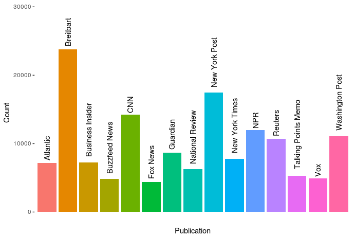
Andrew Thompson was interested in what 10 topics a computer would identify in our daily news. He gathered over 140.000 new articles from the archives of 10 different sources, as you can see in the figure below.

The sources of the news articles used in the analysis.

In Python, Andrew converted the text of all these articles into a manageable form (tf-idf document term matrix (see also Harry Plotter: Part 2)), reduced these data to 100 dimensions using latent semantic analysis (singular value decomposition), and ran a k-means clustering to retrieve the 10 main clusters. I included his main results below, but I highly suggest you visit the original article on Medium as Andrew used Plotly to generate interactive plots!

newplot
Most important words per topic (interactive visual in original article)

The topics structure seems quite nice! Topic 0 involves legal issues, such as immigration, whereas topic 1 seems to be more about politics. Topic 8 is clearly sports whereas 9 is education. Next, Andres inspected which media outlet covers which topics most. Again, visit the original article for interactive plots!

newplot (1).png
Media outlets and the topics they cover (interactive version in original article)

In light of the fake news crisis and the developments in (internet) media, I believe Andrew’s conclusions on these data are quite interesting.

I suppose different people could interpret this data and these graphs differently, but I interpret them as the following: when forced into groups, the publications sort into Reuters and everything else.

[…]

Every publication in this dataset except Reuters shares some common denominators. They’re entirely funded on ads and/or subscriptions (Vox and BuzzFeed also have VC funding, but they’re ad-based models), and their existence relies on clicks. By contrast, Reuters’s news product is merely the public face of a massive information conglomerate. Perhaps more importantly, it’s a news wire whose coverage includes deep reporting on the affairs of our financial universe, and therefore is charged with a different mandate than the others — arguably more than the New York Times, it must cover all the news, without getting trapped in the character driven reality-TV spectacle that every other citizen of the dataset appears to so heavily relish in doing. Of them all, its voice tends to maintain the most moderate indoor volume, and no single global event provokes larger-than-life outrage, if outrage can be provoked from Reuters at all. Perhaps this is the product of belonging to the financial press and analyzing the world macroscopically; the narrative of the non-financial press fails to accord equal weight to a change in the LIBOR rate and to the policy proposals of a madman, even though it arguably should. Every other publication here seems to bear intimations of utopia, and the subtext of their content is often that a perfect world would materialize if we mixed the right ingredients in the recipe book, and that the thing you’re outraged about is actually the thing standing between us and paradise. In my experience as a reader, I’ve never felt anything of the sort emanate from Reuters.

This should not be interpreted as asserting that the New York Times and Breitbart are therefore identical cauldrons of apoplexy. I read a beautifully designed piece today in the Times about just how common bioluminescence is among deep sea creatures. It goes without saying that the prospect of finding a piece like that in Breitbart is nonexistent, which is one of the things I find so god damned sad about that territory of the political spectrum, as well as in its diametrical opponents a la Talking Points Memo. But this is the whole point: show an algorithm the number of stories you write about deep sea creatures and it’ll show you who you are. At a finer resolution, we would probably find a chasm between the Times and Fox News, or between NPR and the New York Post. See that third cluster up there, where all the words are kind of compressed with lower TfIdf values and nothing sticks out? It’s actually a whole jungle of other topics, and you can run the algorithm on just that cluster and get new groups and distinctions — and one of those clusters will also be a compression of different kinds of stories, and you can do this over and over in a fractal of machine learning. The distinction here is not the only one, but it is, from the aerial perspective of data, the first.

It would be really interesting to see whether more high-quality media outlets, like the New York Times, could be easily distinguished from more sensational outlets, such as Buzzfeed, when more clusters were used, or potentially other text analytics methodology, like latent Dirichlet allocation.