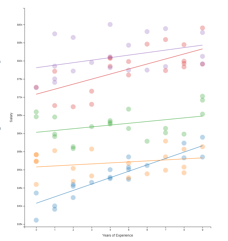
Hierarchical models I have covered before on this blog. These models are super relevant in practice. For instance, in HR, employee data is always nested within teams which are in turn nested within organizational units. Also in my current field of insurances, claims are always nested within policies, which can in turn be nested within product categories. Data is hierachical, and we need to take that into account when we model it.
Hierarchical models do just that. Interested in how they do this? Have a look at this amazing browser application made in React.js!
All code for this project is on GitHub, including the script to create the data and run regressions (done inR). Feel free to issue a pull request for improvements, and if you like it, share it on Twitter. Layout inspired by Tony Chu.
Xander Steenbrugge shared his latest work on LinkedIn yesterday, and I was completely stunned!
Xander had been working on, what he called, a “fun side-project”, but which was in my eyes, absolutely awesome. He had used two generative adversarial networks (GANs) to teach one another how to respond visually to changing audio cues.
This resulted in the generation of stunning audio-visual fanatasy worlds that are complete brain porn. You just can’t stop staring. So much is happening in these video’s; everything looks familiar, whereas nothing really represent anything realistic. There’s always a sliver of reality before the visual shapes morph to their next form.
Have a look yourself at the video’s on Xander’s new Youtube channel “Neural Synesthesia“ dedicated to this project. The videos are also hosted here on Vimeo, where they are rendered in higher resolution even.
This is my favorite video, but there are more below.
Amazing how the image responds to changes in the music, right? I suspect Xander let’s the algorithm traverse some latent space with spaces that are determined by the bass, trebble, and other audio-cues.
Here’s another one of Xander’s videos, with the same audio track as background:
But Xander didn’t limit his GANs to generating landscapes and still paintings, but he also dared to do some human faces. These also turned out amazing.
Both the left and right face seem to start out in about the same position/seed in the latent space, but traverse in different, though still similar directions, morphing into all kinds of reaslistic and more alien forms. The result is simply out of this world!
Curious to see where this project and others head as we continue to see development in this GAN field. This must turn the world of design and art up side down in the coming decade…
A beautiful machine-generated still from the Neural Synthesia videos (link)
Most of my data visualizations I create using R programming — as you might have noticed from the content of my website.
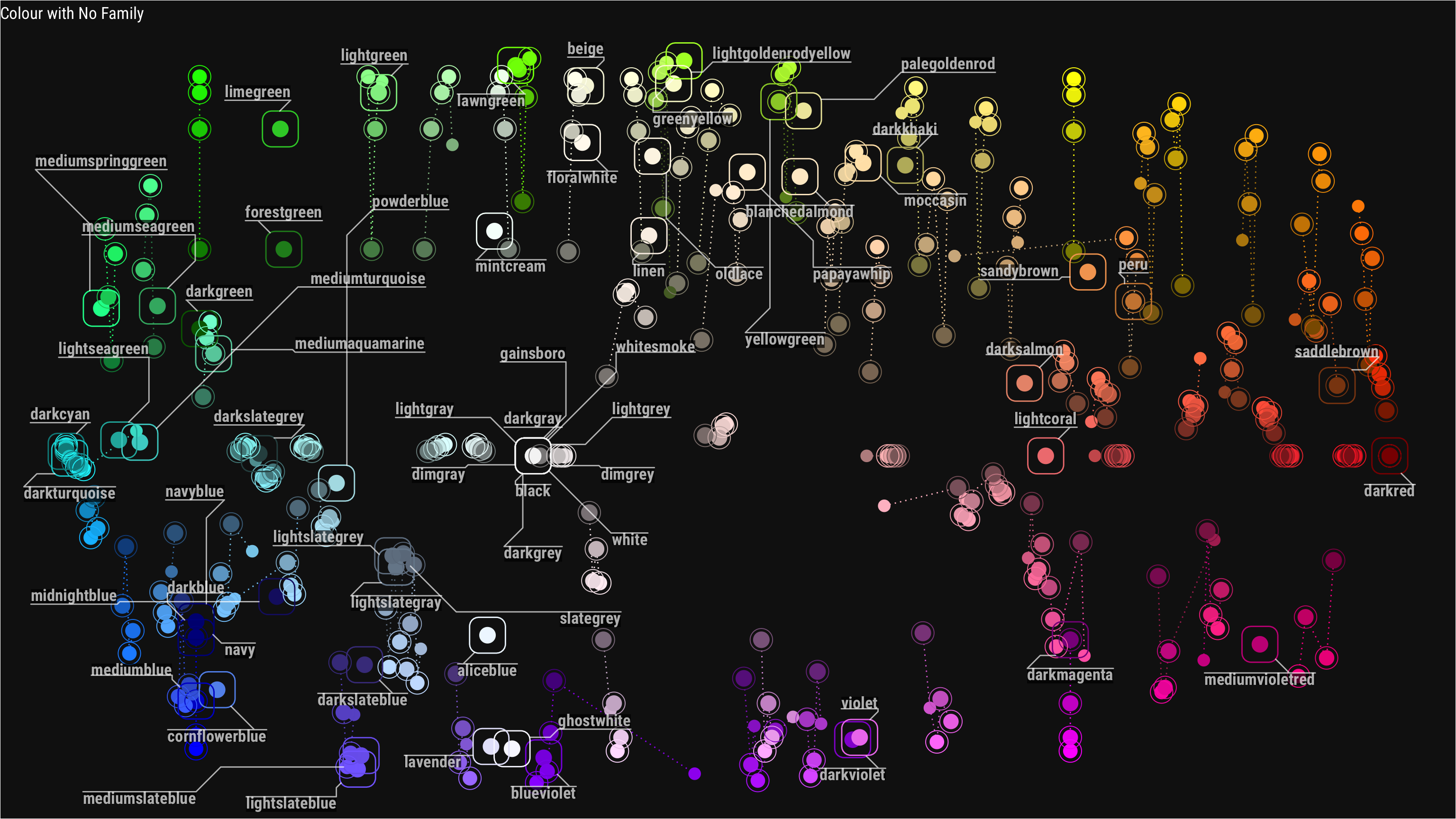
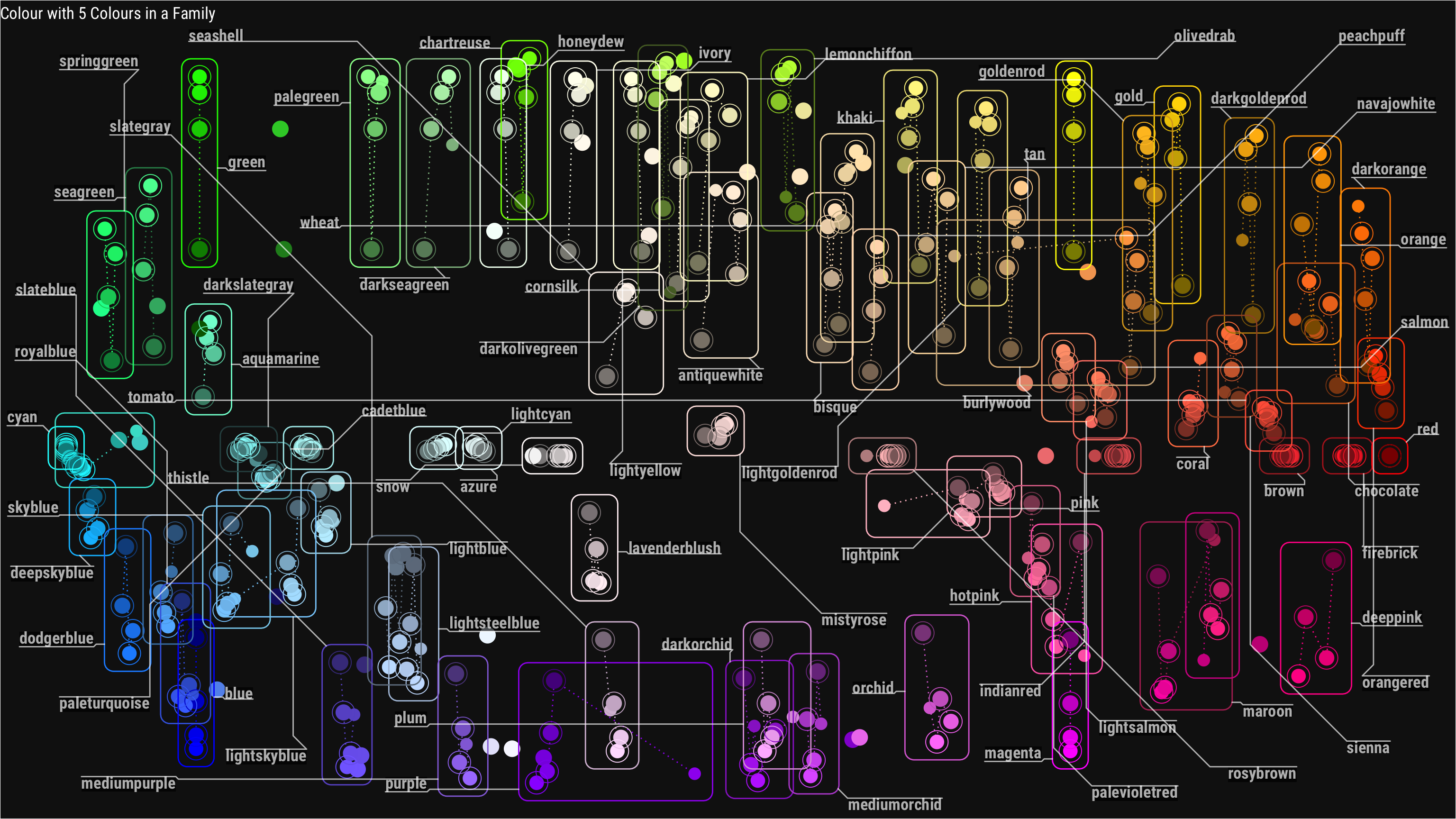
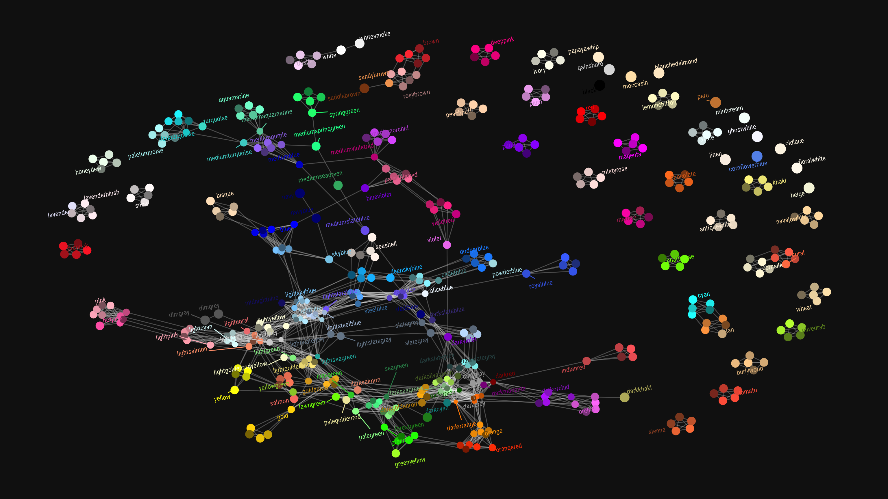
Though I am colorblind myself, I love to work with colors and color palettes in my visualizations. And I’ve come across quite some neat tricks in my time.
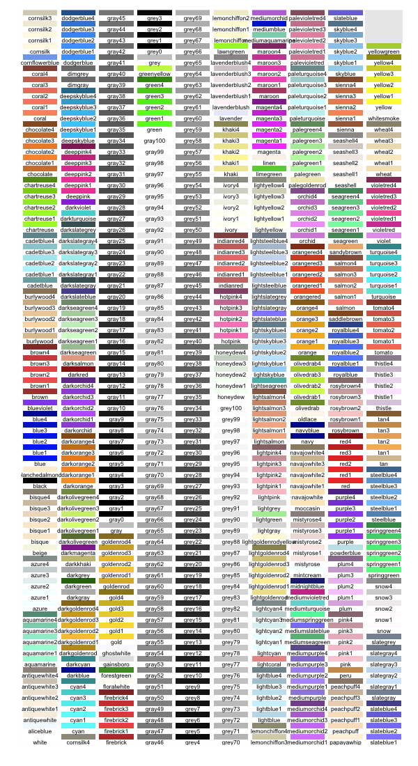
This last trick, I learned in this recent blog post I came across, by Chisato. She explored all colors() base R incorporates, using the new ggforce and ggraph packages (thank you Thomas Lin Petersen!). Her exploration resulted in some nice visual overviews, which you can view in more detail in the original blog here.
Colors() with no color familyColors() that have at least 5 colors in their familyColors() with similar names
Amy’s list includes many references to the best practices used by some of the leading data journalism companies, such as the BBC, or professional data companies like Salesforce and IBM.
As I’m worried that this great repository may not stand the test of time on the current Google Docs location, here are the base URLs once more:
A receiver operating characteristic (ROC) curve displays how well a model can classify binary outcomes. An ROC curve is generated by plotting the false positive rate of a model against its true positive rate, for each possible cutoff value. Often, the area under the curve (AUC) is calculated and used as a metric showing how well a model can classify data points.
If you’re interest in learning more about ROC and AUC, I recommend this short Medium blog, which contains this neat graphic:
Dariya Sydykova, graduate student at the Wilke lab at the University of Texas at Austin, shared some great visual animations of how model accuracy and model cutoffs alter the ROC curve and the AUC metric. The quotes and animations are from the associated github repository.
ROC & AUC
The plot on the left shows the distributions of predictors for the two outcomes, and the plot on the right shows the ROC curve for these distributions. The vertical line that travels left-to-right is the cutoff value. The red dot that travels along the ROC curve corresponds to the false positive rate and the true positive rate for the cutoff value given in the plot on the left.
The traveling cutoff demonstrates the trade-off between trying to classify one outcome correctly and trying to classify the other outcome correcly. When we try to increase the true positive rate, we also increase the false positive rate. When we try to decrease the false positive rate, we decrease the true positive rate.
The shape of an ROC curve changes when a model changes the way it classifies the two outcomes.
The animation [below] starts with a model that cannot tell one outcome from the other, and the two distributions completely overlap (essentially a random classifier). As the two distributions separate, the ROC curve approaches the left-top corner, and the AUC value of the curve increases. When the model can perfectly separate the two outcomes, the ROC curve forms a right angle and the AUC becomes 1.
Precision-Recall
Two other metrics that are often used to quantify model performance are precision and recall.
Precision (also called positive predictive value) is defined as the number of true positives divided by the total number of positive predictions. Hence, precision quantifies what percentage of the positive predictions were correct: How correct your model’s positive predictions were.
Recall (also called sensitivity) is defined as the number of true positives divided by the total number of true postives and false negatives (i.e. all actual positives). Hence, recall quantifies what percentage of the actual positives you were able to identify: How sensitive your model was in identifying positives.
Dariya also made some visualizations of precision-recall curves:
Precision-recall curves also displays how well a model can classify binary outcomes. However, it does it differently from the way an ROC curve does. Precision-recall curve plots true positive rate (recall or sensitivity) against the positive predictive value (precision).
In the middle, here below, the ROC curve with AUC. On the right, the associated precision-recall curve.
Similarly to the ROC curve, when the two outcomes separate, precision-recall curves will approach the top-right corner. Typically, a model that produces a precision-recall curve that is closer to the top-right corner is better than a model that produces a precision-recall curve that is skewed towards the bottom of the plot.
Class imbalance
Class imbalance happens when the number of outputs in one class is different from the number of outputs in another class. For example, one of the distributions has 1000 observations and the other has 10. An ROC curve tends to be more robust to class imbalanace that a precision-recall curve.
In this animation [below], both distributions start with 1000 outcomes. The blue one is then reduced to 50. The precision-recall curve changes shape more drastically than the ROC curve, and the AUC value mostly stays the same. We also observe this behaviour when the other disribution is reduced to 50.
Here’s the same, but now with the red distribution shrinking to just 50 samples.
Dariya invites you to use these visualizations for educational purposes:
Please feel free to use the animations and scripts in this repository for teaching or learning. You can directly download the gif files for any of the animations, or you can recreate them using these scripts. Each script is named according to the animation it generates (i.e. animate_ROC.r generates ROC.gif, animate_SD.r generates SD.gif, etc.).
Want to learn more about the different evaluation metrics for machine learning? Here’s a nice how-to guide by Neptune.ai demonstrating different metrics applied in Python.


