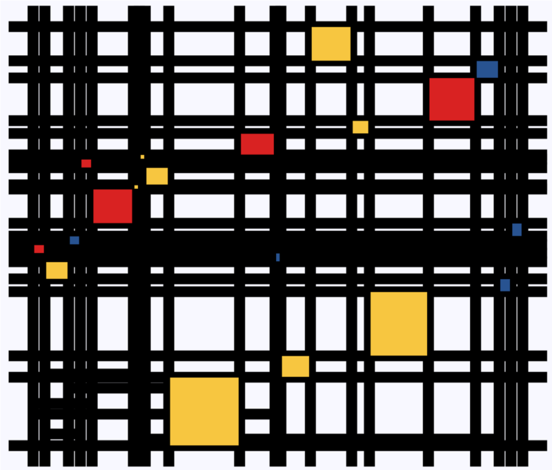
In a recent post, Claus shared the link to a GitHub repository where he hosts some of the R programming code with which Claus made the graphics for his dataviz book. The repository is named practical ggplot2, after the R package Clause used to make many of his visuals.
Check it out, the page contains some pearls and the code behind them, which will help you learn to create fabulous visualizations yourself. Some examples:
Data visualizations that make smart use of icons have a way of conveying information that sticks. Dataviz professionals like Moritz Stefaner know this and use the practice in their daily work.
A recent #tidytuesday entry by Georgios Karamanis demonstrates how easy it is to integrate visual icons in your data figures when you write code in R. You can simply store the URL location of an icon as a data column, and map it to an aesthetic using the ggplot2::geom_image function.
Do have a closer look at Georgios’ github repository for week 21 of tidytuesday. You will probably have to alter the code a bit to get it to work. though!
For those who haven’t moved away from base R plotting functions yet, here’s a good StackOverflow item showing how to use icons in both base R and tidyverse.
Disclaimer: This page contains one or more links to Amazon. Any purchases made through those links provide us with a small commission that helps to host this blog.
Data visualization and the (in)effective communication of information are salient topics on this blog. I just love to read and write about best practices related to data visualization (or bad practices), or to explore novel types of complex graphs. However, I am not always online, and I am equally fond of reading about data visualization offline.
These amazing books about data visualization are written by some of the leading experts in the dataviz scene:
Maarten Lambrechts is a data journalist I closely follow online, with great delight. Recently, he shared on Twitter his slidedeck on the 18 most common data visualization pitfalls. You will probably already be familiar with most, but some (like #14) were new to me:
Save pies for dessert
Don’t cut bars
Don’t cut time axes
Label directly
Use colors deliberately
Avoid chart junk
Scale circles by area
Avoid double axes
Correlation is no causality
Don’t do 3D
Sort on the data
Tell the story
1 chart, 1 message
Common scales on small mult’s
#Endrainbow
Normalise data on maps
Sometimes best map is no map
All maps lie
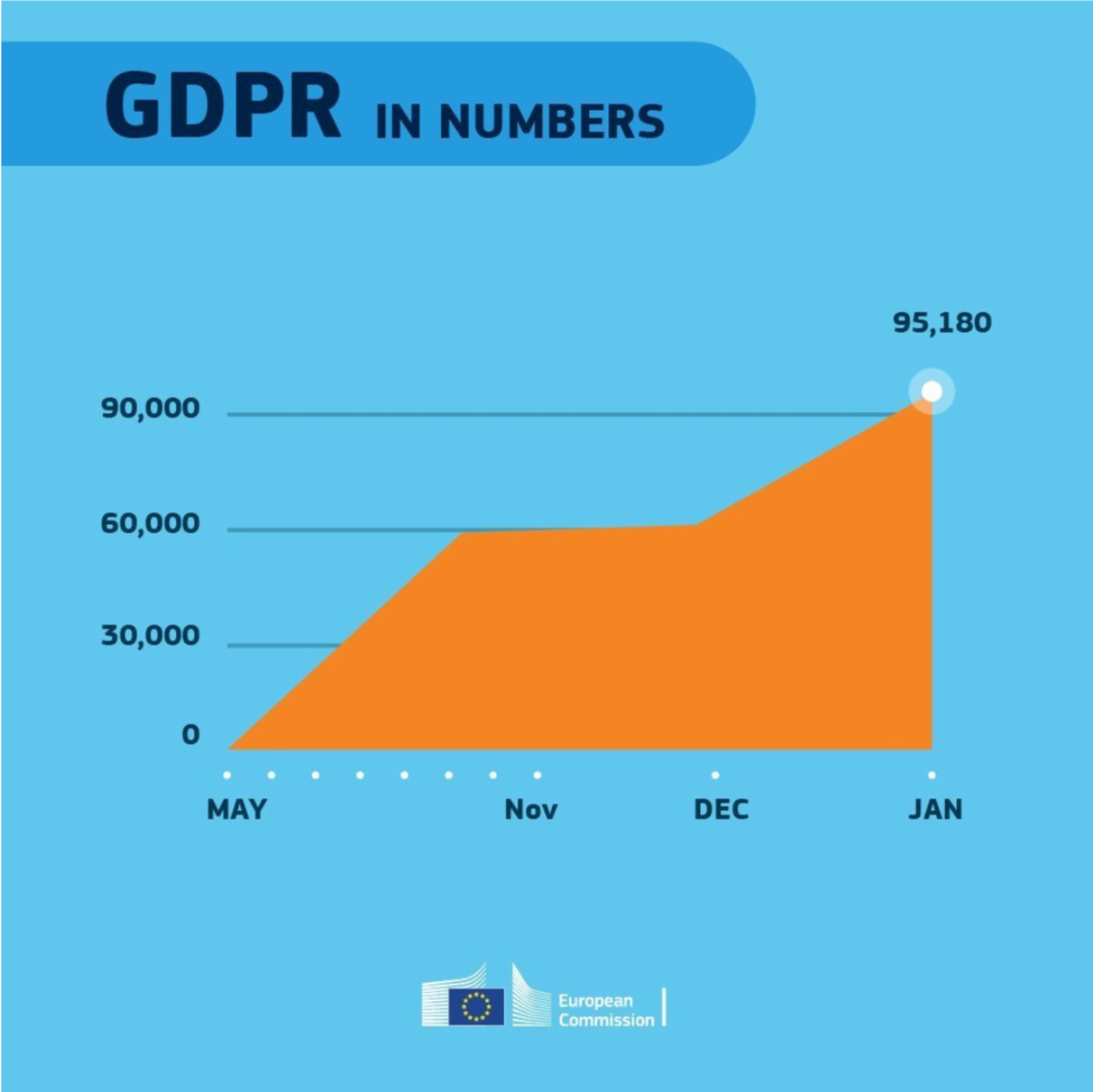
Even though most of these 18 rules below seem quite obvious, even the European Commissions seems to break them every now and then:
With great pleasure I’ve studied and worked in the field of people analytics, where we seek to leverage employee, management-, and business information to better organize and manage our personnel. Here, data has proven valuable itself indispensible for the organization of the future.
Data and analytics have not traditionally been high on the list of HR professionals. Fortunately, there is an increased awareness that the 21st century (HR) manager has to be data-savvy. But where to start learning? The plentiful available resources can be daunting…
Have a look at these 100+ amazing books for (starting) people analytics specialists. My personal recommendations are included as pictures, but feel free to ask for more detailed suggestions!
Categories (clickable)
Behavioural Psychology: focus on behavioural psychology and economics, including decision-making and the biases therein.
Technology: focus on the implications of new technology….
Ethics: … on society and humanity, and what can go wrong.
Digital & Data-driven HR: … for the future of work, workforce, and organization. Includes people analytics case studies.
Management: focus on industrial and organizational psychology, HR, leadership, and business strategy.
Statistics: focus on the technical books explaining statistical concepts and applied data analysis.
People analytics: …. more technical books on how to conduct people analytics studies step-by-step in (statistical) software.
Programming: … technical books specifically aimed at (statistical) programming and data analysis.
Communication: focus on information exchange, presentation, and data visualization.
Disclaimer: This page contains one or more links to Amazon. Any purchases made through those links provide us with a small commission that helps to host this blog.
I want to thank the active people analytics community, publishing in management journals, but also on social media. I knew Littral Shemer Haim already hosted a people analytics reading list, and so did Analytics in HR (Erik van Vulpen) and Workplaceif (Manoj Kumar). After Jared Valdron called for book recommendation on people analytics on LinkedIn, and nearly 60 people replied, I thought let’s merge these overviews.
Hence, a big thank you and acknowledgement to all those who’ve contributed directly or indirectly. I hope this comprehensive merged overview is helpful.
2018 seemed to be the year of challengesgoing viral on the web. Most of them were plain stupid and/or dangerous. However, one viral challenge I did like: #100DaysOfCode
1. Code minimum an hour every day for the next 100 days.
2. Tweet your progress every day with the #100DaysOfCode hashtag.
3. Each day, reach out to at least two people on Twitter who are also doing the challenge
Many (aspiring) programming professionals competed in this challenge, sharing their learning journeys in domains from web development, machine learning, or data visualization.
With this blog, I wanted to share two of those learning journeys that stood out for me.
Machine learning
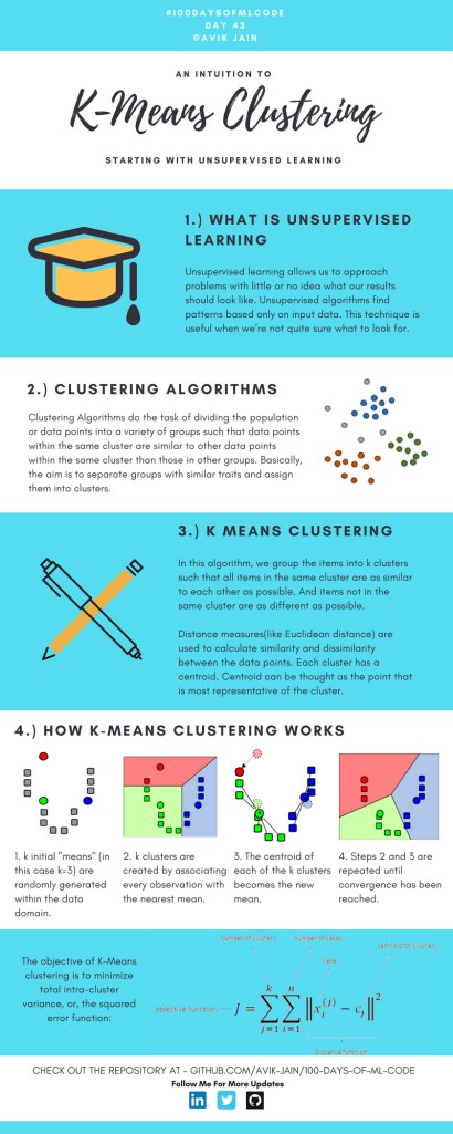
First, there’s Avik Jain’s 100 days of Machine Learning code repository on Github. Avik’s repository contains all learning activities he followed during the 53 days of programming he completed. Some of Avik’s entries really stood out, and I particularly liked his educational infographics:
Just look at the wonderful design and visual aids on this decision tree for dummies infographic, pseudocode and all:
Day 23: Decision trees for dummies. This just looks fabulous right?!
Although Avik didn’t seem to have completed the full 100 days, many others did.
Data visualization
I have blogged about Hannah Yan Han‘s 100 days of code project before, but she definately deserves another mention here. Her 100 days revolved around data science, data visualization, and storytelling using both R and Python. You can find her #100DaysOfCode Medium page here, and her associated Github repository here.
For example, one day Hannah explored where instant noodles come from, how they are served, and whether people like them or not.
What I found so great about Hannah’s project is that she picked a novel dataset every couple of days. Moreover, she used a extremely large variety of different visualization formats. All visuals were equally beautiful, but Hannah made sure to pick the right one for the purpose she was trying to serve. If you are interested in data visualization, you seriously should check out Hannah’s 100DaysOfCode Medium page.