Tag: science

10 Simple Rules for Better Data Visualizations

10 Simple Rules for Better Data Visualizations

Nicolas Rougier, Michael Droettboom, Philip Bourne wrote an open access article for the Public Library of Open Science (PLOS) in 2014, proposing ten simple rules for better figures. Below I posted these 10 rules and quote several main sentences extracted from the original article.

Rule 1: Know Your Audience

It is important to identify, as early as possible in the design process, the audience and the message the visual is to convey. The graphical design of the visual should be informed by this intent. […] The general public may be the most difficult audience of all since you need to design a simple, possibly approximated, figure that reveals only the most salient part of your research.

Rule 2: Identify Your Message

It is important to clearly identify the role of the figure, i.e., what is the underlying message and how can a figure best express this message? […] Only after identifying the message will it be worth the time to develop your figure, just as you would take the time to craft your words and sentences when writing an article only after deciding on the main points of the text.

Rule 3: Adapt the Figure to the Support Medium

Ideally, each type of support medium requires a different figure, and you should abandon the practice of extracting a figure from your article to be put, as is, in your oral presentation. […] For example, during an oral presentation, a figure will be displayed for a limited time. Thus, the viewer must quickly understand what is displayed and what it represents while still listening to your explanation.

Rule 4: Captions Are Not Optional

The caption explains how to read the figure and provides additional precision for what cannot be graphically represented. This can be thought of as the explanation you would give during an oral presentation, or in front of a poster, but with the difference that you must think in advance about the questions people would ask. […] if there is a point of interest in the figure (critical domain, specific point, etc.), make sure it is visually distinct but do not hesitate to point it out again in the caption.

Rule 5: Do Not Trust the Defaults

All plots require at least some manual tuning of the different settings to better express the message, be it for making a precise plot more salient to a broad audience, or to choose the best colormap for the nature of the data.

Rule 6: Use Color Effectively

As explained by Edward Tufte [1], color can be either your greatest ally or your worst enemy if not used properly. If you decide to use color, you should consider which colors to use and where to use them. […] However, if you have no such need, you need to ask yourself, “Is there any reason this plot is blue and not black?”

Rule 7: Do Not Mislead the Reader

What distinguishes a scientific figure from other graphical artwork is the presence of data that needs to be shown as objectively as possible. […] As a rule of thumb, make sure to always use the simplest type of plots that can convey your message and make sure to use labels, ticks, title, and the full range of values when relevant.

journal.pcbi.1003833.g006[2].png
Example from the paper on how visualization parameters can convey a misleading message.

Rule 8: Avoid “Chartjunk”

Chartjunk refers to all the unnecessary or confusing visual elements found in a figure that do not improve the message (in the best case) or add confusion (in the worst case). For example, chartjunk may include the use of too many colors, too many labels, gratuitously colored backgrounds, useless grid lines, etc. The term was first coined by Edward Tutfe [1]; he argues that any decorations that do not tell the viewer something new must be banned: “Regardless of the cause, it is all non-data-ink or redundant data-ink, and it is often chartjunk.” Thus, in order to avoid chartjunk, try to save ink, or electrons in the computing era.

Rule 9: Message Trumps Beauty

There exists a myriad of online graphics in which aesthetic is the first criterion and content comes in second place. Even if a lot of those graphics might be considered beautiful, most of them do not fit the scientific framework. Remember, in science, message and readability of the figure is the most important aspect while beauty is only an option.

Rule 10: Get the Right Tool

  • Matplotlib is a python plotting library, primarily for 2-D plotting, but with some 3-D support, which produces publication-quality figures in a variety of hardcopy formats and interactive environments across platforms. It comes with a huge gallery of examples that cover virtually all scientific domains (http://matplotlib.org/gallery.html).
  • is a language and environment for statistical computing and graphics. R provides a wide variety of statistical (linear and nonlinear modeling, classical statistical tests, time-series analysis, classification, clustering, etc.) and graphical techniques, and is highly extensible.
  • Inkscape is a professional vector graphics editor. It allows you to design complex figures and can be used, for example, to improve a script-generated figure or to read a PDF file in order to extract figures and transform them any way you like.
  • TikZ and PGF are TeX packages for creating graphics programmatically. TikZ is built on top of PGF and allows you to create sophisticated graphics in a rather intuitive and easy manner, as shown by the Tikz gallery (http://www.texample.net/tikz/examples/all/).
  • GIMP is the GNU Image Manipulation Program. It is an application for such tasks as photo retouching, image composition, and image authoring. If you need to quickly retouch an image or add some legends or labels, GIMP is the perfect tool.
  • ImageMagick is a software suite to create, edit, compose, or convert bitmap images from the command line. It can be used to quickly convert an image into another format, and the huge script gallery (http://www.fmwconcepts.com/imagemagick/index.php) by Fred Weinhaus will provide virtually any effect you might want to achieve.
  • D3.js (or just D3 for Data-Driven Documents) is a JavaScript library that offers an easy way to create and control interactive data-based graphical forms which run in web browsers, as shown in the gallery at http://github.com/mbostock/d3/wiki/Gallery.
  • Cytoscape is a software platform for visualizing complex networks and integrating these with any type of attribute data. If your data or results are very complex, cytoscape may help you alleviate this complexity.
  • Circos was originally designed for visualizing genomic data but can create figures from data in any field. Circos is useful if you have data that describes relationships or multilayered annotations of one or more scales.

You can download the PDF version of the full article here.

[1] Tufte EG (1983) The Visual Display of Quantitative Information. Cheshire, Connecticut: Graphics Press.


Computers decode what humans see: Generating images from brain activity

Computers decode what humans see: Generating images from brain activity

I recently got pointed towards a 2017 paper on bioRxiv that blew my mind: three researchers at the Computational Neuroscience Laboratories at Kyoto, Japan, demonstrate how they trained a deep neural network to decode human functional magnetic resonance imaging (fMRI) patterns and then generate the stimulus images.

In simple words, the scholars used sophisticated machine learning to reconstruct the photo’s their research particpants saw based on their brain activity… INSANE! The below shows the analysis workflow, and an actual reconstructed image. More reconstructions follow further on.

1.PNG
Figure 1 | Deep image reconstruction. Overview of deep image reconstruction is shown. The pixels’ values of the input image are optimized so that the DNN features of the image are similar to those decoded from fMRI activity. A deep generator network (DGN) is optionally combined with the DNN to produce natural-looking images, in which optimization is performed at the input space of the DGN. [original]
Three healthy young adults participated in two types of experiments: an image presentation experiment and an imagery experiment.

In the image presentation experiments, participants were presented with several natural images from the ImageNet database, with 40 images geometrical shapes, and with 10 images of black alphabetic characters. These visual stimuli were rear-projected onto a screen in an fMRI scanner bore. Data from each subject were collected over multiple scanning sessions spanning approximately 10 months. Images were flashed at 2 Hz for several seconds. In the imagery experiment, subjects were asked to visually imagine / remember one of 25 images of the presentation experiments. Subjects were
required to start imagining a target image after seeing some cue words.

In both experimental setups, fMRI data were collected using 3.0-Tesla Siemens MAGNETOM Verio scanner located at the Kokoro Research Center, Kyoto University.

The results, some of which I copied below, are plainly amazing.

2.PNG
Figure 2 | Seen natural image reconstructions. Images with black and gray frames show presented and reconstructed images, respectively (reconstructed from VC activity). a) Reconstructions utilizing the DGN (using DNN1–8). Three reconstructed images
correspond to reconstructions from three subjects. b) Reconstructions with and without the DGN (DNN1–8). The first, second, and third rows show presented images, reconstructions with and without the DGN, respectively. c) Reconstruction quality of seen natural images (error bars, 95% confidence interval (C.I.) across samples; three subjects pooled; chance level, 50%). d)  Reconstructions using different combinations of DNN layers (without the DGN). e) Subjective assessment of reconstructions from different combinations of DNN layers (error bars, 95% C.I. across samples) [original]
3.PNG
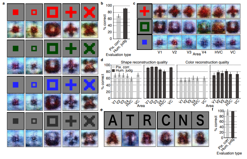
Figure 3 | Seen artificial shape reconstructions. Images with black and gray frames show presented and reconstructed images (DNN 1–8, without the DGN). a) Reconstructions for seen colored artificial shapes (VC activity). b, Reconstruction quality of colored artificial shapes. c) Reconstructions of colored artificial shapes obtained from multiple visual areas. d) Reconstruction quality of shape and colors for different visual areas. e) Reconstructions of alphabetical letters. f) Reconstruction quality for alphabetical letters. For b, d, f, error bars  indicate 95% C.I. across samples (three subjects pooled; chance level, 50%)  [original]
4
Supplementary Figure 2 | Other examples of natural image reconstructions obtained with the DGN. Images with black and gray frames show presented and reconstructed images, respectively (reconstructed from VC activity using all DNN layers). Three reconstructed images correspond to reconstructions from three subjects. [original]
5.PNG
Supplementary Figure 3 | Reconstructions through optimization processes. Reconstructed images obtained through the optimization processes are shown (reconstructed from VC activity of Subject 1 using all DNN layers and the DGN). Images with black and gray frames show presented and reconstructed images, respectively. [original]
There were many more examples of reconstructed images, as well as much more detailed information regarding the machine learning approach and experimental setup, so I strongly advise you check out the orginal paper.

I can’t even imagine what such technology would imply for society… Proper minority report stuff here.

Here’s the abstract as an additional teaser:

Abstract

Machine learning-based analysis of human functional magnetic resonance imaging
(fMRI) patterns has enabled the visualization of perceptual content. However, it has been limited to the reconstruction with low-level image bases (Miyawaki et al., 2008; Wen et al., 2016) or to the matching to exemplars (Naselaris et al., 2009; Nishimoto et al., 2011). Recent work showed that visual cortical activity can be decoded (translated) into hierarchical features of a deep neural network (DNN) for the same input image, providing a way to make use of the information from hierarchical visual features (Horikawa & Kamitani, 2017). Here, we present a novel image reconstruction method, in which the pixel values of an image are optimized to make its DNN features similar to those decoded from human brain activity at multiple layers. We found that the generated images resembled the stimulus images (both natural images and artificial shapes) and the subjective visual content during imagery. While our model was solely trained with natural images, our method successfully generalized the reconstruction to artificial shapes, indicating that our model indeed ‘reconstructs’ or ‘generates’ images from brain activity, not simply matches to exemplars. A natural image prior introduced by another deep neural network effectively rendered semantically meaningful details to reconstructions by constraining reconstructed images to be similar to natural images. Furthermore, human judgment of reconstructions suggests the effectiveness of combining multiple DNN layers to enhance visual quality of generated images. The results suggest that hierarchical visual information in the brain can be effectively combined to reconstruct perceptual and subjective images.

Bayesian data analysis for newcomers

Bayesian data analysis for newcomers

Professor John Kruschke and Torrin Liddell – one of his Ph.D. students at Indiana University – wrote a fantastically useful scientific paper introducing Bayesian data analysis to the masses. Kruschke and Liddell explain the main ideas behind Bayesian statistics, how Bayesians deal with continuous and binary variables, how to use and set meaningful priors, the differences between confidence and credibility intervals, how to perform model comparison tests, and many more. The paper is published open access so you can read it here.

I found it incredibly useful, providing me with a better understanding of how Bayesian analysis works, what kind of questions you can answer with it, and what the resulting insights would comprise of. After reading it, I was honestly asking myself why I don’t use Bayesian methods more often… So what’s next, how to learn more?


Simpson’s Paradox: Two HR examples with R code.

Simpson’s Paradox: Two HR examples with R code.

Simpson (1951) demonstrated that a statistical relationship observed within a population—i.e., a group of individuals—could be reversed within all subgroups that make up that population. This phenomenon, where X seems to relate to Y in a certain way, but flips direction when the population is split for W, has since been referred to as Simpson’s paradox. Others names, according to Wikipedia, include the Simpson-Yule effect, reversal paradox or amalgamation paradox.

The most famous example has to be the seemingly gender-biased Berkeley admission rates:

“Examination of aggregate data on graduate admissions to the University of California, Berkeley, for fall 1973 shows a clear but misleading pattern of bias against female applicants. Examination of the disaggregated data reveals few decision-making units that show statistically significant departures from expected frequencies of female admissions, and about as many units appear to favor women as to favor men. If the data are properly pooled, taking into account the autonomy of departmental decision making, thus correcting for the tendency of women to apply to graduate departments that are more difficult for applicants of either sex to enter, there is a small but statistically significant bias in favor of women. […] The bias in the aggregated data stems not from any pattern of discrimination on the part of admissions committees, which seem quite fair on the whole, but apparently from prior screening at earlier levels of the educational system.” – part of abstract of Bickel, Hammel, & O’Connel (1975)

In a table, the effect becomes clear. While it seems as if women are rejected more often overall, women are actually less often rejected on a departmental level. Women simply applied to more selective departments more often (E & C below), resulting in the overall lower admission rate for women (35% as opposed to 44% for men).

Afbeeldingsresultaat voor berkeley simpson's paradox
Copied from Bits of Pi

Examples in HR

Simpsons Paradox can easily occur in organizational or human resources settings as well. Let me run you through two illustrated examples, I simulated:

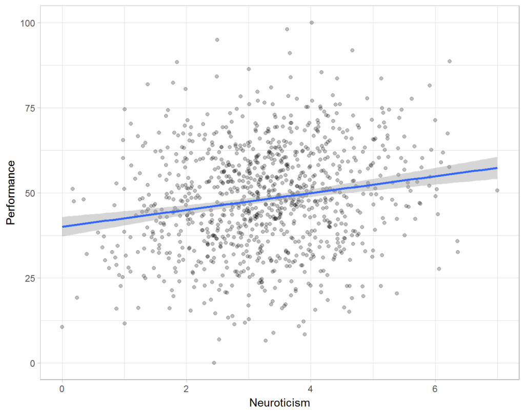
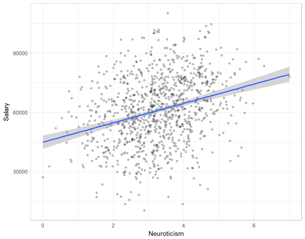
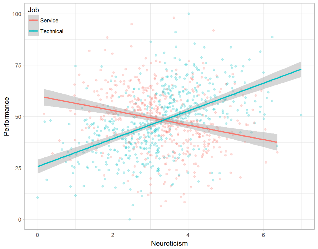
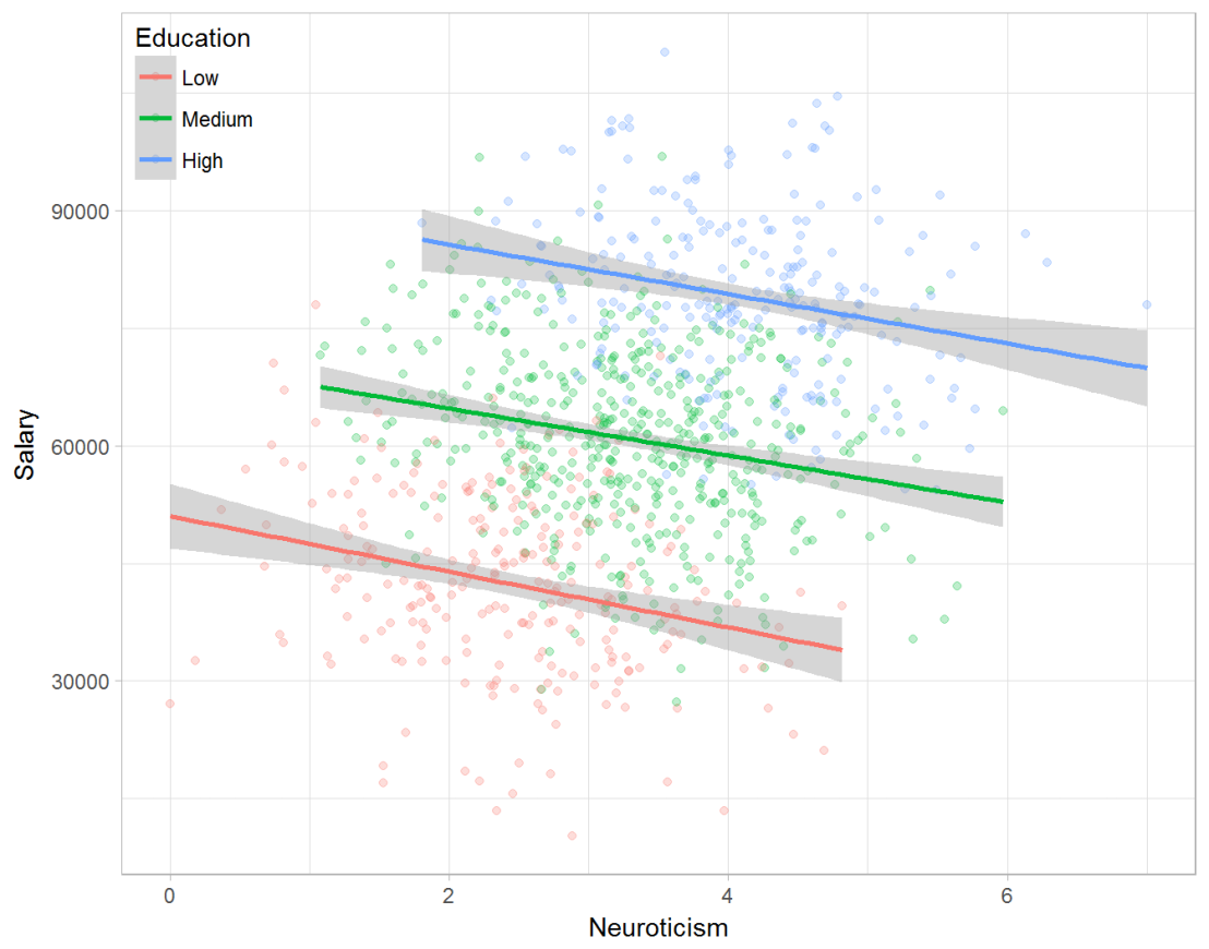
Assume you run a company of 1000 employees and you have asked all of them to fill out a Big Five personality survey. Per individual, you therefore have a score depicting his/her personality characteristic Neuroticism, which can run from 0 (not at all neurotic) to 7 (very neurotic). Now you are interested in the extent to which this Neuroticism of employees relates to their Job Performance (measured 0 – 100) and their Salary (measured in Euro’s per Year). In order to get a sense of the effects, you may decide to visualize both these relations in scatter plots:

downloaddownload (6)

From these visualizations it would look like Neuroticism relates significantly and positively to both employees’ performance and their yearly salary. Should you select more neurotic people to improve your overall company performance? Or are you discriminating emotionally-stable (non-neurotic) employees when it comes to salary?

Taking a closer look at the subgroups in your data, you might however find very different relationships. For instance, the positive relationship between neuroticism and performance may only apply to technical positions, but not to those employees’ in service-oriented jobs.

download (7).png

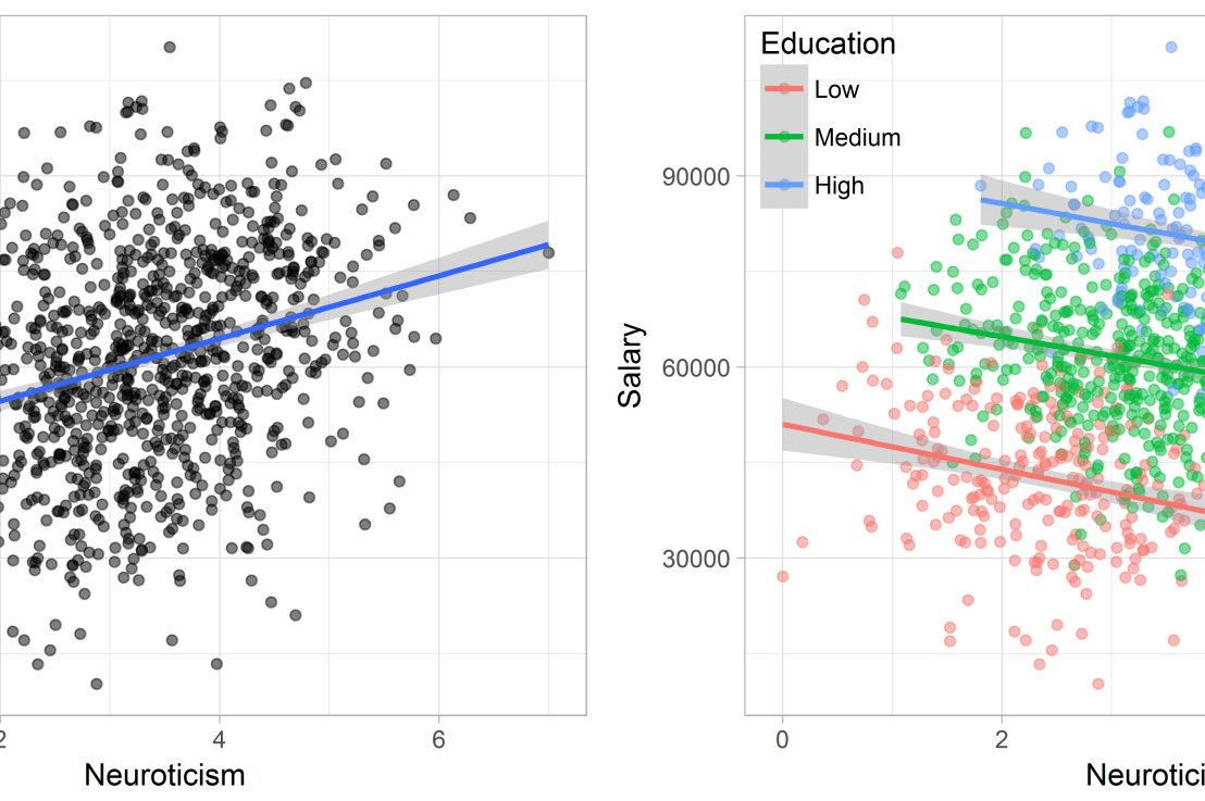
Similarly, splitting the employees by education level, it becomes clear that there is a relationship between neuroticism and education level that may explain the earlier association with salary. More educated employees receive higher salaries and within these groups, neuroticism is actually related to lower yearly income.

download (8).png

If you’d like to see the code used to simulate these data and generate the examples, you can find the R markdown file here on Rpubs.

Solving the paradox

Kievit and colleagues (2013) argue that Simpsons paradox may occur in a wide variety of research designs, methods, and questions, particularly within the social and medical sciences. As such, they propose several means to “control” or minimize the risk of it occurring. The paradox may be prevented from occurring altogether by more rigorous research design: testing mechanisms in longitudinal or intervention studies. However, this is not always feasible. Alternatively, the researchers pose that data visualization may help recognize the patterns and subgroups and thereby diagnose paradoxes. This may be easy if your data looks like this:

An external file that holds a picture, illustration, etc. Object name is fpsyg-04-00513-g0001.jpg

But rather hard, or even impossible, when your data looks more like the below:

An external file that holds a picture, illustration, etc. Object name is fpsyg-04-00513-g0003.jpg

Clustering may nevertheless help to detect Simpson’s paradox when it is not directly observable in the data. To this end, Kievit and Epskamp (2012) have developed a tool to facilitate the detection of hitherto undetected patterns of association in existing datasets. It is written in R, a language specifically tailored for a wide variety of statistical analyses which makes it very suitable for integration into the regular analysis workflow. As an R package, the tool is is freely available and specializes in the detection of cases of Simpson’s paradox for bivariate continuous data with categorical grouping variables (also known as Robinson’s paradox), a very common inference type for psychologists. Finally, its code is open source and can be extended and improved upon depending on the nature of the data being studied.

One example of application is provided in the paper, for a dataset on coffee and neuroticism. A regression analysis would suggest a significant positive association between coffee and neuroticism overall. However, when the detection algorithm of the R package is applied, a different picture appears: the analysis shows that there are three latent clusters present and that the purported positive relationship only holds for one cluster whereas it is negative in the others.

An external file that holds a picture, illustration, etc. Object name is fpsyg-04-00513-g0006.jpg

Update 24-10-2017: minutephysics – one of my favorite YouTube channels – uploaded a video explaining Simpson’s paradox very intuitively in a medical context:

Update 01-11-2017: minutephysics uploaded a follow-up video:

The paradox is that we remain reluctant to fight our bias, even when they are put in plain sight.

TACIT: An open-source Text Analysis, Crawling, and Interpretation Tool

Click here for the original PDF: TACIT 2017


The first programs for (scientific) text mining are already over 50 years old. More recent efforts, such as the Linguistic Inquiry Word Count (LIWC; Tausczik & Pennebaker, 2010), have greatly improved our text analytical capabilities. Moreover, several single-purpose programs have been developed, which also consider syntactic text structures (e.g., Syntactic Complexity Analyzer [Lu, 2010], TAALES [Kyle & Crossley, 2015]).However, the widespread use of many of these programs has been hampered by two major barriers.

First, considerable technical expertise is required, which obstructs researchers without statistical backgrounds. For example, packages such as tm in R (Meyer et al., 2015) have been developed to conduct natural-language processing, but the steep learning curve forms a challenge. Additionally, the constant increase of computational processing power and the proliferation of new algorithms makes it difficult for researchers to maintain working knowledge of state-of-the-art methods.

Alternatively, most of the existing user-friendly NLP programs (and packages), such as RapidMiner (Akthar & Hahne, 2012), SAS Text Miner (Abell, 2014), or SPSS Modeler (IBM Corp., 2011), charge either a large software fee up front or a subscription fee. The cost of these programs can be prohibitively expensive for junior researchers and researchers looking to integrate new techniques into their research toolbox.

In the attached article, TACIT is introduced: Text Analysis, Crawling and Investigation Tool. TACIT is an open-source architecture that establishes a pipeline between the various stages of text-based research by integrating tools for text mining, data cleaning, and analysis under a single user-friendly architecture. In addition to being prepackaged with a range of easily applied, cutting-edge methods, TACIT’s design also allows other researchers to write their own plugins.

The authors’ hope is that TACIT can facilitate the integration and use of advancements in computational linguistics in psychological research, and by doing so can help researchers make use of the ever-growing documents of our social discourse in ways that have previously not been possible.