Tag: statistics

Glossary of Statistical Terminology

Frank Harrel shared this 16-page glossary of statistical terminology created by the Department of Biostatistics of Vanderbilt University School of Medicine. The overview touches on everything from Bayes’ Theorem to p-values, explaining matters in just the right detail. Various study designs and model types are also discussed so it might just come in handy for a quick review or just to browse through and see what you might have missed past years.

An extract from the glossary
Avoid bar plots for continuous data! Do this instead:

Avoid bar plots for continuous data! Do this instead:

Tracey Weissgerber, Natasa Milic, Stacey Winham, and Vesna Garovic wrote this interesting 2015 paper on bar graphs. By a systematic review of physiology research, they demonstrate we need to reconsider how we present continuous data in small samples.

Bar and line plots are commonly used to display continuous data. This is problematic, as many different data distributions can lead to the same bar or line graph. Nevertheless, the rarely used scatterplots, box plots, and histograms much better allow users to critically evaluate continuous data.

They provide many interesting visuals that underline their argument.

For instance, the four datasets below (B, C, D, and E) will all result in the same barplot (A), whereas they demonstrate quite different characteristics.

Alternatively, bar plots are often used for to display group means when observations within groups may not be independent. For instance, it could be that the bars below represent two measurement occassians, and that each of our sampled observations occurs in both. In that case, the scatterplots with connected dots may be more suitable. While the bars in plot A would represent datasets B, C, and D, these are clearly different when viewed in scatterplots. 

Also, a lot of meaningful information is typically lost in bar plots. For instance, the number of observations in a group. But also the distribution of values. While the former can be added (see B below), the latter can much better be shown in a scatter plot like C (below).

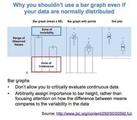
Actually, in a later blog post, lead researcher Tracey Weissgerber  shares the below visual. It highlights the distractive irrelevance of bar plot and the information that is lost (becomes invisible) when opting for a bar chart.

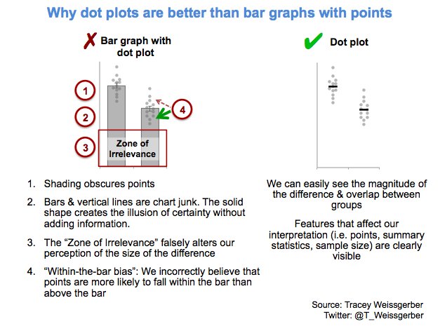
Tracey refactored this into a similar visual of her own:

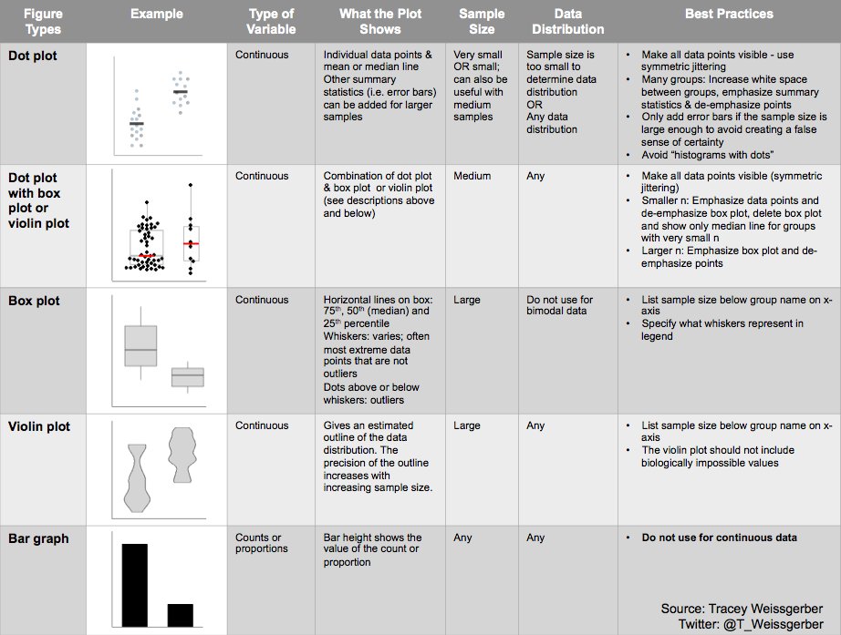
So what can you do instead, you may ask yourself. To this question too, Tracey has an answer, sharing the below overview of alternatives options:

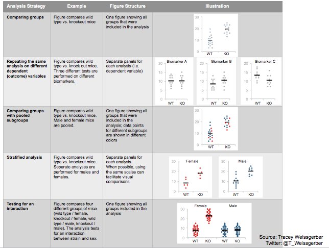
She made another overview which may help you pick the best visual for your data. This one takes your intention behind the visual as a starting point, though is unfortunately a bit low quality:

Animated Citation Gates turned into Selection Gates

Bret Beheim — senior researcher at the Max Planck Institute for Evolutionary Anthropology — posted a great GIF animation of the response to his research survey. He calls the figure citation gates, relating the year of scientific publication to the likelihood that the research materials are published open-source or accessible.

To generate the visualization, Bret used R’s base plotting functionality combined with Thomas Lin Pedersen‘s R package tweenrto animate it.

Bret shared his R code for the above GIF of his citation gates on GitHub. With the open source code, this amazing visual display inspired others to make similar GIFs for their own projects. For example, Anne-Wil Kruijt’s dance of the confidence intervals:

A spin-off of the citation gates: A gif showing confidence intervals of sample means.

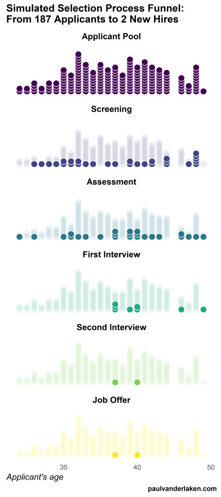
Applied to a Human Resource Management context, we could use this similar animation setup to explore, for instance, recruitment, selection, or talent management processes.

Unfortunately, I couldn’t get the below figure to animate properly yet, but I am working on it (damn ggplot2 facets). It’s a quick simulation of how this type of visualization could help to get insights into the recruitment and selection process for open vacancies.

The figure shows how nearly 200 applicants — sorted by their age — go through several selection barriers. A closer look demonstrates that some applicants actually skip the screening and assessment steps and join via a fast lane in the first interview round, which could happen, for instance, when there are known or preferred internal candidates. When animated, such insights would become more clearly visible.

Tidy Missing Data Handling

Tidy Missing Data Handling

A recent open access paper by Nicholas Tierney and Dianne Cook — professors at Monash University — deals with simpler handling, exploring, and imputation of missing values in data.They present new methodology building upon tidy data principles, with a goal to integrating missing value handling as an integral part of data analysis workflows. New data structures are defined (like the nabular) along with new functions to perform common operations (like gg_miss_case).

These new methods have bundled among others in the R packages naniar and visdat, which I highly recommend you check out. To put in the author’s own words:

The naniar and visdat packages build on existing tidy tools and strike a compromise between automation and control that makes analysis efficient, readable, but not overly complex. Each tool has clear intent and effects – plotting or generating data or augmenting data in some way. This reduces repetition and typing for the user, making exploration of missing values easier as they follow consistent rules with a declarative interface.

The below showcases some of the highly informational visuals you can easily generate with naniar‘s nabulars and the associated functionalities.

For instance, these heatmap visualizations of missing data for the airquality dataset. (A) represents the default output and (B) is ordered by clustering on rows and columns. You can see there are only missings in ozone and solar radiation, and there appears to be some structure to their missingness.

a.JPG

Another example is this upset plot of the patterns of missingness in the airquality dataset. Only Ozone and Solar.R have missing values, and Ozone has the most missing values. There are 2 cases where both Solar.R and Ozone have missing values.b.JPG

You can also generate a histogram using nabular data in order to show the values and missings in Ozone. Values are imputed below the range to show the number of missings in Ozone and colored according to missingness of ozone (‘Ozone_NA‘). This displays directly that there are approximately 35-40 missings in Ozone.

c.JPGAlternatively, scatterplots can be easily generated. Displaying missings at 10 percent below the minimum of the airquality dataset. Scatterplots of ozone and solar radiation (A), and ozone and temperature (B). These plots demonstrate that there are missings in ozone and solar radiation, but not in temperature.d.JPG

Finally, this parallel coordinate plot displays the missing values imputed 10% below range for the oceanbuoys dataset. Values are colored by missingness of humidity. Humidity is missing for low air and sea temperatures, and is missing for one year and one location.

e.JPG

Please do check out the original open access paper and the CRAN vignettes associated with the packages!


12 Guidelines for Effective A/B Testing

12 Guidelines for Effective A/B Testing

I wrote about Emily Robinson and her A/B testing activities at Etsy before, but now she’s back with a great new blog full of practical advice: Emily provides 12 guidelines for A/B testing that help to setup effective experiments and mitigate data-driven but erroneous conclusions:

  1. Have one key metric for your experiment.
  2. Use that key metric do a power calculation.
  3. Run your experiment for the length you’ve planned on.
  4. Pay more attention to confidence intervals than p-values.
  5. Don’t run tons of variants.
  6. Don’t try to look for differences for every possible segment.
  7. Check that there’s not bucketing skew.
  8. Don’t overcomplicate your methods.
  9. Be careful of launching things because they “don’t hurt”.
  10. Have a data scientist/analyst involved in the whole process.
  11. Only include people in your analysis who could have been affected by the change.
  12. Focus on smaller, incremental tests that change one thing at a time.

More details regarding each guideline you can read in Emily’s original blogpost.

In her blog, Emily also refers to a great article by Stephen Holiday discussing five online experiments that had (almost) gone wrong and a presentation by Dan McKinley on continuous experimentation.

Add a self-explantory legend to your ggplot2 boxplots

Add a self-explantory legend to your ggplot2 boxplots

Laura DeCicco found that non-R users keep asking her what her box plots exactly mean or demonstrate. In a recent blog post, she therefore breaks down the calculations into easy-to-follow chunks of code. Even better, she included the source code to make boxplots that come with a very elaborate default legend:

Chloride by month, styled.

As you can see, the above contains much more and easier to understand information than the original ggplot2 boxplot below.

ggplot2 defaults for boxplots.

Laura wrote the custom function ggplot_box_legend() (see source code below and in Laura’s blog), which uses the cowplot package to paste the explanation to the box plot. All you need to do is call the legend function just before you run your ggplot2 boxplot call.

ggplot_box_legend <- function(family = "serif"){
  
  # Create data to use in the boxplot legend:
  set.seed(100)

  sample_df <- data.frame(parameter = "test",
                        values = sample(500))

  # Extend the top whisker a bit:
  sample_df$values[1:100] <- 701:800
  # Make sure there's only 1 lower outlier:
  sample_df$values[1] <- -350
  
  # Function to calculate important values:
  ggplot2_boxplot <- function(x){
  
    quartiles <- as.numeric(quantile(x, 
                                     probs = c(0.25, 0.5, 0.75)))
    
    names(quartiles) <- c("25th percentile", 
                          "50th percentile\n(median)",
                          "75th percentile")
    
    IQR <- diff(quartiles[c(1,3)])
  
    upper_whisker <- max(x[x < (quartiles[3] + 1.5 * IQR)])
    lower_whisker <- min(x[x > (quartiles[1] - 1.5 * IQR)])
      
    upper_dots <- x[x > (quartiles[3] + 1.5*IQR)]
    lower_dots <- x[x < (quartiles[1] - 1.5*IQR)]
  
    return(list("quartiles" = quartiles,
                "25th percentile" = as.numeric(quartiles[1]),
                "50th percentile\n(median)" = as.numeric(quartiles[2]),
                "75th percentile" = as.numeric(quartiles[3]),
                "IQR" = IQR,
                "upper_whisker" = upper_whisker,
                "lower_whisker" = lower_whisker,
                "upper_dots" = upper_dots,
                "lower_dots" = lower_dots))
  }
  
  # Get those values:
  ggplot_output <- ggplot2_boxplot(sample_df$values)
  
  # Lots of text in the legend, make it smaller and consistent font:
  update_geom_defaults("text", 
                     list(size = 3, 
                          hjust = 0,
                          family = family))
  # Labels don't inherit text:
  update_geom_defaults("label", 
                     list(size = 3, 
                          hjust = 0,
                          family = family))
  
  # Create the legend:
  # The main elements of the plot (the boxplot, error bars, and count)
  # are the easy part.
  # The text describing each of those takes a lot of fiddling to
  # get the location and style just right:
  explain_plot <- ggplot() +     stat_boxplot(data = sample_df,                  aes(x = parameter, y=values),                  geom ='errorbar', width = 0.3) +     geom_boxplot(data = sample_df,                  aes(x = parameter, y=values),                   width = 0.3, fill = "lightgrey") +     geom_text(aes(x = 1, y = 950, label = "500"), hjust = 0.5) +     geom_text(aes(x = 1.17, y = 950,                   label = "Number of values"),               fontface = "bold", vjust = 0.4) +     theme_minimal(base_size = 5, base_family = family) +     geom_segment(aes(x = 2.3, xend = 2.3,                       y = ggplot_output[["25th percentile"]],                       yend = ggplot_output[["75th percentile"]])) +     geom_segment(aes(x = 1.2, xend = 2.3,                       y = ggplot_output[["25th percentile"]],                       yend = ggplot_output[["25th percentile"]])) +     geom_segment(aes(x = 1.2, xend = 2.3,                       y = ggplot_output[["75th percentile"]],                       yend = ggplot_output[["75th percentile"]])) +     geom_text(aes(x = 2.4, y = ggplot_output[["50th percentile\n(median)"]]),                label = "Interquartile\nrange", fontface = "bold",               vjust = 0.4) +     geom_text(aes(x = c(1.17,1.17),                    y = c(ggplot_output[["upper_whisker"]],                         ggplot_output[["lower_whisker"]]),                    label = c("Largest value within 1.5 times\ninterquartile range above\n75th percentile",                             "Smallest value within 1.5 times\ninterquartile range below\n25th percentile")),                   fontface = "bold", vjust = 0.9) +     geom_text(aes(x = c(1.17),                    y =  ggplot_output[["lower_dots"]],                    label = "Outside value"),                vjust = 0.5, fontface = "bold") +     geom_text(aes(x = c(1.9),                    y =  ggplot_output[["lower_dots"]],                    label = "-Value is >1.5 times and"), 
              vjust = 0.5) +
    geom_text(aes(x = 1.17, 
                  y = ggplot_output[["lower_dots"]], 
                  label = "<3 times the interquartile range\nbeyond either end of the box"), 
              vjust = 1.5) +
    geom_label(aes(x = 1.17, y = ggplot_output[["quartiles"]], 
                  label = names(ggplot_output[["quartiles"]])),
              vjust = c(0.4,0.85,0.4), 
              fill = "white", label.size = 0) +
    ylab("") + xlab("") +
    theme(axis.text = element_blank(),
          axis.ticks = element_blank(),
          panel.grid = element_blank(),
          aspect.ratio = 4/3,
          plot.title = element_text(hjust = 0.5, size = 10)) +
    coord_cartesian(xlim = c(1.4,3.1), ylim = c(-600, 900)) +
    labs(title = "EXPLANATION")

  return(explain_plot) 
  
}

ggplot_box_legend()