Searching and applying to jobs can be a costly activity, requiring many hours upon hours of perfecting your motivation letter and CV. Hence, it can be very frustrating to get ghosted (not receiving a reply) for a job. Luckily, Talent Works is able to give us some general tips when it comes to improving the success of your applications. You might remember them from their Interactive Map of the US Job Market.
Using a sample of about 1600 job applications, Talent Works recently conducted all kinds of statistical analyses to look at the hiring process. For instance, they examined the time it takes to get from the application stage to your first day on the job. Split out for various jobs, it seems Mechanical Engineers spend quite a while in the interview stage whereas Software developers are put to work within three weeks.
The numbers of days spent in each application stage per job (Talent.Works)
In a different analysis, Talent Works examined how to minimize your risk of getting ghosted on a job application. For instance, they found that during the “Golden Hours” (the first 96 hours after a job gets posted), your chances of getting an invitation for an interview are up to 8 times higher than afterwards.
If you submit a job application in the first 96 hours, you’re up to 8x more likely to get an interview. After that, every day you wait reduces your chances by 28% (Talent.Works)
Based on the above they come to the following three timeframes in the application cycle:
“Golden Hours”: Applications submitted between 2-4 days after a job is posted have the highest chance of getting an interview. Not only is there a difference, there’s a big difference: you have up to an 8x higher chance of getting an interview during this period, even if you’re submitting the same application.
Twilight Zone: Chances quickly decrease from OK to really bad: every day you wait after the “Golden Hours” reduces your chances by 28%. The longer you wait, the higher the risk that employers have already checked their inboxes and setup interviews with candidates that met their “good enough”-bar.
Resume Blackhole: According to Talent.Works it’s nearly not worth applying after 10 days. On average, job applications during this phase have a meager ~1.5% of getting an interview. Put another way, if you send out 50 job applications, you might hear back from one (if you’re lucky).
Next, Talent.Works investigated on a more granular level what would then be the best time to apply for a job.This resulted in the following figure
The best time to apply for a job is between 6am and 10am. During this time, you have an 13% chance of getting an interview — nearly 5x as if you applied to the same job after work. Whatever you do, don’t apply after 4pm (Talent.Works)
Again, they provide a summary of their conclusions:
The best time to apply for a job is between 6am and 10am. During this time, you have an 13% chance of getting an interview.
After that morning window, your interview odds start falling by 10% every 30 minutes. If you’re late, you’re going to pay dearly.
There’s a brief reprieve during lunchtime, where your odds climb back up to 11% at around 12:30pm but then start falling precipitously again.
The single-worst time to apply for a job is after work — if you apply at 7:30pm, you have less than a 3% chance of getting an interview.
If you want to see more, please visit Talent.Works. Here, you can let them process your CV and help you improve your hiring chances (see also this blog post).
Simpson (1951) demonstrated that a statistical relationship observed within a population—i.e., a group of individuals—could be reversed within all subgroups that make up that population. This phenomenon, where X seems to relate to Y in a certain way, but flips direction when the population is split for W, has since been referred to as Simpson’s paradox. Others names, according to Wikipedia, include the Simpson-Yule effect, reversal paradox or amalgamation paradox.
The most famous example has to be the seemingly gender-biased Berkeley admission rates:
“Examination of aggregate data on graduate admissions to the University of California, Berkeley, for fall 1973 shows a clear but misleading pattern of bias against female applicants. Examination of the disaggregated data reveals few decision-making units that show statistically significant departures from expected frequencies of female admissions, and about as many units appear to favor women as to favor men. If the data are properly pooled, taking into account the autonomy of departmental decision making, thus correcting for the tendency of women to apply to graduate departments that are more difficult for applicants of either sex to enter, there is a small but statistically significant bias in favor of women. […] The bias in the aggregated data stems not from any pattern of discrimination on the part of admissions committees, which seem quite fair on the whole, but apparently from prior screening at earlier levels of the educational system.” – part of abstract of Bickel, Hammel, & O’Connel (1975)
In a table, the effect becomes clear. While it seems as if women are rejected more often overall, women are actually less often rejected on a departmental level. Women simply applied to more selective departments more often (E & C below), resulting in the overall lower admission rate for women (35% as opposed to 44% for men).
Simpsons Paradox can easily occur in organizational or human resources settings as well. Let me run you through two illustrated examples, I simulated:
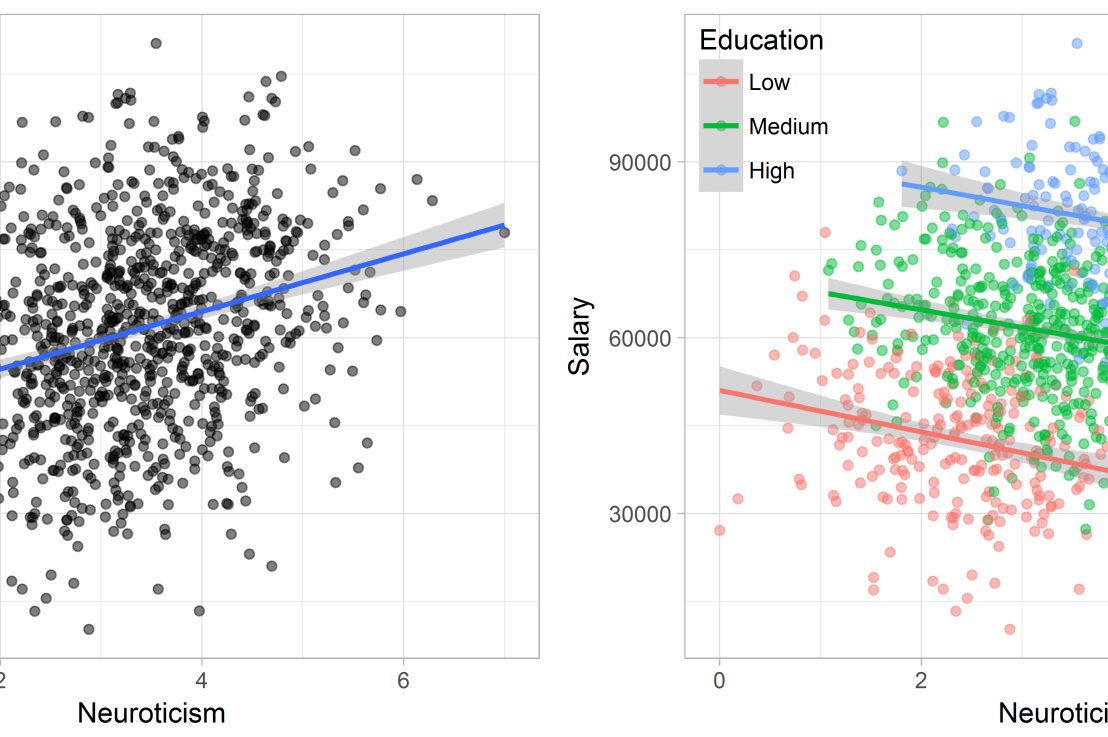
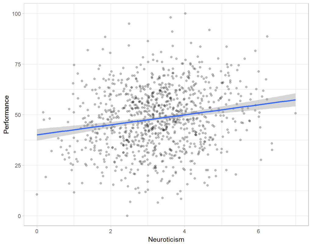
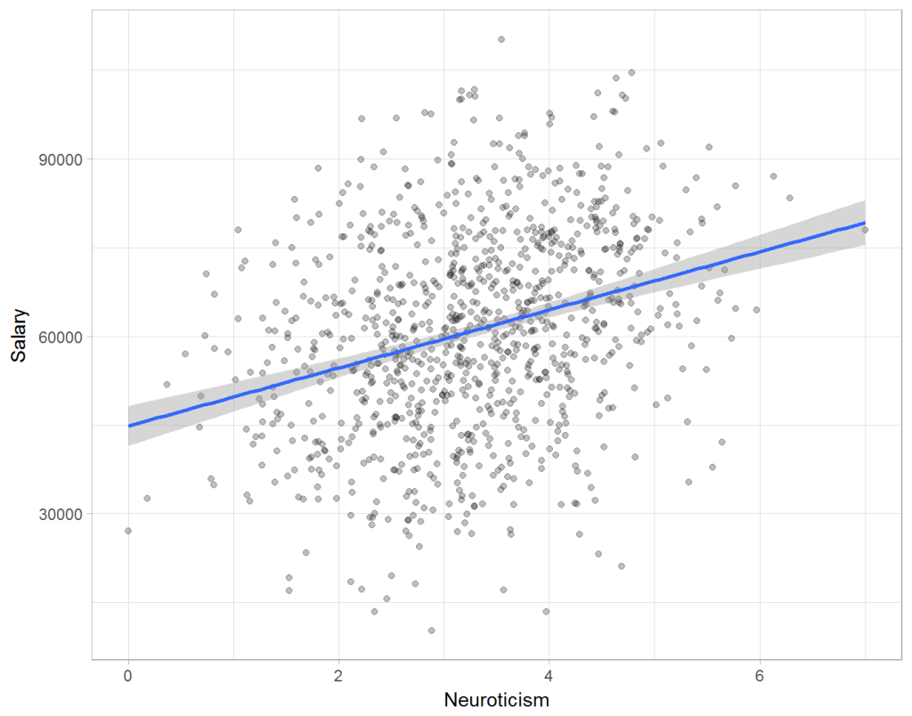
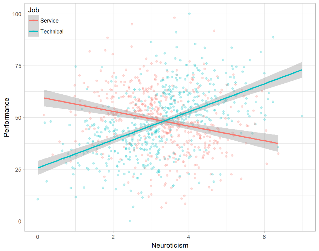
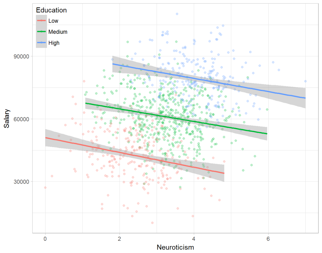
Assume you run a company of 1000 employees and you have asked all of them to fill out a Big Five personality survey. Per individual, you therefore have a score depicting his/her personality characteristic Neuroticism, which can run from 0 (not at all neurotic) to 7 (very neurotic). Now you are interested in the extent to which this Neuroticism of employees relates to their Job Performance (measured 0 – 100) and their Salary (measured in Euro’s per Year). In order to get a sense of the effects, you may decide to visualize both these relations in scatter plots:
From these visualizations it would look like Neuroticism relates significantly and positively to both employees’ performance and their yearly salary. Should you select more neurotic people to improve your overall company performance? Or are you discriminating emotionally-stable (non-neurotic) employees when it comes to salary?
Taking a closer look at the subgroups in your data, you might however find very different relationships. For instance, the positive relationship between neuroticism and performance may only apply to technical positions, but not to those employees’ in service-oriented jobs.
Similarly, splitting the employees by education level, it becomes clear that there is a relationship between neuroticism and education level that may explain the earlier association with salary. More educated employees receive higher salaries and within these groups, neuroticism is actually related to lower yearly income.
If you’d like to see the code used to simulate these data and generate the examples, you can find the R markdown file here on Rpubs.
Solving the paradox
Kievit and colleagues (2013) argue that Simpsons paradox may occur in a wide variety of research designs, methods, and questions, particularly within the social and medical sciences. As such, they propose several means to “control” or minimize the risk of it occurring. The paradox may be prevented from occurring altogether by more rigorous research design: testing mechanisms in longitudinal or intervention studies. However, this is not always feasible. Alternatively, the researchers pose that data visualization may help recognize the patterns and subgroups and thereby diagnose paradoxes. This may be easy if your data looks like this:
But rather hard, or even impossible, when your data looks more like the below:
Clustering may nevertheless help to detect Simpson’s paradox when it is not directly observable in the data. To this end, Kievit and Epskamp (2012) have developed a tool to facilitate the detection of hitherto undetected patterns of association in existing datasets. It is written in R, a language specifically tailored for a wide variety of statistical analyses which makes it very suitable for integration into the regular analysis workflow. As an R package, the tool is is freely available and specializes in the detection of cases of Simpson’s paradox for bivariate continuous data with categorical grouping variables (also known as Robinson’s paradox), a very common inference type for psychologists. Finally, its code is open source and can be extended and improved upon depending on the nature of the data being studied.
One example of application is provided in the paper, for a dataset on coffee and neuroticism. A regression analysis would suggest a significant positive association between coffee and neuroticism overall. However, when the detection algorithm of the R package is applied, a different picture appears: the analysis shows that there are three latent clusters present and that the purported positive relationship only holds for one cluster whereas it is negative in the others.
Update 24-10-2017: minutephysics – one of my favorite YouTube channels – uploaded a video explaining Simpson’s paradox very intuitively in a medical context:
Update 01-11-2017: minutephysics uploaded a follow-up video:
The paradox is that we remain reluctant to fight our bias, even when they are put in plain sight.
Welcome to my repository of data science, machine learning, and statistics resources. Software-specific material has to a large extent been listed under their respective overviews: R Resources & Python Resources. I also host a list of SQL Resources and datasets to practice programming. If you have any additions, please comment or contact me!
Statistics, and statistical inference in specific, are becoming an ever greater part of our daily lives. Models are trying to estimate anything from (future) consumer behaviour to optimal steering behaviours and we need these models to be as accurate as possible. Trevor Hastie is a great contributor to the development of the field, and I highly recommend the machine learning books and courses that he developed, together with Robert Tibshirani. These you may find in my list of R Resources (Cheatsheets, Tutorials, & Books).
Today I wanted to share another book Hastie wrote, together with Bradley Efron, another colleague of his at Stanford University. It is called Computer Age Statistical Inference (Efron & Hastie, 2016) and is a definite must read for every aspiring data scientist because it illustrates most algorithms commonly used in modern-day statistical inference. Many of these algorithms Hastie and his colleagues at Stanford developed themselves and the book handles among others:
Help yourself to these free books, tutorials, packages, cheat sheets, and many more materials for R programming. There’s a separate overview for handy R programming tricks. If you have additions, please comment below or contact me!
Integrated Development Environments (IDEs) & Graphical User Inferfaces (GUIs)
Descriptions mostly taken from their own websites:
RStudio*** – Open source and enterprise ready professional software
Jupyter Notebook*** – open-source web application that allows you to create and share documents that contain live code, equations, visualizations and narrative text across dozens of programming languages.
Gradient Descent is, in essence, a simple optimization algorithm. It seeks to find the gradient of a linear slope, by which the resulting linear line best fits the observed data, resulting in the smallest or lowest error(s). It is THE inner working of the linear functions we get taught in university statistics courses, however, many of us will finish our Masters (business) degree without having heard the term. Hence, this blog.
Linear regression is among the simplest and most frequently used supervised learning algorithms. It reduces observed data to a linear function (Y = a + bX) in order to retrieve a set of general rules, or to predict the Y-values for instances where the outcome is not observed.
One can define various linear functions to model a set of data points (e.g. below). However, each of these may fit the data better or worse than the others. How can you determine which function fits the data best? Which function is an optimal representation of the data? Enter stage Gradient Descent. By iteratively testing values for the intersect (a; where the linear line intersects with the Y-axis (X = 0)) and the gradient (b; the slope of the line; the difference in Y when X increases with 1) and comparing the resulting predictions against the actual data, Gradient Descent finds the optimal values for the intersect and the slope. These optimal values can be found because they result in the smallest difference between the predicted values and the actual data – the least error.
The video below is part of a Coursera machine learning course of Stanford University and it provides a very intuitive explanation of the algorithm and its workings:
A recent blog demonstrates how one could program the gradient descent algorithm in R for him-/herself. Indeed, the code copied below provides the same results as the linear modelling function in R’s base environment.
gradientDesc  max_iter) {
      abline(c, m)
      converged = T
      return(paste("Optimal intercept:", c, "Optimal slope:", m))
    }
  }
}

# compare resulting coefficients
coef(lm(mpg ~ disp, data = mtcars)
gradientDesc(x = disp, y = mpg, learn_rate = 0.0000293, conv_theshold = 0.001, n = 32, max_iter = 2500000)
Although the algorithm may result in a so-called “local optimum”, representing the best fitting set of values (a & b) among a specific range of X-values, such issues can be handled but deserve a separate discussion.


