Help yourself to these free books, tutorials, packages, cheat sheets, and many more materials for R programming. There’s a separate overview for handy R programming tricks. If you have additions, please comment below or contact me!
Join 385 other subscribers
LAST UPDATED: 2021-09-24
Table of Contents (clickable)
- Beginner
- Advanced
- Cheat sheets
- Data manipulation
- Data visualization
- Dashboards & Shiny
- Markdown
- Database connections
- Machine learning
- Text mining
- Geospatial analysis
- Bioinformatics
- R IDEs
- Software & language connections
- Help
- Blogs
- Conferences, Events, & Groups
- Jobs
- Other tips & tricks
Completely new to R? → Start learning here!
Introductory R
Introductory Books
- Introduction to R (R Core Team, 1999)
- R Language Definition (Manual) (R Core Team, 2000)
- Data Import/Export (R Core Team, 2000)
- SimpleR (Verzani, 2001-2)
- R for Beginners (Paradis, 2002)
- Introduction to R (Spector, 2004)
- Ecological Models and Data in R (Bolker, 2007)
- Software for Data Analysis: Programming with R (Chambers, 2008)
- Econometrics in R (Farnsworth, 2008)
- The Art of R Programming (Matloff, 2009)
- R in a Nutshell (Adler, 2010)
- R in Action: Data Analysis and Graphics with R (Kabacoff, 2011)
- R for Psychology Experiments and Questionnaires (Baron, 2011)
- The R Inferno (Burns, 2011)
- Cookbook for R (Chang, ???)
- The R Book (Crawley, 2013)
- Introduction to Data Technologies (Murrel, 2013)
- Introduction to Statistical Thought (Lavine, 2013)
- A (very) short introduction to R (Torfs & Bauer, 2014)***
- Advanced R (Wickham, 2014)
- Introduction to R (Vaidyanathan, 2014)
- Learning statistics with R (Navarro, 2014)
- Programming for Psychologists (Crump, 2014)
- IPSUR: Introduction to Probability and Statistics Using R (Kerns, 2014)
- Hands-On Programming with R (Grolemund, 2014)
- Getting used to R, RStudio, and R Markdown (2016)
- Introduction to R (Venables, Smith, & R Core Team, 2017)
- The R Language Definition (R Core Team, 2017)
- Functional Programming and Unit Testing for Data Munging with R (Rodrigues, 2017)
- YaRrr! The Pirate’s Guide to R (Phillips, 2017)***
- R for Data Science (Grolemund & Wickham, 2017)***
- An Introduction to Statistical and Data Sciences via R (Ismay & Kim, 2018) by ModernDive
- Answering questions with data (Crump, 2018)
- Statistical Thinking for the 21st Century (Poldrack, 2018)
- R Notes for Professionals book (Goalkicker, 2018)
- Learning Statistics with R (Navarro, 2019)
- R Graphics Cookbook – 2nd edition (Chang, 2019)
- Introduction to Open Data Science (The Ocean Health Index Team, 2019)
- Data Science with R: A Resource Compendium (Monkman, 2019)
- R in Action: Third Edition (Kabacoff, 2019)
- A Practical Extension of Introductory Statistics in Psychology using R (Pongpipat, Miranda, & Kmiecik, 2019)
- R for Marketing Students (Samuel Franssens, ????)
Online Courses
swirl()***- Join #TidyTuesday***
- Try R by Code School
- Learn R by R-Exercises
- R Tutorial by Cyclismo & DataCamp
- 100 Tutorials for Learning R
- Introduction to R by DataCamp
- YaRrr! The Pirate’s Guide to R (Video)
- R for Cats
- Chromebook Data Science (CBDS) – Introduction to R
- Learning R by Doing – A Learning Experiment in RStudio and GitHub
- R Bootcamp by Jared Knowles
- Hands-on Introduction to Statistics with R by DataCamp.com
- R Course in Statistics by PagePiccini.com
- Data Analysis in R by DataQuest.io
- Data Science: R Basics @edX
- Introduction to R for Data Science @edX
- Introduction to R workshop by Chris Bilder
- Data Analysis and Visualization Using R @VarianceExplained
- Programming @Coursera*** by Roger Peng, Jeff Leek, & Brian Caffo
- Intro to R by Bradley Boehmke
- Intermediate R by Bradley Boehmke
- Advanced R by Bradley Boehmke
- Wrangling data in the Tidyverse – useR! 2018 tutorial by Simon Jackson
- Winter R Bootcamp 2015 by Sean Cross
- RStudio’s Data Science Course in a Box
- Data Carpentry Social Science Workshop in R
- Youtube R classes by Chris Bilder
- 37 Youtube R Tutorials by Flavio Azevedo***
- Essential R tutorials by Gilad Feldman
- Data Carpentry Social Science in R
- Statistics and R, by Rafael Irizarry and Michael Love
- Learn R via R-coder.com
- A Psychologist’s Guide to R (pdf) by Sean Chris Murphy
- Learn R for Psychology research: A crash course
- Social Sciences: Critically Analyze Research and Results Using R by Coursera
- LearnR – R Programming for Behavioral Scientists
- Data Science for Social Scientists
- Boston University workshop – Tricks for cleaning your data
- University of Oklahoma – Econometrics lab sessions by Tyler Ransom
- University of British Colombia – STAT 545A and 547M – Data wrangling, exploration, and analysis with R
- University of California – Business Analytics R Programming Guide
- University of Oregon – Summer School 2018 R Bootcamp by Jessica Kosie
- University of Oregon – Data science for economists
- Oregon Health & Science University – CS631 Principles & Practice of Data Visualization
- Brooklyn College of CUNY – Psych7709 Using R for Reproducible Research
- University of Illinois – A language, not a letter: Learning Statistics in R
- University College London – Statistical Computing with R Programming Language: A Gentle Introduction
- University of Glasgow – psyTeachR Teaching Reproducible Research
- GitHub repository rstats-ed, including many additional courses and learning materials
- Gilad Feldman’s How To R Guides
Style Guides
- Google’s R style guide
- Tidyverse style guide by Hadley Wickham
- Advanced R style guide by Hadley Wickham
- R style guide for stat405 by Hadley Wickham
- R style guide by Collin Gillespie
- Best practices for R Coding by Arnaud Amsellem / The R Trader
- The State of Naming Conventions in R (Bååth, 2012)
- A guide for switching from base R to the
tidyverse
Advanced R
- Advanced R – 1st ed. (Wickham, 2014)
- Advanced R – 2nd ed. (Wickham, 2018)***
- Efficient R Programming (Gillespie & Lovelace, 2017)
- Writing R extensions
- Happy Git and GitHub for the useR (Jenny Bryan, 2017)
- RStudio addins by Dean Attali
Package Development
- Mastering Software Development in R (Peng, Kross, & Anderson, 2017)
- R Packages (Wickham & Bryan, ???)
- rOpenSci Packages: Development, Maintenance, and Peer Review
- How to develop good R packages (for open science) by Maëlle Salmon
- Tutorial on creating R packages by Friedrich Leisch
- Developing R Packages by Jeff Leek
- Writing an R package from scratch by Hilary Parker
- Write your own R package by STAT545
- Making an R Package, by R.M. Ripley
- Prepare your package for CRAN
- Introduction to
roxygen2by Hadley Wickham - How to build package vignettes with
knitrby Yihui Xie knitrin a nutshell: a minimal tutorial by Karl Broman- Rtools: Building R for Windows by Brian Ripley, Duncan Murdoch, and Jeroen Ooms
devtools– tools to make an R developer’s life easierroxygen2– tools for describing functions in comments next to their definitionsRd2roxygen– tools for converting Rd toroxygendocumentationtestthat– tools that simplify the testing of R packages
Non-standard Evaluation
- Tidy evaluation explained in 5 minutes via YouTube
- Tidy evaluation (Henry & Wickham, 2018)
- Tidy evaluation webinar by RStudio
- IV metaprogramming chapters of Advanced R (Wickham, 2014)
tidyevaltutorial by Ian Lyttle
Functional Programming
- Writing Functions in R by Hadley Wickham via DataCamp.com
- R for Data Science chapters on Functions and Iteration
(Grolemund & Wickham, 2018)*** - Advanced R chapter on Functions (Wickham, 2014)
- Lesson on writing, testing, and documenting custom functions by Software-Carpentry.org
- User-defined R fuctions tutorial by Carlo Fanara via DataCamp.com
- Functional programming lecture by Duke University
purrrtutorial by Jenny Bryan***- Intro to
purrrtutorial by Emorie Beck - Learn
purrrtutorial by Dan Ovando purrrcheat sheet by RStudio
Cheat Sheets
- Getting started in R, by Saghir Bashir***
- Base R cheat sheet by Mhairi McNeill***
- Base R functions cheat sheet by Tom Short
- Basic R cheat sheet by Quandl.com
- R function abbreviations cheat sheet by Jeromy Anglim
- RStudio cheat sheet by RStudio
- RStudio keyboard shortcuts by RStudio***
- Data management in R cheat sheet
data.tablecheat sheet by Erik Petrovskidata.tablewide cheat sheet by DataCampdata.tablelong cheat sheet by DataCamp- Advanced R cheat sheet by Arianne Colton & Sean Chen
tidyversecheat sheet by DataCamp- Data import cheat sheet by RStudio with
readr,tibble, andtidyr - Factor manipulation with
forcatscheat sheet by Lise Vaudor - Data transformation cheat sheet by RStudio with
dplyr - Data transformation cheat sheet 2 by Daniel Lüdecke with
dplyrandsjmisc - Data visualization cheat sheet by RStudio with
ggplot2 - Data wrangling cheat sheet by RStudio with
dplyrandtidyr - Automate random assignment and sampling cheat sheet with
randomizrby Alex Coppock. - Cheat sheet for the
mosaicpackage teaching math, stats, computation, and modelling, by Michael Laviolette - Character string manipulation cheat sheet by RStudio with
stringr - Dates and times cheat sheet by RStudio with
lubridate - Split-Apply-Combine cheat sheet by Ernest Adrogue Calvera
purrrfunctional programming cheat sheet by RStudio- Tidy evaluation cheet sheet by Edwin Thoen
cartographycheat sheet by Timothee Giraudbayesplotcheat sheet by Edward Roualdes- R package development cheat sheet with
devtools - R syntax comparison cheat sheet by Amelia McNamara
xtscheat sheet for time series by DataCamp- RStudio cheat sheet GitHub
reticulatecheat sheet by RStudio
Many of the above cheat sheets are hosted in the official RStudio cheat sheet overview.
Data Manipulation
- Introduction to
data.table - Comparison between
data.table&dplyrcode data.tablecheat sheet by Erik Petrovskidata.tablewide cheat sheet by DataCampdata.tablelong cheat sheet by DataCampdplyrcheat sheet by RStudio- Pipes in R Tutorial For Beginners
Data Visualization
- R graph gallery & code examples***
- R charts: A collection of charts and graphs made with R code
- Fundamentals of Data Visualization (Wilke, 2018)
- Exploratory Data Analysis and Visualization (Bogart & Robbins, 2018)
- R base plots wiki reference guide
- Guide to (base) graphics and visualization in R, by StatisticsGlobe
- CRAN Task View – Graphics & Visualization
- R graphical parameters cheat sheet by Flowingdata.com
- MPA 635: Data Visualization course by Andrew Heiss
Colors
- R Color Guide***
colourpicker– widget that allows users to choose colourspaletteer– comprehensive collection of color palettes in R***- ggplot2 colour guide***
- Canva’s 100 color palette included in
ggthemes::scale_color_canva - Wes Anderson color palettes
- Multicolored annotated text in ggplot2 by Andrew Whitby & Visuelle Data
- Picular.co – Google, but for colors
Interactive / HTML / JavaScript widgets
- R HTML Widgets Gallery***
plotly– interactive plotsbillboarder– easy interface to billboard.js, a JavaScript chart library based on D3d3heatmap– interactive D3 heatmapsaltair– Vega-Lite visualizations via PythonDT– interactive tablesDiagrammeR– interactive diagrams (DiagrammeR cheat sheet)dygraphs– interactive time series plotsformattable– formattable data structuresggvis– interactive ggplot2highcharter– interactive Highcharts plotsleaflet– interactive mapsmetricsgraphics– interactive JavaScript bare-bones line, scatterplot and bar chartsnetworkD3– interative D3 network graphsscatterD3– interactive scatterplots with D3rbokeh– interactive Bokeh plotsrCharts– interactive Javascript chartsrcdimple– interactive JavaScript bar charts and othersrglwidget– interactive 3d plotsthreejs– interactive 3d plots and globesvisNetwork– interactive network graphswordcloud2– interface to wordcloud2.js.timevis– interactive timelines
ggplot2
- Code examples of top-50 ggplot2 visualizations***
- ggplot2 Cheatsheet by RStudio
- ggplot2 Quick Reference Guide
- ggplot2 Code Snippets
- ggplot2 Code Snippets 2
- Hitchhiker’s Guide to ggplot2 in R (Burchell & Vargas, 2016)
- A practical introduction with R and ggplot2 (Healy, 2017)
- Data Vizualization: A practical introduction (Healy, 2018)
- Complete ggplot2 Tutorial
- Principles & Practice of Data Visualization CS631 at Oregon Health & Science University
- Data visualization cheat sheet by RStudio with
ggplot2 - Setting custom ggplot themes with
ggthemr - Creating custom, reproducible color palettes by Simon Jackson
- Rearranging values within ggplot2 facets
- Combine plots using
patchworkorcowplot equisse– RStudio addin to interactively explore data with ggplot2 without coding
ggplot2 extensions
- ggplot2 extensions overview***
ggthemes– plot style themeshrbrthemes– opinionated, typographic-centric themesggmap– maps with Google Maps, Open Street Maps, etc.ggiraph– interactive ggplotsgghighight– highlight lines or values, see vignetteggstance– horizontal versions of common plotsGGally– scatterplot matricesggalt– additional coordinate systems, geoms, etc.ggbeeswarm– column scatter plots or voilin scatter plotsggforce– additional geoms, see visual guideggrepel– prevent plot labels from overlappingggraph– graphs, networks, trees and moreggpmisc– photo-biology related extensionsgeomnet– network visualizationggExtra– marginal histograms for a plotgganimate– animations, see also the gganimate wiki pageggpage– pagestyled visualizations of text based dataggpmisc– useful additionalgeom_*andstat_*functionsggstatsplot– include details from statistical tests in plotsggspectra– tools for plotting light spectraggnetwork– geoms to plot networksggpoindensity– cross between a scatter plot and a 2D density plotggradar– radar chartsggsurvplot (survminer)– survival curvesggseas– seasonal adjustment toolsggthreed– (evil) 3D geomsggtech– style themes for plotsggtern– ternary diagramsggTimeSeries– time series visualizationsggtree– tree visualizationstreemapify– wilcox’s treemapsseewave– spectograms
Miscellaneous
coefplot– visualizes model statisticscirclize– circular visualizations for categorical dataclustree– visualize clustering analysisquantmod– candlestick financial chartsdabestr– Data Analysis using Bootstrap-Coupled ESTimationdevoutsvg– an SVG graphics device (with pattern fills)devoutpdf– an PDF graphics devicecartography– create and integrate maps in your R workflowcolorspace– HSL based color palettesviridis– Matplotlib viridis color pallete for Rmunsell– Munsell color palettes for RCairo– high-quality display outputigraph– Network Analysis and Visualizationgraphlayouts– new layout algorithms for network visualizationlattice– Trellis graphicstmap– thematic mapstrelliscopejs– interactive alternative forfacet_wraprgl– interactive 3D plotscorrplot– graphical display of a correlation matrixgoogleVis– Google Charts APIplotROC– interactive ROC plotsextrafont– fonts in R graphicsrvg– produces Vector Graphics that allow further editing in PowerPoint or Excelshowtext– text using system fontsanimation– animated graphics using ImageMagick.misc3d– 3d plots, isosurfaces, etc.xkcd– xkcd style graphicsimager– CImg library to work with imagesungeviz– tools for visualize uncertaintywaffle– square pie charts a.k.a. waffle charts- Creating spectograms in R with
hht,warbleR,soundgen,signal,seewave, orphonTools
Shiny, Dashboards, & Apps
- Shiny Cheat Sheet by RStudio
- Shiny Tutorial
- A collection of links to Shiny applications that have been shared on Twitter.
- Enterprise-ready dashboards with Shiny and databases
- Several packages to upgrade your Shiny dashboards
- More Shiny Resources by Rob Gilmore
- More Shiny Resources for Statistics by Yingjie Hu
- Building Shiny apps – an interactive tutorial by Dean Attali
- Advanced Shiny tips & tricks by Dean Attali (version 2)
flexdashboard– dashboard creation simplifiedcolourpicker– widget that allows users to choose coloursbrighter– toolbox with helpful functions for shiny developmentDesktopDeployR– self-contained R-based desktop applications
Markdown & Other Output Formats
- R Markdown cheat sheet by RStudio
- R Markdown reference guide by RStudio
- R Markdown Basics
- R Markdown tutorial by RStudio
- R Markdown gallery by RStudio
- The
knitrbook (Xie, 2015) - Getting used to R, RStudio, and R Markdown (2016)
- R Markdown: The Definitive Guide (Xie, Allaire, & Grolemund, 2018)
- Introduction to R Markdown (Clark, 2018)
- R Markdown for Scientists (Tierney, 2019)
- R Markdown Tips and Tricks
- Pimp my RMD by Holtz Yan
- Pandoc syntax highlighting examples by Garrick Aden-Buie
- Creating slides with R Markdown (Video) by Brian Caffo
- Introduction to
xaringanby Yihui Xie - A quick demonstration of
xarigan - General Markdown cheat sheet
blogdownwebsites with R Markdown (Xie, Thomas, & Hill, 2018)blogdowntutorials- How to build a website with
blogdownin R, by Storybench - radix – online publication format designed for scientific and technical communication
- A template RStudio project with data analysis and manuscript writing by Thomas Julou
- Multiple reports from a single Markdown file (example 1) (example2)
tidystats– automating updating of model statisticspapaja– preparing APA journal articlesblogdown– build websites with Markdown & Hugohuxtable– create Excel, html, & LaTeX tablesxaringan– make slideshows via remark.js and markdownsummarytools– produces neat, quick data summary tablescitr– RStudio Addin to Insert Markdown Citations
Cloud, Server, & Database
- Access and manage Google spreadsheets from R with
googlesheets - Tutorial: Database Queries with R
- Introduction to
sparklyrby DataCamp - Running R on AWS
- AWS EC2 Tutorial For Beginners
- Using RStudio on Amazon EC2 under the Free Usage Tier
- Getting started with databases using R, by RStudio
RMySQL– connects to MySQL and MariaDBRPostgreSQL– connects to Postgres and Redshift.RSQLite– embeds a SQLite database.odbc– connects to many commercial databases via the open database connectivity protocol.bigrquery– connects to Google’s BigQuery.DBI– separates the connectivity to the DBMS into a “front-end” and a “back-end”.dbplot– leveragesdplyrto process calculations of plot inside databasedplyr– also works with remote on-disk data stored in databasestidypredict– run predictions inside the database
Statistical Modeling & Machine Learning
- Machine Learning with R: An Irresponsibly Fast Tutorial by Will Stanton***
- CRAN Task View – Machine Learning & Statistical Learning
- R Packages for Machine Learning by Joseph Misiti
- Introduction to Data Science with R (Video)
- 100 Tutorials for Learning R
- Machine Learning Algorithms R Implementation by Ajitesh Kumar
- R Data Mining: Examples & Case Studies (Zhao, 2015)
- Statistical modelling in R (Zhao, 2015) @RDataMining
- Predictive modelling in R with
caret - R interface to Keras
- Tensorflow for R gallery
- Image featurization
- R for Data Science Online Learning Community
- R statistical programming resources by Michael Clark
Books
- Elements of Statistical Learning (Hastie, Tibshirani, & Friedman, 2001)
- Introduction to Statistical Learning (James, Witten, Hastie, & Tibshirani, 2013)
- Machine Learning with R (Lantz, 2013)
- Regression Models for Data Science in R (Caffo, 2015)
- R Programming for Data Science (Peng, 2016)
- Data Science Live Book (Casas, 2017)
- Statistical Foundations of Machine Learning (Bontempi & Taieb, 2017)
- R for Data Science (Grolemund & Wickham, 2017)
- Introduction to Data Science (Irizarry, 2018)
Courses
- Introduction to Statistical Learning*** at Stanford University by Trevor Hastie and Rob Tibshirani
- Introduction to R for Data Science @Microsoft
- Introduction to R for Data Science @FutureLearn by Hadley Wickham
- PSY2002: Advanced Statistics at University of Toronto by Elizabeth Page-Gould
- STAT 450/870: Regression Analysis at University of Nebraska-Lincoln by Chris Bilder
- STAT 850: Computing Tools for Statisticians at University of Nebraska-Lincoln by Chris Bilder
- STAT 873: Applied Multivariate Statistical Analysis at University of Nebraska-Lincoln by Chris Bilder
- STAT 875: Categorical Data Analysis at University of Nebraska-Lincoln by Chris Bilder
- STAT 950: Computational Statistics at University of Nebraska-Lincoln by Chris Bilder
- Joint Statistical Meetings: Analysis of Categorical Data by Chris Bilder
Cheat sheets
- R functions for regression analysis cheat sheet by Vito Ricci
- Machine Learning modeling cheat sheet by Arnaud Amsellem
- Machine Learning with
mlrcheat sheet by Aaron Coley - Cheat sheet for h20’s algorithms for big data and parallel computing in R by Juan Telleria
- Deep Learning with
kerascheat sheet by RStudio - Machine Learning with
caretcheat sheet by Max Kuhn - Nonlinear cointegrating autoregressive distributed lag models with
nardlcheat sheet by Taha Zaghdoudi - R survival analysis with
survminercheat sheet by Przemysław Biecek - R Data Mining reference card
- R
sparklyrcheat sheet by RStudio
Time series
- CRAN Task View – TimeSeries
- R
xtscheat sheet - Forecasting: Principles and Practice (Hyndman & Athanasopoulos, 2017)
- A little book of R for time series (tutorial)
- ARIMA forecasting in R (6-part Youtube series)
- Introduction to the
tsfeaturespackage - Tutorials: Part 1, Part 2, Part 3, & Part 4 of tidy time series @Business-Science.io with
tidyquant - Packages:
xts– extensible time seriestsfeatures– methods for extracting various features from time series datatidyquant–tidyverse-style financial analysis
Survival analysis
- CRAN Task View – Survival
- R survival analysis cheat sheet by Przemysław Biecek
- Packages:
survival– functionality for survival and hazard modelsggsurvplot(survminer) – survival curves
Bayesian
Miscellaneous
corrr– easier correlation matrix management and exploration
Natural Language Processing & Text Mining
- Text Mining Tutorial with
tm - Tidy Text Mining (Silges & Robinson, 2017) with
tidytext - Text Analysis with R for Students of Literature (Jockers, 2014)
- Tidytext tutorials by computational journalism
- 21 Recipes for Mining Twitter Data (Rudis, 2017) with
rtweet - Emil Hvitfeldt’s R-text-data GitHub repository
- Course: Introduction to Text Analytics with R @DataScienceDojo
- Course: Twitter Text Mining and Social Network Analysis (Zhoa, 2016) @RDataMining with
twitteR - Quantitative Analysis of Textual Data with
quantedacheat sheet by Stefan Müller and Kenneth Benoit - List of resources for NLP & Text Mining by Stephen Thomas
- Packages — for an overview: CRAN Task View – Natural Language Processing:
tm– text mining.tidytext– text mining usingtidyverseprinciplesquanteda– framework for quantitative text analysisgutenbergr– public domain works (free books to practice on)corpora– statistics and data sets for corpus frequency data.tau– Text Analysis UtilitiesSentiment140– headache-free sentiment analysissentimentr– sentiment analysis using text polarityopenNLP– sentence detector, tokenizer, pos-tagger, shallow and full syntactic parser, named-entity detector, and maximum entropy models with OpenNLP.cleanNLP– natural language processing via tidy data modelsRSentiment– English lexicon-based sentiment analysis with negation and sarcasm detection functionalities.RWeka– data mining tasks with Wekawordnet– a large lexical database of English with WordNet .stringi– language processing wrapperstextcat– provides support for n-gram based text categorization.text2vec– text vectorization, topic modeling (LDA, LSA), word embeddings (GloVe), and similarities.lsa– Latent Semantic Analysistopicmodels-Latent Dirichlet Allocation (LDA) and Correlated Topics Models (CTM)lda-Latent Dirichlet Allocation and related models
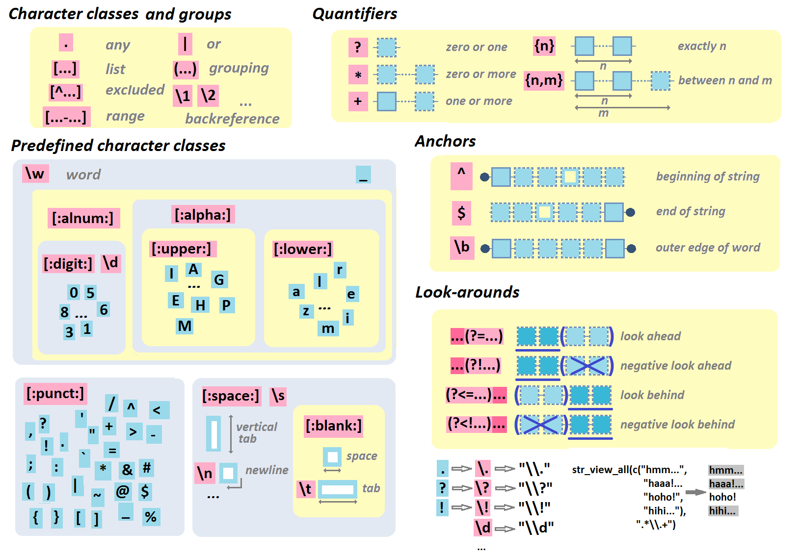
Regular Expressions
- R Regular Expression cheat sheet by Lise Vaudor
- R Regular Expression cheat sheet
- R Regular Expression cheat sheet (page 2) by RStudio
regexplain– interactive RStudio addin for regular expressions- Regular Expressions in R – Part 1: Introduction and base R functions
- R Regular Expressions by Jon M. Calder in swirl()
- R Regular Expression Video Tutorial by Roger Peng
- General Regular Expression cheat sheet
- General Regular Expression Video Tutorial by Roger Peng
- General Regular Expression cheat sheet by OverAPI.com
Geographic & Spatial mapping
- Making Maps with R (tutorial) with ggmaps, maps, and mapdata
- Importing OpenStreetMap data (tutorial) with osmar
- Geocomputation with R (Lovelace, Nowosad, & Muenchow, 2018)
- Spatial manipulation with Simple Features (
sf) cheat sheet by Ryan Garnett
Bioinformatics & Computational Biology
- Applied statistics for Bioinformatics using R (Krijnen, 2009)
- A little book of R for Bioinformatics (Coghlan, ???)
- Bioinformatics and Functional Genomics (Pevsner, 2015)
- Applied Biostatistical Analyses using R (Cox, 2017)
- Molecular data analysis using R (Ortutay & Ortutay, 2017)
- Modern statistics for Biology (Holmes & Huber, 2019)
Integrated Development Environments (IDEs) &
Graphical User Inferfaces (GUIs)
Descriptions mostly taken from their own websites:
- RStudio*** – Open source and enterprise ready professional software
- Jupyter Notebook*** – open-source web application that allows you to create and share documents that contain live code, equations, visualizations and narrative text across dozens of programming languages.
- Microsoft R tools for Visual Studio – turn Visual Studio into a powerful R IDE
- R Plugins for Vim, Emax, and Atom editors
- Rattle*** – GUI for data mining
- equisse – RStudio add-in to interactively explore and visualize data
- R Analytic Flow – data flow diagram-based IDE
- RKWard – easy to use and easily extensible IDE and GUI
- Eclipse StatET – Eclipse-based IDE
- OpenAnalytics Architect – Eclipse-based IDE
- TinnR – open source GUI and IDE
- DisplayR – cloud-based GUI
- BlueSkyStatistics – GUI designed to look like SPSS and SAS
- ducer – GUI for everyone
- R commander (Rcmdr) – easy and intuitive GUI
- JGR – Java-based GUI for R
- jamovi &
jmv– free and open statistical software to bridge the gap between researcher and statistician - Exploratory.io – cloud-based data science focused GUI
- Stagraph – GUI for ggplot2 that allows you to visualize and connect to databases and/or basic file types
- ggraptr – GUI for visualization (Rapid And Pretty Things in R)
- ML Studio – interactive Shiny platform for data visualization, statistical modeling and machine learning
R & other software and languages
R & Excel
- BERT – Basic Excel R Toolkit
- A Comprehensive Guide to Transitioning from Excel to R by Alyssa Columbus
readxl– package to load in Excel dataxlsx– package to read and write Excel datarvg– produces Vector Graphics which can be modified in Exceldevoutpdf– an PDF graphics devicetidyxl– imports non-tabular (e.g., format) data from Excel files into Runpivotr– unpivot complex and irregular data layouts in Runheadr– handle data with embedded subheaders
R & Python
- Python for R users
reticulatecheat sheet by RStudioreticulate– tools for interoperability between Python and R
R & SQL
sqldf– running SQL statements on R data frames
Join 385 other subscribers
R Help, Connect, & Inspiration
- RStudio Community
- R help mailing list
- R seek – search engine for R-related websites
- R site search – search engine for help files, manuals, and mailing lists
- Nabble – mailing list archive and forum
- R User Groups & Conferences
- R for Data Science Online Learning Community
- Stack Overflow – a FAQ for all your R struggles (programming)
- Cross Validated – a FAQ for all your R struggles (statistics)
- CRAN Task Views – discover new packages per topic
- The R Journal – open access, refereed journal of R
- Twitter: #rstats, RStudio, Hadley Wickham, Yihui Xie, Mara Averick, Julia Silge, Jenny Bryan, David Smith, Hilary Parker, R-bloggers
- Facebook: R Users Psychology
- Youtube: Ben Lambert, Roger Peng
- Reddit: rstats, rstudio, statistics, machinelearning, dataisbeautiful
R Blogs
- http://adamleerich.com
- http://njtierney.github.io/
- https://trinkerrstuff.wordpress.com
- https://rollingyours.wordpress.com
- https://r-statistics.com
- https://beckmw.wordpress.com
- http://rgraphgallery.blogspot.com
- http://onertipaday.blogspot.com
- https://learnr.wordpress.com
- http://padamson.github.io
- http://www.r-datacollection.com/blog/
- http://www.thertrader.com
- https://fronkonstin.com
- https://nicercode.github.io
- http://www.rblog.uni-freiburg.de
- https://advanceddataanalytics.net
- http://r4stats.com/blog/
- http://blog.revolutionanalytics.com/
- http://www.r-bloggers.com/
- http://kbroman.org/blog/
- https://juliasilge.com/blog/
- http://andrewgelman.com/
- http://www.statsblogs.com/author/eric-cai-the-chemical-statistician/
- https://www.statmethods.net/
- http://www.stats-et-al.com/search/label/R
- http://www.brodrigues.co/
- https://datasharkie.com/
- https://www.programmingwithr.com/
R Conferences, Events, & Meetups
- Overview of R conferences by JumpingRivers
- Overview of R virtual events by JumpingRivers
- Overview of R user groups by JumpingRivers
- Overview of R-Ladies groups by JumpingRivers


