Several Chinese Ph.D. students wrote a PyTorch program that can turn your holiday pictures into 3D sceneries. They call it 3D photo inpainting. Here are some examples
And here’s the new method compares to previous techniques:
We propose a method for converting a single RGB-D input image into a 3D photo, i.e., a multi-layer representation for novel view synthesis that contains hallucinated color and depth structures in regions occluded in the original view. We use a Layered Depth Image with explicit pixel connectivity as underlying representation, and present a learning-based inpainting model that iteratively synthesizes new local color-and-depth content into the occluded region in a spatial context-aware manner. The resulting 3D photos can be efficiently rendered with motion parallax using standard graphics engines. We validate the effectiveness of our method on a wide range of challenging everyday scenes and show fewer artifacts when compared with the state-of-the-arts.
Update March, 2021: My R package for the predictive power score (ppsr) is live on CRAN! Try install.packages("ppsr") in your R terminal to get the latest version.
Last week, I shared this Medium blog on PPS — or Predictive Power Score — on my LinkedIn and got so many enthousiastic responses, that I had to share it with here too.
Basically, the predictive power score is a normalized metric (values range from 0 to 1) that shows you to what extent you can use a variable X (say age) to predict a variable Y (say weight in kgs).
A PPS high score of, for instance, 0.85, would show that weight can be predicted pretty good using age.
A low PPS score, of say 0.10, would imply that weight is hard to predict using age.
The PPS acts a bit like a correlation coefficient we’re used too, but it is also different in many ways that are useful to data scientists:
PPS also detects and summarizes non-linear relationships
PPS is assymetric, so that it models Y ~ X, but not necessarily X ~ Y
PPS can summarize predictive value of / among categorical variables and nominal data
However, you may argue that the PPS is harder to interpret than the common correlation coefficent:
PPS can reflect quite complex and very different patterns
Therefore, PPS are hard to compare: a 0.5 may reflect a linear relationship but also many other relationships
PPS are highly dependent on the used algorithm: you can use any algorithm from OLS to CART to full-blown NN or XGBoost. Your algorithm hihgly depends the patterns you’ll detect and thus your scores
PPS are highly dependent on the the evaluation metric (RMSE, MAE, etc).
Here’s an example picture from the original blog, showing a case in which PSS shows the relevant predictive value of Y ~ X, whereas a correlation coefficient would show no relationship whatsoever:
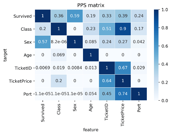
Here’s two more pictures from the original blog showing the differences with a standard correlation matrix on the Titanic data:
I highly suggest you readthe original blog for more details and information, and that you check out the associated Python packageppscore:
Installing the package:
pip install ppscore
Calculating the PPS for a given pandas dataframe:
import ppscore as pps
pps.score(df, "feature_column", "target_column")
You can also calculate the whole PPS matrix:
pps.matrix(df)
There’s no R package yet, but it should not be hard to implement this general logic.
Florian Wetschoreck — the author — already noted that there may be several use cases where he’d think PPS may add value:
Find patterns in the data [red: data exploration]: The PPS finds every relationship that the correlation finds — and more. Thus, you can use the PPS matrix as an alternative to the correlation matrix to detect and understand linear or nonlinear patterns in your data. This is possible across data types using a single score that always ranges from 0 to 1.
Feature selection: In addition to your usual feature selection mechanism, you can use the predictive power score to find good predictors for your target column. Also, you can eliminate features that just add random noise. Those features sometimes still score high in feature importance metrics. In addition, you can eliminate features that can be predicted by other features because they don’t add new information. Besides, you can identify pairs of mutually predictive features in the PPS matrix — this includes strongly correlated features but will also detect non-linear relationships.
Detect information leakage: Use the PPS matrix to detect information leakage between variables — even if the information leakage is mediated via other variables.
Data Normalization: Find entity structures in the data via interpreting the PPS matrix as a directed graph. This might be surprising when the data contains latent structures that were previously unknown. For example: the TicketID in the Titanic dataset is often an indicator for a family.
Grant McDermott developed this new R package I wish I had thought of: parttree
parttree includes a set of simple functions for visualizing decision tree partitions in R with ggplot2. The package is not yet on CRAN, but can be installed from GitHub using:
Using the familiar ggplot2 syntax, we can simply add decision tree boundaries to a plot of our data.
In this example from his Github page, Grant trains a decision tree on the famous Titanic data using the parsnip package. And then visualizes the resulting partition / decision boundaries using the simple function geom_parttree()
library(parsnip)
library(titanic) ## Just for a different data set
set.seed(123) ## For consistent jitter
titanic_train$Survived = as.factor(titanic_train$Survived)
## Build our tree using parsnip (but with rpart as the model engine)
ti_tree =
  decision_tree() %>%
  set_engine("rpart") %>%
  set_mode("classification") %>%
  fit(Survived ~ Pclass + Age, data = titanic_train)
## Plot the data and model partitions
titanic_train %>%
  ggplot(aes(x=Pclass, y=Age)) +
  geom_jitter(aes(col=Survived), alpha=0.7) +
  geom_parttree(data = ti_tree, aes(fill=Survived), alpha = 0.1) +
  theme_minimal()
Super awesome!
This visualization precisely shows where the trained decision tree thinks it should predict that the passengers of the Titanic would have survived (blue regions) or not (red), based on their age and passenger class (Pclass).
This will be super helpful if you need to explain to yourself, your team, or your stakeholders how you model works. Currently, only rpart decision trees are supported, but I am very much hoping that Grant continues building this functionality!
The assumption that a Machine Learning (ML) project is done when a trained model is put into production is quite faulty. Neverthless, according to Alexandre Gonfalonieri — artificial intelligence (AI) strategist at Philips — this assumption is among the most common mistakes of companies taking their AI products to market.
Actually, in the real world, we see pretty much the opposite of this assumption. People like Alexandre therefore strongly recommend companies keep their best data scientists and engineers on a ML project, especially after it reaches production!
Why?
If you’ve ever productionized a model and really started using it, you know that, over time, your model will start performing worse.
In order to maintain the original accuracy of a ML model which is interacting with real world customers or processes, you will need to continuously monitor and/or tweak it!
In the best case, algorithms are retrained with each new data delivery. This offers a maintenance burden that is not fully automatable. According to Alexandre, tending to machine learning models demands the close scrutiny, critical thinking, and manual effort that only highly trained data scientists can provide.
This means that there’s a higher marginal cost to operating ML products compared to traditional software. Whereas the whole reason we are implementing these products is often to decrease (the) costs (of human labor)!
What causes this?
Your models’ accuracy will often be at its best when it just leaves the training grounds.
Building a model on relevant and available data and coming up with accurate predictions is a great start. However, for how long do you expect those data — that age by the day — continue to provide accurate predictions?
Chances are that each day, the model’s latent performance will go down.
This phenomenon is called concept drift, and is heavily studied in academia but less often considered in business settings. Concept drift means that the statistical properties of the target variable, which the model is trying to predict, change over time in unforeseen ways.
In simpler terms, your model is no longer modelling the outcome that it used to model. This causes problems because the predictions become less accurate as time passes.
Particularly, models of human behavior seem to suffer from this pitfall.
The key is that, unlike a simple calculator, your ML model interacts with the real world. And the data it generates and that reaches it is going to change over time. A key part of any ML project should be predicting how your data is going to change over time.
You need to create a monitoring strategy before reaching production!
According to Alexandre, as soon as you feel confident with your project after the proof-of-concept stage, you should start planning a strategy for keeping your models up to date.
How often will you check in?
On the whole model, or just some features?
What features?
In general, sensible model surveillance combined with a well thought out schedule of model checks is crucial to keeping a production model accurate. Prioritizing checks on the key variables and setting up warnings for when a change has taken place will ensure that you are never caught by a surprise by a change to the environment that robs your model of its efficacy.
Your strategy will strongly differ based on your model and your business context.
Moreover, there are many different types of concept drift that can affect your models, so it should be a key element to think of the right strategy for you specific case!
Once you observe degraded model performance, you will need to redesign your model (pipeline).
One solution is referred to as manual learning. Here, we provide the newly gathered datato our model and re-train and re-deploy it just like the first time we build the model. If you think this sounds time-consuming, you are right. Moreover, the tricky part is not refreshing and retraining a model, but rather thinking of new features that might deal with the concept drift.
A second solution could be to weight your data. Some algorithms allow for this very easily. For others you will need to custom build it in yourself. One recommended weighting schema is to use the inversely proportional age of the data. This way, more attention will be paid to the most recent data (higher weight) and less attention to the oldest of data (smaller weight) in your training set. In this sense, if there is drift, your model will pick it up and correct accordingly.
According to Alexandre and many others, the third and best solution is to build your productionized system in such a way that you continuously evaluate and retrain your models. The benefit of such a continuous learning system is that it can be automated to a large extent, thus reducing (the human labor) maintance costs.
Although Alexandre doesn’t expand on how to do these, he does formulate the three steps below:
In my personal experience, if you have your model retrained (automatically) every now and then, using a smart weighting schema, and keep monitoring the changes in the parameters and for several “unit-test” cases, you will come a long way.
If you’re feeling more adventureous, you could improve on matters by having your model perform some exploration (at random or rule-wise) of potential new relationships in your data (see for instance multi-armed bandits). This will definitely take you a long way!
Google Brain researchers published this amazing paper, with accompanying GIF where they show the true power of AutoML.
AutoML stands for automated machine learning, and basically refers to an algorithm autonomously building the best machine learning model for a given problem.
This task of selecting the best ML model is difficult as it is. There are many different ML algorithms to choose from, and each of these has many different settings ([hyper]parameters) you can change to optimalize the model’s predictions.
For instance, let’s look at one specific ML algorithm: the neural network. Not only can we try out millions of different neural network architectures (ways in which the nodes and lyers of a network are connected), but each of these we can test with different loss functions, learning rates, dropout rates, et cetera. And this is only one algorithm!
In their new paper, the Google Brain scholars display how they managed to automatically discover complete machine learning algorithms just using basic mathematical operations as building blocks. Using evolutionary principles, they have developed an AutoML framework that tailors its own algorithms and architectures to best fit the data and problem at hand.
This is AI research at its finest, and the results are truly remarkable!