Rafa Irizarry is a biostatistics professor and one of the three people behind SimplyStatistics.org (the others are Jeff Leek, Roger Peng). They post ideas that they find interesting and their blog contributes greatly to discussion of science/popular writing.
Rafa is the creator of many data visualization GIFs that have recently trended on the web, and in a recent post he provides all the source code behind the beautiful imagery. I sincerely recommend you check out the orginal blog if you want to find out more, but here are the GIFS:
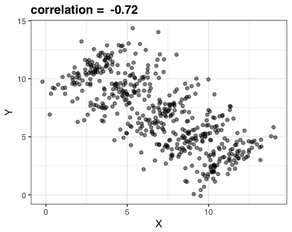
Simpson’s paradox is a statistical phenomenon where an observed relationship within a population reverses within all subgroups that make up that population. Rafa visualized it wonderfully in a GIF that took only twenty-some lines of R code:
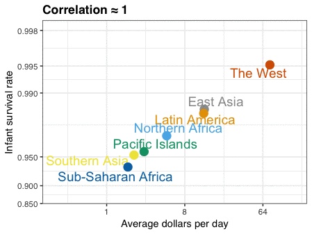
A different statistical phenomenon is discussed at the end of the original blog: namely the ecological fallacy. It occurs when correlations that occur on the group-level are erroneously extrapolated to the individual-level. Rafa used the gapminder data included in the dslabs package to illustrate the fallacy: there is a very high correlation at the region level and a lower correlation at the individual country level:
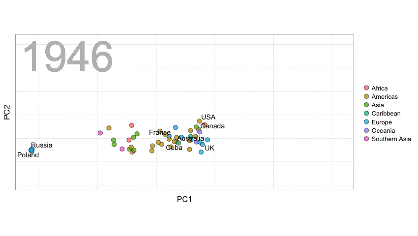
A next visualization demonstrates how the UN voting data (of Erik Voeten and Anton Strezhnev) can be used to examine different voting behaviors. It seems to reduce the voting data to a two-dimensional factor structure, and seemingly there are three distinct groups of voters these days, with particularly the USA and Israel far removed from other members:
The next GIFs are more statistical. The one below demonstrates how the local regression (LOESS) works. Simply speaking, LOESS determines the relationship for a local subset of the population and when you iteratively repeat this for all local subsets in a population you get a nicely fitting LOESS curve, the red line in Rafa’s GIF:
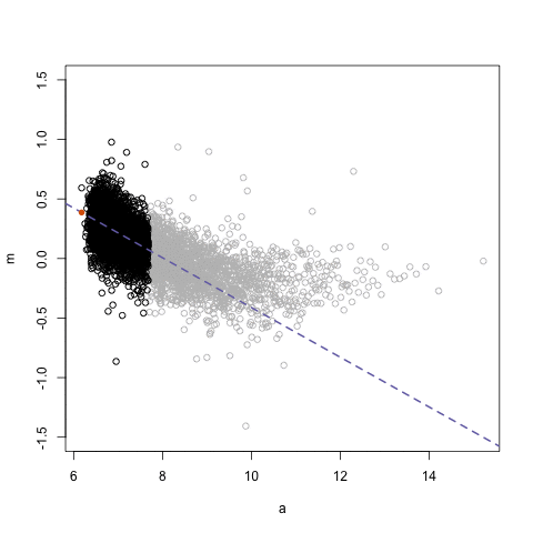
Not quite sure how to interpret the next one, but Rafa explains it visualized a random forest’s predictions using only one predictor variable. I think that different trees would then provide different predictions because they leverage different training samples, and an ensemble of those trees would then improve predictive accuracy?
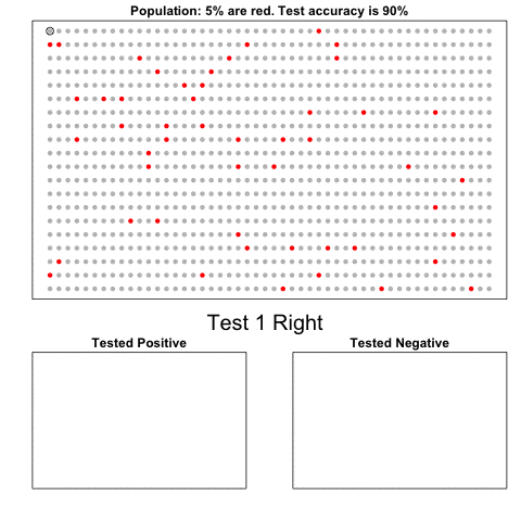
The next one is my favorite I think. This animation illustrates how a highly accurate test would function in a population with low prevalence of true values (e.g., disease, applicant success). More details are in the original blog or here.
The blog ends with a rather funny animation of the only good use of pie charts, according to Rafa:
Multilevel models (also known as hierarchical linear models, nested data models, mixed models, random coefficient, random-effects models, random parameter models, or split-plot designs) are statistical models of parameters that vary at more than one level (Wikipedia). They are very useful in Social Sciences, where we are often interested in individuals that reside in nations, organizations, teams, or other higher-level units. Next to their individuals characteristics, the characteristics of these units they belong to may also have effects. To take into account effects from variables residing at multiple levels, we can use multilevel or hierarchical models.
If you want to practice hierarchical modeling in R, I recommend the lesson by Page Paccini (first video) or the more elaborate video series by Statistics of DOOM (second):
Eiko Fried, researcher at the University of Amsterdam, recently blogged about personal collaborator networks. I came across his post on twitter, discussing how to conduct such analysis in R, and got inspired.
Unfortunately, my own publication record is quite boring to analyse, containing only a handful of papers. However, my promotors – Prof. dr. Jaap Paauwe and Prof. dr. Marc van Veldhoven – have more extensive publication lists. Although I did not manage to retrieve those using the scholarpackage, I was able to scrape Jaap Paauwe’s publication list from his Google Scholar page. Jaap has 141 publications listed with one or more citation on Google Scholar. More than enough for an analysis!
While Eiko uses his colleague Sacha Epskamp’s R package qgraph, I found an alternative in the packages igraph and ggraph.
### PAUL VAN DER LAKEN### 2017-10-31### COAUTHORSHIP NETWORK VISUALIZATION# LOAD IN PACKAGESlibrary(readxl)library(dplyr)library(ggraph)library(igraph)# STANDARDIZE VISUALIZATIONSw=14h=7dpi=900# LOAD IN DATApub_history<-read_excel("paauwe_wos.xlsx")# RETRIEVE AUTHORSpub_history%>%filter(condition==1)%>%select(name)%>%
.$name%>%gsub("[A-Z]{2,}|[A-Z][ ]", "", .)%>%strsplit(",")%>%lapply(function(x)gsub("\\..*", "", x))%>%lapply(function(x)gsub("^[ ]+","",x))%>%lapply(function(x)x[x!=""])%>%lapply(function(x)tolower(x))->authors# ADD JAAP PAAUWE WHERE MISSINGauthors<-lapply(authors, function(x){if(!"paauwe"%in%x){return(c(x,"paauwe"))}else{return(x)}})# EXTRACT UNIQUE AUTHORSauthors_unique<-authors%>%unlist()%>%unique()%>%sort(F)# FORMAT AUTHOR NAMES # CAPATILIZEsimpleCap<-function(x){s<-strsplit(x, " ")[[1]]names(s)<-NULLpaste(toupper(substring(s, 1,1)), substring(s, 2),
sep="", collapse=" ")}authors_unique_names<-sapply(authors_unique, simpleCap)
The above retrieve the names of every unique author from the excel file I got from Google Scholar. Now we need to examine to what extent the author names co-occur. We do that with the below code, storing all co-occurance data in a matrix, which we then transform to an adjacency matrix igraph can deal with. The output graph data looks like this:
Kaggle conducts industry-wide surveys to assess the state of data science and machine learning. Over 17,000 individuals worldwide participated in the survey, myself included, and 171 countries and territories are represented in the data.
There is an ongoing debate regarding whether R or Python is better suited for Data Science (probably the latter, but I nevertheless prefer the former). The thousands of responses to the Kaggle survey may provide some insights into how the preferences for each of these languages are dispersed over the globe. At least, that was what I thought when I wrote the code below.
### PAUL VAN DER LAKEN### 2017-10-31### KAGGLE DATA SCIENCE SURVEY### VISUALIZING WORLD WIDE RESPONSES### AND PYTHON/R PREFERENCES# LOAD IN LIBRARIESlibrary(ggplot2)library(dplyr)library(tidyr)library(tibble)# OPTIONS & STANDARDIZATIONoptions(stringsAsFactors=F)theme_set(theme_light())dpi=600w=12h=8wm_cor=0.8hm_cor=0.8capt="Kaggle Data Science Survey 2017 by paulvanderlaken.com"# READ IN KAGGLE DATAmc<-read.csv("multipleChoiceResponses.csv")%>%as.tibble()# READ IN WORLDMAP DATAworldMap<-map_data(map="world")%>%as.tibble()# ALIGN KAGGLE AND WORLDMAP COUNTRY NAMESmc$Country[!mc$Country%in%worldMap$region]%>%unique()worldMap$region%>%unique()%>%sort(F)mc$Country[mc$Country=="United States"]<-"USA"mc$Country[mc$Country=="United Kingdom"]<-"UK"mc$Country[grepl("China|Hong Kong", mc$Country)]<-"China"# CLEAN UP KAGGLE DATAlvls=c("","Rarely", "Sometimes", "Often", "Most of the time")labels=c("NA", lvls[-1])ind_data<-mc%>%select(Country, WorkToolsFrequencyR, WorkToolsFrequencyPython)%>%mutate(WorkToolsFrequencyR=factor(WorkToolsFrequencyR,
levels=lvls, labels=labels))%>%mutate(WorkToolsFrequencyPython=factor(WorkToolsFrequencyPython,
levels=lvls, labels=labels))%>%filter(!(Country==""|is.na(WorkToolsFrequencyR)|is.na(WorkToolsFrequencyPython)))# AGGREGATE TO COUNTRY LEVELcountry_data<-ind_data%>%group_by(Country)%>%summarize(N=n(),
R=sum(WorkToolsFrequencyR%>%as.numeric()),
Python=sum(WorkToolsFrequencyPython%>%as.numeric()))# CREATE THEME FOR WORLDMAP PLOTtheme_worldMap<-theme(plot.background=element_rect(fill="white"),
panel.border=element_blank(),
panel.grid=element_blank(),
panel.background=element_blank(),
legend.background=element_blank(),
legend.position=c(0, 0.2),
legend.justification=c(0, 0),
legend.title=element_text(colour="black"),
legend.text=element_text(colour="black"),
legend.key=element_blank(),
legend.key.size=unit(0.04, "npc"),
axis.text=element_blank(),
axis.title=element_blank(),
axis.ticks=element_blank())
After aligning some country names (above), I was able to start visualizing the results. A first step was to look at the responses across the globe. The greener the more responses and the grey countries were not represented in the dataset. A nice addition would have been to look at the response rate relative to country population.. any volunteers?
Now, let’s look at how frequently respondents use Python and R in their daily work. I created two heatmaps: one excluding the majority of respondents who indicated not using either Python or R, probably because they didn’t complete the survey.
# AGGREGATE DATA TO WORKTOOL RESPONSESworktool_data<-ind_data%>%group_by(WorkToolsFrequencyR, WorkToolsFrequencyPython)%>%count()# HEATMAP OF PREFERRED WORKTOOLSggplot(worktool_data, aes(x=WorkToolsFrequencyR, y=WorkToolsFrequencyPython))+geom_tile(aes(fill=log(n)))+geom_text(aes(label=n), col="black")+scale_fill_gradient(low="red", high="yellow")+labs(title="Heatmap of Python and R usage",
subtitle="Most respondents indicate not using Python or R (or did not complete the survey)",
caption=capt,
fill="Log(N)")
# HEATMAP OF PREFERRED WORKTOOLS# EXCLUSING DOUBLE NA'Sworktool_data%>%filter(!(WorkToolsFrequencyPython=="NA"&WorkToolsFrequencyR=="NA"))%>%ungroup()%>%mutate(perc=n/sum(n))%>%ggplot(aes(x=WorkToolsFrequencyR, y=WorkToolsFrequencyPython))+geom_tile(aes(fill=n))+geom_text(aes(label=paste0(round(perc,3)*100,"%")), col="black")+scale_fill_gradient(low="red", high="yellow")+labs(title="Heatmap of Python and R usage (non-users excluded)",
subtitle="There is a strong reliance on Python and less users focus solely on R",
caption=capt,
fill="N")
Okay, now let’s map these frequency data on a worldmap. Because I’m interested in the country level differences in usage, I look at the relative usage of Python compared to R. So the redder the country, the more Python is used by Data Scientists in their workflow whereas R is the preferred tool in the bluer countries. Interesting to see, there is no country where respondents really use R much more than Python.
# WORLDMAP OF RELATIVE WORKTOOL PREFERENCEggplot(country_data)+geom_map(data=worldMap,
aes(map_id=region, x=long, y=lat),
map=worldMap, fill="grey")+geom_map(aes(map_id=Country, fill=Python/R),
map=worldMap, size=0.3)+scale_fill_gradient(low="blue", high="red", name="Python/R")+theme_worldMap+labs(title="Relative usage of Python to R per country",
subtitle="Focus on Python in Russia, Israel, Japan, Ukraine, China, Norway & Belarus",
caption=capt)+coord_equal()
Countries are color-coded for their relative preference for Python (red/purple) or R (blue) as a Data Science tool. 167 out of 171 countries (98%) demonstrate a value of > 1, indicating a preference for Python over R.
Thank you for reading my visualization report. Please do try and extract some other interesting insights from the data yourself.
# retrieve data filelink="https://gist.githubusercontent.com/maartenzam/787498bbc07ae06b637447dbd430ea0a/raw/9a9dafafb44d8990f85243a9c7ca349acd3a0d07/worldtilegrid.csv"geodata<-read.csv(link)%>%as.tibble()# load in geodatastr(geodata)# examine geodata
R users have been using the twitter package by Geoff Jentry to mine tweets for several years now. However, a recent blog suggests a novel package provides a better mining tool: rtweet by Michael Kearney (GitHub).
Both packages use a similar setup and require you to do some prep-work by creating a Twitter “app” (see the package instructions). However, rtweet will save you considerable API-time and post-API munging time. This is demonstrated by the examples below, where Twitter is searched for #rstats-tagged tweets, first using twitteR, then using rtweet.
library(twitteR)# this relies on you setting up an app in apps.twitter.com
setup_twitter_oauth(
consumer_key = Sys.getenv("TWITTER_CONSUMER_KEY"),
consumer_secret = Sys.getenv("TWITTER_CONSUMER_SECRET"))
r_folks <- searchTwitter("#rstats", n=300)
str(r_folks,1)## List of 300## $ :Reference class 'status' [package "twitteR"] with 17 fields## ..and 53 methods, of which 39 are possibly relevant## $ :Reference class 'status' [package "twitteR"] with 17 fields## ..and 53 methods, of which 39 are possibly relevant## $ :Reference class 'status' [package "twitteR"] with 17 fields## ..and 53 methods, of which 39 are possibly relevant
str(r_folks[1])## List of 1## $ :Reference class 'status' [package "twitteR"] with 17 fields## ..$ text : chr "RT @historying: Wow. This is an enormously helpful tutorial by @vivalosburros for anyone interested in mapping "| __truncated__## ..$ favorited : logi FALSE## ..$ favoriteCount: num 0## ..$ replyToSN : chr(0) ## ..$ created : POSIXct[1:1], format: "2017-10-22 17:18:31"## ..$ truncated : logi FALSE## ..$ replyToSID : chr(0) ## ..$ id : chr "922150185916157952"## ..$ replyToUID : chr(0) ## ..$ statusSource : chr "Twitter for Android"## ..$ screenName : chr "jasonrhody"## ..$ retweetCount : num 3## ..$ isRetweet : logi TRUE## ..$ retweeted : logi FALSE## ..$ longitude : chr(0) ## ..$ latitude : chr(0) ## ..$ urls :'data.frame': 0 obs. of 4 variables:## .. ..$ url : chr(0) ## .. ..$ expanded_url: chr(0) ## .. ..$ dispaly_url : chr(0) ## .. ..$ indices : num(0) ## ..and 53 methods, of which 39 are possibly relevant:## .. getCreated, getFavoriteCount, getFavorited, getId, getIsRetweet, getLatitude, getLongitude, getReplyToSID,## .. getReplyToSN, getReplyToUID, getRetweetCount, getRetweeted, getRetweeters, getRetweets, getScreenName,## .. getStatusSource, getText, getTruncated, getUrls, initialize, setCreated, setFavoriteCount, setFavorited, setId,## .. setIsRetweet, setLatitude, setLongitude, setReplyToSID, setReplyToSN, setReplyToUID, setRetweetCount,## .. setRetweeted, setScreenName, setStatusSource, setText, setTruncated, setUrls, toDataFrame, toDataFrame#twitterObj
The above operations required only several seconds to completely. The returned data is definitely usable, but not in the most handy format: the package models the Twitter API on to custom R objects. It’s elegant, but also likely overkill for most operations. Here’s the rtweet version:
This operation took equal to less time but provides the data in a tidy, immediately usable structure.
On the rtweetwebsite, you can read about the additional functionalities this new package provides. For instance,ts_plot() provides a quick visual of the frequency of tweets. It’s possible to aggregate by the minute, i.e., by = "mins", or by some value of seconds, e.g.,by = "15 secs".
## Plot time series of all tweets aggregated by second
ts_plot(rt, by ="secs")
ts_filter() creates a time series-like data structure, which consists of “time” (specific interval of time determined via the by argument), “freq” (the number of observations, or tweets, that fall within the corresponding interval of time), and “filter” (a label representing the filtering rule used to subset the data). If no filter is provided, the returned data object includes a “filter” variable, but all of the entries will be blank "", indicating that no filter filter was used. Otherwise, ts_filter() uses the regular expressions supplied to the filter argument as values for the filter variable. To make the filter labels pretty, users may also provide a character vector using the key parameter.
## plot multiple time series by first filtering the data using
## regular expressions on the tweet "text" variable
rt %>%
dplyr::group_by(screen_name) %>%
## The pipe operator allows you to combine this with ts_plot
## without things getting too messy.
ts_plot() +
ggplot2::labs(
title ="Tweets during election day for the 2016 U.S. election",
subtitle ="Tweets collected, parsed, and plotted using `rtweet`"
)
The developer cautions that these plots often resemble frowny faces: the first and last points appear significantly lower than the rest. This is caused by the first and last intervals of time to be artificially shrunken by connection and disconnection processes. To remedy this, users may specify trim = TRUE to drop the first and last observation for each time series.
Give rtweet a try and let me know whether you prefer it over twitter.