Despite the pandemic, 2020 has been a great year for me.
Professionally, I grew into my role as data science product owner. And next to this, I got more and more freelance side gigs. Mostly teaching, but also some consultancy projects. Unfortunately, all my start-up ideas failed miserably again this year, yet I’ll keep trying : )
Personally, 2020 was also generous to us. We have a family expansion coming in 2021! (Un)Fortunately, the whole quarantaine situation provided a lot of time to make our house baby-ready!
A year in numbers
2020 was also a great year for our blog.
Here are some statistics. We reached 300 followers, on the last day of the year! Who could have imagined that?!
| Statistic | 2019 | 2020 | delta |
|---|---|---|---|
| Views | 107.828 | 150.599 | 40% |
| Visitors | 70.870 | 100.539 | 42% |
| Followers | 159 | 300 | 89% |
| Posts | 96 | 72 | -25% |
| Comments | 40 | 59 | 48% |
| per post | 0,42 | 0,82 | 97% |
| Likes | 116 | 86 | -26% |
| per post | 1,21 | 1,19 | -1% |
This tremendous growth of the website is despite me posting a lot less frequently this year.
After a friend’s advice, I started posting less, but more regularly.
Can you spot the pattern in my 2020 posting behavior?

Compare that to my erratic 2019 posting:

Now my readers have got something to look forward to every Tuesday!
Yet, is Tuesday really the best day for me to post my stuff?

You seem to prefer visiting my blog on Wednesdays.
Let me know what you think in the comments!
I am looking forward to what 2021 has in store for my blogging. I guess a baby will result in even less posts… But we’ll just focus on quality over quantity!
I hope I can keep up with the exponential growth:

Best new articles in 2020
There are many ways in which you could define the quality of an article.
For me, the most obvious would be to look at some view-based metric. Something like the number of views, or the number of unique visitors.
Yet, some articles have been online longer than others. So maybe we should focus on the average views per day. Still these you can expect to be increase as articles have been in existance longer.
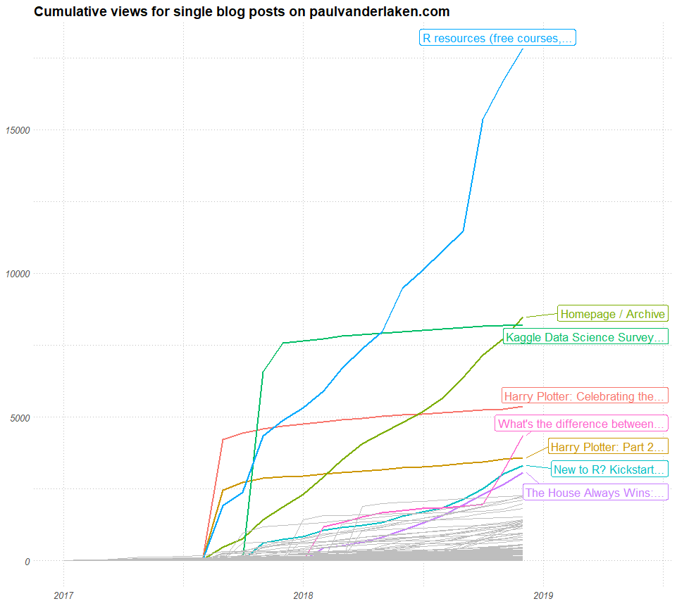
In my opinion, how an article attract viewers over time tells an interesting story. For instance, how stable are the daily viewer numbers? Are they rising? This is often indicative that external websites link to my article. Which implies it holds valuable information to a specific readership. In turn, this suggests that the article is likely to continue attracting viewers in the future.
Here is an abstract visualization. Every line represents and article. Every line/article starts in the lower left corner. On the x-axis you see the number of days since posting. So lines slowly move right, the longer they have been on my website. On the y-axis you see the total viewers it attracted.

You can see three types of blog articles: (1) articles that attract 90% of their views within the first month, (2) articles that generate a steady flow of visitors, (3) articles that never attract (m)any readers.
Here’s a different way of visualizing those same articles: by their average daily visitors (x) and the standard deviation in daily visitors (y).

Basically, I hope to write articles that get many daily visitors (high x). Yet, I also hope that my articles have either have stable (or preferably increasing) visitor numbers. This would mean that they either score low on y, or that y increases over time.
By these measures, my best articles of 2020 are, in my opinion:
- Bayesian statistics using R, Python, & Stan
- Automatically create perfect .gitignore file
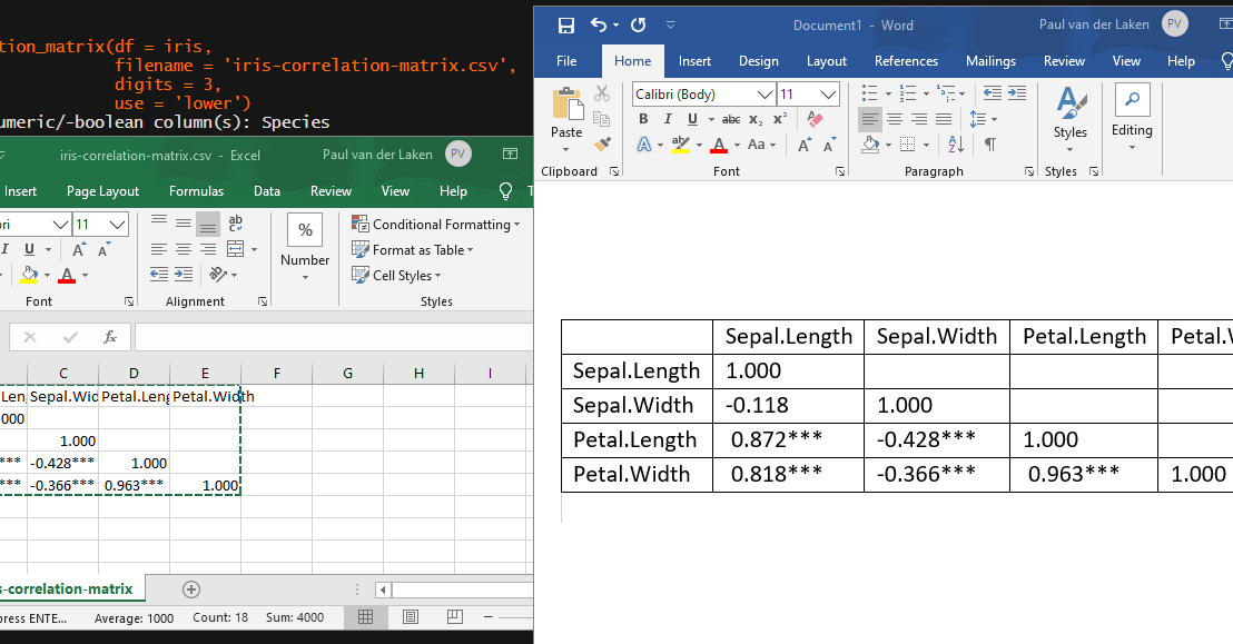
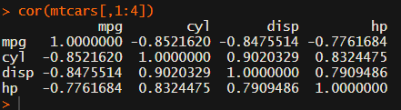
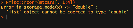
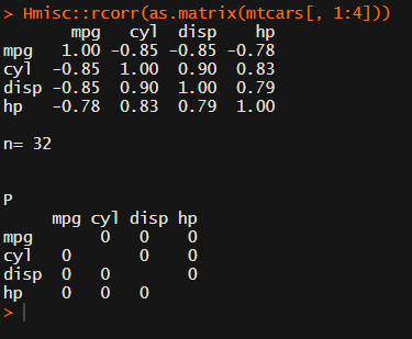
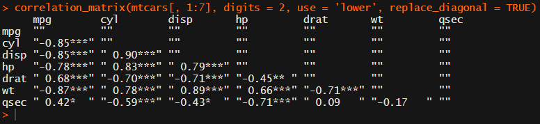
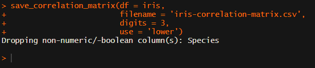
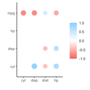
- Create a publication-ready correlation matrix
- Simulating and visualizing the Monthy Hall problem in R & Python
- How most statistical tests are linear
Best all time reads
For the first time, my blog roll & archives were the most visited page of my website this year! A whopping 13k views!!
With regard to the most visited pages of this year, not much has changed since 2019. We see some golden oldies and I once again conclude that my viewership remains mostly R-based:
- R resources
- New to R?
- R tips and tricks
- The house always wins
- Simple correlation analysis in R
- Visualization innovations
- Beating battleships with algorithms and AI
- Regular expressions in R
- Learn project-based programming
- Simpson’s paradox
Which articles haven’t you read?
Did you know you can search for keywords or tags using the main page?