This blog highlights a recent PNAS paper in which 457 data scientists and academic scholars were challenged use machine learning to predict life outcomes using a rich dataset.
Yet, I can not summarize the result better than this tweet by the author of the paper:
If hundreds of scientists created predictive algorithms with high-quality data, how well would the best predict life outcomes? Not very well. Fragile Families Challenge: paper in PNAS w 112 authors https://t.co/WxDJbw0joz & Special Collection of Socius https://t.co/WM9f4oYaABpic.twitter.com/ZPFChD79VR
Over 750 scientific papers have used the Fragile Families dataset.
The dataset is famous for its richness of cohort (survey) data on the included families’ lives and their childrens’ upbringings. It includes a whopping 12.942 variables!!
Some of these variables reflect interesting life outcomes of the included families.
For instance, the childrens’ grade point averages (GPA) and grit, but also whether the family was ever evicted or experienced hardship, or whether their primary caregiver had received job training or was laid off at work.
You can read more about the exact data contents in the paper’s appendix.
Now Matthew and his co-authors shared this enormous dataset with over 160 teams consisting of 457 academics researchers and data scientists alike. Each of them well versed in statistics and predictive modelling.
These data scientists were challenged with this task: by all means possible, make the most predictive model for the six life outcomes (i.e., GPA, conviction, etc).
The scientists could use all the Fragile Families data, and any algorithm they liked, and their final model and its predictions would be compared against the actual life outcomes in a holdout sample.
According to the paper, many of these teams used machine-learning methods that are not typically used in social science research and that explicitly seek to maximize predictive accuracy.
Now, here’s the summary again:
If hundreds of [data] scientists created predictive algorithms with high-quality data, how well would the best predict life outcomes?
Not very well.
@msalganik
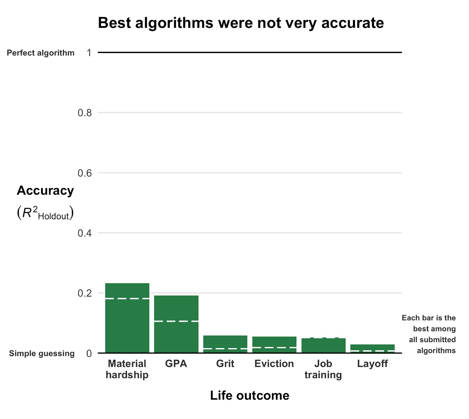
Even the best among the 160 teams’ predictions showed disappointing resemblance of the actual life outcomes. None of the trained models/algorithms achieved an R-squared of over 0.25.
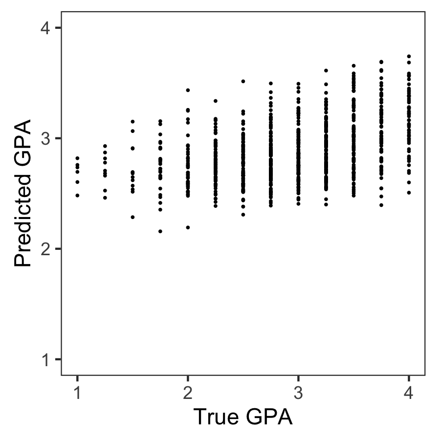
Wondering what these best R-squared of around 0.20 look like? Here’s the disappointg reality of plot C enlarged: the actual TRUE GPA’s on the x-axis, plotted against the best team’s predicted GPA’s on the y-axis.
Sure, there’s some relationship, with higher actual scores getting higher (average) predictions. But it ain’t much.
Moreover, there’s very little variation in the predictions. They all clump together between the range of about 2.1 and 3.8… that’s not really setting apart the geniuses from the less bright!
Matthew sums up the implications quite nicely in one of his tweets:
For policymakers deploying predictive algorithms in high-stakes decisions, our result is a reminder of a basic fact: one should not assume that algorithms predict well. That must be demonstrated with transparent, empirical evidence.
According to Matthew this “collective failure of 160 teams” is hard to ignore. And it failure highlights the understanding vs. predicting paradox: these data have been used to generate knowledge on how the world works in over 750 papers, yet few checked to see whether these same data and the scientific models would be useful to predict the life outcomes we’re trying to understand.
I was super excited to read this paper and I love the approach. It is actually quite closely linked to a series of papers I have been working on with Brian Spisak and Brian Doornenbal on trying to predict which people will emerge as organizational leaders. (hint: we could not really, at least not based on their personality)
Apparently, others were as excited as I am about this paper, as Filiz Garip already published a commentary paper on this research piece. Unfortunately, it’s behind a paywall so I haven’t read it yet.
Moreover, if you want to learn more about the approaches the 160 data science teams took in modelling these life outcomes, here are twelve papers in which some teams share their attempts.
Very curious to hear what you think of the paper and its implications. You can access it here, and I’d love to read your comments below.
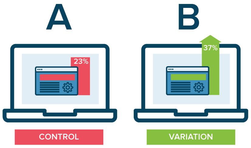
A/B testing is a method of comparing two versions of some thing against each other to determine which is better. A/B tests are often mentioned in e-commerce contexts, where the things we are comparing are web pages.
Business leaders and data scientists alike face a difficult trade-off when running A/B tests: How big should the A/B test be? Or in other words, After collecting how many data points, or running for how many days, should we make a decision whether A or B is the best way to go?
This is a tradeoff because the sample size of an A/B test determines its statistical power. This statistical power, in simple terms, determines the probability of a A/B test showing an effect if there is actually really an effect. In general, the more data you collect, the higher the odds of you finding the real effect and making the right decision.
By default, researchers often aim for 80% power, with a 5% significance cutoff. But is this general guideline really optimal for the tradeoff between costs and benefits in your specific business context? Chris thinks not.
Chris said wrote a great three-piece blog in which he explains how you can mathematically determine the optimal duration of A/B-testing in your own company setting:
Part I: General Overview. Starts with a mostly non-technical overview and ends with a section called “Three lessons for practitioners”.
Part II: Expected lift. A more technical section that quantifies the benefits of experimentation as a function of sample size.
Part III: Aggregate time-discounted lift. A more technical section that quantifies the costs of experimentation as a function of sample size. It then combines costs and benefits into a closed-form expression that can be optimized. Ends with an FAQ.
Update March, 2021: My R package for the predictive power score (ppsr) is live on CRAN! Try install.packages("ppsr") in your R terminal to get the latest version.
Last week, I shared this Medium blog on PPS — or Predictive Power Score — on my LinkedIn and got so many enthousiastic responses, that I had to share it with here too.
Basically, the predictive power score is a normalized metric (values range from 0 to 1) that shows you to what extent you can use a variable X (say age) to predict a variable Y (say weight in kgs).
A PPS high score of, for instance, 0.85, would show that weight can be predicted pretty good using age.
A low PPS score, of say 0.10, would imply that weight is hard to predict using age.
The PPS acts a bit like a correlation coefficient we’re used too, but it is also different in many ways that are useful to data scientists:
PPS also detects and summarizes non-linear relationships
PPS is assymetric, so that it models Y ~ X, but not necessarily X ~ Y
PPS can summarize predictive value of / among categorical variables and nominal data
However, you may argue that the PPS is harder to interpret than the common correlation coefficent:
PPS can reflect quite complex and very different patterns
Therefore, PPS are hard to compare: a 0.5 may reflect a linear relationship but also many other relationships
PPS are highly dependent on the used algorithm: you can use any algorithm from OLS to CART to full-blown NN or XGBoost. Your algorithm hihgly depends the patterns you’ll detect and thus your scores
PPS are highly dependent on the the evaluation metric (RMSE, MAE, etc).
Here’s an example picture from the original blog, showing a case in which PSS shows the relevant predictive value of Y ~ X, whereas a correlation coefficient would show no relationship whatsoever:
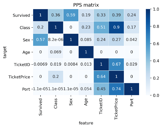
Here’s two more pictures from the original blog showing the differences with a standard correlation matrix on the Titanic data:
I highly suggest you readthe original blog for more details and information, and that you check out the associated Python packageppscore:
Installing the package:
pip install ppscore
Calculating the PPS for a given pandas dataframe:
import ppscore as pps
pps.score(df, "feature_column", "target_column")
You can also calculate the whole PPS matrix:
pps.matrix(df)
There’s no R package yet, but it should not be hard to implement this general logic.
Florian Wetschoreck — the author — already noted that there may be several use cases where he’d think PPS may add value:
Find patterns in the data [red: data exploration]: The PPS finds every relationship that the correlation finds — and more. Thus, you can use the PPS matrix as an alternative to the correlation matrix to detect and understand linear or nonlinear patterns in your data. This is possible across data types using a single score that always ranges from 0 to 1.
Feature selection: In addition to your usual feature selection mechanism, you can use the predictive power score to find good predictors for your target column. Also, you can eliminate features that just add random noise. Those features sometimes still score high in feature importance metrics. In addition, you can eliminate features that can be predicted by other features because they don’t add new information. Besides, you can identify pairs of mutually predictive features in the PPS matrix — this includes strongly correlated features but will also detect non-linear relationships.
Detect information leakage: Use the PPS matrix to detect information leakage between variables — even if the information leakage is mediated via other variables.
Data Normalization: Find entity structures in the data via interpreting the PPS matrix as a directed graph. This might be surprising when the data contains latent structures that were previously unknown. For example: the TicketID in the Titanic dataset is often an indicator for a family.
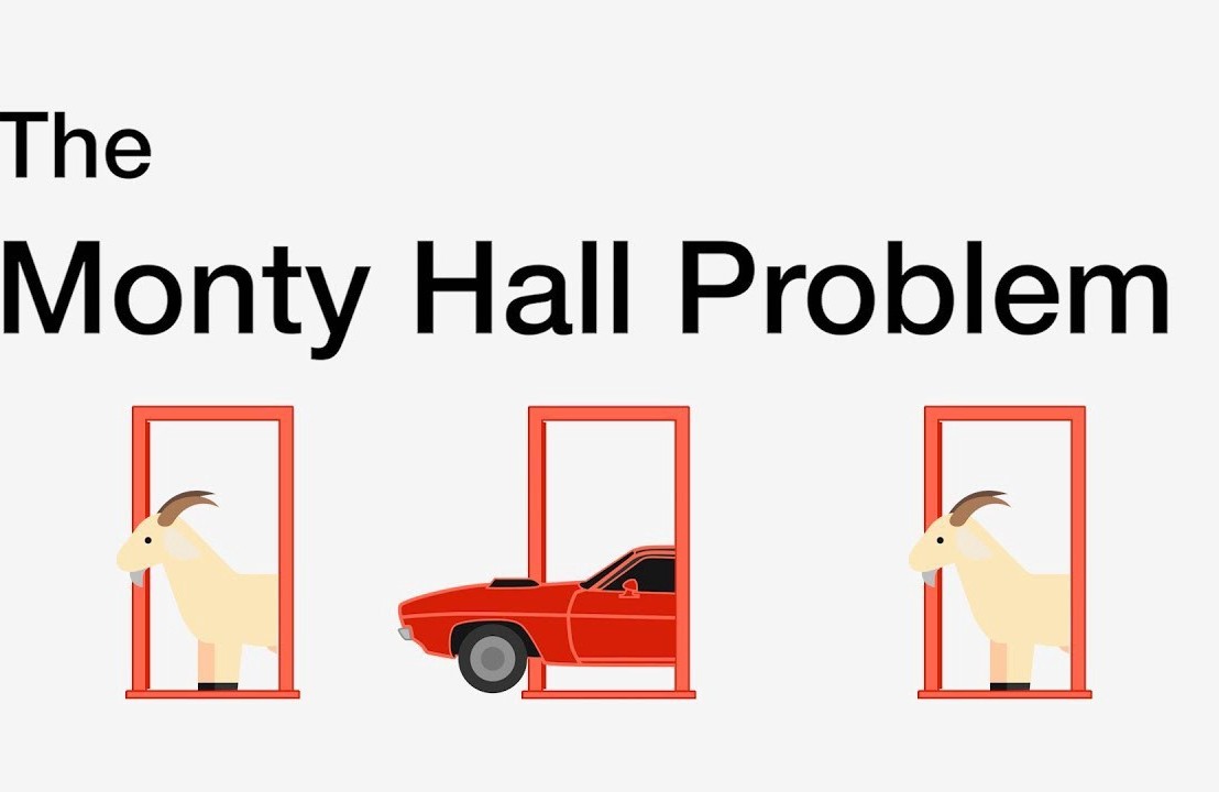
I recently visited a data science meetup where one of the speakers — Harm Bodewes — spoke about playing out the Monty Hall problem with his kids.
TheMonty Hall problemis probability puzzle. Based on the American television game show Let’s Make a Deal and its host, named Monty Hall:
You’re given the choice of three doors.
Behind one door sits a prize: a shiny sports car.
Behind the others doors, something shitty, like goats.
You pick a door — say, door 1.
Now, the host, who knows what’s behind the doors, opens one of the other doors — say, door 2 — which reveals a goat.
The host then asks you: Do you want to stay with door 1, or would you like to switch to door 3?
The probability puzzle here is:
Is switching doors the smart thing to do?
Back to my meetup.
Harm — the presenter — had ran the Monty Hall experiment with his kids.
Twenty-five times, he had hidden candy under one of three plastic cups. His kids could then pick a cup, he’d remove one of the non-candy cups they had not picked, and then he’d proposed them to make the switch.
The results he had tracked, and visualized in a simple Excel graph. And here he was presenting these results to us, his Meetup audience.
People (also statisticans) had been arguing whether it is best to stay or switch doors for years. Yet, here, this random guy ran a play-experiment and provided very visual proof removing any doubts you might have yourself.
You really need to switch doors!
At about the same time, I came across this Github repo by Saghir, who had made some vectorised simulations of the problem in R. I thought it was a fun excercise to simulate and visualize matters in two different data science programming languages — Python & R — and see what I’d run in to.
So I’ll cut to the chase.
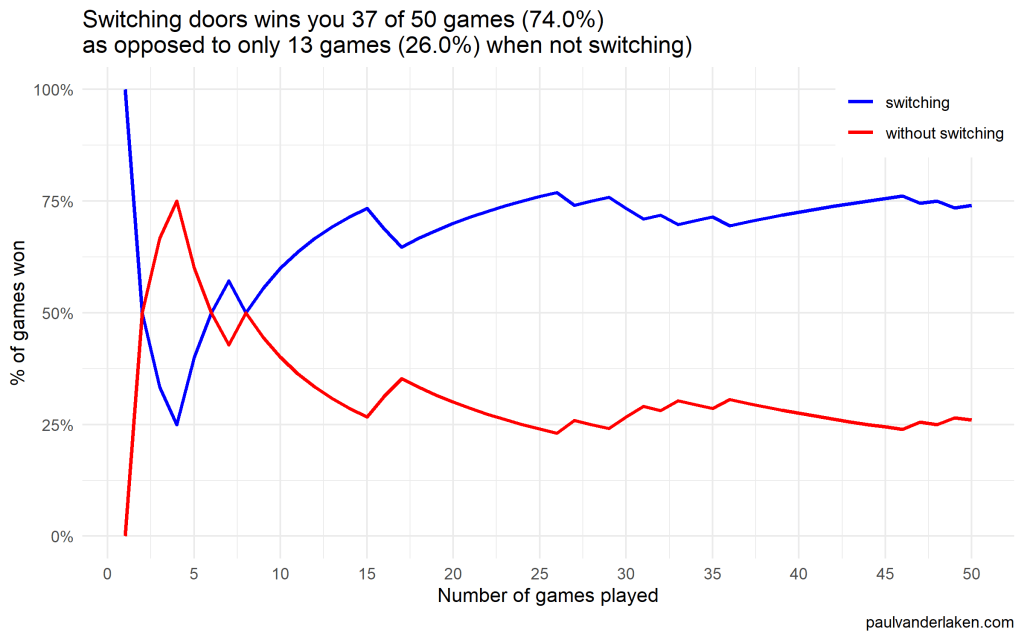
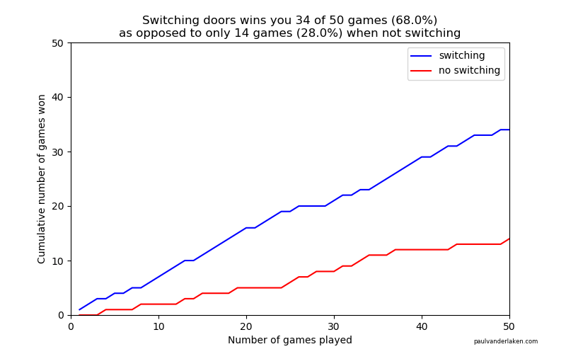
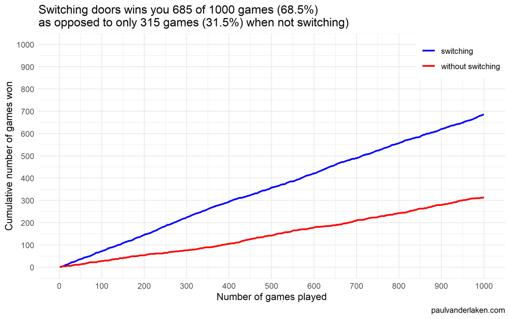
As we play more and more games against Monty Hall, it becomes very clear that you really, really, really need to switch doors in order to maximize the probability of winning a car.
Actually, the more games we play, the closer the probability of winning in our sample gets to the actual probability.
Even after 1000 games, the probabilities are still not at their actual values. But, ultimately…
If you stick to your door, you end up with the car in only 33% of the cases.
If you switch to the other door, you end up with the car 66% of the time!
Simulation Code
In both Python and R, I wrote two scripts. You can find the most recent version of the code on my Github. However, I pasted the versions of March 4th 2020 below.
The first script contains a function simulating a single game of Monty Hall. A second script runs this function an X amount of times, and visualizes the outcomes as we play more and more games.
Python
simulate_game.py
import random

def simulate_game(make_switch=False, n_doors=3, seed=None):
    '''
    Simulate a game of Monty Hall
    For detailed information: https://en.wikipedia.org/wiki/Monty_Hall_problem
    Basically, there are several closed doors and behind only one of them is a prize.
    The player can choose one door at the start.
    Next, the game master (Monty Hall) opens all the other doors, but one.
    Now, the player can stick to his/her initial choice or switch to the remaining closed door.
    If the prize is behind the player's final choice he/she wins.

    Keyword arguments:
    make_switch -- a boolean value whether the player switches after its initial choice and Monty Hall opening all other non-prize doors but one (default False)
    n_doors -- an integer value > 2, for the number of doors behind which one prize and (n-1) non-prizes (e.g., goats) are hidden (default 3)
    seed -- a seed to set (default None)
    '''

    # check the arguments
    if type(make_switch) is not bool:
        raise TypeError("`make_switch` must be boolean")
    if type(n_doors) is float:
        n_doors = int(n_doors)
        raise Warning("float value provided for `n_doors`: forced to integer value of", n_doors)
    if type(n_doors) is not int:
        raise TypeError("`n_doors` needs to be a positive integer > 2")
    if n_doors < 2:
        raise ValueError("`n_doors` needs to be a positive integer > 2")

    # if a seed was provided, set it
    if seed is not None:
        random.seed(seed)

    # sample one index for the door to hide the car behind
    prize_index = random.randint(0, n_doors - 1)

    # sample one index for the door initially chosen by the player
    choice_index = random.randint(0, n_doors - 1)

    # we can test for the current result
    current_result = prize_index == choice_index

    # now Monty Hall opens all doors the player did not choose, except for one door
    # next, he asks the player if he/she wants to make a switch
    if (make_switch):
        # if we do, we change to the one remaining door, which inverts our current choice
        # if we had already picked the prize door, the one remaining closed door has a nonprize
        # if we had not already picked the prize door, the one remaining closed door has the prize
        return not current_result
    else:
        # the player sticks with his/her original door,
        # which may or may not be the prize door
        return current_result
visualize_game_results.py
from simulate_game import simulate_game
from random import seed
from numpy import mean, cumsum
from matplotlib import pyplot as plt
import os

# set the seed here
# do not set the `seed` parameter in `simulate_game()`,
# as this will make the function retun `n_games` times the same results
seed(1)

# pick number of games you want to simulate
n_games = 1000

# simulate the games and store the boolean results
results_with_switching = [simulate_game(make_switch=True) for _ in range(n_games)]
results_without_switching = [simulate_game(make_switch=False) for _ in range(n_games)]

# make a equal-length list showing, for each element in the results, the game to which it belongs
games = [i + 1 for i in range(n_games)]

# generate a title based on the results of the simulations
title = f'Switching doors wins you {sum(results_with_switching)} of {n_games} games ({mean(results_with_switching) * 100:.1f}%)' + \
    '\n' + \
    f'as opposed to only {sum(results_without_switching)} games ({mean(results_without_switching) * 100:.1f}%) when not switching'

# set some basic plotting parameters
w = 8
h = 5

# make a line plot of the cumulative wins with and without switching
plt.figure(figsize=(w, h))
plt.plot(games, cumsum(results_with_switching), color='blue', label='switching')
plt.plot(games, cumsum(results_without_switching), color='red', label='no switching')
plt.axis([0, n_games, 0, n_games])
plt.title(title)
plt.legend()
plt.xlabel('Number of games played')
plt.ylabel('Cumulative number of games won')
plt.figtext(0.95, 0.03, 'paulvanderlaken.com', wrap=True, horizontalalignment='right', fontsize=6)

# you can uncomment this to see the results directly,
# but then python will not save the result to your directory
# plt.show()
# plt.close()

# create a directory to store the plots in
# if this directory does not yet exist
try:
    os.makedirs('output')
except OSError:
    None
plt.savefig('output/monty-hall_' + str(n_games) + '_python.png')
Visualizations (matplotlib)
R
simulate-game.R
Note that I wrote a second function, simulate_n_games, which just runs simulate_game an N number of times.
#' Simulate a game of Monty Hall
#' For detailed information: https://en.wikipedia.org/wiki/Monty_Hall_problem
#' Basically, there are several closed doors and behind only one of them is a prize.
#' The player can choose one door at the start.
#' Next, the game master (Monty Hall) opens all the other doors, but one.
#' Now, the player can stick to his/her initial choice or switch to the remaining closed door.
#' If the prize is behind the player's final choice he/she wins.
#'
#' @param make_switch A boolean value whether the player switches after its initial choice and Monty Hall opening all other non-prize doors but one. Defaults to `FALSE`
#' @param n_doors An integer value > 2, for the number of doors behind which one prize and (n-1) non-prizes (e.g., goats) are hidden. Defaults to `3L`
#' @param seed A seed to set. Defaults to `NULL`
#'
#' @return A boolean value indicating whether the player won the prize
#'
#' @examples
#' simulate_game()
#' simulate_game(make_switch = TRUE)
#' simulate_game(make_switch = TRUE, n_doors = 5L, seed = 1)
simulate_game = function(make_switch = FALSE, n_doors = 3L, seed = NULL) {

  # check the arguments
  if (!is.logical(make_switch) | is.na(make_switch)) stop("`make_switch` needs to be TRUE or FALSE")
  if (is.double(n_doors)) {
    n_doors = as.integer(n_doors)
    warning(paste("double value provided for `n_doors`: forced to integer value of", n_doors))
  }
  if (!is.integer(n_doors) | n_doors < 2) stop("`n_doors` needs to be a positive integer > 2")

  # if a seed was provided, set it
  if (!is.null(seed)) set.seed(seed)

  # create a integer vector for the door indices
  doors = seq_len(n_doors)

  # create a boolean vector showing which doors are opened
  # all doors are closed at the start of the game
  isClosed = rep(TRUE, length = n_doors)

  # sample one index for the door to hide the car behind
  prize_index = sample(doors, size = 1)

  # sample one index for the door initially chosen by the player
  # this can be the same door as the prize door
  choice_index = sample(doors, size = 1)

  # now Monty Hall opens all doors the player did not choose
  # except for one door
  # if we have already picked the prize door, the one remaining closed door has a nonprize
  # if we have not picked the prize door, the one remaining closed door has the prize
  if (prize_index == choice_index) {
    # if we have the prize, Monty Hall can open all but two doors:
    #   ours, which we remove from the options to sample from and open
    #   and one goat-conceiling door, which we do not open
    isClosed[sample(doors[-prize_index], size = n_doors - 2)] = FALSE
  } else {
    # else, Monty Hall can also open all but two doors:
    #   ours
    #   and the prize-conceiling door
    isClosed[-c(prize_index, choice_index)] = FALSE
  }

  # now Monty Hall asks us whether we want to make a switch
  if (make_switch) {
    # if we decide to make a switch, we can pick the closed door that is not our door
    choice_index = doors[isClosed][doors[isClosed] != choice_index]
  }

  # we return a boolean value showing whether the player choice is the prize door
  return(choice_index == prize_index)
}


#' Simulate N games of Monty Hall
#' Calls the `simulate_game()` function `n` times and returns a boolean vector representing the games won
#'
#' @param n An integer value for the number of times to call the `simulate_game()` function
#' @param seed A seed to set in the outer loop. Defaults to `NULL`
#' @param ... Any parameters to be passed to the `simulate_game()` function.
#' No seed can be passed to the simulate_game function as that would result in `n` times the same result
#'
#' @return A boolean vector indicating for each of the games whether the player won the prize
#'
#' @examples
#' simulate_n_games(n = 100)
#' simulate_n_games(n = 500, make_switch = TRUE)
#' simulate_n_games(n = 1000, seed = 123, make_switch = TRUE, n_doors = 5L)
simulate_n_games = function(n, seed = NULL, make_switch = FALSE, ...) {
  # round the number of iterations to an integer value
  if (is.double(n)) {
    n = as.integer(n)
  }
  if (!is.integer(n) | n < 1) stop("`n_games` needs to be a positive integer > 1")
  # if a seed was provided, set it
  if (!is.null(seed)) set.seed(seed)
  return(vapply(rep(make_switch, n), simulate_game, logical(1), ...))
}
visualize-game-results.R
Note that we source in the simulate-game.R file to get access to the simulate_game and simulate_n_games functions.
Also note that I make a second plot here, to show the probabilities of winning converging to their real-world probability as we play more and more games.
source('R/simulate-game.R')

# install.packages('ggplot2')
library(ggplot2)

# set the seed here
# do not set the `seed` parameter in `simulate_game()`,
# as this will make the function return `n_games` times the same results
seed = 1

# pick number of games you want to simulate
n_games = 1000

# simulate the games and store the boolean results
results_without_switching = simulate_n_games(n = n_games, seed = seed, make_switch = FALSE)
results_with_switching = simulate_n_games(n = n_games, seed = seed, make_switch = TRUE)

# store the cumulative wins in a dataframe
results = data.frame(
  game = seq_len(n_games),
  cumulative_wins_without_switching = cumsum(results_without_switching),
  cumulative_wins_with_switching = cumsum(results_with_switching)
)

# function that turns values into nice percentages
format_percentage = function(values, digits = 1) {
  return(paste0(formatC(values * 100, digits = digits, format = 'f'), '%'))
}

# generate a title based on the results of the simulations
title = paste(
  paste0('Switching doors wins you ', sum(results_with_switching), ' of ', n_games, ' games (', format_percentage(mean(results_with_switching)), ')'),
  paste0('as opposed to only ', sum(results_without_switching), ' games (', format_percentage(mean(results_without_switching)), ') when not switching)'),
  sep = '\n'
)

# set some basic plotting parameters
linesize = 1 # size of the plotted lines
x_breaks = y_breaks = seq(from = 0, to = n_games, length.out = 10 + 1) # breaks of the axes
y_limits = c(0, n_games) # limits of the y axis - makes y limits match x limits
w = 8 # width for saving plot
h = 5 # height for saving plot
palette = setNames(c('blue', 'red'), nm = c('switching', 'without switching')) # make a named color scheme

# make a line plot of the cumulative wins with and without switching
ggplot(data = results) +
  geom_line(aes(x = game, y = cumulative_wins_with_switching, col = names(palette[1])), size = linesize) +
  geom_line(aes(x = game, y = cumulative_wins_without_switching, col = names(palette[2])), size = linesize) +
  scale_x_continuous(breaks = x_breaks) +
  scale_y_continuous(breaks = y_breaks, limits = y_limits) +
  scale_color_manual(values = palette) +
  theme_minimal() +
  theme(legend.position = c(1, 1), legend.justification = c(1, 1), legend.background = element_rect(fill = 'white', color = 'transparent')) +
  labs(x = 'Number of games played') +
  labs(y = 'Cumulative number of games won') +
  labs(col = NULL) +
  labs(caption = 'paulvanderlaken.com') +
  labs(title = title)

# save the plot in the output folder
# create the output folder if it does not exist yet
if (!file.exists('output')) dir.create('output', showWarnings = FALSE)
ggsave(paste0('output/monty-hall_', n_games, '_r.png'), width = w, height = h)


# make a line plot of the rolling % win chance with and without switching
ggplot(data = results) +
  geom_line(aes(x = game, y = cumulative_wins_with_switching / game, col = names(palette[1])), size = linesize) +
  geom_line(aes(x = game, y = cumulative_wins_without_switching / game, col = names(palette[2])), size = linesize) +
  scale_x_continuous(breaks = x_breaks) +
  scale_y_continuous(labels = function(x) format_percentage(x, digits = 0)) +
  scale_color_manual(values = palette) +
  theme_minimal() +
  theme(legend.position = c(1, 1), legend.justification = c(1, 1), legend.background = element_rect(fill = 'white', color = 'transparent')) +
  labs(x = 'Number of games played') +
  labs(y = '% of games won') +
  labs(col = NULL) +
  labs(caption = 'paulvanderlaken.com') +
  labs(title = title)


# save the plot in the output folder
# create the output folder if it does not exist yet
if (!file.exists('output')) dir.create('output', showWarnings = FALSE)
ggsave(paste0('output/monty-hall_perc_', n_games, '_r.png'), width = w, height = h)
Visualizations (ggplot2)
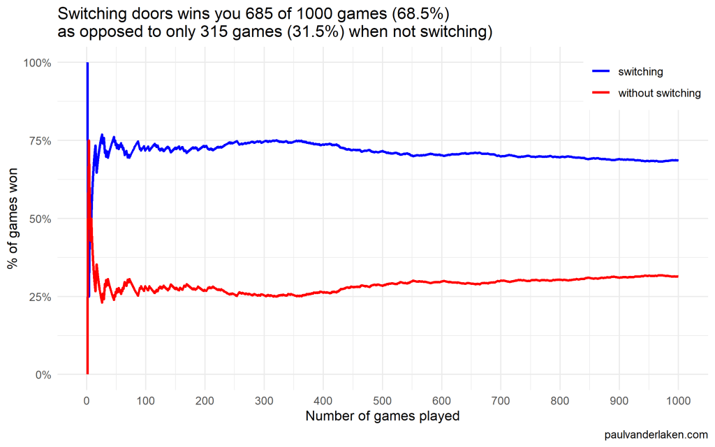
I specifically picked a seed (the second one I tried) in which not switching looked like it was better during the first few games played.
In R, I made an additional plot that shows the probabilities converging.
As we play more and more games, our results move to the actual probabilities of winning:
After the first four games, you could have erroneously concluded that not switching would result in better chances of you winning a sports car. However, in the long run, that is definitely not true.
I was actually suprised to see that these lines look to be mirroring each other. But actually, that’s quite logical maybe… We already had the car with our initial door guess in those games. If we would have sticked to that initial choice of a door, we would have won, whereas all the cases where we switched, we lost.
Keep me posted!
I hope you enjoyed these simulations and visualizations, and am curious to see what you come up with yourself!
For instance, you could increase the number of doors in the game, or the number of goat-doors Monty Hall opens. When does it become a disadvantage to switch?
Both in science and business, we often experience difficulties collecting enough data to test our hypotheses, either because target groups are small or hard to access, or because data collection entails prohibitive costs.
Such obstacles may result in data sets that are too small for the complexity of the statistical model needed to answer the questions we’re really interested in.
This unique book provides guidelines and tools for implementing solutions to issues that arise in small sample studies. Each chapter illustrates statistical methods that allow researchers and analysts to apply the optimal statistical model for their research question when the sample is too small.
This book will enable anyone working with data to test their hypotheses even when the statistical model required for answering their questions are too complex for the sample sizes they can collect. The covered statistical models range from the estimation of a population mean to models with latent variables and nested observations, and solutions include both classical and Bayesian methods. All proposed solutions are described in steps researchers can implement with their own data and are accompanied with annotated syntax in R.
Sean Owen created this handy cheat sheet that shows the most common probability distributions mapped by their underlying relationships.
Probability distributions are fundamental to statistics, just like data structures are to computer science. They’re the place to start studying if you mean to talk like a data scientist.
Owen argues that the probability distributions relate to each other in intuitive and interesting ways that makes it easier for you to recall them. For instance, several follow naturally from the Bernoulli distribution. Having this map by hand should thus help you really understand what these distributions imply.
On top of that, it’s just a nice geeky network poster!
Sean’s map of the relationships between probability distributions (via)
Now, Sean didn’t just make a fancy map. In the original blog he also explains each of the distributions and how it relates to the others. Having this knowledge is vital to being a good data scientist / analyst.
You can sometimes get away with simple analysis using R or scikit-learn without quite understanding distributions, just like you can manage a Java program without understanding hash functions. But it would soon end in tears, bugs, bogus results, or worse: sighs and eye-rolling from stats majors.
For instance, here’s Sean explaining the Binomial distribution:
The binomial distribution may be thought of as the sum of outcomes of things that follow a Bernoulli distribution. Toss a fair coin 20 times; how many times does it come up heads? This count is an outcome that follows the binomial distribution. Its parameters are n, the number of trials, and p, the probability of a “success” (here: heads, or 1). Each flip is a Bernoulli-distributed outcome, or trial. Reach for the binomial distribution when counting the number of successes in things that act like a coin flip, where each flip is independent and has the same probability of success.


