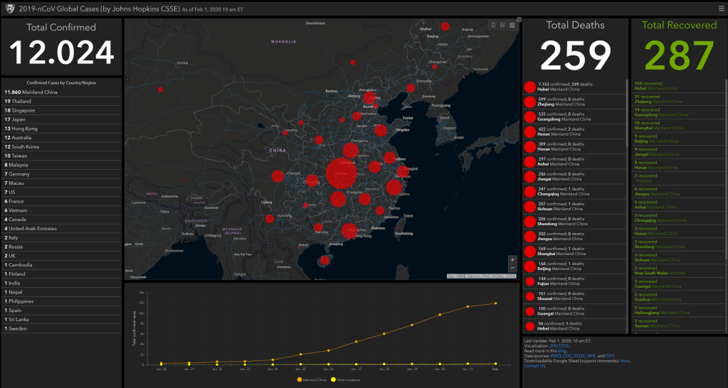
I don’t want to participate in the general debate on COVID19 as there are enough, much more knowledgeable experts doing so already.
However, I did want to share something that sparked my interest: this great article by the Washington Post where they show the importance of social distancing in case of viral outbreaks with four simple simulations:
Regular viral outbreak
Viral outbreak with forced (temporary) quarantaine
Viral outbreak with moderate social distancing
Viral outbreak with extensive social distancing
While these are obviously much oversimplified models of reality, the results convey a powerful and very visual message showing the importance of our social behavior in such a crisis.
1. Simulation of regular viral outbreak2. Simulation with temporary quarantaine opening up.
This video I’ve been meaning to watch for a while now. It another great visual explanation of a statistics topic by the 3Blue1Brown Youtube channel (which I’ve covered before, multiple times).
This time, it’s all about Bayes theorem, and I just love how Grant Sanderson explains the concept so visually. He argues that rather then memorizing the theorem, we’d rather learn how to draw out the context. Have a look at the video, or read my summary below:
Grant Sanderson explains the concept very visually following an example outlined in Daniel Kahneman’s and Amos Tversky’s book Thinking Fast, Thinking Slow:
Steve is very shy and withdrawn, invariably helpful but with very little interest in people or in the world of reality. A meek and tidy soul, he has a need for order and structure, and a passion for detail.”
Is Steve more likely to be a librarian or a farmer?
Kahneman and Tversky argue that people take into account Steve’s disposition and therefore lean towards librarians.
However, few people take into account that librarians are quite scarce in our society, which is rich with farmers. For every librarian, there are 20+ farmers. Hence, despite the disposition, Steve is probably more like to be a farmer.
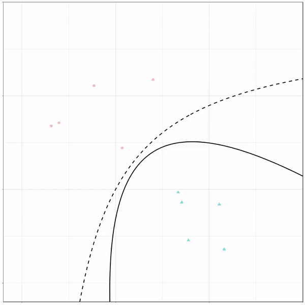
Ryan Holbrook made awesome animated GIFs in R of several classifiers learning a decision rule boundary between two classes. Basically, what you see is a machine learning model in action, learning how to distinguish data of two classes, say cats and dogs, using some X and Y variables.
These visuals can be great to understand these algorithms, the models, and their learning process a bit better.
Here’s the original tweet, with the logistic regression animation. If you follow it, you will find a whole thread of classifier GIFs. These I extracted, pasted, and explained below.
A thread of classifiers learning a decision rule. Dashed line is optimal boundary. Animations with #gganimate by @thomasp85 and @drob. #rstats
Logistic regression {stats::glm} with each class having normally distributed features. (1/n) pic.twitter.com/kKmqdO2zGy
Below is the GIF which I extracted using EZgif.com.
What you see is observations from two classes, say cats and dogs, each represented using colored dots. The dots are placed along X and Y axes, which represent variables about the observations. Their tail lengths and their hairyness, for instance.
Now there’s an optimal way to seperate these classes, which is the dashed line. That line best seperates the cats from the dogs based on these two variables X and Y. As this is an optimal boundary given this data, it is stable, it does not change.
However, there’s also a solid black line, which does change. This line represents the learned boundary by the machine learning model, in this case using logistic regression. As the model is shown more data, it learns, and the boundary is updated. This learned boundary represents the best line with which the model has learned to seperate cats from dogs.
Anything above the boundary is predicted to be class 1, a dog. Everything below predicted to be class 2, a cat. As logistic regression results in a linear model, the seperation boundary is very much linear/straight.
Logistic regression gif by Ryan Holbrook
These animations are great to get a sense of how the models come to their boundaries in the back-end.
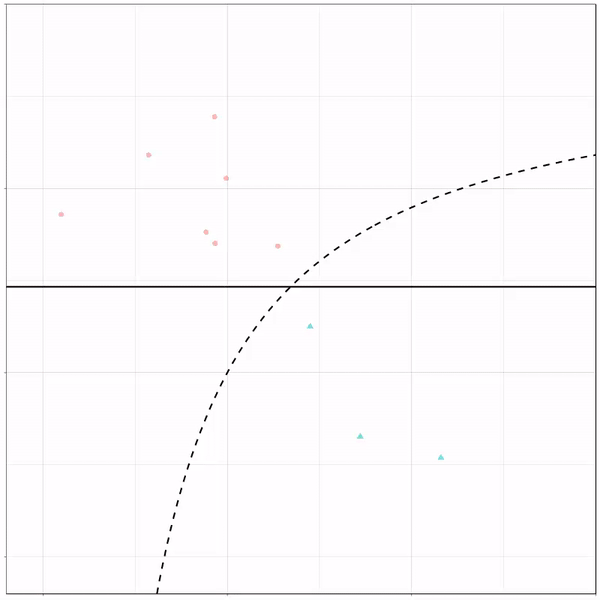
For instance, other machine learning models are able to use non-linear boundaries to dinstinguish classes, such as this quadratic discriminant analysis (qda). This “learned” boundary is much closer to the optimal boundary:
Quadratic discriminant analysis gif by Ryan Holbrook
Multivariate adaptive regression splines gif by Ryan Holbrook
Next, we have the k-nearest neighbors algorithm, which predicts for each point (animal) the class (cat/dog) based on the “k” points closest to it. As you see, this results in a highly fluctuating, localized boundary.
K-nearest neighbors gif by Ryan Holbrook
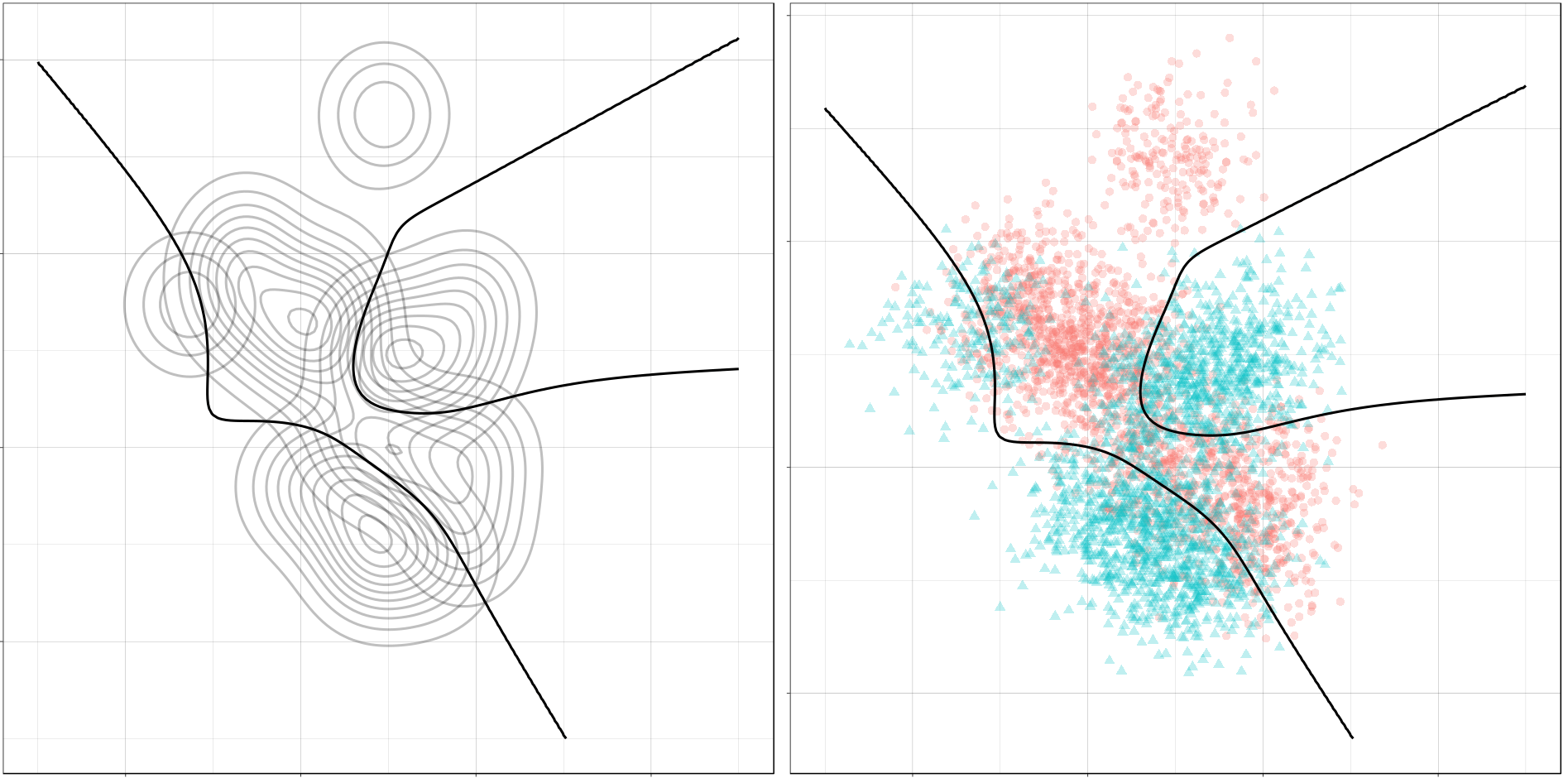
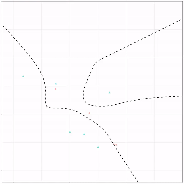
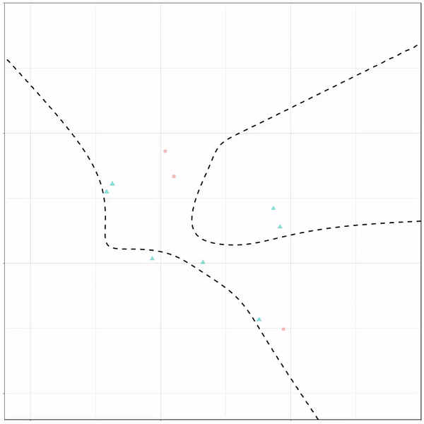
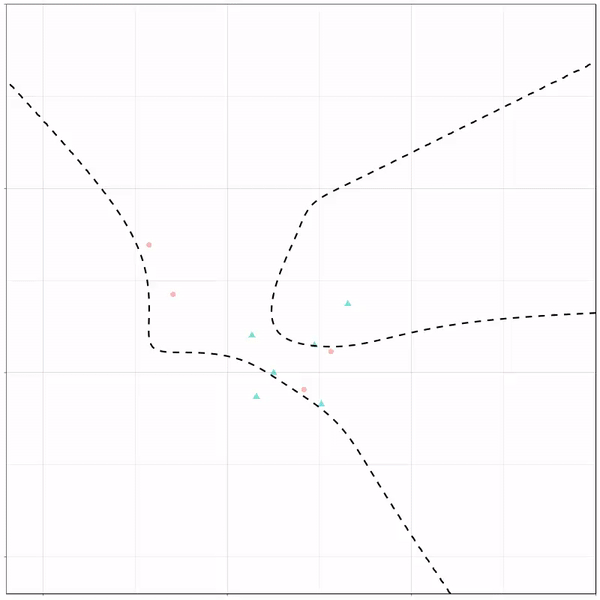
Now, Ryan decided to push the challenge, and simulate new data for two classes with a more difficult decision boundary. The new data and optimal boundaries look like this:
On these data, Ryan put a whole range of non-linear models to work.
Like this support-vector machine, which tries to create optimal boundaries built of support vectors around all the cats and all the dohs (this is definitely not a technical, error-free explanation of what’s happening here).
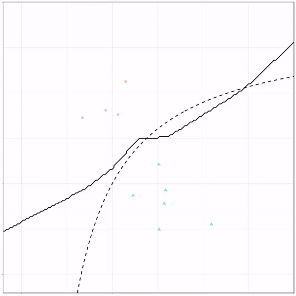
Let’s jump into some tree-based algorithms and the resulting models. A decision tree classifies data based on multiple, sequential, binary splits. Here, Ryan trained a simple decision tree:
Decision tree gif by Ryan Holbrook
As well as it’s big brother, a random forest, which uses hundreds of trees in the back end and thus results in a more flexible boundary:
Random forest gif by Ryan Holbrook
Extreme gradient boosting is also a tree-based algorithm, which leverages many machine learning techniques to optimize the bias-variance tradeoff. Here’s an earlier blog on how to get started with Xgboost in Python or R:
Leonardo is an open source tool for creating adaptive color palettes; a custom color generator for creating colors based on target contrast ratio. Leonardo is delivered as a Javascript module (@adobe/leonardo-contrast-colors) with a web interface to aid in creating your color palette configurations, which can easily be shared with both designers and engineers. Simply put, Leonardo is for dynamic accessibility of your products.
The tool is very easy to use. Even I could create a quick palette! Though it’s probably horrendous (due to my colorblindness : ))
🎨 Leonardo est une application web open source, créée par Adobe, qui permet de concevoir des nuanciers accessibles *et* adaptables à un contexte :https://t.co/QgP3UtrvBz