The people at Predictive Talent, Inc. took a sample of 23.4 million job postings from 5,200+ job boards and 1,800+ cities around the US. They classified these jobs using the BLS Standard Occupational Classification tree and identified their primary work locations, primary job roles, estimated salaries, and 17 other job search-related characteristics. Next, they calculated five metrics for each role and city in order to identify the 123 biggest job shortages in the US:
Monthly Demand (#): How many people are companies hiring every month? This is simply the number of unique jobs posted every month.
Unmet Demand (%): What percentage of jobs did companies have a hard time filling? Details aside, basically, if a company re-posts the same job every week for 6 weeks, one may assume that they couldn’t find someone for the first 5 weeks.
Salary ($): What’s the estimated salary for these jobs near this city? Using 145,000+ data points from the federal government and proprietary sources, along with salary information parsed from jobs themselves, they estimated the median salary for similar jobs within 100 miles of the city.
Delight (#): On a scale of 1 (least) to 10 (most delight), how easy should the job search be for the average job-seeker? This is basically the opposite of Agony.
The end result is this amazing map of the job market in the U.S, which you can interactively explore here to see where you could best start your next job hunt.
Max Woolf writes machine learning blogs on his personal blog, minimaxir, and posts open-source code repositories on his GitHub. He is a former Apple Software QA Engineer and graduated from Carnegie Mellon University. I have published his work before, for instance, this short ggplot2 tutorial by MiniMaxir, but his new project really amazed me.
Max developed a Facebook web scaper in Python. This tool gathers all the posts and comments of Facebook Pages (or Open Facebook Groups) and the related metadata, including post message, post links, and counts of each reaction on the post. The data is then exported to a CSV file, which can be imported into any data analysis program like Excel, or R.
The data format returned by the Facebook scaper.
Max put his scraper to work and gathered a ton of publicly available Facebook posts and their metadata between 2016 and 2017.
Responses to collected Facebook posts.
However, this was only the beginning. In a follow-up project, Max trained a recurrent neural network (or RNN) on these 2016-2017 data in order to predict the proportionate reactions (love, wow, haha, sad, angry) to any given text. Now, he has made this neural network publicly available with the Python 2/3 module and R package, reactionrnn, which builds on Keras/TensorFlow (see Keras: Deep Learning in R or Python within 30 seconds & R learning: Neural Networks).
reactionrnn architecture
Python implementation
For Python, reactionrnn can be installed from pypi via pip:
python3 -m pip install reactionrnn
You may need to create a venv (python3 -m venv <path>) first.
from reactionrnn import reactionrnn

react = reactionrnn()
react.predict("Happy Mother's Day from the Chicago Cubs!")
reactionrnn is trained on Facebook posts of 2016 and 2017 and will often yield responses that are characteristic for this corpus.
reactionrnn will only use the first 140 characters of any given text.
Max intends to build a web-based implementation using Keras.js
Max also intends to improve the network (longer character sequences and better performance) and released it as a commercial product if any venture capitalists are interested.
Max’s projects are open-source and supported by his Patreon, any monetary contributions are appreciated and will be put to good creative use.
The US Census Download Center contains rich information on its countries demographic data. Here you can find a piece of R code that uses the highcharter package in R to create an interactive map showing the median household per country.
Obviously, analysing beer data in high on everybody’s list of favourite things to do in your weekend. Amanda Dobbyn wanted to examine whether she could provide us with an informative categorization the 45.000+ beers in her data set, without having to taste them all herself.
You can find the full report here but you may also like to interactively discover beer similarities yourself in Amanda’s Beer Clustering Shiny App. Or just have a quick look at some of Amanda’s wonderful visualizations below.
A density map of the bitterness (y-axis) and alcohol percentages (x-axis) in the most popular beer styles.A k-means clustering of each of the 45000 beers in 10 clusters. Try out other settings in Amanda’s Beer Clustering Shiny App.The alcohol percentages (x), bitterness (y) and cluster assignments of some popular beer styles.
Modelling beer’s bitterness (y) by the number of used hops (x).
This blog explains t-Distributed Stochastic Neighbor Embedding (t-SNE) by a story of programmers joining forces with musicians to create the ultimate drum machine (if you are here just for the fun, you may start playing right away).
Kyle McDonald, Manny Tan, and Yotam Mann experienced difficulties in pinpointing to what extent sounds are similar (ding, dong) and others are not (ding, beep) and they wanted to examine how we, humans, determine and experience this similarity among sounds. They teamed up with some friends at Google’s Creative Lab and the London Philharmonia to realize what they have named “the Infinite Drum Machine” turning the most random set of sounds into a musical instrument.
The project team wanted to include as many different sounds as they could, but had less appetite to compare, contrast and arrange all sounds into musical accords themselves. Instead, they imagined that a computer could perform such a laborious task. To determine the similarities among their dataset of sounds – which literally includes a thousand different sounds from the ngaaarh of a photocopier to the zing of an anvil – they used a fairly novel unsupervised machine learning technique called t-Distributed Stochastic Neighbor Embedding, or t-SNE in short (t-SNE Wiki; developer: Laurens van der Maaten). t-SNE specializes in dimensionality reduction for visualization purposes as it transforms highly-dimensional data into a two- or three-dimensional space. For a rapid introduction to highly-dimensional data and t-SNE by some smart Googlers, please watch the video below.
As the video explains, t-SNE maps complex data to a two- or three-dimensional space and was therefore really useful to compare and group similar sounds. Sounds are super highly-dimensional as they are essentially a very elaborate sequence of waves, each with a pitch, a duration, a frequency, a bass, an overall length, etcetera (clearly I am no musician). You would need a lot of information to describe a specific sound accurately. The project team compared sound to fingerprints, as there is an immense amount of data in a single padamtss.
t-SNE takes into account all this information of a sound and compares all sounds in the dataset. Next, it creates 2 or 3 new dimensions and assigns each sound values on these new dimensions in such a way that sounds which were previously similar (on the highly-dimensional data) are also similar on the new 2 – 3 dimensions. You could say that t-SNE summarizes (most of) the information that was stored in the previous complex data. This is what dimensionality reduction techniques do: they reduce the number of dimensions you need to describe data (sufficiently). Fortunately, techniques such as t-SNE are unsupervised, meaning that the project team did not have to tag or describe the sounds in their dataset manually but could just let the computer do the heavy lifting.
The result of this project is fantastic and righteously bears the name of Infinite Drum Machine (click to play)! You can use the two-dimensional map to explore similar sounds and you can even make beats using the sequencing tool. The below video summarizes the creation process.
Amazed by this application, I wanted to know how t-SNE is being used in other projects. I have found a tremendous amount of applications that demonstrate how to implement t-SNE in Python, R, and even JS whereas the method also seems popular in academia.
Clusters of similar cats/dogs in Luke Metz’ application of t-SNE.Cho et al., 2014 have used t-SNE in their natural language processing projects as it allows for an easy examination of the similarity among words and phrases. Mnih and colleagues (2015) have used t-SNE to examine how neural networks were playing video games.
Two-dimensional t-SNE visualization of the hidden layer activity of neural network playing Space Invaders (Mnih et al., 2015)
On a final note, while acknowledging its potential, this blog warns for the inaccuracies in t-SNE due to the aesthetical adjustments it often seems to make. They have some lovely interactive visualizations to back up their claim. They conclude that it’s incredible flexibility allows t-SNE to find structure where other methods cannot. Unfortunately, this makes it tricky to interpret t-SNE results as the algorithm makes all sorts of untransparent adjustments to tidy its visualizations and make the complex information fit on just 2-3 dimensions.
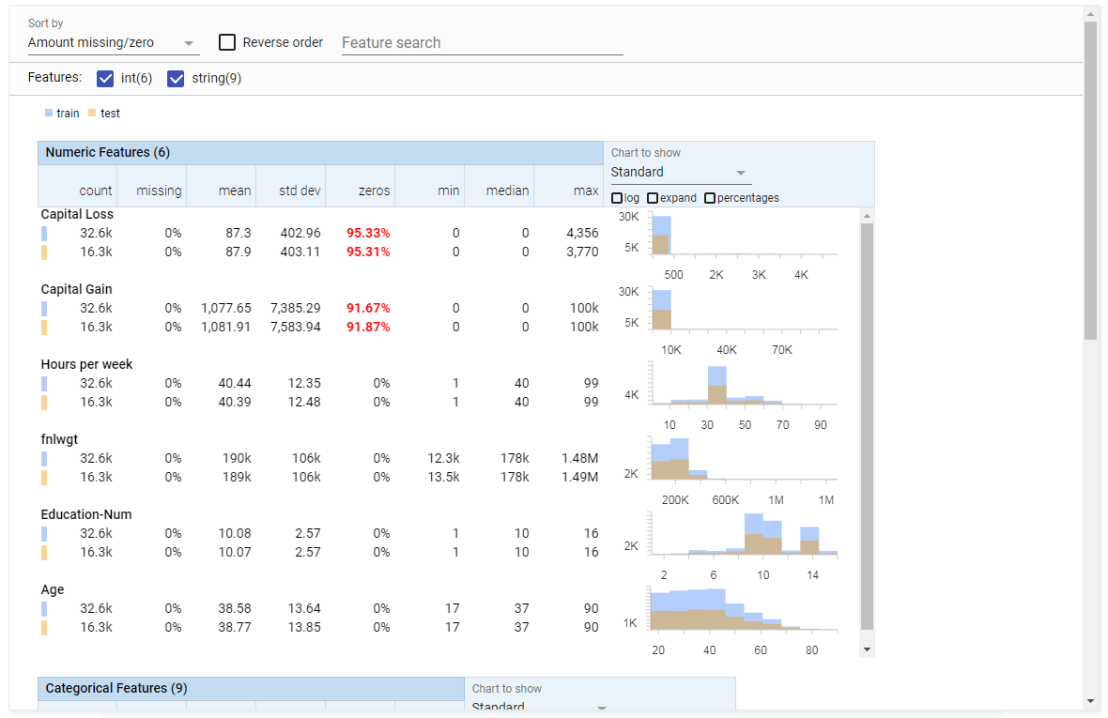
Last week, Google released Facets, their new, open source visualization tool. Facets consists of two interfaces that allow users to investigate their data at different levels.
Facets Overview provides users with a quick understanding of the distribution of values across the variables in their dataset. Overview is especially helpful in detecting unexpected values, missing values, unbalanced distributions, and skewed distributions. Overview will detect all kinds of statistics for every column (i.e., variable) in your dataset, along with some simple vizualizations, such as histograms.
Example of Facets Overview tool
Dive is the name of the second interface of Facets. It provides an intuitive dashboard in which users can explore relationships between data points across the different variables in their dataset. The dashboard is easy to customize and users can control the position, color, and visual representation of each data point based on the underlying values.
Example of Facets Dive tool
Moreover, if the data points have images associated with them, these images can be used as the visual representations of the data points. The latter is especially helpful when Facets is used for its actual purpose: aiding in machine learning processes. The below GIF demonstrates how Facets Dive spots incorrectly labelled images with ease, allowing users to zoom in on a case-by-case level, for instance, to identify a frog that has been erroneously labelled as a cat.
Exploration of the CIFAR-10 dataset using Facets Dive


![indico_features_img_callout_small-1024x973[1].jpg](https://paulvanderlaken.com/wp-content/uploads/2017/08/indico_features_img_callout_small-1024x9731.jpg?w=1108)