Data visualizations that make smart use of icons have a way of conveying information that sticks. Dataviz professionals like Moritz Stefaner know this and use the practice in their daily work.
A recent #tidytuesday entry by Georgios Karamanis demonstrates how easy it is to integrate visual icons in your data figures when you write code in R. You can simply store the URL location of an icon as a data column, and map it to an aesthetic using the ggplot2::geom_image function.
Do have a closer look at Georgios’ github repository for week 21 of tidytuesday. You will probably have to alter the code a bit to get it to work. though!
For those who haven’t moved away from base R plotting functions yet, here’s a good StackOverflow item showing how to use icons in both base R and tidyverse.
Disclaimer: This page contains one or more links to Amazon. Any purchases made through those links provide us with a small commission that helps to host this blog.
Data visualization and the (in)effective communication of information are salient topics on this blog. I just love to read and write about best practices related to data visualization (or bad practices), or to explore novel types of complex graphs. However, I am not always online, and I am equally fond of reading about data visualization offline.
These amazing books about data visualization are written by some of the leading experts in the dataviz scene:
Looking for a custom typeface to use in your data visualizations? Google Fonts is an awesome databank of nearly a thousands font families you can access, download, and use for free.
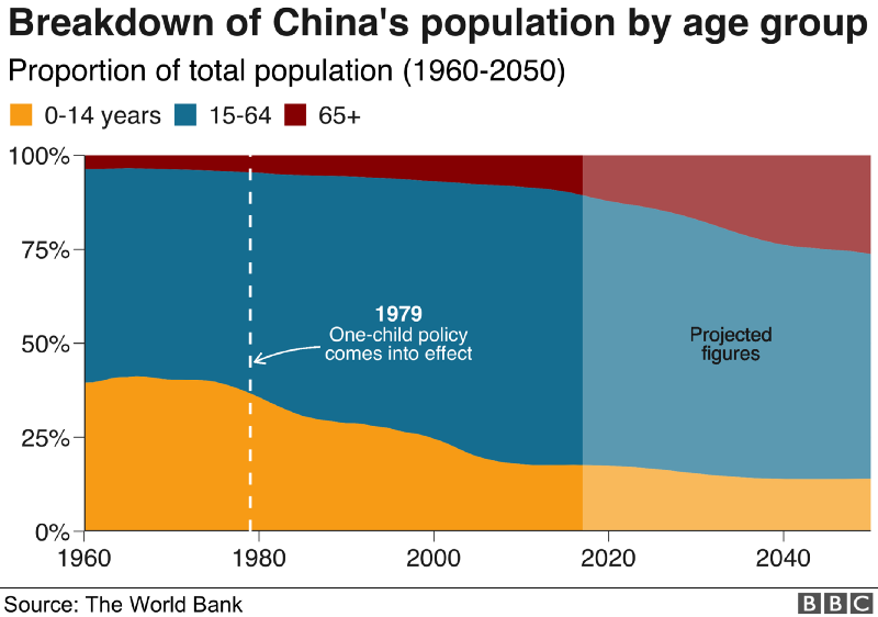
The BBC data team developed an R package (bbplot) which makes the process of creating publication-ready graphics in their in-house style using R’s ggplot2 library a more reproducible process, as well as making it easier for people new to R to create graphics.
Apart from sharing several best practices related to data visualization, they walk you through the steps and R code to create graphs such as the below:
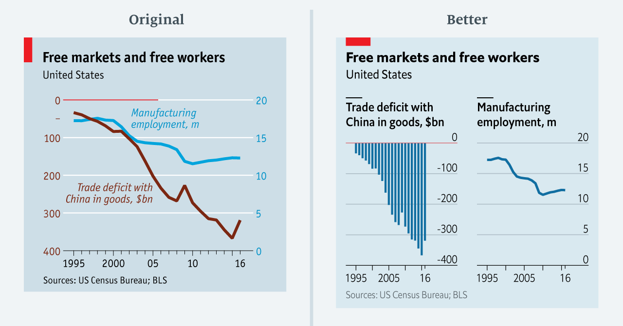
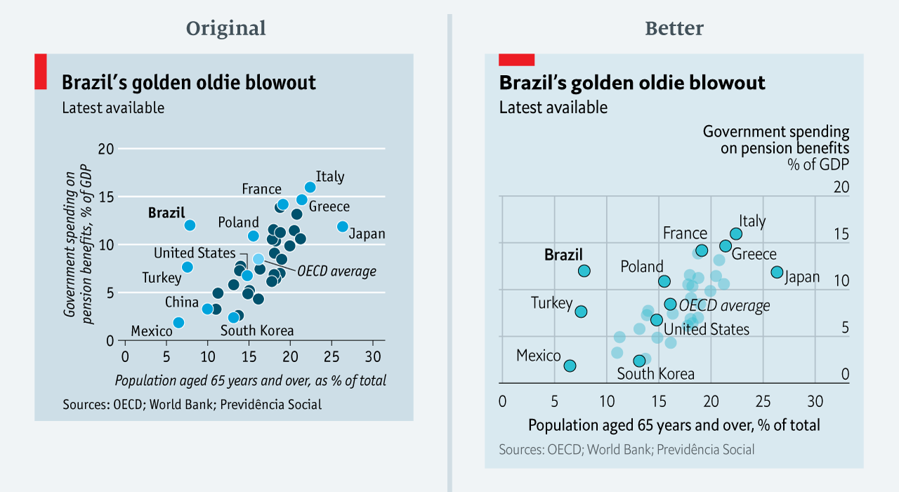
The data team at the Economist also felt a need to share their lessons learned via Medium. They show some of their most misleading, confusing, and failing graphics of the past years, and share the following mistakes and their remedies:
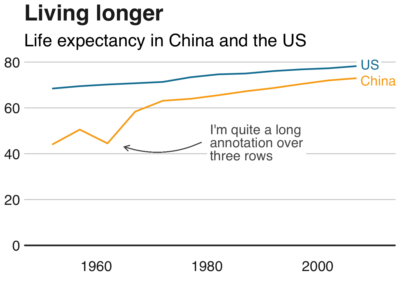
Truncating the scale (image #1 below)
Forcing a relationship by cherry-picking scales
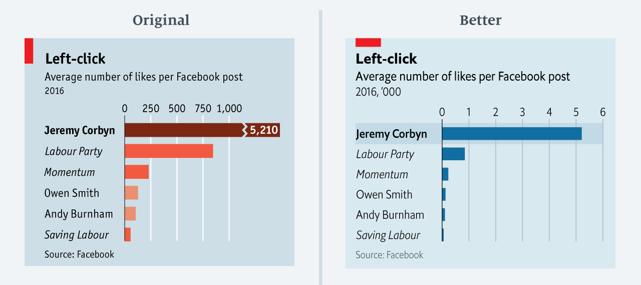
Choosing the wrong visualisation method (image #2 below)
Taking the “mind-stretch” a little too far (image #3 below)
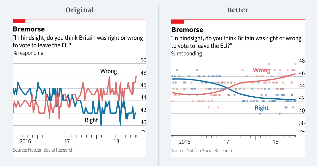
Confusing use of colour (image #4 below)
Including too much detail
Lots of data, not enough space
Moreover, they share the data behind these failing and repaired data visualizations:
All 538’s data visualizations are just stunningly beautiful and often very ingenious, using new chart formats to display complex patterns. Moreover, the range of topics they cover is huge. Anything ranging from their traditional background — politics — to great cover stories on sumo wrestling and pricy wine.
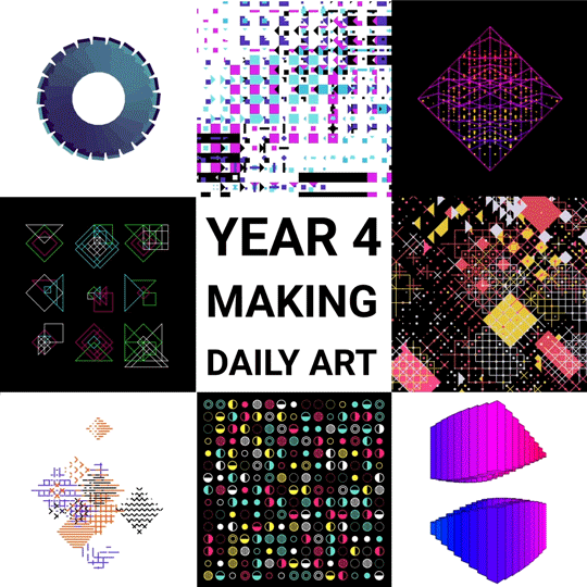
Saskia Freeke (twitter) is a Dutch artist, creative coder, interaction designer, visual designer, and educator working from Amsterdam. She has been creating an awesome digital art piece for every day since January 1st 2015. Her ever-growing collection includes some animated, visual masterpieces.
Maarten Lambrechts is a data journalist I closely follow online, with great delight. Recently, he shared on Twitter his slidedeck on the 18 most common data visualization pitfalls. You will probably already be familiar with most, but some (like #14) were new to me:
Save pies for dessert
Don’t cut bars
Don’t cut time axes
Label directly
Use colors deliberately
Avoid chart junk
Scale circles by area
Avoid double axes
Correlation is no causality
Don’t do 3D
Sort on the data
Tell the story
1 chart, 1 message
Common scales on small mult’s
#Endrainbow
Normalise data on maps
Sometimes best map is no map
All maps lie
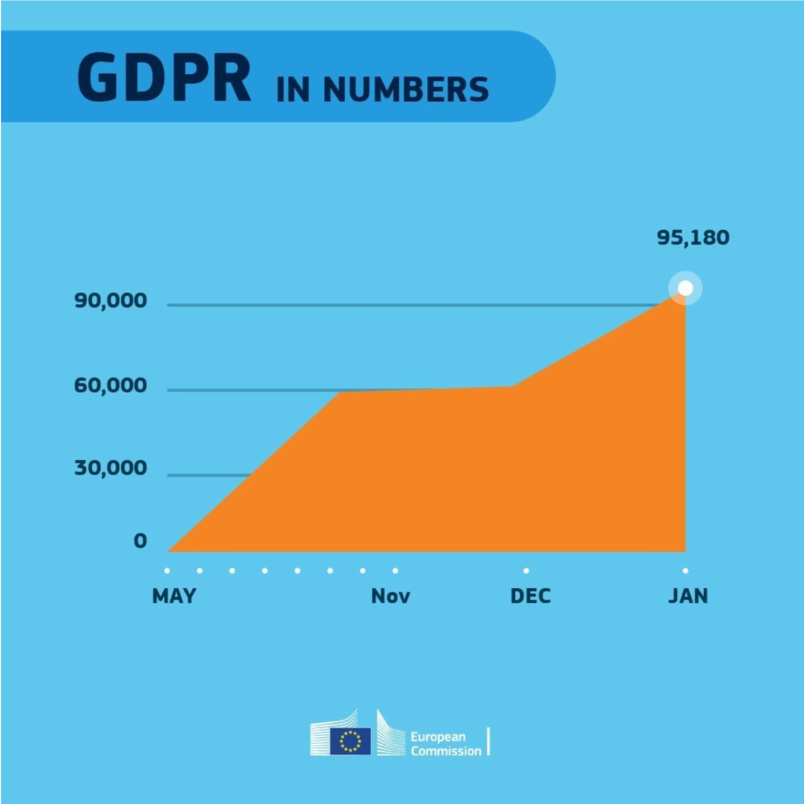
Even though most of these 18 rules below seem quite obvious, even the European Commissions seems to break them every now and then: