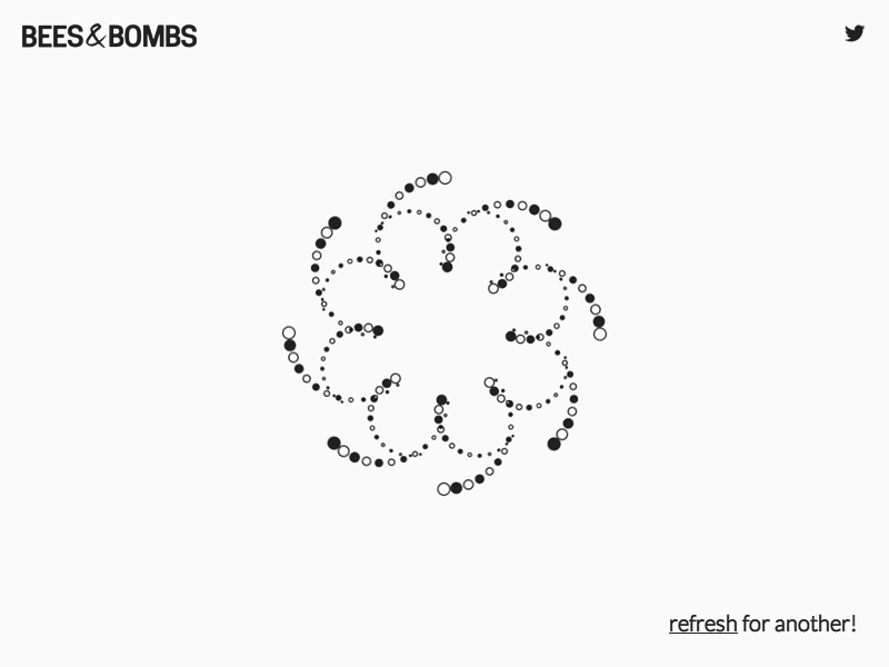
I really like generative art, or so-called algorithmic art. Basically, it means you take a pattern or a complex system of rules, and apply it to create something new following those patterns/rules.
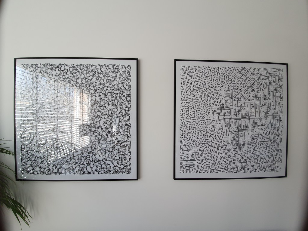
When I finished my PhD, I got a beautiful poster of where the k-nearest neighbors algorithms was used to generate a set of connected points.
As we recently moved into our new house, I decided I wanted to have a brother for the knn-poster. So I did some research in algorithms I wanted to use to generate a painting. I found some very cool ones, of which I unforunately can’t recollect the artists anymore:
Note: these are NOT mine
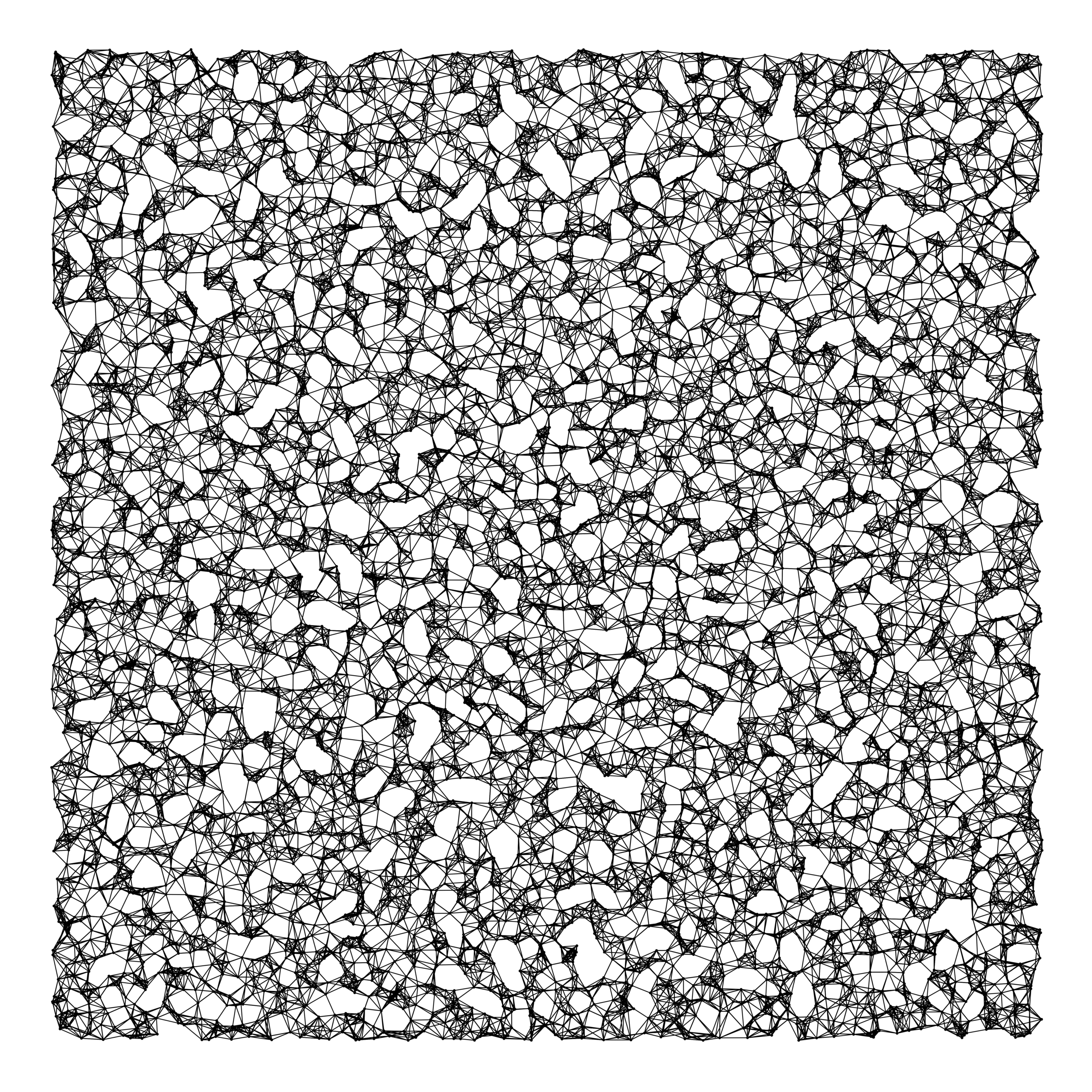
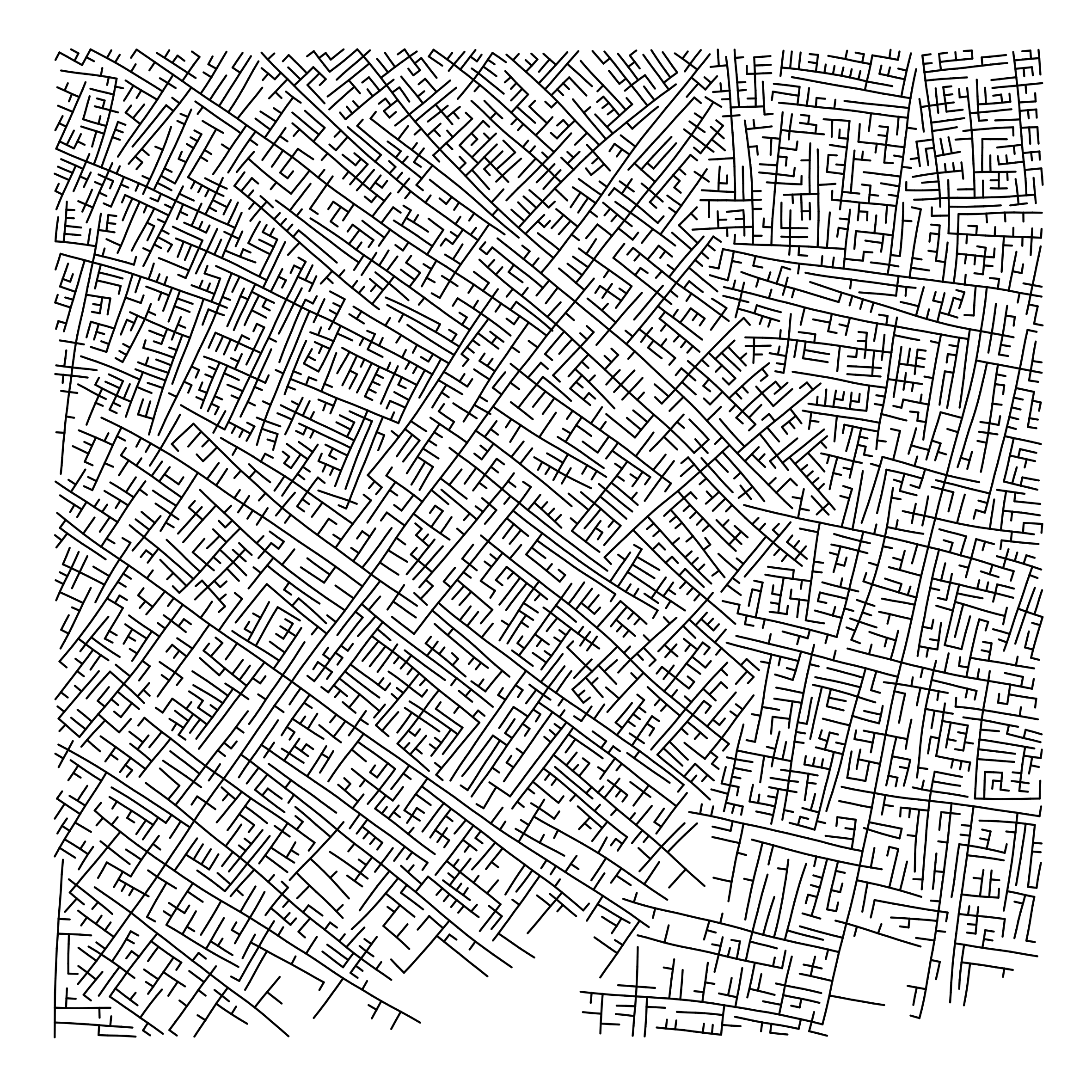
However, I preferred to make one myself. So we again turned to the work of the author that made the knn-poster: Marcus Volz.
He has written (in R) many other algorithms. And we found that one specifically nicely matched the knn-poster. His metropolis – or generative city:
However, I wanted to make one myself, so I download Marcus code, and tweaked it a bit. Most importantly, I made it start in the center, made it fill up the whole space, and I made it run more efficient so I could generate a couple dozen large cities quickly, and pick the one I liked most. Here’s the end result:
Typography plays a crucial role in design and finding the right font can take a few minutes or a few days. According to Vijay Verma, every font has specific design intent, communicates certain attributes. Fortunately, there are many (free) online libraries to help you these days, such as Google Fonts, MyFonts, Lineto, TypeAtelier, or TypeMates.
Geometric fonts
Geometric fonts are sans-serif typefaces building on geometric shapes like near-perfect circles and squares.
Today many technology brands currently deploy geometric fonts that represent minimalism, simplicity, and cleanliness, like — Product Sans by Google, Cereal by Airbnb etc.
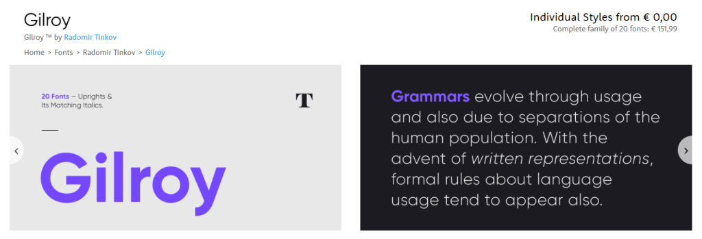
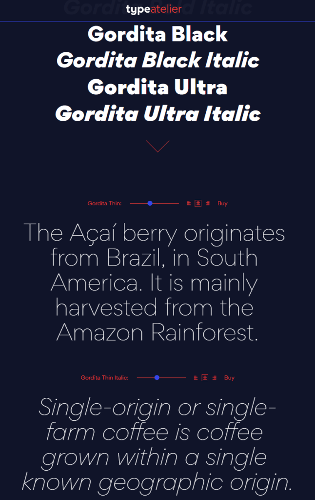
Design experts argue (here, here) that the geometric fonts below will work very well in modern user interfaces. These fonts are used among others by IKEA, Spotify, NASA, AirBnB, Volkswagen, Apple, Marvel, and Snapchat. Can you guess which is which?
You can click the images to visit the source pages.
Although very aesthetically pleasing, some of these fonts can be pretty expensive if you’re just hobbying. While there are many more fonts out there that may be perfectly free.
Do have a look atGoogle Fonts, as they provide nearly a 1000 pretty interesting typefaces, all for free!
Moreover, if you’re specifically looking for a geometric font, have a look at these 18 free geometric typefaces!
We can’t just throw data into machines and expect to see any meaning […], we need to think [about this]. I see a strong trend in the practitioners community to just automate everything, to just throw data into a black box and expect to get money out of it, and I really don’t believe in that.
All pictures below are slides from the above video.
My summary / interpretation
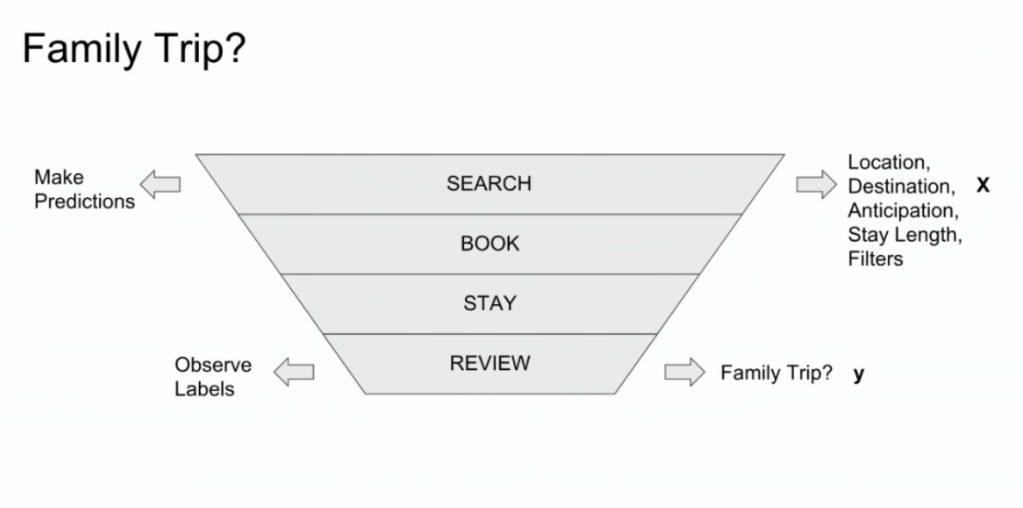
Lucas highlights an example he has been working on at Booking.com, where they seek to predict which searching activities on their website are for family trips.
What happens is that people forget to specify that they intend to travel as a family, forget to input one/two/three child travellers will come along on the trip, and end up not being able to book the accomodations that come up during their search. If Booking.com would know, in advance, that people (may) be searching for family accomodations, they can better guide these bookers to family arrangements.
The problem here is that many business processes in real life look and act like a funnel. Samples drop out of the process during the course of it. So too the user search activity on Booking.com’s website acts like a funnel.
People come to search for arrangements
Less people end up actually booking arrangements
Even less people actually go on their trip
And even less people then write up a review
However, only for those people that end up writing a review, Booking.com knows 100% certain that they it concerned a family trip, as that is the moment the user can specify so. Of all other people, who did not reach stage 4 of the funnel, Booking.com has no (or not as accurate an) idea whether they were looking for family trips.
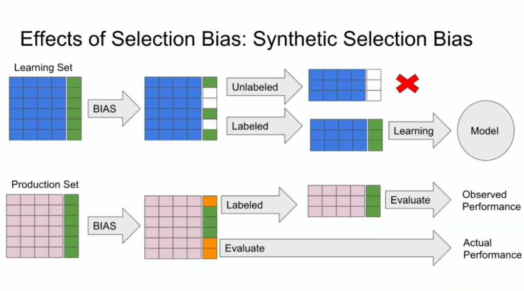
Such a funnel thus inherently produces business data with selection bias in it. Only for people making it to the review stage we know whether they were family trips or not. And only those labeled data can be used to train our machine learning model.
And now for the issue: if you train and evaluate a machine learning model on data generated with such a selection bias, your observed performance metrics will not reflect the actual performance of your machine learning model!
Actually, they are pretty much overestimates.
This is very much an issue, even though many ML practitioners don’t see aware. Selection bias makes us blind as to the real performance of our machine learning models. It produces high variance in the region of our feature space where labels are missing. This leads us to being overconfident in our ability to predict whether some user is looking for a family trip. And if the mechanism causing the selection bias is still there, we could never find out that we are overconfident. Consistently estimating, say, 30% of people are looking for family trips, whereas only 25% are.
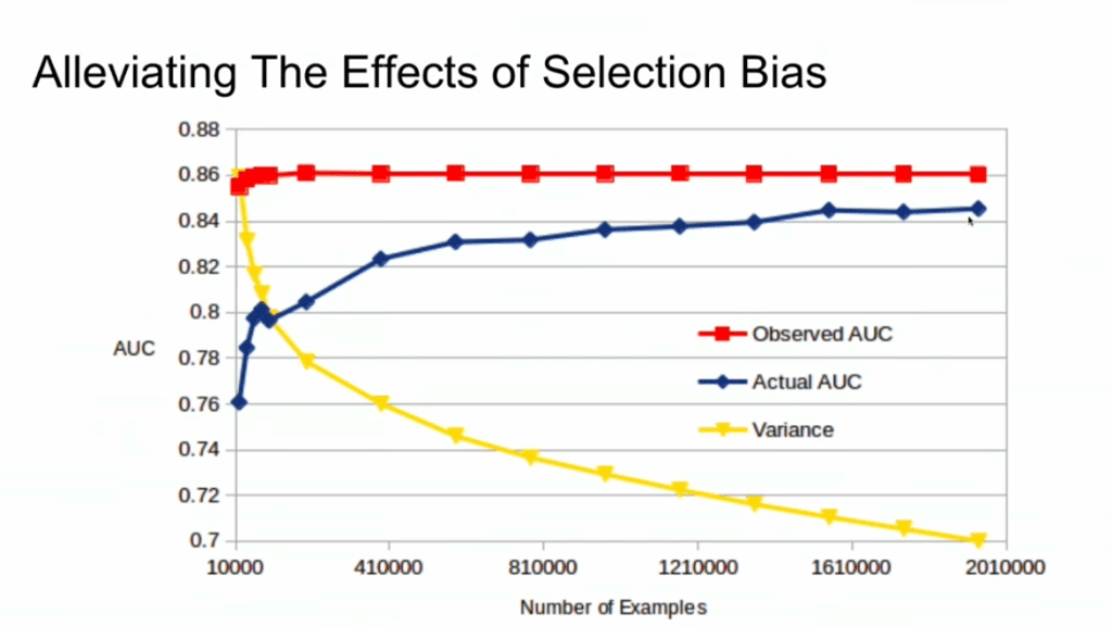
Fortunately, Lucas proposes a very simple solution! Just adding more observations can (partially) alleviate this detrimental effect of selection bias. Although our bias still remains, the variance goes down and the difference between our observed and actual performance decreases.
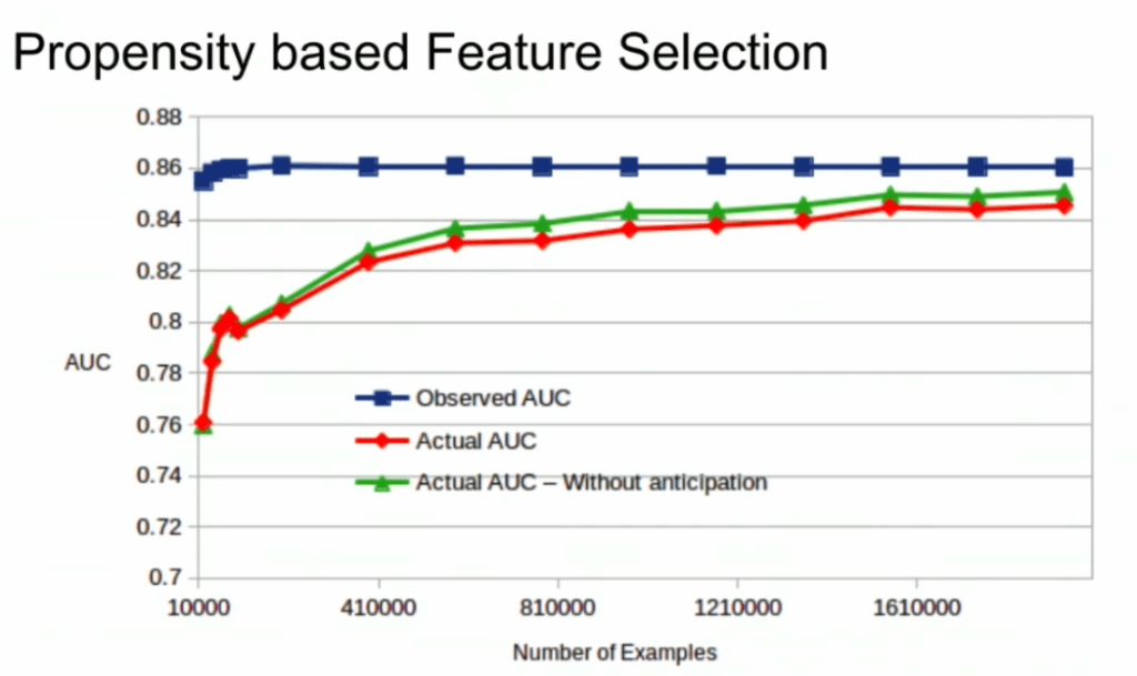
A second issue and solution to selection bias relates to propensity (see also): the extent to which your features X influence not only the outcome Y, but also the selection criteria s.
If our features X influence both the outcome Y but also the selection criteria s, selection bias will occur in your data and can thus screw up your conclusion. In order to inspect to what extent this occurs in your setting, you will want to estimate a propensity model. If that model is good, and X appears valuable in predicting s, you have a selection bias problem.
Via a propensity model s ~ X, we quantify to what extent selection bias influences our data and model. The nice thing is that we, as data scientists, control the features X we use to train a model. Hence, we could just use only features X that do not predict s to predict Y. Conclusion: we can conduct propensity-based feature selection in our Y ~ X by simply avoiding features X that predicted s!
Still, Lucas does point that this becomes difficult when you have valuable features that predict both s and Y. Hence, propensity-based feature selection may end up cost(ing) you performance, as you will need to remove features relevant to Y.
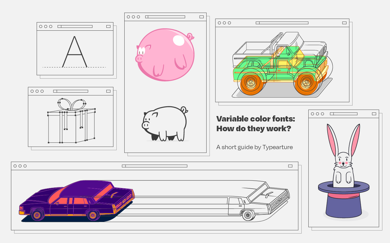
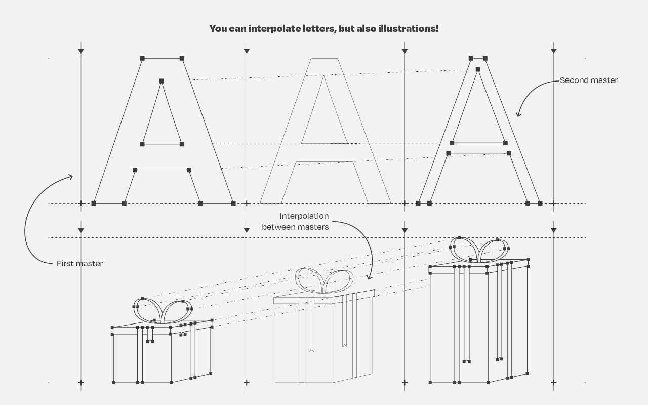
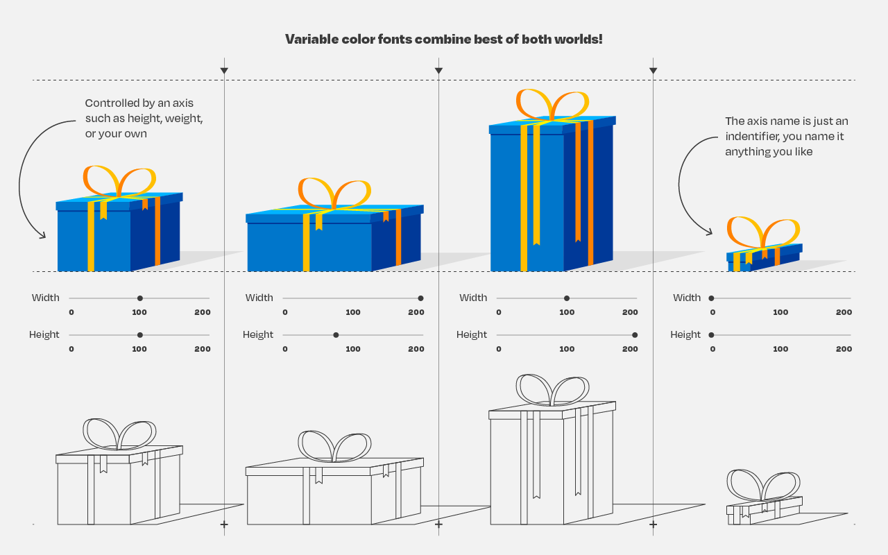
So, you’ve probably never heard of variable fonts.
Well, I sure had not when I first came across the concept a week or so ago. And I was shocked. This looked so cool. As I adjusted the size of my browser, the text and images adjusted itself along. As I made my Chrome window bigger, the text enlarged to keep filling the space it was allowed. Insane!
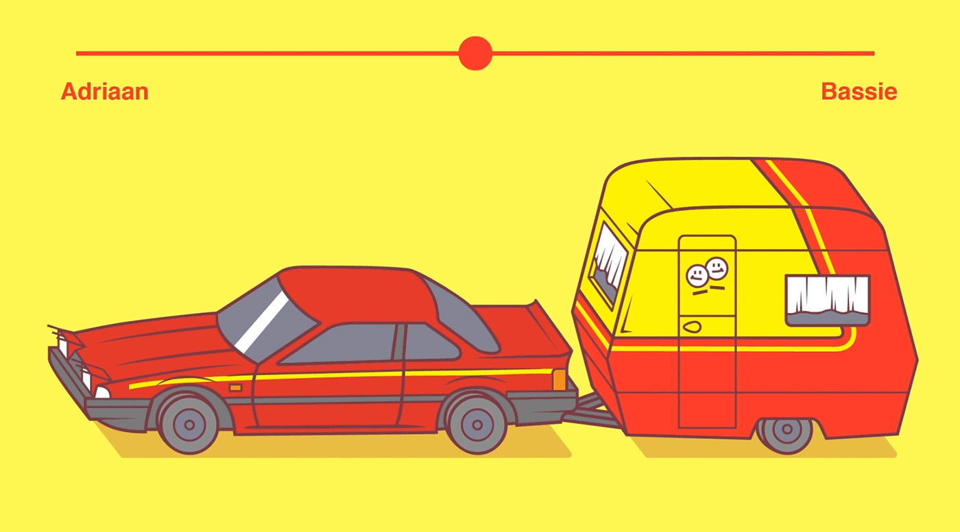
Typearture is Arthur Reinders Folmer’s adventure in type, creating type designs with a focus on conceptual, illustrative and ornamental typefaces.
The typefaces in the Typearture library are not just collections of glyphs, but typefaces that use the conventions of type design and written language to tell their stories. These stories are woven throughout the typefaces, connecting A to Z and the Lemniscate to Question mark. Each character has it’s place and meaning, making each keystroke a small tale in itself.
Processingis a flexible software sketchbook and a language for learning how to code within the context of the visual arts. It’s open-source, there are many online materials, and the language itself is very accessible.
I recently stumbled upon 17-year-old Joseff Nic from Cardiff who has been making GIFs in Processing only since 2018, but which are turning out fantastic already. You can hire him here, and have a look at his Twitter, Tumbler or Drimble channels for the originals:
Some of Joseff’s work seems inspired by David Whyte, a graphic designer from Ireland. His portfolio is quite impressive as well, very visually pleasing, and you can hire him here.
If you’re interesting in learning Processing, Daniel Shiffman demonstrates how to create the most amazing things in Processing via his Youtube channel the Coding Train, which I’ve covered before.
Ever wondered what it is like to program computer games?
Or even better, what it is like to program programs that program your computer games for you? Then welcome to the wonderful world of procedural game design, such as Spore, Borderlands, and No Man’s Sky.
Recently, I have been watching and greatly enjoying this Youtube playlist of the South-African Sebastian Lague. In a series of nine videos, Sebastian programs a procedural cave generator from scratch. The program generates a pseudo-random cave, following some sensible constraints, everytime its triggered.
The following is Sebastian’s first video in the series labeled: Learn how to create procedurally generated caverns/dungeons for your games using cellular automata and marching squares.
More in line with my blog’s main topics, Sebastian also hosts a series on neural networks, which I will most probably watch and report on over the course of the coming weeks: