Tag: programming

R tips and tricks

R tips and tricks

Below are a dozen of very specific R tips and tricks. Some are valuable, useful, or boost your productivity. Others are just geeky funny. 

More general helpful R packages and resources can be found in this list.

If you have additions, please comment below or contact me!

Completely new to R? → Start here!

Table of Contents


Join 385 other subscribers

RStudio

Many more shortkeys available here online, and in your RStudio under Tools → Keyboard Shortcuts Help.

General

Disclaimer: This page contains one or more links to Amazon.
Any purchases made through those links provide us with a small commission that helps to host this blog.

Useful base functions

Back to Table of Contents

R Markdown

Data manipulation

Data visualization

Back to Table of Contents

Fun

Easter eggs

Join 385 other subscribers

Back to Table of Contents

rstudio::conf 2018 summary

rstudio::conf 2018 summary

rstudio::conf is the yearly conference when it comes to R programming and RStudio. In 2017, nearly 500 people attended and, last week, 1100 people went to the 2018 edition. Regretfully, I was on holiday in Cardiff and missed out on meeting all my #rstats hero’s. Just browsing through the #rstudioconf Twitter-feed, I already learned so many new things that I decided to dedicate a page to it!

Fortunately, you can watch the live streams taped during the conference:

Two people have collected the slides of most rstudio::conf 2018 talks, which you can acces via the Github repo’s of matthewravey and by simecek. People on Twitter have particularly recommended teach the tidyverse to beginners (by David Robinson), the lesser known stars of the tidyverse (by Emily Robinson), the future of time series and financial analysis in the tidyverse (by Davis Vaughan of business-science.io), Understanding Principal Component Analysis (by Julia Silge), and Deploying TensorFlow models (by Javier Luraschi). Nevertheless, all other presentations are definitely worth checking out as well!

One of the workshops deserves an honorable mention. Jenny Bryan presented on What they forgot to teach you about R, providing some excellent advice on reproducible workflows. It elaborates on her earlier blog on project-oriented workflows, which you should read if you haven’t yet. Some best pRactices Jenny suggests:

  • Restart R often. This ensures your code is still working as intended. Use Shift-CMD-F10 to do so quickly in RStudio.
  • Use stable instead of absolute paths. This allows you to (1) better manage your imports/exports and folders, and (2) allows you to move/share your folders without the code breaking. For instance, here::here("data","raw-data.csv") loads the raw-data.csv-file from the data folder in your project directory. If you are not using the here package yet, you are honestly missing out! Alternatively you can use fs::path_home()normalizePath() will make paths work on both windows and mac. You can usebasename instead of strsplit to get name of file from a path.
  • To upload an existing git directory to GitHub easily, you can usethis::use_github().
  • If you include the below YAML header in your .R file, you can easily generate .md files for you github repo.
#' ---
#' output: github_document
#' ---
  • Moreover, Jenny proposed these useful default settings for knitr:
knitr::opts_chunk$set(
collapse = TRUE,
comment = "#>",
out.width = "100%"
)

Another of Jenny Bryan‘s talks was named Data Rectangling and although you might not get much out of her slides without her presenting them, you should definitely try the associated repurrrsive tutorial if you haven’t done so yet. It’s a poweR up for any useR!

Here’s a Shiny dashboard made by Garrick Aden-Buie including all the #rstudioconf tweets so you can browse the posts yourself. If you want to download the tweets, Mike Kearney (author of rtweet) shares the data here on his Github. Some highlights:

These probably only present a minimal portion of the thousands of tips and tricks you could have learned by simply attending rstudio::conf. I will definitely try to attend next year’s edition. Nevertheless, I hope the above has been useful. If I missed out on any tips, presentations, tweets, or other materials, please reply below, tweet me or pop me a message!

Animated Snow in R

Animated Snow in R

Due to the recent updates to the gganimate package, the code below no longer produces the desired animation.
A working, updated version can be found here

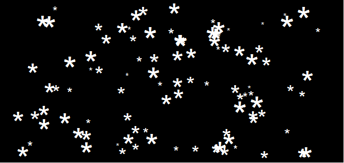
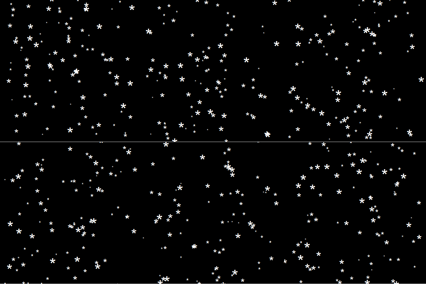
After hearing R play the Jingle Bells tune, I really got into the holiday vibe. It made me think of Ilya Kashnitsky (homepage, twitter) his snowy image in R.

if(!"tidyverse" %in% installed.packages()) install.packages("tidyverse")

library("tidyverse")

n <- 100 
tibble(x = runif(n),  
y = runif(n),  
s = runif(n, min = 4, max = 20)) %>%
ggplot(aes(x, y, size = s)) +
geom_point(color = "white", pch = 42) +
scale_size_identity() +
coord_cartesian(c(0,1), c(0,1)) +
theme_void() +
theme(panel.background = element_rect("black"))

snow.png

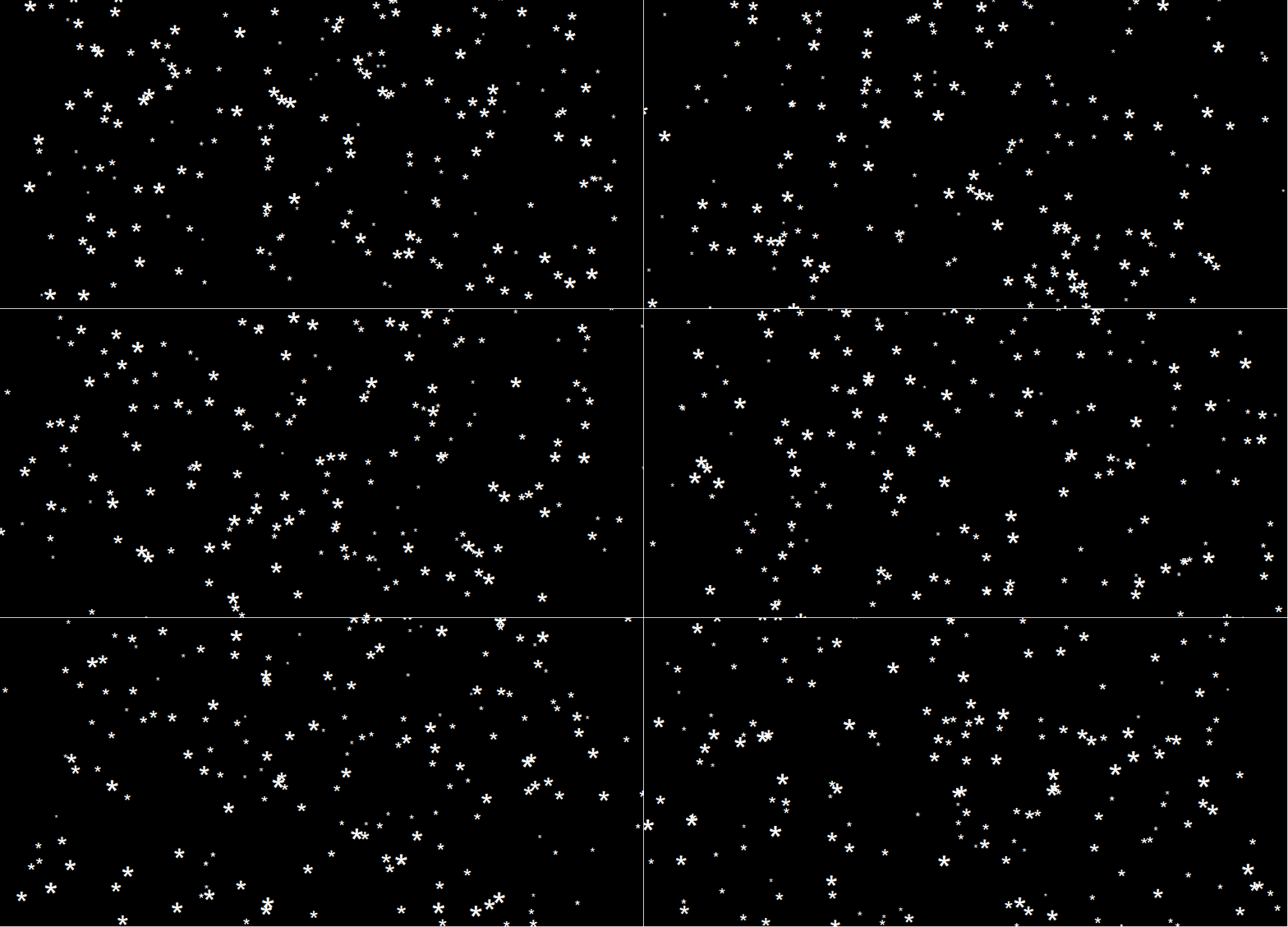
This greatly fits the Christmas theme we have going here. Inspired by Ilya’s script, I decided to make an animated snowy GIF! Sure R is able to make something like the lively visualizations Daniel Shiffman (Coding Train) usually makes in Processing/JavaScript? It seems so:

snow

### ANIMATED SNOW === BY PAULVANDERLAKEN.COM
### PUT THIS FILE IN AN RPROJECT FOLDER

# load in packages
pkg <- c("here", "tidyverse", "gganimate", "animation")
sapply(pkg, function(x){
if (!x %in% installed.packages()){install.packages(x)}
library(x, character.only = TRUE)
})

# parameters
n <- 100 # number of flakes
times <- 100 # number of loops
xstart <- runif(n, max = 1) # random flake start x position
ystart <- runif(n, max = 1.1) # random flake start y position
size <- runif(n, min = 4, max = 20) # random flake size
xspeed <- seq(-0.02, 0.02, length.out = 100) # flake shift speeds to randomly pick from
yspeed <- runif(n, min = 0.005, max = 0.025) # random flake fall speed

# create storage vectors
xpos <- rep(NA, n * times)
ypos <- rep(NA, n * times)

# loop through simulations
for(i in seq(times)){
if(i == 1){
# initiate values
xpos[1:n] <- xstart
ypos[1:n] <- ystart
} else {
# specify datapoints to update
first_obs <- (n*i - n + 1)
last_obs <- (n*i)
# update x position
# random shift
xpos[first_obs:last_obs] <- xpos[(first_obs-n):(last_obs-n)] - sample(xspeed, n, TRUE)
# update y position
# lower by yspeed
ypos[first_obs:last_obs] <- ypos[(first_obs-n):(last_obs-n)] - yspeed
# reset if passed bottom screen
xpos <- ifelse(ypos < -0.1, runif(n), xpos) # restart at random x
ypos <- ifelse(ypos < -0.1, 1.1, ypos) # restart just above top
}
}

# store in dataframe
data_fluid <- cbind.data.frame(x = xpos,
y = ypos,
s = size,
t = rep(1:times, each = n))

# create animation
snow <- data_fluid %>%
ggplot(aes(x, y, size = s, frame = t)) +
geom_point(color = "white", pch = 42) +
scale_size_identity() +
coord_cartesian(c(0, 1), c(0, 1)) +
theme_void() +
theme(panel.background = element_rect("black"))

# save animation
gganimate(snow, filename = here("snow.gif"), title_frame = FALSE, interval = .1)

snowsnow.gifsnow.gif

Updates:

Jingle Bells in R

Jingle Bells in R

Christmas is here! Keith McNulty called on his LinkedIn network to co-create a script to play Christmas tunes. After adding some notes myself, the R script on this github page now plays Jingle Bells. The final tune you can download here and the script I pasted below. Any volunteers to make Let it snow or Silent night?

if(!"dplyr" %in% installed.packages()) install.packages("dplyr")
if(!"audio" %in% installed.packages()) install.packages("audio")

library("dplyr")
library("audio")

notes <- c(A = 0, B = 2, C = 3, D = 5, E = 7, F = 8, G = 10)

pitch <- paste("E E E",
"E E E",
"E G C D",
"E",
"F F F F",
"F E E E",
"E D D E",
"D G",
"E E E",
"E E E",
"E G C D",
"E",
"F F F F",
"F E E E E",
"G G F D",
"C",
"G3 E D C",
"G3",
"G3 G3 G3 E D C",
"A3",
"A3 F E D",
"B3",
"G G F D",
"E",
"G3 E D C",
"G3",
"G3 E D C",
"A3 A3",
"A3 F E D",
"G G G G A G F D",
"C C5 B A G F G",
"E E E G C D",
"E E E G C D",
"E F G A C E D F",
"E C D E F G A G",
"F F F F F F",
"F E E E E E",
"E D D D D E",
"D D E F G F E D",
"E E E G C D",
"E E E G C D",
"E F G A C E D F",
"E C D E F G A G",
"F F F F F F",
"F E E E E E",
"G C5 B A G F E D",
"C C E G C5")

duration <- c(1, 1, 2,
1, 1, 2,
1, 1, 1.5, 0.5,
4,
1, 1, 1, 1,
1, 1, 1, 1,
1, 1, 1, 1,
2, 2,
1, 1, 2,
1, 1, 2,
1, 1, 1.5, 0.5,
4,
1, 1, 1, 1,
1, 1, 1, 0.5, 0.5,
1, 1, 1, 1,
4,
1, 1, 1, 1,
3, .5, .5,
1, 1, 1, 1,
4,
1, 1, 1, 1,
4,
1, 1, 1, 1,
4,
1, 1, 1, 1,
4,
1, 1, 1, 1,
3, 1,
1, 1, 1, 1,
1, 1, 1, 1,
1, 1, 1, 1,
1, 0.5, 0.5, 0.5, 0.5, 0.5, 0.5,
1, 1, 0.5, 0.5, 0.5, 0.5,
1, 1, 0.5, 0.5, 0.5, 0.5,
0.5, 0.5, 0.5, 0.5, 0.5, 0.5, 0.5, 0.5,
0.5, 0.5, 0.5, 0.5, 0.5, 0.5, 0.5, 0.5,
1, 0.5, 0.5, 1, 0.5, 0.5,
1, 0.5, 0.5, 1, 0.5, 0.5,
1, 0.5, 0.5, 0.5, 0.5, 1,
1, 0.33, 0.33, 0.33, 1, 0.33, 0.33, 0.33,
1, 1, 0.5, 0.5, 0.5, 0.5,
1, 1, 0.5, 0.5, 0.5, 0.5,
0.5, 0.5, 0.5, 0.5, 0.5, 0.5, 0.5, 0.5,
0.5, 0.5, 0.5, 0.5, 0.5, 0.5, 0.5, 0.5,
1, 0.5, 0.5, 1, 0.5, 0.5,
1, 0.5, 0.5, 1, 0.5, 0.5,
0.5, 0.5, 0.5, 0.5, 0.5, 0.5, 0.5, 0.5,
1, 0.33, 0.33, 0.33, 2)

jbells <- data_frame(pitch = strsplit(pitch, " ")[[1]],
duration = duration)

jbells <- jbells %>%
mutate(octave = substring(pitch, nchar(pitch)) %>%
{suppressWarnings(as.numeric(.))} %>%
ifelse(is.na(.), 4, .),
note = notes[substr(pitch, 1, 1)],
note = note + grepl("#", pitch) -
grepl("b", pitch) + octave * 12 +
12 * (note < 3),
freq = 2 ^ ((note - 60) / 12) * 440)

tempo <- 250

sample_rate <- 44100

make_sine <- function(freq, duration) {
wave <- sin(seq(0, duration / tempo * 60, 1 / sample_rate) *
freq * 2 * pi)
fade <- seq(0, 1, 50 / sample_rate)
wave * c(fade, rep(1, length(wave) - 2 * length(fade)), rev(fade))
}

jbells_wave <- mapply(make_sine, jbells$freq, jbells$duration) %>%
do.call("c", .)

play(jbells_wave)
Vega: The Grammar of Interactive Graphics

Vega: The Grammar of Interactive Graphics

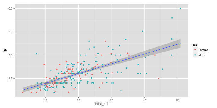
If you have ever programmed in R, you are probably familiar with the Grammar of Graphics due to ggplot2. You can read more about the Grammar of Graphics here, but the general idea behind it is that visualizations can be build up through various layers, each of which have certain characteristics (aesthetics in ggplot2).

ggplot(tips, aes(x = total_bill, y = tip)) +
  geom_point(aes(color = sex)) +
  geom_smooth(method = 'lm')

plot of chunk layer5

This post is not about ggplot2 nor specifically the Grammar of Graphics, but rather a summary of the official release of Vega-Lite 2, a high-level language for rapidly creating interactive visualizations which you might know from the R-package ggvis.

Vega-Lite has four operators to compose charts: layerfacetconcat and repeat. Layer stacks charts on top of each other in an orderly fashion. Facet divides and charts the data into groups. Concat combines multiple charts into dashboard layouts and, finally, repeat concatenate charts. Most importantly is that these operators can be combined! The example below compares weather data in New York and Seattle, layering data for individual years and averages within a repeated template for different measurements.

A layered and reapeted Vega-Lite graph of weather data

Vega-Lite 2 is especially useful because of the included interaction options. Programmers can specify how users can interactive select the data in their visualizations (e.g., a point or interval selection), along with possible transformations. With these interactions, users can for instance filter data, highlight points, or pan or zoom a plot. The plot below uses an interval selection, which causes the chart to include an interactive brush (shown in grey). The brush selection parameterizes the red guideline, which visualizes the average value within the selected interval.

An interactive moving average in Vega-Lite 2. Try it out!

However, this is not all! When multiple visualizations are combined in a dashboard, interactive selections can apply to all. Below, you see an interval selection being applied over a set of histograms. As a viewer adjusts the selection, they can immediately see how the other distributions change in response.

A crossfilter interaction in Vega-Lite 2. Try it out!

According to the developers Vega and Vega-Lite will be included in Jupyter Lab (the next generation of Jupyter Notebooks). Please find more details about Vega-Lite in the documentation or view the InfoVis 2016 research paper on the Vega-Lite language design. Moreover, check out the example gallery or these Vega-Lite applications. The source code you can find on GitHub. For updates, follow the Vega project on Twitter at @vega_vis. For an overview of the features you may watch the OpenVis Conference Video with the developers.

Kaggle Data Science Survey 2017: Worldwide Preferences for Python & R

Kaggle Data Science Survey 2017: Worldwide Preferences for Python & R

Kaggle conducts industry-wide surveys to assess the state of data science and machine learning. Over 17,000 individuals worldwide participated in the survey, myself included, and 171 countries and territories are represented in the data.

There is an ongoing debate regarding whether R or Python is better suited for Data Science (probably the latter, but I nevertheless prefer the former). The thousands of responses to the Kaggle survey may provide some insights into how the preferences for each of these languages are dispersed over the globe. At least, that was what I thought when I wrote the code below.

View the Kaggle Kernel here.

### PAUL VAN DER LAKEN
### 2017-10-31
### KAGGLE DATA SCIENCE SURVEY
### VISUALIZING WORLD WIDE RESPONSES
### AND PYTHON/R PREFERENCES

# LOAD IN LIBRARIES
library(ggplot2)
library(dplyr)
library(tidyr)
library(tibble)

# OPTIONS & STANDARDIZATION
options(stringsAsFactors = F)
theme_set(theme_light())
dpi = 600
w = 12
h = 8
wm_cor = 0.8
hm_cor = 0.8
capt = "Kaggle Data Science Survey 2017 by paulvanderlaken.com"

# READ IN KAGGLE DATA
mc <- read.csv("multipleChoiceResponses.csv") %>%
  as.tibble()

# READ IN WORLDMAP DATA
worldMap <- map_data(map = "world") %>% as.tibble()

# ALIGN KAGGLE AND WORLDMAP COUNTRY NAMES
mc$Country[!mc$Country %in% worldMap$region] %>% unique()
worldMap$region %>% unique() %>% sort(F)
mc$Country[mc$Country == "United States"] <- "USA"
mc$Country[mc$Country == "United Kingdom"] <- "UK"
mc$Country[grepl("China|Hong Kong", mc$Country)] <- "China"


# CLEAN UP KAGGLE DATA
lvls = c("","Rarely", "Sometimes", "Often", "Most of the time")
labels = c("NA", lvls[-1])
ind_data <- mc %>% 
  select(Country, WorkToolsFrequencyR, WorkToolsFrequencyPython) %>%
  mutate(WorkToolsFrequencyR = factor(WorkToolsFrequencyR, 
                                      levels = lvls, labels = labels)) %>% 
  mutate(WorkToolsFrequencyPython = factor(WorkToolsFrequencyPython, 
                                           levels = lvls, labels = labels)) %>% 
  filter(!(Country == "" | is.na(WorkToolsFrequencyR) | is.na(WorkToolsFrequencyPython)))

# AGGREGATE TO COUNTRY LEVEL
country_data <- ind_data %>%
  group_by(Country) %>%
  summarize(N = n(),
            R = sum(WorkToolsFrequencyR %>% as.numeric()),
            Python = sum(WorkToolsFrequencyPython %>% as.numeric()))

# CREATE THEME FOR WORLDMAP PLOT
theme_worldMap <- theme(
    plot.background = element_rect(fill = "white"),
    panel.border = element_blank(),
    panel.grid = element_blank(),
    panel.background = element_blank(),
    legend.background = element_blank(),
    legend.position = c(0, 0.2),
    legend.justification = c(0, 0),
    legend.title = element_text(colour = "black"),
    legend.text = element_text(colour = "black"),
    legend.key = element_blank(),
    legend.key.size = unit(0.04, "npc"),
    axis.text = element_blank(), 
    axis.title = element_blank(),
    axis.ticks = element_blank()
  )

After aligning some country names (above), I was able to start visualizing the results. A first step was to look at the responses across the globe. The greener the more responses and the grey countries were not represented in the dataset. A nice addition would have been to look at the response rate relative to country population.. any volunteers?

# PLOT WORLDMAP OF RESPONSE RATE
ggplot(country_data) + 
  geom_map(data = worldMap, 
           aes(map_id = region, x = long, y = lat),
           map = worldMap, fill = "grey") +
  geom_map(aes(map_id = Country, fill = N),
           map = worldMap, size = 0.3) +
  scale_fill_gradient(low = "green", high = "darkgreen", name = "Response") +
  theme_worldMap +
  labs(title = "Worldwide Response Kaggle DS Survey 2017",
       caption = capt) +
  coord_equal()

Worldmap_response.png

Now, let’s look at how frequently respondents use Python and R in their daily work. I created two heatmaps: one excluding the majority of respondents who indicated not using either Python or R, probably because they didn’t complete the survey.

# AGGREGATE DATA TO WORKTOOL RESPONSES
worktool_data <- ind_data %>%
  group_by(WorkToolsFrequencyR, WorkToolsFrequencyPython) %>%
  count()

# HEATMAP OF PREFERRED WORKTOOLS
ggplot(worktool_data, aes(x = WorkToolsFrequencyR, y = WorkToolsFrequencyPython)) +
  geom_tile(aes(fill = log(n))) +
  geom_text(aes(label = n), col = "black") +
  scale_fill_gradient(low = "red", high = "yellow") +
  labs(title = "Heatmap of Python and R usage",
       subtitle = "Most respondents indicate not using Python or R (or did not complete the survey)",
       caption = capt, 
       fill = "Log(N)") 

heatmap_worktools.png

# HEATMAP OF PREFERRED WORKTOOLS
# EXCLUSING DOUBLE NA'S
worktool_data %>%
  filter(!(WorkToolsFrequencyPython == "NA" & WorkToolsFrequencyR == "NA")) %>%
  ungroup() %>%
  mutate(perc = n / sum(n)) %>%
  ggplot(aes(x = WorkToolsFrequencyR, y = WorkToolsFrequencyPython)) +
  geom_tile(aes(fill = n)) +
  geom_text(aes(label = paste0(round(perc,3)*100,"%")), col = "black") +
  scale_fill_gradient(low = "red", high = "yellow") +
  labs(title = "Heatmap of Python and R usage (non-users excluded)",
       subtitle = "There is a strong reliance on Python and less users focus solely on R",
       caption = capt, 
       fill = "N") 

heatmap_worktools_usersonly.png

Okay, now let’s map these frequency data on a worldmap. Because I’m interested in the country level differences in usage, I look at the relative usage of Python compared to R. So the redder the country, the more Python is used by Data Scientists in their workflow whereas R is the preferred tool in the bluer countries. Interesting to see, there is no country where respondents really use R much more than Python.

# WORLDMAP OF RELATIVE WORKTOOL PREFERENCE
ggplot(country_data) + 
  geom_map(data = worldMap, 
           aes(map_id = region, x = long, y = lat),
           map = worldMap, fill = "grey") +
  geom_map(aes(map_id = Country, fill = Python/R),
           map = worldMap, size = 0.3) +
  scale_fill_gradient(low = "blue", high = "red", name = "Python/R") +
  theme_worldMap +
  labs(title = "Relative usage of Python to R per country",
       subtitle = "Focus on Python in Russia, Israel, Japan, Ukraine, China, Norway & Belarus",
       caption = capt) +
  coord_equal() 

Worldmap_relative_usage.png
Countries are color-coded for their relative preference for Python (red/purple) or R (blue) as a Data Science tool. 167 out of 171 countries (98%) demonstrate a value of > 1, indicating a preference for Python over R.

Thank you for reading my visualization report. Please do try and extract some other interesting insights from the data yourself.

If you liked my analysis, please upvote my Kaggle Kernel here!