Ryan Holbrook made awesome animated GIFs in R of several classifiers learning a decision rule boundary between two classes. Basically, what you see is a machine learning model in action, learning how to distinguish data of two classes, say cats and dogs, using some X and Y variables.
These visuals can be great to understand these algorithms, the models, and their learning process a bit better.
Here’s the original tweet, with the logistic regression animation. If you follow it, you will find a whole thread of classifier GIFs. These I extracted, pasted, and explained below.
A thread of classifiers learning a decision rule. Dashed line is optimal boundary. Animations with #gganimate by @thomasp85 and @drob. #rstats
Logistic regression {stats::glm} with each class having normally distributed features. (1/n) pic.twitter.com/kKmqdO2zGy
Below is the GIF which I extracted using EZgif.com.
What you see is observations from two classes, say cats and dogs, each represented using colored dots. The dots are placed along X and Y axes, which represent variables about the observations. Their tail lengths and their hairyness, for instance.
Now there’s an optimal way to seperate these classes, which is the dashed line. That line best seperates the cats from the dogs based on these two variables X and Y. As this is an optimal boundary given this data, it is stable, it does not change.
However, there’s also a solid black line, which does change. This line represents the learned boundary by the machine learning model, in this case using logistic regression. As the model is shown more data, it learns, and the boundary is updated. This learned boundary represents the best line with which the model has learned to seperate cats from dogs.
Anything above the boundary is predicted to be class 1, a dog. Everything below predicted to be class 2, a cat. As logistic regression results in a linear model, the seperation boundary is very much linear/straight.
Logistic regression gif by Ryan Holbrook
These animations are great to get a sense of how the models come to their boundaries in the back-end.
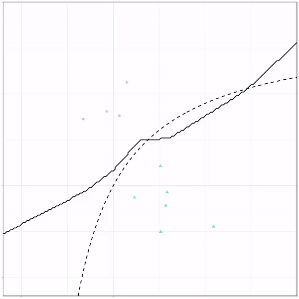
For instance, other machine learning models are able to use non-linear boundaries to dinstinguish classes, such as this quadratic discriminant analysis (qda). This “learned” boundary is much closer to the optimal boundary:
Quadratic discriminant analysis gif by Ryan Holbrook
Multivariate adaptive regression splines gif by Ryan Holbrook
Next, we have the k-nearest neighbors algorithm, which predicts for each point (animal) the class (cat/dog) based on the “k” points closest to it. As you see, this results in a highly fluctuating, localized boundary.
K-nearest neighbors gif by Ryan Holbrook
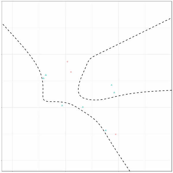
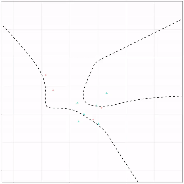
Now, Ryan decided to push the challenge, and simulate new data for two classes with a more difficult decision boundary. The new data and optimal boundaries look like this:
On these data, Ryan put a whole range of non-linear models to work.
Like this support-vector machine, which tries to create optimal boundaries built of support vectors around all the cats and all the dohs (this is definitely not a technical, error-free explanation of what’s happening here).
Let’s jump into some tree-based algorithms and the resulting models. A decision tree classifies data based on multiple, sequential, binary splits. Here, Ryan trained a simple decision tree:
Decision tree gif by Ryan Holbrook
As well as it’s big brother, a random forest, which uses hundreds of trees in the back end and thus results in a more flexible boundary:
Random forest gif by Ryan Holbrook
Extreme gradient boosting is also a tree-based algorithm, which leverages many machine learning techniques to optimize the bias-variance tradeoff. Here’s an earlier blog on how to get started with Xgboost in Python or R:
I’ve had this WordPress domain for several years now, and in the beginning it was very convenient.
WordPress enabled me to set up a fully functional blog in a matter of hours. Everything from HTML markup, external content embedding, databases, and simple analytics was already conveniently set up.
However, after a while, I wanted to do some more advanced stuff. Here, the disadvantages of WordPress hosting became evident fast. Anything beyond the most simple capabilities is locked firmly behind paywalls. Arguably rightfully so. If you want to use WordPress’ add-ins, I feel you should pay for them. That’s their business model after all.
However, what greatly annoys me is that WordPress actively hinders you from arranging matters yourself. Want to incorporate some JavaScript in your page? Upgrade to a paid account. Want to use Google Analytics? Upgrade and buy an add-in. Want to customize your HTML / CSS code? Upgrade or be damned. Even the simplest of tasks — just downloading visitor counts — WordPress made harder than it should be.
You can download visitor statistics manually — day by day, week by week, or year by year. However, there is no way to download your visitor history in batches. If you want to have your daily visiting history, you will manually have to download and store every day’s statistics.
For me, getting historic daily data would entail 1100 times entering a date, scrolling down, clicking a button, specifying a filename, and clicking to save. I did this once, for 36 monthly data snapshots, and the insights were barely worth the hassle, I assure you.
Fortunately, today, after nearly three years of hosting on WordPress, I finally managed to circumvent past this annoyance! Using the Python script detailed below, my computer now automonously logs in to WordPress and downloads the historic daily visitor statistics for all my blogs and pages!
Let me walk you through the program and code.
Modules & Setup
Before we jump into Python, you need to install Chromedriver. Just download the zip and unpack the execution file somewhere you can find it, and make sure to copy the path into Python. You will need it later. Chromedriver allows Python’s selenium webdriver to open up and steer a chrome browser.
We need another module for browsing: webdriver_manager. The other modules and their functions are for more common purposes: os for directory management, re for regular expression, datetime for working with dates, and time for letting the computer sleep in between operations.
from selenium import webdriver
from webdriver_manager.chrome import ChromeDriverManager
from time import sleep
from datetime import datetime, timedelta
import os
import re
Helper Functions
I try to write my code in functions, so let’s dive into the functions that allow us to download visitor statistics.
To begin, we need to set up a driver (i.e., automated browser) and this is what get_driver does. Two things are important here. Firstly, the function takes an argument dir_download. You need to give it a path so it knows where to put any downloaded files. This path is stored under preferences in the driver options. Secondly, you need to specify the path_chromedriver argument. This needs to be the exact location you unpacked the chromedriver.exe. All these paths you can change later in the main program, so don’t worry about them for now. The get_driver function returns a ready-to-go driver object.
Next, our driver will need to know where to browse to. So the function below, compile_traffic_url, uses an f-string to generate the url for the visitor statistics overview of a specific domain and date. Important here is that you will need to change the domain default from paulvanderlaken.com to your own WordPress adress. Take a look at the statistics overview in your regular browser to see how you may tailor your urls.
Now, in the rest of the program, I work dates formatted and stored as datetime.datetime.date(). By default, the compile_traffic_url function also uses a datetime date argument for today’s date. However, WordPress expects simple string dates in the urls. Hence, I need a way to convert these complex datetime dates into simpler strings. That’s what the strftimefunction below does. It formats a datetime date to a date_string, in the format YYYY-MM-DD.
So we know how to generate the urls for the pages we want to scrape. We compile them using this handy function.
If we would let the driver browse directly to one of these compiled traffic urls, you will find yourself redirected to the WordPress login page, like below. That’s a bummer!
Hence, whenever we start our program, we will first need to log in once using our password. That’s what the signing_in function below is for. This function takes in a driver, a username, and a password. It uses the compile_traffic_url function to generate a traffic url (by default of today’s traffic [see above]). Then the driver loads the website using its get method. This will redirect us to the WordPress login page. In order for the webpages to load before our driver starts clicking away, we let our computer sleep a bit, using time.sleep.
Now, our automated driver is looking at the WordPress login page. We need to help it find where to input the username and password. If you press CTRL+SHIFT+C while on any webpage, the HTML behind it will show. Now you can just browse over the webpage elements, like the login input fields, and see what their CSS selectors, names, and classes are.
If you press CTRL+SHIFT+C on a webpage, the html behind it will show.
So, next, I order the driver to find the HTML element of the username-input field and input my username keys into it. We ask the driver to find the Continue-button and click it. Time for the driver to sleep again, while the page loads the password input field. Afterwards, we ask the driver to find the password input field, input our password, and click the Continue-button a second time. While our automatic login completes, we let the computer sleep some more.
Once we have logged in once, we will remain logged in until the Python program ends, which closes the driver.
Okay, so now that we have a function that logs us in, let’s start downloading our visitor statistics!
The download_traffic function takes in a driver, a date, and a list of dates_downloaded (an empty list by default). First, it checks whether the date to download occurs in dates_downloaded. If so, we do not want to waste time downloading statistics we already have. Otherwise, it puts the driver to work downloading the traffic for the specified date following these steps:
Compile url for the specified date
Driver browses to the webpage of that url
Computer sleeps while the webpage loads
Driver executes script, letting it scroll down to the bottom of the webpage
Driver is asked to find the button to download the visitor statistics in csv
Driver clicks said button
Computer sleeps while the csv is downloaded
If anything goes wrong during these steps, an error message is printed and no document is downloaded. With no document downloaded, our program can try again for that link the next time.
def download_traffic(driver, date, dates_downloaded=[]):
    if date in dates_downloaded:
        print(f'Already downloaded {date} traffic')
    else:
        try:
            print(f'Downloading {date} traffic')
            url = compile_traffic_url(date=date)
            driver.get(url)
            sleep(1)
            driver.execute_script("window.scrollTo(0, document.body.scrollHeight);")
            button = driver.find_element_by_class_name('stats-download-csv')
            button.click()
            sleep(1)
        except:
            print(f'Error during downloading of {date}')
We need one more function to generate the dates_downloaded list of download_traffic. The date_from_filename function below takes in a filename (e.g., paulvanderlaken.com_posts_day_12_28_2019_12_28_2019) and searches for a regular expression date format. The found match is turned into a datetime date using strptime and returned. This allows us to walk through a directory on our computer and see for which dates we have already downloaded visitor statistics. You will see how this works in the main program below.
def date_from_filename(filename):
    match = re.search(r'\d{2}_\d{2}_\d{4}', filename)
    date = datetime.strptime(match.group(), '%m_%d_%Y').date()
    return date
Main program
In the end, we combine all these above functions in our main program. Here you will need to change five things to make it work on your computer:
path_data – enter a folder path where you want to store the retrieved visitor statistics csv’s
path_chromedriver – enter the path to the chromedriver.exe you unpacked
first_date – enter the date from which you want to start scraping (by default up to today)
username – enter your WordPress username or email address
password – enter your WordPress password
if __name__ == '__main__':
    path_data = 'C:\\Users\\paulv\\stack\\projects\\2019_paulvanderlaken.com-anniversary\\traffic-day\\'
    path_chromedriver = 'C:\\Users\\paulv\\chromedriver.exe'

    first_date = datetime(2017, 1, 18).date()
    last_date = datetime.today().date()

    username = "insert_username"
    password = "insert_password"

    driver = get_driver(dir_download=path_data, path_chromedriver=path_chromedriver)

    days_delta = last_date - first_date
    days = [first_date + timedelta(days) for days in range(days_delta.days + 1)]
    dates_downloaded = [date_from_filename(file) for _, _, f in os.walk(path_data) for file in f]

    signing_in(driver, username=username, password=password)

    for d in days:
        download_traffic(driver, d, dates_downloaded)
    driver.close()
If you have downloaded Chromedriver, have copied all the code blocks from this blog into a Python script, and have added in your personal paths, usernames, and passwords, this Python program should work like a charm on your computer as well. By default, the program will scrape statistics from all days from the first_date up to the day you run the program, but this you can change obviously.
Results
For me, the program took about 10 seconds to download one csv consisting of statistics for one day. So three years of WordPress blogging, or 1095 daily datasets of statistics, were extracted in about 3 hours. I did some nice cooking and wrote this blog in the meantime : )
The result after 3 hours of scraping
Compare that to the horror of having to surf, scroll, and click that godforsaken Download data as CSV button ~1100 times!!
The horror button (in Dutch)
Final notes
The main goal of this blog was to share the basic inner workings of this scraper with you, and to give you the same tool to scrape your own visitor statistics.
Now, this project can still be improved tremendously and in many ways. For instance, with very little effort you could add some command line arguments (with argparse) so you can run this program directly or schedule it daily. My next step is to set it up to run daily on my Raspberry Pi.
An additional potential improvement: when the current script encounters no statistics do download for a specific day, no csv is saved. This makes the program try again a next time it is run, as the dates_downloaded list will not include that date. Probably this some minor smart tweaks will solve this issue.
Moreover, there are many more statistics you could scrape of your WordPress account, like external clicks, the visitors home countries, search terms, et cetera.
The above are improvement points you can further develop yourself, and if you do please share them with the greater public so we can all benefit!
For now, I am happy with these data, and will start on building some basic dashboards and visualizations to derive some insights from my visitor patterns. If you have any ideas or experiences please let me know!
I hope this walkthrough and code may have help you in getting in control of your WordPress website as well. Or that you learned a thing or two about basic web scraping with Python. I am still in the midst of starting with Python myself, so if you have any tips, tricks, feedback, or general remarks, please do let me know! I am always happy to talk code and love to start pet projects to improve my programming skills, so do reach out if you have any ideas!
I can’t begin to count how often I have wanted to visualize a (normal) distribution in a plot. For instance to show how my sample differs from expectations, or to highlight the skewness of the scores on a particular variable. I wish I’d known earlier that I could just add one simple geom to my ggplot!
Want a different mean and standard deviation, just add a list to the args argument:
I found this interesting blog by Guilherme Duarte Marmerola where he shows how the predictions of algorithmic models (such as gradient boosted machines, or random forests) can be calibrated by stacking a logistic regression model on top of it: by using the predicted leaves of the algorithmic model as features / inputs in a subsequent logistic model.
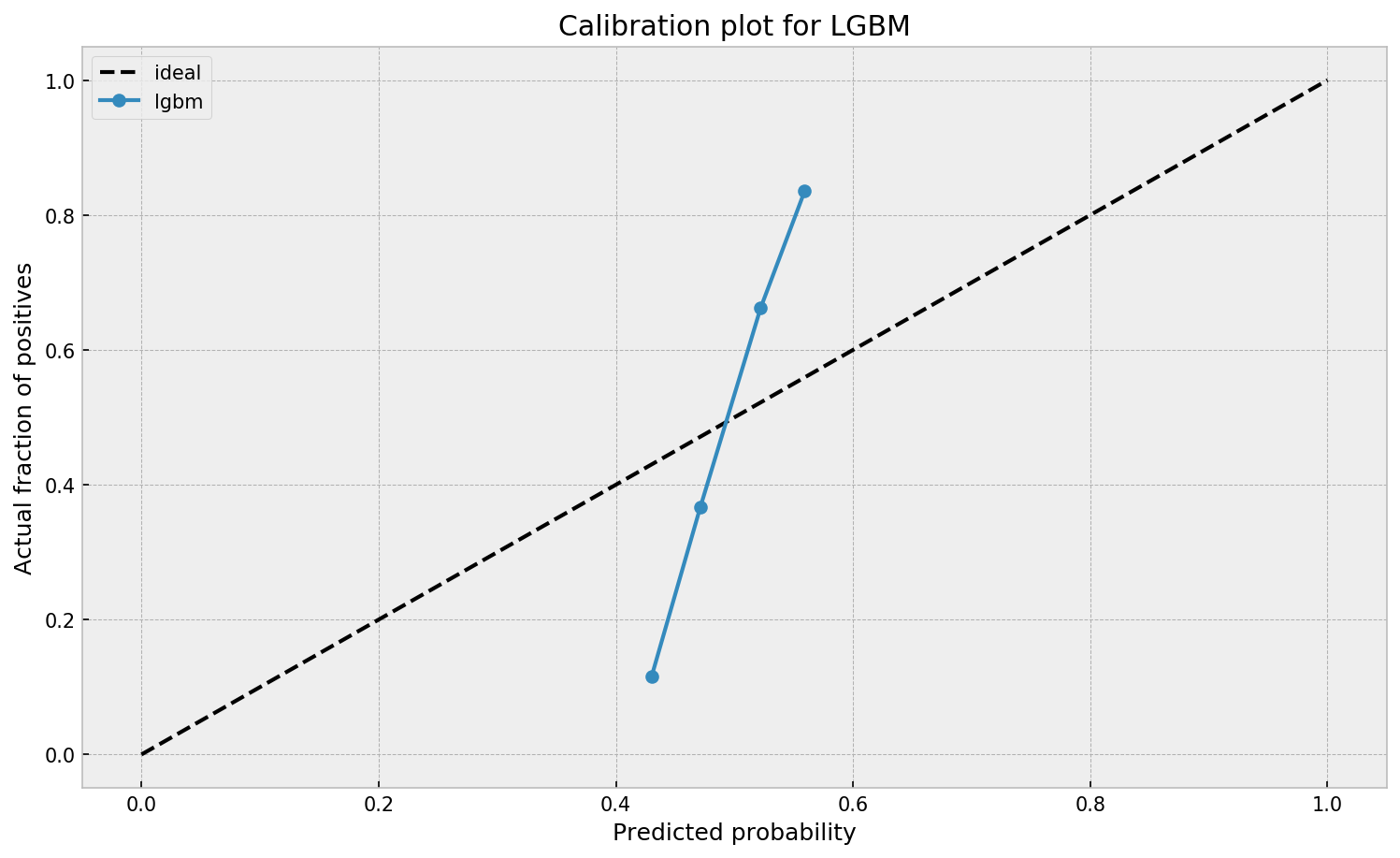
When working with ML models such as GBMs, RFs, SVMs or kNNs (any one that is not a logistic regression) we can observe a pattern that is intriguing: the probabilities that the model outputs do not correspond to the real fraction of positives we see in real life.
This is visible in the predictions of the light gradient boosted machine (LGBM) Guilherme trained: its predictions range only between ~ 0.45 and ~ 0.55. In contrast, the actual fraction of positive observations in those groups is much lower or higher (ranging from ~ 0.10 to ~0.85).
I highly recommend you look at Guilherme’s code to see for yourself what’s happening behind the scenes, but basically it’s this:
Train an algorithmic model (e.g., GBM) using your regular features (data)
Retrieve the probabilities GBM predicts
Retrieve the leaves (end-nodes) in which the GBM sorts the observations
Turn the array of leaves into a matrix of (one-hot-encoded) features, showing for each observation which leave it ended up in (1) and which not (many 0’s)
Basically, until now, you have used the GBM to reduce the original features to a new, one-hot-encoded matrix of binary features
Now you can use that matrix of new features as input for a logistic regression model predicting your target (Y) variable
Apparently, those logistic regression predictions will show a greater spread of probabilities with the same or better accuracy
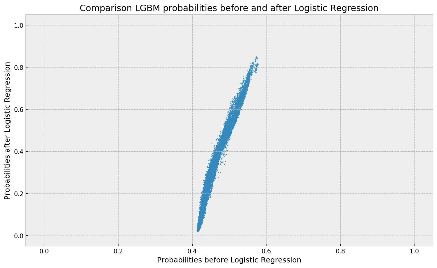
Here’s a visual depiction from Guilherme’s blog, with the original GBM predictions on the X-axis, and the new logistic predictions on the Y-axis.
As you can see, you retain roughly the same ordering, but the logistic regression probabilities spread is much larger.
Now according to Guilherme and the Facebook paper he refers to, the accuracy of the logistic predictions should not be less than those of the original algorithmic method.
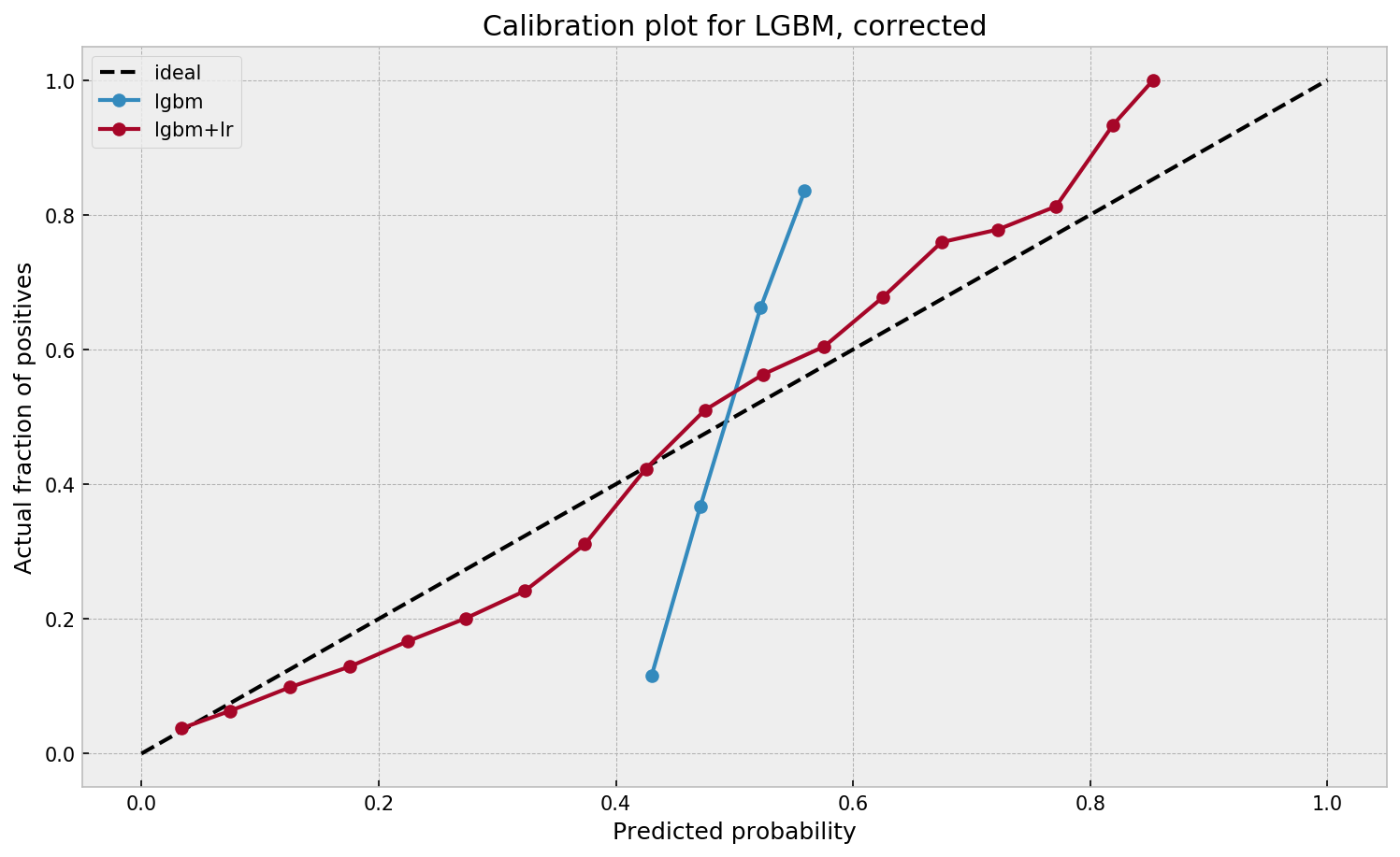
Much better. The calibration plot of lgbm+lr is much closer to the ideal. Now, when the model tells us that the probability of success is 60%, we can actually be much more confident that this is the true fraction of success! Let us now try this with the ET model.
In his blog, Guilherme shows the same process visually for an Extremely Randomized Trees model, so I highly recommend you read the original article. Also, you can find the complete code on his GitHub.
Harvard (bio)statisticians Miguel Hernan and Jamie Robins just released their new book, online and accessible for free!
The Causal Inference book provides a cohesive presentation of causal inference, its concepts and its methods. The book is divided in 3 parts of increasing difficulty: causal inference without models, causal inference with models, and causal inference from complex longitudinal data. Here’s the official Harvard page for the book release.
This is definitely an interesting read for epidemiologists, statisticians, psychologists, economists, sociologists, political scientists, data scientists, computer scientists, and any other person with a love for proper data analysis!
Thanks to Sebastian Raschka I am able to share this great GitHub overview page of relevant graph classification techniques, and the scientific papers behind them. The overview divides the algorithms into four groups:
As well as a link to relevant graph classification benchmark datasets.
"Awesome Graph Classification" — A collection of graph classification methods, covering embedding, deep learning, graph kernel, and factorization papers with reference implementations https://t.co/ugpL3xSvf1