Nothing beats a aesthetically-pleasing data visualization in the form of a map (see evidence here, here, here, or here).
Moreover, we’ve already witnessed some great R tutorials by Ilya Kashnitsky before (see Animated Snow in R).
These two come together in Ilya’s recent post on subplots in ggplot2 maps, with which he completely amazed me. The creation process is actually easier than the end result makes it look: make several visualizations and add them as ggplot2::annotation_custom() to your main ggplot2 map — the same as if you are adding a logo to your plot. Enjoy:
PyData provides a forum for the international community of users and developers of data analysis tools to share ideas and learn from each other. The communities approach data science using many languages, including (but not limited to) Python, Julia, and R.
April 2018, a PyData conference was held in London, with three days of super interesting sessions and hackathons. While I couldn’t attend in person, I very much enjoy reviewing the sessions at home as all are shared open access on YouTube channel PyDataTV!
In the following section, I will outline some of my favorites as I progress through the channel:
Winning with simple, even linear, models:
One talk that really resonated with me is Vincent Warmerdam‘s talk on “Winning with Simple, even Linear, Models“. Working at GoDataDriven, a data science consultancy firm in the Netherlands, Vincent is quite familiar with deploying deep learning models, but is also midly annoyed by all the hype surrounding deep learning and neural networks. Particularly when less complex models perform equally well or only slightly less. One of his quote’s nicely sums it up:
“Tensorflow is a cool tool, but it’s even cooler when you don’t need it!”
— Vincent Warmerdam, PyData 2018
In only 40 minutes, Vincent goes to show the finesse of much simpler (linear) models in all different kinds of production settings. Among others, Vincent shows:
how to solve the XOR problem with linear models
how to win at timeseries with radial basis features
how to use weighted regression to deal with historical overfitting
how deep learning models introduce a new theme of horror in production
how to create streaming models using passive aggressive updating
how to build a real-time video game ranking system using mere histograms
how to create a well performing recommender with two SQL tables
how to rock at data science and machine learning using Python, R, and even Stan
Disclaimer: This page contains one or more links to Amazon. Any purchases made through those links provide us with a small commission that helps to host this blog.
Useful base functions
str() – explore structure of R object
trimws() – trim trailing and/or leading whitespaces
dput() – dump an R object in form of R code
cut()– categorize values into intervals
intersect() – returns similar elements in two vectors
union() – find intersecting items in two vectors
setdiff() – returns different elements in two vectors
interaction() – computes a factor which represents the interaction of the given factors
formatC()can be used to round numbers and force trailing zero’s
formatC() and sprintf() can be used to add leading/trailing characters
expand.grid() – create a data frame from all combinations of the supplied vectors or factors
seq_along(myvec) – generates a vector of 1:length(myvec)
Generate distributions in ggplot2 using the stat_function function. Normal distributions, student t-distributions, beta distributions, anything. See also here.
The 2018 annual Society for Industrial and Organizational Psychology (SIOP) conference featured its first-ever machine learning competition. Teams competed for several months in predicting the enployee turnover (or churn) in a large US company. A more complete introduction as presented at the conference can be found here. All submissions had to be open source and the winning submissions have been posted in this GitHub repository. The winning teams consist of analysts working at WalMart, DDI, and HumRRO. They mostly built ensemble models, in Python and/or R, combining algorithms such as (light) gradient boosted trees, neural networks, and random forest analysis.
Timo Grossenbacher works as reporter/coder for SRF Data, the data journalism unit of Swiss Radio and TV. He analyzes and visualizes data and investigates data-driven stories. On his website, he hosts a growing list of cool projects. One of his recent blogs covers categorical spatial interpolation in R. The end result of that blog looks amazing:
This map was built with data Timo crowdsourced for one of his projects. With this data, Timo took the following steps, which are covered in his tutorial:
Read in the data, first the geometries (Germany political boundaries), then the point data upon which the interpolation will be based on.
Preprocess the data (simplify geometries, convert CSV point data into an sf object, reproject the geodata into the ETRS CRS, clip the point data to Germany, so data outside of Germany is discarded).
Then, a regular grid (a raster without “data”) is created. Each grid point in this raster will later be interpolated from the point data.
Run the spatial interpolation with the kknn package. Since this is quite computationally and memory intensive, the resulting raster is split up into 20 batches, and each batch is computed by a single CPU core in parallel.
Visualize the resulting raster with ggplot2.
All code for the above process can be accessed on Timo’s Github. The georeferenced points underlying the interpolation look like the below, where each point represents the location of a person who selected a certain pronunciation in an online survey. More details on the crowdsourced pronunciation project van be found here, .
Another of Timo’s R map, before he applied k-nearest neighbors on these crowdsourced data. [original]If you want to know more, please read the original blog or follow Timo’s new DataCamp course called Communicating with Data in the Tidyverse.
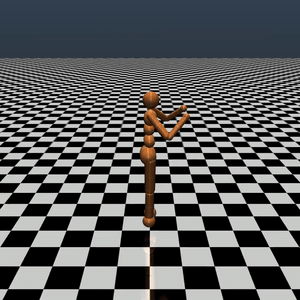
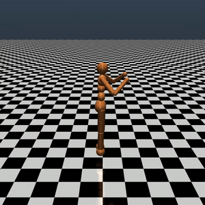
In optimizing their transportation services, Uber uses evolutionary strategies and genetic algorithms to train deep neural networks through reinforcement learning. A lot of difficult words in one sentence; you can imagine the complexity of the process.
Because it is particularly difficult to observe the underlying dynamics of this learning process in neural network optimization, Uber built VINE – a Visual Inspector for NeuroEvolution. VINE helps to discover how evolutionary strategies and genetic optimizing are performing under the hood. In a recent article, they demonstrate how VINE works on the MujocoHumanoid Locomotion task.
[…] In the Humanoid Locomotion Task, each pseudo-offspring neural network controls the movement of a robot, and earns a score, called its fitness, based on how well it walks. [Evolutionary principles] construct the next parent by aggregating the parameters of pseudo-offspring based on these fitness scores […]. The cycle then repeats.
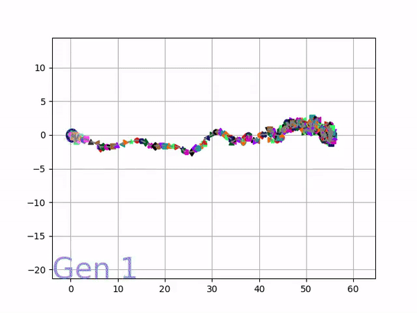
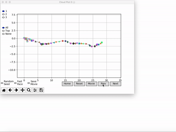
VINE plots parent neural networks and their pseudo-offspring according to their performance. Users can then interact with these plots to:
visualize parents, top performance, and/or the entire pseudo-offspring cloud of any generation,
compare between and within generation performance,
and zoom in on any pseudo-offspring (points) in the plot to display performance information.
The GIFs below demonstrate what VINE is capable of displaying:
The evolution of performance over generations. The color changes in each generation. Within a generation, the color intensity of each pseudo-offspring is based on the percentile of its fitness score in that generation (aggregated into five bins). [original]Vine allows user to deep dive into each single generation, comparing generations and each pseudo-offspring within them [original]VINE can be found at this link. It is lightweight, portable, and implemented in Python.


