However, paletteer is by far my favorite package for customizing your colors in R!
The paletteer package offers direct access to 1759 color palettes, from 50 different packages!
After installing and loading the package, paletteer works as easy as just adding one additional line of code to your ggplot:
install.packages("paletteer")
library(paletteer)

install.packages("ggplot2")
library(ggplot2)

ggplot(iris, aes(Sepal.Length, Sepal.Width, color = Species)) +
  geom_point() +
  scale_color_paletteer_d("nord::aurora")
paletteer offers a combined collection of hundreds of other color palettes offered in the R programming environment, so you are sure you will find a palette that you like! Here’s the list copied below, but this github repo provides more detailed information about the package contents.
Both in science and business, we often experience difficulties collecting enough data to test our hypotheses, either because target groups are small or hard to access, or because data collection entails prohibitive costs.
Such obstacles may result in data sets that are too small for the complexity of the statistical model needed to answer the questions we’re really interested in.
This unique book provides guidelines and tools for implementing solutions to issues that arise in small sample studies. Each chapter illustrates statistical methods that allow researchers and analysts to apply the optimal statistical model for their research question when the sample is too small.
This book will enable anyone working with data to test their hypotheses even when the statistical model required for answering their questions are too complex for the sample sizes they can collect. The covered statistical models range from the estimation of a population mean to models with latent variables and nested observations, and solutions include both classical and Bayesian methods. All proposed solutions are described in steps researchers can implement with their own data and are accompanied with annotated syntax in R.
Bayesian networks are a type of probabilistic graphical model that uses Bayesian inference for probability computations. Bayesian networks aim to model conditional dependence, and therefore causation, by representing conditional dependence by edges in a directed graph. Through these relationships, one can efficiently conduct inference on the random variables in the graph through the use of factors.
As Bayes nets represent data as a probabilistic graph, it is very easy to use that structure to simulate new data that demonstrate the realistic patterns of the underlying causal system. Daniel’s post shows how to do this with bnlearn.
Daniel’s example Bayes net
New data is simulated from a Bayes net (see above) by first sampling from each of the root nodes, in this case sex. Then followed by the children conditional on their parent(s) (e.g. sport | sex and hg | sex) until data for all nodes has been drawn. The numbers on the nodes below indicate the sequence in which the data is simulated, noting that rcc is the terminal node.
The original and simulated datasets are compared in a couple of ways 1) observing the distributions of the variables 2) comparing the output from various models and 3) comparing conditional probability queries. The third test is more of a sanity check. If the data is generated from the original Bayes net then a new one fit on the simulated data should be approximately the same. The more rows we generate the closer the parameters will be to the original values.
The original data alongside the generated data in Daniel’s example
As you can see, a Bayesian network allows you to generate data that looks, feels, and behaves a lot like the data on which you based your network on in the first place.
This can be super useful if you want to generate a synthetic / fake / artificial dataset without sharing personal or sensitive data.
Moreover, the underlying Bayesian net can be very useful to compute missing values. In Daniel’s example, he left out some values on purpose (pretending they were missing) and imputed them with the Bayes net. He found that the imputed values for the missing data points were quite close to the original ones:
For two variables, the original values plotted against the imputed replacements.
In the original blog, Daniel goes on to show how to further check the integrity of the simulated data using statistical models and shares all his code so you can try this out yourself. Please do give his website a visit as Daniel has many more interesting statistics blogs!
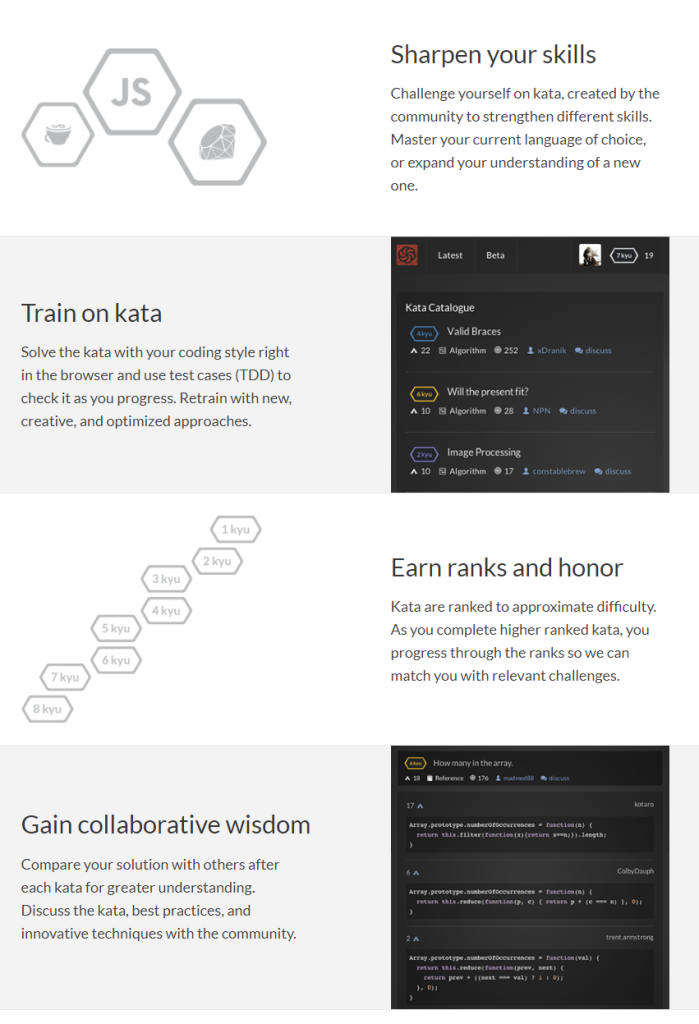
As I wrote about Project Euler and CodingGame before, someone recommended me CodeWars. CodeWars offers free online learning exercises to develop your programming skills through fun daily challenges.
In line with Project Euler, you are tasked with solving increasingly complex programming challenges. At CodeWars, these little problems you need to solve with code are called kata.
Kata take a test-driven development approach: the programs you write need to pass the tests of the developer who made the kata in the first place. Only then are you awarded with honour and can you earn your ranks and progress to the more complex kata.
Sounds fun right? I’m definitely going to check this out, as they support a wide range of programming languages, each with many kata to solve!
Python, Ruby, C++, Java, JavaScript and many other main programming languages are already supported, but CodeWards is also still developing kata for more niche or upcoming languages like R, Lua, Kotlin, and Scala.
This blog by Gordon Shotwell has passed my Twitter feed a couple of times now and I thought I’d share it here: blog.shotwell.ca/posts/why_i_use_r
It in, Gordon present his reasons for using R, describing R’s four unique selling point, and outlining a discussion full of perfectly quotable thoughts and opinions.
Do have a look at the original blog as well, but here’s my 3-minute summary:
Gordon finds that there are four main features of the R programming language that are essential to his work and in a sense unique to the R language. Here they are, along with quotes by Gordon explaining R’s unique selling points in his words:
(1) Native data science structures
It’s relatively easy to do data science in R without any external libraries. You can read data from a csv into a data frame, plot and clean that data, and analyse it using built-in statistical models.
(2) Non-standard evaluation
Non-standard evaluation lets you do things like use a variable name in a plot title, or evaluate a user-supplied expression in a different environment.
[…]
For example, R lets you specify models with a formula interface like this: lm(mtcars, mpg ~ cyl). This is a natural way for statisticians to specify statistical models because they’re usually familliar with the syntax, but without NSE there’s no way to make that function work as written because mpg and cylare not objects in the calling environment.
(3) Packaging concensus
R let me get up and running, installing packages, filtering data, and printing plots in under 20 minutes, which meant that I stayed interested in the language and eventually started using it professionally. I had actually started to learn Python at around the same time but just found it too difficult. […]
The user that I care the most about only has 20 minutes of attention and no real programming skill, so the only thing they can “just” do is copy and paste one line of code into a console. If that doesn’t work, I’ve lost them, and they’ll spend another lonely year renewing their SPSS licenses.
(4) Functional programming
I really like this pattern of [functional] programming because breaking complicated jobs down into small functional bricks gives me confidence that the overall solution is correct. I can work on the small functions, verify that they’re correct through tests, and then know that combining those building blocks together won’t change their behaviour.
Although I personally do not fully agree with these four points (e.g., I very much like to leverage functional programming in Python and it works like a charm!) I very much liked the outline Gordon provides. I’d love to hear your thoughts as well, so do share them in the comments.
For now, let’s end with some other lovely quotes by Gordon:
The thing is, I don’t use R out of some blind brand loyalty but because I don’t like working hard.
I came to R from an Excel background, and for a long time I had internalized the feeling that serious engineers used Python, while analysts or researchers could use languages like R. Over time I’ve realized that the people making that statement often aren’t really informed. They rarely know anything about R, and often don’t really write production-quality code themselves.
In contrast, most of the very senior engineers I’ve met understand that all programming languages are basically just bundles of trade-offs, and so no single language is going to be globally superior to another. There really are no production languages – only production engineers.
I can’t begin to count how often I have wanted to visualize a (normal) distribution in a plot. For instance to show how my sample differs from expectations, or to highlight the skewness of the scores on a particular variable. I wish I’d known earlier that I could just add one simple geom to my ggplot!
Want a different mean and standard deviation, just add a list to the args argument: