Xeno.graphics is the collection of unusual charts and maps Maarten Lambrechts maintains. It’s a repository of novel, innovative, and experimental visualizations to inspire you, to fight xenographphobia, and popularize new chart types.
For instance, have you ever before heard of a time curve? These are very useful to visualize the development of a relationship over time.
Time curves are based on the metaphor of folding a timeline visualization into itself so as to bring similar time points close to each other. This metaphor can be applied to any dataset where a similarity metric between temporal snapshots can be defined, thus it is largely datatype-agnostic. [https://xeno.graphics/time-curve]The upset plot is another example of an upcoming visualization. It can demonstrate the overlap or insection in a dataset. For instance, in the social network of #rstats twitter heroes, as the below example from the Xenographics website does.
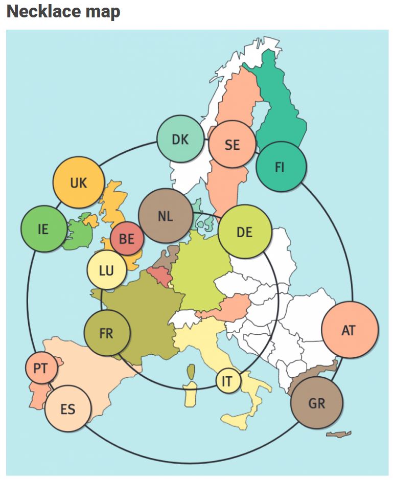
Understanding relationships between sets is an important analysis task. The major challenge in this context is the combinatorial explosion of the number of set intersections if the number of sets exceeds a trivial threshold. To address this, we introduce UpSet, a novel visualization technique for the quantitative analysis of sets, their intersections, and aggregates of intersections. [https://xeno.graphics/upset-plot/]The below necklace map is new to me too. What it does precisely is unclear to me as well.
In a necklace map, the regions of the underlying two-dimensional map are projected onto intervals on a one-dimensional curve (the necklace) that surrounds the map regions. Symbols are scaled such that their area corresponds to the data of their region and placed without overlap inside the corresponding interval on the necklace. [https://xeno.graphics/necklace-map/]There are hundreds of other interestingcharts, maps, figures, and plots, so do have a look yourself. Moreover, the xenographics collection is still growing. If you know of one that isn’t here already, please submit it. You can also expect some posts about certain topics around xenographics.
This pearl had been resting in my inbox for quite a while before I was able to add it to my R resources list. Citing its GitHub page, ggstatsplot is an extension of ggplot2 package for creating graphics with details from statistical tests included in the plots themselves and targeted primarily at behavioral sciences community to provide a one-line code to produce information-rich plots. The package is currently maintained and still under development by Indrajeet Patil. Nevertheless, its functionality is already quite impressive. You can download the latest stable version via:
utils::install.packages(pkgs="ggstatsplot")
Or download the development version via:
devtools::install_github(
repo="IndrajeetPatil/ggstatsplot", # package path on GitHubdependencies=TRUE, # installs packages which ggstatsplot depends onupgrade_dependencies=TRUE# updates any out of date dependencies
)
The package currently supports many different statistical plots, including:
This function creates either a violin plot, a box plot, or a mix of two for between-group or between-condition comparisons and additional detailed results from statistical tests can be added in the subtitle. The simplest function call looks like the below, but much more complex information can be added and specified.
set.seed(123) # to get reproducible results
# the functions work approximately the same as ggplot2
ggstatsplot::ggbetweenstats(
data=datasets::iris,
x=Species,
y=Sepal.Length,
messages=FALSE
) +
# and can be adjusted using the same, orginal function calls
ggplot2::coord_cartesian(ylim= c(3, 8)) +ggplot2::scale_y_continuous(breaks= seq(3, 8, by=1))
All pictures copied from the GitHub page of ggstatsplot [original]
ggscatterstats
Not all plots are ggplot2-compatible though, for instance, ggscatterstats is not. Nevertheless, it produces a very powerful plot in my opinion.
All pictures copied from the GitHub page of ggstatsplot [original]
ggcormat
ggcorrmat is also quite impressive, producing correlalograms with only minimal amounts of code as it wraps around ggcorplot. The defaults already produces publication-ready correlation matrices:
ggstatsplot::ggcorrmat(
data=datasets::iris,
corr.method="spearman",
sig.level=0.005,
cor.vars=Sepal.Length:Petal.Width,
cor.vars.names= c("Sepal Length", "Sepal Width", "Petal Length", "Petal Width"),
title="Correlalogram for length measures for Iris species",
subtitle="Iris dataset by Anderson",
caption= expression(
paste(
italic("Note"),
": X denotes correlation non-significant at ",
italic("p "),
"< 0.005; adjusted alpha"
)
)
)
All pictures copied from the GitHub page of ggstatsplot [original]
ggcoefstats
Finally, ggcoefstats is a wrapper around GGally::ggcoef, creating a plot with the regression coefficients’ point estimates as dots with confidence interval whiskers. Here’s an example with some detailed specifications:
ggstatsplot::ggcoefstats(
x=stats::lm(formula=mpg~am*cyl,
data=datasets::mtcars),
point.color="red",
vline.color="#CC79A7",
vline.linetype="dotdash",
stats.label.size=3.5,
stats.label.color= c("#0072B2", "#D55E00", "darkgreen"),
title="Car performance predicted by transmission and cylinder count",
subtitle="Source: 1974 Motor Trend US magazine"
) +ggplot2::scale_y_discrete(labels= c("transmission", "cylinders", "interaction")) +ggplot2::labs(x="regression coefficient",
y=NULL)
All pictures copied from the GitHub page of ggstatsplot [original]I for one am very curious to see how Indrajeet will further develop this package, and whether academics will start using it as a default in publishing.
If you have ever programmed in R, you are probably familiar with the Grammar of Graphics due to ggplot2. You can read more about the Grammar of Graphics here, but the general idea behind it is that visualizations can be build up through various layers, each of which have certain characteristics (aesthetics in ggplot2).
This post is not about ggplot2 nor specifically the Grammar of Graphics, but rather a summary of the official release of Vega-Lite 2, a high-level language for rapidly creating interactive visualizations which you might know from the R-package ggvis.
Vega-Lite has four operators to compose charts: layer, facet, concat and repeat. Layer stacks charts on top of each other in an orderly fashion. Facet divides and charts the data into groups. Concat combines multiple charts into dashboard layouts and, finally, repeat concatenate charts. Most importantly is that these operators can be combined! The example below compares weather data in New York and Seattle, layering data for individual years and averages within a repeated template for different measurements.
A layered and reapeted Vega-Lite graph of weather data
Vega-Lite 2 is especially useful because of the included interaction options. Programmers can specify how users can interactive select the data in their visualizations (e.g., a point or interval selection), along with possible transformations. With these interactions, users can for instance filter data, highlight points, or pan or zoom a plot. The plot below uses an interval selection, which causes the chart to include an interactive brush (shown in grey). The brush selection parameterizes the red guideline, which visualizes the average value within the selected interval.
An interactive moving average in Vega-Lite 2. Try it out!
However, this is not all! When multiple visualizations are combined in a dashboard, interactive selections can apply to all. Below, you see an interval selection being applied over a set of histograms. As a viewer adjusts the selection, they can immediately see how the other distributions change in response.
A crossfilter interaction in Vega-Lite 2. Try it out!
R users have been using the twitter package by Geoff Jentry to mine tweets for several years now. However, a recent blog suggests a novel package provides a better mining tool: rtweet by Michael Kearney (GitHub).
Both packages use a similar setup and require you to do some prep-work by creating a Twitter “app” (see the package instructions). However, rtweet will save you considerable API-time and post-API munging time. This is demonstrated by the examples below, where Twitter is searched for #rstats-tagged tweets, first using twitteR, then using rtweet.
library(twitteR)# this relies on you setting up an app in apps.twitter.com
setup_twitter_oauth(
consumer_key = Sys.getenv("TWITTER_CONSUMER_KEY"),
consumer_secret = Sys.getenv("TWITTER_CONSUMER_SECRET"))
r_folks <- searchTwitter("#rstats", n=300)
str(r_folks,1)## List of 300## $ :Reference class 'status' [package "twitteR"] with 17 fields## ..and 53 methods, of which 39 are possibly relevant## $ :Reference class 'status' [package "twitteR"] with 17 fields## ..and 53 methods, of which 39 are possibly relevant## $ :Reference class 'status' [package "twitteR"] with 17 fields## ..and 53 methods, of which 39 are possibly relevant
str(r_folks[1])## List of 1## $ :Reference class 'status' [package "twitteR"] with 17 fields## ..$ text : chr "RT @historying: Wow. This is an enormously helpful tutorial by @vivalosburros for anyone interested in mapping "| __truncated__## ..$ favorited : logi FALSE## ..$ favoriteCount: num 0## ..$ replyToSN : chr(0) ## ..$ created : POSIXct[1:1], format: "2017-10-22 17:18:31"## ..$ truncated : logi FALSE## ..$ replyToSID : chr(0) ## ..$ id : chr "922150185916157952"## ..$ replyToUID : chr(0) ## ..$ statusSource : chr "Twitter for Android"## ..$ screenName : chr "jasonrhody"## ..$ retweetCount : num 3## ..$ isRetweet : logi TRUE## ..$ retweeted : logi FALSE## ..$ longitude : chr(0) ## ..$ latitude : chr(0) ## ..$ urls :'data.frame': 0 obs. of 4 variables:## .. ..$ url : chr(0) ## .. ..$ expanded_url: chr(0) ## .. ..$ dispaly_url : chr(0) ## .. ..$ indices : num(0) ## ..and 53 methods, of which 39 are possibly relevant:## .. getCreated, getFavoriteCount, getFavorited, getId, getIsRetweet, getLatitude, getLongitude, getReplyToSID,## .. getReplyToSN, getReplyToUID, getRetweetCount, getRetweeted, getRetweeters, getRetweets, getScreenName,## .. getStatusSource, getText, getTruncated, getUrls, initialize, setCreated, setFavoriteCount, setFavorited, setId,## .. setIsRetweet, setLatitude, setLongitude, setReplyToSID, setReplyToSN, setReplyToUID, setRetweetCount,## .. setRetweeted, setScreenName, setStatusSource, setText, setTruncated, setUrls, toDataFrame, toDataFrame#twitterObj
The above operations required only several seconds to completely. The returned data is definitely usable, but not in the most handy format: the package models the Twitter API on to custom R objects. It’s elegant, but also likely overkill for most operations. Here’s the rtweet version:
This operation took equal to less time but provides the data in a tidy, immediately usable structure.
On the rtweetwebsite, you can read about the additional functionalities this new package provides. For instance,ts_plot() provides a quick visual of the frequency of tweets. It’s possible to aggregate by the minute, i.e., by = "mins", or by some value of seconds, e.g.,by = "15 secs".
## Plot time series of all tweets aggregated by second
ts_plot(rt, by ="secs")
ts_filter() creates a time series-like data structure, which consists of “time” (specific interval of time determined via the by argument), “freq” (the number of observations, or tweets, that fall within the corresponding interval of time), and “filter” (a label representing the filtering rule used to subset the data). If no filter is provided, the returned data object includes a “filter” variable, but all of the entries will be blank "", indicating that no filter filter was used. Otherwise, ts_filter() uses the regular expressions supplied to the filter argument as values for the filter variable. To make the filter labels pretty, users may also provide a character vector using the key parameter.
## plot multiple time series by first filtering the data using
## regular expressions on the tweet "text" variable
rt %>%
dplyr::group_by(screen_name) %>%
## The pipe operator allows you to combine this with ts_plot
## without things getting too messy.
ts_plot() +
ggplot2::labs(
title ="Tweets during election day for the 2016 U.S. election",
subtitle ="Tweets collected, parsed, and plotted using `rtweet`"
)
The developer cautions that these plots often resemble frowny faces: the first and last points appear significantly lower than the rest. This is caused by the first and last intervals of time to be artificially shrunken by connection and disconnection processes. To remedy this, users may specify trim = TRUE to drop the first and last observation for each time series.
Give rtweet a try and let me know whether you prefer it over twitter.