Tag: programming

Animated vs. Static Data Visualizations

Animated vs. Static Data Visualizations

GIFs or animations are rising quickly in the data visualization world (see for instance here).

However, in my personal experience, they are not as widely used in business settings. You might even say animations are frowned by, for instance, LinkedIn, which removed the option to even post GIFs on their platform!

Nevertheless, animations can be pretty useful sometimes. For instance, they can display what happens during a process, like a analytical model converging, which can be useful for didactic purposes. Alternatively, they can be great for showing or highlighting trends over time.  

I am curious what you think are the pro’s and con’s of animations. Below, I posted two visualizations of the same data. The data consists of the simulated workforce trends, including new hires and employee attrition over the course of twelve months. 
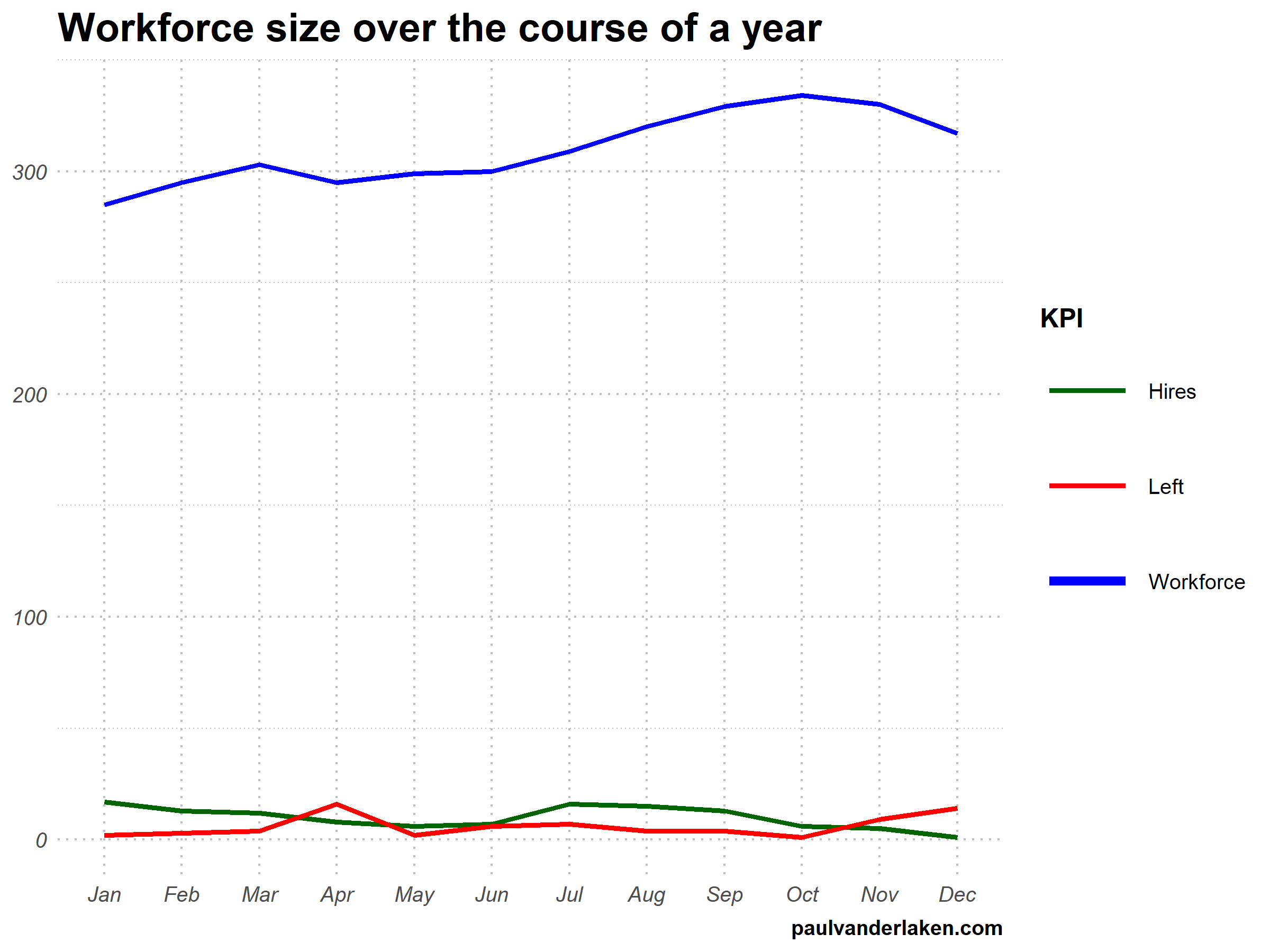
versus

Would you prefer the static, or the animated version? Please do share your thoughts in the comments below, or on the respective LinkedIn and Twitter posts!


Want to reproduce these plots? Or play with the data? Here’s the R code:

# LOAD IN PACKAGES ####
# install.packages('devtools')
# devtools::install_github('thomasp85/gganimate')
library(tidyverse)
library(gganimate)
library(here)


# SET CONSTANTS ####
# data
HEADCOUNT = 270
HIRE_RATE = 0.12
HIRE_ADDED_SEASONALITY = rep(floor(seq(14, 0, length.out = 6)), 2)
LEAVER_RATE = 0.16
LEAVER_ADDED_SEASONALITY = c(rep(0, 3), 10, rep(0, 6), 7, 12)

# plot
TEXT_SIZE = 12
LINE_SIZE1 = 2
LINE_SIZE2 = 1.1
COLORS = c("darkgreen", "red", "blue")

# saving
PLOT_WIDTH = 8
PLOT_HEIGHT = 6
FRAMES_PER_POINT = 5


# HELPER FUNCTIONS ####
capitalize_string = function(text_string){
paste0(toupper(substring(text_string, 1, 1)), substring(text_string, 2, nchar(text_string)))
}


# SIMULATE WORKFORCE DATA ####
set.seed(1)

# generate random leavers and some seasonality
leavers <- rbinom(length(month.abb), HEADCOUNT, TURNOVER_RATE / length(month.abb)) + LEAVER_ADDED_SEASONALITY

# generate random hires and some seasonality
joiners <- rbinom(length(month.abb), HEADCOUNT, HIRE_RATE / length(month.abb)) + HIRE_ADDED_SEASONALITY

# combine in dataframe
data.frame(
month = factor(month.abb, levels = month.abb, ordered = TRUE)
, workforce = HEADCOUNT - cumsum(leavers) + cumsum(joiners)
, left = leavers
, hires = joiners
) ->
wf

# transform to long format
wf_long <- gather(wf, key = "variable", value = "value", -month)
capitalize the name of variables
wf_long$variable <- capitalize_string(wf_long$variable)


# VISUALIZE & ANIMATE ####
# draw workforce plot
ggplot(wf_long, aes(x = month, y = value, group = variable)) +
geom_line(aes(col = variable, size = variable == "workforce")) +
scale_color_manual(values = COLORS) +
scale_size_manual(values = c(LINE_SIZE2, LINE_SIZE1), guide = FALSE) +
guides(color = guide_legend(override.aes = list(size = c(rep(LINE_SIZE2, 2), LINE_SIZE1)))) +
# theme_PVDL() +
labs(x = NULL, y = NULL, color = "KPI", caption = "paulvanderlaken.com") +
ggtitle("Workforce size over the course of a year") +
NULL ->
workforce_plot

# ggsave(here("workforce_plot.png"), workforce_plot, dpi = 300, width = PLOT_WIDTH, height = PLOT_HEIGHT)

# animate the plot
workforce_plot +
geom_segment(aes(xend = 12, yend = value), linetype = 2, colour = 'grey') +
geom_label(aes(x = 12.5, label = paste(variable, value), col = variable),
hjust = 0, size = 5) +
transition_reveal(variable, along = as.numeric(month)) +
enter_grow() +
coord_cartesian(clip = 'off') +
theme(
plot.margin = margin(5.5, 100, 11, 5.5)
, legend.position = "none"
) ->
animated_workforce

anim_save(here("workforce_animation.gif"),
animate(animated_workforce, nframes = nrow(wf) * FRAMES_PER_POINT,
width = PLOT_WIDTH, height = PLOT_HEIGHT, units = "in", res = 300))

Data Visualization Tools & Resources

There’s this amazing overview of helpful dataviz resources atwww.visualisingdata.com/resources!

Browse through hundreds of helpful data visualization tools, programs, and services. All neatly organized by Andy Kirk in categories: data handling, applications, programming, web-based, qualitative, mapping, specialist, and colour. What a great repository!

A snapshot of www.visualisingdata.com/resource

Looking for expert books on data visualization?
Have a look at these recommendations!

7 tips for writing cleaner JavaScript code, translated to 3.5 tips for R programming

7 tips for writing cleaner JavaScript code, translated to 3.5 tips for R programming

I recently came across this lovely article where Ali Spittel provides 7 tips for writing cleaner JavaScript code. Enthusiastic about her guidelines, I wanted to translate them to the R programming environment. However, since R is not an object-oriented programming language, not all tips were equally relevant in my opinion. Here’s what really stood out for me.

Capture.PNG
Ali Spittel’s Javascript tips, via https://dev.to/aspittel/extreme-makeover-code-edition-k5k

1. Use clear variable and function names

Suppose we want to create our own custom function to derive the average value of a vector v (please note that there is a base::mean function to do this much more efficiently). We could use the R code below to compute that the average of vector 1 through 10 is 5.5.

avg <- function(v){
    s = 0
    for(i in seq_along(v)) {
        s = s + v[i]
    }
    return(s / length(v))
}

avg(1:10) # 5.5

However, Ali rightfully argues that this code can be improved by making the variable and function names much more explicit. For instance, the refigured code below makes much more sense on a first look, while doing exactly the same.

averageVector <- function(vector){
    sum = 0
    for(i in seq_along(vector)){
        sum = sum + vector[i]
    }
    return(sum / length(vector))
}

averageVector(1:10) #5.5

Of course, you don’t want to make variable and function names unnecessary long (e.g., average would have been a great alternative function name, whereas computeAverageOfThisVector is probably too long). I like Ali’s principle:

Don’t minify your own code; use full variable names that the next developer can understand.

2. Write short functions that only do one thing

Ali argues “Functions are more understandable, readable, and maintainable if they do one thing only. If we have a bug when we write short functions, it is usually easier to find the source of that bug. Also, our code will be more reusable.” It thus helps to break up your code into custom functions that all do one thing and do that thing good!

For instance, our earlier function averageVector actually did two things. It first summated the vector, and then took the average. We can split this into two seperate functions in order to standardize our operations.

sumVector <- function(vector){
    sum = 0
    for(i in seq_along(vector)){
        sum = sum + vector[i]
    }
    return(sum)
}

averageVector <- function(vector){
    sum = sumVector(vector)
    average = sum / length(vector)
    return(average)
}

sumVector(1:10) # 55
averageVector(1:10) # 5.5

If you are writing a function that could be named with an “and” in it — it really should be two functions.

3. Documentation

Personally, I am terrible in commenting and documenting my work. I am always too much in a hurry, I tell myself. However, no more excuses! Anybody should make sure to write good documentation for their code so that future developers, including future you, understand what your code is doing and why!

Ali uses the following great example, of a piece of code with magic numbers in it.

areaOfCircle <- function(radius) {
  return(3.14 * radius ** 2)
}

Now, you might immediately recognize the number Pi in this return statement, but others may not. And maybe you will need the value Pi somewhere else in your script as well, but you accidentally use three decimals the next time. Best to standardize and comment!

PI <- 3.14 # PI rounded to two decimal places

areaOfCircle <- function(radius) {
  # Implements the mathematical equation for the area of a circle:
  # Pi times the radius of the circle squared.
  return(PI * radius ** 2)
}

The above is much clearer. And by making PI a variable, you make sure that you use the same value in other places in your script! Unfortunately, R doesn’t handle constants (unchangeable variables), but I try to denote my constants by using ALL CAPITAL variable names such as PI, MAX_GROUP_SIZE, or COLOR_EXPERIMENTAL_GROUP.

Do note that R has a built in variable pi for purposes such as the above.

I love Ali’s general rule that:

Your comments should describe the “why” of your code.

However, more elaborate R programming commenting guidelines are given in the Google R coding guide, stating that:

Functions should contain a comments section immediately below the function definition line. These comments should consist of a one-sentence description of the function; a list of the function’s arguments, denoted by Args:, with a description of each (including the data type); and a description of the return value, denoted by Returns:. The comments should be descriptive enough that a caller can use the function without reading any of the function’s code.

Either way, prevent that your comments only denote “what” your code does:

# EXAMPLE OF BAD COMMENTING ####

PI <- 3.14 # PI

areaOfCircle <- function(radius) {
    # custom function for area of circle
    return(PI * radius ** 2) # radius squared times PI
}

5. Be Consistent

I do not have as strong a sentiment about consistency as Ali does in her article, but I do agree that it’s nice if code is at least somewhat in line with the common style guides. For R, I like to refer to my R resources list which includes several common style guides, such as Google’s or Hadley Wickham’s Advanced R style guide.


How to Design Your First Programs

How to Design Your First Programs

Past week, I started this great C++ tutorial: learncpp.com. It has been an amazing learning experience so far, mostly because the tutorial is very hands on, allowing you to immediately self-program all of the code examples.

Several hours in now, section 1.10b explains how to design of your own, first programs. The advice in this seciton seemd pretty universal, thus valuable regardless of the programming language you normally work in. At least, I found it to resonates with my personal experiences so I highly recommend that you take 10 minutes to read it yourself: www.learncpp.com/cpp-tutorial/1-10b-how-to-design-your-first-programs. For those who dislike detailed insights, here are the main pointers:

A little up-front planning saves time and frustration in the long run. Generally speaking, work through these eight steps when starting a new program or project:

  1. Define the problem
  2. Collect the program’s basic requirements (e.g., functionality, constraints)
  3. Define your tools, targets, and backup plan
  4. Break hard problems down into easy problems
  5. Figure out (and list) the sequence of events
  6. Figure out the data inputs and outputs for each task
  7. Write the task details
  8. Connect the data inputs and outputs

Some general words of advice when writing programs:

Keep your programs simple to start. Often new programmers have a grand vision for all the things they want their program to do. “I want to write a role-playing game with graphics and sound and random monsters and dungeons, with a town you can visit to sell the items that you find in the dungeon” If you try to write something too complex to start, you will become overwhelmed and discouraged at your lack of progress. Instead, make your first goal as simple as possible, something that is definitely within your reach. For example, “I want to be able to display a 2d field on the screen”.

Add features over time. Once you have your simple program working and working well, then you can add features to it. For example, once you can display your 2d field, add a character who can walk around. Once you can walk around, add walls that can impede your progress. Once you have walls, build a simple town out of them. Once you have a town, add merchants. By adding each feature incrementally your program will get progressively more complex without overwhelming you in the process.

Focus on one area at a time. Don’t try to code everything at once, and don’t divide your attention across multiple tasks. Focus on one task at a time, and see it through to completion as much as is possible. It is much better to have one fully working task and five that haven’t been started yet than six partially-working tasks. If you split your attention, you are more likely to make mistakes and forget important details.

Test each piece of code as you go. New programmers will often write the entire program in one pass. Then when they compile it for the first time, the compiler reports hundreds of errors. This can not only be intimidating, if your code doesn’t work, it may be hard to figure out why. Instead, write a piece of code, and then compile and test it immediately. If it doesn’t work, you’ll know exactly where the problem is, and it will be easy to fix. Once you are sure that the code works, move to the next piece and repeat. It may take longer to finish writing your code, but when you are done the whole thing should work, and you won’t have to spend twice as long trying to figure out why it doesn’t.

Learn C++; Section 1.10b

Analytics in HR case study: Behind the scenes

Analytics in HR case study: Behind the scenes

Past week, Analytics in HR published a guest blog about one of my People Analytics projects which you can read here. In the blog, I explain why and how I examined the turnover of management trainees in light of the international work assignments they go on.

For the analyses, I used a statistical model called a survival analysis – also referred to as event history analysis, reliability analysis, duration analysis, time-to-event analysis, or proporational hazard models. It estimates the likelihood of an event occuring at time t, potentially as a function of certain data.

The sec version of surival analysis is a relatively easy model, requiring very little data. You can come a long way if you only have the time of observation (in this case tenure), and whether or not an event (turnover in this case) occured. For my own project, I had two organizations, so I added a source column as well (see below).

# LOAD REQUIRED PACKAGES ####
library(tidyverse)
library(ggfortify)
library(survival)

# SET PARAMETERS ####
set.seed(2)
sources = c("Organization Red","Organization Blue")
prob_leave = c(0.5, 0.5)
prob_stay = c(0.8, 0.2)
n = 60

# SIMULATE DATASETS ####
bind_rows(
  tibble(
    Tenure = sample(1:80, n*2, T),
    Source = sample(sources, n*2, T, prob_leave),
    Turnover = T
  ),
  tibble(
    Tenure = sample(1:85, n*25, T),
    Source = sample(sources, n*25, T, prob_stay),
    Turnover = F
  )
) ->
  data_surv

# RUN SURVIVAL MODEL ####
sfit <- survfit(Surv(data_surv$Tenure, event = data_surv$Turnover) ~ data_surv$Source)

# PLOT  SURVIVAL ####
autoplot(sfit, censor = F, surv.geom = 'line', surv.size = 1.5, conf.int.alpha = 0.2) +
  scale_x_continuous(breaks = seq(0, max(data_surv$Tenure), 12)) +
  coord_cartesian(xlim = c(0,72), ylim = c(0.4, 1)) +
  scale_color_manual(values = c("blue", "red")) +
  scale_fill_manual(values = c("blue", "red")) +
  theme_light() +
  theme(legend.background = element_rect(fill = "transparent"),
        legend.justification = c(0, 0),
        legend.position = c(0, 0),
        legend.text = element_text(size = 12)
        ) +
  labs(x = "Length of service", 
       y = "Percentage employed",
       title = "Survival model applied to the retention of new trainees",
       fill = "",
       color = "")

survival_plot
The resulting plot saved with ggsave, using width = 8 and height = 6.

Using the code above, you should be able to conduct a survival analysis and visualize the results for your own projects. Please do share your results!

Generating Book Covers By Their Words — My Dissertation Cover

Generating Book Covers By Their Words — My Dissertation Cover

As some of you might know, I am defending my PhD dissertation later this year. It’s titled “Data-Driven Human Resource Management: The rise of people analytics and its application to expatriate management” and, over the past few months, I was tasked with designing its cover.

Now, I didn’t want to buy some random stock photo depicting data, an organization, or overly happy employees. I’d rather build something myself. Something reflecting what I liked about the dissertation project: statistical programming and sharing and creating knowledge with others.

Hence, I came up with the idea to use the collective intelligence of the People Analytics community to generate a unique cover. It required a dataset of people analytics-related concepts, which I asked People Analytics professionals on LinkedIn, Twitter, and other channels to help compile. Via a Google Form, colleagues, connections, acquitances, and complete strangers contributed hundreds of keywords ranging from the standard (employees, HRM, performance) to the surprising (monetization, quantitative scissors [which I had to Google]). After reviewing the list and adding some concepts of my own creation, I ended up with 1786 unique words related to either business, HRM, expatriation, data science, or statistics.

I very much dislike wordclouds (these are kind of cool though), but already had a different idea in mind. I thought of generating a background cover of the words relating to my dissertation topic, over which I could then place my title and other information. I wanted to place these keywords randomly, maybe using a color schema, or with some random sizes.

The picture below shows the result of one of my first attempts. I programmed everything in R, writing some custom functionality to generate the word-datasets, the cover-plot, and .png, .pdf, and .gif files as output.

canvas.PNG

Random colors did not produce a pleasing result and I definitely needed more and larger words in order to fill my 17cm by 24cm canvas!

Hence, I started experimenting. Using base R’s expand.grid() and set.seed() together with mapply(), I could quickly explore and generate a large amount of covers based on different parameter settings and random fluctuations.

expand.grid(seed = c(1:3), 
            dupl = c(1:4, seq(5, 30, 5)),
            font = c("sans", "League Spartan"),
            colors = c(blue_scheme, red_scheme, 
                       rainbow_scheme, random_scheme),
            size_mult = seq(1, 3, 0.3),
            angle_sd = c(5, 10, 12, 15)) -> 
  param

mapply(create_textcover, 
       param$seed, param$dupl, 
       param$font, param$colors, 
       param$size_mult, param$angle_sd)

The generation process for each unique cover only took a few seconds, so I would generate a few hundred, quickly browse through them, update the parameters to match my preferences, and then generate a new set. Among others, I varied the color palette used, the size range of the words, their angle, the font used, et cetera. To fill up the canvas, I experimented with repeating the words: two, three, five, heck, even twenty, thirty times. After an evening of generating and rating, I came to the final settings for my cover:

  • Words were repeated twenty times in the dataset.
  • Words were randomly distributed across the canvas.
  • Words placed in random order onto the canvas, except for a select set of relevant words, placed last.
  • Words’ transparency ranged randomly between 0% and 70%.
  • Words’ color was randomly selected out of six colors from this palette of blues.
  • Words’ writing angles were normally distributed around 0 degrees, with a standard deviation of 12 degrees. However, 25% of words were explicitly without angle.
  • Words’ size ranged between 1 and 4 based on a negative binomial distribution (10 * 0.8) resulting in more small than large words. The set of relevant words were explicitly enlarged throughout.

With League Spartan (#thisisparta) loaded as a beautiful custom font, this was the final cover background which I and my significant other liked most:

cover_wordcloud_20-League Spartan-4.png

While I still need to decide on the final details regarding title placement and other details, I suspect that the final cover will look something like below — the white stripe in the middle depicting the book’s back.

coverpaul.png

Now, for the finale, I wanted to visualize the generation process via a GIF. Thomas Lin Pedersen developed this great gganimate package, which builds on the older animation package. The package greatly simplifies creating your own GIFs, as I already discussed in this earlier blog about animated GIFs in R. Anywhere, here is the generation process, where each frame includes the first frame ^ 3.2 words:

cover_wordcloud_20-League Spartan_4.gif

If you are interested in the process, or the R code I’ve written, feel free to reach out!

I’m sharing a digital version of the dissertation online sometime around the defense date: November 9th, 2018. If you’d like a copy, you can still leave your e-mailadress in the Google Form here and I’ll make sure you’ll receive your copy in time!