Survival of the Best Fit was built by Gabor Csapo, Jihyun Kim, Miha Klasinc, and Alia ElKattan. They are software engineers, designers and technologists, advocating for better software that allows members of the public to question its impact on society.
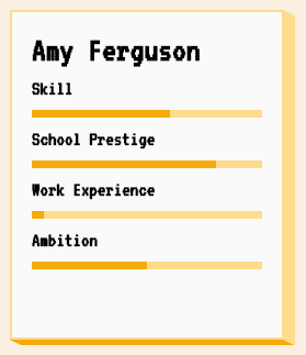
You don’t need to be an engineer to question how technology is affecting our lives. The goal is not for everyone to be a data scientist or machine learning engineer, though the field can certainly use more diversity, but to have enough awareness to join the conversation and ask important questions.
With Survival of the Best Fit, we want to reach an audience that may not be the makers of the very technology that impact them everyday. We want to help them better understand how AI works and how it may affect them, so that they can better demand transparency and accountability in systems that make more and more decisions for us.
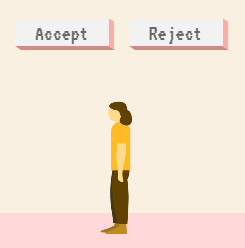
I found that the game provides a great intuitive explanation of how (humas) bias can slip into A.I. or machine learning applications in recruitment, selection, or other human resource management practices and processes.
Note, as Joachin replied below, that the game apparently does not learn from user-input, but is programmed to always result in bias towards blues. I kind of hoped that there was actually an algorithm “learning” in the backend, and while the developers could argue that the bias arises from the added external training data (you picked either Google, Apple, or Amazon to learn from), it feels like a bit of a disappointment that there is no real interactivity here.
In a recent post, Claus shared the link to a GitHub repository where he hosts some of the R programming code with which Claus made the graphics for his dataviz book. The repository is named practical ggplot2, after the R package Clause used to make many of his visuals.
Check it out, the page contains some pearls and the code behind them, which will help you learn to create fabulous visualizations yourself. Some examples:
Norm Matloff is a professor of Computer Science at University College Davis. He recently updated his viewpoint on whether R or Python is the best language for Data Science. While I normally hate those opinionated comparisons, Norm’s outline of the two languages’ (dis)advantages is actually quite balanced and well-versed.
I can mostly agree with Norm, although the blog reads as if he has a (slight) bias in favor of R. In his original blog, Norm discusses many different programming topics and provides detailed information on why he considers certain topics big wins, slight edges, or ties between the two programming languages.
In the table below, I’ve tried to summarize Norm’s opinions by converting his words to 0-100 scores per topic for a quicker overview. I’ve converted Norm’s words to scores: his huge win became 100-0, a big win 80-20, a win 70-30, an edge 60-40, and a tie 50-50.
Python
R
Elegance
100
Learning curve
100
Data Science libraries
40
60
Machine Learning
60
40
Statistical correctness
20
80
Parallel computing
50
50
C/C++ interface
40
60
Object orientation, metaprogramming
40
60
Language unity
100
Linked data structures
70
30
Online help
20
80
I personally started my career with R, so that’s definitely my favorite programming language. However, I think that Python is more convenient and faster on certain topics, and closer to more mainstream programming languages, which I why I’m currently learning it next to using R.
PS. This tweet by John summarizes the whole discussion quite well.
Someone asked me "R vs. Python", so: 1. It depends what you're trying to do 2. If you're trying to capitalise the letter r, I'd go with R, but if you're trying to strangle a woodland animal, I'd say python 3. Java is better than either. It's a huge island! Tropical rainforests!
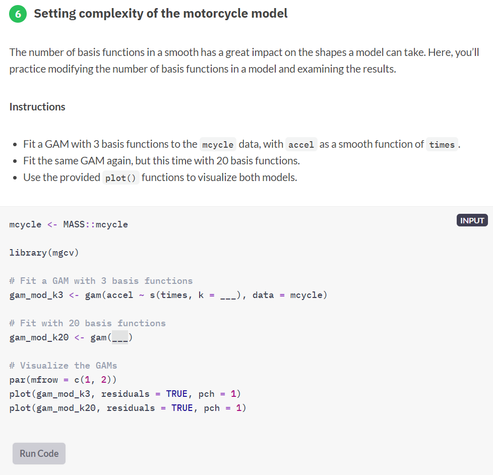
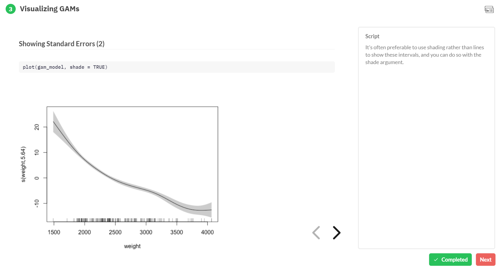
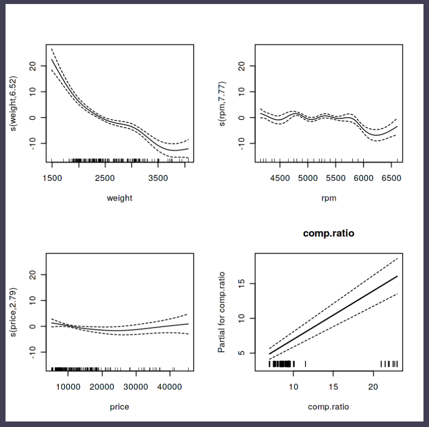
Generalized Additive Models — or GAMs in short — have been somewhat of a mystery to me. I’ve known about them, but didn’t know exactly what they did, or when they’re useful. That came to an end when I found out about this tutorial by Noam Ross.
In this beautiful, online, interactive course, Noam allows you to program several GAMs yourself (in R) and to progressively learn about the different functions and features. I am currently halfway through, but already very much enjoy it.
If you’re already familiar with linear models and want to learn something new, I strongly recommend this course!
Recently, I came across a social science paper that had used linear probability regression. I had never heard of linear probability models (LPM), but it seems just an application of ordinary least squares regression but to a binomial dependent variable.
According to some, LPM is a commonly used alternative for logistic regression, which is what I was learned to use when the outcome is binary.
Potentially because of my own social science background (HRM), using linear regression without a link transformation on binary data just seems very unintuitive and error-prone to me. Hence, I sought for more information.
I particularly liked this article by Jake Westfall, which he dubbed “Logistic regression is not fucked”, following a series of blogs in which he talks about methods that are fucked and not useful.
Jake explains the classification problem and both methods inner workings in a very straightforward way, using great visual aids. He shows how LMP would differ from logistic models, and why its proposed benefits are actually not so beneficial. Maybe I’m in my bubble, but Jake’s arguments resonated.
Here’s the summary: Arguments against the use of logistic regression due to problems with “unobserved heterogeneity” proceed from two distinct sets of premises. The first argument points out that if the binary outcome arises from a latent continuous outcome and a threshold, then observed effects also reflect latent heteroskedasticity. This is true, but only relevant in cases where we actually care about an underlying continuous variable, which is not usually the case. The second argument points out that logistic regression coefficients are not collapsible over uncorrelated covariates, and claims that this precludes any substantive interpretation. On the contrary, we can interpret logistic regression coefficients perfectly well in the face of non-collapsibility by thinking clearly about the conditional probabilities they refer to.
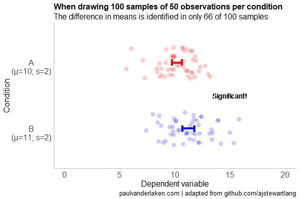
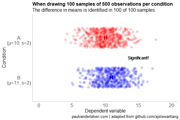
Created by Andrew Stewart, and tweeted by John Holbein, the visuals show samples taken from a normal distributed variable with a mean of 10 and a standard deviation of 2. In the left section, Andrew took several samples of 20. In the right section, the sample size was increased to 500.
Just look at how much the distribution and the estimated mean change for small samples!
Andrew shared his code via Github, so I was able to download and tweak it a bit to make my own version.
Andrew’s version seems to be concerned with potential Type 1 errors when small samples are taken. A type 1 error occurs when you reject your null hypothesis (you reject “there is no effect”) while you should not have (“there is actually no effect”).
You can see this in the distributions Andrew sampled from in the tweet above. The data for conditions A (red) and B (blue) are sampled from the same distribution, with mean 10 and standard deviation 2. While there should thus be no difference between the groups, small samples may cause researchers to erroneously conclude that there is a difference between conditions A and B due to the observed data.
We could use Andrew’s basic code and tweak it a bit to simulate a setting in which Type 2 errors could occur. A type 2 error occurs when you do not reject your null hypothesis (you maintain “there is no effect”) whereas there is actually an effect, which you thus missed.
To illustrate this, I adapted Andrew’s code: I sampled data for condition B using a normal distribution with a slightly higher mean value of 11, as opposed to the mean of 10 for condition A. The standard deviation remained the same in both conditions (2).
Next, I drew 10 data samples from both conditions, for various sample sizes: 10, 20, 50, 100, 250, 500, and even 1000. After drawing these samples for both conditions, I ran a simple t-test to compare their means, and estimate whether any observed difference could be considered significant (at the alpha = 0.05 level [95%]).
In the end, I visualized the results in a similar fashion as Andrew did. Below are the results.
As you can see, only in 1 of our 10 samples with size 10 were we able to conclude that there was a difference in means. This means that we are 90% incorrect.
After increasing the sample size to 100, we strongly decrease our risk of Type 2 errors. Now we are down to 20% incorrect conclusions.
At this point though, I decided to rework Andrew’s code even more, to clarify the message.
I was not so much interested in the estimated distribution, which currently only distracts. Similarly, the points and axes can be toned down a bit. Moreover, I’d like to be able to see when my condition samples have significant different means, so let’s add a 95% confidence interval, and some text. Finally, let’s increase the number of drawn samples per sample size to, say, 100, to reduce the influence that chance may have on our Type 2 error rate estimations.
Let’s rerun the code and generate some GIFs!
The below demonstrates that small samples of only 10 observations per condition have only about a 11% probability of detecting the difference in means when the true difference is 1 (or half the standard deviation [i.e., 2]). In other words, there is a 89% chance of a Type 2 error occuring, where we fail to reject the null hypothesis due to sampling error.
Doubling the sample size to 20, more than doubles our detection rate. We now correctly identify the difference 28% of the time.
With 50 observations the Type 2 error rate drops to 34%.
Finally, with sample sizes of 100+ our results become somewhat reliable. We are now able to correctly identify the true difference over 95% of the times.
With a true difference of half the standard deviation, further increases in the sample size start to lose their added value. For instance, a sample size of 250 already uncovers the effect in all 100 samples, so doubling to 500 would not make sense.
I hope you liked the visuals. If you are interested in these kind of analysis, or want to estimate how large of a sample you need in your own study, have a look at power analysis. These analysis can help you determine the best setup for your own research initiatives.
If you’d like to reproduce or change the graphics above, here is the R code. Note that it is strongly inspired by Andrew’s original code.
# setup -------------------------------------------------------------------

# The new version of gganimate by Thomas Lin Pedersen - @thomasp85 may not yet be on CRAN so use devtools
# devtools::install_github('thomasp85/gganimate')

library(ggplot2)
library(dplyr)
library(glue)
library(magrittr)
library(gganimate)


# main function to create and save the animation --------------------------

save_created_animation = function(sample_size,
                                  samples = 100,
                                  colors = c("red", "blue"),
                                  Amean = 10, Asd = 2,
                                  Bmean = 11, Bsd = 2,
                                  seed = 1){

  ### generate the data

  # set the seed
  set.seed(seed)

  # set the names of our variables
  cnames <- c("Score", "Condition", "Sample")

  # create an empty data frame to store our simulated samples
  df <- data.frame(matrix(rep(NA_character_, samples * sample_size * 2 * length(cnames)), ncol = length(cnames), dimnames = list(NULL, cnames)), stringsAsFactors = FALSE)

  # create an empty vector to store whether t.test identifies significant difference in means
  result <- rep(NA_real_, samples)

  # run a for loop to iteratively simulate the samples
  for (i in seq_len(samples)) {
    # draw random samples for both conditions
    a <- rnorm(sample_size, mean = Amean, sd = Asd)
    b <- rnorm(sample_size, mean = Bmean, sd = Bsd)
    # test whether there the difference in the means of samples is significant
    result[i] = t.test(a, b)$p.value < 0.05
    # add the identifiers for both conditions, and for the sample iteration
    a <- cbind(a, rep(glue("A\n(μ={Amean}; σ={Asd})"), sample_size), rep(i, sample_size))
    b <- cbind(b, rep(glue("B\n(μ={Bmean}; σ={Bsd})"), sample_size), rep(i, sample_size))
    # bind the two sampled conditions together in a single matrix and set its names
    ab <- rbind(a, b)
    colnames(ab) <- cnames
    # push the matrix into its reserved spot in the reserved dataframe
    df[((i - 1) * sample_size * 2 + 1):((i * (sample_size * 2))), ] <- ab
  }


  ### prepare the data

  # create a custom function to calculate the standard error
  se <- function(x) sd(x) / sqrt(length(x))

  df %>%
    # switch data types for condition and score
    mutate(Condition = factor(Condition)) %>%
    mutate(Score = as.numeric(Score)) %>%
    # calculate the mean and standard error to be used in the error bar
    group_by(Condition, Sample) %>%
    mutate(Score_Mean = mean(Score)) %>%
    mutate(Score_SE = se(Score)) ->
    df

  # create a new dataframe storing the result per sample
  df_result <- data.frame(Sample = unique(df$Sample), Result = result, stringsAsFactors = FALSE)

  # and add this result to the dataframe
  df <- left_join(df, df_result, by = "Sample")

  # identify whether not all but also not zero samples identified the difference in means
  # if so, store the string "only ", later to be added into the subtitle
  result_mention_adj <- ifelse(sum(result) != 0 & sum(result) < length(result), "only ", "")


  ### create a custom theme

  textsize <- 16

  my_theme <- theme(
    text = element_text(size = textsize),
    axis.title.x = element_text(size = textsize),
    axis.title.y = element_text(size = textsize),
    axis.text.y = element_text(hjust = 0.5, vjust = 0.75),
    axis.text = element_text(size = textsize),
    legend.title = element_text(size = textsize),
    legend.text =  element_text(size = textsize),
    legend.position = "right",
    plot.title = element_text(lineheight = .8, face = "bold", size = textsize),
    panel.border = element_blank(),
    panel.grid.minor = element_blank(),
    panel.grid.major = element_blank(),
    axis.line = element_line(color = "grey", size = 0.5, linetype = "solid"),
    axis.ticks = element_line(color = "grey")
  )

  # store the chosen colors in a named vector for use as palette,
  # and add the colors for (in)significant results
  COLORS = c(colors, "black", "darkgrey")
  names(COLORS) = c(levels(df$Condition), "1", "0")


  ### create the animated plot

  df %>%
    ggplot(aes(y = Score, x = Condition, fill = Condition, color = Condition)) +
    geom_point(aes(y = Score), position = position_jitter(width = 0.25), alpha = 0.20, stroke = NA, size = 1) +
    geom_errorbar(aes(ymin = Score_Mean - 1.96 * Score_SE, ymax = Score_Mean + 1.96 * Score_SE), width = 0.10, size = 1.5) +
    geom_text(data = . %>% filter(as.numeric(Condition) == 1),
              aes(x = levels(df$Condition)[1], y = Result * 10 + 5,
                  label = ifelse(Result == 1, "Significant!", "Insignificant!"),
                  col = as.character(Result)), position = position_nudge(x = -0.5), size = 5) +
    transition_states(Sample, transition_length = 1, state_length = 2) +
    guides(fill = FALSE) +
    guides(color = FALSE) +
    scale_x_discrete(limits = rev(levels(df$Condition)), breaks = rev(levels(df$Condition))) +
    scale_y_continuous(limits = c(0, 20), breaks = seq(0, 20, 5)) +
    scale_color_manual(values = COLORS) +
    scale_fill_manual(values = COLORS) +
    coord_flip() +
    theme_minimal() +
    my_theme +
    labs(x = "Condition") +
    labs(y = "Dependent variable") +
    labs(title = glue("When drawing {samples} samples of {sample_size} observations per condition")) +
    labs(subtitle = glue("The difference in means is identified in {result_mention_adj}{sum(result)} of {length(result)} samples")) +
    labs(caption = "paulvanderlaken.com | adapted from github.com/ajstewartlang") ->
    ani

  ### save the animated plot

  anim_save(paste0(paste("sampling_error", sample_size, sep = "_"), ".gif"),
            animate(ani, nframes = samples * 10, duration = samples, width = 600, height = 400))

}


# call animation function for different sample sizes ----------------------

# !!! !!! !!!
# the number of samples is set to 100 by default
# if left at 100, each function call will take a long time!
# add argument `samples = 10` to get quicker results, like so:
# save_created_animation(10, samples = 10)
# !!! !!! !!!

save_created_animation(10)
save_created_animation(20)
save_created_animation(50)
save_created_animation(100)
save_created_animation(250)
save_created_animation(500)


