Category: r

Visualization innovations: Waffleplots and Swarmplots

Visualization innovations: Waffleplots and Swarmplots

Last year witnessed the creation of many novel types of data visualization. Some lesser known ones, jokingly referred to as xenographics, I already discussed.

Two new visualization formats seem to stick around though. And as always, it was not long before someone created special R packages for them. Get ready to meet waffleplots and swarmplots!

Waffleplot

Waffleplots — also called square pie charts — are very useful in communicating parts of a whole for categorical quantities. Bob Rudis (twitter) — scholar and R developer among many other things — did us all a favor and created the R waffle package.

First, we need to install and load the waffle package.

install.packages("waffle") # install waffle package
library(waffle) # load in package

I will use the famous iris data to demonstrate both plots.

Since waffleplots work with frequencies, I will specifically use the iris$Species data stored as a frequency table.

(spec <- table(iris$Species))

    setosa versicolor  virginica 
        50         50         50 

Now let’s produce our first waffle plot
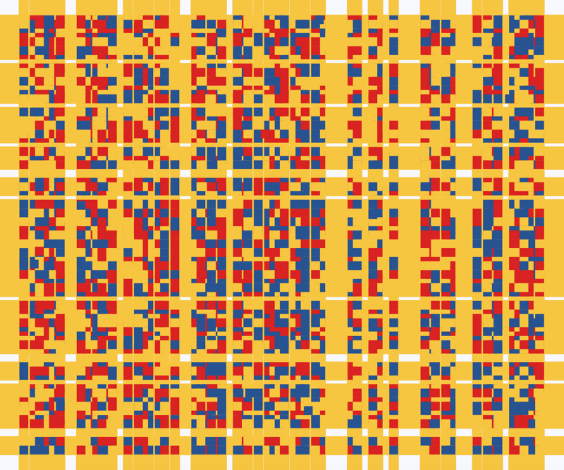
waffle(spec)

Here, we see every single flower in the iris dataset represented by a tile. This provides an immediate visual representation of the group sizes in the dataset. Looks pretty huh!

But we can play around with the display settings, for instance, let’s change the number of rows and the placement of the legend. Building on ggplot2, the waffle package works very intuitive:

waffle(spec, rows = 3, legend_pos = "bottom")

Or, in case we want to highlight a specific value, we could play around with the colors a bit.

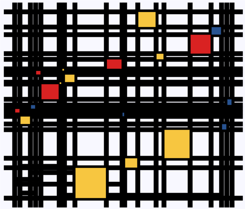
waffle(spec, rows = 15, colors = c("lightgrey", "darkgrey", "red"))

The plot is a bit crowded though with each flower as a seperate tile. We can simply reduce the number of tiles by dividing the values in our frequency table, like so:

# do not forget to annotate what each square represents!
w1 <- waffle(spec / 10, rows = 5, xlab = "1 square = 10 flowers")
w1

Finally, you might want to combine multiple waffles into a single visual. This you can do with the accompanied well-named waffle::iron function. Like so:

iron(
  waffle(spec / 5, rows = 5, title = "iron() combines waffles"),
  w1
)

I am definately going to use this package in my daily work. I just love the visual simplicity.

As a final remark, the waffle Github page argues that the argument use_glyph can be used to replace the tiles by pictures from the extrafont package, however, I could not get the code to work.

The visual resulting from the use_glyph waffle example via github.

The ggplot2 waffle extension geom_waffle is being developed as we speak, but is not yet hosted on CRAN yet.

Swarmplot

A second innovation comes in the form of the so-called swarmplot, or beeswarmplot, and is already hosted on CRAN in the form of the ggbeeswarm package, developed by Erik Clarke (I think this guy) and Scott Sherril-Mix.

Some examples hosted on the Github page also use the iris dataset, so you can have a look at those. However, I made novel visuals because I prefer theme_light. Hence, I first install the ggbeeswarm package along with ggplot2, and then set the default theme to theme_light.

install.packages("ggplot2")
install.packages("ggbeeswarm")

library(ggplot2)
library(ggbeeswarm)

theme_set(theme_light()) # sets a default ggplot theme

geom_beeswarm

There are two main functions in the ggbeeswarm package, geom_beeswarm and geom_quasirandom. Let’s start with the actual beeswarm.

Generating a beeswarm plot is as simple as any other ggplot:

ggplot(iris, aes(Species, Sepal.Length)) + geom_beeswarm()

As this is an “official” ggplot2 extension, most functionality works the same as in any other geom_*. Thus, adding colors or increasing point size is easy:

ggplot(iris, aes(Species, Sepal.Length, col = Species)) + geom_beeswarm(size = 2)

For larger sizes, you might want to adjust the spacing between the points using the cex argument.

ggplot(iris, aes(Species, Sepal.Length, col = Species)) + geom_beeswarm(size = 3, cex = 3)

Points in a beeswarmplot are automatically plotted side-by-side grouped on the X variable, but you can turn that off with the groupOnX command.

ggplot(iris, aes(Species, Sepal.Length, col = Species)) + geom_beeswarm(groupOnX = FALSE)

Finally, if you have another grouping variable besides those on the axis (e.g., a large Sepal.Length below), you might want to consider using the dodge.width argument to seperate the groups.

ggplot(iris, aes(Species, Sepal.Length, col = Sepal.Length > 5)) + geom_beeswarm(dodge.width = 0.5)

geom_quasirandom

The second function in the ggbeeswarm package is geom_quasirandom, an alternative to the original geom_jitter. Basically, it’s a convenient tool to offset points within categories to reduce overplotting.

ggplot(iris, aes(Species, Sepal.Length, col = Species)) + geom_quasirandom()

Instead of the quasirandom offset, the geom allows for many other methods, including a smiley face pattern : )

ggplot(iris, aes(Species, Sepal.Length, col = Species)) + geom_quasirandom(size = 2, method = "smiley")

There is also a earlier package on CRAN, called beeswarm, but it doesn’t seem to be maintained anymore. Moreover, its syntax more or less resembles R’s base::plot, whereas I have a strong preference for ggplot2 personally.

Circular Map Cutouts in R

Circular Map Cutouts in R

Katie Jolly wanted to surprise a friend with a nice geeky gift: a custom-made map cutout. Using R and some visual finetuning in Inkscape, she was able to made the below.

A detailed write-up of how Katie got to this product is posted here.

Basically, the R’s tigris package included all data on roads, and the ArcGIS Open Data Hub provided the neighborhood boundaries. Fortunately, the sf package is great for transforming and manipulating geospatial data, and includes some functions to retrieve a subset of roads based on their distance to a centroid. With this subset, Katie could then build these wonderful plots in no time with ggplot2.

GoalKicker: Free Programming Books

This specific link has been on my to-do list for so-long now that I’ve decided to just share it without any further ado.

The people behind GoalKicker, for whatever reason, decided to compile nearly 100 books on different programming languages based on among others StackOverflow entries. Their open access library contains books on languages from Latex to Linux, from Java to JavaScript, from SQL to MySQL, and from C, to C++, C#, and objective-C.

Basically, they host it all. Have a look yourself: https://books.goalkicker.com/

#100DaysOfCode: Machine Learning & Data Visualization

#100DaysOfCode: Machine Learning & Data Visualization

2018 seemed to be the year of challenges going viral on the web. Most of them were plain stupid and/or dangerous. However, one viral challenge I did like: #100DaysOfCode

1. Code minimum an hour every day for the next 100 days.

2. Tweet your progress every day with the #100DaysOfCode hashtag.

3. Each day, reach out to at least two people on Twitter who are also doing the challenge

100 Days of Code rulebook

Many (aspiring) programming professionals competed in this challenge, sharing their learning journeys in domains from web development, machine learning, or data visualization.

With this blog, I wanted to share two of those learning journeys that stood out for me.

Machine learning

First, there’s Avik Jain’s 100 days of Machine Learning code repository on Github. Avik’s repository contains all learning activities he followed during the 53 days of programming he completed. Some of Avik’s entries really stood out, and I particularly liked his educational infographics:

Just look at the wonderful design and visual aids on this decision tree for dummies infographic, pseudocode and all:

Day 23: Decision trees for dummies. This just looks fabulous right?!

Apart from the infographics, Avik also links to many very well produced tutorials that helped him improve his machine learning skills. Such as the free Python for Data Science Handbook Avik worked through, or this Youtube tutorial on deep learning in Python with Tensorflow and Keras:

Although Avik didn’t seem to have completed the full 100 days, many others did.

Data visualization

I have blogged about Hannah Yan Han‘s 100 days of code project before, but she definately deserves another mention here. Her 100 days revolved around data science, data visualization, and storytelling using both R and Python. You can find her #100DaysOfCode Medium page here, and her associated Github repository here.

For example, one day Hannah explored where instant noodles come from, how they are served, and whether people like them or not.

A different day she would examine which sports are the thoughest:

Or how scientific researchers migrate across the globe:

Hannah used many different plot types in those 100 days. Also some lesser known ones, like these upset plots on TED talk data:

Heck, she even made her own R package to generate Mondriaan-like paintings on one of the days:

What I found so great about Hannah’s project is that she picked a novel dataset every couple of days. Moreover, she used a extremely large variety of different visualization formats. All visuals were equally beautiful, but Hannah made sure to pick the right one for the purpose she was trying to serve. If you are interested in data visualization, you seriously should check out Hannah’s 100DaysOfCode Medium page.

Animated Snow in R, 2.0: gganimate API update

Animated Snow in R, 2.0: gganimate API update

Last year, inspired by a tweet from Ilya Kashnitsky, I wrote a snow animation which you can read all about here

Now, this year, the old code no longer worked due to an update to the gganimate API. Hence, I was about to only refactor the code, but decided to give the whole thing a minor update. Below, you find the 2.0 version of my R snow animation.

# PACKAGES ####
pkg <- c("here", "tidyverse", "gganimate", "animation")
sapply(pkg, function(x){
if (!x %in% installed.packages()){install.packages(x)}
library(x, character.only = TRUE)
})

# CUSTOM FUNCTIONS ####
map_to_range <- function(x, from, to) {
# Shifting the vector so that min(x) == 0
x <- x - min(x)
# Scaling to the range of [0, 1]
x <- x / max(x)
# Scaling to the needed amplitude
x <- x * (to - from)
# Shifting to the needed level
x + from
}

# CONSTANTS ####
N <- 500 # number of flakes
TIMES <- 100 # number of loops
XPOS_DELTA <- 0.01
YSPEED_MIN = 0.005
YSPEED_MAX = 0.03
FLAKE_SIZE_COINFLIP = 5
FLAKE_SIZE_COINFLIP_PROB = 0.1
FLAKE_SIZE_MIN = 4
FLAKE_SIZE_MAX = 20

# INITIALIZE DATA ####
set.seed(1)

size <- runif(N) + rbinom(N, FLAKE_SIZE_COINFLIP, FLAKE_SIZE_COINFLIP_PROB) # random flake size
yspeed <- map_to_range(size, YSPEED_MIN, YSPEED_MAX)

# create storage vectors
xpos <- rep(NA, N * TIMES)
ypos <- rep(NA, N * TIMES)

# loop through simulations
for(i in seq(TIMES)){
if(i == 1){
# initiate values
xpos[1:N] <- runif(N, min = -0.1, max = 1.1)
ypos[1:N] <- runif(N, min = 1.1, max = 2)
} else {
# specify datapoints to update
first_obs <- (N * i - N + 1)
last_obs <- (N * i)
# update x position
# random shift
xpos[first_obs:last_obs] <- xpos[(first_obs-N):(last_obs-N)] - runif(N, min = -XPOS_DELTA, max = XPOS_DELTA)
# update y position
# lower by yspeed
ypos[first_obs:last_obs] <- ypos[(first_obs-N):(last_obs-N)] - yspeed
# reset if passed bottom screen
xpos <- ifelse(ypos < -0.1, runif(N), xpos) # restart at random x
ypos <- ifelse(ypos < -0.1, 1.1, ypos) # restart just above top
}
}


# VISUALIZE DATA ####
cbind.data.frame(ID = rep(1:N, TIMES)
,x = xpos
,y = ypos
,s = size
,t = rep(1:TIMES, each = N)) %>%
# create animation
ggplot() +
geom_point(aes(x, y, size = s, alpha = s), color = "white", pch = 42) +
scale_size_continuous(range = c(FLAKE_SIZE_MIN, FLAKE_SIZE_MAX)) +
scale_alpha_continuous(range = c(0.2, 0.8)) +
coord_cartesian(c(0, 1), c(0, 1)) +
theme_void() +
theme(legend.position = "none",
panel.background = element_rect("black")) +
transition_time(t) +
ease_aes('linear') ->
snow_plot

snow_anim <- animate(snow_plot, nframes = TIMES, width = 600, height = 600)

If you want to see some spin-offs of last years code:

Animated vs. Static Data Visualizations

Animated vs. Static Data Visualizations

GIFs or animations are rising quickly in the data visualization world (see for instance here).

However, in my personal experience, they are not as widely used in business settings. You might even say animations are frowned by, for instance, LinkedIn, which removed the option to even post GIFs on their platform!

Nevertheless, animations can be pretty useful sometimes. For instance, they can display what happens during a process, like a analytical model converging, which can be useful for didactic purposes. Alternatively, they can be great for showing or highlighting trends over time.  

I am curious what you think are the pro’s and con’s of animations. Below, I posted two visualizations of the same data. The data consists of the simulated workforce trends, including new hires and employee attrition over the course of twelve months. 

versus

Would you prefer the static, or the animated version? Please do share your thoughts in the comments below, or on the respective LinkedIn and Twitter posts!


Want to reproduce these plots? Or play with the data? Here’s the R code:

# LOAD IN PACKAGES ####
# install.packages('devtools')
# devtools::install_github('thomasp85/gganimate')
library(tidyverse)
library(gganimate)
library(here)


# SET CONSTANTS ####
# data
HEADCOUNT = 270
HIRE_RATE = 0.12
HIRE_ADDED_SEASONALITY = rep(floor(seq(14, 0, length.out = 6)), 2)
LEAVER_RATE = 0.16
LEAVER_ADDED_SEASONALITY = c(rep(0, 3), 10, rep(0, 6), 7, 12)

# plot
TEXT_SIZE = 12
LINE_SIZE1 = 2
LINE_SIZE2 = 1.1
COLORS = c("darkgreen", "red", "blue")

# saving
PLOT_WIDTH = 8
PLOT_HEIGHT = 6
FRAMES_PER_POINT = 5


# HELPER FUNCTIONS ####
capitalize_string = function(text_string){
paste0(toupper(substring(text_string, 1, 1)), substring(text_string, 2, nchar(text_string)))
}


# SIMULATE WORKFORCE DATA ####
set.seed(1)

# generate random leavers and some seasonality
leavers <- rbinom(length(month.abb), HEADCOUNT, TURNOVER_RATE / length(month.abb)) + LEAVER_ADDED_SEASONALITY

# generate random hires and some seasonality
joiners <- rbinom(length(month.abb), HEADCOUNT, HIRE_RATE / length(month.abb)) + HIRE_ADDED_SEASONALITY

# combine in dataframe
data.frame(
month = factor(month.abb, levels = month.abb, ordered = TRUE)
, workforce = HEADCOUNT - cumsum(leavers) + cumsum(joiners)
, left = leavers
, hires = joiners
) ->
wf

# transform to long format
wf_long <- gather(wf, key = "variable", value = "value", -month)
capitalize the name of variables
wf_long$variable <- capitalize_string(wf_long$variable)


# VISUALIZE & ANIMATE ####
# draw workforce plot
ggplot(wf_long, aes(x = month, y = value, group = variable)) +
geom_line(aes(col = variable, size = variable == "workforce")) +
scale_color_manual(values = COLORS) +
scale_size_manual(values = c(LINE_SIZE2, LINE_SIZE1), guide = FALSE) +
guides(color = guide_legend(override.aes = list(size = c(rep(LINE_SIZE2, 2), LINE_SIZE1)))) +
# theme_PVDL() +
labs(x = NULL, y = NULL, color = "KPI", caption = "paulvanderlaken.com") +
ggtitle("Workforce size over the course of a year") +
NULL ->
workforce_plot

# ggsave(here("workforce_plot.png"), workforce_plot, dpi = 300, width = PLOT_WIDTH, height = PLOT_HEIGHT)

# animate the plot
workforce_plot +
geom_segment(aes(xend = 12, yend = value), linetype = 2, colour = 'grey') +
geom_label(aes(x = 12.5, label = paste(variable, value), col = variable),
hjust = 0, size = 5) +
transition_reveal(variable, along = as.numeric(month)) +
enter_grow() +
coord_cartesian(clip = 'off') +
theme(
plot.margin = margin(5.5, 100, 11, 5.5)
, legend.position = "none"
) ->
animated_workforce

anim_save(here("workforce_animation.gif"),
animate(animated_workforce, nframes = nrow(wf) * FRAMES_PER_POINT,
width = PLOT_WIDTH, height = PLOT_HEIGHT, units = "in", res = 300))