Category: visualization

Sentiment Analysis of Stranger Things Seasons 1 and 2

Sentiment Analysis of Stranger Things Seasons 1 and 2

Jordan Dworkin, a Biostatistics PhD student at the University of Pennsylvania, is one of the few million fans of Stranger Things, a 80s-themed Netflix series combining drama, fantasy, mystery, and horror. Awaiting the third season, Jordan was curious as to the emotional voyage viewers went through during the series, and he decided to examine this using a statistical approach. Like I did for the seven Harry Plotter books, Jordan downloaded the scripts of all the Stranger Things episodes and conducted a sentiment analysis in R, of course using the tidyverse and tidytext. Jordan measured the positive or negative sentiment of the words in them using the AFINN dictionary and a first exploration led Jordan to visualize these average sentiment scores per episode:

The average positive/negative sentiment during the 17 episodes of the first two seasons of Stranger Things (from Medium.com)

Jordan jokingly explains that you might expect such overly negative sentiment in show about missing children and inter-dimensional monsters. The less-than-well-received episode 15 stands out, Jordan feels this may be due to a combination of its dark plot and the lack of any comedic relief from the main characters.

Reflecting on the visual above, Jordan felt that a lot of the granularity of the actual sentiment was missing. For a next analysis, he thus calculated a rolling average sentiment during the course of the separate episodes, which he animated using the animation package:

GIF displaying the rolling average (40 words) sentiment per Stranger Things episode (from Medium.com)

Jordan has two new takeaways: (1) only 3 of the 17 episodes have a positive ending – the Season 1 finale, the Season 2 premiere, and the Season 2 finale – (2) the episodes do not follow a clear emotional pattern. Based on this second finding, Jordan subsequently compared the average emotional trajectories of the two seasons, but the difference was not significant:

Smoothed (loess, I guess) trajectories of the sentiment during the episodes in seasons one and two of Stranger Things (from Medium.com)

Potentially, it’s better to classify the episodes based on their emotional trajectory than on the season they below too, Jordan thought next. Hence, he constructed a network based on the similarity (temporal correlation) between episodes’ temporal sentiment scores. In this network, the episodes are the nodes whereas the edges are weighted for the similarity of their emotional trajectories. In that sense, more distant episodes are less similar in terms of their emotional trajectory. The network below, made using igraph (see also here), demonstrates that consecutive episodes (1 → 2, 2 → 3, 3 → 4) are not that much alike:

The network of Stranger Things episodes, where the relations between the episodes are weighted for the similarity of their emotional trajectories (from Medium.com).

A community detection algorithm Jordan ran in MATLAB identified three main trajectories among the episodes:

Three different emotional trajectories were identified among the 17 Stranger Things episodes in Season 1 and 2 (from Medium.com).

Looking at the average patterns, we can see that group 1 contains episodes that begin and end with neutral emotion and have slow fluctuations in the middle, group 2 contains episodes that begin with negative emotion and gradually climb towards a positive ending, and group 3 contains episodes that begin on a positive note and oscillate downwards towards a darker ending.

– Jordan on Medium.com

Jordan final suggestion is that producers and scriptwriters may consciously introduce these variations in emotional trajectories among consecutive episodes in order to get viewers hooked. If you want to redo the analysis or reuse some of the code used to create the visuals above, you can access Jordan’s R scripts here. I, for one, look forward to his analysis of Season 3!

A note on Pie Charts

A note on Pie Charts

A table is nearly always better than a dumb pie chart; the only worse design than a pie chart is several of them […] pie charts should never be used.

Edward Tufte in the Visual Display of Quantitative Information

Stop using pie charts, they are evil!

title of Bernard Marr’s LinkedIn post

I hate pie charts. I mean, really hate them.

Cole Nussbaumer in death to pie charts

Many people have criticized the pie chart. The most important critique is that we, humans, are good in comparing lengths and heights, but angles and areas not so much. The following three charts by Kristin Henry demonstrate the phenomenon. Can you spot how the two pie charts below are different? 

And how about now?

OK, I admit that the order of the categories matters quite a lot in the chart above. But alternatively, you can transform the pie charts into grouped bar charts, that will immediately show the difference: 

In general, pie charts should be avoided when a large number of items is considered. Simple pie charts displaying 2-3 categories or one category as opposed to the others may work just fine, but when displaying more data, it is better to choose a different chart type. Oracle hosted a different example some years back:

Data Visualization - Pie Chart Angles

Fortunately, there is some constructive criticism as well. Cole Nussbaumer of storytellingwithdata.com provides some good alternatives to pie charts and David Robinson of VarianceExplained.org does provides alternative charts specifically in R. Datawrapper.de discusses when pie charts may come in handy and when they should definately not be used. Finally, the below GIF funnily shows the steps in which pie charts can be improved:

Pie charts have been used for jokes before, arguably their only good purpose:

Image result for the only good use of a pie chart
(image from Denovo Group)

On a final note, there do seem to be even worse visualizations of data than pie charts:

Data Visualization - Stacked Donut Chart
This monstrosity is apparently called a stacked donut chart (OpenDataScience.com)


Job-Switching Behaviors in the USA

Job-Switching Behaviors in the USA

Nathan Yau – the guy behind the wonderful visualizations of FlowingData.com – has been looking into job market data more and more lately. For his latest project, he took data of the Current Population Survey (2011-2016) a survey run by the US Census Bureau and Bureau of Labor Statistics. This survey covers many topics, but Nathan specifically looked into people’s current occupation and what they were doing the year before.

For his first visualization, Nathan examined the percentage of people switching jobs (a statistic he dubs the switching rate). Only occupations with over 100 survey responses are shown:

switchrate.png
Nathan concludes that jobs that come with higher salaries and require more training, education, and experience have lower switching rates. The interactive visualization can be found on FlowingData.com

Next Nathan looked into job moves within job categories, as he hypothesizes that people who decide to switch jobs look for something similar.

switchcategories.png
Nathan concludes that job categories with lower entry boundaries are subjected to more leavers. Original on FlowingData.com

The above results in the main question of the blog: Given you have a certain job, what are the possible jobs to switch to? The following interactive bar charts gives the top 20 jobs people with a specific job switched to. In the original blog you can specify a job to examine or ask for a random suggestion. I searched for “analyst” in the picture below, and apparently HR professional would be a good next challenge.

switchchoices.png
The interactive visualization can be found on FlowingData.com

Nathan got the data here, prepared it in R, and used d3.js for the visualizations. I’d have loved to see this data in a network-kind of flowchart or a Markov-chain. For more of Nathan’s work, please visit his FlowingData website.

Advanced GIFs in R

Advanced GIFs in R

Rafa Irizarry is a biostatistics professor and one of the three people behind SimplyStatistics.org (the others are Jeff LeekRoger Peng). They post ideas that they find interesting and their blog contributes greatly to discussion of science/popular writing.

Rafa is the creator of many data visualization GIFs that have recently trended on the web, and in a recent post he provides all the source code behind the beautiful imagery. I sincerely recommend you check out the orginal blog if you want to find out more, but here are the GIFS:

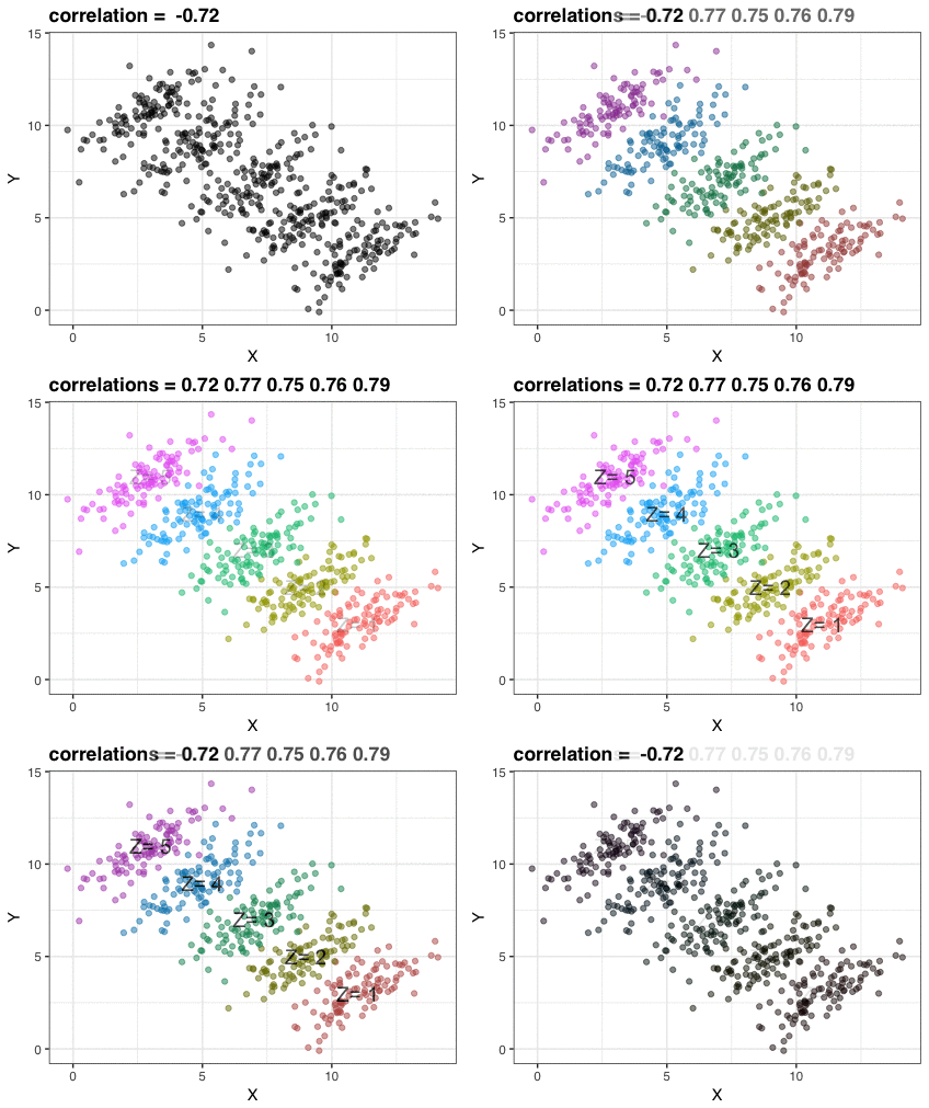
Simpson’s paradox is a statistical phenomenon where an observed relationship within a population reverses within all subgroups that make up that population. Rafa visualized it wonderfully in a GIF that took only twenty-some lines of R code:

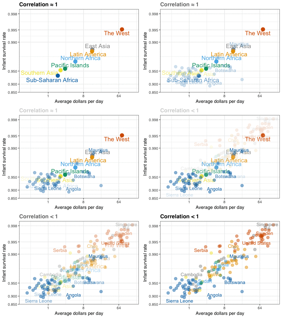
A different statistical phenomenon is discussed at the end of the original blog: namely  the ecological fallacy. It occurs when correlations that occur on the group-level are erroneously extrapolated to the individual-level. Rafa used the gapminder data included in the dslabs package to illustrate the fallacy: there is a very high correlation at the region level and a lower correlation at the individual country level:

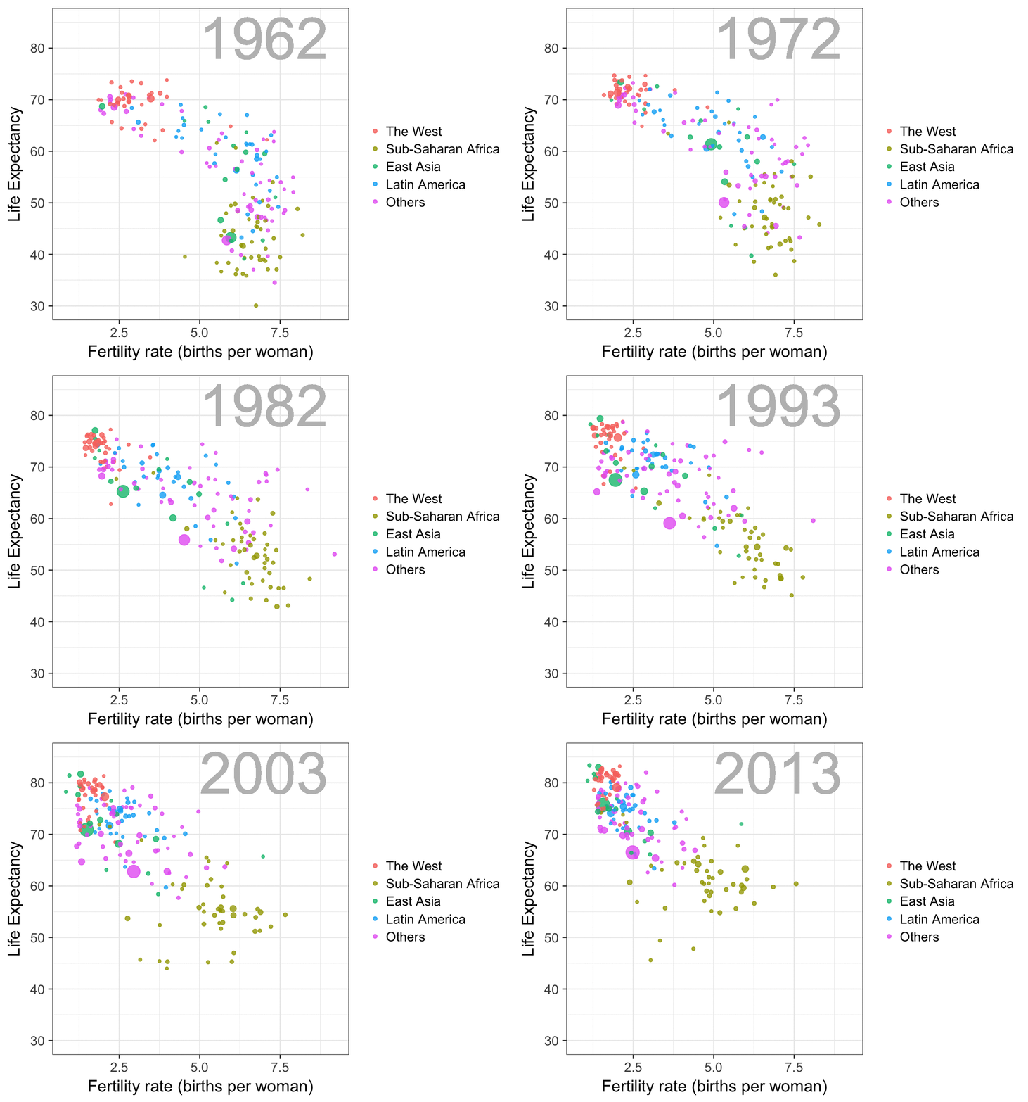
The gapminder data is also used in the next GIF. This mimics Hans Rosling’s famous animation during his talk on New Insights on Poverty, but then made with R and gganimate by Rafa:

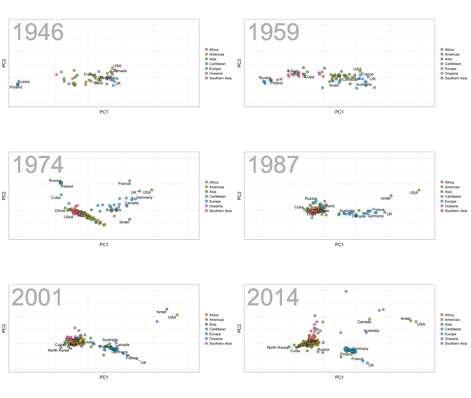
A next visualization demonstrates how the UN voting data (of Erik Voeten and Anton Strezhnev) can be used to examine different voting behaviors. It seems to reduce the voting data to a two-dimensional factor structure, and seemingly there are three distinct groups of voters these days, with particularly the USA and Israel far removed from other members:

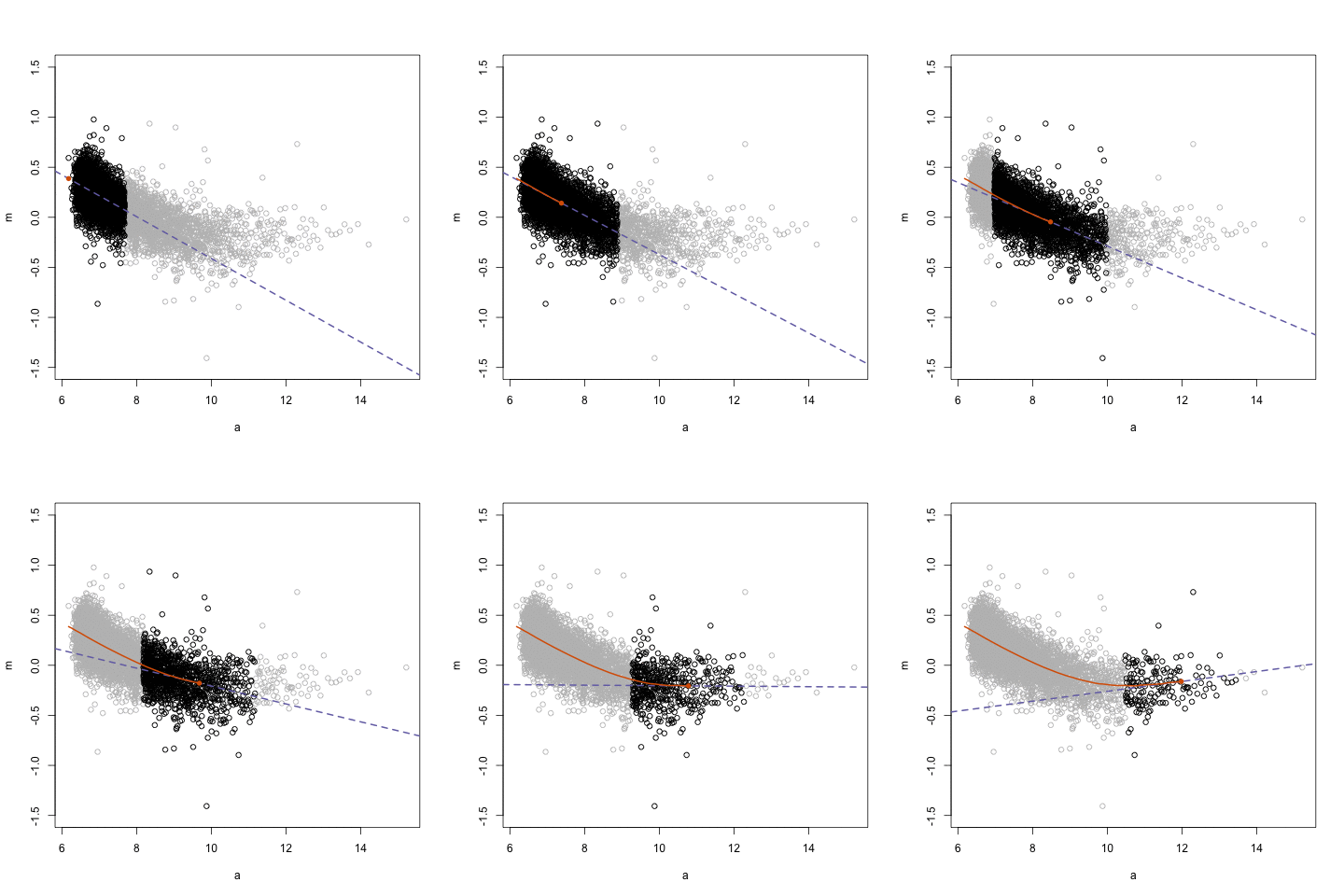
The next GIFs are more statistical. The one below demonstrates how the local regression (LOESS) works. Simply speaking, LOESS determines the relationship for a local subset of the population and when you iteratively repeat this for all local subsets in a population you get a nicely fitting LOESS curve, the red line in Rafa’s GIF:

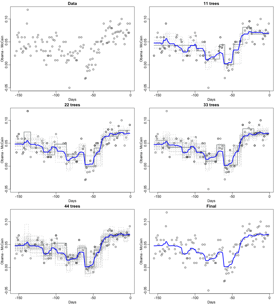
Not quite sure how to interpret the next one, but Rafa explains it visualized a random forest’s predictions using only one predictor variable. I think that different trees would then provide different predictions because they leverage different training samples, and an ensemble of those trees would then improve predictive accuracy?

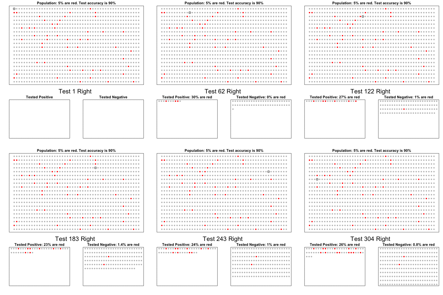
The next one is my favorite I think. This animation illustrates how a highly accurate test would function in a population with low prevalence of true values (e.g., disease, applicant success). More details are in the original blog or here.

The blog ends with a rather funny animation of the only good use of pie charts, according to Rafa:

Vega: The Grammar of Interactive Graphics

Vega: The Grammar of Interactive Graphics

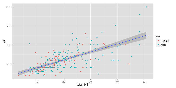
If you have ever programmed in R, you are probably familiar with the Grammar of Graphics due to ggplot2. You can read more about the Grammar of Graphics here, but the general idea behind it is that visualizations can be build up through various layers, each of which have certain characteristics (aesthetics in ggplot2).

ggplot(tips, aes(x = total_bill, y = tip)) +
  geom_point(aes(color = sex)) +
  geom_smooth(method = 'lm')

plot of chunk layer5

This post is not about ggplot2 nor specifically the Grammar of Graphics, but rather a summary of the official release of Vega-Lite 2, a high-level language for rapidly creating interactive visualizations which you might know from the R-package ggvis.

Vega-Lite has four operators to compose charts: layerfacetconcat and repeat. Layer stacks charts on top of each other in an orderly fashion. Facet divides and charts the data into groups. Concat combines multiple charts into dashboard layouts and, finally, repeat concatenate charts. Most importantly is that these operators can be combined! The example below compares weather data in New York and Seattle, layering data for individual years and averages within a repeated template for different measurements.

A layered and reapeted Vega-Lite graph of weather data

Vega-Lite 2 is especially useful because of the included interaction options. Programmers can specify how users can interactive select the data in their visualizations (e.g., a point or interval selection), along with possible transformations. With these interactions, users can for instance filter data, highlight points, or pan or zoom a plot. The plot below uses an interval selection, which causes the chart to include an interactive brush (shown in grey). The brush selection parameterizes the red guideline, which visualizes the average value within the selected interval.

An interactive moving average in Vega-Lite 2. Try it out!

However, this is not all! When multiple visualizations are combined in a dashboard, interactive selections can apply to all. Below, you see an interval selection being applied over a set of histograms. As a viewer adjusts the selection, they can immediately see how the other distributions change in response.

A crossfilter interaction in Vega-Lite 2. Try it out!

According to the developers Vega and Vega-Lite will be included in Jupyter Lab (the next generation of Jupyter Notebooks). Please find more details about Vega-Lite in the documentation or view the InfoVis 2016 research paper on the Vega-Lite language design. Moreover, check out the example gallery or these Vega-Lite applications. The source code you can find on GitHub. For updates, follow the Vega project on Twitter at @vega_vis. For an overview of the features you may watch the OpenVis Conference Video with the developers.

Hierarchical Linear Models 101

Hierarchical Linear Models 101

Multilevel models (also known as hierarchical linear models, nested data models, mixed models, random coefficient, random-effects models, random parameter models, or split-plot designs) are statistical models of parameters that vary at more than one level (Wikipedia). They are very useful in Social Sciences, where we are often interested in individuals that reside in nations, organizations, teams, or other higher-level units. Next to their individuals characteristics, the characteristics of these units they belong to may also have effects. To take into account effects from variables residing at multiple levels, we can use multilevel or hierarchical models.

Michael Freeman, a faculty member at the University of Washington Information School. made this amazing visual introduction to hierarchical modeling:

hlm

If you want to practice hierarchical modeling in R, I recommend the lesson by Page Paccini (first video) or the more elaborate video series by Statistics of DOOM (second):