Tag: r

Pixel Maps in R

Pixel Maps in R

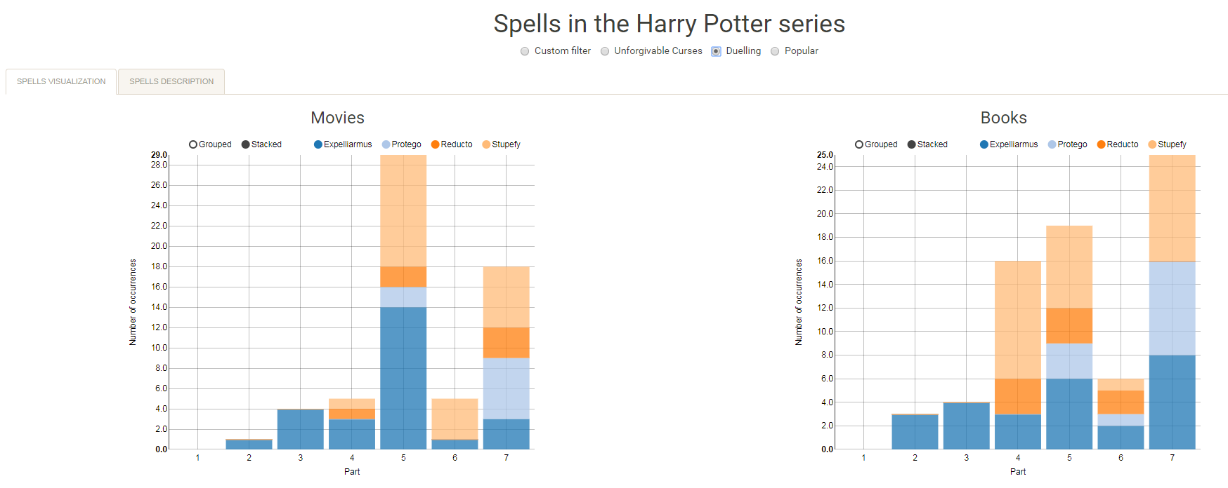
Those of you who follow my blog know I love world maps. Particularly when they are used to visualize data, like these maps of Kaggle programming language preferencesUS household incomes, rush hour travel times, or Shazam recognitions. Those who share this passion will probably like this blog’s topic: mapping data to pixel maps! In R obviously!

A pixel map of holiday and living locations made by Taras Kaduk in R [original]

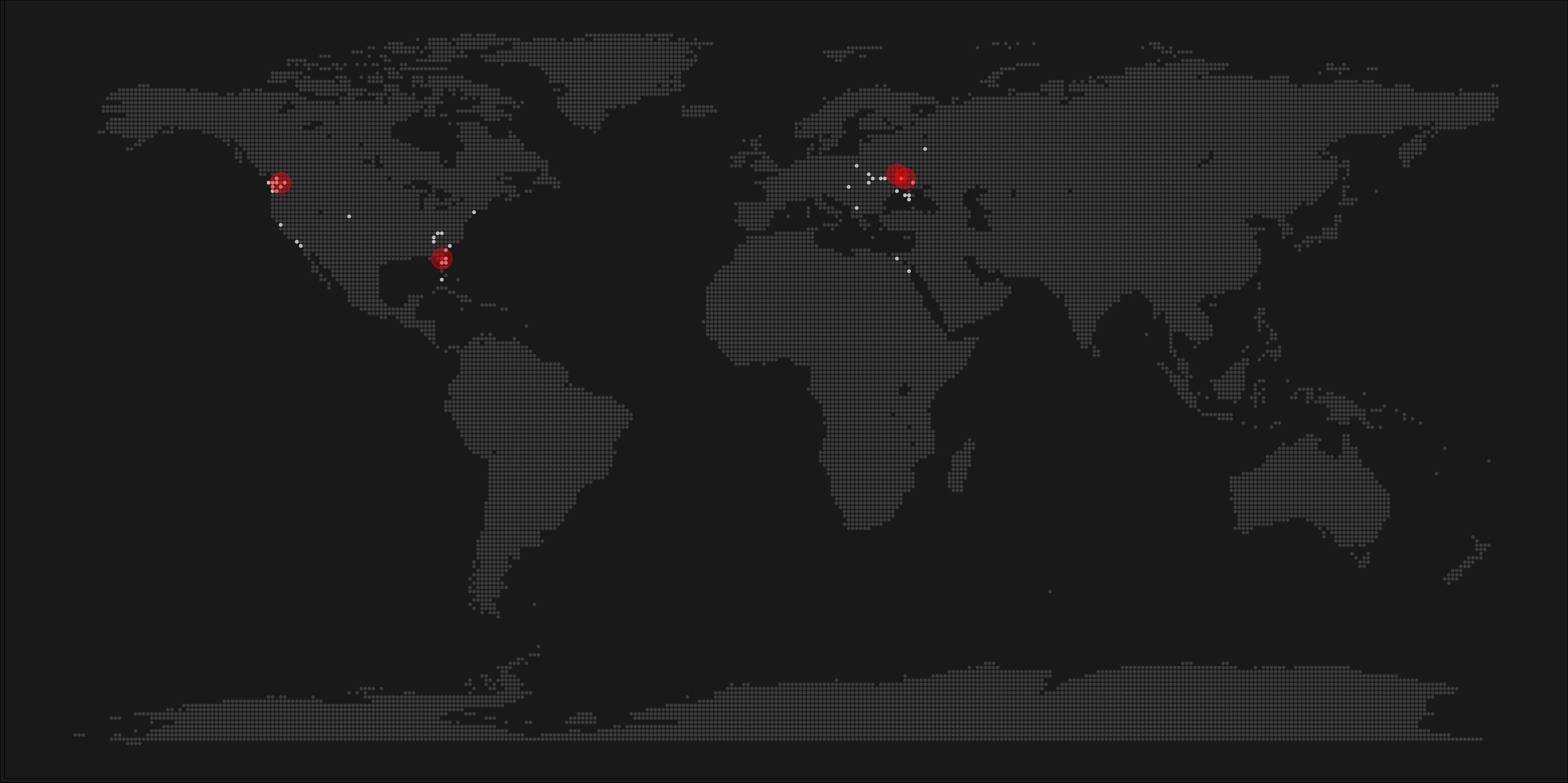
Taras Kaduk seems as excited about R and the tidyverse as I am, as he built the beautiful map above. It flags all the cities he has visited and, in red, the cities he has lived. Taras was nice enough to share his code here, in the original blog post.

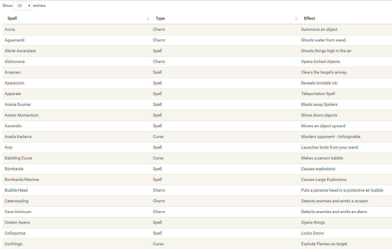
Now, I am not much of a globetrotter, but I do like programming. Hence, I immediately wanted to play with the code and visualize my own holiday destinations. Below you can find my attempt. The updated code I also posted below, but WordPress doesn’t handle code well, so you better look here.

worlmap_dots
The code to make your own map you can find here.

Let’s run you through the steps to make such a map. First, we need to load some packages. I use the apply family to install and/or load a set of packages so that if I/you run the script on a different computer, it will still work. In terms of packages, the tidyverse (read more) includes some nice data manipulation packages as well as the famous ggplot2 package for visualizations. We need maps and ggmap for their mapping functionalities. here is a great little package for convenient project management, as you will see (read more).

### setup ----------------------------------------------------------------------

# install and/or load packages
pkg <- c("tidyverse", "maps", "ggmap", "here")
sapply(pkg, function(x){
  if(! x %in% installed.packages()) install.packages(x)
  require(x, character.only = TRUE)
})

Next, we need to load in the coordinates (longitudes and latitudes) of our holiday destinations. Now, I started out creating a dataframe with city coordinates by hand. However, this was definitely not a scale-able solution. Fortunately, after some Googling, I came across ggmap::geocode(). This function allows you to query the Google maps API(no longer works) Data Science Toolkit, which returns all kinds of coordinates data for any character string you feed it.

Although, I ran into two problems with this approach, this was nothing we couldn’t fix. First, my home city of Breda apparently has a name-city in the USA, which Google favors. Accordingly, you need to be careful and/or specific regarding the strings you feed to geocode() (e.g., “Breda NL“). Second, API’s often have a query limit, meaning you can only ask for data every so often. geocode() will quickly return NAs when you feed it more than two, three values. Hence, I wrote a simple while loop to repeat the query until the API retrieves coordinates. The query will pause shortly in between every attempt. Returned coordinates are then stored in the empty dataframe I created earlier. Now, we can easily query a couple dozen of locations without errors.

You can try it yourself: all you need to change is the city_name string.

### cities data ----------------------------------------------------------------

# cities to geolocate
city_name <- c("breda NL", "utrecht", "rotterdam", "tilburg", "amsterdam",
               "london", "singapore", "kuala lumpur", "zanzibar", "antwerp",
               "middelkerke", "maastricht", "bruges", "san fransisco", "vancouver", 
               "willemstad", "hurghada", "paris", "rome", "bordeaux", 
               "berlin", "kos", "crete", "kefalonia", "corfu", 
               "dubai", " barcalona", "san sebastian", "dominican republic", 
               "porto", "gran canaria", "albufeira", "istanbul", 
               "lake como", "oslo", "riga", "newcastle", "dublin", 
               "nice", "cardiff", "san fransisco", "tokyo", "kyoto", "osaka",
               "bangkok", "krabi thailand", "chang mai thailand", "koh tao thailand")   

# initialize empty dataframe   
tibble( 
  city = city_name, 
  lon = rep(NA, length(city_name)), 
  lat = rep(NA, length(city_name)) 
) ->
  cities

# loop cities through API to overcome SQ limit
# stop after if unsuccessful after 5 attempts
for(c in city_name){
  temp <- tibble(lon = NA)
  # geolocate until found or tried 5 times
  attempt <- 0 # set attempt counter
  while(is.na(temp$lon) & attempt < 5) {
    temp <- geocode(c, source = "dsk")
    attempt <- attempt + 1 
    cat(c, attempt, ifelse(!is.na(temp[[1]]), "success", "failure"), "\n") # print status
    Sys.sleep(runif(1)) # sleep for random 0-1 seconds
  } 
  # write to dataframe
  cities[cities$city == c, -1] <- temp
}

Now, Taras wrote a very convenient piece of code to generate the dotted world map, which I borrowed from his blog:

### dot data -------------------------------------------------------------------

# generate worldwide dots
lat <- data_frame(lat = seq(-90, 90, by = 1))
lon <- data_frame(lon = seq(-180, 180, by = 1))
dots <- merge(lat, lon, all = TRUE)  
# exclude water-based dots 
dots %>%
mutate(country = map.where("world", lon, lat),
       lakes = map.where("lakes", lon, lat)) %>%
  filter(!is.na(country) & is.na(lakes)) %>% 
  select(-lakes) ->
  dots

With both the dot data and the cities’ geocode() coordinates ready, it is high time to visualize the map. Note that I use one geom_point() layer to plot the dots, small and black, and another layer to plot the cities data in transparent red. Taras added a third layer for the cities he had actually lived in; I purposefully did not as I have only lived in the Netherlands and the UK. Note that I again use the convenient here::here() function to save the plot in my current project folder.

### visualize ------------------------------------------------------------------

# plot the data
dots %>% ggplot(aes(x = lon, y = lat)) + 
  geom_point(col = "black", size = 0.25) +
  geom_point(data = cities, col = "red", size = 3, alpha = 0.7) + 
  theme_void() +
  theme(
    panel.background = element_rect(fill = "#006994"),
    plot.background = element_rect(fill = "#006994")
  ) -> dot_map

# save plot
ggsave(here("worlmap_dots.png"), dot_map, 
       dpi = 600, width = 8, height = 4.5)


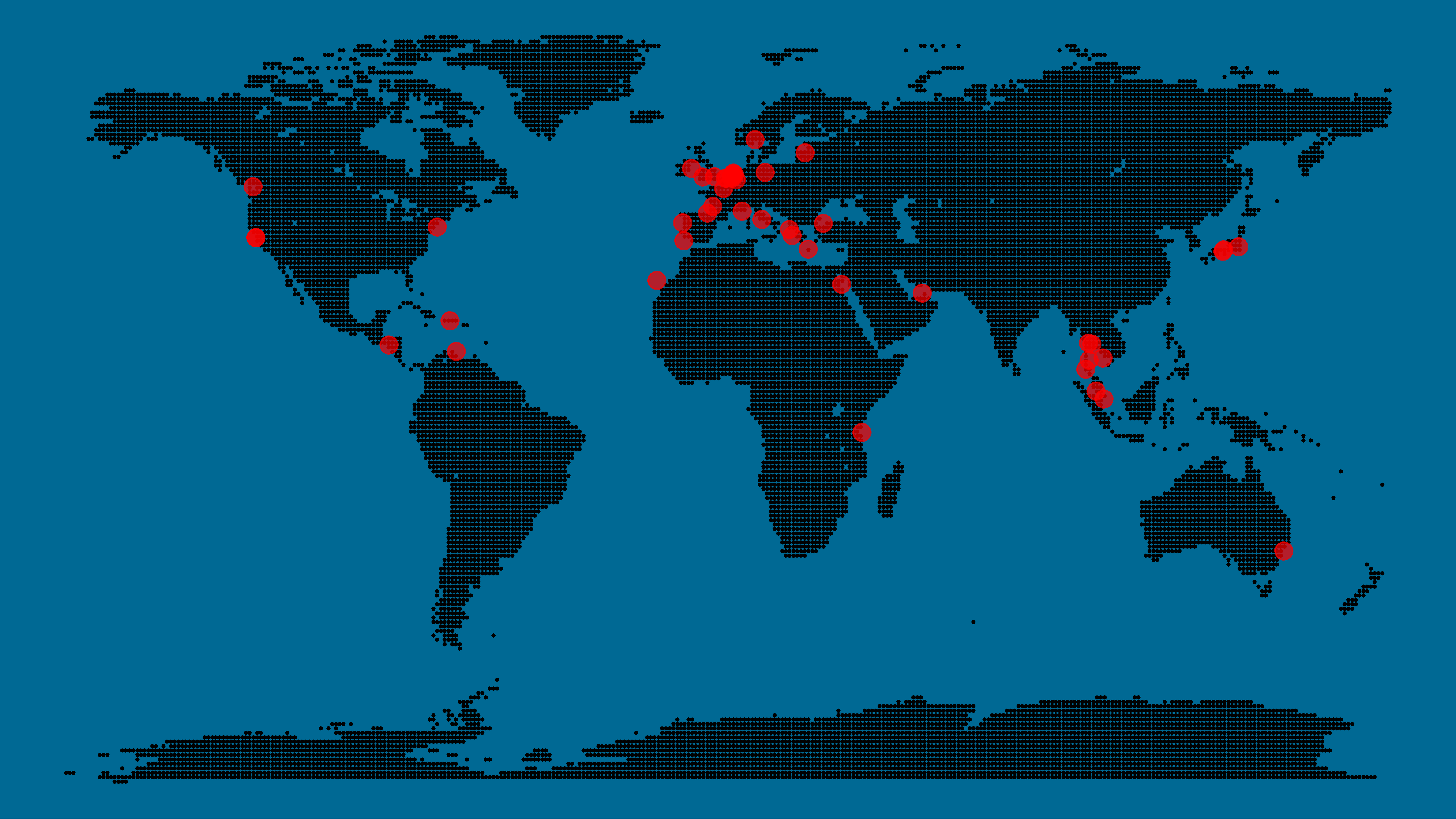
I very much like the look of this map and I’d love to see what innovative, other applications you guys can come up with. To copy the code, please look here on RPubs. Do share your personal creations and also remember to take a look at Taras original blog!

Harry Plotter: Shiny App of Spell Usage

Harry Plotter: Shiny App of Spell Usage

In my second Harry Plotter blog (22-Aug-2017), I wrote:

I would like to demonstrate how regular expressions can be used to retrieve (sub)strings that follow a specific format. We could use regex to examine, for instance, when, and by whom, which magical spells are cast.

Well, Prusinowskik (real name unknown) beat me to it, and how! S/He formed a comprehensive list of all spells found in the Harry Potter saga (see below), and categorized these into “spells“, “charms“, and “curses“, and into “popular“, “dueling” and “unforgivable” purposes. Next, Prusinowskik built an interactive Shiny application with lovely JavaScript graphs (package: rCharts) for us to discover precisely when during the saga which spells are cast (see also below). Moreover, the analysis was repeated for both the books and the movies.

Truly excellent work Prusinowskik! The Shiny app can be found here.

spells_dash
Overview of dueling spells (interactive)

spells
Overview of spells (interactive)


Animated Snow in R

Animated Snow in R

Due to the recent updates to the gganimate package, the code below no longer produces the desired animation.
A working, updated version can be found here

After hearing R play the Jingle Bells tune, I really got into the holiday vibe. It made me think of Ilya Kashnitsky (homepage, twitter) his snowy image in R.

if(!"tidyverse" %in% installed.packages()) install.packages("tidyverse")

library("tidyverse")

n <- 100 
tibble(x = runif(n),  
y = runif(n),  
s = runif(n, min = 4, max = 20)) %>%
ggplot(aes(x, y, size = s)) +
geom_point(color = "white", pch = 42) +
scale_size_identity() +
coord_cartesian(c(0,1), c(0,1)) +
theme_void() +
theme(panel.background = element_rect("black"))

snow.png

This greatly fits the Christmas theme we have going here. Inspired by Ilya’s script, I decided to make an animated snowy GIF! Sure R is able to make something like the lively visualizations Daniel Shiffman (Coding Train) usually makes in Processing/JavaScript? It seems so:

snow

### ANIMATED SNOW === BY PAULVANDERLAKEN.COM
### PUT THIS FILE IN AN RPROJECT FOLDER

# load in packages
pkg <- c("here", "tidyverse", "gganimate", "animation")
sapply(pkg, function(x){
if (!x %in% installed.packages()){install.packages(x)}
library(x, character.only = TRUE)
})

# parameters
n <- 100 # number of flakes
times <- 100 # number of loops
xstart <- runif(n, max = 1) # random flake start x position
ystart <- runif(n, max = 1.1) # random flake start y position
size <- runif(n, min = 4, max = 20) # random flake size
xspeed <- seq(-0.02, 0.02, length.out = 100) # flake shift speeds to randomly pick from
yspeed <- runif(n, min = 0.005, max = 0.025) # random flake fall speed

# create storage vectors
xpos <- rep(NA, n * times)
ypos <- rep(NA, n * times)

# loop through simulations
for(i in seq(times)){
if(i == 1){
# initiate values
xpos[1:n] <- xstart
ypos[1:n] <- ystart
} else {
# specify datapoints to update
first_obs <- (n*i - n + 1)
last_obs <- (n*i)
# update x position
# random shift
xpos[first_obs:last_obs] <- xpos[(first_obs-n):(last_obs-n)] - sample(xspeed, n, TRUE)
# update y position
# lower by yspeed
ypos[first_obs:last_obs] <- ypos[(first_obs-n):(last_obs-n)] - yspeed
# reset if passed bottom screen
xpos <- ifelse(ypos < -0.1, runif(n), xpos) # restart at random x
ypos <- ifelse(ypos < -0.1, 1.1, ypos) # restart just above top
}
}

# store in dataframe
data_fluid <- cbind.data.frame(x = xpos,
y = ypos,
s = size,
t = rep(1:times, each = n))

# create animation
snow <- data_fluid %>%
ggplot(aes(x, y, size = s, frame = t)) +
geom_point(color = "white", pch = 42) +
scale_size_identity() +
coord_cartesian(c(0, 1), c(0, 1)) +
theme_void() +
theme(panel.background = element_rect("black"))

# save animation
gganimate(snow, filename = here("snow.gif"), title_frame = FALSE, interval = .1)

snowsnow.gifsnow.gif

Updates:

Jingle Bells in R

Jingle Bells in R

Christmas is here! Keith McNulty called on his LinkedIn network to co-create a script to play Christmas tunes. After adding some notes myself, the R script on this github page now plays Jingle Bells. The final tune you can download here and the script I pasted below. Any volunteers to make Let it snow or Silent night?

if(!"dplyr" %in% installed.packages()) install.packages("dplyr")
if(!"audio" %in% installed.packages()) install.packages("audio")

library("dplyr")
library("audio")

notes <- c(A = 0, B = 2, C = 3, D = 5, E = 7, F = 8, G = 10)

pitch <- paste("E E E",
"E E E",
"E G C D",
"E",
"F F F F",
"F E E E",
"E D D E",
"D G",
"E E E",
"E E E",
"E G C D",
"E",
"F F F F",
"F E E E E",
"G G F D",
"C",
"G3 E D C",
"G3",
"G3 G3 G3 E D C",
"A3",
"A3 F E D",
"B3",
"G G F D",
"E",
"G3 E D C",
"G3",
"G3 E D C",
"A3 A3",
"A3 F E D",
"G G G G A G F D",
"C C5 B A G F G",
"E E E G C D",
"E E E G C D",
"E F G A C E D F",
"E C D E F G A G",
"F F F F F F",
"F E E E E E",
"E D D D D E",
"D D E F G F E D",
"E E E G C D",
"E E E G C D",
"E F G A C E D F",
"E C D E F G A G",
"F F F F F F",
"F E E E E E",
"G C5 B A G F E D",
"C C E G C5")

duration <- c(1, 1, 2,
1, 1, 2,
1, 1, 1.5, 0.5,
4,
1, 1, 1, 1,
1, 1, 1, 1,
1, 1, 1, 1,
2, 2,
1, 1, 2,
1, 1, 2,
1, 1, 1.5, 0.5,
4,
1, 1, 1, 1,
1, 1, 1, 0.5, 0.5,
1, 1, 1, 1,
4,
1, 1, 1, 1,
3, .5, .5,
1, 1, 1, 1,
4,
1, 1, 1, 1,
4,
1, 1, 1, 1,
4,
1, 1, 1, 1,
4,
1, 1, 1, 1,
3, 1,
1, 1, 1, 1,
1, 1, 1, 1,
1, 1, 1, 1,
1, 0.5, 0.5, 0.5, 0.5, 0.5, 0.5,
1, 1, 0.5, 0.5, 0.5, 0.5,
1, 1, 0.5, 0.5, 0.5, 0.5,
0.5, 0.5, 0.5, 0.5, 0.5, 0.5, 0.5, 0.5,
0.5, 0.5, 0.5, 0.5, 0.5, 0.5, 0.5, 0.5,
1, 0.5, 0.5, 1, 0.5, 0.5,
1, 0.5, 0.5, 1, 0.5, 0.5,
1, 0.5, 0.5, 0.5, 0.5, 1,
1, 0.33, 0.33, 0.33, 1, 0.33, 0.33, 0.33,
1, 1, 0.5, 0.5, 0.5, 0.5,
1, 1, 0.5, 0.5, 0.5, 0.5,
0.5, 0.5, 0.5, 0.5, 0.5, 0.5, 0.5, 0.5,
0.5, 0.5, 0.5, 0.5, 0.5, 0.5, 0.5, 0.5,
1, 0.5, 0.5, 1, 0.5, 0.5,
1, 0.5, 0.5, 1, 0.5, 0.5,
0.5, 0.5, 0.5, 0.5, 0.5, 0.5, 0.5, 0.5,
1, 0.33, 0.33, 0.33, 2)

jbells <- data_frame(pitch = strsplit(pitch, " ")[[1]],
duration = duration)

jbells <- jbells %>%
mutate(octave = substring(pitch, nchar(pitch)) %>%
{suppressWarnings(as.numeric(.))} %>%
ifelse(is.na(.), 4, .),
note = notes[substr(pitch, 1, 1)],
note = note + grepl("#", pitch) -
grepl("b", pitch) + octave * 12 +
12 * (note < 3),
freq = 2 ^ ((note - 60) / 12) * 440)

tempo <- 250

sample_rate <- 44100

make_sine <- function(freq, duration) {
wave <- sin(seq(0, duration / tempo * 60, 1 / sample_rate) *
freq * 2 * pi)
fade <- seq(0, 1, 50 / sample_rate)
wave * c(fade, rep(1, length(wave) - 2 * length(fade)), rev(fade))
}

jbells_wave <- mapply(make_sine, jbells$freq, jbells$duration) %>%
do.call("c", .)

play(jbells_wave)
Sentiment Analysis of Stranger Things Seasons 1 and 2

Sentiment Analysis of Stranger Things Seasons 1 and 2

Jordan Dworkin, a Biostatistics PhD student at the University of Pennsylvania, is one of the few million fans of Stranger Things, a 80s-themed Netflix series combining drama, fantasy, mystery, and horror. Awaiting the third season, Jordan was curious as to the emotional voyage viewers went through during the series, and he decided to examine this using a statistical approach. Like I did for the seven Harry Plotter books, Jordan downloaded the scripts of all the Stranger Things episodes and conducted a sentiment analysis in R, of course using the tidyverse and tidytext. Jordan measured the positive or negative sentiment of the words in them using the AFINN dictionary and a first exploration led Jordan to visualize these average sentiment scores per episode:

The average positive/negative sentiment during the 17 episodes of the first two seasons of Stranger Things (from Medium.com)

Jordan jokingly explains that you might expect such overly negative sentiment in show about missing children and inter-dimensional monsters. The less-than-well-received episode 15 stands out, Jordan feels this may be due to a combination of its dark plot and the lack of any comedic relief from the main characters.

Reflecting on the visual above, Jordan felt that a lot of the granularity of the actual sentiment was missing. For a next analysis, he thus calculated a rolling average sentiment during the course of the separate episodes, which he animated using the animation package:

GIF displaying the rolling average (40 words) sentiment per Stranger Things episode (from Medium.com)

Jordan has two new takeaways: (1) only 3 of the 17 episodes have a positive ending – the Season 1 finale, the Season 2 premiere, and the Season 2 finale – (2) the episodes do not follow a clear emotional pattern. Based on this second finding, Jordan subsequently compared the average emotional trajectories of the two seasons, but the difference was not significant:

Smoothed (loess, I guess) trajectories of the sentiment during the episodes in seasons one and two of Stranger Things (from Medium.com)

Potentially, it’s better to classify the episodes based on their emotional trajectory than on the season they below too, Jordan thought next. Hence, he constructed a network based on the similarity (temporal correlation) between episodes’ temporal sentiment scores. In this network, the episodes are the nodes whereas the edges are weighted for the similarity of their emotional trajectories. In that sense, more distant episodes are less similar in terms of their emotional trajectory. The network below, made using igraph (see also here), demonstrates that consecutive episodes (1 → 2, 2 → 3, 3 → 4) are not that much alike:

The network of Stranger Things episodes, where the relations between the episodes are weighted for the similarity of their emotional trajectories (from Medium.com).

A community detection algorithm Jordan ran in MATLAB identified three main trajectories among the episodes:

Three different emotional trajectories were identified among the 17 Stranger Things episodes in Season 1 and 2 (from Medium.com).

Looking at the average patterns, we can see that group 1 contains episodes that begin and end with neutral emotion and have slow fluctuations in the middle, group 2 contains episodes that begin with negative emotion and gradually climb towards a positive ending, and group 3 contains episodes that begin on a positive note and oscillate downwards towards a darker ending.

– Jordan on Medium.com

Jordan final suggestion is that producers and scriptwriters may consciously introduce these variations in emotional trajectories among consecutive episodes in order to get viewers hooked. If you want to redo the analysis or reuse some of the code used to create the visuals above, you can access Jordan’s R scripts here. I, for one, look forward to his analysis of Season 3!

Robust Effect Sizes for Independent Group Comparisons

Robust Effect Sizes for Independent Group Comparisons

Guillaume Rousselet explains how and when group comparisons with Cohen’s d fail, and what robust statistics one could use instead:

garstats's avatarbasic statistics

When I was an undergrad, I was told that beyond a certain sample size (n=30 if I recall correctly), t-tests and ANOVAs are fine. This was a lie. I wished I had been taught robust methods and that t-tests and ANOVAs on means are only a few options among many alternatives. Indeed, t-tests and ANOVAs on means are not robust to outliers, skewness, heavy-tails, and for independent groups, differences in skewness, variance (heteroscedasticity) and combinations of these factors (Wilcox & Keselman, 2003; Wilcox, 2012). The main consequence is a lack of statistical power. For this reason, it is often advised to report a measure of effect size to determine, for instance, if a non-significant effect (based on some arbitrary p value threshold) could be due to lack of power, or reflect a genuine lack of effect. The rationale is that an effect could be associated with a sufficiently large effect…

View original post 3,911 more words