Tag: research

How Booking.com deals with Selection Bias

How Booking.com deals with Selection Bias

I came across this PyData 2018 talk by Lucas Bernadi of Booking.com where he talks about the importance of selection bias for practical applications of machine learning.

We can’t just throw data into machines and expect to see any meaning […], we need to think [about this]. I see a strong trend in the practitioners community to just automate everything, to just throw data into a black box and expect to get money out of it, and I really don’t believe in that.

Lucas Bernadi in https://www.youtube.com/watch?v=3ZWCKr0vDtc

All pictures below are slides from the above video.

My summary / interpretation

Lucas highlights an example he has been working on at Booking.com, where they seek to predict which searching activities on their website are for family trips.

What happens is that people forget to specify that they intend to travel as a family, forget to input one/two/three child travellers will come along on the trip, and end up not being able to book the accomodations that come up during their search. If Booking.com would know, in advance, that people (may) be searching for family accomodations, they can better guide these bookers to family arrangements.

The problem here is that many business processes in real life look and act like a funnel. Samples drop out of the process during the course of it. So too the user search activity on Booking.com’s website acts like a funnel.

  1. People come to search for arrangements
  2. Less people end up actually booking arrangements
  3. Even less people actually go on their trip
  4. And even less people then write up a review

However, only for those people that end up writing a review, Booking.com knows 100% certain that they it concerned a family trip, as that is the moment the user can specify so. Of all other people, who did not reach stage 4 of the funnel, Booking.com has no (or not as accurate an) idea whether they were looking for family trips.

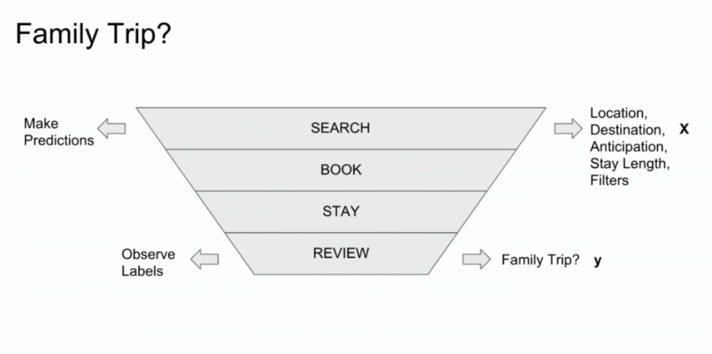
Such a funnel thus inherently produces business data with selection bias in it. Only for people making it to the review stage we know whether they were family trips or not. And only those labeled data can be used to train our machine learning model.

And now for the issue: if you train and evaluate a machine learning model on data generated with such a selection bias, your observed performance metrics will not reflect the actual performance of your machine learning model!

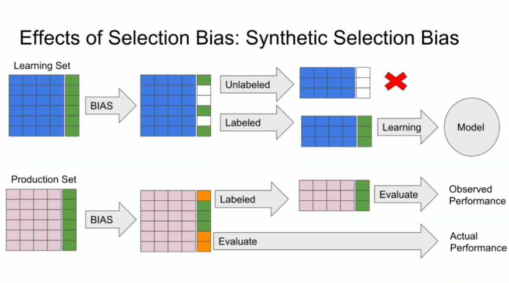
Actually, they are pretty much overestimates.

This is very much an issue, even though many ML practitioners don’t see aware. Selection bias makes us blind as to the real performance of our machine learning models. It produces high variance in the region of our feature space where labels are missing. This leads us to being overconfident in our ability to predict whether some user is looking for a family trip. And if the mechanism causing the selection bias is still there, we could never find out that we are overconfident. Consistently estimating, say, 30% of people are looking for family trips, whereas only 25% are.

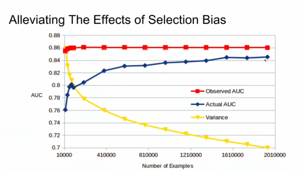
Fortunately, Lucas proposes a very simple solution! Just adding more observations can (partially) alleviate this detrimental effect of selection bias. Although our bias still remains, the variance goes down and the difference between our observed and actual performance decreases.

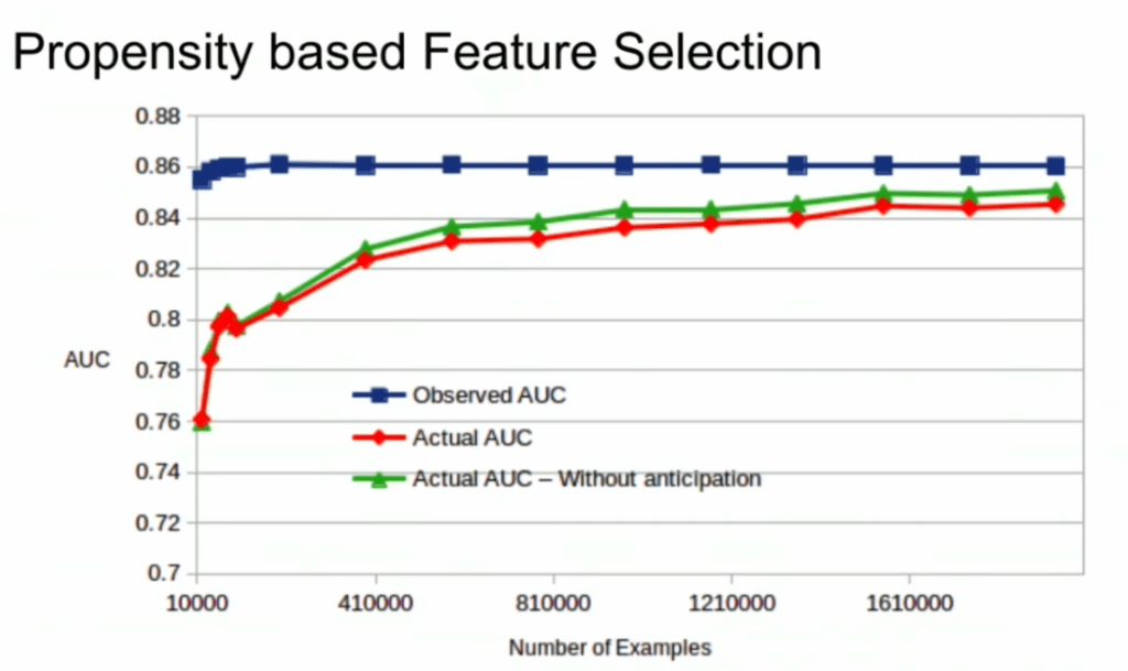
A second issue and solution to selection bias relates to propensity (see also): the extent to which your features X influence not only the outcome Y, but also the selection criteria s.

If our features X influence both the outcome Y but also the selection criteria s, selection bias will occur in your data and can thus screw up your conclusion. In order to inspect to what extent this occurs in your setting, you will want to estimate a propensity model. If that model is good, and X appears valuable in predicting s, you have a selection bias problem.

Via a propensity model s ~ X, we quantify to what extent selection bias influences our data and model. The nice thing is that we, as data scientists, control the features X we use to train a model. Hence, we could just use only features X that do not predict s to predict Y. Conclusion: we can conduct propensity-based feature selection in our Y ~ X by simply avoiding features X that predicted s!

Still, Lucas does point that this becomes difficult when you have valuable features that predict both s and Y. Hence, propensity-based feature selection may end up cost(ing) you performance, as you will need to remove features relevant to Y.

I am sure I explained this phenomena worse than Lucas did himself, so please do have a look at the original PyData 2018 Amsterdam video!

treevis.net – A Visual Bibliography of Tree Visualizations

treevis.net – A Visual Bibliography of Tree Visualizations

Last week I cohosted a professional learning course on data visualization at JADS. My fellow host was prof. Jack van Wijk, and together we organized an amazing workshop and poster event. Jack gave two lectures on data visualization theory and resources, and mentioned among others treevis.net, a resource I was unfamiliar with up until then.

treevis.net is a lot like the dataviz project in the sense that it is an extensive overview of different types of data visualizations. treevis is unique, however, in the sense that it is focused on specifically visualizations of hierarchical data: multi-level or nested data structures.

Hans-Jörg Schulz — professor of Computer Science at Aarhus University in Denmark — maintains the treevis repo. At the moment of writing, he has compiled over 300 different types of hierachical data visualizations and displays them on this website.

As an added bonus, the repo is interactive as there are several ways to filter and look for the visualization type that best fits your data and needs.

Most resources come with added links to the original authors and the original papers they were first published in, so this is truly a great resources for those interested in doing a deep dive into data visualization. Do have a look yourself!

Anomaly Detection Resources

Anomaly Detection Resources

Carnegie Mellon PhD student Yue Zhao collects this great Github repository of anomaly detection resources: https://github.com/yzhao062/anomaly-detection-resources

The repository consists of tools for multiple languages (R, Python, Matlab, Java) and resources in the form of:

  1. Books & Academic Papers
  2. Online Courses and Videos
  3. Outlier Datasets
  4. Algorithms and Applications
  5. Open-source and Commercial Libraries/Toolkits
  6. Key Conferences & Journals

Outlier Detection (also known as Anomaly Detection) is an exciting yet challenging field, which aims to identify outlying objects that are deviant from the general data distribution. Outlier detection has been proven critical in many fields, such as credit card fraud analytics, network intrusion detection, and mechanical unit defect detection.

https://github.com/yzhao062/anomaly-detection-resources

Quick Access — Table of Contents

Overviews of Graph Classification and Network Clustering methods

Thanks to Sebastian Raschka I am able to share this great GitHub overview page of relevant graph classification techniques, and the scientific papers behind them. The overview divides the algorithms into four groups:

  1. Factorization
  2. Spectral and Statistical Fingerprints
  3. Deep Learning
  4. Graph Kernels

Moreover, the overview contains links to similar collections on community detectionclassification/regression trees and gradient boosting papers with implementations.

As well as a link to relevant graph classification benchmark datasets.

Glossary of Statistical Terminology

Frank Harrel shared this 16-page glossary of statistical terminology created by the Department of Biostatistics of Vanderbilt University School of Medicine. The overview touches on everything from Bayes’ Theorem to p-values, explaining matters in just the right detail. Various study designs and model types are also discussed so it might just come in handy for a quick review or just to browse through and see what you might have missed past years.

An extract from the glossary
Avoid bar plots for continuous data! Do this instead:

Avoid bar plots for continuous data! Do this instead:

Tracey Weissgerber, Natasa Milic, Stacey Winham, and Vesna Garovic wrote this interesting 2015 paper on bar graphs. By a systematic review of physiology research, they demonstrate we need to reconsider how we present continuous data in small samples.

Bar and line plots are commonly used to display continuous data. This is problematic, as many different data distributions can lead to the same bar or line graph. Nevertheless, the rarely used scatterplots, box plots, and histograms much better allow users to critically evaluate continuous data.

They provide many interesting visuals that underline their argument.

For instance, the four datasets below (B, C, D, and E) will all result in the same barplot (A), whereas they demonstrate quite different characteristics.

Alternatively, bar plots are often used for to display group means when observations within groups may not be independent. For instance, it could be that the bars below represent two measurement occassians, and that each of our sampled observations occurs in both. In that case, the scatterplots with connected dots may be more suitable. While the bars in plot A would represent datasets B, C, and D, these are clearly different when viewed in scatterplots. 

Also, a lot of meaningful information is typically lost in bar plots. For instance, the number of observations in a group. But also the distribution of values. While the former can be added (see B below), the latter can much better be shown in a scatter plot like C (below).

Actually, in a later blog post, lead researcher Tracey Weissgerber  shares the below visual. It highlights the distractive irrelevance of bar plot and the information that is lost (becomes invisible) when opting for a bar chart.

Tracey refactored this into a similar visual of her own:

So what can you do instead, you may ask yourself. To this question too, Tracey has an answer, sharing the below overview of alternatives options:

She made another overview which may help you pick the best visual for your data. This one takes your intention behind the visual as a starting point, though is unfortunately a bit low quality: