Past week, I came across two programming initiatives to uncover Twitter bots and one attempt to identify fake Instagram accounts.
Mike Kearney developed the R package botornot which applies machine learning to estimate the probability that a Twitter user is a bot. His default model is a gradient boosted model trained using both users-level (bio, location, number of followers and friends, etc.) and tweets-level information (number of hashtags, mentions, capital letters, etc.). This model is 93.53% accurate when classifying bots and 95.32% accurate when classifying non-bots. His faster model uses only the user-level data and is 91.78% accurate when classifying bots and 92.61% accurate when classifying non-bots. Unfortunately, the models did not classify my account correctly (see below), but you should definitely test yourself and your friends via this Shiny application.
Fun fact: botornot can be integrated with Mike’s rtweet package
Scraping Dirty Bots
At around the same time, I read this very interesting blog by Andy Patel. Annoyed by the fake Twitter accounts that kept liking and sharing his tweets, Andy wrote a Python script called pronbot_search. It’s an iterative search algorithm which Andy seeded with the dozen fake Twitter accounts that he identified originally. Subsequently, the program iterated over the friends and followers of each of these fake users, looking for other accounts displaying similar traits (e.g., similar description, including an URL to a sex-website called “Dirty Tinder”).
Whenever a new account was discovered, it was added to the query list, and the process continued. Because of the Twitter API restrictions, the whole crawling process took literal days before Andy manually terminated it. The results are just amazing:
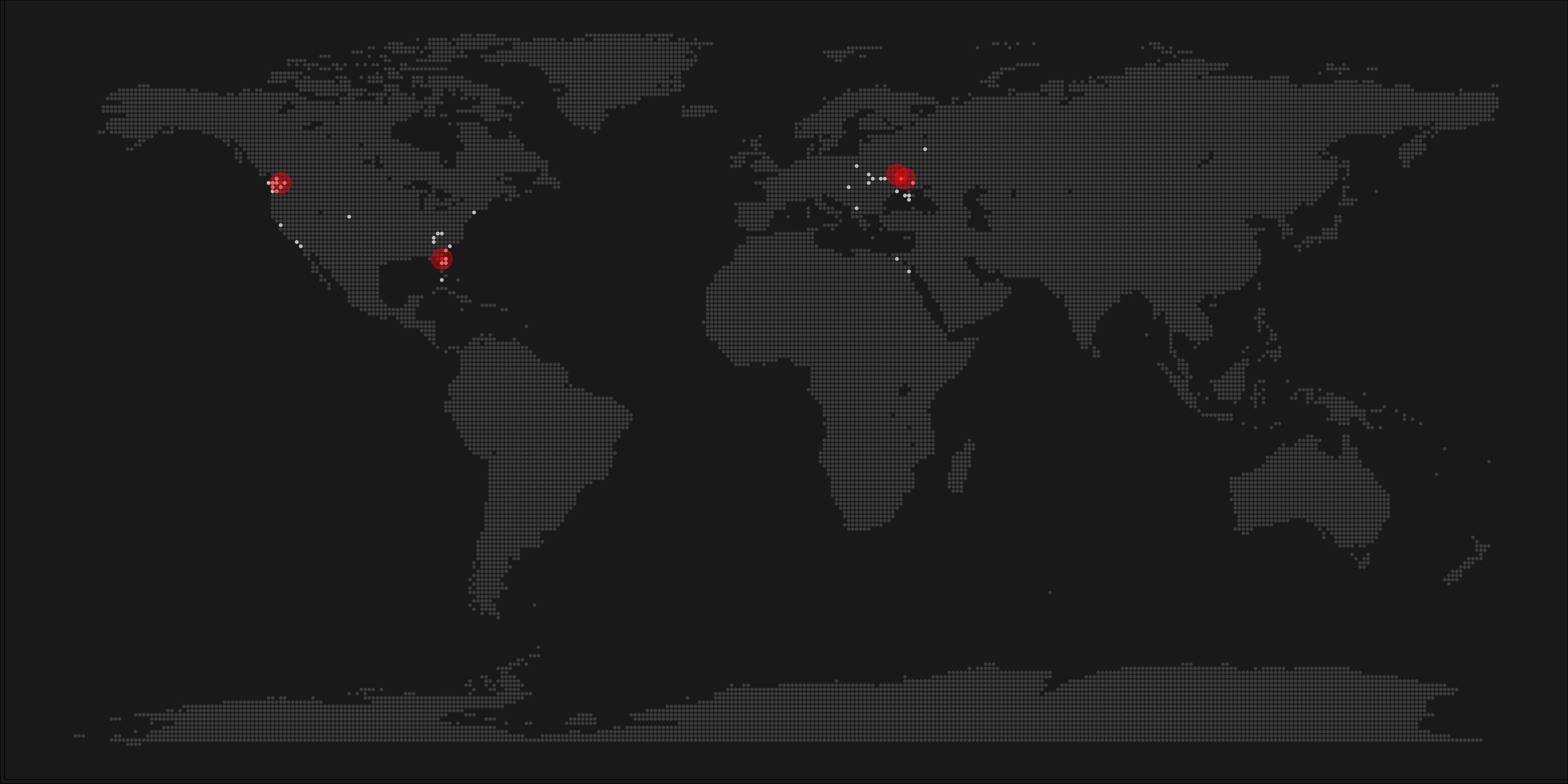
After a day, the results looked like so. Notice the weird clusters of relationships in this network. [original]The full bot network uncovered by Andy included 22.000 fake Twitter accounts:
At the end of the weekend of March 10th, Andy had to stop the scraper after running for several days even though he had only processed 18% of the networks of the 22.000 included Twitter bots [original]The bot network on Twitter is probably enormous! Zooming in on the network, Andy notes that:
Pretty much the same pattern I’d seen after one day of crawling still existed after one week. Just a few of the clusters weren’t “flower” shaped.
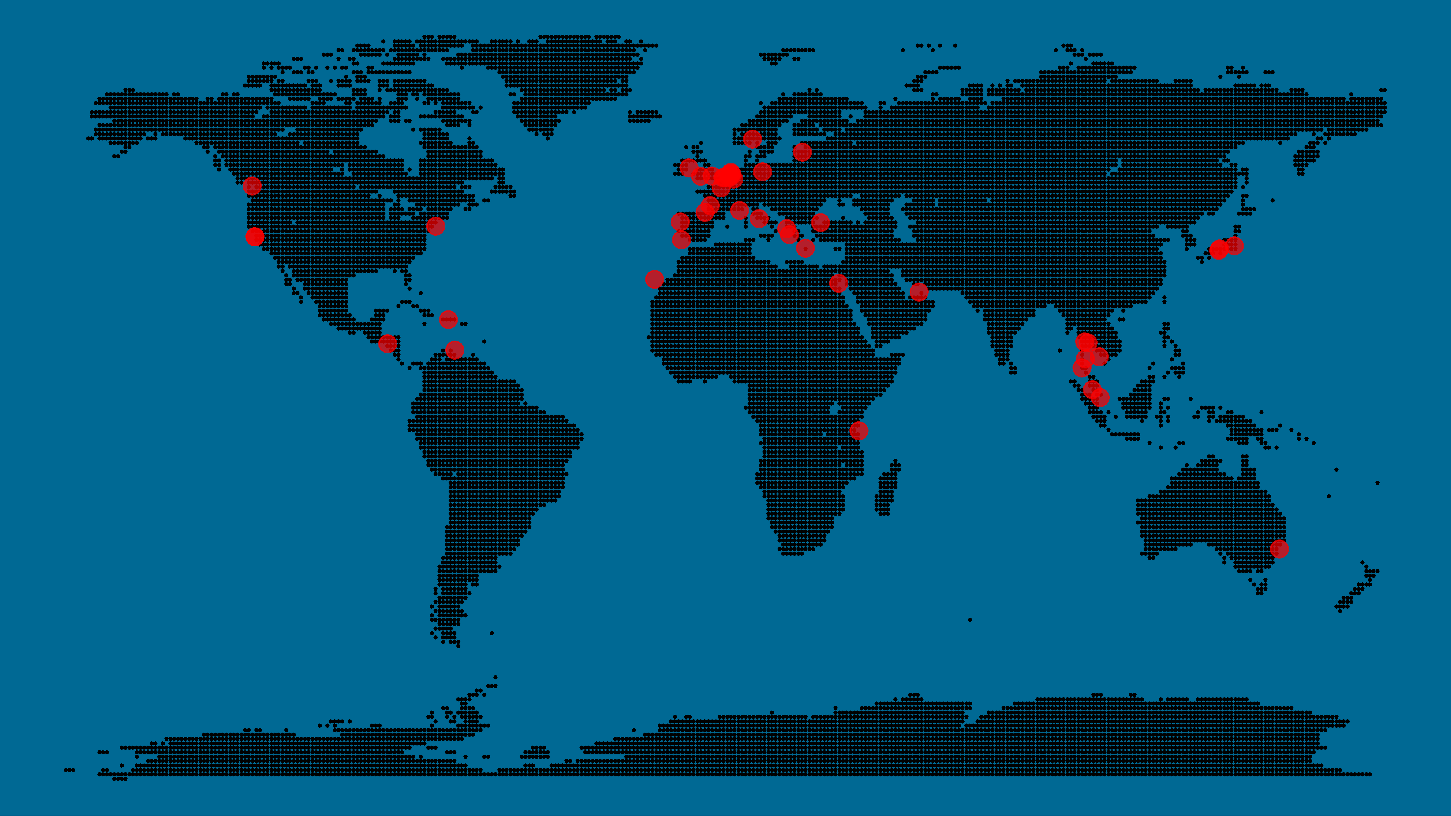
Zoomed in to a specific part of the network you can see the separate clusters of bots doing little more than liking each others messages. [original]In his blog, Andy continues to look at all kind of data on these fake accounts. I found most striking that many of these account are years and years old already. Potentially, Twitter can use Mike Kearney’s botornot application to spot and remove them!
Most of the bots in the Dirty Tinder network found by Andy Patel were 3 to 8 years old already. [original]Andy was nice enough to share the data on these bot accounts here, for you to play with. His Python code is stored in the same github repo and more details around this project you can read in his original blog.
Fake Instagram Accounts
Finally, SRFdata (Timo Grossenbacher) attempted to uncover fake Instagram followers among the 7 million followers in the network of 115 important Swiss Instagram influencers in R. Magi Metrics was used to retrieve information for public Instagram accounts and rvest for private accounts. Next, clear fake accounts (e.g., little followers, following many, no posts, no profile picture, numbers in name) were labelled manually, and approximately 10% of the inspected 1000 accounts appeared fake. Finally, they trained a random forest model to classify fake accounts with a sensitivity (true negative) rate of 77.4% and an overall accuracy of around 94%.
Google has announced to provide open access to its artificial intelligence and machine learning courses. On their overview page, you will find many educational resources from machine learning experts at Google. They announced to share AI and machine learning lessons, tutorials and hands-on exercises for people at all experience levels. Simply filter through the resources and start learning, building and problem-solving.
For instance, up your game straight away with this 15-hour Machine Learning crash course. Zuri Kemp – who leads Google’s machine learning education program – said that over 18,000 Googlers have already enrolled in the course. Designed by the engineering education team, the courses explores loss functions and gradient descent and teached you to build your own neural network in Tensorflow.
rstudio::conf is theyearly conference when it comes to R programming and RStudio. In 2017, nearly 500 people attended and, last week, 1100 people went to the 2018 edition. Regretfully, I was on holiday in Cardiff and missed out on meeting all my #rstats hero’s. Just browsing through the #rstudioconf Twitter-feed, I already learned so many new things that I decided to dedicate a page to it!
Fortunately, you can watch the live streams taped during the conference:
One of the workshops deserves an honorable mention. Jenny Bryan presented on What they forgot to teach you about R, providing some excellent advice on reproducible workflows. It elaborates on her earlier blog on project-oriented workflows, which you should read if you haven’t yet. Some best pRactices Jenny suggests:
Restart R often. This ensures your code is still working as intended. Use Shift-CMD-F10 to do so quickly in RStudio.
Use stable instead of absolute paths. This allows you to (1) better manage your imports/exports and folders, and (2) allows you to move/share your folders without the code breaking. For instance, here::here("data","raw-data.csv") loads the raw-data.csv-file from the data folder in your project directory. If you are not using the here package yet, you are honestly missing out! Alternatively you can use fs::path_home(). normalizePath() will make paths work on both windows and mac. You can usebasename instead of strsplit to get name of file from a path.
To upload an existing git directory to GitHub easily, you can usethis::use_github().
If you include the below YAML header in your .R file, you can easily generate .md files for you github repo.
#' ---
#' output: github_document
#' ---
Moreover, Jenny proposed these useful default settings for knitr:
Another of Jenny Bryan‘s talks was named Data Rectangling and although you might not get much out of her slides without her presenting them, you should definitely try the associated repurrrsivetutorial if you haven’t done so yet. It’s a poweR up for any useR!
I can’t remember who shared it, but a very cool trick is to name the viewing tab of any dataframe you pipe into View() using df %>% View("enter_view_tab_name").
These probably only present a minimal portion of the thousands of tips and tricks you could have learned by simply attending rstudio::conf. I will definitely try to attend next year’s edition. Nevertheless, I hope the above has been useful. If I missed out on any tips, presentations, tweets, or other materials, please reply below, tweet me or pop me a message!
A pixel map of holiday and living locations made by Taras Kaduk in R [original]
Taras Kaduk seems as excited about R and the tidyverse as I am, as he built the beautiful map above. It flags all the cities he has visited and, in red, the cities he has lived. Taras was nice enough to share his code here, in the original blog post.
Now, I am not much of a globetrotter, but I do like programming. Hence, I immediately wanted to play with the code and visualize my own holiday destinations. Below you can find my attempt. The updated code I also posted below, but WordPress doesn’t handle code well, so you better look here.
Let’s run you through the steps to make such a map. First, we need to load some packages. I use the apply family to install and/or load a set of packages so that if I/you run the script on a different computer, it will still work. In terms of packages, the tidyverse (read more) includes some nice data manipulation packages as well as the famous ggplot2 package for visualizations. We need maps and ggmap for their mapping functionalities. here is a great little package for convenient project management, as you will see (read more).
Next, we need to load in the coordinates (longitudes and latitudes) of our holiday destinations. Now, I started out creating a dataframe with city coordinates by hand. However, this was definitely not a scale-able solution. Fortunately, after some Googling, I came across ggmap::geocode(). This function allows you to query the Google maps API(no longer works) Data Science Toolkit, which returns all kinds of coordinates data for any character string you feed it.
Although, I ran into two problems with this approach, this was nothing we couldn’t fix. First, my home city of Breda apparently has a name-city in the USA, which Google favors. Accordingly, you need to be careful and/or specific regarding the strings you feed to geocode() (e.g., “Breda NL“). Second, API’s often have a query limit, meaning you can only ask for data every so often. geocode() will quickly return NAs when you feed it more than two, three values. Hence, I wrote a simple while loop to repeat the query until the API retrieves coordinates. The query will pause shortly in between every attempt. Returned coordinates are then stored in the empty dataframe I created earlier. Now, we can easily query a couple dozen of locations without errors.
You can try it yourself: all you need to change is the city_name string.
### cities data ----------------------------------------------------------------

# cities to geolocate
city_name <- c("breda NL", "utrecht", "rotterdam", "tilburg", "amsterdam",
               "london", "singapore", "kuala lumpur", "zanzibar", "antwerp",
               "middelkerke", "maastricht", "bruges", "san fransisco", "vancouver",
               "willemstad", "hurghada", "paris", "rome", "bordeaux",
               "berlin", "kos", "crete", "kefalonia", "corfu",
               "dubai", " barcalona", "san sebastian", "dominican republic",
               "porto", "gran canaria", "albufeira", "istanbul",
               "lake como", "oslo", "riga", "newcastle", "dublin",
               "nice", "cardiff", "san fransisco", "tokyo", "kyoto", "osaka",
               "bangkok", "krabi thailand", "chang mai thailand", "koh tao thailand")

# initialize empty dataframe
tibble(
  city = city_name,
  lon = rep(NA, length(city_name)),
  lat = rep(NA, length(city_name))
) ->
  cities

# loop cities through API to overcome SQ limit
# stop after if unsuccessful after 5 attempts
for(c in city_name){
  temp <- tibble(lon = NA)
  # geolocate until found or tried 5 times
  attempt <- 0 # set attempt counter
  while(is.na(temp$lon) & attempt < 5) {
    temp <- geocode(c, source = "dsk")
    attempt <- attempt + 1
    cat(c, attempt, ifelse(!is.na(temp[[1]]), "success", "failure"), "\n") # print status
    Sys.sleep(runif(1)) # sleep for random 0-1 seconds
  }
  # write to dataframe
  cities[cities$city == c, -1] <- temp
}
Now, Taras wrote a very convenient piece of code to generate the dotted world map, which I borrowed from his blog:
With both the dot data and the cities’ geocode() coordinates ready, it is high time to visualize the map. Note that I use one geom_point() layer to plot the dots, small and black, and another layer to plot the cities data in transparent red. Taras added a third layer for the cities he had actually lived in; I purposefully did not as I have only lived in the Netherlands and the UK. Note that I again use the convenient here::here() function to save the plot in my current project folder.
I very much like the look of this map and I’d love to see what innovative, other applications you guys can come up with. To copy the code, please look here on RPubs. Do share your personal creations and also remember to take a look at Taras original blog!
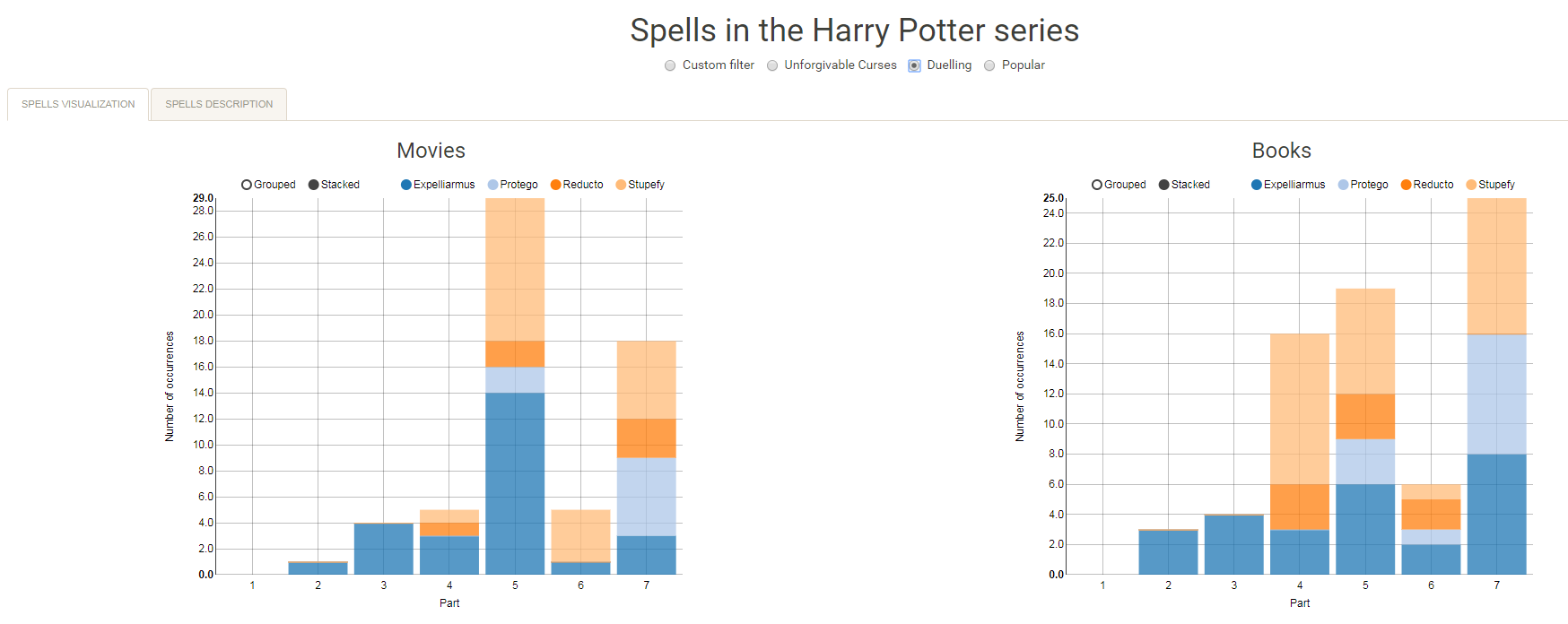
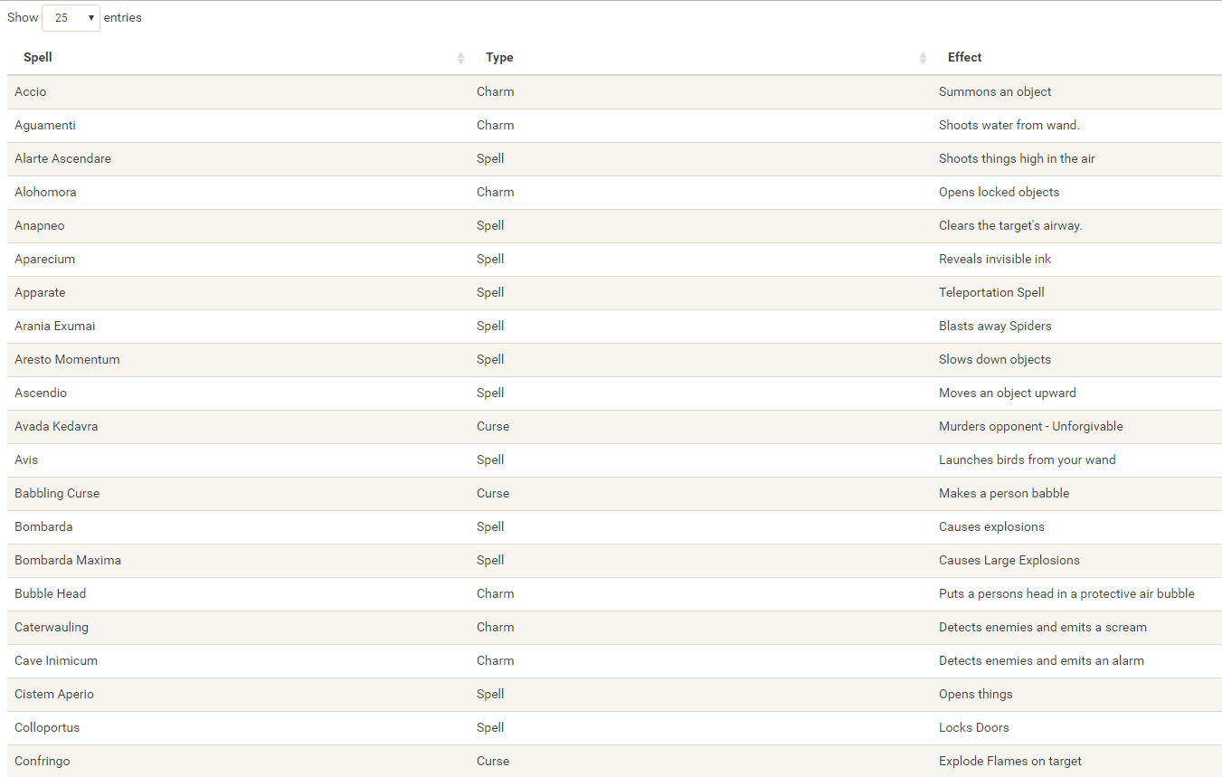
I would like to demonstrate how regular expressions can be used to retrieve (sub)strings that follow a specific format. We could use regex to examine, for instance, when, and by whom, which magical spells are cast.
Well, Prusinowskik (real name unknown) beat me to it, and how! S/He formed a comprehensive list of all spells found in the Harry Potter saga (see below), and categorized these into “spells“, “charms“, and “curses“, and into “popular“, “dueling” and “unforgivable” purposes. Next, Prusinowskik built an interactive Shiny application with lovely JavaScript graphs (package: rCharts) for us to discover precisely when during the saga which spells are cast (see also below). Moreover, the analysis was repeated for both the books and the movies.
Truly excellent work Prusinowskik! The Shiny app can be found here.
Past weekend, I visited the casino with some friends. Of all games, we enjoy North-American-style Baccarat the most. This type of Baccarat is often called Punto Banco. In short, Punto Banco is a card game in which two hands compete: the “player” and the “banker“. During each coup (a round of play), both hands get dealt either 2 or 3 cards, depending on a complex drawing schema, and all cards have a certain value. Put simply, the hand with the highest total value of cards wins the coup, after which a new one starts. Before each coup, gamblers may bet which of the hands will win. Neither hand is in any way associated with the actual house or player/gambler, so bets may be placed on both. All in all, three different bets can be placed in a game of Punto Banco:
The player hand has the highest total value, in which case the player wins (Punto);
The banker hand has the highest total value, in which case the banker wins (Banco);
The player and banker hands have equal total value, in which case there is a tie (Egalité).
If a gambler correctly bets either Punto or Banco, their bets get a 100% payoff. However, a house tax will often be applied to Banco wins. For instance, Banco wins may only pay off 95% or specific Banco wins (e.g., total card value of 5) may pay off less (e.g., 50%). Depending on house rules, a correct bet on a tie (Egalité) will pay off either 800% or 900%. A wrong bet on Punto or Banco stands in case Egalité is dealt. In all other cases of wrong bets, the house takes the money.
My friends and I like Punto Banco because it is completely random but seems “gameable”. Punto Banco is played with six or eight decks so there is no way to know which cards will be next. Moreover, the card-drawing rules are quite complex, so you never really know what’s going to happen. Sometimes both Punto and Banco get only two cards, at other times, the hand you bet on will get its third card, which might just turn things around. Punto Banco’s perceived gameability comes through our human fallacies to see patterns in randomness. Often, casino’s will place a monitor with the last fifty-so results (see below) to tempt gamblers to (erroneously) spot and bet on patterns. Alternatively, you might think it’s smart to bet against the table (play Punto when everybody else goes for Banco) or play on whatever bet won last hand. As the hands are dealt quite quickly in succession, and the minimal bet is often 10+ euro/dollar, Punto Banco is a quick way to find out how lucky you are.
Examples of Baccarat monitors, often placed next to a table.
So back to last weekend’s trip to the casino. Unfortunately, my friends and I lost quite some money at the Punto Banco table. We know the house has an edge (though smaller than in other games) but normally we are quite lucky. We often discuss what would be good strategies to minimize this houses’ edge. Obviously, you want to play as few games as possible, but that’s as far as we got in terms of strategy. Normally, we just test our luck and randomly bet Punto or Banco, and sparsely on Egalité.
As a statistical programmer, I thought it might be interesting to simulate the game and its odds from the bottom up. On the one hand, I wanted to get a sense of how favorable the odds are to the house. On the other hand, I was curious as to what extent strategies may be more or less successful in retaining at least some of your hard-earned cash.
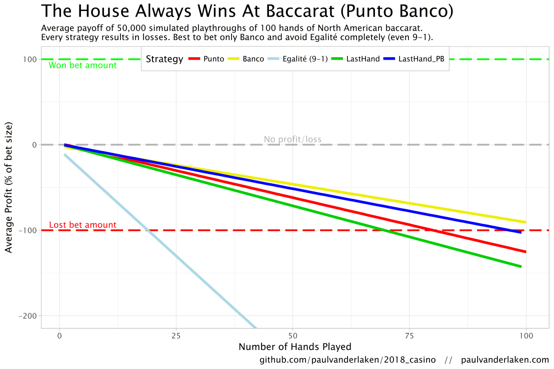
In my simulations, I follow the Holland Casino Punto Banco rules, meaning a six-deck shoe and a Banco win with 5 pays out 50%. I did adopt the more lenient 9-1 payoff for Egalité though. Several hours of programming and some million simulated Baccarat hands later, here are the results:
Do not play Baccarat / Punto Banco if you do not want to lose your money. Obviously, it’s best to not set foot in the casino if you can’t afford to lose some money. However, I eagerly pay for the entertainment value I get from it.
You lose least if you stick to Banco. Despite having only a 50% payoff when Banco wins with 5, the odds are best for Banco due to the drawing rules. Indeed, according to the Wizard of Odds, the house edge for Banco (1.06%) is slightly lower than that of Punto (1.24%).
Whatever you do, do not bet on Egalité. Because most casino’s pay out 8 to 1 in case of a correctly predicted tie, betting on one seems about the worst gambling strategy out there. With a house edge of over 14%, you are better off playing most other games (Wizard of Odds). Although casino’s paying out a tie 9 to 1 decrease the house edge to just below 5%, this is still way worse than playing either Punto or Banco.
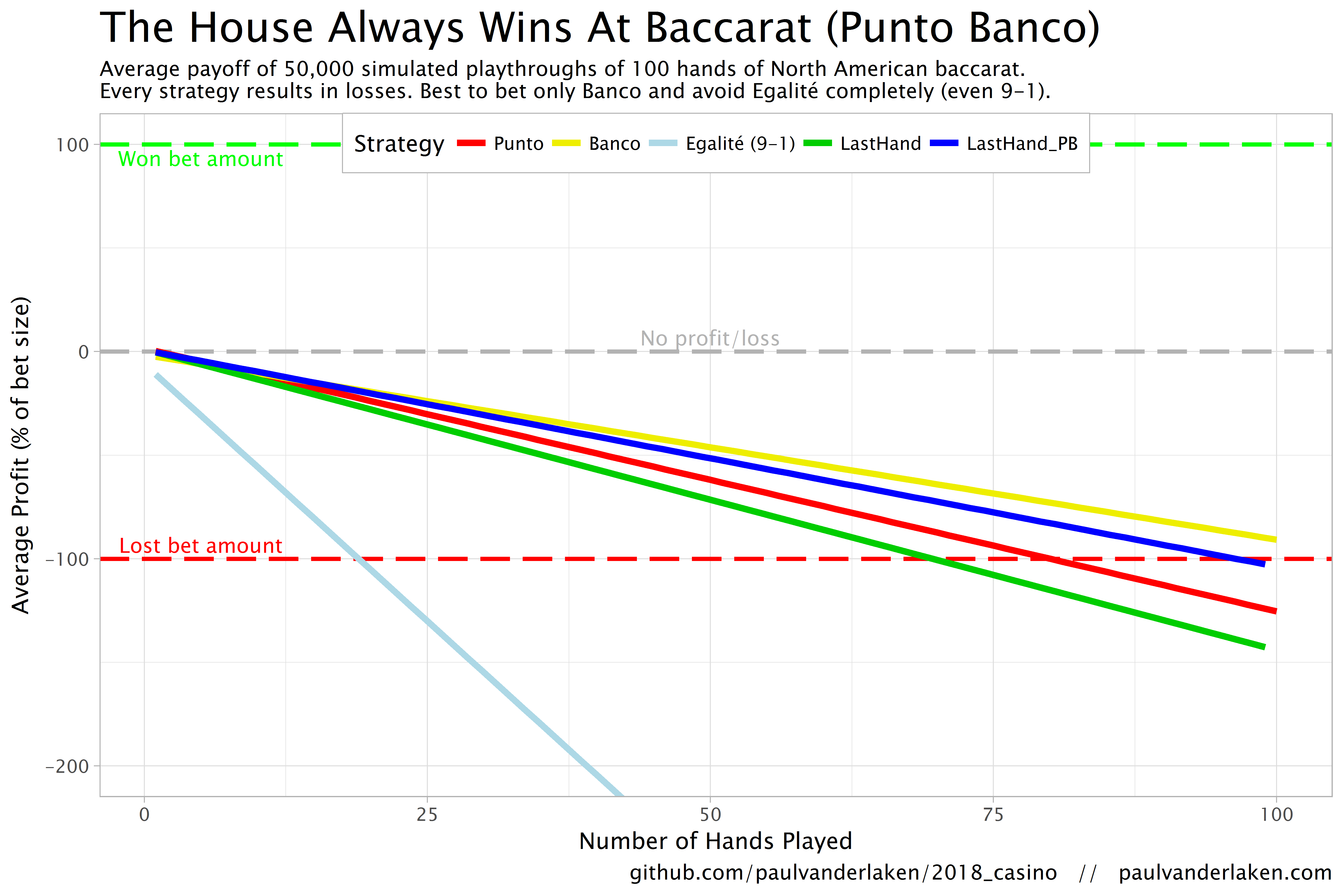
The figure below shows the results of the five strategies I tested using 50,000 simulations of 100 consecutive hands. Based on the results, I was reluctant to develop and test other strategies as results look quite straightforward: play Banco. Additionally, Wikipedia cites Thorp (1984, original reference unknown) who suggested that there are no strategies that will really result in any significant player advantage, except maybe for the endgame of a deck, which presumably requires a lot of card counting. If you nevertheless want to test other strategies, please be my guest, here are my five:
Punto: Always bet on Punto.
Banco: Always bet on Banco.
Egalité: Always bet on Egalité.
LastHand: Bet on the outcome of the last hand/coup.
LastHand_PB: Bet on the outcome of the last hand/coup, only if this was Punto or Banco.
The above figure depicts the expected value of each strategy over a series of consecutive hands played. Clearly, the payoff is quite linear, independent of your strategy. The more hands you play, the more you lose. However, also clear is that some strategies outperform others. After 100 hands of Baccarat, playing only Banco will on average result in a total loss below the amount you wager. For example, if you bet 10 euro every hand, you will have a loss of about 9 euro’s after 100 rounds, on average. This is in line with the ~1% house edge reported by the Wizard of Odds. Similarly, betting only Punto will result in a loss of about 130% of the bet amount, which is also conform the ~1.4% house edge reported by the Wizard of Odds. Betting on Punto or Banco based on whichever won last (LastHand_PB) performs somewhere in between these two strategies, losing just over 100% of the bet amount in 100 hands. Your expected losses increase when you just bet on whichever outcome came last, including Egalité, resulting in around ~-150% after 100 hands. This is mainly because betting on Egalité, which seems about the worst strategy ever, will result in a remarkable 493.9% loss after 100 hands.
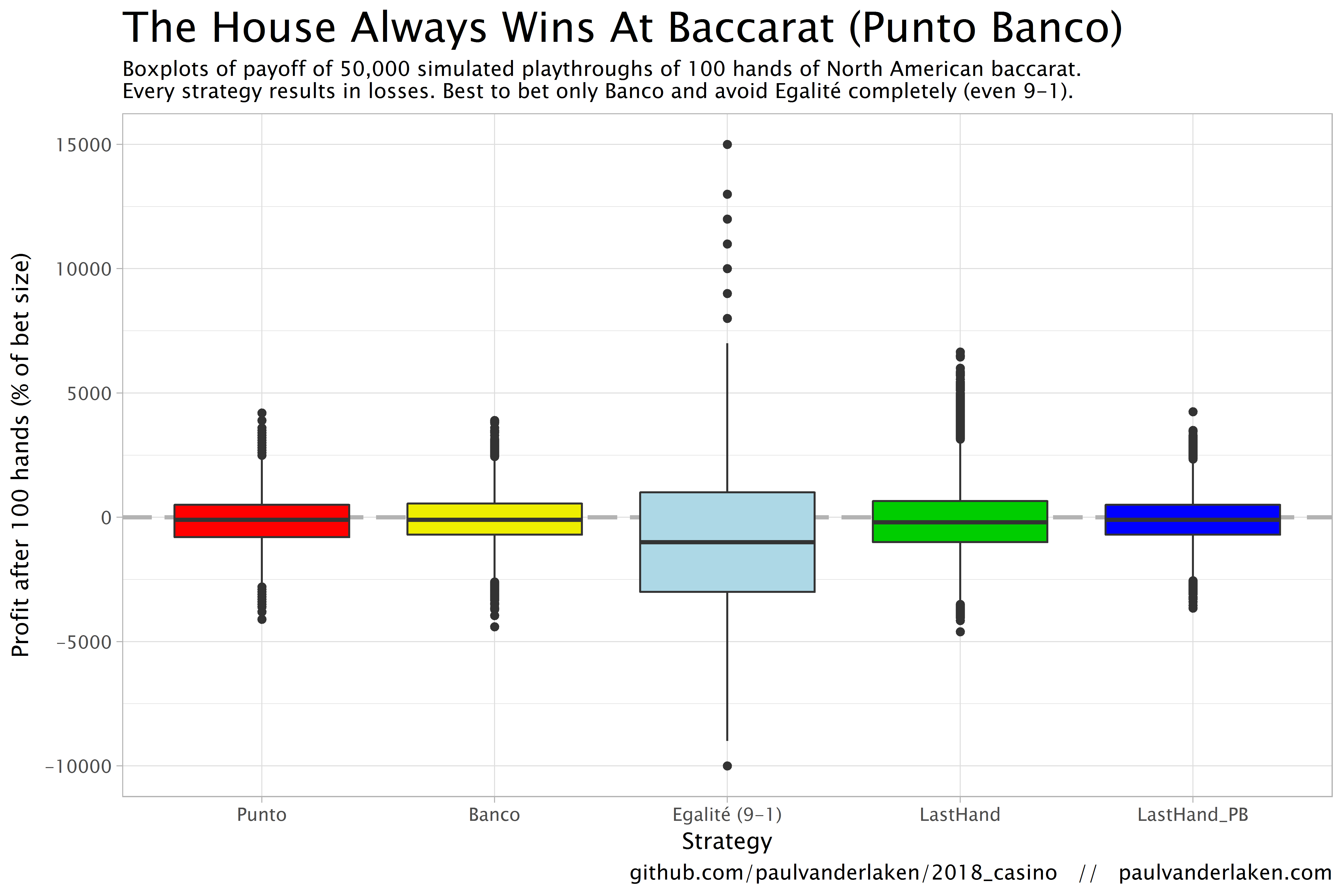
Apart from these average or expected values, I was also interested in the spread of outcomes of our thousands of simulations. Particularly because gamblers on a lucky streak may win much more when betting on Egalité, as the payoff is larger (8-1 or 9-1). The figure below shows that any strategy including Egalité will indeed result in a wider spread of outcomes. Betting on Egalité may thus be a good strategy if you are by some miracle divinely lucky, have information on which cards are coming next, or have an agreement with the dealer (disclaimer: this is a joke, please do not ever bet on Egalité with the intention of making money or try to cheat at the casino).
If you want to know how I programmed these simulations, please visit the associated github repository or reach out. I intend on simulating the payoff for various other casino games in the near future (first up: BlackJack), so if you are interested keep an eye on my website or twitter.