Survival of the Best Fit was built by Gabor Csapo, Jihyun Kim, Miha Klasinc, and Alia ElKattan. They are software engineers, designers and technologists, advocating for better software that allows members of the public to question its impact on society.
You don’t need to be an engineer to question how technology is affecting our lives. The goal is not for everyone to be a data scientist or machine learning engineer, though the field can certainly use more diversity, but to have enough awareness to join the conversation and ask important questions.
With Survival of the Best Fit, we want to reach an audience that may not be the makers of the very technology that impact them everyday. We want to help them better understand how AI works and how it may affect them, so that they can better demand transparency and accountability in systems that make more and more decisions for us.
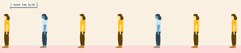
I found that the game provides a great intuitive explanation of how (humas) bias can slip into A.I. or machine learning applications in recruitment, selection, or other human resource management practices and processes.
Note, as Joachin replied below, that the game apparently does not learn from user-input, but is programmed to always result in bias towards blues. I kind of hoped that there was actually an algorithm “learning” in the backend, and while the developers could argue that the bias arises from the added external training data (you picked either Google, Apple, or Amazon to learn from), it feels like a bit of a disappointment that there is no real interactivity here.
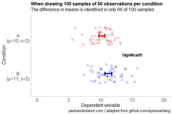
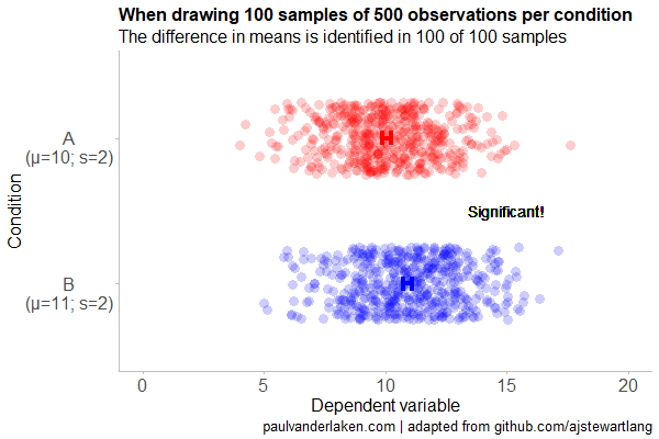
Created by Andrew Stewart, and tweeted by John Holbein, the visuals show samples taken from a normal distributed variable with a mean of 10 and a standard deviation of 2. In the left section, Andrew took several samples of 20. In the right section, the sample size was increased to 500.
Just look at how much the distribution and the estimated mean change for small samples!
Andrew shared his code via Github, so I was able to download and tweak it a bit to make my own version.
Andrew’s version seems to be concerned with potential Type 1 errors when small samples are taken. A type 1 error occurs when you reject your null hypothesis (you reject “there is no effect”) while you should not have (“there is actually no effect”).
You can see this in the distributions Andrew sampled from in the tweet above. The data for conditions A (red) and B (blue) are sampled from the same distribution, with mean 10 and standard deviation 2. While there should thus be no difference between the groups, small samples may cause researchers to erroneously conclude that there is a difference between conditions A and B due to the observed data.
We could use Andrew’s basic code and tweak it a bit to simulate a setting in which Type 2 errors could occur. A type 2 error occurs when you do not reject your null hypothesis (you maintain “there is no effect”) whereas there is actually an effect, which you thus missed.
To illustrate this, I adapted Andrew’s code: I sampled data for condition B using a normal distribution with a slightly higher mean value of 11, as opposed to the mean of 10 for condition A. The standard deviation remained the same in both conditions (2).
Next, I drew 10 data samples from both conditions, for various sample sizes: 10, 20, 50, 100, 250, 500, and even 1000. After drawing these samples for both conditions, I ran a simple t-test to compare their means, and estimate whether any observed difference could be considered significant (at the alpha = 0.05 level [95%]).
In the end, I visualized the results in a similar fashion as Andrew did. Below are the results.
As you can see, only in 1 of our 10 samples with size 10 were we able to conclude that there was a difference in means. This means that we are 90% incorrect.
After increasing the sample size to 100, we strongly decrease our risk of Type 2 errors. Now we are down to 20% incorrect conclusions.
At this point though, I decided to rework Andrew’s code even more, to clarify the message.
I was not so much interested in the estimated distribution, which currently only distracts. Similarly, the points and axes can be toned down a bit. Moreover, I’d like to be able to see when my condition samples have significant different means, so let’s add a 95% confidence interval, and some text. Finally, let’s increase the number of drawn samples per sample size to, say, 100, to reduce the influence that chance may have on our Type 2 error rate estimations.
Let’s rerun the code and generate some GIFs!
The below demonstrates that small samples of only 10 observations per condition have only about a 11% probability of detecting the difference in means when the true difference is 1 (or half the standard deviation [i.e., 2]). In other words, there is a 89% chance of a Type 2 error occuring, where we fail to reject the null hypothesis due to sampling error.
Doubling the sample size to 20, more than doubles our detection rate. We now correctly identify the difference 28% of the time.
With 50 observations the Type 2 error rate drops to 34%.
Finally, with sample sizes of 100+ our results become somewhat reliable. We are now able to correctly identify the true difference over 95% of the times.
With a true difference of half the standard deviation, further increases in the sample size start to lose their added value. For instance, a sample size of 250 already uncovers the effect in all 100 samples, so doubling to 500 would not make sense.
I hope you liked the visuals. If you are interested in these kind of analysis, or want to estimate how large of a sample you need in your own study, have a look at power analysis. These analysis can help you determine the best setup for your own research initiatives.
If you’d like to reproduce or change the graphics above, here is the R code. Note that it is strongly inspired by Andrew’s original code.
# setup -------------------------------------------------------------------

# The new version of gganimate by Thomas Lin Pedersen - @thomasp85 may not yet be on CRAN so use devtools
# devtools::install_github('thomasp85/gganimate')

library(ggplot2)
library(dplyr)
library(glue)
library(magrittr)
library(gganimate)


# main function to create and save the animation --------------------------

save_created_animation = function(sample_size,
                                  samples = 100,
                                  colors = c("red", "blue"),
                                  Amean = 10, Asd = 2,
                                  Bmean = 11, Bsd = 2,
                                  seed = 1){

  ### generate the data

  # set the seed
  set.seed(seed)

  # set the names of our variables
  cnames <- c("Score", "Condition", "Sample")

  # create an empty data frame to store our simulated samples
  df <- data.frame(matrix(rep(NA_character_, samples * sample_size * 2 * length(cnames)), ncol = length(cnames), dimnames = list(NULL, cnames)), stringsAsFactors = FALSE)

  # create an empty vector to store whether t.test identifies significant difference in means
  result <- rep(NA_real_, samples)

  # run a for loop to iteratively simulate the samples
  for (i in seq_len(samples)) {
    # draw random samples for both conditions
    a <- rnorm(sample_size, mean = Amean, sd = Asd)
    b <- rnorm(sample_size, mean = Bmean, sd = Bsd)
    # test whether there the difference in the means of samples is significant
    result[i] = t.test(a, b)$p.value < 0.05
    # add the identifiers for both conditions, and for the sample iteration
    a <- cbind(a, rep(glue("A\n(μ={Amean}; σ={Asd})"), sample_size), rep(i, sample_size))
    b <- cbind(b, rep(glue("B\n(μ={Bmean}; σ={Bsd})"), sample_size), rep(i, sample_size))
    # bind the two sampled conditions together in a single matrix and set its names
    ab <- rbind(a, b)
    colnames(ab) <- cnames
    # push the matrix into its reserved spot in the reserved dataframe
    df[((i - 1) * sample_size * 2 + 1):((i * (sample_size * 2))), ] <- ab
  }


  ### prepare the data

  # create a custom function to calculate the standard error
  se <- function(x) sd(x) / sqrt(length(x))

  df %>%
    # switch data types for condition and score
    mutate(Condition = factor(Condition)) %>%
    mutate(Score = as.numeric(Score)) %>%
    # calculate the mean and standard error to be used in the error bar
    group_by(Condition, Sample) %>%
    mutate(Score_Mean = mean(Score)) %>%
    mutate(Score_SE = se(Score)) ->
    df

  # create a new dataframe storing the result per sample
  df_result <- data.frame(Sample = unique(df$Sample), Result = result, stringsAsFactors = FALSE)

  # and add this result to the dataframe
  df <- left_join(df, df_result, by = "Sample")

  # identify whether not all but also not zero samples identified the difference in means
  # if so, store the string "only ", later to be added into the subtitle
  result_mention_adj <- ifelse(sum(result) != 0 & sum(result) < length(result), "only ", "")


  ### create a custom theme

  textsize <- 16

  my_theme <- theme(
    text = element_text(size = textsize),
    axis.title.x = element_text(size = textsize),
    axis.title.y = element_text(size = textsize),
    axis.text.y = element_text(hjust = 0.5, vjust = 0.75),
    axis.text = element_text(size = textsize),
    legend.title = element_text(size = textsize),
    legend.text =  element_text(size = textsize),
    legend.position = "right",
    plot.title = element_text(lineheight = .8, face = "bold", size = textsize),
    panel.border = element_blank(),
    panel.grid.minor = element_blank(),
    panel.grid.major = element_blank(),
    axis.line = element_line(color = "grey", size = 0.5, linetype = "solid"),
    axis.ticks = element_line(color = "grey")
  )

  # store the chosen colors in a named vector for use as palette,
  # and add the colors for (in)significant results
  COLORS = c(colors, "black", "darkgrey")
  names(COLORS) = c(levels(df$Condition), "1", "0")


  ### create the animated plot

  df %>%
    ggplot(aes(y = Score, x = Condition, fill = Condition, color = Condition)) +
    geom_point(aes(y = Score), position = position_jitter(width = 0.25), alpha = 0.20, stroke = NA, size = 1) +
    geom_errorbar(aes(ymin = Score_Mean - 1.96 * Score_SE, ymax = Score_Mean + 1.96 * Score_SE), width = 0.10, size = 1.5) +
    geom_text(data = . %>% filter(as.numeric(Condition) == 1),
              aes(x = levels(df$Condition)[1], y = Result * 10 + 5,
                  label = ifelse(Result == 1, "Significant!", "Insignificant!"),
                  col = as.character(Result)), position = position_nudge(x = -0.5), size = 5) +
    transition_states(Sample, transition_length = 1, state_length = 2) +
    guides(fill = FALSE) +
    guides(color = FALSE) +
    scale_x_discrete(limits = rev(levels(df$Condition)), breaks = rev(levels(df$Condition))) +
    scale_y_continuous(limits = c(0, 20), breaks = seq(0, 20, 5)) +
    scale_color_manual(values = COLORS) +
    scale_fill_manual(values = COLORS) +
    coord_flip() +
    theme_minimal() +
    my_theme +
    labs(x = "Condition") +
    labs(y = "Dependent variable") +
    labs(title = glue("When drawing {samples} samples of {sample_size} observations per condition")) +
    labs(subtitle = glue("The difference in means is identified in {result_mention_adj}{sum(result)} of {length(result)} samples")) +
    labs(caption = "paulvanderlaken.com | adapted from github.com/ajstewartlang") ->
    ani

  ### save the animated plot

  anim_save(paste0(paste("sampling_error", sample_size, sep = "_"), ".gif"),
            animate(ani, nframes = samples * 10, duration = samples, width = 600, height = 400))

}


# call animation function for different sample sizes ----------------------

# !!! !!! !!!
# the number of samples is set to 100 by default
# if left at 100, each function call will take a long time!
# add argument `samples = 10` to get quicker results, like so:
# save_created_animation(10, samples = 10)
# !!! !!! !!!

save_created_animation(10)
save_created_animation(20)
save_created_animation(50)
save_created_animation(100)
save_created_animation(250)
save_created_animation(500)
A while back I discovered this free game called Screeps: an RTS colony-simulation game specifically directed AI programmers. I was immediately intrigued by the concept, but it took me a while to find the time and courage to play. When I finally got to playing though, I lost myself in the game for several days on end.
Screeps means “scripting creeps.”
It’s an open-source sandbox MMO RTS game for programmers, wherein the core mechanic is programming your units’ AI. You control your colony by writing JavaScript which operate 24/7 in the single persistent real-time world filled by other players on par with you.
Basically, screeps is very little game. You start with in a randomly generated canyon of some 400 by 400 pixels, with nothing more than some basic resources and your base. Nothing fun will happen. Even better, nothing at all will happen. Unless you program it yourself.
As a player, it is your job to “script” your own creeps’ AI. And your buildings AI for that matter. You will need to write a program that makes your base spawn workers. And next those workers will need to be programmed to actually work. You need to direct them to go to the resources, explain them how to mine the resources, when to stop mining, and how to return the mined resources to your base. You will probably also want some soldiers and some other defenses, so those need to be spawned with their own special instructions as well.
Everything needs to be scripted well, as the game (and thus your screeps) runs on special servers, 24/7, so also when you are not playing yourself. Truly your personal, virtual, mini-AI colony.
The programming mostly occurs in JavaScript. This can be difficult for those like myself who do not know JavaScript, but even I managed to have some basic workers running up and down my screen in a matter of hours. Step by step, you will learn (be forced) to create different worker types (harvesters, builders, repairmen, and even some stupid soldiers) and even some basic colony management scripts (spawning workers, spending resources, upgrading stuff). In the mean time, you will silently learn some JavaScript while playing. As I put in more and more hours, I could even see how to improve on my earlier scripts. This makes screeps a fun and rewarding gaming and learning experience.
Do expect to run into frustrations though! If you’re no JavaScript expert you will personally create a lot of bugs. Of which the game by default send you messages, as your colony will get stuck overnight. Moreover, you will likely need to Google every single thing you want to do at the start. I found great help in this YouTube tutorial to get me started. Finally, you are only under nooby-protection for the first so-many hours, after which you will quickly get slaughtered by all the advanced multi-CPU players on the servers.
Heck, it was fun while it lasted : )
PS. I read here that, using WebAssembly, one could also compile code written in different languages and run it in Screeps: C/C++ or Rust code, as well as other supported languages.
Joel Simon is the genius behind an experimental project exploring optimized school blueprints. Joel used graph-contraction and ant-colony pathing algorithms as growth processes, which could generate elementary school designs optimized for all kinds of characteristics: walking time, hallway usage, outdoor views, and escape routes just to name a few.
Two generated designs, minimizing the traffic flow (left) as well as escape routes (right) [original]Other designs tried to maximize the number of windows, resulting in seemingly random open courtyards [original]
The original floor plan [original]Definitely check out the original write-up if you are interested in the details behind the generation process! Or have a look at some of Joel’s other projects.
Why do groups of people act smart, dumb, kind, or cruel? People behave in strange ways, particularly when they are able to influence one another. Both good and bad things can happen when people interact and behave in network structures. On the bright side, you must be familiar with the wisdom of the crowd, where the aggregated knowledge of a group is more valuable than its sum? Ensemble algorithms – like random forest analysis – rely on this positive principle.
On the dark side, are you familiar with the phenomenon called the tragedy of the commons, where shared resource-systems collapse because individuals behave in their self-interest? Or psychological phenomena such as groupthink, where groups of people make irrational decisions due to social issues? The recent spread of fake news and misinformation is also stimulated by network interactions. In these cases, we could speak of the madness of the crowd.
Nicky Case made a great interactive walkthrough explaining why and when networks of people become wise or mad. You are tasked to change and simulate network interactions while Nicky explains concepts such as (complex) contagion, the majority illusion paradox, bonding and bridging, and small world networks. In the references, Nicky provides links to scientific papers explaining these concepts in more detail. I highly suggest you check out her website here.
Screenshot of one of the explanations/simulations Nicky offers.
Past weekend, I visited the casino with some friends. Of all games, we enjoy North-American-style Baccarat the most. This type of Baccarat is often called Punto Banco. In short, Punto Banco is a card game in which two hands compete: the “player” and the “banker“. During each coup (a round of play), both hands get dealt either 2 or 3 cards, depending on a complex drawing schema, and all cards have a certain value. Put simply, the hand with the highest total value of cards wins the coup, after which a new one starts. Before each coup, gamblers may bet which of the hands will win. Neither hand is in any way associated with the actual house or player/gambler, so bets may be placed on both. All in all, three different bets can be placed in a game of Punto Banco:
The player hand has the highest total value, in which case the player wins (Punto);
The banker hand has the highest total value, in which case the banker wins (Banco);
The player and banker hands have equal total value, in which case there is a tie (Egalité).
If a gambler correctly bets either Punto or Banco, their bets get a 100% payoff. However, a house tax will often be applied to Banco wins. For instance, Banco wins may only pay off 95% or specific Banco wins (e.g., total card value of 5) may pay off less (e.g., 50%). Depending on house rules, a correct bet on a tie (Egalité) will pay off either 800% or 900%. A wrong bet on Punto or Banco stands in case Egalité is dealt. In all other cases of wrong bets, the house takes the money.
My friends and I like Punto Banco because it is completely random but seems “gameable”. Punto Banco is played with six or eight decks so there is no way to know which cards will be next. Moreover, the card-drawing rules are quite complex, so you never really know what’s going to happen. Sometimes both Punto and Banco get only two cards, at other times, the hand you bet on will get its third card, which might just turn things around. Punto Banco’s perceived gameability comes through our human fallacies to see patterns in randomness. Often, casino’s will place a monitor with the last fifty-so results (see below) to tempt gamblers to (erroneously) spot and bet on patterns. Alternatively, you might think it’s smart to bet against the table (play Punto when everybody else goes for Banco) or play on whatever bet won last hand. As the hands are dealt quite quickly in succession, and the minimal bet is often 10+ euro/dollar, Punto Banco is a quick way to find out how lucky you are.
Examples of Baccarat monitors, often placed next to a table.
So back to last weekend’s trip to the casino. Unfortunately, my friends and I lost quite some money at the Punto Banco table. We know the house has an edge (though smaller than in other games) but normally we are quite lucky. We often discuss what would be good strategies to minimize this houses’ edge. Obviously, you want to play as few games as possible, but that’s as far as we got in terms of strategy. Normally, we just test our luck and randomly bet Punto or Banco, and sparsely on Egalité.
As a statistical programmer, I thought it might be interesting to simulate the game and its odds from the bottom up. On the one hand, I wanted to get a sense of how favorable the odds are to the house. On the other hand, I was curious as to what extent strategies may be more or less successful in retaining at least some of your hard-earned cash.
In my simulations, I follow the Holland Casino Punto Banco rules, meaning a six-deck shoe and a Banco win with 5 pays out 50%. I did adopt the more lenient 9-1 payoff for Egalité though. Several hours of programming and some million simulated Baccarat hands later, here are the results:
Do not play Baccarat / Punto Banco if you do not want to lose your money. Obviously, it’s best to not set foot in the casino if you can’t afford to lose some money. However, I eagerly pay for the entertainment value I get from it.
You lose least if you stick to Banco. Despite having only a 50% payoff when Banco wins with 5, the odds are best for Banco due to the drawing rules. Indeed, according to the Wizard of Odds, the house edge for Banco (1.06%) is slightly lower than that of Punto (1.24%).
Whatever you do, do not bet on Egalité. Because most casino’s pay out 8 to 1 in case of a correctly predicted tie, betting on one seems about the worst gambling strategy out there. With a house edge of over 14%, you are better off playing most other games (Wizard of Odds). Although casino’s paying out a tie 9 to 1 decrease the house edge to just below 5%, this is still way worse than playing either Punto or Banco.
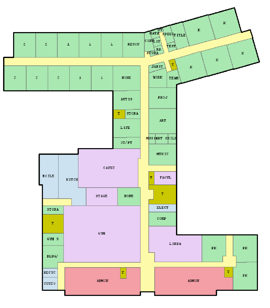
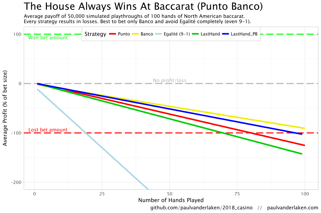
The figure below shows the results of the five strategies I tested using 50,000 simulations of 100 consecutive hands. Based on the results, I was reluctant to develop and test other strategies as results look quite straightforward: play Banco. Additionally, Wikipedia cites Thorp (1984, original reference unknown) who suggested that there are no strategies that will really result in any significant player advantage, except maybe for the endgame of a deck, which presumably requires a lot of card counting. If you nevertheless want to test other strategies, please be my guest, here are my five:
Punto: Always bet on Punto.
Banco: Always bet on Banco.
Egalité: Always bet on Egalité.
LastHand: Bet on the outcome of the last hand/coup.
LastHand_PB: Bet on the outcome of the last hand/coup, only if this was Punto or Banco.
The above figure depicts the expected value of each strategy over a series of consecutive hands played. Clearly, the payoff is quite linear, independent of your strategy. The more hands you play, the more you lose. However, also clear is that some strategies outperform others. After 100 hands of Baccarat, playing only Banco will on average result in a total loss below the amount you wager. For example, if you bet 10 euro every hand, you will have a loss of about 9 euro’s after 100 rounds, on average. This is in line with the ~1% house edge reported by the Wizard of Odds. Similarly, betting only Punto will result in a loss of about 130% of the bet amount, which is also conform the ~1.4% house edge reported by the Wizard of Odds. Betting on Punto or Banco based on whichever won last (LastHand_PB) performs somewhere in between these two strategies, losing just over 100% of the bet amount in 100 hands. Your expected losses increase when you just bet on whichever outcome came last, including Egalité, resulting in around ~-150% after 100 hands. This is mainly because betting on Egalité, which seems about the worst strategy ever, will result in a remarkable 493.9% loss after 100 hands.
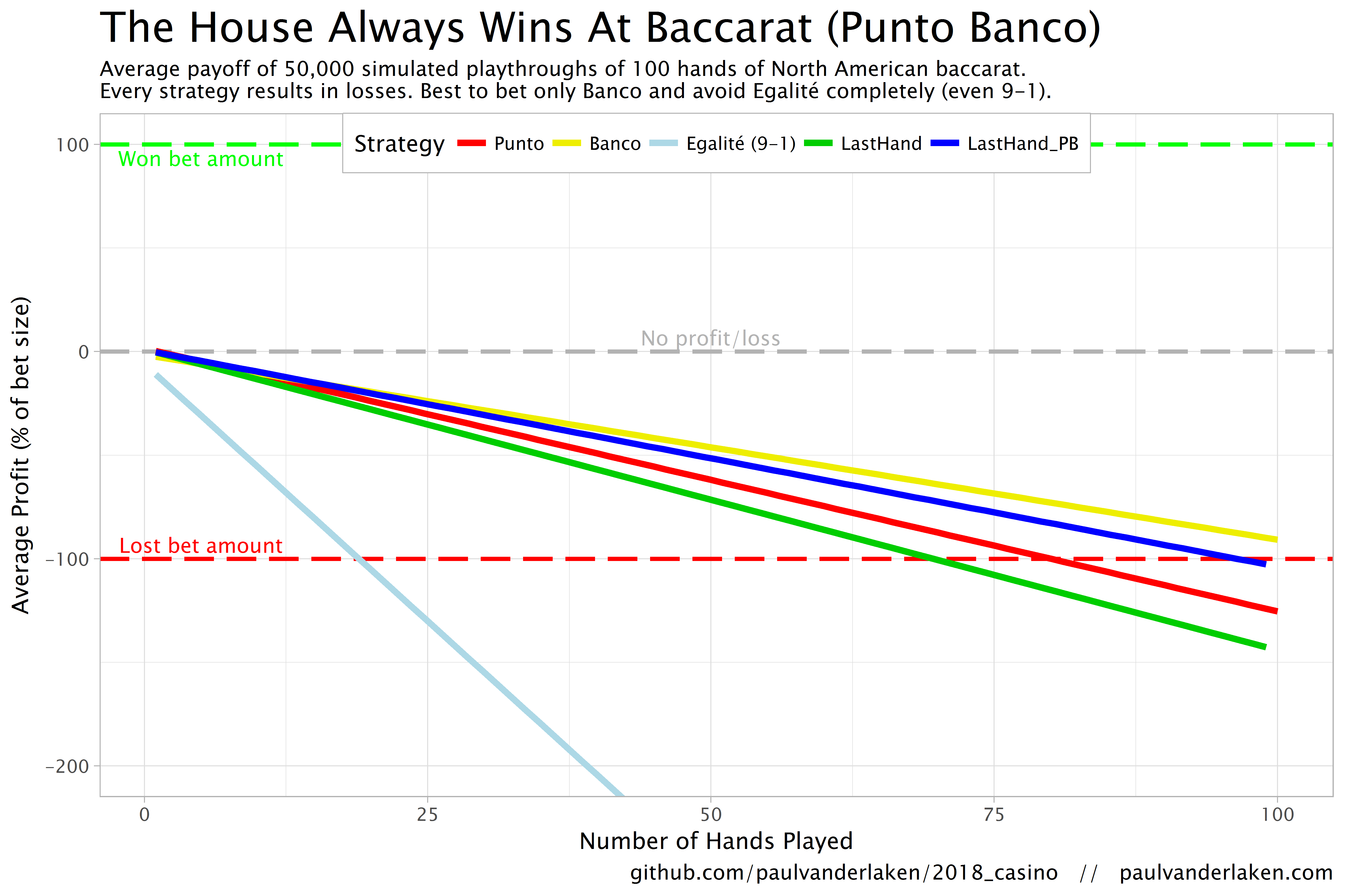
Apart from these average or expected values, I was also interested in the spread of outcomes of our thousands of simulations. Particularly because gamblers on a lucky streak may win much more when betting on Egalité, as the payoff is larger (8-1 or 9-1). The figure below shows that any strategy including Egalité will indeed result in a wider spread of outcomes. Betting on Egalité may thus be a good strategy if you are by some miracle divinely lucky, have information on which cards are coming next, or have an agreement with the dealer (disclaimer: this is a joke, please do not ever bet on Egalité with the intention of making money or try to cheat at the casino).
If you want to know how I programmed these simulations, please visit the associated github repository or reach out. I intend on simulating the payoff for various other casino games in the near future (first up: BlackJack), so if you are interested keep an eye on my website or twitter.