Month: November 2018

Tensorflow for R Gallery

Tensorflow for R Gallery

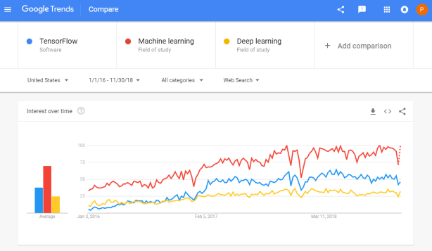
Tensorflow is a open-source machine learning (ML) framework. It’s primarily used to build neural networks, and thus very often used to conduct so-called deep learning through multi-layered neural nets. 

Although there are other ML frameworks — such as Caffe or Torch — Tensorflow is particularly famous because it was developed by researchers of Google’s Brain Lab. There are widespread debates on which framework is best, nonetheless, Tensorflow does a pretty good job on marketing itself. 

Google search engine searches on Tensorflow in comparison to searches on Machine learing and Deep learning

I primarily work in the programming language R, and have written before about how to start with deep learning in R using Keras — an user-friendly API built on top of, among others, Tensorflow. Now, it has become even easier to learn how to implement the power of Tensorflow in R, for RStudio has compiled a gallery of featured posts on Tensorflow implementations in R. It features a variety of applications related to collaborative filtering, image recognition, audio classification, times series forecasting, and fraud detection, all using Keras and TensorFlow. I highly recommend you check it out if you want to learn more about deep learning in R. 

Animated Citation Gates turned into Selection Gates

Bret Beheim — senior researcher at the Max Planck Institute for Evolutionary Anthropology — posted a great GIF animation of the response to his research survey. He calls the figure citation gates, relating the year of scientific publication to the likelihood that the research materials are published open-source or accessible.

To generate the visualization, Bret used R’s base plotting functionality combined with Thomas Lin Pedersen‘s R package tweenrto animate it.

Bret shared his R code for the above GIF of his citation gates on GitHub. With the open source code, this amazing visual display inspired others to make similar GIFs for their own projects. For example, Anne-Wil Kruijt’s dance of the confidence intervals:

A spin-off of the citation gates: A gif showing confidence intervals of sample means.

Applied to a Human Resource Management context, we could use this similar animation setup to explore, for instance, recruitment, selection, or talent management processes.

Unfortunately, I couldn’t get the below figure to animate properly yet, but I am working on it (damn ggplot2 facets). It’s a quick simulation of how this type of visualization could help to get insights into the recruitment and selection process for open vacancies.

The figure shows how nearly 200 applicants — sorted by their age — go through several selection barriers. A closer look demonstrates that some applicants actually skip the screening and assessment steps and join via a fast lane in the first interview round, which could happen, for instance, when there are known or preferred internal candidates. When animated, such insights would become more clearly visible.

Univers Interview: “Algorithms haven’t replaced the HR manager yet”

Univers Interview: “Algorithms haven’t replaced the HR manager yet”

The magazine of Tilburg University — Univers — recently interviewed me on my PhD research on People Analytics and data-driven Human Resource management. The Dutch write-up by interviewer Ron Vaessen you can find here, but is unfortunately available in Dutch only.

The full text of my dissertation can be accessed in a flipbook here or downloaded directly via this link.

I have also dedicated several blogs to more background information. A small extract on the ethics of people analytics and machine learning in HR I posted here. Those interested in visualizing survival curves like I did can see this post. Curious about the cover design, read this post

A/B Testing a New Look

A/B Testing a New Look

This WordPress blogger I came across — let’s call him “John” for now — has a very peculiar way of testing out his looks. Using dating-apps like Tinder,
John conducted A/B-tests to find out whether people would prefer him romantically with or without a beard. 

Via a proper experimental setup, John found out that bearded John receives much more attention in the form of Tinder matches. However, not from girls whom John characterized as being asian, that group seemed to prefer shaven John. 

While the sample size was not too large (Nbearded = 500; Nshaven = 500) and the response rate even lower (Nbearded = 64; Nshaven = 30), this seems like a fun way to make your look more data-driven!

Read more on “John”‘s orginal blog below:

How Do You Test Out A New Look? Dating Apps!

Chatterplots

Chatterplots

I’ve mentioned before that I dislike wordclouds (for instance here, or here) and apparently others share that sentiment. In his recent Medium blog, Daniel McNichol goes as far as to refer to the wordcloud as the pie chart of text data! Among others, Daniel calls wordclouds disorienting, one-dimensional, arbitrary and opaque and he mentions their lack of order, information, and scale. 

Wordcloud of the negative characteristics of wordclouds, via Medium

Instead of using wordclouds, Daniel suggests we revert to alternative approaches. For instance, in their Tidy Text Mining with R book, Julia Silge and David Robinson suggest using bar charts or network graphs, providing the necessary R code. Another alternative is provided in Daniel’s blogthe chatterplot!

While Daniel didn’t invent this unorthodox wordcloud-like plot, he might have been the first to name it a chatterplot. Daniel’s chatterplot uses a full x/y cartesian plane, turning the usually only arbitrary though exploratory wordcloud into a more quantitatively sound, information-rich visualization.

R package ggplot’s geom_text() function — or alternatively ggrepel‘s geom_text_repel() for better legibility — is perfectly suited for making a chatterplot. And interesting features/variables for the axis — apart from the regular word frequencies — can be easily computed using the R tidytext package. 

Here’s an example generated by Daniel, plotting words simulatenously by their frequency of occurance in comments to Hacker News articles (y-axis) as well as by the respective popularity of the comments the word was used in (log of the ranking, on the x-axis).

[CHATTERPLOTs arelike a wordcloud, except there’s actual quantitative logic to the order, placement & aesthetic aspects of the elements, along with an explicit scale reference for each. This allows us to represent more, multidimensional information in the plot, & provides the viewer with a coherent visual logic& direction by which to explore the data.

Daniel McNichol via Medium

I highly recommend the use of these chatterplots over their less-informative wordcloud counterpart, and strongly suggest you read Daniel’s original blog, in which you can also find the R code for the above visualizations.

Checklist to Optimize Training Transfer in Organizations

Checklist to Optimize Training Transfer in Organizations

Ashley Hughes, Stephanie Zajac, Jacqueline Spencer, and Eduardo Salas wrote a recent research note for the International Journal of Training and Development. The research note is build around an evidence-based checklist of actionable insights for practitioners that will help to enhance the effectiveness of training interventions. These actionable insights would help to prevent ‘transfer problem’, meaning that trained skills are not being used on the job. 


Screenshot of the first page of the published research note, containing the abstract

Unfortunately, these published academic papers are often behind a paywall, but you may request a PDF from the authors here on ResearchGate.

Screenshot of the appendix of the research note containing the checklist for practitioners.

For the full details and scientific evidence behind each suggested action, I suggest you access the research note. Nevertheless, here’s my summary of their main advice on improving training transfer before, during, and after training implementation:

Before training

  • Conduct a training needs analysis to align the training’s content and participants with the organizational objectives
  • Involved stakeholders should be aware of training, understand its importance, and — obviously — be prepared for the training program. The scholars provide seven specific actions here, including the setting of personal training goals, and aligning resources and rewards with the training.
  • Training attendance should be framed as an opportunity, and the training’s anticipated benefits could be emphasized (e.g. improvement of work processes or on-the-job performance).
  • A climate which encourages learning should be created, with dedicated time (and opportunities) for post‐training learning 
    and a sense of accountability for using trained knowledge, skills, and abilities.

During training

  • Piloting the training with a single department or subset of trainees is highly encouraged. This is one way that greatly helps to assess whether the training design is appropriate in terms of content and delivery.
  • Error‐encouragement framing can influence a trainee’s learning orientation and thus errors made during training should be framed as growth opportunities.

After training

  • Use of the trained skills should be supported and planned. For instance, participants could be given a small workload reduction to provide opportunities to apply the learned knowledge and skills once they return to their position. 
  • Management and training participants should be held accountable for their use of skills on the job.
  • Think about using just‐in‐time or refresher training and coaching, if needed.
  • Assess training effectiveness criteria including training transfer using metrics and analytics. Specifically, the scholars propose that the criteria measured in the training evaluation should correspond to the training needs identified through the training needs analysis that was conducted before the training. 
  • Training evaluation criteria should consider the scope and timeframe of the training. Take into account that distal outcomes such as ROI may take longer to realize.