Bret Beheim — senior researcher at the Max Planck Institute for Evolutionary Anthropology — posted a great GIF animation of the response to his research survey. He calls the figure citation gates, relating the year of scientific publication to the likelihood that the research materials are published open-source or accessible.
To generate the visualization, Bret used R’s base plotting functionality combined with Thomas Lin Pedersen‘s R package tweenrto animate it.
I've been experimenting with R animations using the tweenR package for visualizing the results of our reproducibility survey, and I think it turned out pretty nice. pic.twitter.com/MRerAWHNYT
Bret shared his R code for the above GIF of his citation gateson GitHub. With the open source code, this amazing visual display inspired others to make similar GIFs for their own projects. For example, Anne-Wil Kruijt’s dance of the confidence intervals:
Two wks ago I built a shiny 'CI demo' app for a job interview. Yet I wasn't quite content with it. Then 2 days ago @babeheim posted an amazing gif (srsly, go check it!). Super inspired, & borrowing heavily from his code: my rendition of 'the Dance of the Confidence Intervals' pic.twitter.com/ORheOBBzDm
A spin-off of the citation gates: A gif showing confidence intervals of sample means.
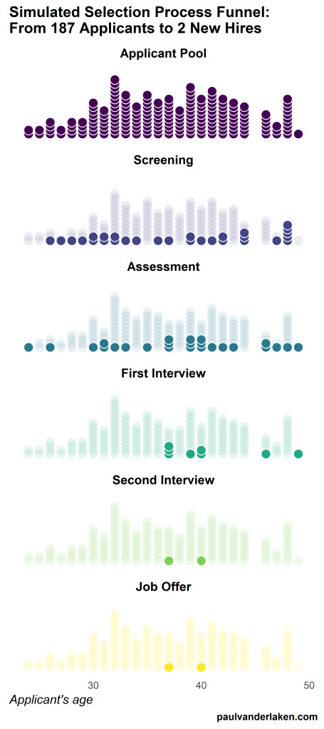
Applied to a Human Resource Management context, we could use this similar animation setup to explore, for instance, recruitment, selection, or talent management processes.
Unfortunately, I couldn’t get the below figure to animate properly yet, but I am working on it (damn ggplot2 facets). It’s a quick simulation of how this type of visualization could help to get insights into the recruitment and selection process for open vacancies.
The figure shows how nearly 200 applicants — sorted by their age — go through several selection barriers. A closer look demonstrates that some applicants actually skip the screening and assessment steps and join via a fast lane in the first interview round, which could happen, for instance, when there are known or preferred internal candidates. When animated, such insights would become more clearly visible.
The magazine of Tilburg University — Univers — recently interviewed me on my PhD research on People Analytics and data-driven Human Resource management. The Dutch write-up by interviewer Ron Vaessen you can find here, but is unfortunately available in Dutch only.
I have also dedicated several blogs to more background information. A small extract on the ethics of people analytics and machine learning in HR I posted here. Those interested in visualizing survival curves like I did can see this post. Curious about the cover design, read this post.
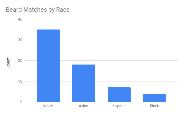
This WordPress blogger I came across — let’s call him “John” for now — has a very peculiar way of testing out his looks. Using dating-apps like Tinder, John conducted A/B-tests to find out whether people would prefer him romantically with or without a beard.
Via a proper experimental setup, John found out that bearded John receives much more attention in the form of Tinder matches. However, not from girls whom John characterized as being asian, that group seemed to prefer shaven John.
While the sample size was not too large (Nbearded = 500; Nshaven = 500) and the response rate even lower (Nbearded = 64; Nshaven = 30), this seems like a fun way to make your look more data-driven!
I’ve mentioned before that I dislike wordclouds (for instance here, or here) and apparently others share that sentiment. In his recent Medium blog, Daniel McNichol goes as far as to refer to the wordcloud as the pie chart of text data! Among others, Daniel calls wordclouds disorienting, one-dimensional, arbitrary and opaque and he mentions their lack of order, information, and scale.
Wordcloud of the negative characteristics of wordclouds, via Medium
Instead of using wordclouds, Daniel suggests we revert to alternative approaches. For instance, in their Tidy Text Mining with R book, Julia Silge and David Robinson suggest using bar charts or network graphs, providing the necessary R code. Another alternative is provided in Daniel’s blog: the chatterplot!
While Daniel didn’t invent this unorthodox wordcloud-like plot, he might have been the first to name it a chatterplot. Daniel’s chatterplot uses a full x/y cartesian plane, turning the usually only arbitrary though exploratory wordcloud into a more quantitatively sound, information-rich visualization.
R package ggplot’s geom_text() function — or alternatively ggrepel‘s geom_text_repel() for better legibility — is perfectly suited for making a chatterplot. And interesting features/variables for the axis — apart from the regular word frequencies — can be easily computed using the R tidytext package.
Here’s an example generated by Daniel, plotting words simulatenously by their frequency of occurance in comments to Hacker News articles (y-axis) as well as by the respective popularity of the comments the word was used in (log of the ranking, on the x-axis).
[CHATTERPLOTs are] like a wordcloud, except there’s actual quantitative logic to the order, placement & aesthetic aspects of the elements, along with an explicit scale reference for each. This allows us to represent more, multidimensional information in the plot, & provides the viewer with a coherent visual logic& direction by which to explore the data.
I highly recommend the use of these chatterplots over their less-informative wordcloud counterpart, and strongly suggest you read Daniel’s original blog, in which you can also find the R code for the above visualizations.
Ashley Hughes, Stephanie Zajac, Jacqueline Spencer, and Eduardo Salas wrote a recent research note for the International Journal of Training and Development. The research note is build around an evidence-based checklist of actionable insights for practitioners that will help to enhance the effectiveness of training interventions. These actionable insights would help to prevent ‘transfer problem’, meaning that trained skills are not being used on the job.
Screenshot of the first page of the published research note, containing the abstract
Screenshot of the appendix of the research note containing the checklist for practitioners.
For the full details and scientific evidence behind each suggested action, I suggest you access the research note. Nevertheless, here’s my summary of their main advice on improving training transfer before, during, and after training implementation:
Before training
Conduct a training needs analysis to align the training’s content and participants with the organizational objectives
Involved stakeholders should be aware of training, understand its importance, and — obviously — be prepared for the training program. The scholars provide seven specific actions here, including the setting of personal training goals, and aligning resources and rewards with the training.
Training attendance should be framed as an opportunity, and the training’s anticipated benefits could be emphasized (e.g. improvement of work processes or on-the-job performance).
A climate which encourages learning should be created, with dedicated time (and opportunities) for post‐training learning and a sense of accountability for using trained knowledge, skills, and abilities.
During training
Piloting the training with a single department or subset of trainees is highly encouraged. This is one way that greatly helps to assess whether the training design is appropriate in terms of content and delivery.
Error‐encouragement framing can influence a trainee’s learning orientation and thus errors made during training should be framed as growth opportunities.
After training
Use of the trained skills should be supported and planned. For instance, participants could be given a small workload reduction to provide opportunities to apply the learned knowledge and skills once they return to their position.
Management and training participants should be held accountable for their use of skills on the job.
Think about using just‐in‐time or refresher training and coaching, if needed.
Assess training effectiveness criteria including training transfer using metrics and analytics. Specifically, the scholars propose that the criteria measured in the training evaluation should correspond to the training needs identified through the training needs analysis that was conducted before the training.
Training evaluation criteria should consider the scope and timeframe of the training. Take into account that distal outcomes such as ROI may take longer to realize.
Marcus Volz is a research fellow at the University of Melbourne, studying geometric networks, optimisation and computational geometry. He’s interested in visualisation, and always looking for opportunities to represent complex information in novel ways to accelerate learning and uncover the unexpected.
One of Marcus’ hobbies is the visualization of mathematical patterns and statistical algorithms via R. He has a whole portfolio full of them, including a Github page with all the associated R code. For my recent promotion, my girlfriend asked Marcus to generate a K-nearest neighbors visual and she had it printed on a large canvas.
The picture contains about 10.000 points, randomly uniformly distributed across x and y, connected by lines with their closest k other points. Marcus shared the code to generate such k-nearest neighbor algorithm plots here on Github. So if you know your way around R, you could make your own version:
#' k-nearest neighbour graph
#'
#' Computes a k-nearest neighbour graph for a given set of points. Refer to the \href{https://en.wikipedia.org/wiki/Nearest_neighbor_graph}{Wikipedia article} for details.
#' @param points A data frame with x, y coordinates for the points
#' @param k Number of neighbours
#' @keywords nearest neightbour graph
#' @export
#' @examples
#' k_nearest_neighbour_graph()

k_nearest_neighbour_graph <- function(points, k=8) {
  get_k_nearest <- function(points, ptnum, k) {
    xi <- points$x[ptnum]
    yi <- points$y[ptnum]     points %>%
      dplyr::mutate(dist = sqrt((x - xi)^2 + (y - yi)^2)) %>%
      dplyr::arrange(dist) %>%
      dplyr::filter(row_number() %in% seq(2, k+1)) %>%
      dplyr::mutate(xend = xi, yend = yi)
  }

  1:nrow(points) %>%
    purrr::map_df(~get_k_nearest(points, ., k))
}
Those less versed in R can use Marcus package mathart. With this package, Marcus shares many more visual depictions of cool algorithms! You can install the package and several dependencies with the following lines of code:
This page of Marcus’ mathart Github repository contains the code exact code for these and many other visualizations of algorithms and statistical phenomena. Do check it out if you’re interested!
Also, check out the “Fun” section of my R tips and tricks list for more cool visuals you can generate in R!