Category: automation

Computers decode what humans see: Generating images from brain activity

Computers decode what humans see: Generating images from brain activity

I recently got pointed towards a 2017 paper on bioRxiv that blew my mind: three researchers at the Computational Neuroscience Laboratories at Kyoto, Japan, demonstrate how they trained a deep neural network to decode human functional magnetic resonance imaging (fMRI) patterns and then generate the stimulus images.

In simple words, the scholars used sophisticated machine learning to reconstruct the photo’s their research particpants saw based on their brain activity… INSANE! The below shows the analysis workflow, and an actual reconstructed image. More reconstructions follow further on.

1.PNG
Figure 1 | Deep image reconstruction. Overview of deep image reconstruction is shown. The pixels’ values of the input image are optimized so that the DNN features of the image are similar to those decoded from fMRI activity. A deep generator network (DGN) is optionally combined with the DNN to produce natural-looking images, in which optimization is performed at the input space of the DGN. [original]
Three healthy young adults participated in two types of experiments: an image presentation experiment and an imagery experiment.

In the image presentation experiments, participants were presented with several natural images from the ImageNet database, with 40 images geometrical shapes, and with 10 images of black alphabetic characters. These visual stimuli were rear-projected onto a screen in an fMRI scanner bore. Data from each subject were collected over multiple scanning sessions spanning approximately 10 months. Images were flashed at 2 Hz for several seconds. In the imagery experiment, subjects were asked to visually imagine / remember one of 25 images of the presentation experiments. Subjects were
required to start imagining a target image after seeing some cue words.

In both experimental setups, fMRI data were collected using 3.0-Tesla Siemens MAGNETOM Verio scanner located at the Kokoro Research Center, Kyoto University.

The results, some of which I copied below, are plainly amazing.

2.PNG
Figure 2 | Seen natural image reconstructions. Images with black and gray frames show presented and reconstructed images, respectively (reconstructed from VC activity). a) Reconstructions utilizing the DGN (using DNN1–8). Three reconstructed images
correspond to reconstructions from three subjects. b) Reconstructions with and without the DGN (DNN1–8). The first, second, and third rows show presented images, reconstructions with and without the DGN, respectively. c) Reconstruction quality of seen natural images (error bars, 95% confidence interval (C.I.) across samples; three subjects pooled; chance level, 50%). d)  Reconstructions using different combinations of DNN layers (without the DGN). e) Subjective assessment of reconstructions from different combinations of DNN layers (error bars, 95% C.I. across samples) [original]
3.PNG
Figure 3 | Seen artificial shape reconstructions. Images with black and gray frames show presented and reconstructed images (DNN 1–8, without the DGN). a) Reconstructions for seen colored artificial shapes (VC activity). b, Reconstruction quality of colored artificial shapes. c) Reconstructions of colored artificial shapes obtained from multiple visual areas. d) Reconstruction quality of shape and colors for different visual areas. e) Reconstructions of alphabetical letters. f) Reconstruction quality for alphabetical letters. For b, d, f, error bars  indicate 95% C.I. across samples (three subjects pooled; chance level, 50%)  [original]
4
Supplementary Figure 2 | Other examples of natural image reconstructions obtained with the DGN. Images with black and gray frames show presented and reconstructed images, respectively (reconstructed from VC activity using all DNN layers). Three reconstructed images correspond to reconstructions from three subjects. [original]
5.PNG
Supplementary Figure 3 | Reconstructions through optimization processes. Reconstructed images obtained through the optimization processes are shown (reconstructed from VC activity of Subject 1 using all DNN layers and the DGN). Images with black and gray frames show presented and reconstructed images, respectively. [original]
There were many more examples of reconstructed images, as well as much more detailed information regarding the machine learning approach and experimental setup, so I strongly advise you check out the orginal paper.

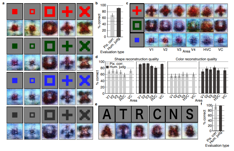
I can’t even imagine what such technology would imply for society… Proper minority report stuff here.

Here’s the abstract as an additional teaser:

Abstract

Machine learning-based analysis of human functional magnetic resonance imaging
(fMRI) patterns has enabled the visualization of perceptual content. However, it has been limited to the reconstruction with low-level image bases (Miyawaki et al., 2008; Wen et al., 2016) or to the matching to exemplars (Naselaris et al., 2009; Nishimoto et al., 2011). Recent work showed that visual cortical activity can be decoded (translated) into hierarchical features of a deep neural network (DNN) for the same input image, providing a way to make use of the information from hierarchical visual features (Horikawa & Kamitani, 2017). Here, we present a novel image reconstruction method, in which the pixel values of an image are optimized to make its DNN features similar to those decoded from human brain activity at multiple layers. We found that the generated images resembled the stimulus images (both natural images and artificial shapes) and the subjective visual content during imagery. While our model was solely trained with natural images, our method successfully generalized the reconstruction to artificial shapes, indicating that our model indeed ‘reconstructs’ or ‘generates’ images from brain activity, not simply matches to exemplars. A natural image prior introduced by another deep neural network effectively rendered semantically meaningful details to reconstructions by constraining reconstructed images to be similar to natural images. Furthermore, human judgment of reconstructions suggests the effectiveness of combining multiple DNN layers to enhance visual quality of generated images. The results suggest that hierarchical visual information in the brain can be effectively combined to reconstruct perceptual and subjective images.

Generating Book Covers By Their Words — My Dissertation Cover

Generating Book Covers By Their Words — My Dissertation Cover

As some of you might know, I am defending my PhD dissertation later this year. It’s titled “Data-Driven Human Resource Management: The rise of people analytics and its application to expatriate management” and, over the past few months, I was tasked with designing its cover.

Now, I didn’t want to buy some random stock photo depicting data, an organization, or overly happy employees. I’d rather build something myself. Something reflecting what I liked about the dissertation project: statistical programming and sharing and creating knowledge with others.

Hence, I came up with the idea to use the collective intelligence of the People Analytics community to generate a unique cover. It required a dataset of people analytics-related concepts, which I asked People Analytics professionals on LinkedIn, Twitter, and other channels to help compile. Via a Google Form, colleagues, connections, acquitances, and complete strangers contributed hundreds of keywords ranging from the standard (employees, HRM, performance) to the surprising (monetization, quantitative scissors [which I had to Google]). After reviewing the list and adding some concepts of my own creation, I ended up with 1786 unique words related to either business, HRM, expatriation, data science, or statistics.

I very much dislike wordclouds (these are kind of cool though), but already had a different idea in mind. I thought of generating a background cover of the words relating to my dissertation topic, over which I could then place my title and other information. I wanted to place these keywords randomly, maybe using a color schema, or with some random sizes.

The picture below shows the result of one of my first attempts. I programmed everything in R, writing some custom functionality to generate the word-datasets, the cover-plot, and .png, .pdf, and .gif files as output.

canvas.PNG

Random colors did not produce a pleasing result and I definitely needed more and larger words in order to fill my 17cm by 24cm canvas!

Hence, I started experimenting. Using base R’s expand.grid() and set.seed() together with mapply(), I could quickly explore and generate a large amount of covers based on different parameter settings and random fluctuations.

expand.grid(seed = c(1:3), 
            dupl = c(1:4, seq(5, 30, 5)),
            font = c("sans", "League Spartan"),
            colors = c(blue_scheme, red_scheme, 
                       rainbow_scheme, random_scheme),
            size_mult = seq(1, 3, 0.3),
            angle_sd = c(5, 10, 12, 15)) -> 
  param

mapply(create_textcover, 
       param$seed, param$dupl, 
       param$font, param$colors, 
       param$size_mult, param$angle_sd)

The generation process for each unique cover only took a few seconds, so I would generate a few hundred, quickly browse through them, update the parameters to match my preferences, and then generate a new set. Among others, I varied the color palette used, the size range of the words, their angle, the font used, et cetera. To fill up the canvas, I experimented with repeating the words: two, three, five, heck, even twenty, thirty times. After an evening of generating and rating, I came to the final settings for my cover:

  • Words were repeated twenty times in the dataset.
  • Words were randomly distributed across the canvas.
  • Words placed in random order onto the canvas, except for a select set of relevant words, placed last.
  • Words’ transparency ranged randomly between 0% and 70%.
  • Words’ color was randomly selected out of six colors from this palette of blues.
  • Words’ writing angles were normally distributed around 0 degrees, with a standard deviation of 12 degrees. However, 25% of words were explicitly without angle.
  • Words’ size ranged between 1 and 4 based on a negative binomial distribution (10 * 0.8) resulting in more small than large words. The set of relevant words were explicitly enlarged throughout.

With League Spartan (#thisisparta) loaded as a beautiful custom font, this was the final cover background which I and my significant other liked most:

cover_wordcloud_20-League Spartan-4.png

While I still need to decide on the final details regarding title placement and other details, I suspect that the final cover will look something like below — the white stripe in the middle depicting the book’s back.

coverpaul.png

Now, for the finale, I wanted to visualize the generation process via a GIF. Thomas Lin Pedersen developed this great gganimate package, which builds on the older animation package. The package greatly simplifies creating your own GIFs, as I already discussed in this earlier blog about animated GIFs in R. Anywhere, here is the generation process, where each frame includes the first frame ^ 3.2 words:

cover_wordcloud_20-League Spartan_4.gif

If you are interested in the process, or the R code I’ve written, feel free to reach out!

I’m sharing a digital version of the dissertation online sometime around the defense date: November 9th, 2018. If you’d like a copy, you can still leave your e-mailadress in the Google Form here and I’ll make sure you’ll receive your copy in time!

Evolving Floorplans – by Joel Simon

Evolving Floorplans – by Joel Simon

Joel Simon is the genius behind an experimental project exploring optimized school blueprints. Joel used graph-contraction and ant-colony pathing algorithms as growth processes, which could generate elementary school designs optimized for all kinds of characteristics: walking time, hallway usage, outdoor views, and escape routes just to name a few.

Two generated designs, minimizing the traffic flow (left) as well as escape routes (right) [original]
Other designs tried to maximize the number of windows, resulting in seemingly random open courtyards [original]
 

The original floor plan [original]
Definitely check out the original write-up if you are interested in the details behind the generation process! Or have a look at some of Joel’s other projects.

Identifying “Dirty” Twitter Bots with R and Python

Past week, I came across two programming initiatives to uncover Twitter bots and one attempt to identify fake Instagram accounts.

Mike Kearney developed the R package botornot which applies machine learning to estimate the probability that a Twitter user is a bot. His default model is a gradient boosted model trained using both users-level (bio, location, number of followers and friends, etc.) and tweets-level information (number of hashtags, mentions, capital letters, etc.). This model is 93.53% accurate when classifying bots and 95.32% accurate when classifying non-bots. His faster model uses only the user-level data and is 91.78% accurate when classifying bots and 92.61% accurate when classifying non-bots. Unfortunately, the models did not classify my account correctly (see below), but you should definitely test yourself and your friends via this Shiny application.

Fun fact: botornot can be integrated with Mike’s rtweet package

Scraping Dirty Bots

At around the same time, I read this very interesting blog by Andy Patel. Annoyed by the fake Twitter accounts that kept liking and sharing his tweets, Andy wrote a Python script called pronbot_search. It’s an iterative search algorithm which Andy seeded with the dozen fake Twitter accounts that he identified originally. Subsequently, the program iterated over the friends and followers of each of these fake users, looking for other accounts displaying similar traits (e.g., similar description, including an URL to a sex-website called “Dirty Tinder”).

Whenever a new account was discovered, it was added to the query list, and the process continued. Because of the Twitter API restrictions, the whole crawling process took literal days before Andy manually terminated it. The results are just amazing:

After a day, the results looked like so. Notice the weird clusters of relationships in this network. [original]
The full bot network uncovered by Andy included 22.000 fake Twitter accounts:

At the end of the weekend of March 10th, Andy had to stop the scraper after running for several days even though he had only processed 18% of the networks of the 22.000 included Twitter bots [original]
The bot network on Twitter is probably enormous! Zooming in on the network, Andy notes that:

Pretty much the same pattern I’d seen after one day of crawling still existed after one week. Just a few of the clusters weren’t “flower” shaped.

Andy Patel, March 2018, link

Zoomed in to a specific part of the network you can see the separate clusters of bots doing little more than liking each others messages. [original]
In his blog, Andy continues to look at all kind of data on these fake accounts. I found most striking that many of these account are years and years old already. Potentially, Twitter can use Mike Kearney’s botornot application to spot and remove them!

Most of the bots in the Dirty Tinder network found by Andy Patel were 3 to 8 years old already. [original]
Andy was nice enough to share the data on these bot accounts here, for you to play with. His Python code is stored in the same github repo and more details around this project you can read in his original blog.

Fake Instagram Accounts

Finally, SRFdata (Timo Grossenbacher) attempted to uncover fake Instagram followers among the 7 million followers in the network of 115 important Swiss Instagram influencers in R. Magi Metrics was used to retrieve information for public Instagram accounts and rvest for private accounts. Next, clear fake accounts (e.g., little followers, following many, no posts, no profile picture, numbers in name) were labelled manually, and approximately 10% of the inspected 1000 accounts appeared fake. Finally, they trained a random forest model to classify fake accounts with a sensitivity (true negative) rate of 77.4% and an overall accuracy of around 94%.

The wondrous state of Computer Vision, and what the algorithms actually “see”

The wondrous state of Computer Vision, and what the algorithms actually “see”

The field of computer vision tries to replicate our human visual capabilities, allowing computers to perceive their environment in a same way as you and I do. The recent breakthroughs in this field are super exciting and I couldn’t but share them with you.

In the TED talk below by Joseph Redmon (PhD at the University of Washington) showcases the latest progressions in computer vision resulting, among others, from his open-source research on Darknet – neural network applications in C. Most impressive is the insane speed with which contemporary algorithms are able to classify objects. Joseph demonstrates this by detecting all kinds of random stuff practically in real-time on his phone! Moreover, you’ve got to love how well the system works: even the ties worn in the audience are classified correctly!

PS. please have a look at Joseph’s amazing My Little Pony-themed resumé.

The second talk, below, is more scientific and maybe even a bit dry at the start. Blaise Aguera y Arcas (engineer at Google) starts with a historic overview brain research but, fortunately, this serves a cause, as ~6 minutes in Blaise provides one of the best explanations I have yet heard of how a neural network processes images and learns to perceive and classify the underlying patterns. Blaise continues with a similarly great explanation of how this process can be reversed to generate weird, Asher-like images, one could consider creative art:

neuralnetart1.png
An example of a reversed neural network thus “estimating” an image of a bird [via Youtube]
Blaise’s colleagues at Google took this a step further and used t-SNE to visualize the continuous space of animal concepts as perceived by their neural network, here a zoomed in part on the Armadillo part of the map, apparently closely located to fish, salamanders, and monkeys?

neuralnetart2.png
A zoomed view of part of a t-SNE map of latent animal concepts generated by reversing a neural network [via Youtube]
We’ve seen these latent spaces/continua before. This example Andrej Karpathy shared immediately comes to mind:

Blaise’s presentaton you can find here:

If you want to learn more about this process of image synthesis through deep learning, I can recommend the scientific papers discussed by one of my favorite Youtube-channels, Two-Minute Papers. Karoly’s videos, such as the ones below, discuss many of the latest developments:

Let me know if you have any other video’s, papers, or materials you think are worthwhile!

“What’s the difference between data science, machine learning, and artificial intelligence?”, visualized.

“What’s the difference between data science, machine learning, and artificial intelligence?”, visualized.

There has been a lot of hype around data the past years. With the big data buzz cooling down, data now needs to be smart, apparently. Data scientists became the most sexy professionals alive, and got a martial arts assistant. Artificial intelligence has been hot for decades, the term seems to change meaning every now and then. Currently, machine and deep learning are the quickest rising data domains.

Things can get confusing quite quickly if you’re a layman. People boast about boosting  while deep, brain-like networks are used to play child’s games. Data guru’s speak of mighty, though random woodlands and the media simultaneously praise and criticize IBM Watson. To create even more confusion, consultancy firms introduce a new type of analytics every year, each one more valuable than its predecessor. I am not even kidding, I counted seven eight nine ten eleven types: descriptive, diagnostic, exploratory, inferential, strategic, causal, enterprise, advanced, predictive, prescriptive, adaptive, and cognitive analytics, roughly in that order of complexity.

The resulting confusion I experience firsthand in my work. In my workshops, people would ask questions like “How can I use data mining to make our dashboards to more predictive?” or How can I build neural networks to understand our customer needs?”. Similarly, I’ve heard managers ask for more “cognitive solutions” or “one of those fancy neural networks“. However, things can get pretty ugly, pretty soon, once unnecessary complexity is introduced without good reasons (e.g., superior performance, processing speed), appropriate foundations (e.g., accurate, valid, and sufficient data), or good research designs (e.g., control conditions, random assignment, out-of-sample validation).

It is high time to demystify the data domain. If people outside the direct domain know what’s what, they will better understand what can and can’t be done with data. Moreover, they will not be as easily fooled by the cognitive AI mumbojumbo of consultants. A recent blog made me very happy. David Robinson — data scientist at StackOverflow — proposes very simple definitions of three interrelated domains (data science, machine learning, and artificial intelligence) and highlights their differences. If you haven’t yet, do read it, but to summarize David’s take:

  • Data science produces insights
  • Machine learning produces predictions
  • Artificial intelligence produces actions

These definitions are overly simplistic, David acknowledges, and not without their flaws: “A fortune teller makes predictions, but we’d never say that they’re doing machine learning!”. However, I feel its a great first attempt at demystification. Particularly, the applied example with which David continues make matters more clear:

Suppose we were building a self-driving car, and were working on the specific problem of stopping at stop signs. We would need skills drawn from all three of these fields.

  • Machine learning: The car has to recognize a stop sign using its cameras. We construct a dataset of millions of photos of streetside objects, and train an algorithm to predict which have stop signs in them.
  • Artificial intelligence: Once our car can recognize stop signs, it needs to decide when to take the action of applying the brakes. It’s dangerous to apply them too early or too late, and we need it to handle varying road conditions (for example, to recognize on a slippery road that it’s not slowing down quickly enough), which is a problem of control theory.
  • Data science: In street tests, we find that the car’s performance isn’t good enough, with some false negatives in which it drives right by a stop sign. After analyzing the street test data, we gain the insight that the rate of false negatives depends on the time of day: it’s more likely to miss a stop sign before sunrise or after sunset. We realize that most of our training data included only objects in full daylight, so we construct a better dataset including nighttime images and go back to the machine learning step.

David Robinson (2017; source)

Around the same time I read David’s blog, I came across the picture below, and its brother:

ML_evolution.png
The evolution of the AI field (source unknown)

This got me thinking about how I would explain the field to a layman. In Human Resource Management (my PhD domain), there is enormous confusion around what’s what. When HR professionals speak of analytics they can mean about anything from a group average or a bar chart up to a deep neural network. I hoped that a simple diagram could help solve some of the confusion in terminology. Here’s my attempt:

AI_definitions
A process diagram in order to demystify the fancy analytical terminology.

Note that this diagram reflects my personal, implicit definitions of the concepts. Hence, in many ways, it may be biased, incorrect, or plain stupid. Fortunately, the r/datascience and r/MachineLearning communities were very willing to help me improve it. I should also stress that David’s blog inspired the attempt in the first place. While the diagram still greatly oversimplifies matters (and is in conflict with the purist academic definitions), I hope its helps as a layman’s introduction to the field.

  • How to read it? From left to right, we start out with raw data. Often, we’d first transform this data into usable features/variables: discriminatory characteristics of the objects were trying to analyze. On the one hand, a researcher may engineer these features. For instance, by some (statistical) transformation such as taking the average X within groups or reducing the number of categories for Z. On the other hand, unsupervised machine learning techniques may be applied to (semi-)automatically engineer features by identifying relevant clusters or dimensions in the data.
    Next, the features can be input into statistical analysis. Taking the upper path, both  unsupervised and supervised machine learning techniques can be used to build models that can be interpreted to gain insights about phenomena. This process is what business people usually mean when they say “analytics“. Mostly, it involves descriptive, causal or inferential analyses in order to gain insights into some process or phenomenon. Taking the lower path, supervised learning may be applied build a predictive model and retrieve predictions for a dependent variable. These predictions may also be evaluated using further analysis to retrieve insights. For instance, to gain understanding about what’s driving the predictions or how the predictions may be leveraged in practice.
    Finally, both predictions and insights may form the basis of actions, which can be taken by a human agent or by a computer agent. In the latter case, we would deal with AI by some definitions.
    There is one more route in the diagram, going directly from the raw data to the predictions: deep learning. Here, a neural network may take in complex data (e.g., text, images, sound) and engineer relevant features autonomously to base predictions on.
  • Disclaimer: The diagram is a major oversimplification! Particularly the placement of and overlap between the domains in this diagram is a simplification and not very good by purist, academic standards. For instance, despite being a extremely important field of innovation, I excluded reinforcement learning as I was unable to place it without making the figure considerably more complex. Similarly, the others domains do not have as clear demarcations as this figure suggests and their placement is by my definition of them. Data science, in my opinion, reflects the diffusion of insights or knowledge from data, particularly the (human) decisions and actions made in that process. Much of data science relies on machine learning, which involves how algorithms learn a model of reality from data, observations, or experiences. This learning can occur in different forms (e.g., supervised, unsupervised, deep, and reinforcement learning) and, unlike David’s definition, thus not always output predictions (e.g., also dimensions, clusters). Finally, machine learning is a specific branch of artificial intelligence, a label that has had many definitions. In my eyes, it includes any (partially) automated process where seemingly intelligent actions are automatically executed based on decision rules. An action can be as simple as a single if-then statement or as complex as a smart fridge ordering new milk. Whether AI is or should be considered a part of data science is food for a different discussion. For much more straightforward definitions of the fields, please consult this slide shared by u/mmcmtl:

    Definitions shared by u/mmcmtl in the reddit discussion.

If you have any thoughts on how the above diagram and/or blog could or should be improved, feel free to comment below, reach out, or share your own attempts!