JS13K Games is a competition where developers are challenged to create an entire game using less than 13 kilobytes of memory. Creative developer Matt Deslaudiers participated and created Bellwoods: an art game for mobile and desktop that you can play in your browser.
The concept of the game is simple: fly your kite through endless fields of colour and sound, trying to discover new worlds. To remain under 13kb, all of the graphics and audio in Bellwoods are procedurally generated. The game was mostly programmed in JavaScript with minimal custom HTML/CSS. Matt’s motivation and the actual development you can read about in his original blog. The source code the game, Matt also shared on GitHub.
Mélissa Hernandez, a French UX and Interaction Designer, helped Matt design this beautiful game. Together, they even versed a haiku that not only evokes the mood of the game, but also provides some subtle gameplay instructions:
over the tall grass following birds, chasing wind in search of color
Did you know that dragonflies are one of the most effective and accurate predators alive? And that while it has a brain consisting of very few neurons. Neuroscientist Greg Gage and his colleagues studied how a dragonfly locks onto its preys and captures it within milliseconds. Actually, a dragonfly seems to be little more than a small neural network hooked up to some wings, and optimized through millions of years of evolution.
Disclaimer: This page contains one or more links to Amazon. Any purchases made through those links provide us with a small commission that helps to host this blog.
Useful base functions
str() – explore structure of R object
trimws() – trim trailing and/or leading whitespaces
dput() – dump an R object in form of R code
cut()– categorize values into intervals
intersect() – returns similar elements in two vectors
union() – find intersecting items in two vectors
setdiff() – returns different elements in two vectors
interaction() – computes a factor which represents the interaction of the given factors
formatC()can be used to round numbers and force trailing zero’s
formatC() and sprintf() can be used to add leading/trailing characters
expand.grid() – create a data frame from all combinations of the supplied vectors or factors
seq_along(myvec) – generates a vector of 1:length(myvec)
Generate distributions in ggplot2 using the stat_function function. Normal distributions, student t-distributions, beta distributions, anything. See also here.
Past week, I came across two programming initiatives to uncover Twitter bots and one attempt to identify fake Instagram accounts.
Mike Kearney developed the R package botornot which applies machine learning to estimate the probability that a Twitter user is a bot. His default model is a gradient boosted model trained using both users-level (bio, location, number of followers and friends, etc.) and tweets-level information (number of hashtags, mentions, capital letters, etc.). This model is 93.53% accurate when classifying bots and 95.32% accurate when classifying non-bots. His faster model uses only the user-level data and is 91.78% accurate when classifying bots and 92.61% accurate when classifying non-bots. Unfortunately, the models did not classify my account correctly (see below), but you should definitely test yourself and your friends via this Shiny application.
Fun fact: botornot can be integrated with Mike’s rtweet package
Scraping Dirty Bots
At around the same time, I read this very interesting blog by Andy Patel. Annoyed by the fake Twitter accounts that kept liking and sharing his tweets, Andy wrote a Python script called pronbot_search. It’s an iterative search algorithm which Andy seeded with the dozen fake Twitter accounts that he identified originally. Subsequently, the program iterated over the friends and followers of each of these fake users, looking for other accounts displaying similar traits (e.g., similar description, including an URL to a sex-website called “Dirty Tinder”).
Whenever a new account was discovered, it was added to the query list, and the process continued. Because of the Twitter API restrictions, the whole crawling process took literal days before Andy manually terminated it. The results are just amazing:
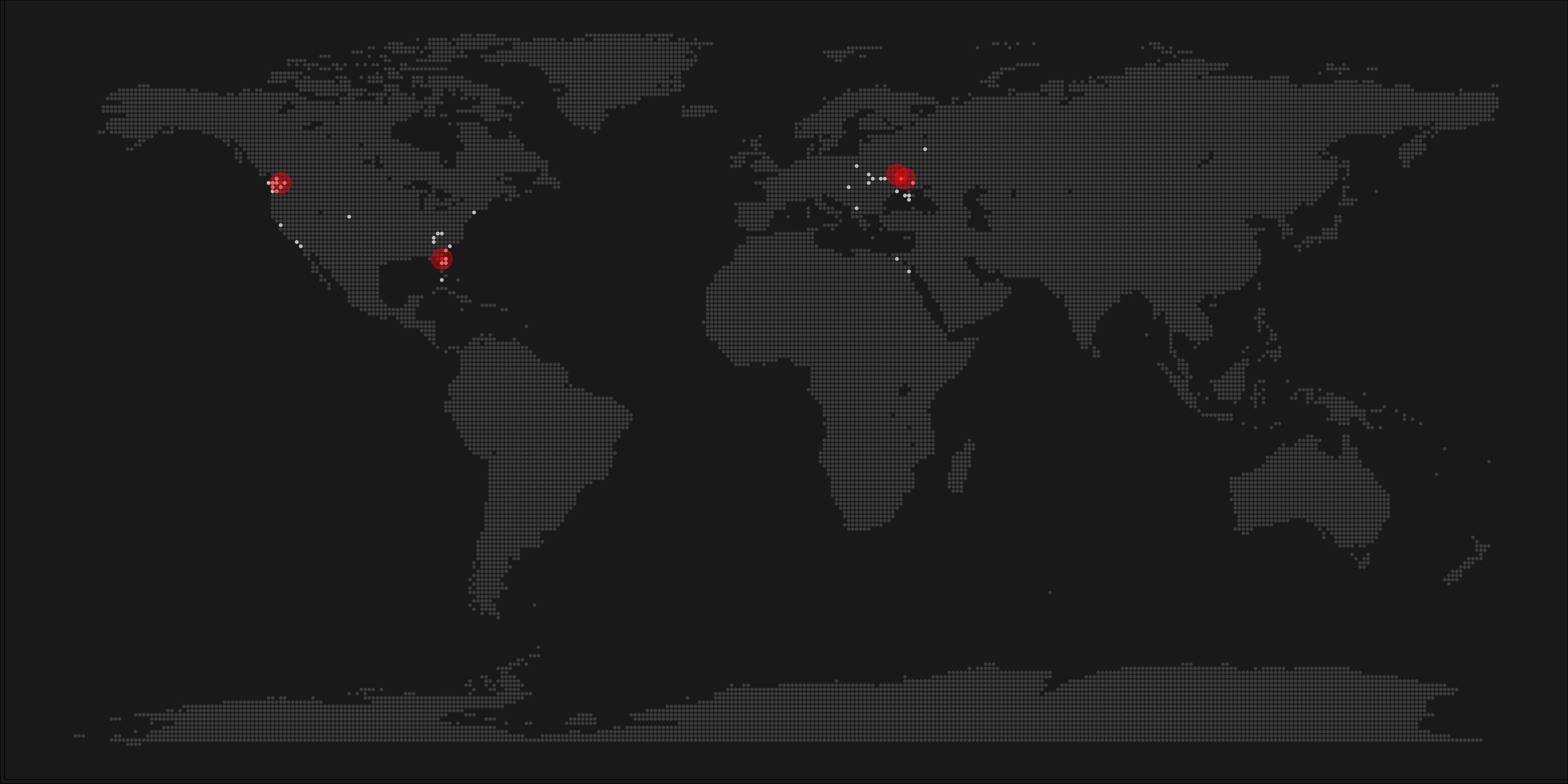
After a day, the results looked like so. Notice the weird clusters of relationships in this network. [original]The full bot network uncovered by Andy included 22.000 fake Twitter accounts:
At the end of the weekend of March 10th, Andy had to stop the scraper after running for several days even though he had only processed 18% of the networks of the 22.000 included Twitter bots [original]The bot network on Twitter is probably enormous! Zooming in on the network, Andy notes that:
Pretty much the same pattern I’d seen after one day of crawling still existed after one week. Just a few of the clusters weren’t “flower” shaped.
Zoomed in to a specific part of the network you can see the separate clusters of bots doing little more than liking each others messages. [original]In his blog, Andy continues to look at all kind of data on these fake accounts. I found most striking that many of these account are years and years old already. Potentially, Twitter can use Mike Kearney’s botornot application to spot and remove them!
Most of the bots in the Dirty Tinder network found by Andy Patel were 3 to 8 years old already. [original]Andy was nice enough to share the data on these bot accounts here, for you to play with. His Python code is stored in the same github repo and more details around this project you can read in his original blog.
Fake Instagram Accounts
Finally, SRFdata (Timo Grossenbacher) attempted to uncover fake Instagram followers among the 7 million followers in the network of 115 important Swiss Instagram influencers in R. Magi Metrics was used to retrieve information for public Instagram accounts and rvest for private accounts. Next, clear fake accounts (e.g., little followers, following many, no posts, no profile picture, numbers in name) were labelled manually, and approximately 10% of the inspected 1000 accounts appeared fake. Finally, they trained a random forest model to classify fake accounts with a sensitivity (true negative) rate of 77.4% and an overall accuracy of around 94%.
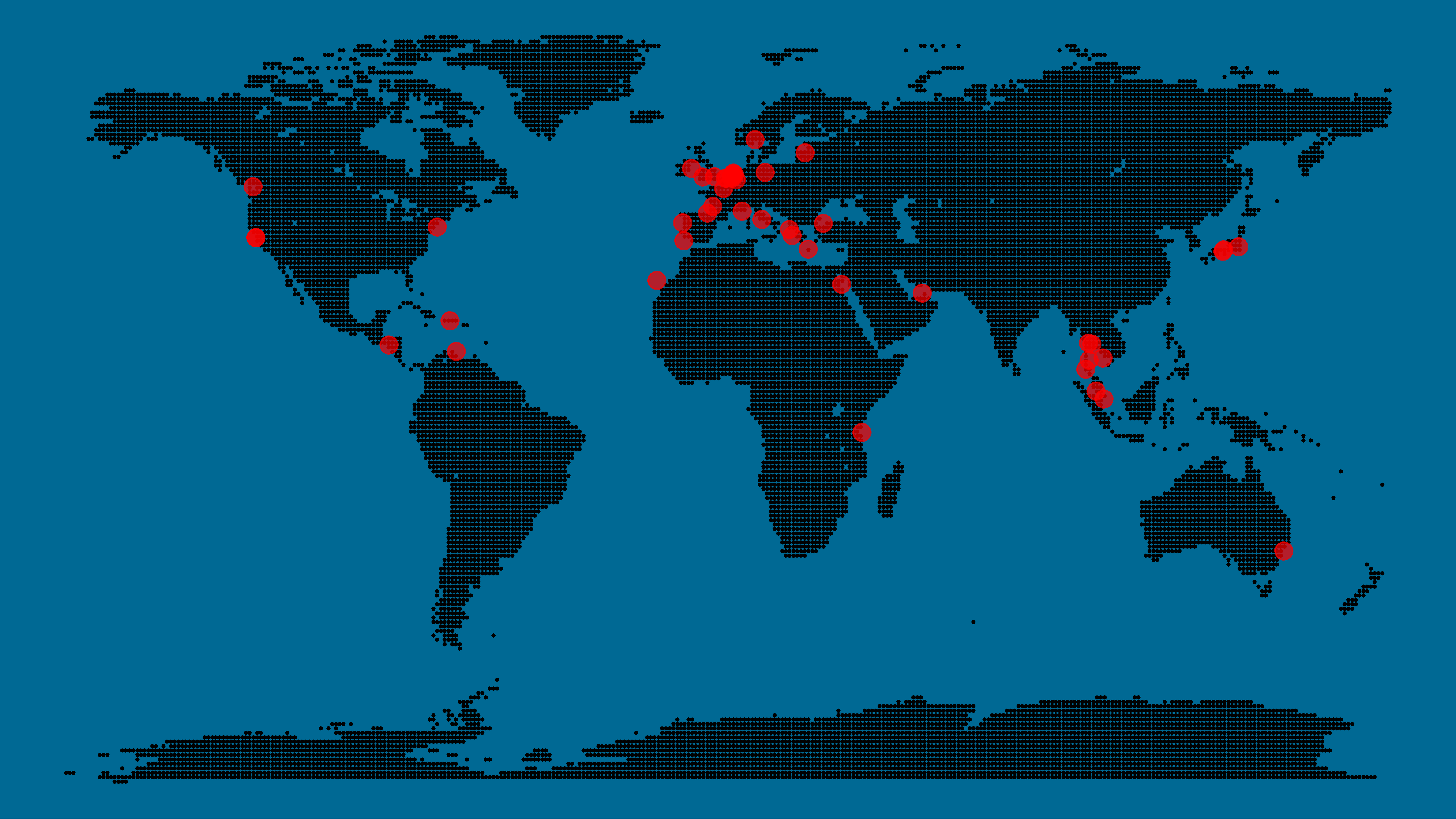
A pixel map of holiday and living locations made by Taras Kaduk in R [original]
Taras Kaduk seems as excited about R and the tidyverse as I am, as he built the beautiful map above. It flags all the cities he has visited and, in red, the cities he has lived. Taras was nice enough to share his code here, in the original blog post.
Now, I am not much of a globetrotter, but I do like programming. Hence, I immediately wanted to play with the code and visualize my own holiday destinations. Below you can find my attempt. The updated code I also posted below, but WordPress doesn’t handle code well, so you better look here.
Let’s run you through the steps to make such a map. First, we need to load some packages. I use the apply family to install and/or load a set of packages so that if I/you run the script on a different computer, it will still work. In terms of packages, the tidyverse (read more) includes some nice data manipulation packages as well as the famous ggplot2 package for visualizations. We need maps and ggmap for their mapping functionalities. here is a great little package for convenient project management, as you will see (read more).
Next, we need to load in the coordinates (longitudes and latitudes) of our holiday destinations. Now, I started out creating a dataframe with city coordinates by hand. However, this was definitely not a scale-able solution. Fortunately, after some Googling, I came across ggmap::geocode(). This function allows you to query the Google maps API(no longer works) Data Science Toolkit, which returns all kinds of coordinates data for any character string you feed it.
Although, I ran into two problems with this approach, this was nothing we couldn’t fix. First, my home city of Breda apparently has a name-city in the USA, which Google favors. Accordingly, you need to be careful and/or specific regarding the strings you feed to geocode() (e.g., “Breda NL“). Second, API’s often have a query limit, meaning you can only ask for data every so often. geocode() will quickly return NAs when you feed it more than two, three values. Hence, I wrote a simple while loop to repeat the query until the API retrieves coordinates. The query will pause shortly in between every attempt. Returned coordinates are then stored in the empty dataframe I created earlier. Now, we can easily query a couple dozen of locations without errors.
You can try it yourself: all you need to change is the city_name string.
### cities data ----------------------------------------------------------------

# cities to geolocate
city_name <- c("breda NL", "utrecht", "rotterdam", "tilburg", "amsterdam",
               "london", "singapore", "kuala lumpur", "zanzibar", "antwerp",
               "middelkerke", "maastricht", "bruges", "san fransisco", "vancouver",
               "willemstad", "hurghada", "paris", "rome", "bordeaux",
               "berlin", "kos", "crete", "kefalonia", "corfu",
               "dubai", " barcalona", "san sebastian", "dominican republic",
               "porto", "gran canaria", "albufeira", "istanbul",
               "lake como", "oslo", "riga", "newcastle", "dublin",
               "nice", "cardiff", "san fransisco", "tokyo", "kyoto", "osaka",
               "bangkok", "krabi thailand", "chang mai thailand", "koh tao thailand")

# initialize empty dataframe
tibble(
  city = city_name,
  lon = rep(NA, length(city_name)),
  lat = rep(NA, length(city_name))
) ->
  cities

# loop cities through API to overcome SQ limit
# stop after if unsuccessful after 5 attempts
for(c in city_name){
  temp <- tibble(lon = NA)
  # geolocate until found or tried 5 times
  attempt <- 0 # set attempt counter
  while(is.na(temp$lon) & attempt < 5) {
    temp <- geocode(c, source = "dsk")
    attempt <- attempt + 1
    cat(c, attempt, ifelse(!is.na(temp[[1]]), "success", "failure"), "\n") # print status
    Sys.sleep(runif(1)) # sleep for random 0-1 seconds
  }
  # write to dataframe
  cities[cities$city == c, -1] <- temp
}
Now, Taras wrote a very convenient piece of code to generate the dotted world map, which I borrowed from his blog:
With both the dot data and the cities’ geocode() coordinates ready, it is high time to visualize the map. Note that I use one geom_point() layer to plot the dots, small and black, and another layer to plot the cities data in transparent red. Taras added a third layer for the cities he had actually lived in; I purposefully did not as I have only lived in the Netherlands and the UK. Note that I again use the convenient here::here() function to save the plot in my current project folder.
I very much like the look of this map and I’d love to see what innovative, other applications you guys can come up with. To copy the code, please look here on RPubs. Do share your personal creations and also remember to take a look at Taras original blog!
Apparently, I was not the only geek who decided to celebrate the 20th anniversary of the Harry Potter saga with statistical analysis. Students Moritz Haine and Markus Dienstknecht of the Data Science for Decision Making Master at Maastricht University started their own celebratory project as part of a course Information Retrieval and Text Mining.
Students in previous years looked at for example Lord of the Rings, Star Wars and Game of Thrones. However, to our surprise, Harry Potter was missing. Since the books are about magic, we decided it would be interesting to identify all of the spells and the wizards that cast the most spells
Moritz Haine
From the books, the students extracted 41 different wizards, 64 different spells and 253 spells. Moritz points out that they could only include spoken spells, even though the most powerful wizards can also cast spells without naming them. They expect this might be the reason why Dumbledore and Voldemort are not ranked as high. At the end of their project, Moritz and Markus visualized their results in a spell-character mapping.
A network mapping of the characters and spells casted in the Harry Potter saga [original]This is the latest addition to my collection of Harry Potter analyses, to which a similar, interactive web application of spell usage was added only last week.


