Category: r

rstudio::conf 2018 summary

rstudio::conf 2018 summary

rstudio::conf is the yearly conference when it comes to R programming and RStudio. In 2017, nearly 500 people attended and, last week, 1100 people went to the 2018 edition. Regretfully, I was on holiday in Cardiff and missed out on meeting all my #rstats hero’s. Just browsing through the #rstudioconf Twitter-feed, I already learned so many new things that I decided to dedicate a page to it!

Fortunately, you can watch the live streams taped during the conference:

Two people have collected the slides of most rstudio::conf 2018 talks, which you can acces via the Github repo’s of matthewravey and by simecek. People on Twitter have particularly recommended teach the tidyverse to beginners (by David Robinson), the lesser known stars of the tidyverse (by Emily Robinson), the future of time series and financial analysis in the tidyverse (by Davis Vaughan of business-science.io), Understanding Principal Component Analysis (by Julia Silge), and Deploying TensorFlow models (by Javier Luraschi). Nevertheless, all other presentations are definitely worth checking out as well!

One of the workshops deserves an honorable mention. Jenny Bryan presented on What they forgot to teach you about R, providing some excellent advice on reproducible workflows. It elaborates on her earlier blog on project-oriented workflows, which you should read if you haven’t yet. Some best pRactices Jenny suggests:

  • Restart R often. This ensures your code is still working as intended. Use Shift-CMD-F10 to do so quickly in RStudio.
  • Use stable instead of absolute paths. This allows you to (1) better manage your imports/exports and folders, and (2) allows you to move/share your folders without the code breaking. For instance, here::here("data","raw-data.csv") loads the raw-data.csv-file from the data folder in your project directory. If you are not using the here package yet, you are honestly missing out! Alternatively you can use fs::path_home()normalizePath() will make paths work on both windows and mac. You can usebasename instead of strsplit to get name of file from a path.
  • To upload an existing git directory to GitHub easily, you can usethis::use_github().
  • If you include the below YAML header in your .R file, you can easily generate .md files for you github repo.
#' ---
#' output: github_document
#' ---
  • Moreover, Jenny proposed these useful default settings for knitr:
knitr::opts_chunk$set(
collapse = TRUE,
comment = "#>",
out.width = "100%"
)

Another of Jenny Bryan‘s talks was named Data Rectangling and although you might not get much out of her slides without her presenting them, you should definitely try the associated repurrrsive tutorial if you haven’t done so yet. It’s a poweR up for any useR!

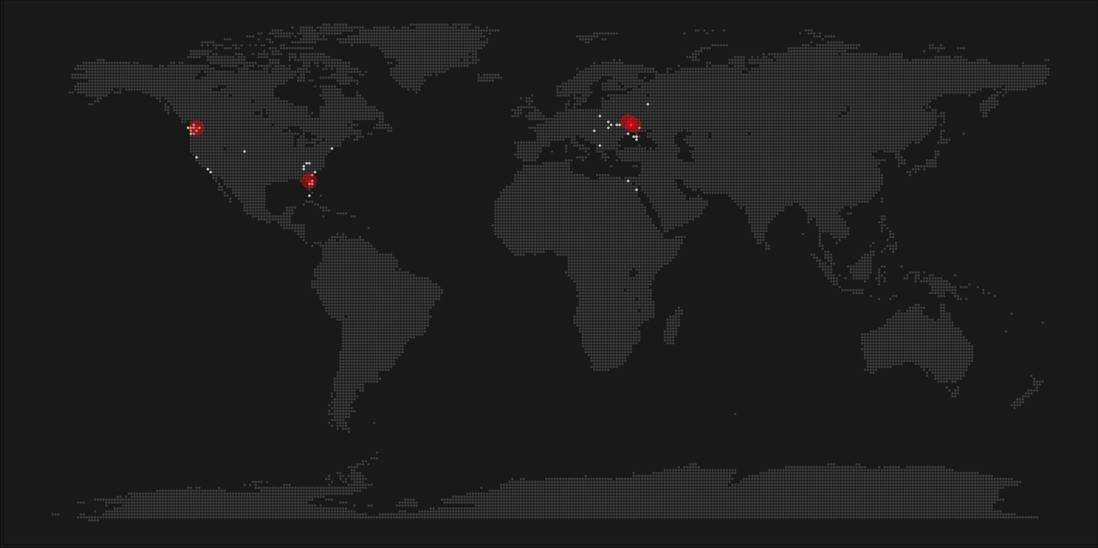
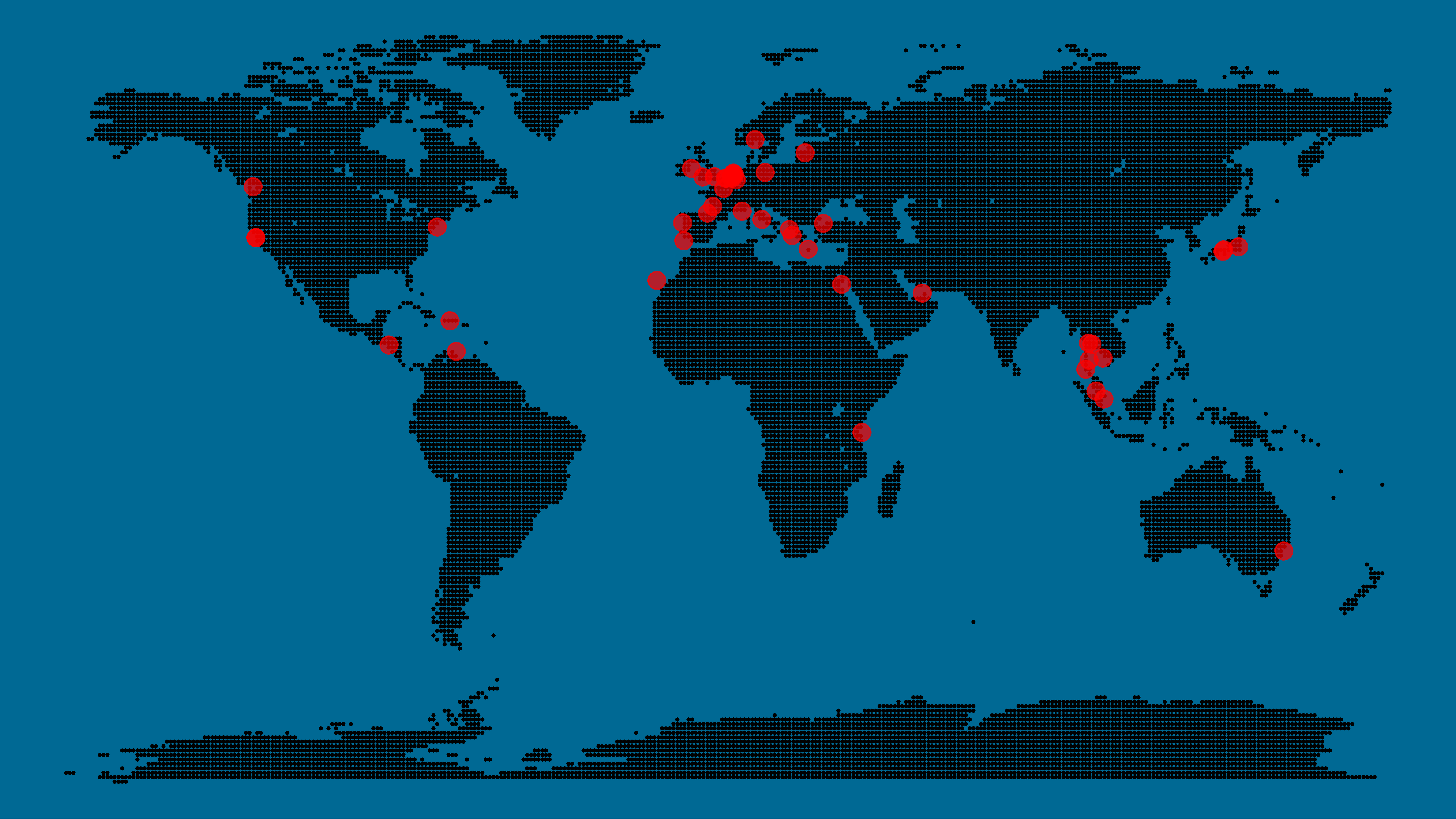
Here’s a Shiny dashboard made by Garrick Aden-Buie including all the #rstudioconf tweets so you can browse the posts yourself. If you want to download the tweets, Mike Kearney (author of rtweet) shares the data here on his Github. Some highlights:

These probably only present a minimal portion of the thousands of tips and tricks you could have learned by simply attending rstudio::conf. I will definitely try to attend next year’s edition. Nevertheless, I hope the above has been useful. If I missed out on any tips, presentations, tweets, or other materials, please reply below, tweet me or pop me a message!

Pixel Maps in R

Pixel Maps in R

Those of you who follow my blog know I love world maps. Particularly when they are used to visualize data, like these maps of Kaggle programming language preferencesUS household incomes, rush hour travel times, or Shazam recognitions. Those who share this passion will probably like this blog’s topic: mapping data to pixel maps! In R obviously!

A pixel map of holiday and living locations made by Taras Kaduk in R [original]

Taras Kaduk seems as excited about R and the tidyverse as I am, as he built the beautiful map above. It flags all the cities he has visited and, in red, the cities he has lived. Taras was nice enough to share his code here, in the original blog post.

Now, I am not much of a globetrotter, but I do like programming. Hence, I immediately wanted to play with the code and visualize my own holiday destinations. Below you can find my attempt. The updated code I also posted below, but WordPress doesn’t handle code well, so you better look here.

worlmap_dots
The code to make your own map you can find here.

Let’s run you through the steps to make such a map. First, we need to load some packages. I use the apply family to install and/or load a set of packages so that if I/you run the script on a different computer, it will still work. In terms of packages, the tidyverse (read more) includes some nice data manipulation packages as well as the famous ggplot2 package for visualizations. We need maps and ggmap for their mapping functionalities. here is a great little package for convenient project management, as you will see (read more).

### setup ----------------------------------------------------------------------

# install and/or load packages
pkg <- c("tidyverse", "maps", "ggmap", "here")
sapply(pkg, function(x){
  if(! x %in% installed.packages()) install.packages(x)
  require(x, character.only = TRUE)
})

Next, we need to load in the coordinates (longitudes and latitudes) of our holiday destinations. Now, I started out creating a dataframe with city coordinates by hand. However, this was definitely not a scale-able solution. Fortunately, after some Googling, I came across ggmap::geocode(). This function allows you to query the Google maps API(no longer works) Data Science Toolkit, which returns all kinds of coordinates data for any character string you feed it.

Although, I ran into two problems with this approach, this was nothing we couldn’t fix. First, my home city of Breda apparently has a name-city in the USA, which Google favors. Accordingly, you need to be careful and/or specific regarding the strings you feed to geocode() (e.g., “Breda NL“). Second, API’s often have a query limit, meaning you can only ask for data every so often. geocode() will quickly return NAs when you feed it more than two, three values. Hence, I wrote a simple while loop to repeat the query until the API retrieves coordinates. The query will pause shortly in between every attempt. Returned coordinates are then stored in the empty dataframe I created earlier. Now, we can easily query a couple dozen of locations without errors.

You can try it yourself: all you need to change is the city_name string.

### cities data ----------------------------------------------------------------

# cities to geolocate
city_name <- c("breda NL", "utrecht", "rotterdam", "tilburg", "amsterdam",
               "london", "singapore", "kuala lumpur", "zanzibar", "antwerp",
               "middelkerke", "maastricht", "bruges", "san fransisco", "vancouver", 
               "willemstad", "hurghada", "paris", "rome", "bordeaux", 
               "berlin", "kos", "crete", "kefalonia", "corfu", 
               "dubai", " barcalona", "san sebastian", "dominican republic", 
               "porto", "gran canaria", "albufeira", "istanbul", 
               "lake como", "oslo", "riga", "newcastle", "dublin", 
               "nice", "cardiff", "san fransisco", "tokyo", "kyoto", "osaka",
               "bangkok", "krabi thailand", "chang mai thailand", "koh tao thailand")   

# initialize empty dataframe   
tibble( 
  city = city_name, 
  lon = rep(NA, length(city_name)), 
  lat = rep(NA, length(city_name)) 
) ->
  cities

# loop cities through API to overcome SQ limit
# stop after if unsuccessful after 5 attempts
for(c in city_name){
  temp <- tibble(lon = NA)
  # geolocate until found or tried 5 times
  attempt <- 0 # set attempt counter
  while(is.na(temp$lon) & attempt < 5) {
    temp <- geocode(c, source = "dsk")
    attempt <- attempt + 1 
    cat(c, attempt, ifelse(!is.na(temp[[1]]), "success", "failure"), "\n") # print status
    Sys.sleep(runif(1)) # sleep for random 0-1 seconds
  } 
  # write to dataframe
  cities[cities$city == c, -1] <- temp
}

Now, Taras wrote a very convenient piece of code to generate the dotted world map, which I borrowed from his blog:

### dot data -------------------------------------------------------------------

# generate worldwide dots
lat <- data_frame(lat = seq(-90, 90, by = 1))
lon <- data_frame(lon = seq(-180, 180, by = 1))
dots <- merge(lat, lon, all = TRUE)  
# exclude water-based dots 
dots %>%
mutate(country = map.where("world", lon, lat),
       lakes = map.where("lakes", lon, lat)) %>%
  filter(!is.na(country) & is.na(lakes)) %>% 
  select(-lakes) ->
  dots

With both the dot data and the cities’ geocode() coordinates ready, it is high time to visualize the map. Note that I use one geom_point() layer to plot the dots, small and black, and another layer to plot the cities data in transparent red. Taras added a third layer for the cities he had actually lived in; I purposefully did not as I have only lived in the Netherlands and the UK. Note that I again use the convenient here::here() function to save the plot in my current project folder.

### visualize ------------------------------------------------------------------

# plot the data
dots %>% ggplot(aes(x = lon, y = lat)) + 
  geom_point(col = "black", size = 0.25) +
  geom_point(data = cities, col = "red", size = 3, alpha = 0.7) + 
  theme_void() +
  theme(
    panel.background = element_rect(fill = "#006994"),
    plot.background = element_rect(fill = "#006994")
  ) -> dot_map

# save plot
ggsave(here("worlmap_dots.png"), dot_map, 
       dpi = 600, width = 8, height = 4.5)


I very much like the look of this map and I’d love to see what innovative, other applications you guys can come up with. To copy the code, please look here on RPubs. Do share your personal creations and also remember to take a look at Taras original blog!

Harry Plotter: Shiny App of Spell Usage

Harry Plotter: Shiny App of Spell Usage

In my second Harry Plotter blog (22-Aug-2017), I wrote:

I would like to demonstrate how regular expressions can be used to retrieve (sub)strings that follow a specific format. We could use regex to examine, for instance, when, and by whom, which magical spells are cast.

Well, Prusinowskik (real name unknown) beat me to it, and how! S/He formed a comprehensive list of all spells found in the Harry Potter saga (see below), and categorized these into “spells“, “charms“, and “curses“, and into “popular“, “dueling” and “unforgivable” purposes. Next, Prusinowskik built an interactive Shiny application with lovely JavaScript graphs (package: rCharts) for us to discover precisely when during the saga which spells are cast (see also below). Moreover, the analysis was repeated for both the books and the movies.

Truly excellent work Prusinowskik! The Shiny app can be found here.

spells_dash
Overview of dueling spells (interactive)

spells
Overview of spells (interactive)


The House Always Wins: Simulating 5,000,000 Games of Baccarat a.k.a. Punto Banco

The House Always Wins: Simulating 5,000,000 Games of Baccarat a.k.a. Punto Banco

The associated GitHub repository with R code.

Past weekend, I visited the casino with some friends. Of all games, we enjoy North-American-style Baccarat the most. This type of Baccarat is often called Punto Banco. In short, Punto Banco is a card game in which two hands compete: the “player” and the “banker“. During each coup (a round of play), both hands get dealt either 2 or 3 cards, depending on a complex drawing schema, and all cards have a certain value. Put simply, the hand with the highest total value of cards wins the coup, after which a new one starts. Before each coup, gamblers may bet which of the hands will win. Neither hand is in any way associated with the actual house or player/gambler, so bets may be placed on both. All in all, three different bets can be placed in a game of Punto Banco:

  1. The player hand has the highest total value, in which case the player wins (Punto);
  2. The banker hand has the highest total value, in which case the banker wins (Banco);
  3. The player and banker hands have equal total value, in which case there is a tie (Egalité).

If a gambler correctly bets either Punto or Banco, their bets get a 100% payoff. However, a house tax will often be applied to Banco wins. For instance, Banco wins may only pay off 95% or specific Banco wins (e.g., total card value of 5) may pay off less (e.g., 50%). Depending on house rules, a correct bet on a tie (Egalité) will pay off either 800% or 900%. A wrong bet on Punto or Banco stands in case Egalité is dealt. In all other cases of wrong bets, the house takes the money.

Image result for punto banco casino

My friends and I like Punto Banco because it is completely random but seems “gameable”. Punto Banco is played with six or eight decks so there is no way to know which cards will be next. Moreover, the card-drawing rules are quite complex, so you never really know what’s going to happen. Sometimes both Punto and Banco get only two cards, at other times, the hand you bet on will get its third card, which might just turn things around. Punto Banco’s perceived gameability comes through our human fallacies to see patterns in randomness. Often, casino’s will place a monitor with the last fifty-so results (see below) to tempt gamblers to (erroneously) spot and bet on patterns. Alternatively, you might think it’s smart to bet against the table (play Punto when everybody else goes for Banco) or play on whatever bet won last hand. As the hands are dealt quite quickly in succession, and the minimal bet is often 10+ euro/dollar, Punto Banco is a quick way to find out how lucky you are.

Image result for punto banco scoreboard
Examples of Baccarat monitors, often placed next to a table.

So back to last weekend’s trip to the casino. Unfortunately, my friends and I lost quite some money at the Punto Banco table. We know the house has an edge (though smaller than in other games) but normally we are quite lucky. We often discuss what would be good strategies to minimize this houses’ edge. Obviously, you want to play as few games as possible, but that’s as far as we got in terms of strategy. Normally, we just test our luck and randomly bet Punto or Banco, and sparsely on Egalité.

As a statistical programmer, I thought it might be interesting to simulate the game and its odds from the bottom up. On the one hand, I wanted to get a sense of how favorable the odds are to the house. On the other hand, I was curious as to what extent strategies may be more or less successful in retaining at least some of your hard-earned cash.

In my simulations, I follow the Holland Casino Punto Banco rules, meaning a six-deck shoe and a Banco win with 5 pays out 50%. I did adopt the more lenient 9-1 payoff for Egalité though. Several hours of programming and some million simulated Baccarat hands later, here are the results:

  1. Do not play Baccarat / Punto Banco if you do not want to lose your money. Obviously, it’s best to not set foot in the casino if you can’t afford to lose some money. However, I eagerly pay for the entertainment value I get from it.
  2. You lose least if you stick to BancoDespite having only a 50% payoff when Banco wins with 5, the odds are best for Banco due to the drawing rules. Indeed, according to the Wizard of Odds, the house edge for Banco (1.06%) is slightly lower than that of Punto (1.24%).
  3. Whatever you do, do not bet on Egalité. Because most casino’s pay out 8 to 1 in case of a correctly predicted tie, betting on one seems about the worst gambling strategy out there. With a house edge of over 14%, you are better off playing most other games (Wizard of Odds). Although casino’s paying out a tie 9 to 1 decrease the house edge to just below 5%, this is still way worse than playing either Punto or Banco.

The figure below shows the results of the five strategies I tested using 50,000 simulations of 100 consecutive hands. Based on the results, I was reluctant to develop and test other strategies as results look quite straightforward: play Banco. Additionally, Wikipedia cites Thorp (1984, original reference unknown) who suggested that there are no strategies that will really result in any significant player advantage, except maybe for the endgame of a deck, which presumably requires a lot of card counting. If you nevertheless want to test other strategies, please be my guest, here are my five:

  1. Punto: Always bet on Punto.
  2. Banco: Always bet on Banco.
  3. Egalité: Always bet on Egalité.
  4. LastHand: Bet on the outcome of the last hand/coup.
  5. LastHand_PB: Bet on the outcome of the last hand/coup, only if this was Punto or Banco.
average_payoff_PB_50000s100h

The above figure depicts the expected value of each strategy over a series of consecutive hands played. Clearly, the payoff is quite linear, independent of your strategy. The more hands you play, the more you lose. However, also clear is that some strategies outperform others. After 100 hands of Baccarat, playing only Banco will on average result in a total loss below the amount you wager. For example, if you bet 10 euro every hand, you will have a loss of about 9 euro’s after 100 rounds, on average. This is in line with the ~1% house edge reported by the Wizard of Odds. Similarly, betting only Punto will result in a loss of about 130% of the bet amount, which is also conform the ~1.4% house edge reported by the Wizard of Odds. Betting on Punto or Banco based on whichever won last (LastHand_PB) performs somewhere in between these two strategies, losing just over 100% of the bet amount in 100 hands. Your expected losses increase when you just bet on whichever outcome came last, including Egalité, resulting in around ~-150% after 100 hands. This is mainly because betting on Egalité, which seems about the worst strategy ever, will result in a remarkable 493.9% loss after 100 hands.

Apart from these average or expected values, I was also interested in the spread of outcomes of our thousands of simulations. Particularly because gamblers on a lucky streak may win much more when betting on Egalité, as the payoff is larger (8-1 or 9-1). The figure below shows that any strategy including Egalité will indeed result in a wider spread of outcomes. Betting on Egalité may thus be a good strategy if you are by some miracle divinely lucky, have information on which cards are coming next, or have an agreement with the dealer (disclaimer: this is a joke, please do not ever bet on Egalité with the intention of making money or try to cheat at the casino).

boxplot_profit_PB_50000s100h.png

If you want to know how I programmed these simulations, please visit the associated github repository or reach out. I intend on simulating the payoff for various other casino games in the near future (first up: BlackJack), so if you are interested keep an eye on my website or twitter.

Join 385 other subscribers
Sentiment Analysis: Analyzing Lexicon Quality and Estimation Errors

Sentiment Analysis: Analyzing Lexicon Quality and Estimation Errors

Sentiment analysis is a topic I cover regularly, for instance, with regard to Harry PlotterStranger Things, or Facebook. Usually I stick to the three sentiment dictionaries (i.e., lexicons) included in the tidytext R package (Bing, NRC, and AFINN) but there are many more one could use. Heck, I’ve even tried building one myself using a synonym/antonym network (unsuccessful, though a nice challenge). Two lexicons that did become famous are SentiWordNet, accessible via the lexicon R package, and the Loughran lexicon, designed specifically for the analysis of shareholder reports.

Josh Yazman did the world a favor and compared the quality of the five lexicons mentioned above. He observed their validity in relation to the millions of restaurant reviews in the Yelp dataset. This dataset includes both textual reviews and 1 to 5 star ratings. Here’s a summary of Josh’s findings, including two visualizations (read Josh’s full blog + details here):

  • NRC overestimates the positive sentiment.
  • AFINN also provides overly positive estimates, but to a lesser extent.
  • Loughran seems unreliable altogether (on Yelp data).
  • Bing estimates are accurate as long as texts are long enough (e.g., 200+ words).
  • SentiWordNet‘s estimates are mostly valid and precise, also on shorter texts, but may include minor outliers.

Sentiment scores by Yelp rating, estimated using each lexicon. [original]
The average sentiment score estimated using lexicons, where words are randomly sampled from the Yelp dataset. Note that, although both NRC and Bing scores are relatively positive on average, they also demonstrate a larger spread of scores (which is a good thing if you assume that reviews vary in terms of sentiment). [original]
On a more detailed level, David Robinson demonstrated how to uncover performance errors or quality issues in lexicons, in his 2016 blog on the AFINN lexicon. Using only the most common words (i.e., used in 200+ reviews for at least 10 businesses) of the same Yelp dataset, David visualized the inconsistencies between the AFINN sentiment lexicon and the Yelp ratings in two very smart and appealing ways:

center
Words’ AFINN sentiment score by the average rating of the reviews they used in [original]
As the figure above shows, David found a strong positive correlations between the sentiment score assigned to words in the AFINN lexicon and the way they are used in Yelp reviews. However, there are some exception – words that did not have the same meaning in the lexicon and the observed data. Examples of words that seem to cause errors are die and bomb (both negative AFINN scores but used in positive Yelp reviews) or, the other way around, joke and honor (positive AFINN scores but negative meanings on Yelp).

center
A graph of the frequency with which words are used in reviews, by the average rating of the reviews they occur in, colored for their AFINN sentiment score [original]
With the graph above, it is easy to see what words cause inaccuracies. Blue words should be in the upper section of this visual while reds should be closer to the bottom. If this is not the case, a word likely has a different meaning in the lexicon respective to how it’s used on Yelp. These lexicon-data differences become increasingly important as words are located closer to the right side of the graph, which means they more frequently screw up your sentiment estimates. For instance, fine, joke, fuck and hope cause much overestimation of positive sentiment while fresh is not considered in the positive scores it entails and die causes many negative errors.

TL;DR: Sentiment lexicons vary in terms of their quality/performance. If your texts are short (few hundred words) you might be best off using Bing (tidytext). In other cases, opt for SentiWordNet (lexicon), which considers a broader vocabulary. If possible, try to evaluate inaccuracies, outliers, and/or prediction errors via data visualizations.

Animated Snow in R

Animated Snow in R

Due to the recent updates to the gganimate package, the code below no longer produces the desired animation.
A working, updated version can be found here

After hearing R play the Jingle Bells tune, I really got into the holiday vibe. It made me think of Ilya Kashnitsky (homepage, twitter) his snowy image in R.

if(!"tidyverse" %in% installed.packages()) install.packages("tidyverse")

library("tidyverse")

n <- 100 
tibble(x = runif(n),  
y = runif(n),  
s = runif(n, min = 4, max = 20)) %>%
ggplot(aes(x, y, size = s)) +
geom_point(color = "white", pch = 42) +
scale_size_identity() +
coord_cartesian(c(0,1), c(0,1)) +
theme_void() +
theme(panel.background = element_rect("black"))

snow.png

This greatly fits the Christmas theme we have going here. Inspired by Ilya’s script, I decided to make an animated snowy GIF! Sure R is able to make something like the lively visualizations Daniel Shiffman (Coding Train) usually makes in Processing/JavaScript? It seems so:

snow

### ANIMATED SNOW === BY PAULVANDERLAKEN.COM
### PUT THIS FILE IN AN RPROJECT FOLDER

# load in packages
pkg <- c("here", "tidyverse", "gganimate", "animation")
sapply(pkg, function(x){
if (!x %in% installed.packages()){install.packages(x)}
library(x, character.only = TRUE)
})

# parameters
n <- 100 # number of flakes
times <- 100 # number of loops
xstart <- runif(n, max = 1) # random flake start x position
ystart <- runif(n, max = 1.1) # random flake start y position
size <- runif(n, min = 4, max = 20) # random flake size
xspeed <- seq(-0.02, 0.02, length.out = 100) # flake shift speeds to randomly pick from
yspeed <- runif(n, min = 0.005, max = 0.025) # random flake fall speed

# create storage vectors
xpos <- rep(NA, n * times)
ypos <- rep(NA, n * times)

# loop through simulations
for(i in seq(times)){
if(i == 1){
# initiate values
xpos[1:n] <- xstart
ypos[1:n] <- ystart
} else {
# specify datapoints to update
first_obs <- (n*i - n + 1)
last_obs <- (n*i)
# update x position
# random shift
xpos[first_obs:last_obs] <- xpos[(first_obs-n):(last_obs-n)] - sample(xspeed, n, TRUE)
# update y position
# lower by yspeed
ypos[first_obs:last_obs] <- ypos[(first_obs-n):(last_obs-n)] - yspeed
# reset if passed bottom screen
xpos <- ifelse(ypos < -0.1, runif(n), xpos) # restart at random x
ypos <- ifelse(ypos < -0.1, 1.1, ypos) # restart just above top
}
}

# store in dataframe
data_fluid <- cbind.data.frame(x = xpos,
y = ypos,
s = size,
t = rep(1:times, each = n))

# create animation
snow <- data_fluid %>%
ggplot(aes(x, y, size = s, frame = t)) +
geom_point(color = "white", pch = 42) +
scale_size_identity() +
coord_cartesian(c(0, 1), c(0, 1)) +
theme_void() +
theme(panel.background = element_rect("black"))

# save animation
gganimate(snow, filename = here("snow.gif"), title_frame = FALSE, interval = .1)

snowsnow.gifsnow.gif

Updates: