Category: statistics

Simulating data with Bayesian networks, by Daniel Oehm

Simulating data with Bayesian networks, by Daniel Oehm

Daniel Oehm wrote this interesting blog about how to simulate realistic data using a Bayesian network.

Bayesian networks are a type of probabilistic graphical model that uses Bayesian inference for probability computations. Bayesian networks aim to model conditional dependence, and therefore causation, by representing conditional dependence by edges in a directed graph. Through these relationships, one can efficiently conduct inference on the random variables in the graph through the use of factors.

Devin Soni via Medium

As Bayes nets represent data as a probabilistic graph, it is very easy to use that structure to simulate new data that demonstrate the realistic patterns of the underlying causal system. Daniel’s post shows how to do this with bnlearn.

Daniel’s example Bayes net

New data is simulated from a Bayes net (see above) by first sampling from each of the root nodes, in this case sex. Then followed by the children conditional on their parent(s) (e.g. sport | sex and hg | sex) until data for all nodes has been drawn. The numbers on the nodes below indicate the sequence in which the data is simulated, noting that rcc is the terminal node.

Daniel Oehms in his blog

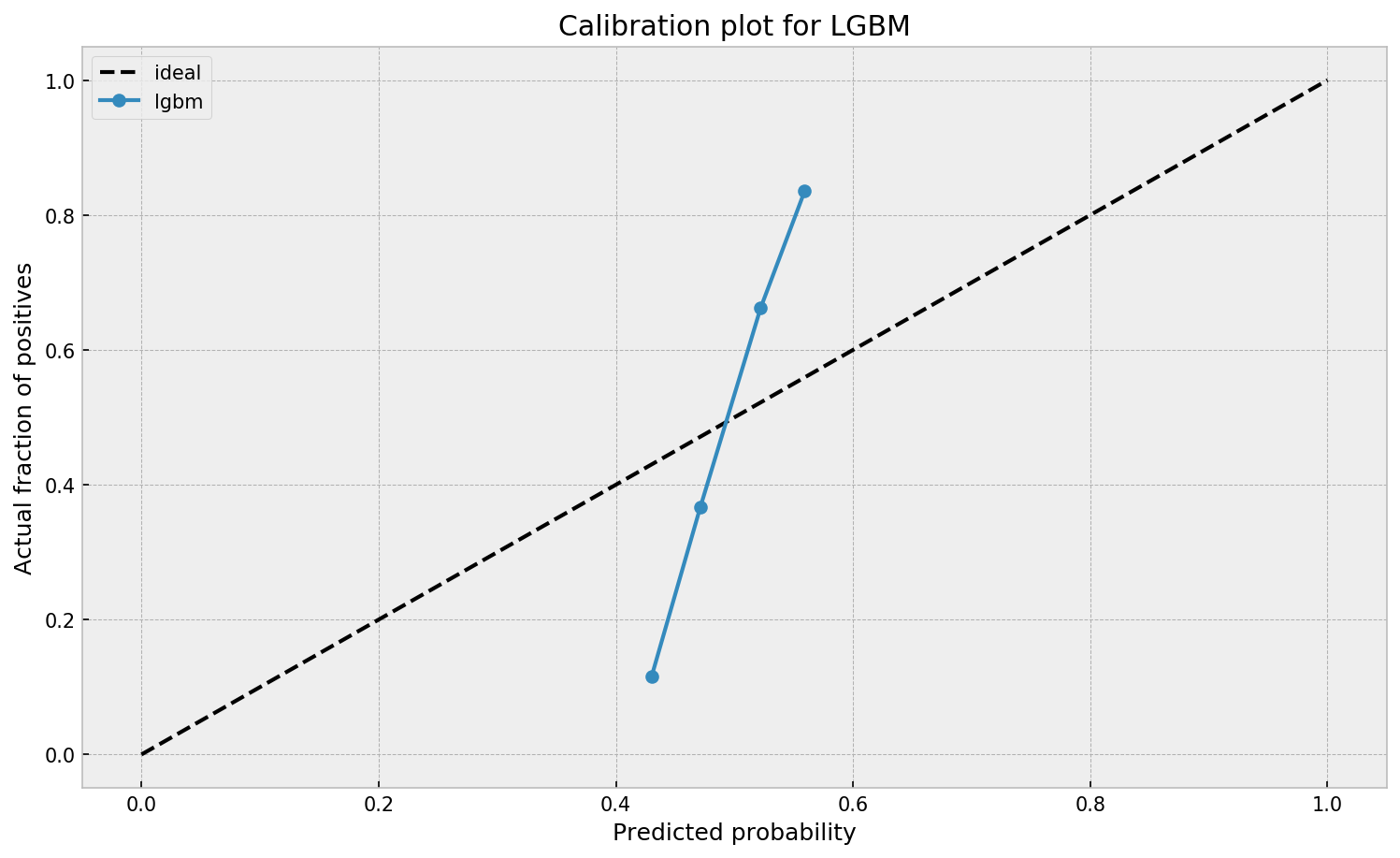
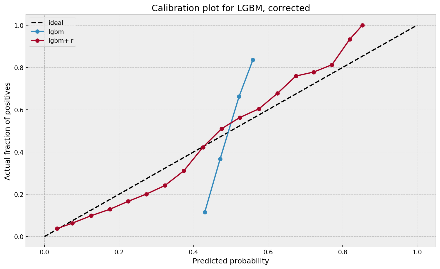
The original and simulated datasets are compared in a couple of ways 1) observing the distributions of the variables 2) comparing the output from various models and 3) comparing conditional probability queries. The third test is more of a sanity check. If the data is generated from the original Bayes net then a new one fit on the simulated data should be approximately the same. The more rows we generate the closer the parameters will be to the original values.

The original data alongside the generated data in Daniel’s example

As you can see, a Bayesian network allows you to generate data that looks, feels, and behaves a lot like the data on which you based your network on in the first place.

This can be super useful if you want to generate a synthetic / fake / artificial dataset without sharing personal or sensitive data.

Moreover, the underlying Bayesian net can be very useful to compute missing values. In Daniel’s example, he left out some values on purpose (pretending they were missing) and imputed them with the Bayes net. He found that the imputed values for the missing data points were quite close to the original ones:

For two variables, the original values plotted against the imputed replacements.

In the original blog, Daniel goes on to show how to further check the integrity of the simulated data using statistical models and shares all his code so you can try this out yourself. Please do give his website a visit as Daniel has many more interesting statistics blogs!

Learn Julia for Data Science

Learn Julia for Data Science

Most data scientists favor Python as a programming language these days. However, there’s also still a large group of data scientists coming from a statistics, econometrics, or social science and therefore favoring R, the programming language they learned in university. Now there’s a new kid on the block: Julia.

Image result for julia programming"
Via Medium

Advantages & Disadvantages

According to some, you can think of Julia as a mixture of R and Python, but faster. As a programming language for data science, Julia has some major advantages:

  1. Julia is light-weight and efficient and will run on the tiniest of computers
  2. Julia is just-in-time (JIT) compiled, and can approach or match the speed of C
  3. Julia is a functional language at its core
  4. Julia support metaprogramming: Julia programs can generate other Julia programs
  5. Julia has a math-friendly syntax
  6. Julia has refined parallelization compared to other data science languages
  7. Julia can call C, Fortran, Python or R packages

However, others also argue that Julia comes with some disadvantages for data science, like data frame printing, 1-indexing, and its external package management.

Comparing Julia to Python and R

Open Risk Manual published this side-by-side review of the main open source Data Science languages: Julia, Python, R.

You can click the links below to jump directly to the section you’re interested in. Once there, you can compare the packages and functions that allow you to perform Data Science tasks in the three languages.

GeneralDevelopmentAlgorithms & Datascience
History and CommunityDevelopment EnvironmentGeneral Purpose Mathematical Libraries
Devices and Operating SystemsFiles, Databases and Data ManipulationCore Statistics Libraries
Package ManagementWeb, Desktop and Mobile DeploymentEconometrics / Timeseries Libraries
Package DocumentationSemantic Web / Semantic DataMachine Learning Libraries
Language CharacteristicsHigh Performance ComputingGeoSpatial Libraries
Using R, Python and Julia togetherVisualization
Via openriskmanual.org/wiki/Overview_of_the_Julia-Python-R_Universe

Starting with Julia for Data Science

Here’s a very well written Medium article that guides you through installing Julia and starting with some simple Data Science tasks. At least, Julia’s plots look like:

Via Medium
Bayes theorem, and making probability intuitive – by 3Blue1Brown

Bayes theorem, and making probability intuitive – by 3Blue1Brown

This video I’ve been meaning to watch for a while now. It another great visual explanation of a statistics topic by the 3Blue1Brown Youtube channel (which I’ve covered before, multiple times).

This time, it’s all about Bayes theorem, and I just love how Grant Sanderson explains the concept so visually. He argues that rather then memorizing the theorem, we’d rather learn how to draw out the context. Have a look at the video, or read my summary below:

Grant Sanderson explains the concept very visually following an example outlined in Daniel Kahneman’s and Amos Tversky’s book Thinking Fast, Thinking Slow:

Steve is very shy and withdrawn, invariably helpful but with very little interest in people or in the world of reality. A meek and tidy soul, he has a need for order and structure, and a passion for detail.”

Is Steve more likely to be a librarian or a farmer?

Question from Thinking Fast, Thinking Slow

What was your first guess?

Kahneman and Tversky argue that people take into account Steve’s disposition and therefore lean towards librarians.

However, few people take into account that librarians are quite scarce in our society, which is rich with farmers. For every librarian, there are 20+ farmers. Hence, despite the disposition, Steve is probably more like to be a farmer.

https://www.youtube.com/watch?v=HZGCoVF3YvM&feature=youtu.be

Rather than remembering the upper theorem, Grant argues that it’s often easier to just draw out the rectangle of probabilities below.

Try it out for yourself using another example by Kahneman and Tversky:

https://www.youtube.com/watch?v=HZGCoVF3YvM&feature=youtu.be
How Booking.com deals with Selection Bias

How Booking.com deals with Selection Bias

I came across this PyData 2018 talk by Lucas Bernadi of Booking.com where he talks about the importance of selection bias for practical applications of machine learning.

We can’t just throw data into machines and expect to see any meaning […], we need to think [about this]. I see a strong trend in the practitioners community to just automate everything, to just throw data into a black box and expect to get money out of it, and I really don’t believe in that.

Lucas Bernadi in https://www.youtube.com/watch?v=3ZWCKr0vDtc

All pictures below are slides from the above video.

My summary / interpretation

Lucas highlights an example he has been working on at Booking.com, where they seek to predict which searching activities on their website are for family trips.

What happens is that people forget to specify that they intend to travel as a family, forget to input one/two/three child travellers will come along on the trip, and end up not being able to book the accomodations that come up during their search. If Booking.com would know, in advance, that people (may) be searching for family accomodations, they can better guide these bookers to family arrangements.

The problem here is that many business processes in real life look and act like a funnel. Samples drop out of the process during the course of it. So too the user search activity on Booking.com’s website acts like a funnel.

  1. People come to search for arrangements
  2. Less people end up actually booking arrangements
  3. Even less people actually go on their trip
  4. And even less people then write up a review

However, only for those people that end up writing a review, Booking.com knows 100% certain that they it concerned a family trip, as that is the moment the user can specify so. Of all other people, who did not reach stage 4 of the funnel, Booking.com has no (or not as accurate an) idea whether they were looking for family trips.

Such a funnel thus inherently produces business data with selection bias in it. Only for people making it to the review stage we know whether they were family trips or not. And only those labeled data can be used to train our machine learning model.

And now for the issue: if you train and evaluate a machine learning model on data generated with such a selection bias, your observed performance metrics will not reflect the actual performance of your machine learning model!

Actually, they are pretty much overestimates.

This is very much an issue, even though many ML practitioners don’t see aware. Selection bias makes us blind as to the real performance of our machine learning models. It produces high variance in the region of our feature space where labels are missing. This leads us to being overconfident in our ability to predict whether some user is looking for a family trip. And if the mechanism causing the selection bias is still there, we could never find out that we are overconfident. Consistently estimating, say, 30% of people are looking for family trips, whereas only 25% are.

Fortunately, Lucas proposes a very simple solution! Just adding more observations can (partially) alleviate this detrimental effect of selection bias. Although our bias still remains, the variance goes down and the difference between our observed and actual performance decreases.

A second issue and solution to selection bias relates to propensity (see also): the extent to which your features X influence not only the outcome Y, but also the selection criteria s.

If our features X influence both the outcome Y but also the selection criteria s, selection bias will occur in your data and can thus screw up your conclusion. In order to inspect to what extent this occurs in your setting, you will want to estimate a propensity model. If that model is good, and X appears valuable in predicting s, you have a selection bias problem.

Via a propensity model s ~ X, we quantify to what extent selection bias influences our data and model. The nice thing is that we, as data scientists, control the features X we use to train a model. Hence, we could just use only features X that do not predict s to predict Y. Conclusion: we can conduct propensity-based feature selection in our Y ~ X by simply avoiding features X that predicted s!

Still, Lucas does point that this becomes difficult when you have valuable features that predict both s and Y. Hence, propensity-based feature selection may end up cost(ing) you performance, as you will need to remove features relevant to Y.

I am sure I explained this phenomena worse than Lucas did himself, so please do have a look at the original PyData 2018 Amsterdam video!

Visualizing Sampling Distributions in ggplot2: Adding area under the curve

Visualizing Sampling Distributions in ggplot2: Adding area under the curve

Thank you ggplot2tutor for solving one of my struggles. Apparently this is all it takes:

ggplot(NULL, aes(x = c(-3, 3))) +
  stat_function(fun = dnorm, geom = "line")

I can’t begin to count how often I have wanted to visualize a (normal) distribution in a plot. For instance to show how my sample differs from expectations, or to highlight the skewness of the scores on a particular variable. I wish I’d known earlier that I could just add one simple geom to my ggplot!

Want a different mean and standard deviation, just add a list to the args argument:

ggplot(NULL, aes(x = c(0, 20))) +
  stat_function(fun = dnorm,
                geom = "area",
                args = list(
                  mean = 10,
                  sd = 3
                ))

Need a different distribution? Just pass a different distribution function to stat_function. For instance, an F-distribution, with the df function:

ggplot(NULL, aes(x = c(0, 5))) +
  stat_function(fun = df,
                geom = "area",
                args = list(
                  df1 = 2,
                  df2 = 10
                ))

You can make it is complex as you want. The original ggplot2tutor blog provides this example:

ggplot(NULL, aes(x = c(-3, 5))) +
  stat_function(
    fun = dnorm,
    geom = "area",
    fill = "steelblue",
    alpha = .3
  ) +
  stat_function(
    fun = dnorm,
    geom = "area",
    fill = "steelblue",
    xlim = c(qnorm(.95), 4)
  ) +
  stat_function(
    fun = dnorm,
    geom = "line",
    linetype = 2,
    fill = "steelblue",
    alpha = .5,
    args = list(
      mean = 2
    )
  ) +
  labs(
    title = "Type I Error",
    x = "z-score",
    y = "Density"
  ) +
  scale_x_continuous(limits = c(-3, 5))

Have a look at the original blog here: https://ggplot2tutor.com/sampling_distribution/sampling_distribution/

Calibrating algorithmic predictions with logistic regression

Calibrating algorithmic predictions with logistic regression

I found this interesting blog by Guilherme Duarte Marmerola where he shows how the predictions of algorithmic models (such as gradient boosted machines, or random forests) can be calibrated by stacking a logistic regression model on top of it: by using the predicted leaves of the algorithmic model as features / inputs in a subsequent logistic model.

When working with ML models such as GBMs, RFs, SVMs or kNNs (any one that is not a logistic regression) we can observe a pattern that is intriguing: the probabilities that the model outputs do not correspond to the real fraction of positives we see in real life.

Guilherme’s in his blog post

This is visible in the predictions of the light gradient boosted machine (LGBM) Guilherme trained: its predictions range only between ~ 0.45 and ~ 0.55. In contrast, the actual fraction of positive observations in those groups is much lower or higher (ranging from ~ 0.10 to ~0.85).

Motivated by sklearn’s topic Probability Calibration and the paper Practical Lessons from Predicting Clicks on Ads at Facebook, Guilherme continues to show how the output probabilities of a tree-based model can be calibrated, while simultenously improving its accuracy.

I highly recommend you look at Guilherme’s code to see for yourself what’s happening behind the scenes, but basically it’s this:

  • Train an algorithmic model (e.g., GBM) using your regular features (data)
  • Retrieve the probabilities GBM predicts
  • Retrieve the leaves (end-nodes) in which the GBM sorts the observations
  • Turn the array of leaves into a matrix of (one-hot-encoded) features, showing for each observation which leave it ended up in (1) and which not (many 0’s)
  • Basically, until now, you have used the GBM to reduce the original features to a new, one-hot-encoded matrix of binary features
  • Now you can use that matrix of new features as input for a logistic regression model predicting your target (Y) variable
  • Apparently, those logistic regression predictions will show a greater spread of probabilities with the same or better accuracy

Here’s a visual depiction from Guilherme’s blog, with the original GBM predictions on the X-axis, and the new logistic predictions on the Y-axis.

As you can see, you retain roughly the same ordering, but the logistic regression probabilities spread is much larger.

Now according to Guilherme and the Facebook paper he refers to, the accuracy of the logistic predictions should not be less than those of the original algorithmic method.

Much better. The calibration plot of lgbm+lr is much closer to the ideal. Now, when the model tells us that the probability of success is 60%, we can actually be much more confident that this is the true fraction of success! Let us now try this with the ET model.

Guilherme in https://gdmarmerola.github.io/probability-calibration/

In his blog, Guilherme shows the same process visually for an Extremely Randomized Trees model, so I highly recommend you read the original article. Also, you can find the complete code on his GitHub.