Category: visualization

Geographical maps using Shazam Recognitions

Geographical maps using Shazam Recognitions

Shazam is a mobile app that can be asked to identify a song by making it “listen”’ to a piece of music. Due to its immense popularity, the organization’s name quickly turned into a verb used in regular conversation (“Do you know this song? Let’s Shazam it.“). A successful identification is referred to as a Shazam recognition.

Shazam users can opt-in to anonymously share their location data with Shazam. Umar Hansa used to work for Shazam and decided to plot the geospatial data of 1 billion Shazam recognitions, during one of the company’s “hackdays“. The following wonderful city, country, and world maps are the result.

All visualisations (source) follow the same principle: Dots, representing successful Shazam recognitions, are plotted onto a blank geographical coordinate system. Can you guess the cities represented by these dots?

These first maps have an additional colour coding for operating systems. Can you guess which is which?

Blue dots represent iOS (Apple iPhones) and seem to cluster in the downtown area’s whereas red Android phones dominate the zones further from the city centres. Did you notice something else? Recall that Umar used a blank canvas, not a map from Google. Nevertheless, in all visualizations the road network is clearly visible. Umar guesses that passengers (hopefully not the drivers) often Shazam music playing in the car.

Try to guess the Canadian and American cities below and compare their layout to the two European cities that follow.

The maps were respectively of Toronto, San Fransisco, London, and Paris. It is just amazing how accurate they resemble the actual world. You have got to love the clear Atlantic borders of Europe in the world map below. 

Are iPhones less common (among Shazam users) in Southern and Eastern Europe? In contrast, England and the big Japanese and Russian cities jump right out as iPhone hubs. In order to allow users to explore the data in more detail, Umar created an interactive tool comparing his maps to Google’s maps. A publicly available version you can access here (note that you can zoom in).
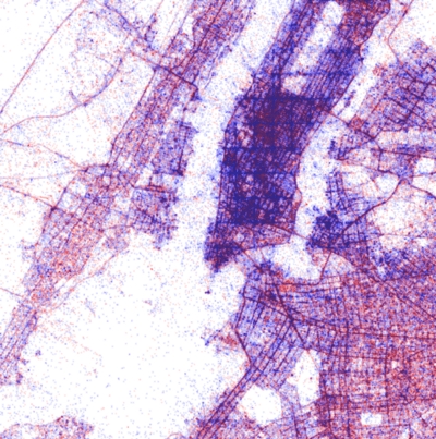
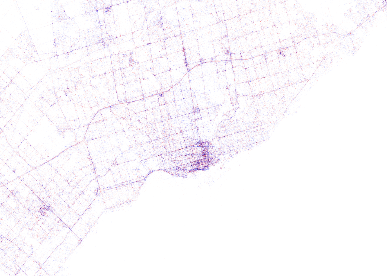
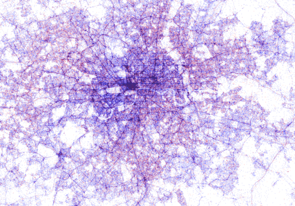
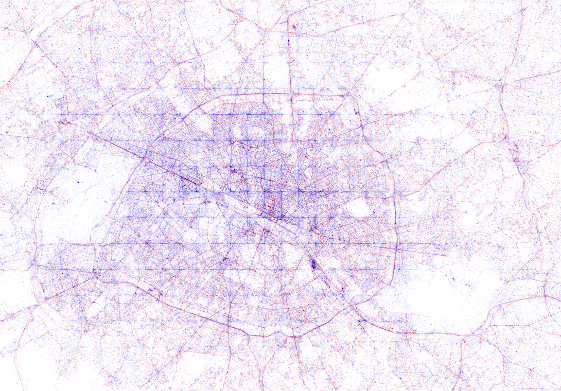
This required quite complex code, the details of which are in his blog. For now, here is another, beautiful map of England, with (the density of) Shazam recognitions reflected by color intensity on a dark background.

London is so crowded! New York also looks very cool. Central Park, the rivers and the bay are so clearly visible, whereas Governors Island is completely lost on this map.

If you liked this blog, please read Umar’s own blog post on this project for more background information, pieces of the JavaScript code, and the original images. If you which to follow his work, you can find him on Twitter.


EDIT — Here and here you find an alternative way of visualizing geographical maps using population data as input for line maps in the R-package ggjoy.


img
HD version of this world map can be found on http://spatial.ly/


Fredericton Property Values
Spot the river flowing through this city


Digitizing the Tour de France 2017 – II

A few weeks back, I gave some examples of how data, predictive analytics, and visualization are changing the Tour de France experience. Today, I came across another wonderful example visualizing the sequences of geospatial data (i.e., the movement) of the cyclists during the 11th stage of the Tour de France  (blue dots). Moreover, the locations of the four choppers capturing the live video feed are tracked in yellow.

This short clip again reflects the enormous amounts of rich data currently being collected in this sports event.

Text Mining: Shirin’s Twitter Feed

Text mining and analytics, natural language processing, and topic modelling have definitely become sort of an obsession of mine. I am just amazed by the insights one can retrieve from textual information, and with the ever increasing amounts of unstructured data on the internet, recreational analysts are coming up with the most amazing text mining projects these days.

Only last week, I came across posts talking about how the text in the Game of Thrones books to demonstrate a gender bias, how someone created an entire book with weirdly-satisfying computer-generated poems, and how to conduct a rather impressive analysis of your Twitter following. The latter, I copied below, with all props obviously for Shirin – the author.

For those of you who want to learn more about text mining and, specifically, how to start mining in R with tidytext, an new text-mining complement to the tidyverse, I can strongly recommend the new book by Julia Silge and David Robinson. This book has helped me greatly in learning the basics and you can definitely expect some blogs on my personal text mining projects soon.

===== COPIED FROM SHIRIN’S PLAYGROUND =====

Lately, I have been more and more taken with tidy principles of data analysis. They are elegant and make analyses clearer and easier to comprehend. Following the tidyverse and ggraph, I have been quite intrigued by applying tidy principles to text analysis with Julia Silge and David Robinson’s tidytext.

In this post, I will explore tidytext with an analysis of my Twitter followers’ descriptions to try and learn more about the people who are interested in my tweets, which are mainly about Data Science and Machine Learning.

Resources I found useful for this analysis were http://www.rdatamining.com/docs/twitter-analysis-with-r and http://tidytextmining.com/tidytext.html

Retrieving Twitter data

I am using twitteR to retrieve data from Twitter (I have also tried rtweet but for some reason, my API key, secret and token (that worked with twitteR) resulted in a “failed to authorize” error with rtweet’s functions).

library(twitteR)

Once we have set up our Twitter REST API, we get the necessary information to authenticate our access.

consumerKey = "INSERT KEY HERE"
consumerSecret = "INSERT SECRET KEY HERE"
accessToken = "INSERT TOKEN HERE"
accessSecret = "INSERT SECRET TOKEN HERE"
options(httr_oauth_cache = TRUE)

setup_twitter_oauth(consumer_key = consumerKey, 
                    consumer_secret = consumerSecret, 
                    access_token = accessToken, 
                    access_secret = accessSecret)

Now, we can access information from Twitter, like timeline tweets, user timelines, mentions, tweets & retweets, followers, etc.

All the following datasets were retrieved on June 7th 2017, converted to a data frame for tidy analysis and saved for later use:

  • the last 3200 tweets on my timeline
my_name <- userTimeline("ShirinGlander", n = 3200, includeRts=TRUE)
my_name_df <- twListToDF(my_name)
save(my_name_df, file = "my_name.RData")
  • my last 3200 mentions and retweets
my_mentions <- mentions(n = 3200)
my_mentions_df <- twListToDF(my_mentions)
save(my_mentions_df, file = "my_mentions.RData")

my_retweets <- retweetsOfMe(n = 3200)
my_retweets_df <- twListToDF(my_retweets)
save(my_retweets_df, file = "my_retweets.RData")
  • the last 3200 tweets to me
tweetstome <- searchTwitter("@ShirinGlander", n = 3200)
tweetstome_df <- twListToDF(tweetstome)
save(tweetstome_df, file = "tweetstome.RData")
  • my friends and followers
user <- getUser("ShirinGlander")

friends <- user$getFriends() # who I follow
friends_df <- twListToDF(friends)
save(friends_df, file = "my_friends.RData")

followers <- user$getFollowers() # my followers
followers_df <- twListToDF(followers)
save(followers_df, file = "my_followers.RData")

Analyzing friends and followers

In this post, I will have a look at my friends and followers.

load("my_friends.RData")
load("my_followers.RData")

I am going to use packages from the tidyverse (tidyquant for plotting).

library(tidyverse)
library(tidyquant)
  • Number of friends (who I follow on Twitter): 225
  • Number of followers (who follows me on Twitter): 324
  • Number of friends who are also followers: 97

What languages do my followers speak?

One of the columns describing my followers is which language they have set for their Twitter account. Not surprisingly, English is by far the most predominant language of my followers, followed by German, Spanish and French.

followers_df %>%
  count(lang) %>%
  droplevels() %>%
  ggplot(aes(x = reorder(lang, desc(n)), y = n)) +
    geom_bar(stat = "identity", color = palette_light()[1], fill = palette_light()[1], alpha = 0.8) +
    theme_tq() +
    theme(axis.text.x = element_text(angle = 45, vjust = 1, hjust = 1)) +
    labs(x = "language ISO 639-1 code",
         y = "number of followers")

Who are my most “influential” followers (i.e. followers with the biggest network)?

I also have information about the number of followers that each of my followers have (2nd degree followers). Most of my followers are followed by up to ~ 1000 people, while only a few have a very large network.

followers_df %>%
  ggplot(aes(x = log2(followersCount))) +
    geom_density(color = palette_light()[1], fill = palette_light()[1], alpha = 0.8) +
    theme_tq() +
    labs(x = "log2 of number of followers",
         y = "density")

How active are my followers (i.e. how often do they tweet)

The followers data frame also tells me how many statuses (i.e. tweets) each of followers have. To make the numbers comparable, I am normalizing them by the number of days that they have had their accounts to calculate the average number of tweets per day.

followers_df %>%
  mutate(date = as.Date(created, format = "%Y-%m-%d"),
         today = as.Date("2017-06-07", format = "%Y-%m-%d"),
         days = as.numeric(today - date),
         statusesCount_pDay = statusesCount / days) %>%
  ggplot(aes(x = log2(statusesCount_pDay))) +
    geom_density(color = palette_light()[1], fill = palette_light()[1], alpha = 0.8) +
    theme_tq()

Who are my followers with the biggest network and who tweet the most?

followers_df %>%
  mutate(date = as.Date(created, format = "%Y-%m-%d"),
         today = as.Date("2017-06-07", format = "%Y-%m-%d"),
         days = as.numeric(today - date),
         statusesCount_pDay = statusesCount / days) %>%
  select(screenName, followersCount, statusesCount_pDay) %>%
  arrange(desc(followersCount)) %>%
  top_n(10)
##         screenName followersCount statusesCount_pDay
## 1        dr_morton         150937           71.35193
## 2    Scientists4EU          66117           17.64389
## 3       dr_morton_          63467           46.57763
## 4   NewScienceWrld          60092           54.65874
## 5     RubenRabines          42286           25.99592
## 6  machinelearnbot          27427          204.67061
## 7  BecomingDataSci          16807           25.24069
## 8       joelgombin           6566           21.24094
## 9    renato_umeton           1998           19.58387
## 10 FranPatogenLoco            311           28.92593
followers_df %>%
  mutate(date = as.Date(created, format = "%Y-%m-%d"),
         today = as.Date("2017-06-07", format = "%Y-%m-%d"),
         days = as.numeric(today - date),
         statusesCount_pDay = statusesCount / days) %>%
  select(screenName, followersCount, statusesCount_pDay) %>%
  arrange(desc(statusesCount_pDay)) %>%
  top_n(10)
##         screenName followersCount statusesCount_pDay
## 1  machinelearnbot          27427          204.67061
## 2        dr_morton         150937           71.35193
## 3   NewScienceWrld          60092           54.65874
## 4       dr_morton_          63467           46.57763
## 5  FranPatogenLoco            311           28.92593
## 6     RubenRabines          42286           25.99592
## 7  BecomingDataSci          16807           25.24069
## 8       joelgombin           6566           21.24094
## 9    renato_umeton           1998           19.58387
## 10   Scientists4EU          66117           17.64389

Is there a correlation between number of followers and number of tweets?

Indeed, there seems to be a correlation that users with many followers also tend to tweet more often.

followers_df %>%
  mutate(date = as.Date(created, format = "%Y-%m-%d"),
         today = as.Date("2017-06-07", format = "%Y-%m-%d"),
         days = as.numeric(today - date),
         statusesCount_pDay = statusesCount / days) %>%
  ggplot(aes(x = followersCount, y = statusesCount_pDay, color = days)) +
    geom_smooth(method = "lm") +
    geom_point() +
    scale_color_continuous(low = palette_light()[1], high = palette_light()[2]) +
    theme_tq()

Tidy text analysis

Next, I want to know more about my followers by analyzing their Twitter descriptions with the tidytext package.

library(tidytext)
library(SnowballC)

To prepare the data, I am going to unnest the words (or tokens) in the user descriptions, convert them to the word stem, remove stop words and urls.

data(stop_words)

tidy_descr <- followers_df %>%
  unnest_tokens(word, description) %>%
  mutate(word_stem = wordStem(word)) %>%
  anti_join(stop_words, by = "word") %>%
  filter(!grepl("\\.|http", word))

What are the most commonly used words in my followers’ descriptions?

The first question I want to ask is what words are most common in my followers’ descriptions.

Not surprisingly, the most common word is “data”. I do tweet mostly about data related topics, so it makes sense that my followers are mostly likeminded. The rest is also related to data science, machine learning and R.

tidy_descr %>%
  count(word_stem, sort = TRUE) %>%
  filter(n > 20) %>%
  ggplot(aes(x = reorder(word_stem, n), y = n)) +
    geom_col(color = palette_light()[1], fill = palette_light()[1], alpha = 0.8) +
    coord_flip() +
    theme_tq() +
    labs(x = "",
         y = "count of word stem in all followers' descriptions")

This, we can also show with a word cloud.

library(wordcloud)
library(tm)
tidy_descr %>%
  count(word_stem) %>%
  mutate(word_stem = removeNumbers(word_stem)) %>%
  with(wordcloud(word_stem, n, max.words = 100, colors = palette_light()))

Instead of looking for the most common words, we can also look for the most common ngrams: here, for the most common word pairs (bigrams) in my followers’ descriptions.

tidy_descr_ngrams <- followers_df %>%
  unnest_tokens(bigram, description, token = "ngrams", n = 2) %>%
  filter(!grepl("\\.|http", bigram)) %>%
  separate(bigram, c("word1", "word2"), sep = " ") %>%
  filter(!word1 %in% stop_words$word) %>%
  filter(!word2 %in% stop_words$word)

bigram_counts <- tidy_descr_ngrams %>%
  count(word1, word2, sort = TRUE)
bigram_counts %>%
  filter(n > 10) %>%
  ggplot(aes(x = reorder(word1, -n), y = reorder(word2, -n), fill = n)) +
    geom_tile(alpha = 0.8, color = "white") +
    scale_fill_gradientn(colours = c(palette_light()[[1]], palette_light()[[2]])) +
    coord_flip() +
    theme_tq() +
    theme(legend.position = "right") +
    theme(axis.text.x = element_text(angle = 45, vjust = 1, hjust = 1)) +
    labs(x = "first word in pair",
         y = "second word in pair")

These, we can also show as a graph:

library(igraph)
library(ggraph)
bigram_graph <- bigram_counts %>%
  filter(n > 5) %>%
  graph_from_data_frame()

set.seed(1)

a <- grid::arrow(type = "closed", length = unit(.15, "inches"))
ggraph(bigram_graph, layout = "fr") +
  geom_edge_link(aes(edge_alpha = n), show.legend = FALSE,
                 arrow = a, end_cap = circle(.07, 'inches')) +
  geom_node_point(color =  palette_light()[1], size = 5, alpha = 0.8) +
  geom_node_text(aes(label = name), vjust = 1, hjust = 0.5) +
  theme_void()

We can also use bigram analysis to identify negated meanings (this will become relevant for sentiment analysis later). So, let’s look at which words are preceded by “not” or “no”.

bigrams_separated <- followers_df %>%
  unnest_tokens(bigram, description, token = "ngrams", n = 2) %>%
  filter(!grepl("\\.|http", bigram)) %>%
  separate(bigram, c("word1", "word2"), sep = " ") %>%
  filter(word1 == "not" | word1 == "no") %>%
  filter(!word2 %in% stop_words$word)

not_words <- bigrams_separated %>%
  filter(word1 == "not") %>%
  inner_join(get_sentiments("afinn"), by = c(word2 = "word")) %>%
  count(word2, score, sort = TRUE) %>%
  ungroup()
not_words %>%
  mutate(contribution = n * score) %>%
  arrange(desc(abs(contribution))) %>%
  head(20) %>%
  mutate(word2 = reorder(word2, contribution)) %>%
  ggplot(aes(word2, n * score, fill = n * score > 0)) +
    geom_col(show.legend = FALSE) +
    scale_fill_manual(values = palette_light()) +
    labs(x = "",
         y = "Sentiment score * number of occurrences",
         title = "Words preceded by \"not\"") +
    coord_flip() +
    theme_tq()

What’s the predominant sentiment in my followers’ descriptions?

For sentiment analysis, I will exclude the words with a negated meaning from nrc and switch their positive and negative meanings from bing (although in this case, there was only one negated word, “endorsement”, so it won’t make a real difference).

tidy_descr_sentiment <- tidy_descr %>%
  left_join(select(bigrams_separated, word1, word2), by = c("word" = "word2")) %>%
  inner_join(get_sentiments("nrc"), by = "word") %>%
  inner_join(get_sentiments("bing"), by = "word") %>%
  rename(nrc = sentiment.x, bing = sentiment.y) %>%
  mutate(nrc = ifelse(!is.na(word1), NA, nrc),
         bing = ifelse(!is.na(word1) & bing == "positive", "negative", 
                       ifelse(!is.na(word1) & bing == "negative", "positive", bing)))
tidy_descr_sentiment %>%
  filter(nrc != "positive") %>%
  filter(nrc != "negative") %>%
  gather(x, y, nrc, bing) %>%
  count(x, y, sort = TRUE) %>%
  filter(n > 10) %>%
  ggplot(aes(x = reorder(y, n), y = n)) +
    facet_wrap(~ x, scales = "free") +
    geom_col(color = palette_light()[1], fill = palette_light()[1], alpha = 0.8) +
    coord_flip() +
    theme_tq() +
    labs(x = "",
         y = "count of sentiment in followers' descriptions")

Are followers’ descriptions mostly positive or negative?

The majority of my followers have predominantly positive descriptions.

tidy_descr_sentiment %>%
  count(screenName, word, bing) %>%
  group_by(screenName, bing) %>%
  summarise(sum = sum(n)) %>%
  spread(bing, sum, fill = 0) %>%
  mutate(sentiment = positive - negative) %>%
  ggplot(aes(x = sentiment)) +
    geom_density(color = palette_light()[1], fill = palette_light()[1], alpha = 0.8) +
    theme_tq()

What are the most common positive and negative words in followers’ descriptions?

library(reshape2)
tidy_descr_sentiment %>%
  count(word, bing, sort = TRUE) %>%
  acast(word ~ bing, value.var = "n", fill = 0) %>%
  comparison.cloud(colors = palette_light()[1:2],
                   max.words = 100)

Topic modeling: are there groups of followers with specific interests?

Topic modeling can be used to categorize words into groups. Here, we can use it to see whether (some) of my followers can be grouped into subgroups according to their descriptions.

library(topicmodels)
dtm_words_count <- tidy_descr %>%
  mutate(word_stem = removeNumbers(word_stem)) %>%
  count(screenName, word_stem, sort = TRUE) %>%
  ungroup() %>%
  filter(word_stem != "") %>%
  cast_dtm(screenName, word_stem, n)

# set a seed so that the output of the model is predictable
dtm_lda <- LDA(dtm_words_count, k = 5, control = list(seed = 1234))

topics_beta <- tidy(dtm_lda, matrix = "beta")
p1 <- topics_beta %>%
  filter(grepl("[a-z]+", term)) %>% # some words are Chinese, etc. I don't want these because ggplot doesn't plot them correctly
  group_by(topic) %>%
  top_n(10, beta) %>%
  ungroup() %>%
  arrange(topic, -beta) %>%
  mutate(term = reorder(term, beta)) %>%
  ggplot(aes(term, beta, color = factor(topic), fill = factor(topic))) +
    geom_col(show.legend = FALSE, alpha = 0.8) +
    scale_color_manual(values = palette_light()) +
    scale_fill_manual(values = palette_light()) +
    facet_wrap(~ topic, ncol = 5) +
    coord_flip() +
    theme_tq() +
    labs(x = "",
         y = "beta (~ occurrence in topics 1-5)",
         title = "The top 10 most characteristic words describe topic categories.")
user_topic <- tidy(dtm_lda, matrix = "gamma") %>%
  arrange(desc(gamma)) %>%
  group_by(document) %>%
  top_n(1, gamma)
p2 <- user_topic %>%
  group_by(topic) %>%
  top_n(10, gamma) %>%
  ggplot(aes(x = reorder(document, -gamma), y = gamma, color = factor(topic))) +
    facet_wrap(~ topic, scales = "free", ncol = 5) +
    geom_point(show.legend = FALSE, size = 4, alpha = 0.8) +
    scale_color_manual(values = palette_light()) +
    scale_fill_manual(values = palette_light()) +
    theme_tq() +
    coord_flip() +
    labs(x = "",
         y = "gamma\n(~ affiliation with topics 1-5)")
library(grid)
library(gridExtra)
grid.arrange(p1, p2, ncol = 1, heights = c(0.7, 0.3))

The upper of the two plots above show the words that were most strongly grouped to five topics. The lower plots show my followers with the strongest affiliation with these five topics.

Because in my tweets I only cover a relatively narrow range of topics (i.e. related to data), my followers are not very diverse in terms of their descriptions and the five topics are not very distinct.

If you find yourself in any of the topics, let me know if you agree with the topic that was modeled for you!

For more text analysis, see my post about text mining and sentiment analysis of a Stuff You Should Know Podcast.

Google Facets: Interactive Visualization for Everybody

Google Facets: Interactive Visualization for Everybody

Last week, Google released Facets, their new, open source visualization tool. Facets consists of two interfaces that allow users to investigate their data at different levels.

Facets Overview provides users with a quick understanding of the distribution of values across the variables in their dataset. Overview is especially helpful in detecting unexpected values, missing values, unbalanced distributions, and skewed distributions. Overview will detect all kinds of statistics for every column (i.e., variable) in your dataset, along with some simple vizualizations, such as histograms.

Overview
Example of Facets Overview tool

Dive is the name of the second interface of Facets. It provides an intuitive dashboard in which users can explore relationships between data points across the different variables in their dataset. The dashboard is easy to customize and users can control the position, color, and visual representation of each data point based on the underlying values.

Dive
Example of Facets Dive tool

Moreover, if the data points have images associated with them, these images can be used as the visual representations of the data points. The latter is especially helpful when Facets is used for its actual purpose: aiding in machine learning processes. The below GIF demonstrates how Facets Dive spots incorrectly labelled images with ease, allowing users to zoom in on a case-by-case level, for instance, to identify a frog that has been erroneously labelled as a cat.

Exploration of the CIFAR-10 dataset using Facets Dive

To use a demo version of the tools with your own data, visit the Facets website. For more details, visit the Facets website or Google’s Research blog on Facets.

‘Wie is de Mol?’ volgens Twitter – Deel 2 (s17e2)

Dit is een repost van mijn Linked-In artikel van 17 januari 2017.
Helaas heb ik er door gebrek aan tijd geen vervolg meer aan gegeven.
De twitter data ben ik wel blijven scrapen, dus wie weet komt het nog…

TL;DR // Samenvatting

Vorige week postte ik een eerste blog (Nederlands & Engels) waarin ik Twitter gebruik om te analyseren in hoeverre Wie is de Mol-kandidaten worden verdacht. De resultaten toonden dat Twitterend Nederland toen vooral Jeroen verdacht vond en dit kwam opvallend overeen met de populaire online polls. Na de tweede aflevering heeft Twitter echter een andere hoofdverdachte aangewezen, namelijk Diederik. Verder heb ik deze week, op aanraden van diverse lezers, iets dieper gegraven in de inhoud van de tweets. Ik hoop dat deze nieuwe analyses jou helpen #tunnelvisie te voorkomen.

Door de positieve respons op de vorige blog (Nederlands / Engels) heb ik besloten mijn WIDM project een vervolg te geven. Ondanks dat Twitter slechts toestaat om berichten tot en met 9 dagen terug te downloaden, had ik de eerdere berichten lokaal opgeslagen zodat ik nu de meest recente #WIDM tweets aan de eerdere dataset kan toevoegen. De complete dataset komt daarmee op 22,696 unieke (re)tweets! Dit zijn alle tweets gepost tussen 31 december 2016 en de avond van dinsdag 16 januari 2017. Ondanks mijn voornemen heb besloten om geen andere hashtags mee te nemen in de analyse, omdat de eerdere dataset die gegevens niet bevat en ik door de bovengenoemde download restrictie niet meer aan die gegevens kon komen. Wel heb ik de analyses uitgebreid op basis van de suggesties die jullie me hebben gegeven. Mocht jij als lezer dus nog tips, suggesties of opmerkingen hebben, schroom dan vooral niet om een berichtje te sturen of een reactie te plaatsen onder deze blog.

Aflevering 2: “Meegaand”

Er is deze week weer flink getweet over WIDM. Ondanks het klassieke laserschiet-element lag het volume deze tweede aflevering een stuk lager dan tijdens de seizoenspremière. Met ‘slechts’ 6,491 tweets afgelopen zaterdag werd er ongeveer 40% minder gepost dan vorige week. Ook het aantal berichten op de zondag na de aflevering was beduidend lager. Daarnaast bleek Twitterend Nederland doordeweeks met haar gedachten ergens anders te zitten.

Tijdens de uitzending van vorige week werden Jeroen, Diederik en Sanne (in die volgorde) het meeste genoemd. Het verloop van de tweede aflevering ziet er anders uit. Jeroen is verstoten uit de top 3 en Diederik heeft zijn plek overgenomen. Hij werd het meest genoemd tijdens de aflevering en heeft dit vooral te danken aan de slotfase van de uitzending, wellicht door zijn geloofwaardige verhaal over de schattige bevertjes (wat kan Diederik goed vertellen zeg). Desalniettemin wordt hij kort gevolgd door Roos en Sanne, wiens beider naam tijdens de uitzending ook meer dan 200 keer werd getwitterd.

Imanuelle werd deze week eindelijk opgemerkt als WIDM kandidaat, na anderhalve aflevering nauwelijks te zijn genoemd door twitterend Nederland. Opvallend is hoe zij na ongeveer 28 minuten in de aflevering opeens drastisch omhoog schiet. Iemand een idee wat daar gebeurde? Ook Sanne nam een sprintje ongeveer 20 minuten na de start. Zou dit tijdens die typmachineopdracht zijn? Of waren we toen al aan het laserschieten? Instegenstelling tot Imanuelle is en blijft kandidaat Thomas een muurbloempje. Hoewel Vincent vorige week tijdens de slotfase van de aflevering een enorme boost kreeg als afvaller is zulke belangstelling deze week in mindere mate zichtbaar voor afvaller Yvonne.

Alle tweets bij elkaar opgeteld heeft Diederik na aflevering twee het stokje overgenomen van eerdere koploper Jeroen. Zoals hieronder zichtbaar werd Diederik zijn naam in maar liefst 6.4% van alle tweets genoemd. Sanne en Roos hebben echter ook een goede aflevering gedraaid en staan nu op een gedeelde derde plaats qua vermeldingen.

Deze rangorde verschilt substantieel van de telling na aflevering 1. Onderstaande figuur geeft de relatieve stijging/daling in de belangstelling voor de verschillende kandidaten weer. Hierbij zijn de totale vermeldingen voor de start van aflevering 2 gedeeld door de vermeldingen sindsdien. Opvallend is dat hoogvlieger Jeroen relatief een stuk minder besproken is sinds afgelopen zaterdag, echter kon hij natuurlijk ook alleen maar verliezen met zijn vroege piek in de eerste aflevering. Imanuelle kwam, zoals eerder gezegd, van ver onderaan de rangorde en zag haar vermeldingen zodoende meer dan verdubbelen sinds afgelopen zaterdag. Roos stond vorige week al in de middenmoot maar is desondanks ook bijna dubbel zo vaak genoemd op Twitter sinds de start van de tweede aflevering. Persoonlijk vind ik het opvallend dat Sigrid haar naam niet vaker is gepost. Wie gaat er tijdens het laserschieten nou schuilen achter een gewoven ijzeren picknicktafel?! Zo raak je die 750 euro wel kwijt ja… Verder lijkt het spreekwoord ‘Uit het oog, uit het hart’ op te gaan als het op tweets aankomt want Vincent’s roem was van zeer korte duur.

Een suggestie heb gekregen sinds de vorige blog, is dat een telling van de daadwerkelijke verdenkingen informatiever zou zijn dan een telling van het aantal keer dat een kandidaat zijn of haar naam genoemd is. Hier ben ik mij volledig van bewust en in de vorige blog heb ik al kort uitgelegd waarom ik toentertijd besloten had dit niet te doen. Desalniettemin heb ik deze week gedetailleerder gekeken naar de daadwerkelijke inhoud van de tweets. Na beraad bij enkele mede-molloten heb ik ingezoomd op de woorden molverdenk* en verdacht*. Hierbij heb ik het systeem opgedragen dat moleen precieze match moest hebben, met uitzondering van een hashtag. Zo zijn bijvoorbeeld mollootmoltalk of #wieisdemol niet geteld, maar #mol wel. Bij zowel verdenk en verdacht heb ik toegestaan dat zij gevolgd mochten worden door willekeurige letters (*), zodat ook woorden zoals verdenkingen en verdachte zouden worden meegeteld. De uitkomst van de uiteindelijke telling is gepresenteerd in de figuur hieronder. Hierbij is de gehele dataset aan tweets gebruikt.

Hoewel deze manier van tellen uiteraard tot minder hoge totalen leidt, is de verdeling en rangorde onder de kandidaten verassend gelijk aan de eerder gepresenteerde grijze staafdiagram. Dit blijkt ook uit onderstaande scatterplot. De twee manieren van tellen hangen zeer sterk positief met elkaar samen en zodoende neig ik te concluderen dat de simpele telling van het aantal naamsvermeldingen op Twitter een goed beeld geeft van de onderliggende verdenkingen van twitterend Nederland. Echter is het goed mogelijk dat ik belangrijke woorden over het hoofd heb gezien, dus laat vooral in een reactie hieronder weten welke woorden ik in het vervolg wel/niet mee moet nemen. Ook hoor ik graag welke manier van tellen jullie graag hebben dat ik aanhoud. Daarnaast zal ik bij aanhoudende respons proberen een interactieve webapp maken zodat jullie zelf met de woorden en data kunnen spelen.

(Tip voor useRs: je kunt xlim beter gebruiken met coord_cartesian(), dan knipt hij de error band niet van je smoothing line af… daar kwam ik later pas achter)

Ook voor deze blog heb ik de vermeldingen van de kandidaten over de loop van de tijd uitgedraaid. Beiden afleveringen zijn goed zichtbaar in onderstaande grafiek op dagbasis. Op dagen zonder uitzendingen is het erg stil, met uitzondering van een aantal tweets op de zondag. De meest significante ontwikkeling deze week lijkt de eerder besproken stijging van Diederik, waarmee hij Jeroen inhaalt. Roos heeft een goede inhaalslag gemaakt ten opzichte van Sanne en zij lijken de derde plek nu te delen, zeker als je de beschuldigende woorden in d

Als we de stand na deze week vergelijken met de polls op de officiële WIDM website en de WIDM fanpagina, dan lijkt Twitter vooral Roos sterker te verdenken dan de respondenten van de polls dat doen. Daarnaast doen Sigrid en Jochem het vrij goed in de peilingen, terwijl zij door twitteraars over het hoofd worden gezien.

En zo zijn we aan het eind gekomen van deze blog over de tweede aflevering van Wie is de Mol 2017. Zoals je wellicht hebt gemerkt probeer ik bij het schrijven zo objectief mogelijk te blijven. Enerzijds omdat ik jaar op jaar verschrikkelijk slecht blijk in het ontmaskeren van de mol. Anderzijds omdat ik na de aflevering altijd al de helft van de gebeurtenissen al weer vergeten ben. Heb jij wel een oplettend oog, ben je bedreven in het geschreven woord en lijkt het je leuk om het bovenstaande in het vervolg van wat inhoud te voorzien neem dan vooral contact op. Verder kun je hieronder in de reacties natuurlijk ook al je verdenkingen, suggesties, opmerkingen of tips kwijt. Deel daarnaast de blog en haar plaatjes vooral met vrienden of op fora, je hoeft hiervoor geen toestemming te vragen.

Ik hoop dat jullie net zo genieten van dit nu al klassieke #WIDM seizoen als ik, en dat jullie na het lezen van deze blog wellicht iets dichter zijn gekomen bij het ontmaskeren van jullie mol. Groetjes, en hopelijk tot volgende week!

– Paul

Link naar deel 1 (NL)

Link naar deel 1 (ENG)

Link naar deel 3 (NL) … komt nog

Over de auteur: Paul van der Laken is promovendus aan het department Human Resource Studies van Tilburg University. In samenwerking met organisaties zoals Shell en Unilever onderzoekt Paul hoe statistische analyse kan worden ingezet binnen de P&O/HR-functie. Hij verdiept zich onder andere in hoe organisaties hun beleid omtrent het internationaal uitzenden van medewerkers meer data-gedreven, en dus effectiever, kunnen maken. Hiernaast geeft Paul cursussen en trainingen in HR data analyse aan Tilburg University, TIAS Business School en inhouse bij bedrijven.

‘Wie is the Mol?’ according to Twitter – Part 1 (s17e1)

This is a repost of my Linked-In article of January 10th 2017.
The Dutch version of this blog is posted here.

TL;DR // Summary

In order to analyze which of the contestants of a Dutch television game show was suspected of sabotage by public opinion, 10,000+ #WIDM tweets were downloaded and analyzed. Data analysis of this first episode demonstrates how certain contestants increasingly receive public attention whereas others are quickly abandoned. Hopefully, this wisdom-of-the-crowd approach will ultimately demonstrate who is most likely to be this years’ mole. (link to Dutch blog)

A sneak peak:

Introduction

Wie is de Mol?” [literal translation: ‘Who is the mole?’], or WIDM in short, is a popular Dutch TV game show that has been running for 17 years. The format consists of 10 famous Dutchies (e.g., actors, comedians, novelists) being sent abroad to complete a series of challenging tasks and puzzles, amassing collective prize money along the way.

However, among the contestants is a mole. This saboteur is carefully trained by the WIDM production team beforehand and his/her secret purpose is to prevent the group from collecting any money. Emphasis on secret, as the mole can only operate if unidentified by the other contestants. Furthermore, at the end of each episode, contestants have to complete a test on their knowledge of the identity of the mole. The one whose suspicions are the furthest off is eliminated and sent back to the cold and rainy Netherlands. This process is repeated every episode until in the final episode only three contestants remain: one mole, one losing finalist, and the winner of the series and thus the prize money.

WIDM has a large, active fanbase of so-called ‘molloten‘, which roughly translates to mole-fanatics. Part of its popularity can be attributed to viewers themselves being challenged to uncover the mole before the end of the series. Although the production team assures that most of the sabotage is not shown to the viewer at home, each episode is filled with visual, musical and textual hints. Frequently, viewers come up with wild theories and detect the most bizarre patterns. In recent years, some dedicated fans even go as far as analyzing the contestants’ personal social media feeds in order to determine who was sent home early. A community has developed with multiple online fora, frequent polling of public suspicions, and even a mobile application so you can compare suspicions and compete with friends. Because of all this public effort, the identity of the mole is frequently known before the actual end of the series.

So, why this blog? Well, first off, I have followed the series for several years myself and, to be honest, my suspicions are often quite far off. Secondly, past year, I played around with twitter data analysis and WIDM seemed like a nice opportunity to dust off that R script. Third, I hoped the LinkedIn community might enjoy a step-by-step example of twitter data analysis. The following is the first of, hopefully, a series of blogs in which I try to uncover the mole using the wisdom of the tweeting crowd. I hope you enjoy it as much as I do.

Analysis & Results

To not keep you waiting, let’s start with the analysis and the results right away.

Time of creation

First, let’s examine when the #WIDM tweets were posted. Episode 1 is clearly visible in the data with most of the traffic occurring in a short timeframe on Saturday evening. Note that unfortunately Twitter only allows data to be downloaded nine days back in time.

# inspect when tweets were posted
hist(tweets.df$created, breaks = 50,xlab = 'Day & Time', main = 'Tweets by date') # simple histogram
ggplot(tweets.df) + geom_histogram(aes(created),col = 'black', fill = 'grey') + 
  labs(x = 'Date & Time', y = 'Frequency', title = '#WIDM tweets over time') + 
  theme_bw()
ggsave('e1_tweetsovertime_histogram.png')

Hashtags

Next, it seemed wise to examine which other hashtags were being used so that future search queries on WIDM can be more comprehensive.

# hashtags frequency
hashtags <- table(tolower(unlist(str_extract_all(tweets.df$text,'#\\S+\\b'))))
head(sort(hashtags,T),20)

           #widm         #moltalk        #widmtips      #wieisdemol        #widm2017 
           10272             1722             1248              360               91 
#etherdiscipline             #app            #npo1             #mol          #widm17 
              56               55               50               47               45 
          #promo             #dtv         #vincent          #oregon           #zinin 
              30               27               27               24               23 
           #2017     #chriszegers        #portland     #tunnelvisie       #ellielust 
              21               20               20               19               18

png('e1_hashtags_wordcloud.png')
wordcloud(names(hashtags),freq = log(hashtags),rot.per = 0)
dev.off()

Because the hashtag I queried was obviously overwhelmingly used in the dataset, this wordcloud depicts hashtags’ by their logarithmic frequency.

Curiously, not all tweets had #widm included in their text. Potentially this is caused by regular expressions I used (more on those later) which may have filtered out hashtags such as #widm-poule whereas Twitter may return those when #WIDM is queried.

Contestant frequencies

Using for-loops and if-statements, described later in this blog, I retrieved the frequency with which contestants were mentioned in the tweets. I had the data in three different formats and the following consists of a series of visualizations of those data.

All tweets combined, contestant Jeroen Kijk in de Vegte (hurray for Dutch surnames) was mentioned most frequently. Vincent Vianen passes him only once retweets are excluded.

If we split the data based on the time of the post relative to the episode, it becomes clear that the majority of the tweets mentioning Vincent occured during the episode’s airtime.

This is likely due to one of two reasons. First of all, Vincent was eliminated in this first episode and the production team of WIDM has the tendency to fool the viewer and frame the contestant that is going to be eliminated as the mole. Often, the eliminated contestant received more airtime and all his/her suspicious behaviors and remarks are showed. Potentially, viewers have tweeted about Vincent throughout the episode because they suspected him. Secondly, Vincent was eliminated at the end of this current episode. This may have roused some positive/negative tweets on his behalf. These would likely not be suspicions by the public though. Let’s see what the data can tell us, by plotting the cumulative name references in tweets per minute during the episode.

Hmm… Apparently, Vincent was not being suspected by Dutch Twitter folk to the extent I had expected. He is not being mentioned any more or less than other contestants (with the exception of Jeroen) up until the very end of the episode. There is a slight bump in the frequency after his blunt behavior, but sentiment for Vincent really kicks in around the 21:25 when it becomes evident that he is going home.

The graph also tells us Jeroen is quite popular throughout the entire episode, whereas both Roos and Sanne receive some last minute boosts in the latter part of the episode. Reference to the rest of the contestants seems to be fairly level.

Also in the tweets that were posted since the episode’s end, Jeroen is mentioned most.

Compared to one of the more popular WIDM polls, our Twitter results seem quite reliable. The four most suspected contestants according to the poll overlap nicely with our Twitter frequencies. The main difference is that Sanne Wallis de Vries is the number one suspect in the poll, whereas she comes in third in our results.

Let us now examine the frequencies of the individual contestants over the course of time, with aggregated frequencies before, during and after the first episode (note: no cumulative here). Note that Vincent has a dotted line as he was eliminated at the end of the first episode. Seemingly, the public immediately lost interest. Jeroen, in particular, seems to be of interest during as well as after the first episode. Enthusiasm about Diederik also increases a fair amount during and after the show. Finally, interest in Roos and Sanne keeps grows, but at a lesser rate. Excitement regarding the rest of the contestants seems to level off.

We have almost come to the end of my Twitter analysis of the first episode of ‘Wie is de Mol?’ 2017. As my main intent was to spark curiosity for WIDM, data visualization, and general programming, I hope this post is received with positive sentiment.

If this blog/post gets a sequel, my main focus would be to track contestant popularity over time, the start of which can be found in the final visualizations below. If I find the time, I will create a more fluent tracking tool, updating on a daily basis, potentially in an interactive Shiny webpage application. I furthermore hope to conduct some explorative text and sentiment analysis – for instance, examining the most frequently used terms to describe specific contestants, what emotions tweets depict, or what makes people retweet others. Possibly, there is even time to perform some network analysis – for instance, examining whether sub-communities exist among the tweeting ‘Molloten‘.

For now, I hope you enjoyed this post! Please do not hesitate to share or use its contents. Also, feel free to comment or to reach out at any time. Maybe you as a reader can suggest additional elements to investigate, or maybe you can spot some obvious errors I made. Also, feel free to download the data yourself and please share any alternative or complementary analyses you conduct. Most of the R script you can find below.in the appendices

Cheers!

Paul van der Laken

Link to Dutch blog (part 1)

About the author: Paul van der Laken is a Ph.D. student at the department of Human Resource Studies at Tilburg University. Working closely with organizations such as Shell and Unilever, Paul conducts research on the application of advanced statistical analysis within the field of HR. Among others, his studies examine how organizations can make global mobility policies more evidence-based and thus effective. Next to this, Paul provides graduate and post-graduate training on HR data analysis at Tilburg University, TIAS Business School and in-house at various organizations.

Appendix: R setup

Let me run you through the packages I used.

# load libraries
libs <- c('plyr','dplyr','tidyr','stringr','twitteR','tm','wordcloud','ggplot2')
lapply(libs,require,character.only = T)
  • The plyrfamily make coding so much easier and prettier. (here for more of my blogs on the tidyverse)
  • stringr comes in handy when dealing with text data.
  • twitteR is obviously the package with which to download Twitter data.
  • Though I think I did not use tm in the current analysis, it will probably come in handy for further text analysis.
  • wordcloud is not necessarily useful, but does quick frequency visualizations of text data.
  • It takes a while to become fluent in ggplot2 but it is so much more flexible than the base R plotting. A must have IMHO and I recommend anyone who works with R to learn ggplot sooner rather than later.

Retrieving the contestants

Although it was not really needed, I wanted to load in the 2017 WIDM contestants right from the official website. I quickly regretted this decision as it took me significantly longer than just typing in the names by hand would have. Nevertheless, it posed a good learning experience. Never before had I extracted raw HTML data and, secondly, this allowed me to refresh my knowledge of regular expressions (R specific). For those of you not familiar with regex, they are tremendously valuable and make coding so much easier and prettier. I am still learning myself and found this playlist by Daniel Shiffman quite helpful and entertaining, despite the fact that it is programming in, I think, javascript, and Mr. Shiffman can become overly enthusiastic from time to time.

After extracting the raw HTML data from the WIDM website contestants page (unfortunately, the raw data did not disclose the identity of the mole), I trimmed it down until a vector containing the contestants’ full names remained. By sorting the vector and creating a color palette right away, I hope to have ensured that I use the same color per contestant in future blogs. In case you may wonder, I specifically use a color-blind friendly palette (with two additions) as I have trouble myself. : )

In a later stage, I added a vector containing the first names of the losers (for lack of a better term) to simplify visualization.

#### contestants ####
# retrieve the contestants' names from the website
# load in website
webpage <- readLines('http://wieisdemol.avrotros.nl/contestants/') 
 # retrieve contestant names
contestants <- webpage[grepl('<strong>[A-Za-z]+</strong>',webpage)]
# remove html formatting
contestants <- gsub('</*\\w+>','',trimws(contestants)) 
contestants <- sort(contestants)
# color per contestant
cbPalette <- c("#999999", "#000000", "#E69F00", "#56B4E9", "#009E73",
"#F0E442", "#0072B2", "#D55E00", "#CC79A7","#E9D2D2")
# store losing contestants
losers <- c('Vincent',rep(NA,9))

Retrieving the tweets

This is not the first blog on Twitter analysis in ROther blogs demonstrate the sequence of steps to follow before one can extract Twitter data in a structured way.

After following these steps, I did a quick exploration of the actual Twitter feeds surrounding the WIDM series and decided that the hashtag #WIDM would serve as a good basis for my extraction. The latest time at which I ran this script is Monday 2017-01-09 17:03 GTM+0, two days after the first episode was aired. It took the system less than 3 minutes to download the 10,503 #WIDM tweets. The tweets and their metadata I stored into a data frame after which I ran a custom cleaning function to extract only the tweeted text.

Next, I subsetted the data in multiple ways. First of all, there seem to be a lot of retweets in my dataset and I expected original messages to differ from those retweeted (in a sense duplicates). Hence, I stored the original tweets in a separate file. Next, I decided to split the tweets based on the time of their creation relative to the show’s airtime. Those in the pre-subset were uploaded before the broadcast, those in the during-subset were posted during the episode, and those in the post-subset were sent after the first episode had ended and the first loser was known.

# download the tweets
system.time(tweets.raw <- searchTwitter('#WIDM', n = 50000,lang = 'nl'))

   user  system elapsed 
  87.75    0.89  159.65

tweets.df <- twListToDF(tweets.raw) # store tweets in dataframe
tweets.text.clean <- CleanTweets(tweets.df$text) # run custom cleaning function on text column
tweets.text.clean.lc <- tolower(tweets.text.clean) # convert to lower case
# store cleaned text without retweets
tweets.text.clean.lc.org <- tweets.text.clean.lc[substring(tweets.df$text,1,2) != 'RT']
# store cleaned text based on time of tweet
airdate <- '2017-01-07'
e1.start <- as.POSIXct(paste(airdate,'19:25:00')) # 20:25 GMT +1 
e1.end <- as.POSIXct(paste(airdate,'20:35:00')) # 21:35 GMT +1 
 # select all tweets before start
tweets.text.clean.lc.pre <- tweets.text.clean.lc[tweets.df$created < e1.start]
# select all tweets during
tweets.text.clean.lc.during <- tweets.text.clean.lc[tweets.df$created > e1.start & tweets.df$created < e1.end]
# select all tweets after 
tweets.text.clean.lc.post <- tweets.text.clean.lc[tweets.df$created > e1.end] 

Contestant mentions

Ultimately, my goal was to create some sort of thermometer or measurement instrument to analyze which of the contestants is suspected most by the public. Some of the tweets include quite clear statements of suspicion (“verdenkingen” in Dutch) or just plain accusations:

head(tweets.text.clean[grepl('ik verdenk [A-Z]',tweets.text.clean)])
[1] " widm ik verdenk Sigrid omdat bij de executie  haar reactie erg geacteerd leek"
[2] "Oké  ik verdenk Jochem heel erg  widm" 

head(tweets.text.clean[grepl('[A-Z][a-z]+ is de mol',tweets.text.clean)],4)
[1] "Jeroen is de mol  widm"                                       
[2] "  Ik weet het zeker    Jandino is de mol  amoz  widm  moltalk"
[3] "Ik weet het zeker    Jandino is de mol  amoz  widm  moltalk"  
[4] "Net  widm teruggekeken  Ik zeg Sigrid is de mol  

However, writing the regular expression(s) to retrieve all the different ways in which tweets can accuse contestants or name suspicions would be quite the job. Besides, in this early phase of the series, tweets often just mention uncommon behaviors contestants have displayed, rather than accusing them. I theorized that those who act more suspiciously would be mentioned more frequently on Twitter, and decided to do a simple count of contestant name occurrences.

What follows are three multi-layer for-loops; probably super inefficient for larger datasets, but here it does the trick in mere seconds while being relatively easy to program. In it, I loop through the different subsets I created earlier and do a contestant name count in each of these. I also count references over time and during the episode’s airtime in specific. I recommend you to scroll past it quickly.

#### LOOP :: BEFORE / DURING / AFTER ####
# times contestants are mentioned in tweets
named <- data.frame() # create empty dataframe
# loop through contestants
for(i in contestants){
  # convert contestant first name to lower case 
  name <- tolower(word(i,1))
  # create counter for number of mentions
  count.rt <- 0
  # loop through all cleaned up, lower case tweets
  for (j in 1:length(tweets.text.clean.lc)){
    # extract current tweet
    tweet <- tweets.text.clean.lc[j]
    # if contestants' name occurs in current tweet
    if(grepl(name,tweet)){
      count.rt <- count.rt + 1 # counter++
    }
  }
  
[......truncated......]
  
  # store number of mentions in dataframe
  named <- rbind.data.frame(named,
                               cbind(Contestant = i,
                                     Total = count.rt,
                                     Original= count.org,
                                     BeforeEp = count.pre,
                                     DuringEp = count.during,
                                     AfterEp = count.post),
                               stringsAsFactors = F)
  
  print(paste(i,'... done!'))
  # continue to next contestant
}


#### LOOP :: OVERTIME ####
# create empty dataframe
named.overtime <- data.frame()
# loop through every day
for(Day in unique(as.Date(tweets.df$created))){
  # select only tweets of that day
  tweets <- tweets.text.clean.lc[as.Date(tweets.df$created) == Day]
  # print progress
  cat(as.Date(as.numeric(Day), origin = '1970-01-01'),':',sep = '')
  # loop through contestants
  for(i in contestants){
    # extract first name in lower case
    name <- tolower(word(i,1))
    # set counter at zero
    Count <- 0
    # loop through every single tweet
    for(j in 1:length(tweets)){
      # extract tweet
      tweet <- tweets[j]
      if(grepl(name,tweet)){
        Count <- Count + 1
      }
    }
    # add to data frame
    named.overtime <- rbind.data.frame(
      named.overtime,
      cbind(Day,Contestant = word(i,1),Count),
      stringsAsFactors = F
    )
    # next contestant 
    # print progress
    cat(word(i,1),' ')
  }
  cat('\n')
}


#### LOOP :: DURING EPISODE ####
# create empty dataframe
named.during <- data.frame()
# loop through every minute of the episode
for(Minute in unique(minutes.during)){
  # extract the tweets during that minute
  temp <- tweets.text.clean.lc.during[minutes.during == Minute]
  # loop through every contestant
  for(i in contestants){
    # save the lowercase name
    name = tolower(word(i,1))
    # create counter
    Count <- 0
    # loop through every tweet of that minute
    for(tweet in temp){
      # if contestant is mentioned, add one to counter
      if(grepl(name,tweet)){
        Count <- Count + 1
      }
    }
    # store all data in date frame
    named.during <- rbind.data.frame(named.during,
                                       cbind(Minute,Contestant = word(i,1),Count),
                                       stringsAsFactors = F)
  }
}

After some final transformations, I have the following tables nicely stored two data frames.

> named
                Contestant Total Original BeforeEp DuringEp AfterEp
1           Diederik Jekel   358      201       16      128     214
2         Imanuelle Grives    96       65        5       43      48
3  Jeroen Kijk in de Vegte   517      335       12      218     287
4        Jochem van Gelder   157      124       15       73      69
5           Roos Schlikker   203      154        7       88     108
6    Sanne Wallis de Vries   255      194        3      106     146
7         Sigrid Ten Napel   135      102        7       65      63
8          Thomas Cammaert    97       69        5       45      47
9           Vincent Vianen   406      354       19      285     102
10      Yvonne Coldeweijer   148      109       16       66      66

> named.overtime
          Day Contestant Count Cumulative
       <date>      <chr> <int>      <int>
1  2016-12-31   Diederik     0          0
2  2016-12-31  Imanuelle     0          0
3  2016-12-31     Jeroen     0          0
4  2016-12-31     Jochem     0          0
5  2016-12-31       Roos     1          1
6  2016-12-31      Sanne     0          0
7  2016-12-31     Sigrid     0          0
8  2016-12-31     Thomas     0          0
9  2016-12-31    Vincent     0          0
10 2016-12-31     Yvonne     0          0
# ... with 90 more rows

> named.during
  Minute Contestant Count Cumulative
   <chr>      <chr> <int>      <int>
1  19:25   Diederik     0          0
2  19:25  Imanuelle     0          0
3  19:25     Jeroen     0          0
4  19:25     Jochem     0          0
5  19:25       Roos     0          0
6  19:25      Sanne     0          0

In order to summarize the frequency table above in a straightforward visual, I wrote the following custom function to automate the generation of barplots for each of the subsets I created earlier.

# assign fixed value to y axis limits to simplify comparison
y.max <- ceiling(max(named$Total)/100)*100 

# custom ggplot function for sideways barplot
GeomBarFlipped <- function(data, x, y, y.max = y.max,
x.lab = 'Contestant', y.lab = '# Mentioned', title.lab){
  ggplot(data) + 
    geom_bar(aes(x = reorder(x,y), y = y), stat = 'identity') + 
    geom_text(aes(x = reorder(x,y), y = y, label = y), 
              col = 'white', hjust = 1.3) + 
    labs(x = x.lab, y = y.lab, title = title.lab) + 
    lims(y = c(0,y.max)) + theme_bw() + coord_flip() 
}

For further details surrounding the analyses, please feel free to reach out.

About the author: Paul van der Laken is a Ph.D. student at the department of Human Resource Studies at Tilburg University. Working closely with organizations such as Shell and Unilever, Paul conducts research on the application of advanced statistical analysis within the field of HR. Among others, his studies examine how organizations can make global mobility policies more evidence-based and thus effective. Next to this, Paul provides graduate and post-graduate training on HR data analysis at Tilburg University, TIAS Business School and in-house at various organizations.