Tag: visualization

Simpson’s Paradox: Two HR examples with R code.

Simpson’s Paradox: Two HR examples with R code.

Simpson (1951) demonstrated that a statistical relationship observed within a population—i.e., a group of individuals—could be reversed within all subgroups that make up that population. This phenomenon, where X seems to relate to Y in a certain way, but flips direction when the population is split for W, has since been referred to as Simpson’s paradox. Others names, according to Wikipedia, include the Simpson-Yule effect, reversal paradox or amalgamation paradox.

The most famous example has to be the seemingly gender-biased Berkeley admission rates:

“Examination of aggregate data on graduate admissions to the University of California, Berkeley, for fall 1973 shows a clear but misleading pattern of bias against female applicants. Examination of the disaggregated data reveals few decision-making units that show statistically significant departures from expected frequencies of female admissions, and about as many units appear to favor women as to favor men. If the data are properly pooled, taking into account the autonomy of departmental decision making, thus correcting for the tendency of women to apply to graduate departments that are more difficult for applicants of either sex to enter, there is a small but statistically significant bias in favor of women. […] The bias in the aggregated data stems not from any pattern of discrimination on the part of admissions committees, which seem quite fair on the whole, but apparently from prior screening at earlier levels of the educational system.” – part of abstract of Bickel, Hammel, & O’Connel (1975)

In a table, the effect becomes clear. While it seems as if women are rejected more often overall, women are actually less often rejected on a departmental level. Women simply applied to more selective departments more often (E & C below), resulting in the overall lower admission rate for women (35% as opposed to 44% for men).

Afbeeldingsresultaat voor berkeley simpson's paradox
Copied from Bits of Pi

Examples in HR

Simpsons Paradox can easily occur in organizational or human resources settings as well. Let me run you through two illustrated examples, I simulated:

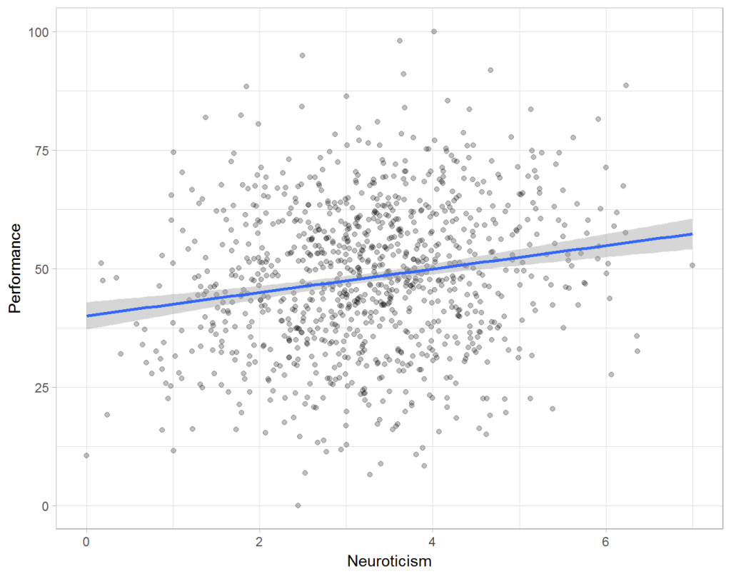
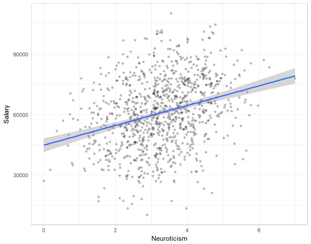
Assume you run a company of 1000 employees and you have asked all of them to fill out a Big Five personality survey. Per individual, you therefore have a score depicting his/her personality characteristic Neuroticism, which can run from 0 (not at all neurotic) to 7 (very neurotic). Now you are interested in the extent to which this Neuroticism of employees relates to their Job Performance (measured 0 – 100) and their Salary (measured in Euro’s per Year). In order to get a sense of the effects, you may decide to visualize both these relations in scatter plots:
downloaddownload (6)

From these visualizations it would look like Neuroticism relates significantly and positively to both employees’ performance and their yearly salary. Should you select more neurotic people to improve your overall company performance? Or are you discriminating emotionally-stable (non-neurotic) employees when it comes to salary?

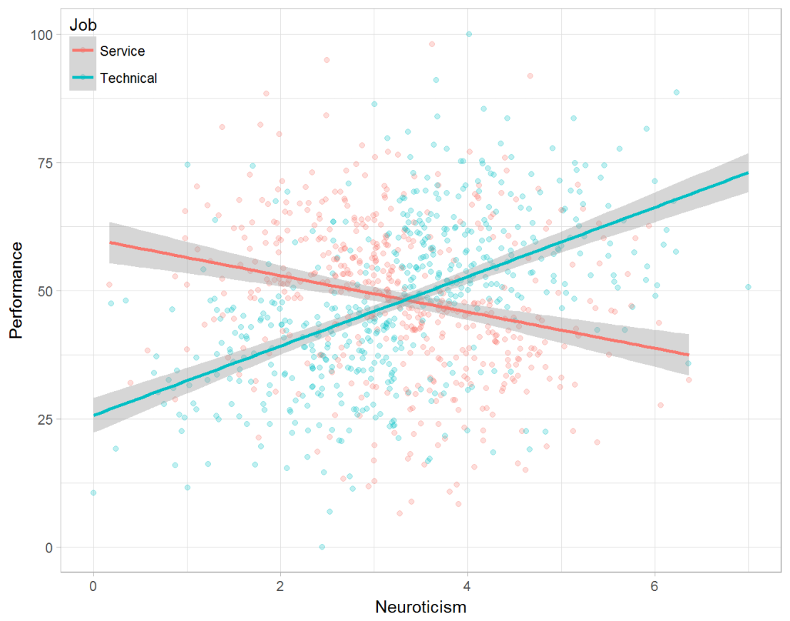
Taking a closer look at the subgroups in your data, you might however find very different relationships. For instance, the positive relationship between neuroticism and performance may only apply to technical positions, but not to those employees’ in service-oriented jobs.
download (7).png

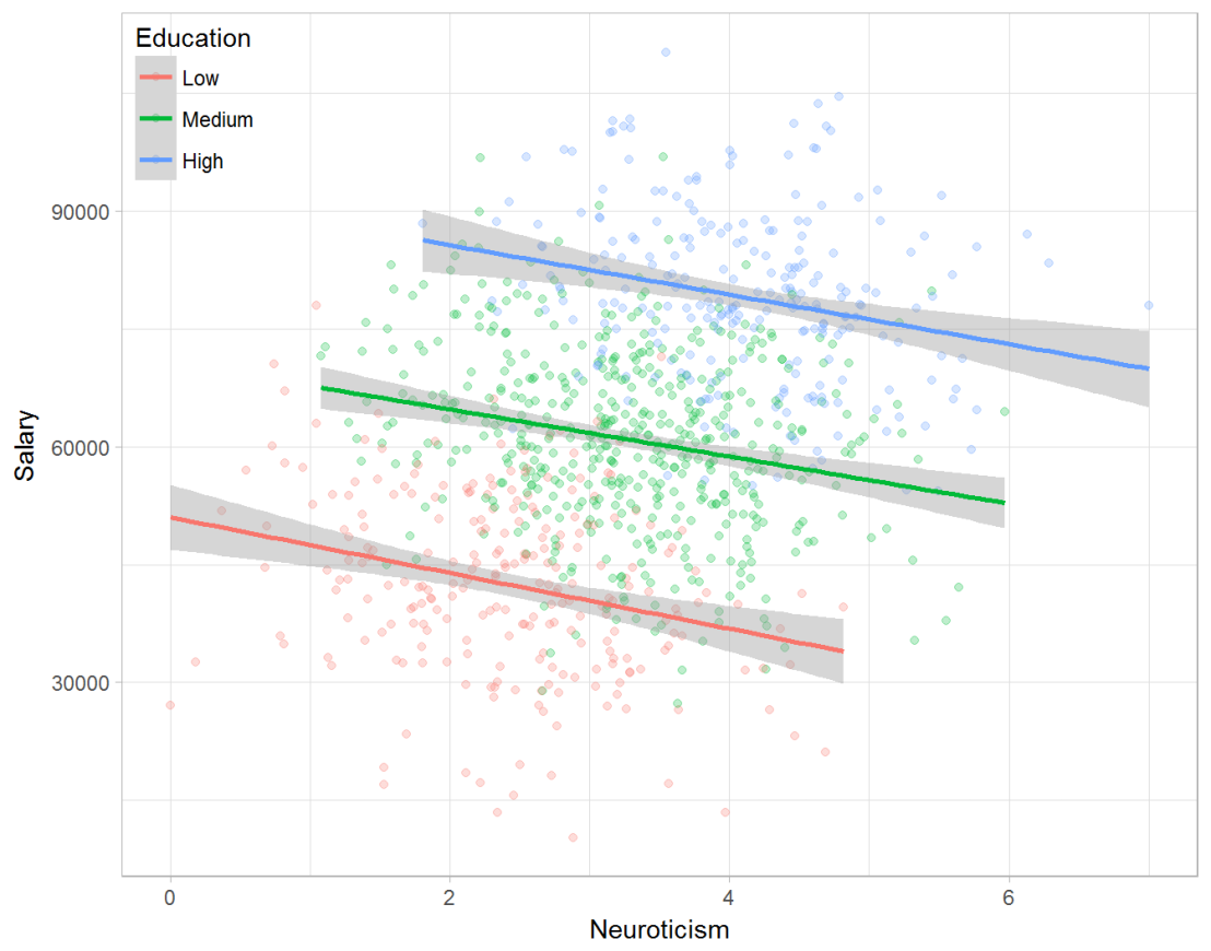
Similarly, splitting the employees by education level, it becomes clear that there is a relationship between neuroticism and education level that may explain the earlier association with salary. More educated employees receive higher salaries and within these groups, neuroticism is actually related to lower yearly income.
download (8).png

If you’d like to see the code used to simulate these data and generate the examples, you can find the R markdown file here on Rpubs.

Solving the paradox

Kievit and colleagues (2013) argue that Simpsons paradox may occur in a wide variety of research designs, methods, and questions, particularly within the social and medical sciences. As such, they propose several means to “control” or minimize the risk of it occurring. The paradox may be prevented from occurring altogether by more rigorous research design: testing mechanisms in longitudinal or intervention studies. However, this is not always feasible. Alternatively, the researchers pose that data visualization may help recognize the patterns and subgroups and thereby diagnose paradoxes. This may be easy if your data looks like this:

An external file that holds a picture, illustration, etc. Object name is fpsyg-04-00513-g0001.jpg

But rather hard, or even impossible, when your data looks more like the below:

An external file that holds a picture, illustration, etc. Object name is fpsyg-04-00513-g0003.jpg

Clustering may nevertheless help to detect Simpson’s paradox when it is not directly observable in the data. To this end, Kievit and Epskamp (2012) have developed a tool to facilitate the detection of hitherto undetected patterns of association in existing datasets. It is written in R, a language specifically tailored for a wide variety of statistical analyses which makes it very suitable for integration into the regular analysis workflow. As an R package, the tool is is freely available and specializes in the detection of cases of Simpson’s paradox for bivariate continuous data with categorical grouping variables (also known as Robinson’s paradox), a very common inference type for psychologists. Finally, its code is open source and can be extended and improved upon depending on the nature of the data being studied.

One example of application is provided in the paper, for a dataset on coffee and neuroticism. A regression analysis would suggest a significant positive association between coffee and neuroticism overall. However, when the detection algorithm of the R package is applied, a different picture appears: the analysis shows that there are three latent clusters present and that the purported positive relationship only holds for one cluster whereas it is negative in the others.

An external file that holds a picture, illustration, etc. Object name is fpsyg-04-00513-g0006.jpg

Update 24-10-2017: minutephysics – one of my favorite YouTube channels – uploaded a video explaining Simpson’s paradox very intuitively in a medical context:

Update 01-11-2017: minutephysics uploaded a follow-up video:

The paradox is that we remain reluctant to fight our bias, even when they are put in plain sight.
The Dataviz Project: Find just the right visualization

The Dataviz Project: Find just the right visualization

Do you have a bunch of data but you can’t seem to figure out how to display it? Or looking for that one specific visualization of which you can’t remember the name?

www.datavizproject.com provides a most comprehensive overview of all the different ways to visualize your data. You can sort all options by Family, Input, Function, and Shape to find that one dataviz that best conveys your message.

datavizproject overview

Update: look at some of these other repositories here or here.

Generating 3D Faces from 2D Photographs

Generating 3D Faces from 2D Photographs

Aaron Jackson, Adrian Bulat, Vasileios Argyriou and Georgios Tzimiropoulos
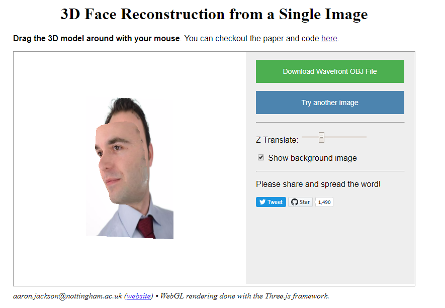
of the Computer Vision Laboratory of the University of Nottingham built a neural network that generates a full 3D image of a single portrait photograph. They turn a photograph like this…

PVDL corporate

… into an accurately creepy 3D image like this.

faceimage

You can try it with your own or other photographs here. I found that images with white background get the best results. On their project website you can read more about the underlying convolutional neural network.

Update 21-10-2017: One of my favorite YouTube channels explains how the models were trained and the data used:

Visualizing #IRMA Tweets

Visualizing #IRMA Tweets

Reddit user LucasCu90 used the R package twitteR to retrieve all tweets that were sent with #Irma and a Geocode of central Miami (25 mile radius) from Saturday September 9, to Sunday September 10, 2017 (the period of Irma’s approach and initial landfall on the Florida Keys and the mainland). From the 29,000 tweets he collected, Lucas then retrieved the 600 most common words and overlaid them on a map of Florida, with their size relative to their frequency in the data. The result is quite nice!

oq41nz62balz

Coexisting Languages in Australia: An Interactive map

Coexisting Languages in Australia: An Interactive map

Jack Zhao from Small Multiples – a multidisciplinary team of data specialists, designers and developers – retrieved the Language Spoken at Home (LANP) data from the 2016 Census and turned it into a dot density map that vividly shows how people from different cultures coexist (or not) in ultra high resolution (using Python, englewood library, QGIS, Carto). Each colored dot in the visualizations below represents five people from the same language group in the area. Highly populated areas have a higher density of dots; while language diversity is shown through the number of different colors in the given area.

Good news: the maps are interactive! Here’s Sydney:

Here is the original webpage on Small Multiples and you can browse the interactive map in full screen in your browser. The below language groups are included:

  • Eastern Asian: Chinese, Japanese, Korean, Other Eastern Asian Languages
  • Southeast Asian: Burmese and Related Languages, Hmong-Mien, Mon-Khmer, Tai, Southeast Asian Austronesian Languages, Other Southeast Asian Languages
  • Southern Asian: Dravidian, Indo-Aryan, Other Southern Asian Languages
  • Southwest And Central Asian: Iranic, Middle Eastern Semitic Languages, Turkic, Other Southwest and Central Asian Languages
  • Northern European: Celtic, English, German and Related Languages, Dutch and Related Languages, Scandinavian, Finnish and Related Languages
  • Southern European: French, Greek, Iberian Romance, Italian, Maltese, Other Southern European Languages
  • Eastern European: Baltic, Hungarian, East Slavic, South Slavic, West Slavic, Other Eastern European Languages
  • Australian Indigenous: Arnhem Land and Daly River Region Languages, Yolngu Matha, Cape York Peninsula Languages, Torres Strait Island Languages, Northern Desert Fringe Area Languages, Arandic, Western Desert Languages, Kimberley Area Languages, Other Australian Indigenous Languages


Where to look for your next job? An Interactive Map of the US Job Market

Where to look for your next job? An Interactive Map of the US Job Market

The people at Predictive Talent, Inc. took a sample of 23.4 million job postings from 5,200+ job boards and 1,800+ cities around the US.  They classified these jobs using the BLS Standard Occupational Classification tree and identified their primary work locations, primary job roles, estimated salaries, and 17 other job search-related characteristics. Next, they calculated five metrics for each role and city in order to identify the 123 biggest job shortages in the US:

  • Monthly Demand (#): How many people are companies hiring every month? This is simply the number of unique jobs posted every month.
  • Unmet Demand (%): What percentage of jobs did companies have a hard time filling? Details aside, basically, if a company re-posts the same job every week for 6 weeks, one may assume that they couldn’t find someone for the first 5 weeks.
  • Salary ($): What’s the estimated salary for these jobs near this city? Using 145,000+ data points from the federal government and proprietary sources, along with salary information parsed from jobs themselves, they estimated the median salary for similar jobs within 100 miles of the city.
  • Delight (#): On a scale of 1 (least) to 10 (most delight), how easy should the job search be for the average job-seeker? This is basically the opposite of Agony.

The end result is this amazing map of the job market in the U.S, which you can interactively explore here to see where you could best start your next job hunt.