Came across this awesome Youtube video that blew my mind. Definitely a handy resource if you want to explain the inner workings of neural networks. Have a look!
Looking for a custom typeface to use in your data visualizations? Google Fonts is an awesome databank of nearly a thousands font families you can access, download, and use for free.
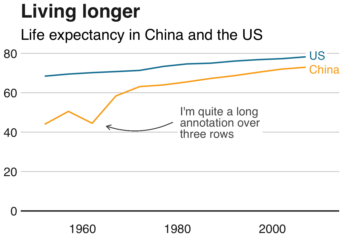
The BBC data team developed an R package (bbplot) which makes the process of creating publication-ready graphics in their in-house style using R’s ggplot2 library a more reproducible process, as well as making it easier for people new to R to create graphics.
Apart from sharing several best practices related to data visualization, they walk you through the steps and R code to create graphs such as the below:
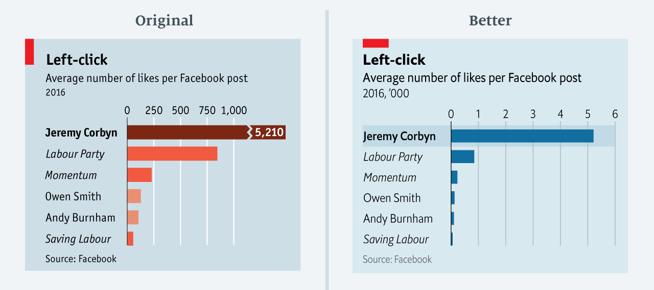
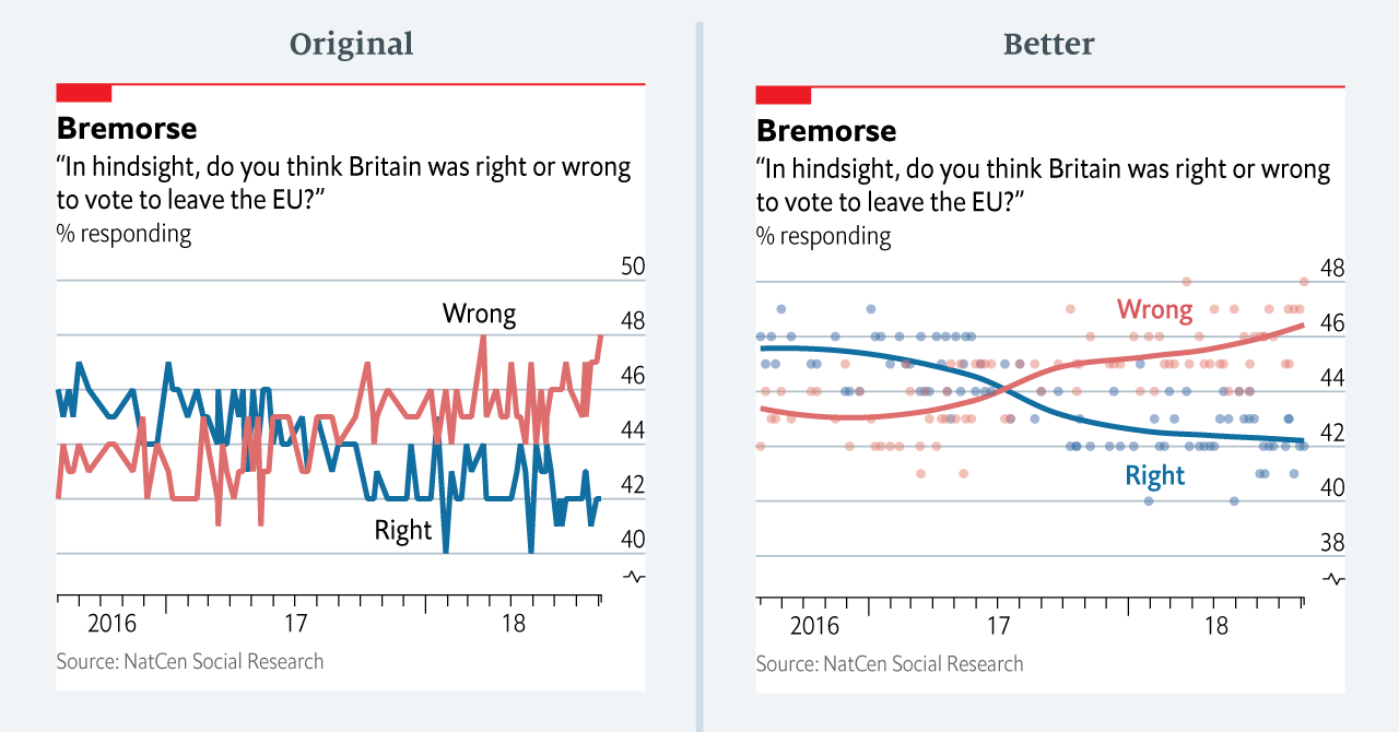
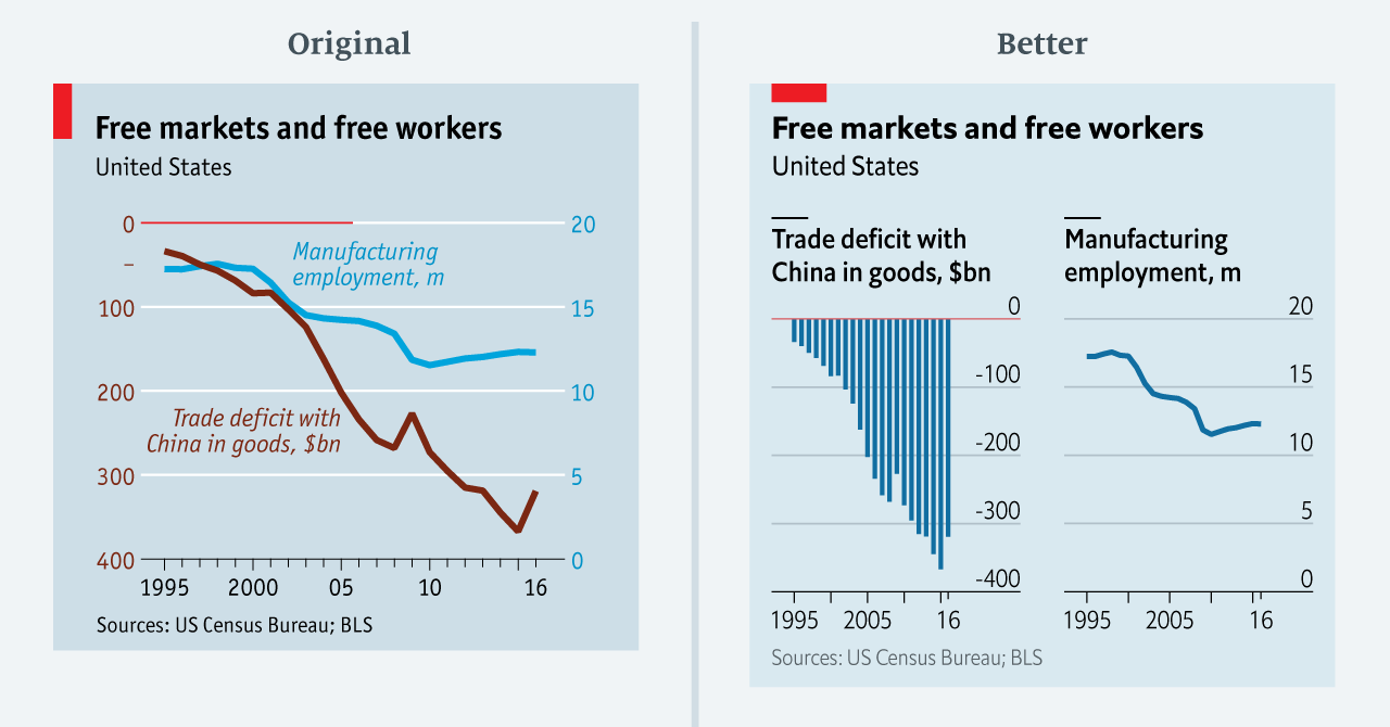
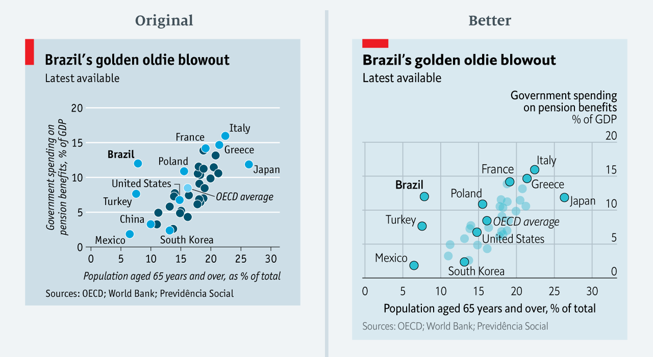
The data team at the Economist also felt a need to share their lessons learned via Medium. They show some of their most misleading, confusing, and failing graphics of the past years, and share the following mistakes and their remedies:
Truncating the scale (image #1 below)
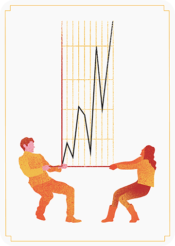
Forcing a relationship by cherry-picking scales
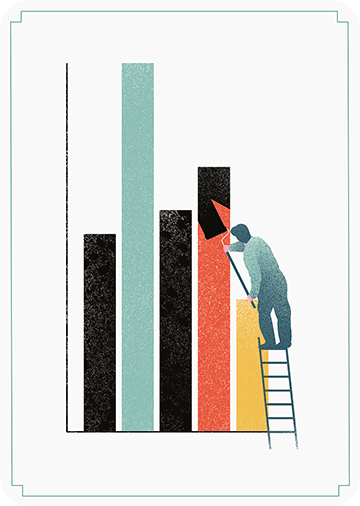
Choosing the wrong visualisation method (image #2 below)
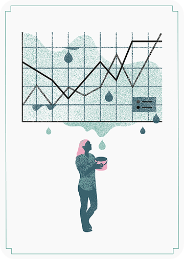
Taking the “mind-stretch” a little too far (image #3 below)
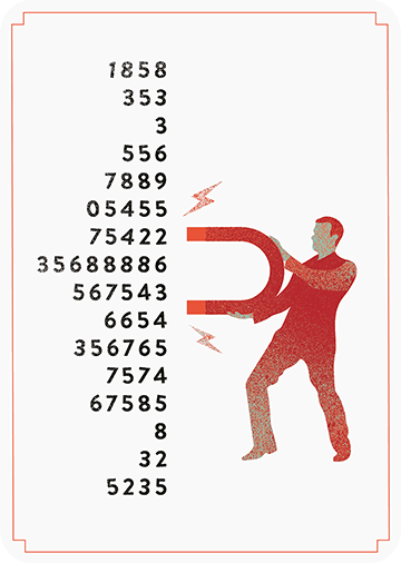
Confusing use of colour (image #4 below)
Including too much detail
Lots of data, not enough space
Moreover, they share the data behind these failing and repaired data visualizations:
All 538’s data visualizations are just stunningly beautiful and often very ingenious, using new chart formats to display complex patterns. Moreover, the range of topics they cover is huge. Anything ranging from their traditional background — politics — to great cover stories on sumo wrestling and pricy wine.
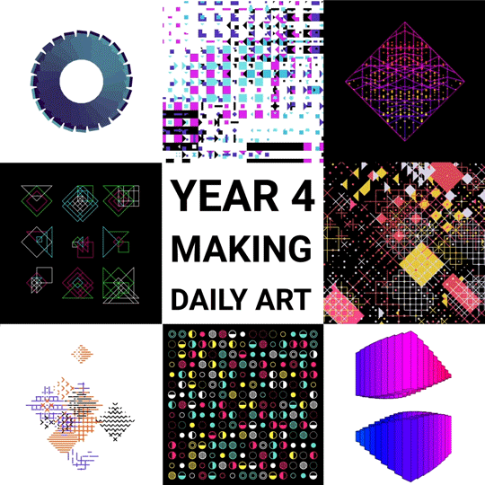
Saskia Freeke (twitter) is a Dutch artist, creative coder, interaction designer, visual designer, and educator working from Amsterdam. She has been creating an awesome digital art piece for every day since January 1st 2015. Her ever-growing collection includes some animated, visual masterpieces.
Maarten Lambrechts is a data journalist I closely follow online, with great delight. Recently, he shared on Twitter his slidedeck on the 18 most common data visualization pitfalls. You will probably already be familiar with most, but some (like #14) were new to me:
Save pies for dessert
Don’t cut bars
Don’t cut time axes
Label directly
Use colors deliberately
Avoid chart junk
Scale circles by area
Avoid double axes
Correlation is no causality
Don’t do 3D
Sort on the data
Tell the story
1 chart, 1 message
Common scales on small mult’s
#Endrainbow
Normalise data on maps
Sometimes best map is no map
All maps lie
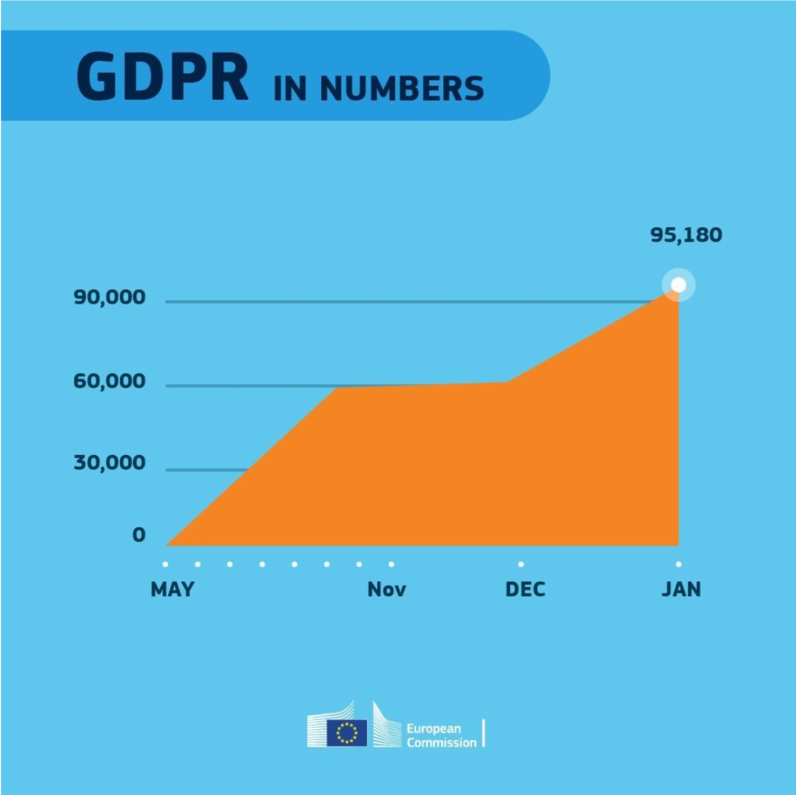
Even though most of these 18 rules below seem quite obvious, even the European Commissions seems to break them every now and then:
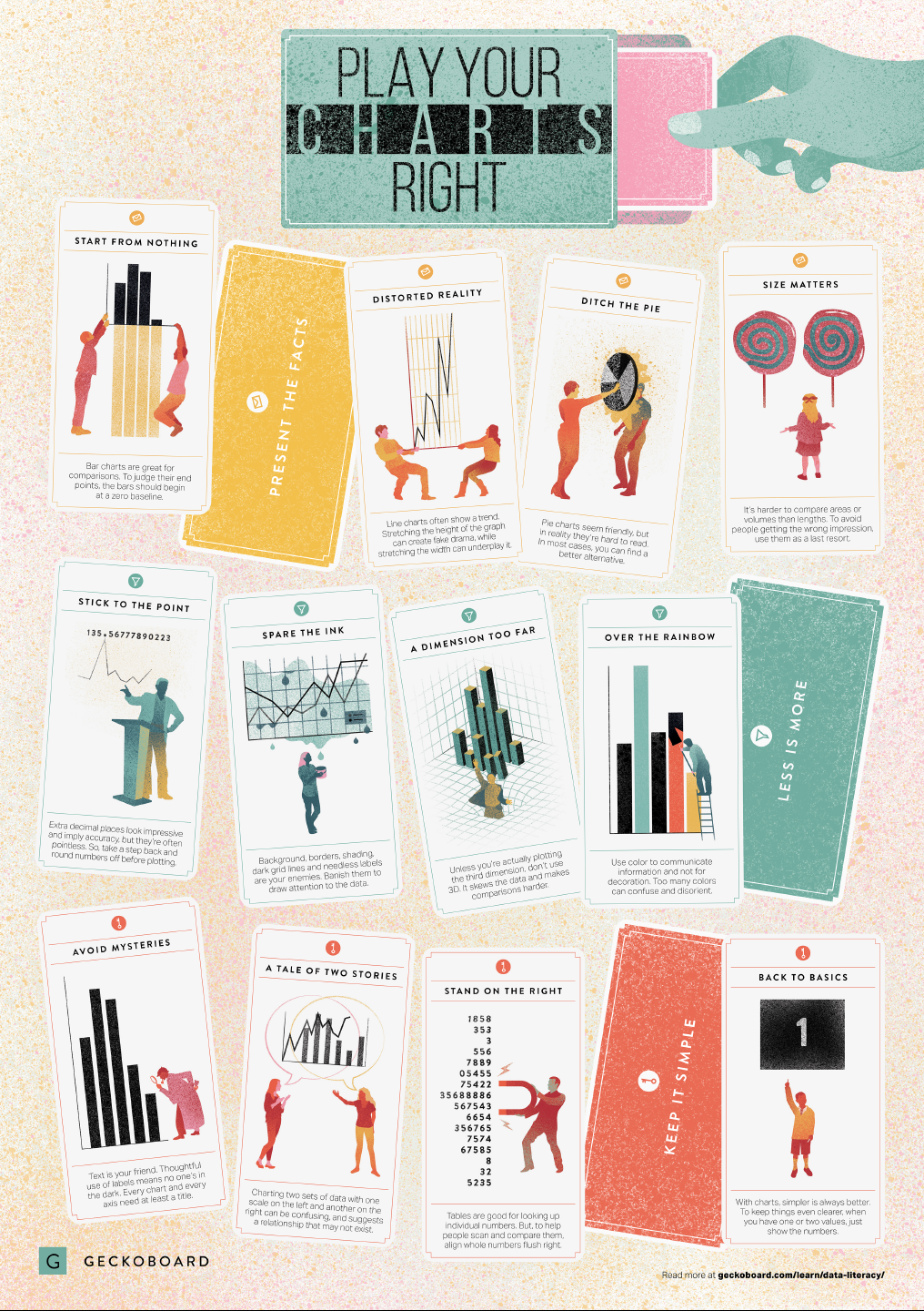
In a world where data really matters, we all want to create effective charts. But data visualization is rarely taught in schools, or covered in on-the-job training. Most of us learn as we go along, and therefore we often make choices or mistakes that confuse and disorient our audience. From overcomplicating or overdressing our charts, to conveying an entirely inaccurate message, there are common design pitfalls that can easily be avoided. We’ve put together these pointers to help you create simpler charts that effectively get across the meaning of your data.
Based on work by experts such as Stephen Few, Dona Wong, Albert Cairo, Cole Nussbaumer Knaflic, and Andy Kirk, the authors at Geckoboard wrote down a list of recommendations which I summarize below:
Present the facts
Start your axis at zero whenever possible, to prevent misinterpretation. Particularly bar charts.
The width and height of line and scatter plots influence its messages.
Area and size are hard to interpret. Hence, there’s often a better alternative to the pie chart. Read also this.