Month: September 2017

Simpson’s Paradox: Two HR examples with R code.

Simpson’s Paradox: Two HR examples with R code.

Simpson (1951) demonstrated that a statistical relationship observed within a population—i.e., a group of individuals—could be reversed within all subgroups that make up that population. This phenomenon, where X seems to relate to Y in a certain way, but flips direction when the population is split for W, has since been referred to as Simpson’s paradox. Others names, according to Wikipedia, include the Simpson-Yule effect, reversal paradox or amalgamation paradox.

The most famous example has to be the seemingly gender-biased Berkeley admission rates:

“Examination of aggregate data on graduate admissions to the University of California, Berkeley, for fall 1973 shows a clear but misleading pattern of bias against female applicants. Examination of the disaggregated data reveals few decision-making units that show statistically significant departures from expected frequencies of female admissions, and about as many units appear to favor women as to favor men. If the data are properly pooled, taking into account the autonomy of departmental decision making, thus correcting for the tendency of women to apply to graduate departments that are more difficult for applicants of either sex to enter, there is a small but statistically significant bias in favor of women. […] The bias in the aggregated data stems not from any pattern of discrimination on the part of admissions committees, which seem quite fair on the whole, but apparently from prior screening at earlier levels of the educational system.” – part of abstract of Bickel, Hammel, & O’Connel (1975)

In a table, the effect becomes clear. While it seems as if women are rejected more often overall, women are actually less often rejected on a departmental level. Women simply applied to more selective departments more often (E & C below), resulting in the overall lower admission rate for women (35% as opposed to 44% for men).

Afbeeldingsresultaat voor berkeley simpson's paradox
Copied from Bits of Pi

Examples in HR

Simpsons Paradox can easily occur in organizational or human resources settings as well. Let me run you through two illustrated examples, I simulated:

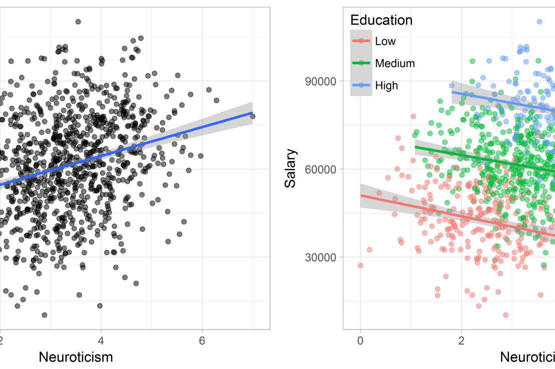
Assume you run a company of 1000 employees and you have asked all of them to fill out a Big Five personality survey. Per individual, you therefore have a score depicting his/her personality characteristic Neuroticism, which can run from 0 (not at all neurotic) to 7 (very neurotic). Now you are interested in the extent to which this Neuroticism of employees relates to their Job Performance (measured 0 – 100) and their Salary (measured in Euro’s per Year). In order to get a sense of the effects, you may decide to visualize both these relations in scatter plots:

downloaddownload (6)

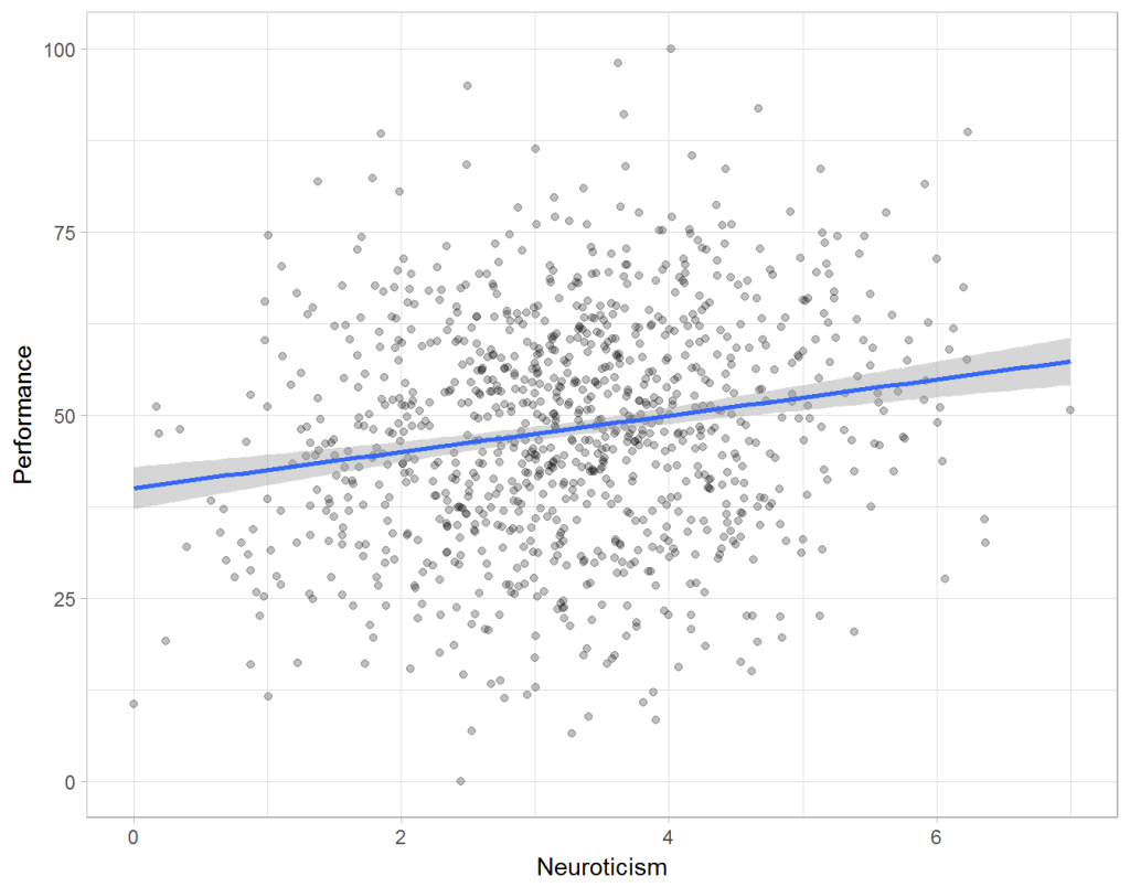
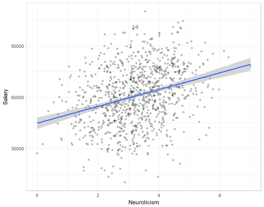
From these visualizations it would look like Neuroticism relates significantly and positively to both employees’ performance and their yearly salary. Should you select more neurotic people to improve your overall company performance? Or are you discriminating emotionally-stable (non-neurotic) employees when it comes to salary?

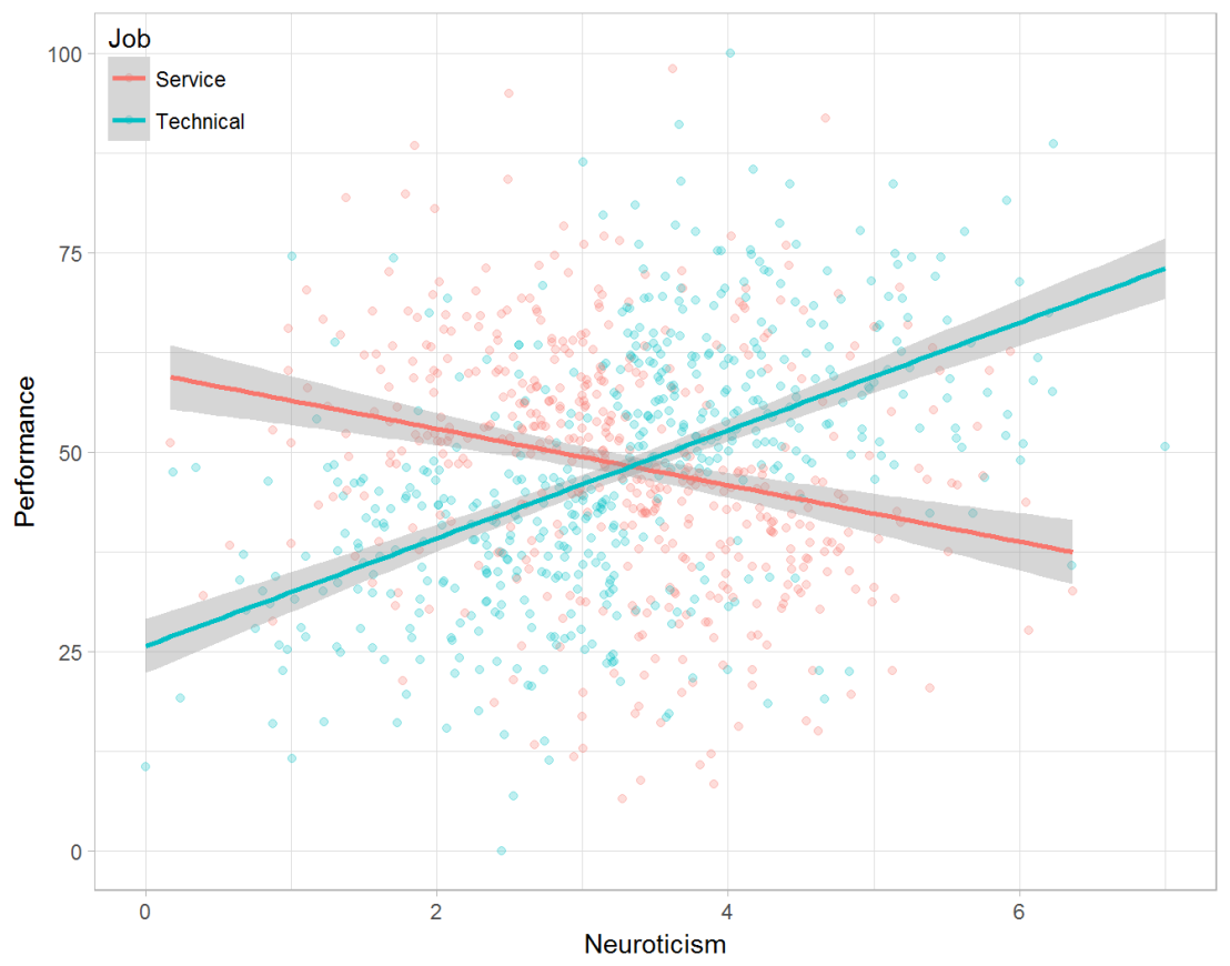
Taking a closer look at the subgroups in your data, you might however find very different relationships. For instance, the positive relationship between neuroticism and performance may only apply to technical positions, but not to those employees’ in service-oriented jobs.

download (7).png

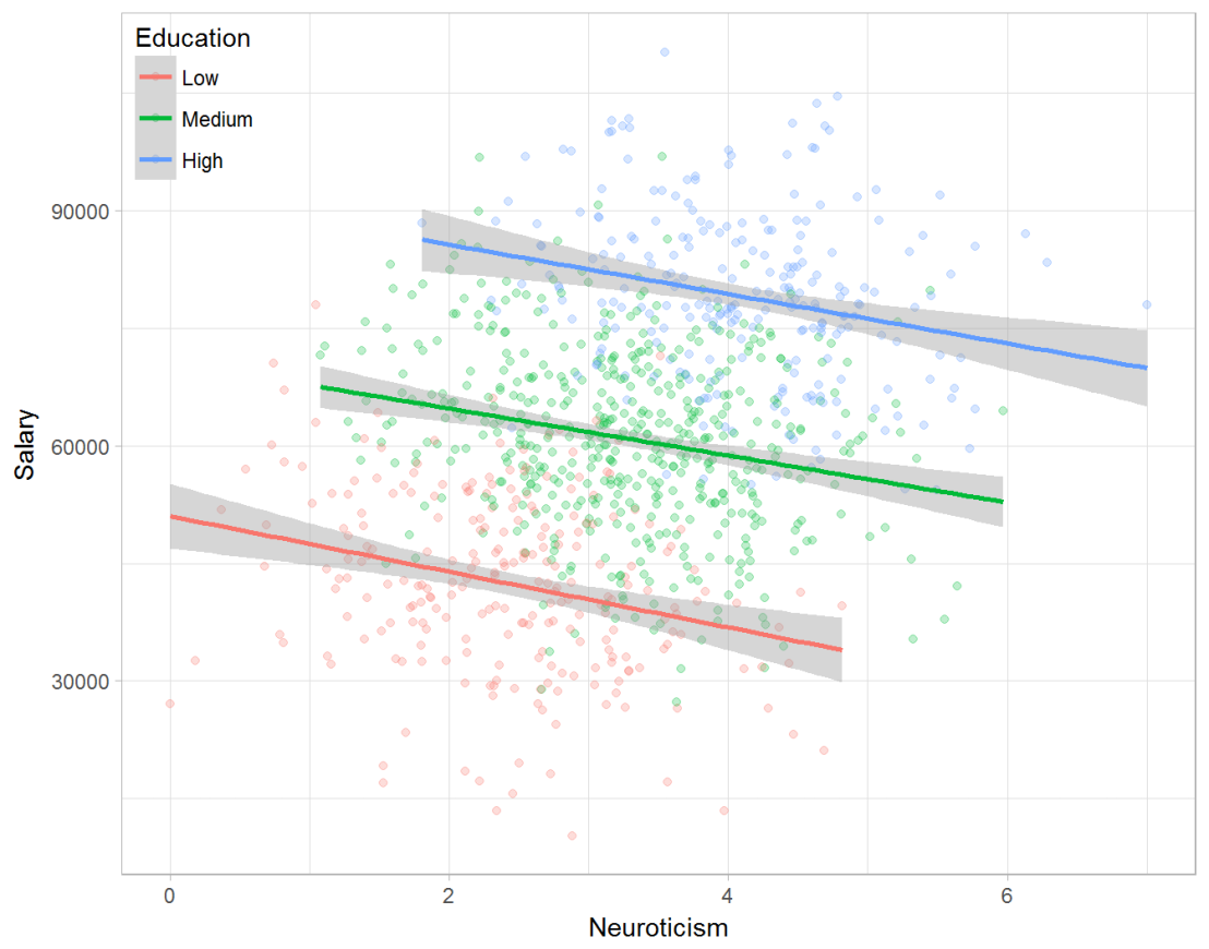
Similarly, splitting the employees by education level, it becomes clear that there is a relationship between neuroticism and education level that may explain the earlier association with salary. More educated employees receive higher salaries and within these groups, neuroticism is actually related to lower yearly income.

download (8).png

If you’d like to see the code used to simulate these data and generate the examples, you can find the R markdown file here on Rpubs.

Solving the paradox

Kievit and colleagues (2013) argue that Simpsons paradox may occur in a wide variety of research designs, methods, and questions, particularly within the social and medical sciences. As such, they propose several means to “control” or minimize the risk of it occurring. The paradox may be prevented from occurring altogether by more rigorous research design: testing mechanisms in longitudinal or intervention studies. However, this is not always feasible. Alternatively, the researchers pose that data visualization may help recognize the patterns and subgroups and thereby diagnose paradoxes. This may be easy if your data looks like this:

An external file that holds a picture, illustration, etc. Object name is fpsyg-04-00513-g0001.jpg

But rather hard, or even impossible, when your data looks more like the below:

An external file that holds a picture, illustration, etc. Object name is fpsyg-04-00513-g0003.jpg

Clustering may nevertheless help to detect Simpson’s paradox when it is not directly observable in the data. To this end, Kievit and Epskamp (2012) have developed a tool to facilitate the detection of hitherto undetected patterns of association in existing datasets. It is written in R, a language specifically tailored for a wide variety of statistical analyses which makes it very suitable for integration into the regular analysis workflow. As an R package, the tool is is freely available and specializes in the detection of cases of Simpson’s paradox for bivariate continuous data with categorical grouping variables (also known as Robinson’s paradox), a very common inference type for psychologists. Finally, its code is open source and can be extended and improved upon depending on the nature of the data being studied.

One example of application is provided in the paper, for a dataset on coffee and neuroticism. A regression analysis would suggest a significant positive association between coffee and neuroticism overall. However, when the detection algorithm of the R package is applied, a different picture appears: the analysis shows that there are three latent clusters present and that the purported positive relationship only holds for one cluster whereas it is negative in the others.

An external file that holds a picture, illustration, etc. Object name is fpsyg-04-00513-g0006.jpg

Update 24-10-2017: minutephysics – one of my favorite YouTube channels – uploaded a video explaining Simpson’s paradox very intuitively in a medical context:

Update 01-11-2017: minutephysics uploaded a follow-up video:

The paradox is that we remain reluctant to fight our bias, even when they are put in plain sight.

Text Mining: Pythonic Heavy Metal

Text Mining: Pythonic Heavy Metal

This blog summarized work that has been posted here, here, and here.

Iain of degeneratestate.org wrote a three-piece series where he applied text mining to the lyrics of 222,623 songs from 7,364 heavy metal bands spread over 22,314 albums that he scraped from darklyrics.com. He applied a broad range of different analyses in Python, the code of which you can find here on Github.

For example, he starts part 1 by calculated the difficulty/complexity of the lyrics of each band using the Simple Measure of Gobbledygook or SMOG and contrasted this to the number of swearwords used, finding a nice correlation.

Ratio of swear words vs readability
Lyric complexity relates positive to swearwords used.

Furthermore, he ran some word importance analysis, looking at word frequencies, log-likelihood ratios, and TF-IDF scores. This allowed him to contrast the word usage of the different bands, finding, for instance, one heavy metal band that was characterized by the words “oh yeah baby got love“: fans might recognize either Motorhead, Machinehead, or Diamondhead.

Examplehead WordImportance 3

Using cosine distance measures, Iain could compare the word vectors of the different bands, ultimately recognizing band similarity, and song representativeness for a band. This allowed interesting analysis, such as a clustering of the various bands:

Metal Cluster Dendrogram

However, all his analysis worked out nicely. While he also applied t-SNE to visualize band similarity in a two-dimensional space, the solution was uninformative due to low variance in the data.

He could predict the band behind a song by training a one-vs-rest logistic regression classifier based on the reduced lyric space of 150 dimensions after latent semantic analysis. Despite classifying a song to one of 120 different bands, the classifier had a precision and recall both around 0.3, with negligible hyper parameter tuning. He used the classification errors to examine which bands get confused with each other, and visualized this using two network graphs.

Metal Graph 1

In part 2, Iain tried to create a heavy metal lyric generator (which you can now try out).

His first approach was to use probabilistic distributions known as language models. Basically he develops a Markov Chain, in his opinion more of a “unsmoothed maximum-likelihood language model“, which determines the next most probable word based on the previous word(s). This model is based on observed word chains, for instance, those in the first two lines to Iron Maiden’s Number of the Beast:

Another approach would be to train a neural network. Iain used Keras, which ran on an amazon GPU instance. He recognizes the power of neural nets, but says they also come at a cost:

“The maximum likelihood models we saw before took twenty minutes to code from scratch. Even using powerful libraries, it took me a while to understand NNs well enough to use. On top of this, training the models here took days of computer time, plus more of my human time tweeking hyper parameters to get the models to converge. I lack the temporal, financial and computational resources to fully explore the hyperparameter space of these models, so the results presented here should be considered suboptimal.” – Iain

He started out with feed forward networks on a character level. His best try consisted of two feed forward layers of 512 units, followed by a softmax output, with layer normalisation, dropout and tanh activations, which he trained for 20 epochs to minimise the mean cross-entropy. Although it quickly beat the maximum likelihood Markov model, its longer outputs did not look like genuine heavy metal songs.

So he turned to recurrent neural network (RNN). The RNN Iain used contains two LSTM layers of 512 units each, followed by a fully connected softmax layer. He unrolled the sequence for 32 characters and trained the model by predicting the next 32 characters, given their immediately preceding characters, while minimizing the mean cross-entropy:

“To generate text from the RNN model, we step character-by-character through a sequence. At each step, we feed the current symbol into the model, and the model returns a probability distribution over the next character. We then sample from this distribution to get the next character in the sequence and this character goes on to become the next input to the model. The first character fed into the model at the beginning of generation is always a special start-of-sequence character.” – Iain

This approach worked quite well, and you can compare and contrast it with the earlier models here. If you’d just like to generate some lyrics, the models are hosted online at deepmetal.io.

In part 3, Iain looks into emotional arcs, examining the happiness and metalness of words and lyrics. Exploring words in the Happy/Metal Plane

When applied to the combined lyrics of albums, you could examine how bands developed their signature sound over time. For example, the lyrics of Metallica’s first few albums seem to be quite heavy metal and unhappy, before moving to a happier place. The Black album is almost sentiment-neutral, but after that they became ever more darker and more metal, moving back to the style to their first few albums. He applied the same analysis on the text of the Harry Potter books, of which especially the first and last appear especially metal.

The Evolution of Metallica's style in the Happy/Metal Plane


The Dataviz Project: Find just the right visualization

The Dataviz Project: Find just the right visualization

Do you have a bunch of data but you can’t seem to figure out how to display it? Or looking for that one specific visualization of which you can’t remember the name?

www.datavizproject.com provides a most comprehensive overview of all the different ways to visualize your data. You can sort all options by Family, Input, Function, and Shape to find that one dataviz that best conveys your message.

datavizproject overview

Update: look at some of these other repositories here or here.

Generating 3D Faces from 2D Photographs

Generating 3D Faces from 2D Photographs

Aaron Jackson, Adrian Bulat, Vasileios Argyriou and Georgios Tzimiropoulos
of the Computer Vision Laboratory of the University of Nottingham built a neural network that generates a full 3D image of a single portrait photograph. They turn a photograph like this…

PVDL corporate

… into an accurately creepy 3D image like this.

faceimage

You can try it with your own or other photographs here. I found that images with white background get the best results. On their project website you can read more about the underlying convolutional neural network.

Update 21-10-2017: One of my favorite YouTube channels explains how the models were trained and the data used:

Analysis of Media Coverage on Refugees

Analysis of Media Coverage on Refugees

Hannah Yan Han is doing #100dayprojects on data science and visual storytelling and I can only recommend that you take a look yourself. Below you find her R text analysis (#41) of UNHCR speeches and TV coverage on refugees.

Unsurprisingly, nouns like asylum, repatriation, displacement, persecution, plight, and crisis appear significantly more often in UNHCR speeches on refugees than in general English texts. The first visualization below shows the action-oriented verbs most commonly used in combination with these nouns.

This second visualization shows the most occurring verb-noun pairs.

Hannah used newsflash to retrieve the GDELT data on US TV news. Some channels seem to cover refugees more than others. I would have loved to see which topics occurred on each channel, but unfortunately she did not report on this.

Visualizing #IRMA Tweets

Visualizing #IRMA Tweets

Reddit user LucasCu90 used the R package twitteR to retrieve all tweets that were sent with #Irma and a Geocode of central Miami (25 mile radius) from Saturday September 9, to Sunday September 10, 2017 (the period of Irma’s approach and initial landfall on the Florida Keys and the mainland). From the 29,000 tweets he collected, Lucas then retrieved the 600 most common words and overlaid them on a map of Florida, with their size relative to their frequency in the data. The result is quite nice!

oq41nz62balz