Past days, I discovered this series of blogs on how to win the classic game of Battleships (gameplay explanation) using different algorithmic approaches. I thought they might amuse you as well : )
The story starts with this 2012 Datagenetics blog where Nick Berry constrasts four algorithms’ performance in the game of Battleships. The resulting levels of artificial intelligence (AI) seem to compare respectively to a distracted baby, two sensible adults, and a mathematical progidy.
The first, stupidest approach is to just take Random shots. The AI resulting from such an algorithm would just pick a random tile to shoot at each turn. Nick simulated 100 million games with this random apporach and computed that the algorithm would require 96 turns to win 50% of games, given that it would not be defeated before that time. At best, the expertise level of this AI would be comparable to that of a distracted baby. Basically, it would lose from the average toddler, given that the toddler would survive the boredom of playing such a stupid AI.
A first major improvement results in what is dubbed the Hunt algorithm. This improved algorithm includes an instruction to explore nearby spaces whenever a prior shot hit. Every human who has every played Battleships will do this intuitively. A great improvement indeed as Nick’s simulations demonstrated that this Hunt algorithm completes 50% of games within ~65 turns, as long as it is not defeated beforehand. Your little toddler nephew will certainly lose, and you might experience some difficulty as well from time to time.

Another minor improvement comes from adding the so-called Parity principle to this Hunt algorithm (i.e., Nick’s Hunt + Parity algorithm). This principle instructs the algorithm to take into account that ships will always cover odd as well as even numbered tiles on the board. This information can be taken into account to provide for some more sensible shooting options. For instance, in the below visual, you should avoid shooting the upper left white tile when you have already shot its blue neighbors. You might have intuitively applied this tactic yourself in the past, shooting tiles in a “checkboard” formation. With the parity principle incorporated, the median completion rate of our algorithm improves to ~62 turns, Nick’s simulations showed.

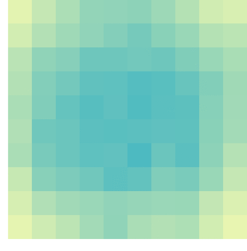
Now, Nick’s final proposed algorithm is much more computationally intensive. It makes use of Probability Density Functions. At the start of every turn, it works out all possible locations that every remaining ship could fit in. As you can imagine, many different combinations are possible with five ships. These different combinations are all added up, and every tile on the board is thus assigned a probability that it includes a ship part, based on the tiles that are already uncovered.

At the start of the game, no tiles are uncovered, so all spaces will have about the same likelihood to contain a ship. However, as more and more shots are fired, some locations become less likely, some become impossible, and some become near certain to contain a ship. For instance, the below visual reflects seven misses by the X’s and the darker tiles which thus have a relatively high probability of containing a ship part.

Nick simulated 100 million games of Battleship for this probabilistic apporach as well as the prior algorithms. The below graph summarizes the results, and highlight that this new probabilistic algorithm greatly outperforms the simpler approaches. It completes 50% of games within ~42 turns! This algorithm will have you crying at the boardgame table.

Reddit user /u/DataSnaek reworked this probablistic algorithm in Python and turned its inner calculations into a neat GIF. Below, on the left, you see the probability of each square containing a ship part. The brighter the color (white <- yellow <- red <- black), the more likely a ship resides at that location. It takes into account that ships occupy multiple consecutive spots. On the right, every turn the algorithm shoots the space with the highest probability. Blue is unknown, misses are in red, sunk ships in brownish, hit “unsunk” ships in light blue (sorry, I am terribly color blind).

The probability matrix as a heatmap for every square after each move in the game. [via]
This latter attempt by DataSnaek was inspired by Jonathan Landy‘s attempt to train a reinforcement learning (RL) algorithm to win at Battleships. Although the associated GitHub repository doesn’t go into much detail, the approach is elaborately explained in this blog. However, it seems that this specific code concerns the training of a neural network to perform well on a very small Battleships board, seemingly containing only a single ship of size 3 on a board with only a single row of 10 tiles.
Fortunately, Sue He wrote about her reinforcement learning approach to Battleships in 2017. Building on the open source phoenix-battleship project, she created a Battleship app on Heroku, and asked co-workers to play. This produced data on 83 real, two-person games, showing, for instance, that Sue’s coworkers often tried to hide their size 2 ships in the corners of the Battleships board.

Next, Sue scripted a reinforcement learning agent in PyTorch to train and learn where to shoot effectively on the 10 by 10 board. It became effective quite quickly, requiring only 52 turns (on average over the past 25 games) to win, after training for only a couple hundreds games.

However, as Sue herself notes in her blog, disappointly, this RL agent still does not outperform the probabilistic approach presented earlier in this current blog.
Reddit user /u/christawful faced similar issues. Christ (I presume he is called) trained a convolutional neural network (CNN) with the below architecture on a dataset of Battleships boards. Based on the current board state (10 tiles * 10 tiles * 3 options [miss/hit/unknown]) as input data, the intermediate convolutional layers result in a final output layer containing 100 values (10 * 10) depicting the probabilities for each tile to result in a hit. Again, the algorithm can simply shoot the tile with the highest probability.

Christ was nice enough to include GIFs of the process as well [via]. The first GIF shows the current state of the board as it is input in the CNN — purple represents unknown tiles, black a hit, and white a miss (i.e., sea). The next GIF represent the calculated probabilities for each tile to contain a ship part — the darker the color the more likely it contains a ship. Finally, the third picture reflects the actual board, with ship pieces in black and sea (i.e., miss) as white.


As cool as this novel approach was, Chris ran into the same issue as Sue, his approach did not perform better than the purely probablistic one. The below graph demonstrates that while Christ’s CNN (“My Algorithm”) performed quite well — finishing a simulated 9000 games in a median of 52 turns — it did not outperform the original probabilistic approach of Nick Berry — which came in at 42 turns. Nevertheless, Chris claims to have programmed this CNN in a couple of hours, so very well done still.

Interested by all the above, I searched the web quite a while for any potential improvement or other algorithmic approaches. Unfortunately, in vain, as I did not find a better attempt than that early 2012 Datagenics probability algorithm by Nick.
Surely, with today’s mass cloud computing power, someone must be able to train a deep reinforcement learner to become the Battleship master? It’s not all probability right, there must be some patterns in generic playing styles, like Sue found among her colleagues. Or maybe even the ability of an algorithm to adapt to the opponent’s playin style, as we see in Libratus, the poker AI. Maybe the guys at AlphaGo could give it a shot?
For starters, Christ’s provided some interesting improvements on his CNN approach. Moreover, while the probabilistic approach seems the best performing, it might not the most computationally efficient. All in all, I am curious to see whether this story will continue.